Client Tech

As all professional designers know, prospective clients can be unpredictable. Sometimes they get in sync with what we’re doing right away, and it seems every step is a positive one. Other times, however, they can be slower to figure things out, and the process can become more complicated.
I started working for a pool-construction company soon after graduating from college with a degree in industrial design. This was before the Digital Age had really taken hold, and I arrived on the scene with a set of old-school proficiencies (with pens, markers and all the tools of the drafting trade), a designer’s trained eye and an emerging ability to see a backyard’s fuller potential.
As it turned out, I also had a knack for communicating with clients about their needs and desires and a keen ability to convey my vision for their outdoor spaces through my designs. I found satisfaction in working with both the easy clients and the tough ones to develop spaces they could move through, occupy and enjoy. My life as an ink-and-paper designer was good and satisfying, and all was well in my world.
For all that, when my company decided to investigate digital design and I was introduced to the Pool Studio software offered by Structure Studios (Henderson, Nev.), there was no looking back: I’d been able to make hand-drawings work, but this was a different game – and it was soon clear that my clients were seeing it as a better one.
FINDING AN EDGE
While in school, I’d been exposed to some of the heavyweight three-dimensional design tools developed by Silicon Graphics and other big tech firms, so my early steps with Pool Studio led me on relatively familiar paths. In fact, I felt comfortable with the system very quickly and almost immediately began to see its advantages.
The big edge it had – even back in 2003, when I first started using the program – was the ease with which changes could be made. At that point, I was working for a high-end firm in the Washington, D.C., area, and there was a distinct expectation of polish in all our presentations.
|
Topography Rules! I grew up on New York’s Long Island, an affluent place but flat as a board and topographically featureless. It’s an easy place to visualize something like a pool: You shape it, place it and it’s done. After I graduated college, however, my new wife and I moved to northern Virginia, and I found myself surrounded by rolling hills and elevations changes and honest-to-goodness drama when it came to site contours. Starting out as an ink-and-paper pool designer, this new topography was a challenge, mostly because it was tough to get clients to understand the spaces I was designing on the basis of two-dimensional drawings. With digital design technology, handling topographical issues is no longer a big deal at all: Three-dimensional drawings and fly-through capability make it easy for my clients to get a sense of the space. Working out the details amid these contours has been both fun and satisfying for me, too. — B.T. |
In the old days, if a client wanted a change made, it wasn’t something that was simply done: Often, it meant starting all over again and generating new ink-and-paper drawings – and this was something that occasionally happened more than once. With Pool Studio, however, making changes to shapes, materials, hardscape features and landscaping was as easy as a bunch of keystrokes – still a demanding process, but one that lacked the basic frustration literally built into the ink-and-paper revision routine.
Another key advantage was the fact that the digital system was user-friendly in ways that made it possible for me to deal with changes rapidly. This enabled me to respond to my clients much more quickly and without the sort of delays that could come in generating fresh sets of elaborate hand drawings. It was a win-win for me and the clients, and it also made life easier within the company because projects could keep their momentum even as changes were being processed.
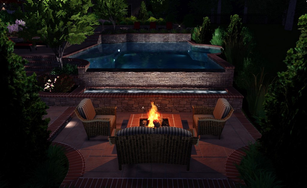
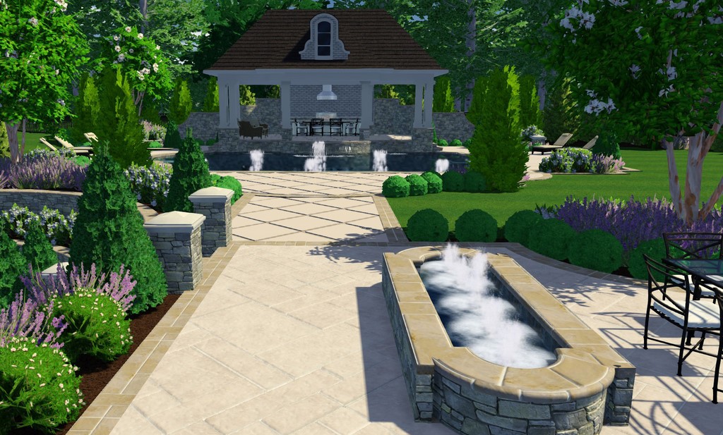
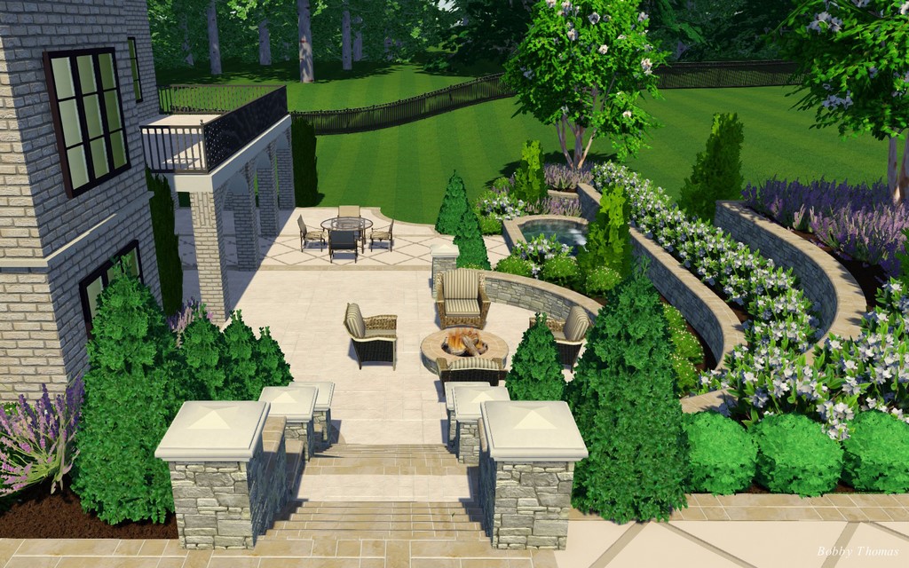
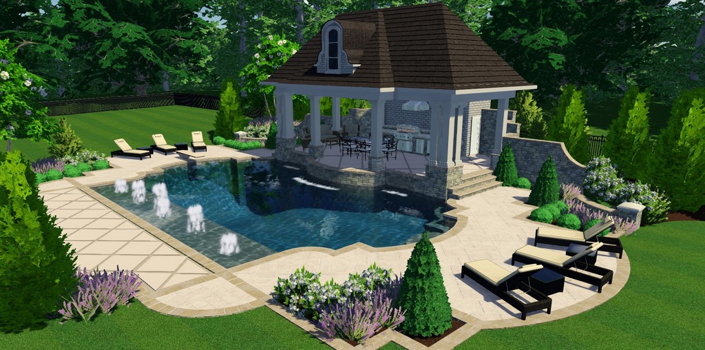
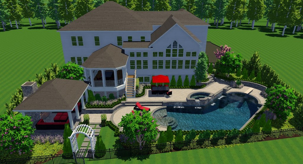
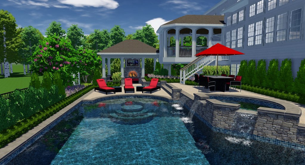
Finally – and this is probably the biggest plus of all – the digital system is able, quickly, to translate two-dimensional drawings into three-dimensional images of the site, as seen from multiple angles. The importance of this single feature can’t be overstated: While I can go onto a site and “see” its potential, most clients aren’t so fortunate. The three-dimensional images bring them into the setting in ways that were possible before with lots of effort. Now, however, it’s all part of what the software does as a matter of course as you work up the design.
SEEING CLEARLY
The effect all of this technology has on clients comes through forcefully in presentations. In the old days, I’d come in with sets of drawings and a laptop and, in words and images, do all I could to help them visualize the space with me.
It was distinctly a sales process, and I watched my clients’ eyes and body language carefully to see how they were reacting. As we moved along, I adjusted on the fly, made mental notes and sketched out new approaches as we gradually came to an understanding.
The difference with a digital approach is all about responsiveness: Now I come in and start by showing clients two-dimensional drawings that give them a basic lay of the land, then, when I sense they’re ready, I’ll move over to a full three-dimensional presentation, flying them through the space from multiple angles to help them fill in whatever blanks there might have been in their understanding of the space.
| A project of this scope and scale will go through multiple iterations as the client gets a feel for the space and we run through possible materials and features. With ink and paper, this process can become arduous. Once you’re familiar with good design software, however, these alterations often involve nothing more than a few skillful keystrokes. |
Absolutely, this is still a sales process and I’m keenly attuned to their vibes and body language, but there’s so much visual weight behind the digital presentation that there’s genuine excitement as the experience unfolds.
This makes it far easier for clients to get involved in the process: Say they like the basic shape but want stone instead of brick decking. Easily done. Or maybe they want to expand the patio area to include more space for dining? No problem. Or if they want to alter the placement of the spa so it’s more easily accessible from the master suite? Here they go. Textures, colors, materials: It’s all so vivid and immediate, and it makes quicker work of navigating details and changes.
It’s so much more direct and comfortable for them – and for me.
To be sure, my digital presentations aren’t fundamentally different from my old-school presentations: They still require me to listen carefully and be attuned to the clients’ needs and desires. I also have to keep an eye on the all-important budget, which is the one area where the digital process, because it’s so fast and so easy, can throw things off track if I’m not careful.
I keep reminding myself: This digital realm is one in which details can be added and removed as required, so even if the clients’ eyes get big, it’s possible to pull back within budget limits with relative ease. Perhaps more important, it’s an opportunity to get them to revisit the budget and project a bigger dream onto the available space – a distinct possibility in many cases.
RIDING THE NUANCES
As I noted at the outset, clients can be unpredictable creatures: For all the advantages of digital design when it comes to presentations and helping them visualize spaces, I still run into situations where, as I watch their reactions, I see that I need to recalculate my approach – and exploit the flexibility of my presentation tools to get things back on track.
Ironically, it’s the highly polished nature of these presentations that is the usual suspect when things go off kilter: My clients are sometimes intimidated enough by what they see that it freezes them, and it’s probably my fault: I really get into it within the program, taking the time to include their home in the images and going to great lengths to create detailed landscapes that add yet another layer of potential to the setting.
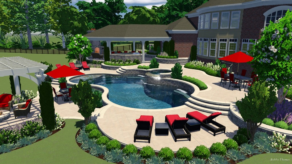
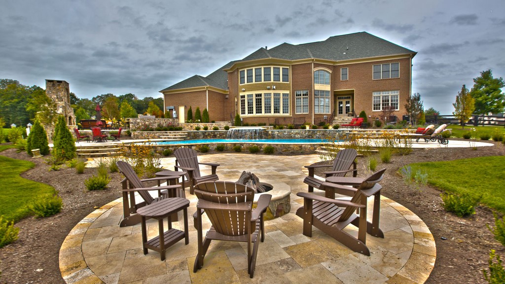
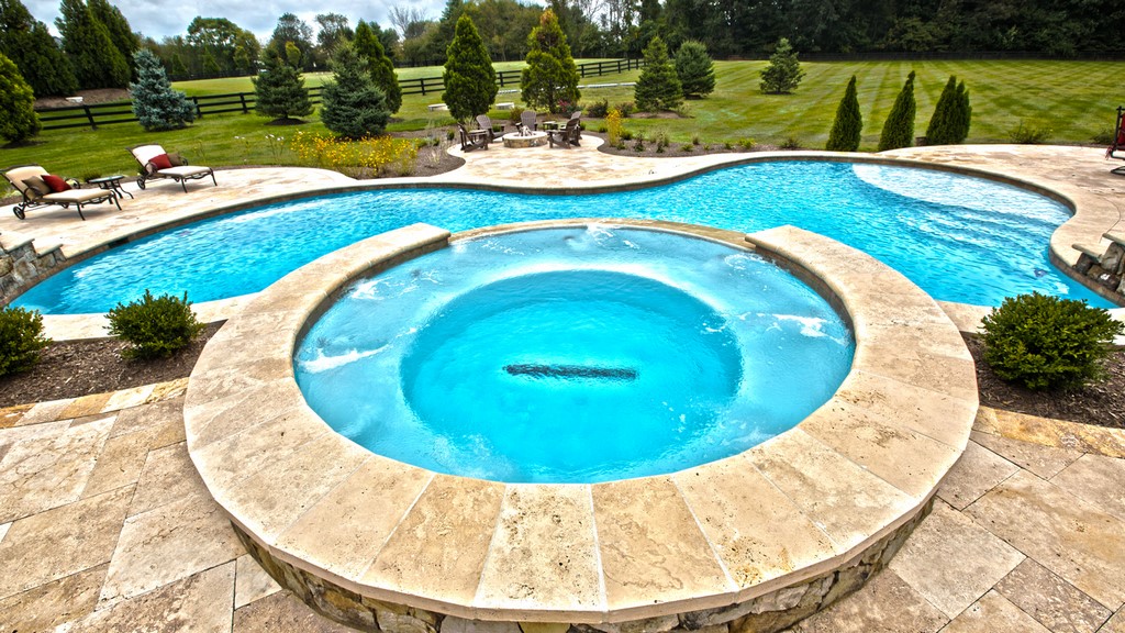
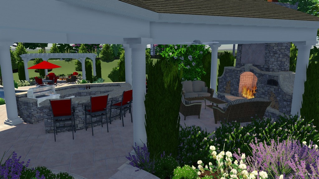
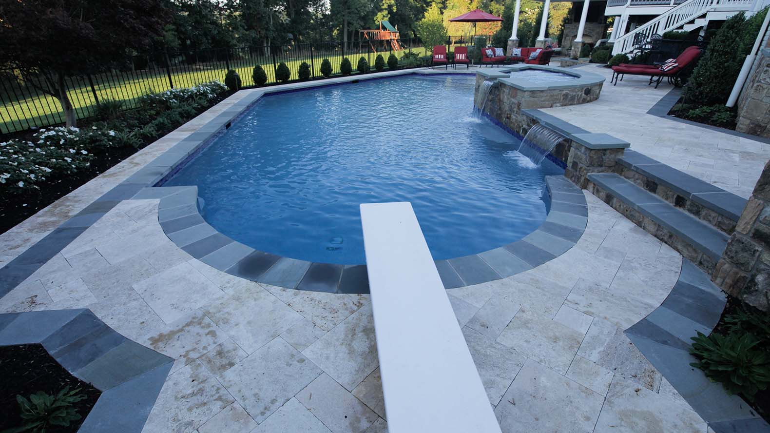
| Sometimes, clients will come to see digital renderings as a form of ‘photographic truth,’ a trick of mind that can lead to awkwardness as a project nears completion: As can be seen in these three pairs of as-designed and as-built images, it helps if we make them aware that plants need time to grow, change orders can delete major design elements such as shade structures, and budget consciousness often limits the number of plants that actually make it into the ground. |
The effect of all of the detail is that they will sometimes start thinking about costs at inopportune times: It’s all so gorgeous, they can’t see any way that we’re still working at or under budget. I know this bottleneck is coming, however, so when we actually do start talking about costs, it often comes as something of a relief to them to learn that gorgeous can also be affordable – often much cheaper than they thought!
|
The Homebuilder Angle Homebuilders are a special breed of client, no doubt about it, and we work with them fairly often in our area. As is the case with homeowners, they love the digital bells and whistles and get as caught up in the fly-throughs as anyone else does. But there’s one big point that takes some getting used to: Unlike the average homeowner, homebuilders tend to want brand-new presentations with every change in a design, meaning new two-dimensional drawings and details along with a completely revised fly-through. That means a lot more work for the designer – a difficulty you have to balance against the volume of work that can come by establishing solid working relationship with a few good builders. — B.T. |
Later on, it also sometimes happens that the design images are so lavishly detailed that the clients are actually a bit let down by the actual results. This often happens when they’ve come up short and have deleted items from the end of the punch list to save money. Typically, it’s the landscaping that falls under the budget axe: That’s such a key part of my presentations that I can see why they’d be disappointed.
It’s also true that some project details can’t be presented with perfect accuracy in the design software. Things such as grouting and the patterns and placement of pavers and bricks often look different in reality than they do in the digital images. It’s easy to explain the system’s limitations, but there’s work involved in managing expectations and navigating past this sort of disappointment.
It’s another reminder that, for all the digital bells and whistles, this is still a basic buyer/seller relationship and odd issues will crop up from time to time. As I’ve gathered experience, I anticipate these episodes more often than not and have learned to guide and manage my clients as we move along.
CONSUMER COMFORT
I write this more than ten years into my career as a digital designer of pools, spas and other watershapes, and I can confidently say that the advantages of these systems over what I once did manually are incredible – and increasingly so. Pool Studio now is a far superior tool to the one I started working with in 2003, and it’s clear just from the march of computer technology that there will be opportunities for additional refinements in years to come.
The key factor in all of this is increasing client acceptance of and comfort with this new tool for designing watershapes: They love the process and the fact that they can get involved in selecting materials, textures and colors once basic project parameters are set. They love the fly-throughs in 3-D (click here for a representative example). They love watching the utter mess we make of their backyards turn into just the sort of space they’ve come to envision and expect.
| I really get into the visualization process for my clients, spending an amazing amount of time generating accurate renderings of their existing homes so they get a reasonable feel for the relationship between the familiar and the new. This way, when we complete our work, it’s already established for them – part of their perception of the way the space should be. |
And my clients aren’t alone: I, too, get caught up in the flexibility and responsiveness of the system in much the same way as they do, and the upshot is that I might spend more time than is truly necessary developing accurate renditions of the house, for example, or delving deeply into incidental details of my landscapes.
But I’m also aware that there are others in my market who are using the same software as I am (in fact, I’ve worked with and/or trained many of them in the system’s use), so I’ll keep the extras flowing to please and inspire my clients. This competition also puts renewed emphasis on the basic sales process and in working closely with homeowners – skills I keep polishing.
On that level, I see competition as a positive part of my work: We drive each other forward in developing our ability to use the design software to its fullest capacity. Frankly, I love working this way, even though I might still spend too much time or go too far to achieve the effects and looks I’m pursuing. I’m a perfectionist, I guess, but I only indulge myself because I know it works for me, my company and my clients.
To see a typical fly-through movie that gives a client a three-dimensional tour through the spaces were discussing, click here.
Bobby Thomas is senior designer and sales associate for the residential division of NVBlu of Chantilly, Va., a high-end, custom design/build watershaping firm he joined in 2012. A graduate of the Rochester Institute of Technology with a degree in industrial design, he began his career in the pool industry in 2001 with Lewis Aquatech (also based in Chantilly) and, while there, started working with digital design software. He may be contacted at [email protected].


