Moving in Styles

If there’s a constant in watershape and landscape design and construction, it’s that clients are almost invariably different from one another.
Through years of watching how others approach these singularities, we’ve seen some designers (and builders) who are so set in their ways that they limit what they’re willing to provide. Indeed, there even seems to be a bias in the industry at large toward elevating those designers who have a “trademark style.”
In our company’s case, however, repetition of styles and features is not something that gets us going: Rather, we find it much more challenging and interesting to approach each project with fresh eyes and a genuine curiosity about our clients’ dreams.
To that end, our approach at Verdant Custom Outdoors (San Diego, Calif.) is all about understanding our clients and avoiding any preconceptions about what we think they might want. That in mind, we deliberately approach all clients and projects with a desire to meet individualized needs – a practice that has required us to become totally adaptable when it comes to both design and construction.
To be sure, this approach adds a layer of complexity to what we do in that we start from scratch with every project. Our process requires a great deal of research, but as we see it, it’s always been an investment of time and resources that constantly
expands our repertoire and enhances our capacity to find design solutions that flow freely from our clients’ personalities and experiences.
STRUCTURED INFORMATION
Through the years, we’ve learned that the only way to accommodate the broad range of needs expressed by our clients is to start off with deep wells of information that enable us to structure our approaches individually.
Along the way, we’ve encountered the full range of architectural styles and variations on those styles – Contemporary, Modern, Mediterranean, Spanish Colonial, Cape Cod and Craftsman, among others – along with the tropical themes that have been popular in southern California for so many years.
Although we stick to these styles where it’s appropriate, we don’t lean on the lexicon of design in describing the work we’re proposing. We will try to educate clients about the architecture of their homes, but we do so knowing there’s a great deal of vagueness in terms such as “Spanish Colonial” when it comes to defining landscapes that will complement their homes.
In other words, we focus less on worrying about verbal hooks that might categorize what we’re doing, instead working to make our finished projects express the personal style of our clients.
For us, this deliberate approach results in a highly structured design process that moves through a sequence of steps that take us from initial concept to construction. It begins with brief, qualifying phone interviews in which we decide whether prospects are committed to high-caliber projects. In these conversations, we’re not looking for every project to have a huge budget, but we are seeking clients who will accept nothing less than exceptional craftsmanship and materials arrayed in unique and creative designs.
Once we determine that these clients are serious, we send along extensive questionnaires that solicit information on materials preferences, budgets and much more. We ask them to tell us about their likes and dislikes related to plants, colors and textures, for example, and also attempt to find indications of which features they may or may not want in their landscapes.
Nothing, of course, can replace actually listening to what clients have to say, but the information they provide us through these questionnaires prepares us for initial meetings and enables us to begin developing basic concepts. In addition, our aim is to draw clients into our approach in ways that will speed communication once we’re all fully engaged.
PERSONAL NUANCES
These exchanges also result in a sort of mutual pre-qualification that’s useful on both sides of the relationship, and in that respect we see it as a distinct advantage that almost all of our initial contacts come through referrals from past projects and clients. While this “familiarity” doesn’t always translate to an initial sense of trust, at the very least it implies a willingness on the part of the clients to engage in our process – an openness that makes the early communication stages flow more easily.
While the questionnaire is an important tool in establishing that flow, things really start to move when we meet face to face with clients and see their homes. We devour every detail we can, looking at décor, their preferences in art and furniture, the colors they use, the clothes they wear and the cars they drive – all while listening intently to everything they have to say about their project.
 This layered exercise in listening requires concentration and, at times, an ability to discern the thoughts and motivations behind the words. Although there’s a bit of psychology involved, we tread lightly here because most people dislike any clear sense that they’re being analyzed. Although we lightly call our efforts “mind reading,” it’s really just a matter of intently listening to what clients are and are not saying. Body language is extremely important here, too.
To clients, the results can seem a bit magical: Generally they have the sense they’ve told us far too little for us to come so close to understanding what they want – a truly positive way to kick off a project.
Back in the office, we discuss our observations and start assimilating everything we’ve learned into (at least) three distinct design schemes. Then we assemble a digital presentation that lays out each scheme, right down to materials and color selections. To expand on each scheme, we also compile photographs from books or magazines, work up quick sketches and select from our own portfolio – anything we have on hand that has relevance to the new work we’re proposing.
So far, we haven’t run into any clients who’ve rejected our approach after these presentations. They’ll either select a single design and simply give us the go ahead, or they’ll choose elements drawn from all of the presented schemes and ask us to meld them into a single plan.
This works as well as it does, we think, because the schemes are based so closely on their tastes that our clients see something of themselves in the results and can work easily within the range of options, materials and details we’ve presented. In other words, we’ve helped them visualize their own ideas with complete clarity while also giving them choices.
WORKING THE PLAN
As much as we enjoy working with clients for whom cost is no object, an open checkbook is rare even with the most affluent among them. That doesn’t mean that we hold back: In fact, we often overshoot declared budgets in the interest of sharing their “dreams” with them.
Many times, when our clients see what they can implement if they are willing to make the investment to achieve it, they’ll stretch their budgets because they’re inspired by our vision for the project.
The key to making them comfortable with the prospect of an expanded budget is that, as a design/build firm, we enter the construction phase with a full awareness of how the project should proceed. We build everything we design (and vice versa), so there are no disconnects in the process – something that can rarely be said when a design-only firm hands a set of plans over to a construction-only firm.
As we see it, this integration of concept and execution is a huge advantage for us. That’s especially true when it comes to changes that crop up during the construction of watershapes, where alterations can significantly affect either the design vision or the bottom line. We rarely encounter problems here – and neither do our clients.
This sort of communication and operational control is the best of all possible worlds: Both sides of the design/build equation are always aware of each other, so the designs actually get built as intended. As we see it, this is a surefire way to produce complete client satisfaction – the real magic behind what we do.
Eclectically Tropical
This tropically themed project arose after a storm felled a huge eucalyptus tree, effectively destroying a vinyl-liner pool and its surrounding backyard. The canvas wasn’t as blank as it might have been, given the client’s desire to install a new concrete pool within the original pool’s footprint, but for the most part we were asked to start fresh and tailor the yard to the homeowner’s tastes.
As it turned out, the client loved all things Hawaiian, so we developed a plant-centered design and a lush, tropical setting that originally included 50 plant species. In our visits to nurseries, however, we saw her interest in rare and unusual plants and knew we had an opportunity to enhance that part of the project: Before we were done, in fact, the scheme included more than 200 plant varieties and the dynamic had changed from a typical client/designer relationship into a collaboration.
The client was, in fact, tireless throughout the construction process, coming back to us with new ideas and wildly creative suggestions – some of which we implemented, some of which we didn’t. On this project especially, the structure of our design/build operation made it possible to work with her ideas in effective, time sensitive and sensible ways.
The property covers three-quarters of an acre and now includes various zones – a palm forest, a fern hill, a drought-tolerant slope and assorted areas of extremely lush foliage. A South Pacific theme is woven throughout, with Tiki totems hand-carved by a well-known local artist and various details in the garden tied to Tahitian legends and traditions.
On a more functional level, there’s a covered dining and entertainment area (with an outdoor pool table and multiple televisions) along with a tree fort that overlooks much of the garden. In both of these areas, the client’s personality is expressed in details including miniature tiki masks carved into posts and handrails. (One of the freestanding tikis is intended to satisfy her sense of poetic justice: There’s a “storm tiki” that guards the garden against further catastrophes!)
We also added colorful stonework as a unifying motif throughout, and there’s a waterfeature in the front yard that increases the sense of seclusion and privacy. The result is a garden that is playful and relaxed but extremely private – a mirror image of our client’s personality.
French Holiday
The project pictured here has a distinct French Provincial style – just the ticket for clients who spend their annual vacations in the south of France and through the years have brought home a mélange of artwork, textiles, tiles and other treasures to remind them of their travels.
Just knowing that the whole family spends a full month every summer in Provence was enough to tell us that, to them, home is where the family is and that the French notion of “the good life” was very appealing to them. This made for easy targeting of the design concept, but we were always aware that they wanted to avoid clichés and stick with the truly authentic.
Material and color selections were critical, so we ended up going through a variety of tile, stone and paint samples to find those that most fully expressed the clients’ desires. (The robin’s-egg blue that we settled on was one of more than a dozen sample patches we prepared.) The plants were chosen with similar care and feature both flowering species and aromatic herbs that capture France’s colors and fragrances.
The area in which we worked was tucked against a steep hillside – small and offering intimate views from the home’s interior. But the compactness meant we focused on an open-patio scheme with an outdoor fireplace and kitchen.
One of the more unique elements of the outdoor kitchen is a ranch-style crank grill we designed and built specifically to match a grill the clients have on their lemon-grove/ranch in California’s San Joaquin Valley. The kitchen island’s cabinet doors were faced with the ends of wooden wine crates with labels from our clients’ favorite vineyards – also collected in their travels. These details, while they work well enough in the design vernacular of the south of France, are much more tailored to the clients’ history and tastes than they are to pages of a design textbook.
Intimate Forms
Occasionally there are projects we do that defy any sort of specific categorization, including this one.
Here, the owners had lived in the house for many years and had continually updated the interior while leaving the exterior essentially the same. The inside of the house clearly reflected their personalities and tastes – elegant, clean-lined and comfortable – and it was now time to focus on the outdoors. The challenge was to reunite exterior and interior without making any major changes to the architecture.
The steep backyard was basically unusable, so our efforts were confined to a front courtyard in which the clients wanted rich stone materials and tasteful plantings while preserving space for intimate entertaining.
The choice of a warm-gray palette ultimately drove all other material choices. We knew that darker, cooler colors would instill the sense of elegance we were looking for (and that going too dark would sacrifice both warmth and comfort), so we headed for warm grays (midway between tan and gray) to walk this fine line. This single choice was the key to setting the stage for seamlessly integrating outdoor improvements with the home’s interior.
As for the plant selections, the clients had experienced problems in the past with invasive roots, so they didn’t want to put anything directly in the ground. Our response was to use a wide variety of pottery (each unit drip-irrigated) to isolate any root-related problems and provide a beautiful tapestry of pottery styles and colors. Then there are the built elements that form the backbone of this garden room, including the pizza oven, a vanishing-edge fountain, a kitchen island and a koi pond.
The clients knew they wanted to entertain outdoors, but they had no idea how attractive their new courtyard would be. Since we completed the project, they’re finding that neighbors will drop by for impromptu wine parties, that their grandchildren love to make their own pizzas and that there’s enough space that they were able to have 120 guests for their 20th-anniversary party – a perfect fit for their lifestyle.
Spanish Casual
This was our third project for these fantastic clients, one of whom is an artist by profession. In this case, they wanted to ensure that their new gardens fit in with the home’s Spanish Colonial style, but it was even more important that the yard would serve as a backdrop for the owners’ artistic inclinations – and their desire to be involved in the project to the extent that they wanted to participate in the construction process itself.
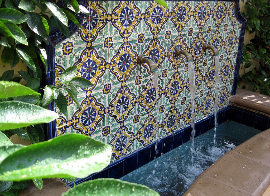
In this context, every space and surface became an outlet for creativity. The pool, for example, gave them the opportunity to seek out (and find) a truly unique fountain spout in the form of a Mexican dragon deity, while the front courtyard let them try their hand at creating a glass-mosaic medallion. They were also thoroughly involved in selecting plants.
All of this transpired in an historic San Diego neighborhood known for small lots and “zero lot line” regulations (meaning that houses could be built directly on property lines) – meaning the backyard was a challenging space. And in it, the owners wanted not only a pool and spa, but also enough room for entertaining and children at play.
They’d planned out the location of the pool before calling us – but that was nowhere near the spot in which it eventually landed. That’s a key point, because client-oriented design doesn’t mean that we detach ourselves from responsibility for a design or that we allow clients to dictate outcomes. In this case, we came up with a layout that maximized space in the backyard to a far greater degree than did the scheme they’d started with – and had stronger aesthetics as well.
Once our drawings showed the clients what we were thinking, they knew we were offering them what they really wanted. The result is a rectilinear pool with a raised bond beam/back wall that uses the freestanding garage as an anchor. In this way, the stone wall becomes a focal point – and a really fantastic waterfeature.
Modern Classic
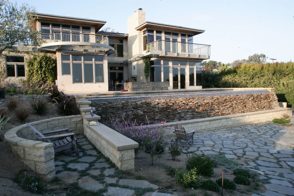
This project began with a fascinating piece of residential architecture. While our client was the home’s second owner and hadn’t been involved with its original design in any way, he was intent upon preserving the architect’s design concept and a set of clean, geometric, fully modern lines that somehow evoked the feeling of an Italian villa.
The home itself successfully walks that difficult tightrope – both contemporary and Old World, but never confused or conflicted.
Mind-reading this client was easy, because the primary goal was always quality. From his beautiful, meticulously maintained home to his flawlessly run business and even his perfectly tailored Italian suits, everything about his lifestyle was carefully chosen and maintained. And he was fully engaged in the design process, bringing an unusual level of focus and intensity to material selections, layout and detailing.
He approached us, for example, with a tile selection he’d already made. It was an iridescent, amber-colored glass tile that was distinctive enough that it could have driven the entire project palette. We included a mock-up with his tile, but we had different ideas and offered several other choices that aligned with his desire for a clean meeting of contemporary and Old World looks. He selected one of our suggestions: a mosaic of soft blues and browns that led us to change almost all of the materials we’d been considering based on his initial choice.
Once this was done, we focused on the technical side of the project, including the low-flow, perimeter-overflow spa, the vanishing-edge pool and a natural-stone waterwall. These involved a range of neatly executed details – every one of them designed and installed in service to a wonderful piece of architecture and its owner.
Keith Lowry is the founder and president of Verdant Custom Outdoors, a landscape and watershape design/build firm based in San Diego, Calif. While still in high school, he established the Lowry Co., a small landscape-maintenance service specializing in residential properties. Through the past 20-plus years, he has transformed (and ultimately renamed) the company, which now focuses strictly on landscape and watershape design and construction. Lowry is a licensed swimming pool, landscape and general contractor, and his company’s portfolio now includes a wide range of high-end residential projects. Kate Wiseman is the vice president and director of design for Verdant Custom Outdoors. She earned a bachelor’s degree in botany from the University of California at Berkeley as well as a master’s in landscape architecture from the School of Environmental Design at California State Polytechnic University at Pomona. She joined Verdant Custom Outdoors in 2001, lending her vast knowledge of plant species to the company’s repertoire and focusing on seamlessly integrating its gardens and watershapes. Both can both be reached via the company’s web site: www.verdantcustomoutdoors.com.


