More than Functional

It may seem an odd source of inspiration, but I’ve always been interested in retaining walls.
Even as a child, I’d see photographs of terraced hillsides rich with crops and wonder, “How did they do that?” I’ve since done my homework and have found historical evidence indicating that the skills needed to build these structures goes back many hundreds of years. I’m now applying those same skills today in devising soil-retaining systems for my clients.
Whether it’s farmers creating flat spaces on which to plant crops or contractors leveling hillsides as building sites, we’ve learned to shape our landscapes to suit our needs. When I first started in the landscaping business in the Chicago area, we built walls using natural materials – that is, cut stone and boulders – and the primary need was for visually pleasing structures used to define planting beds or borders in gardens.
This has changed a bit in the intervening years, largely because an increasing numbers of homes are now being built on hillside lots. In these locations, soil retention is a much more practical issue – one of managing cuts and grade changes and keeping large structures where they belong.
For some time now in my own practice, I’ve also been considering a third factor along with aesthetics and functionality, using projects with retaining walls as an opportunity to factor accessibility into the equation.
MEETING A NEED
This broadening of my perspective has been no accident: My wife has multiple sclerosis, which means that she has great difficulty navigating many surfaces and, all too often, can’t enjoy many landscapes as well as other people can. This has led me to think in new ways about how we view landscapes – and to consider what is needed to ease access for her and others who face physical challenges.
The issues involved here, of course, reach well beyond my wife’s situation. Few of us, for example, think about senior citizens as we design grade changes into our projects. The clients we serve may be young and spry when they call us in on a project, but we seldom create spaces that account for the fact that they will eventually age and have more difficulty enjoying the outdoor environments they love.
As a consequence of this set of observations, I’ve begun encompassing principles of what is generally called “universal design” or “universal access” into my thought processes. Basically, this means I avoid creating barriers no matter whether the current client has or anticipates the need. Properties change hands with regularity these days, and the reality is that the next owner may crave all the ease of access I can provide.
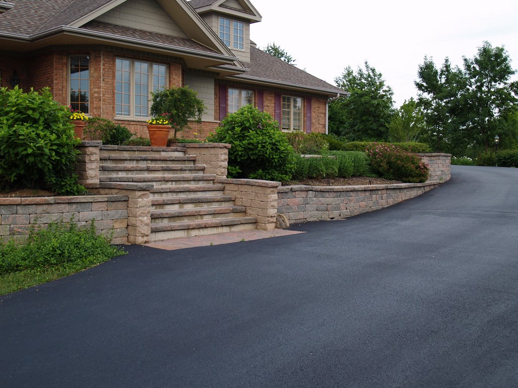
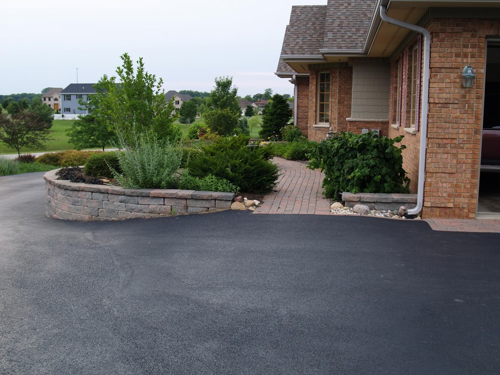
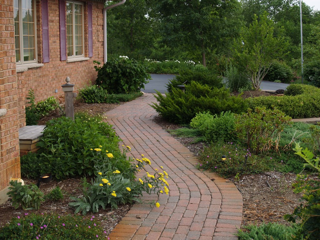
| I’ve always used my own home as a laboratory for testing out universal-access details. Here, the formal entrance off the driveway offers too great a challenge to those who can’t climb stairs to traverse the steep slope and soil-retention structures, but a bit further along, a path starting at the garage level eases the way. |
Naturally, I balance my internal design imperative with the client’s desires and needs. Although a few have had a distinct, unwavering vision that has limited what I’ve been able to do to ensure access, I have generally had no difficulty applying my own philosophy and injecting my bias toward accessibility into the creative mix. In fact, most clients agree with me in heading in that direction.
I always think of things this way: Lots of us can easily navigate a couple of steps, but for people with physical challenges, it’s just not that simple.
The interesting thing is that these accessibility issues are sometimes overlooked by people directly involved in working with those of compromised physical abilities. I’m always thinking about ways to create pathways that enable access for anyone, no matter what their challenges, so I was startled when called in recently to develop the landscape for a retirement community only to learn that that no thought whatsoever had been given to how the elderly or disabled were to get around in the outdoor spaces!
TESTING THE WATERS
In developing and applying my design philosophy, I’ve always relied on the best laboratory I could find – that is, the spaces surrounding my own home.
Through the years, I’ve organized everything based on principles of universal access, meaning you can easily get into or out of the one-story, single-level house from anywhere on the property without having to navigate any steps – even though the home sits on a hill.
Where there are steps – for example, seven of them leading down to the driveway – there is an alternative path, in this case a gently sloped walkway down to the same destination for my wife and anyone else who needs it. The key is to think in terms of multiple solutions, in this case with both steps and a universal-access ramp.
The point here is that you don’t have to stick to one solution and can adopt features that include both steps and easier access. What I find, however, is that most designers and contractors look for one solution instead of integrating multiple solutions: This is something I now see as a design flaw, an approach that fails to be functional and pleasing for everyone, including those with and those without physical challenges.
I’m so far into this philosophy that I find myself liking and even preferring designs done with access in mind. The wide walkways and the step-free approaches serve to soften the look and feel of both details and can result, I think, in more seamless, more pleasing designs. Yes, it takes a conscious effort to set aside steps as a primary answer, but when properly done, the change is never even noticed by the average person.
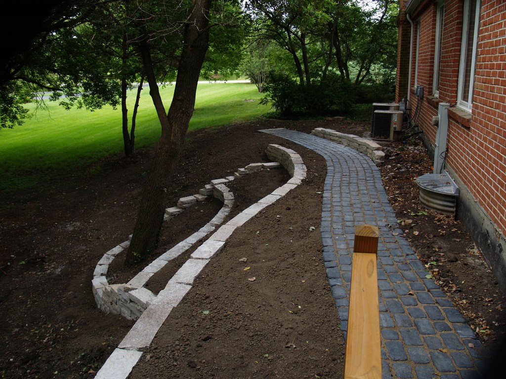
| I used the same dual-access strategy in this backyard, crafting ways for people at all mobility levels to gain access down the slope to the terrace below the house level. Rather than treat the ramp as purely utilitarian accessway (as is often the case), I reward those who take the gentler path with passage through a small garden. |
With all that said, let’s swing our attention back to retaining walls and consider the key role they play in designs that don’t restrict access.
Naturally, I want the structures I design to be attractive and blend seamlessly into the landscape. This means that I begin with beautiful materials and apply the same basic design strategies I’d apply in a completely traditional design scheme, including the following:
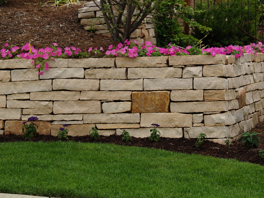
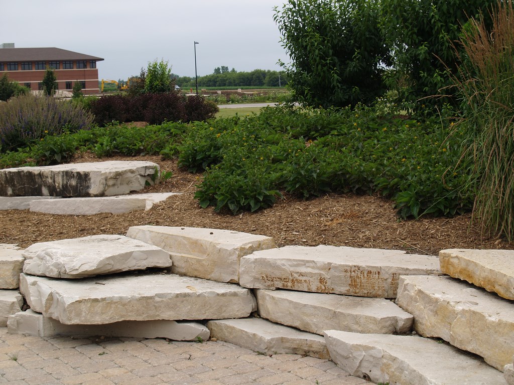
[ ] Scale: Conventional wisdom says that the individual sizes of the units being used on a wall need to be in scale with the finished size and scope of the wall – in other words, big stones for big walls and small stones for small walls. This doesn’t mean you have to use all large stones on large walls and all small stones on small walls, as I will typically intersperse smaller stones in large walls and vice versa – but I do carefully avoid using too many big stones on small walls. Again, I keep the overall scale in mind.
There’s a simple reason why so many retaining walls are built with similar-size stones: Most stone suppliers sell by size, and projects frequently end up reflecting that sales strategy. To me, the resulting checkerboard effect violates the spirit of using natural materials – a problem I circumvent simply by ordering materials in a range of sizes.
Of course, if a uniform look is what you’re after, you can always go with modular materials: They’ll give you a uniformity you probably don’t want with natural stone. Yet even the manufacturers of modular walls are getting away from uniformity by offering wall units in a variety of sizes that can in some cases be mixed together to give a wall a softer, more “natural” appearance.
[ ] Texture: Taking a cue from ancient, hand-hewn walls, I strive for wall surfaces that reflect the material’s natural origins as well as the fact that humans have intervened to assemble them. Many of the walls I’ve seen on my travels were created by craftspeople, not machines, and I’ve always been impressed by how natural they look. And this is true even though the materials have a uniform look and seem “fitted”: The handcrafted textures soften any sense of uniformity in appearance.
|
Shopping Locally Not only do I favor using natural materials in designing and building retaining walls, but I also prefer using local materials whenever I can. Each setting is different, of course, but I believe retaining walls should fit comfortably into their environments rather than standing out. When I visit Colorado, for example, I see walls made from the same sorts of stone I see in hiking through the Rockies. If I see something else, it can be visually jarring. As a rule, when clients insist that we bring in materials from outside our area, it’s tough to make them fit. It’s gotten to the point where I am increasingly holding the line, recommending strongly that clients stay close to home in materials selections on the basis that attention should be drawn to something because it is beautiful rather than because it doesn’t belong. For the most part, of course, it never becomes a confrontation: If I’ve done my job right, my clients will surely be looking at a beautiful wall without perceiving all the things I had to consider in designing it for them. — J.M. |
With modular systems, some companies are adding textures to manufactured materials to reduce the impressions of flatness and uniformity. In some cases, long blocks can be rotated vertically to break the linear look and make the walls more visually appealing – an approach that may well work if that’s what you want.
[ ] Color: Variations in color are important in breaking away from monotony and uniformity, especially in large or tall walls. In most cases, I stick with colors found in nature (locally, if possible) and work to blend them together. With very low walls, however, I tend to think in narrow color bands and stick with a tightly defined mix of colors.
A lot of the functional, engineered walls I see tend to be monochromatic, and my suspicion has always been that no designer had a say in the process. That’s a shame, because it’s inherently difficult to get anything monochromatic to “blend” successfully into any landscape.
[ ] Line: With walls of any size or height, line must always be considered as a basic design element. Not to knock engineers again, but there’s too much of a tendency to create walls with long, monotonous lines and no changes in plane or direction. They may be wonderfully functional, but they’re not much to look at.
If you observe nature, you’ll see that grade changes happen naturally and that it’s rare to see one continuous line. To achieve a natural appearance with a long wall, it’s a good idea to change the direction of the wall or, alternatively, make some wall sections higher than others or vary the line so that the viewer’s eye is carried far away – or brought up close. All of these variations lend depth and interest and tend to make the walls look more natural.
Another idea is to work plant material into the design to break up long lines and take advantage of changes in grade. If you have, say, a four-foot-tall wall that runs on in a straight line for 200 feet, you can break the sense of linearity by setting plant material in front of it or cascading over it, or you can set up distinct planting pockets at different intervals.
Again, it pays to think in terms of multiple solutions – that is, by varying wall height or changing directions as well as creating visual breaks with plants.
PRACTICAL CONSIDERATIONS
These concepts of scale, texture, color and line are part and parcel of the task of designing and building retaining walls. Basically, those who work with them are able to focus attention on how the wall will appear in its landscape – a focus that can make all the difference. The opposite is the case when walls are conceived as purely functional elements – that is, strictly as a means of supporting structures or slopes rather than as components in an overall visual composition.
I will never forget the old saying passed onto me by one of my architecture professors: “If a designer builds a building, it may fall down, but if an engineer builds a building, you may want to tear it down.” This is not to say that design is more important than engineering; rather, it’s about striking a balance between the two so that the walls we build are not only strong and functional but are also far from being blights on the environment.
While I prefer to build retaining walls using natural materials, not all budgets allow for this type of construction. Helpfully and as mentioned previously, the manufacturers of modular-wall materials have been working to bridge the aesthetic gaps between natural and man-made materials, coming closer to natural stone in color, size and texture and giving designers new options when it comes to building strong, attractive walls.
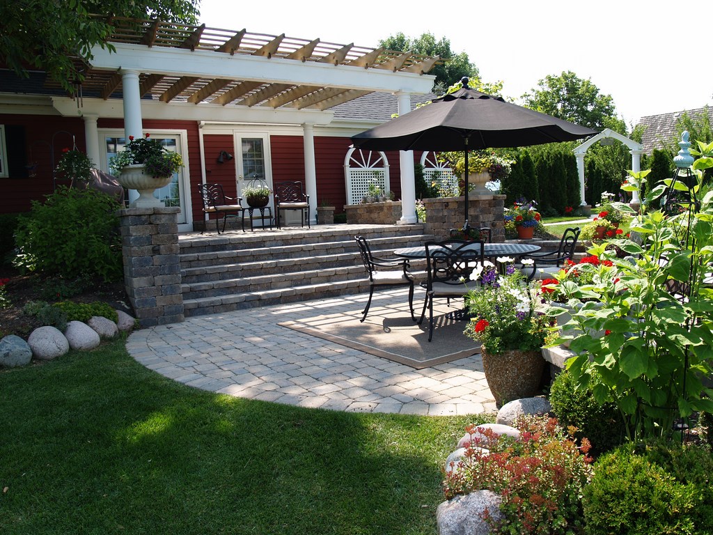
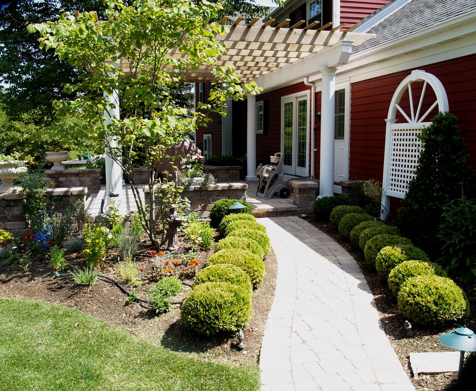
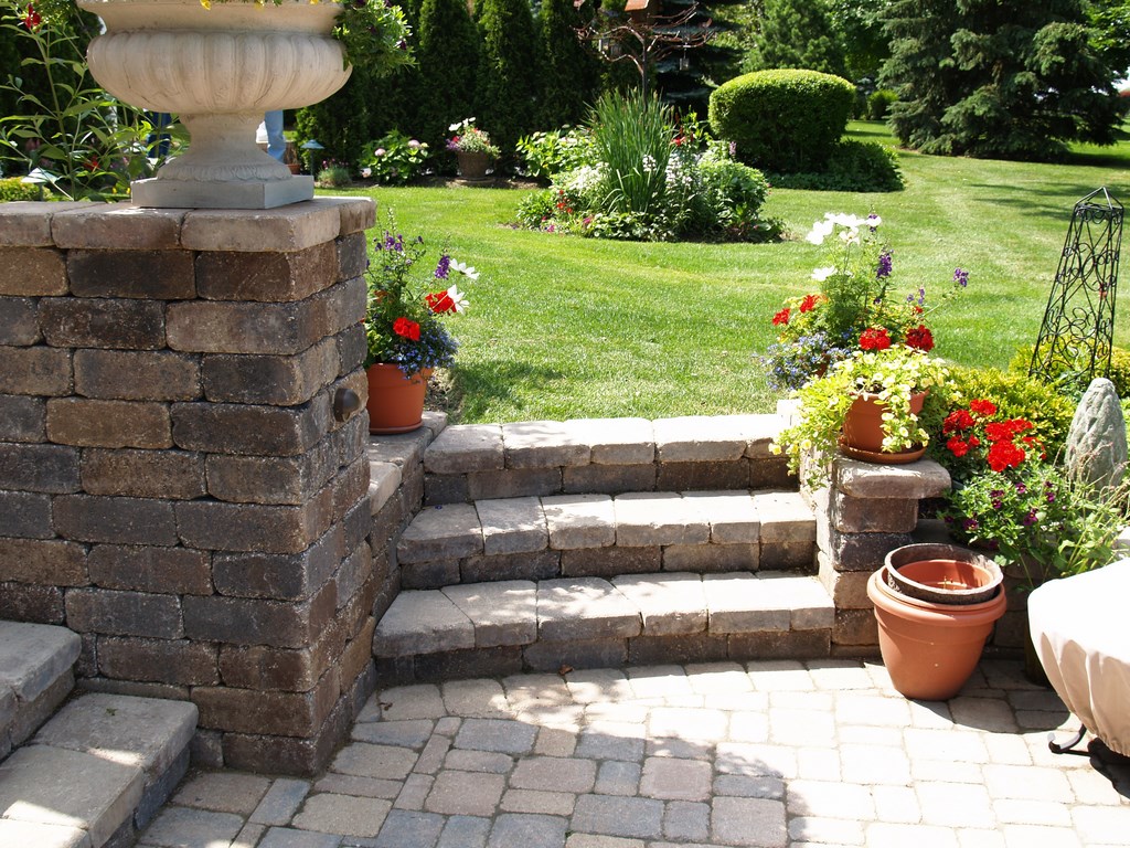
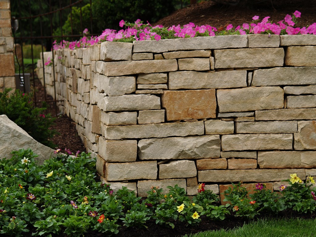
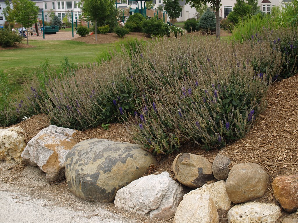
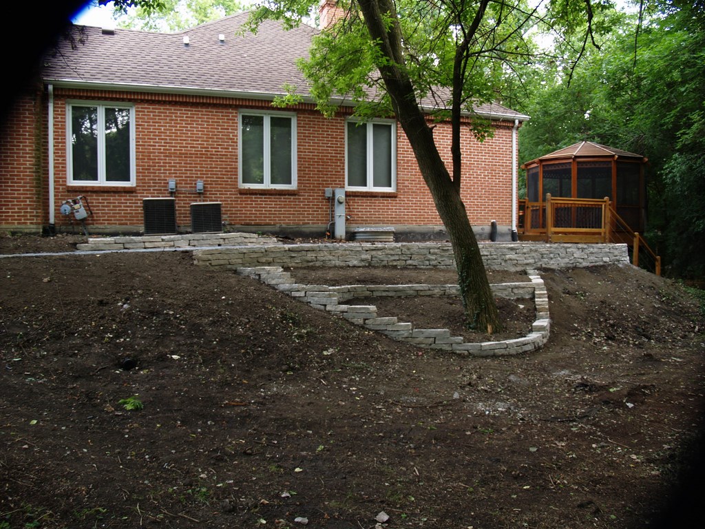
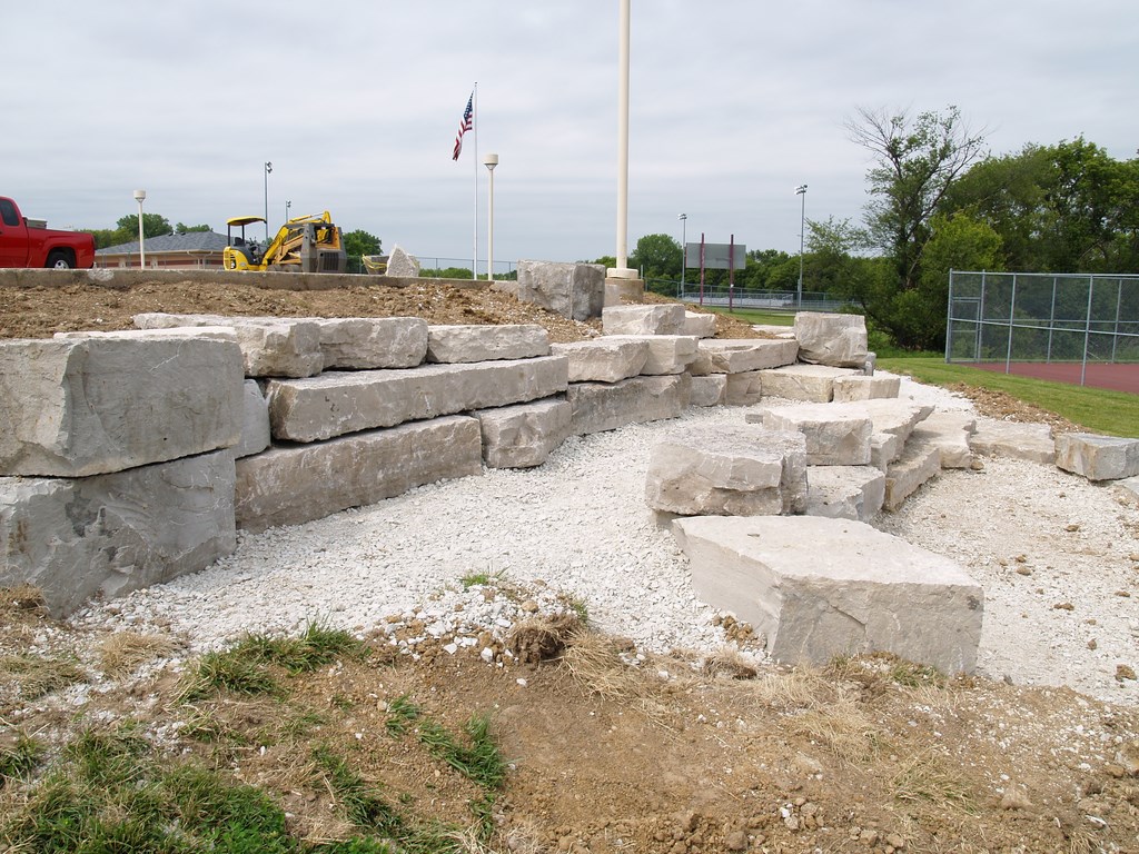
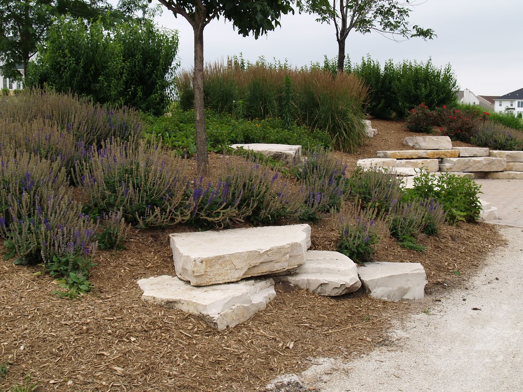
| In all my work with retaining walls – and in the case of the image at middle left, in my observation of the work of others — my focus is always on basic design principles no matter my high level of concern for assuring easy access to outdoor spaces. Whether the issue is appropriate scale (at middle left and middle right, for example), texture (middle left, middle right and right), color (all four images) or line (middle left, middle right and right), I strive to balance aesthetics with functionality in ways that please the eye, provide access, offer the occasional surprise and make my clients happy. |
The appeal of these modular walls is their structural integrity. If suppliers can offer strong visuals as well as engineered solidity, that’s a great package. By the same token, a pretty wall may look great for a time, but if it’s not engineered correctly, it won’t matter what it looked like when it fails.
Here again, the designer has multiple solutions to consider, all of them sound in engineering terms. There’s terracing, for example – that is, splitting one large wall into two or more shorter walls. Taking that notion a step further, you can also think about making the two walls different heights rather than splitting the difference and/or varying the lines to break down any sense of repetition; creating asymmetrical planting spaces; or using tall, narrow trees to create vertical accents.
You can also incorporate natural breaks in walls to signal changes in direction or grade. Large boulders or big, flat pieces of limestone can do the job here, serving as natural transitions that lend drama to the space. I always like my designs to include small visual surprises along the way, and highlighting changes in direction using materials that are different from the wall’s overall material often does the trick.
KNOW THE ROPES
Before beginning any design, of course, you need to research the codes in the area in which you will be working and be mindful of the fact that local building departments may limit your choices when it comes to retaining walls.
You also need to evaluate the basic conditions on site and decide whether your design work needs the support of an engineer. Use your common sense: If there’s any question, call in a professional to make certain the wall will be built soundly and will last.
A trend among local building departments these days is to establish rules requiring water-containment or water-retention walls in proportion to covered areas of a building. In other words, when you cover a specific amount of a lot with roof area, you need to include water-retention provisions to deal with rainwater runoff.
| In considering alternatives to the conventional, massive engineered approaches to soil retention, I prefer to think back to the terraces that captured my imagination as a child and work in more fluid, organic forms based on my familiarity with the way retaining walls work. These structures are obviously man-made and even decorative, but the visual effects can be surprisingly ‘natural’ at the same time the walls serve their primary, soil-retaining purpose – and provide workable access as well. |
Because of this code, we are sometimes forced to build walls where the top of the wall is at grade and the bottom is down about six feet. We’re then required to place a fence on top of the wall as a safety measure that makes the whole assemblage unattractive. When I can, I’ve used plant material to define the edge and mark the grade change, thus eliminating the need for fences and reducing the visual clutter.
To this mix of rules and regulations, I add my own personal adherence to principles of universal access, making certain whenever and wherever I can that the spaces I create can be used and enjoyed by everyone young and old, no matter what their physical capabilities or limitations.
For me, it’s the right thing to do, but it’s never something that leads me away from basic principles of good retaining-wall design – a fact that helps me persuade clients to follow my lead.
Gerald Miraldi is the founder and owner of Miraldi Enterprises, which specializes in residential landscape design in northern Illinois. With a background in art, architecture, horticulture and design, Miraldi has worked in the green industry for more than 35 years, adding experience in construction, landscape maintenance and the nursery trade along the way. He is currently president of the Midwest Chapter of the Association of Professional Landscape Designers and also acts as principal landscape designer for Chicagoland Brick Paving & Landscaping, a company specializing in design and construction of manufactured- and natural-stone pavements, retaining walls and other landscape structures.


