Material Implications
One of my guiding principles has to do with the fact that early decisions my clients and I make about materials have a huge influence on how my watershapes ultimately are designed and built.
The project we’ve been following through the past few issues is a perfect case in point: The choice of the bluestone coping and of the one-inch glass mosaic tile for the pool’s and spa’s interiors started the wheels turning and definitely drove the early stages of the design process.
As I’ve mentioned before, this project and its unforeseen problems (as well as clients who were at times unsure of exactly what they wanted) added layers of difficulty to what would have been a tough, demanding process even without the extra hurdles. With all that difficulty behind us, it was possible to start the work of pleasing these clients without creating what I’ve been known to call “visual pimples.”
BLUESTONE BLUES
The clients decided early on that they wanted one-foot wide wedges of bluestone as their coping. That was fine, but then came a flood of second thoughts and changes: The deck behind the coping was to be all bluestone, for example, then they decided they wanted two feet of radiused coping with enlarged planters and less deck, then they moved back to one foot of coping with a grass yard before finally settling on the deck arrangement we’ll discuss in an upcoming issue.
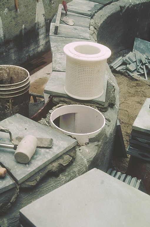
| We started with a typical, off-the-shelf skimmer assembly, but we had to modify it quite thoroughly to make it work with the narrower beam and 12-inch coping the structural and aesthetic programs ultimately required. |
The bluestone coping was always a good choice, no matter how wide its span, because it could be gauged at exactly a three-quarter-inch thickness – which in turn would enable us to set up extremely precise joinery at the pool’s edge and between the coping and the interior tile.
The goal was to employ a minimal coping profile and create a “floating waterline” – that is, we wanted to bring the waterline right up to the bottom of the overflow line set just below the coping. As I’ve mentioned before, I use a one-by-four-inch line manufactured by Overflo in Los Angeles – it’s perfect for these sorts of applications where I want to create tight visual transitions between the edge of the vessel, the surface of the water and the interior finish.
The clients’ final change in preference from two feet of coping to just a foot of coping was tough, however, because of the way in which the shell had been designed. We’d planned on a twelve-inch bond beam with a series of deck dowels tied into the shell that would have enabled us to cantilever the ten extra inches of coping material off the back of the bond beam. But now, with the plumbing, steel and forms already in, the clients insisted on a narrower edge.
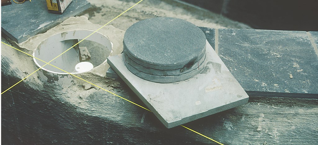
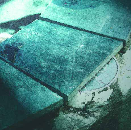
| We tried attaching just a single round of stone to the underside of the coping to set up our skimmer lid, but we found we needed more stability and ended up attaching three pieces of stone. |
Reworking the entire steel structure would have been both extremely costly and time consuming (two outcomes the clients were not willing to accept), so I developed a detail that took care of the problem. We shot the shell the way it had originally been designed, but as it was curing, we shaved off the back of the beam at a 45-degree angle, cutting in about two inches.
Later, we chipped out the concrete around the deck dowels, which had been set every eight inches on the beam, before cutting off the steel. Then we dry-packed mortar where the incisions had been made before waterproofing the whole backside of the beam.
Later, when we installed the bluestone, we cantilevered the wedge-shaped pieces two inches over the poolside of the beam to allow for the mortar bed and tile that would make up the interior finish of the pool. This meant that a portion of the skimmer bodies would have to extend beyond the width of the coping – a double challenge under these circumstances because there was no allowance for any variation in the appearance of the coping.
THE LID ISSUE
This whole skimmer business became very complicated.
Anyone who’s followed this column or is familiar with my work will know that I detest the way skimmer lids look. They disrupt the lines of the typical pool and degrade the appearance of the decking. Even without cutting off the throat, which I often do to make skimmers less obtrusive, the two-foot coping we’d originally planned would have made it fairly easy to conceal the top of the skimmer beneath a removable piece of bluestone.
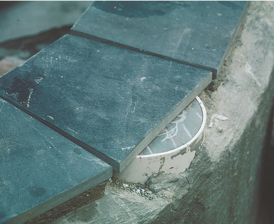
| The lid is now completely stable and, once the landscaping is in, will fit in seamlessly with the visual flow of the entire, undulating edge treatment. |
With the two-inch cantilever, however, the one-foot-wide coping wasn’t wide enough to hide the skimmer and left a portion of the skimmer body exposed beyond the back of the stone. To make a long story short, I had to come up with a way to attach the bluestone to the top of the skimmer and do so with enough stability that a person could stand on the coping/lid without moving it.
Because I knew the stonework couldn’t be compromised, we started by cutting the stone into pie shapes as we would have if the skimmer hadn’t been there. Then I measured the diameter of the skimmer’s top – eight-and-a-half inches – and cut three circular pieces of stone that were one-eighth smaller than the opening of the skimmer. Then I took one of those pieces and glued it to the underside of the piece of bluestone that was to serve as the cap for the skimmer.
|
Mothers of Invention When I was studying industrial design, my instructors taught us that when you have to make something, what you’re really doing is creating the tool that enables you to make the object you need. In this case, we wanted to make an invisible skimmer, so we fabricated a skimmer lid that enabled the skimmer to disappear. This is a different approach to problem-solving than the one taken by all those contractors who look no further than a catalog to find an existing product that (sort of) meets a need. Personally, I have far greater admiration for inventors and those who jump in and fabricate something to suit an immediate need. To my mind, true excellence in watershaping is all about having that inventor’s spirit. In a sense, every new swimming pool is a new invention, and if you’re doing truly custom, quality work, you will certainly find yourself in a position where the best solution is one you must devise for yourself. — D.T. |
I stood on this setup and saw that there was too much play: The lid rocked when I stepped toward the cantilevered edge when there was just one 3/4-inch piece of bluestone glued into place. So we attached the other two circles of stone, and the new skimmer-lid assembly was now anchored in place and completely stable – yet still easy to remove. We then repeated the process for the pool’s other skimmer.
The result is that the skimmers completely disappear from view, but are easily accessed for service. The only difference in the way the new lids look is that they aren’t grouted around the sides.
A SPECIAL BLEND
Next, our attention moved to the interiors of the pool and spa and application of a custom-blended one-by-one glass mosaic tile.
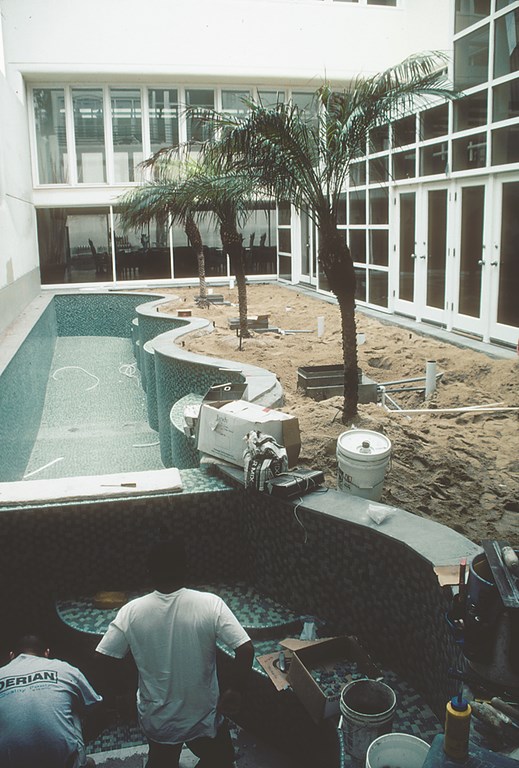
| All the curves and interior details made for lots of cutting and nipping in the tiling process. We helped the installers avoid the “pie” effect (and its big grout joints) by having the tile set up with a running bond rather than the usual stacked pattern. |
The tile was chosen through a process of blending different combinations of green tile in different finishes on sample boards so the clients could visualize how their pool and spa would look. Ultimately, we chose to work with three greens with an iridescent finish and set them up on five sample boards with differing proportions of each shade of green.
The blend we landed on is now called “Heather” green – the most beautiful surface material I’ve ever seen.
As I’ve mentioned before, I feel strongly about green. It’s one of (if not the) most common colors in nature, it’s soothing, it can have a beautifully rich and elegant appearance, and it does not make water look like it’s full of algae. When I want to work harmoniously with all sorts of surroundings, green is often my first choice. And in this case, the green gives the water a beautiful color that truly befits the setting.
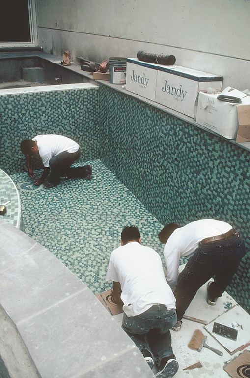
| Here, the tile installer is putting the finishing touches on the “T” badge we placed in a heart in the bottom of the pool. |
One of the small touches that I really like on this project is the small, glass-tile heart we placed in a corner of the pool’s shallow end. In the center of the heart is the letter T. The clients are certain it represents the first initial of their last name, and my electrician Tony has the same idea with his first name. I know, of course, as does anyone who knows me or my work would understand, that the T actually stands for Tisherman. I have, after all, never been accused of lacking ego when it comes to my work.
We made the badge by taking the darkest color green in the tile to use as the field of the heart, and we used the lightest color for the letter. Around the heart, we filled in with the light color to set things off. This heart was, of course, a bit of fun. Actually laying out the tile on all the complex, contoured surfaces of the pool and spa was anything but.
This was a project in which my tile applicator, Willie Villanueva of J.W. Designs in Los Angeles, really showed his stuff. I’ve always considered him the best in the business, and I’ve used him on jobs all over the country, but he outdid himself in this case.
|
Tile Details It’s possible to argue that some of the design decisions we made for this project might have come without knowing about all of the materials selections, but there can be no doubt that specifying tile for the interior drove us in certain specific directions. I know from simple observation that many people don’t consider how much effect the shape of the interior of a pool or spa has on the way tile looks when the vessel is filled with water. That’s not good, because shape and contours of these vessels can have tremendous influence on how good the tile’s appearance, how reflective the surface will be and our perception of the depth of the watershape. In this case, the use of tile dictated that there should be no coves in the pool at all. Instead, the walls and floor are perpendicular, which gives the pool both a deeper look and a cleaner look so far as the tile is concerned. This is, of course, a much more involved sort of construction, because the sides essentially become retaining walls and the floor a footing. And the tolerances are understandably very tight. In short, it’s a completely different way to design and engineer a shell. Yes, it would have been simpler to install a standard cove-contoured shell and finish it with plaster or an exposed-aggregate finish, but in this case, the material selected for the interior finish dictated doing the job a certain way – and designing and building a more challenging structure. The result is glorious use of the “Heather” green tile mix – the most beautiful and striking finish I’ve ever seen, and well worth the extra expense and effort. — D.T. |
To save on installation costs and time, we went to the extra expense up front of having the tile laid out by the manufacturer in a running bond rather than in the stacked style customary with high-end tile. This made it a bit easier to deal with all the twists and turns in the radiuses without producing the big grout joints that can come with the “pie” effect.
Even with that help, the work around radiuses and various fittings required a huge number of cuts and nips – literally thousands of them in the pool and spa. The care and precision were crucial: As always, we didn’t want anything to disrupt the visual flow and dynamics of the lines and the sinuous shape of the pool or spa – and that included using one-inch quarter rounds at every edge of each bench and step.
All of this is in keeping with a commitment to avoid visual pimples – the kinds of blemishes that separate run-of-the-mill work from true artistry of the sort to which we were aspiring with this project.
David Tisherman is the principal in two design/construction firms: David Tisherman’s Visuals of Manhattan Beach, Calif., and Liquid Design of Cherry Hill, N.J. He can be reached at tisherman@verizon.net. He is also an instructor for Artistic Resources & Training (ART); for information on ART’s classes, visit www.theartofwater.com.


