Managed Elevations
It definitely helps to have a good reputation within the local design community.
In this case, an architect I’ve known for years and have worked with on numerous occasions – someone with whom I’ve gotten so familiar with on the job site that we’ve become good friends – called me in to meet clients who needed help beyond the work he was doing on their house.
He thought we’d be a good fit, and he was right: From our first meeting, the clients and I hit it off, and before long we at Lorax Design Group (Overland Park, Kans.) were given carte blanche to add a swimming pool while aligning all of the property’s outdoor spaces stylistically with the changes my friend was making with the house itself.
As I came to know the clients better, I began to understand their polished (but eclectic) tastes, including their love for bright, bold colors and punchy visual details alongside a comfortable mixing of Old World and Contemporary touches when it came to furnishings and artwork. There was a lot to absorb from them, but at every turn I had the sense that they trusted me to make everything work.
ESTABLISHING A ‘LOOK’
Their home is located in Mission Hills, Kans., a town just south of Kansas City on the state line. I spotted a generous mix of architectural styles in the neighborhood, including some Colonial, French Country, English Tudor and Prairie classics to go along with an array of hybrids that drew on various elements of the diverse surroundings.
For their part, the clients lived in a California-style classic – a sprawling Mid-Century Modern organized around an outdoor space enclosed by the home on three sides. In all, the courtyard stretched about 50 feet beyond the home’s central sliding doors and was about 30 feet wide, give or take.
I went to the drawing board after our meeting and, in consultation with the architect, developed a design for presentation to both clients. They loved it – and then the fun began, because it was clear that they also shared a lively sense of humor and intended to let the courtyard capture their whimsical side as well.
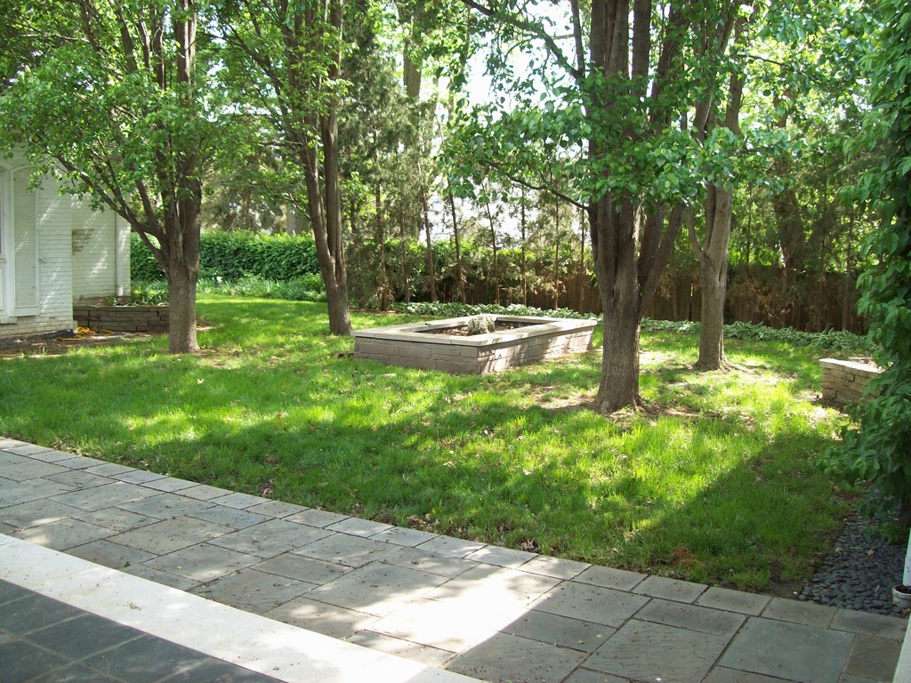
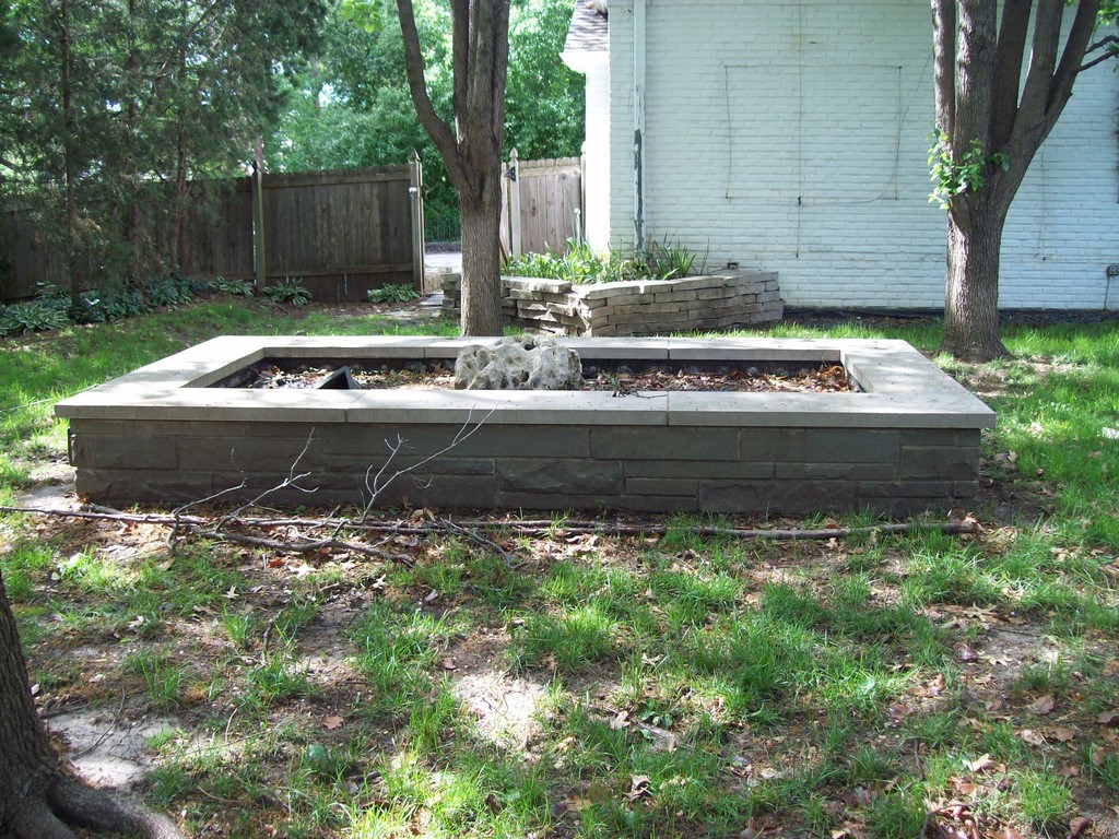
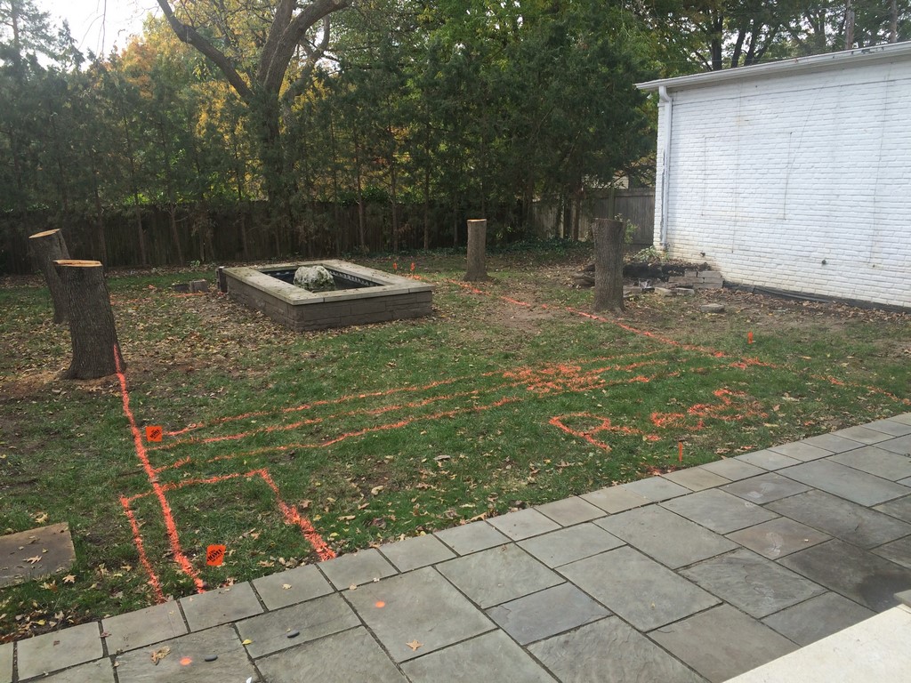
| As we found it, the backyard was inoffensive but dull – and definitely did the home no favors. There was an outdoor kitchen, which was nice, but the trees brought too much verticality to a confined, low-profile area and the raised box looked like a hammock strung among them. We cleared everything away and started from scratch (as, to a lesser extent, did the architect working on the home itself), with all of us working to create a courtyard that fully responded to the home’s Mid-Century Modern roots. Simply topping the trees and opening the space was a huge and helpful first step. |
As we moved forward, it became clear that she would be calling most of the shots, as his work kept him on the road for extended periods and his time at home was focused on matters other than project details. That was fine, because they fully shared their distinct senses of style and taste – and it was clear she would be perfectly comfortable handling any decisions that needed to be made.
As presented, the exterior design closely adhered to the home’s architectural style rather than exploring less-streamlined approaches that might have looked out of step. In fact, it’s as sleek and formal as if the famed California architect (and master of the Mid-Century Modern style) A. Quincy Jones had guided my hand. Nonetheless and as we’ll see in the sidebar below, this approach still left the clients plenty of leeway when it came to expressing their personalities.
At its heart, however, the composition is a study in scale and restraint: By keeping so much of the space at a uniform deck level and lowering structural profiles, we created the uncramped illusion of a minimal visual footprint even though the space included a substantial watershape.
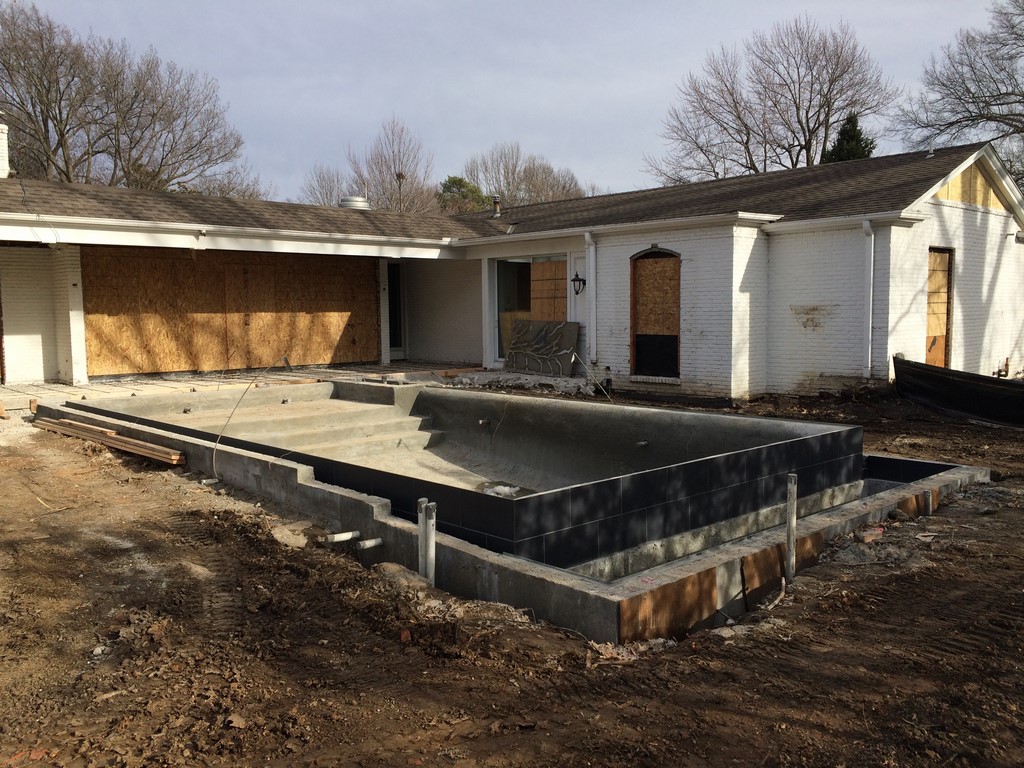
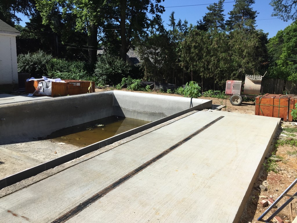
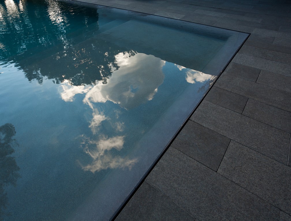
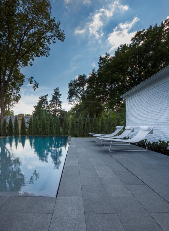
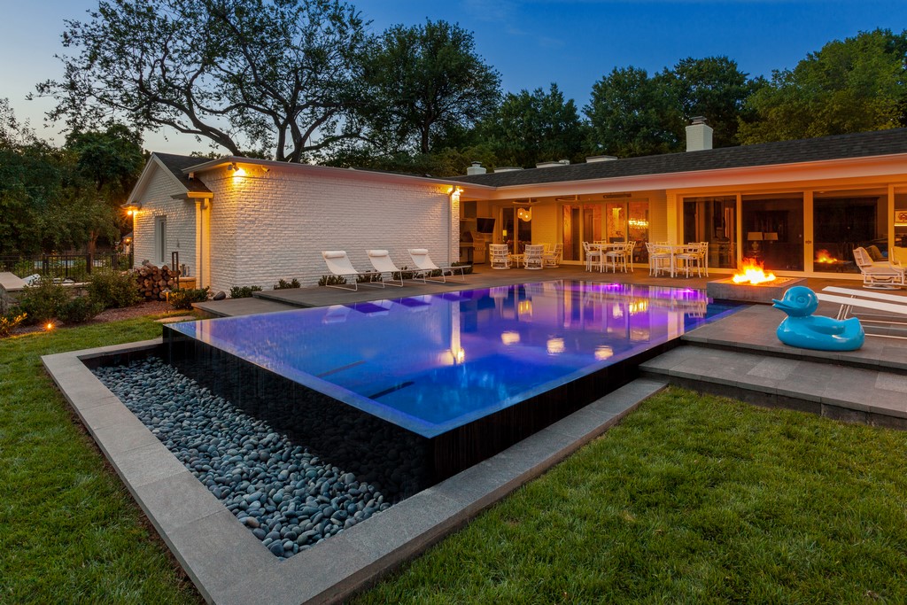
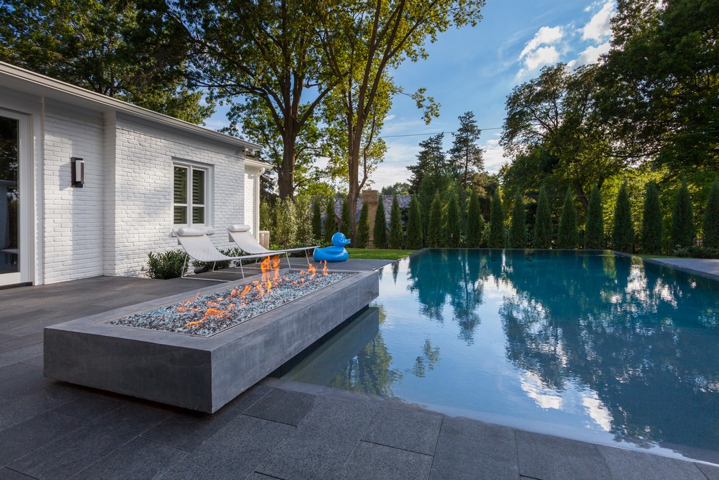
| The pool’s design was quite straightforward, with a large, reflective plane of water in a perimeter-overflow configuration flanked by new decking that stepped down alongside a vanishing edge and its trough. We kept the lines clean by concealing the upper-deck drainage system beneath slots that mirrored those around the pool and used the elevated fire feature and the outdoor kitchen’s surfaces to bring distinctly modern contours to the hardscape. |
The architect participated fully as the project developed, particularly when it came to selecting materials and colors. The only directives from the clients were that they wanted a shallow pool along with a fire feature and a very particular sort of outdoor kitchen. Beyond that, all she said was that she wanted the pool to make a statement – as though it was a piece of art or sculpture.
Eager to oblige, I took their desires and raised the stakes, designing a perimeter-overflow pool surrounded by a stone deck. We can’t be certain of it, but this may be the first pool of its kind in the Kansas City area – a thought backed up by our veteran shotcrete contractor, who’d never seen such a system in his 30 years of working on pools throughout the region.
We’d presented this concept as offering them an approach that was fresh, unique and sculptural – a 360-degree art installation that would, courtesy of its mirror-like surface, change from minute to minute from every angle. And what would be beautiful by day would be breathtaking at night, with the adjacent fire feature creating a dancing, flickering light show.
FILLING THE FRAME
Beyond the pool, there’s an accent on entertaining, with an outdoor kitchen and big seating areas included along with the nine-foot span of the fire feature.
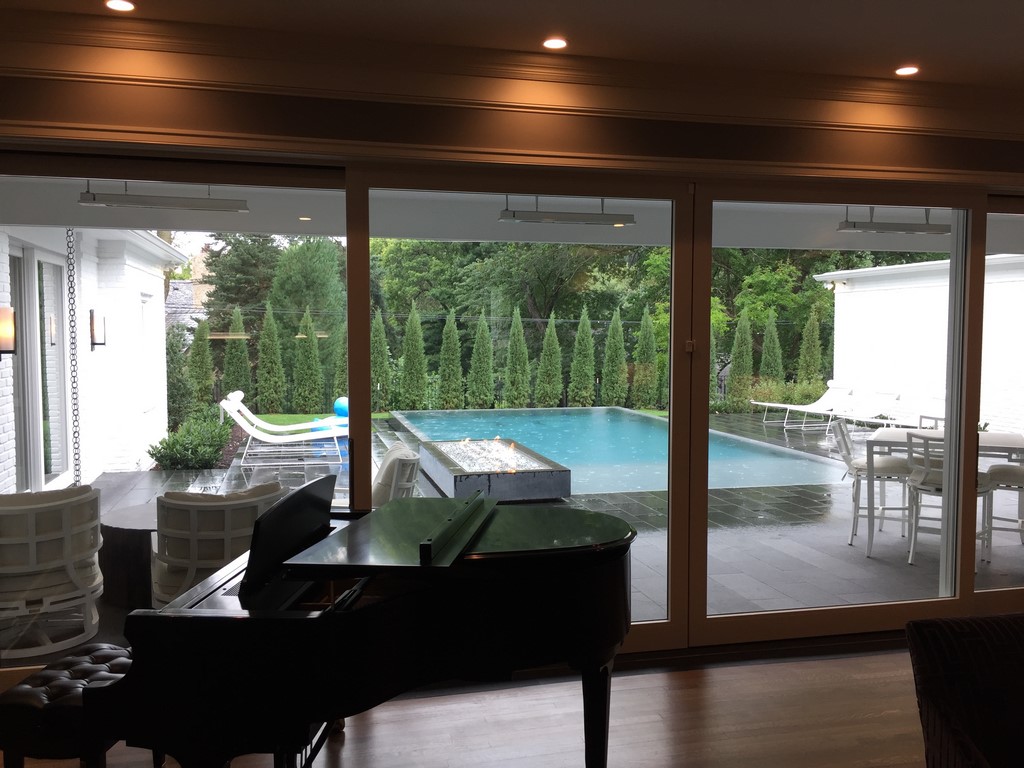
That feature aligns perfectly with the front entry doors, so when the homeowners and their guests enter the house, they see directly through the sliding-glass doors of a den (containing a baby grand piano) to the flames rising from a low-slung, cast-in-place, honed-concrete structure. The feature includes mounded fire-glass arrayed over a burner system from Fire by Design (Las Vegas, Nev.).
The flames can be seen from all of the rooms surrounding the pool, and the reflections off the water’s surface are dazzling. The feature’s broad rim also serves as a sort of outdoor side table – a great place to set drinks or food while small groups are entertained in or out of the water.
The compact pool has no spa, which is a choice some clients are making these days. For one thing, the volume of a pool as shallow and petite as this one is such that it can be heated relatively quickly at no great expense, so it can serve a “spa-like” purpose when there’s a need to accommodate those who want to immerse themselves in warm water.
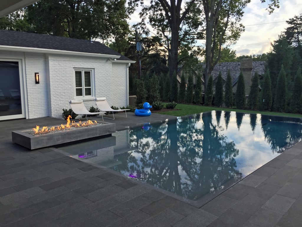
| As completed, the poolscape offers the perfect complement to the home, which had its exterior look upgraded at the same time to align with the homeowners’ desire to give everything a consistent Mid-Century Modern flair. We included some nice touches, such as the white deck furnishings, the fire feature, the pizza oven and the rain chain, and were happy that our clients saw fit to personalize the space on their own with a giant blue duckie. |
For another and perhaps more important thing, some people want their pools just for the visual and spiritual delight of being around water. In fact, we’ve even had a few non-swimming clients who want pools only for their aesthetic virtues and the sheer daily enjoyment of looking out over the water. Spas are still very popular, of course – as are pools made for active recreation – but they weren’t part of the discussion here.
Our work also reached beyond the pool and patio: Indeed, we developed a master plan for the entire property, with everything keyed to the style of the architecture and the clients’ and architect’s decision to stick with whitewashed brick for the courtyard and exterior walls.
The decking was made with a black basalt material imported from China, so we went for contrasting white lounges and patio furnishings. The catch basin at the far end of the pool is filled with dark Mexican beach pebbles, and the exposed pool walls above the trough are wrapped in a black porcelain tile. We also installed a rain chain to channel the flow of water off the roof – a detail we include in many projects because the look is much cooler, classier and visually compelling than a conventional sheet-metal downspout.
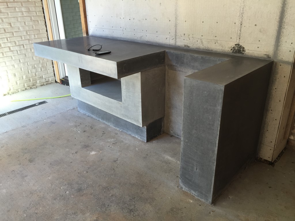
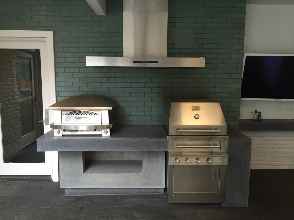
As for the outdoor kitchen, it includes a pizza oven – the only item on the wish list that came directly from him. To fill the bill, we came up with a custom, cast-in-place structure that resembled the approach and finishes we used with the nearby fire feature.
MEASURED EFFECTS
Along with the use of rain chains, another of our signature features involves the hiding of deck drains. In this case, the perimeter-overflow system establishes long, cut lines within the deck system. To handle rainfall, splash and incidental water, we cantilevered stone over the similarly gapped openings of trench drains spanning the long sides of the pool.
|
Why a Duck? As mentioned in the accompanying text, the homeowners had a nice style sense and wanted what we were doing with the pool, deck and landscape to be true to the home’s sprawling, Mid-Century Modern good looks. But as was also mentioned, they had a sense of humor as well as a love for strong colors. While their personalities and preferences were clearly and voluminously expressed inside the house, the sole expression of their fun side at the time we took our photographs of the completed outdoor project was the big blue duck out near the end of the deck. The ceramic tub duckie was a gift from the clients’ interior designer and appeared on deck as the project neared completion. It had broken at some point, so we didn’t want to move it for our photo shoot – and we’re now glad it was there as evidence of the clients’ lively personalities. My guess? It wasn’t long before other expressions of their eclectic (and colorful) tastes begin appearing in their outdoor spaces: I’m confident those big white walls look quite a bit different by now! — K.K. |
We’ve used this detail for many years, and it’s a perfect complement to perimeter-overflow slots. The gap is small, but because of the length and the hidden trough’s size, the collective drainage capacity is more than adequate for capturing whatever water flows across the decks – which are, of course, ever-so-slightly pitched toward the gap.
Careful planting is another particular hallmark of our projects. As it is displayed in the photographs, the landscape had only been established for about four months. We anticipate that the foundation plantings will increase in size – but not by more than about 50 percent: We want them to soften the appearance of the architecture, not blot it out completely!
Before we walked off site, we met with the clients to discuss each of the plant varieties in some detail, letting them know why we’d selected these specific species, what they might expect with respect to growth, how they would change through the seasons and what might be needed by way of maintenance.
So in what had been a choked space filled with overgrown trees that clashed with the low-slung house, we stepped back, accentuated the setting’s horizontal planes and succeeded in making a courtyard area that seems open and even large despite the inclusion of a good-size swimming pool: All in a day’s work.
Kurt Kraisinger is a landscape architect with more than 20 years’ experience in design and consulting. In 2009, he founded Lorax Design Group with a goal of creating memorable spaces that allow people to engage in their surroundings. He received his degree in landscape architecture and urban planning from Kansas State University and participates in Genesis 3’s programs. He may be reached at kkraisinger@loraxdesigngroup.com.


