Integrated View

From my first visit, I knew I’d be spending a lot of time here developing the watershapes and landscapes on this amazing site.
Set on a bluff in Del Mar, Calif., the whole property slopes down from the street level to the back edge of the property. Beyond was an open space offering uninterrupted views of a river estuary, native coastal scrub studded with rare, indigenous, protected Torrey Pines and the Del Mar shoreline’s pounding surf. There were also the spectacularly patterned cliffs at Torrey Pines State Park – a vista and set of colors that ultimately determined material choices for this project.
It helped that I was completely at ease with
the homeowners right from the start as they shared the story of the 25 years their family had spent in this extraordinary place. Not surprisingly, they were protective of both home and property, and their questions to me were to the point and well considered.
I soon learned that they had already interviewed, hired and fired several designers before being referred to me, but that didn’t seem to make a bit of difference, as we connected so strongly and so soon that I left our first meeting feeling honored and fully entrusted with bringing their dreams to reality.
DOING HOMEWORK
As a first step in the design process, we brought in a civil engineer to map the site, took samples for agricultural-suitability testing and shot a barrage of photos for my use during the design process. Next, I visited with the local planning department and the homeowners’ association to determine if there were any ordinances, restrictions, covenants, architectural guidelines or anything else that might affect my direction.
I don’t undertake any design work without first performing these critical tasks: It keeps me from basing my work on supposition and wasting everyone’s time.
As a landscape-oriented designer, I prefer having plant-suitability soil testing performed early in the process instead of waiting for a landscape contractor to make these determinations just before installation. My thought is that plant materials can and should be discussed early on and that this information carries a lot of weight in deciding what will be appropriate.
I also find it helpful, even at this preliminary stage, to start considering what I call “architectural plants” that I like to incorporate as key design elements. Knowing if the soil will help these trees and shrubs thrive is a major consideration.
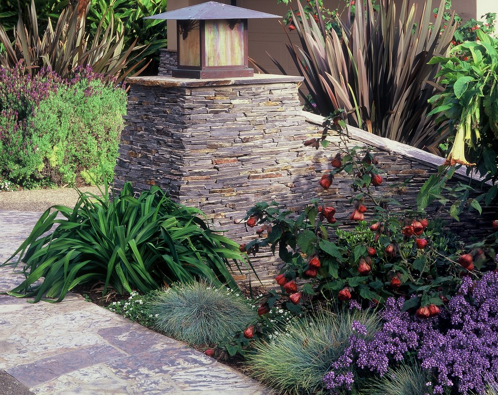
| Access to the home was substantially redefined in remodeling the landscape, starting with the Craftsman-style pilaster and lantern at the head of a sweeping stone stairway. The steps move down to a landing (now hidden from the street) that leads to a bridge and the home’s carved front door. |
While the engineer and I did our work, I asked my clients to do some “homework” on their own. I do so in the belief that full client participation is critical – so much so that if clients have not completed their assignment by the time I call to confirm our pre-design meeting (or if I learn that one spouse will not be able to attend), I will reschedule to allow them time to complete their assigned tasks and/or figure out a time when both will be home.
To me, any project is too important for my clients not to be fully involved – and when they are, I find they always get excited and become more aware of what they like and dislike. Using this approach, I nail 98 percent of my designs in the first concept drawings, usually with only minor revisions. Of the two percent I miss, it’s with clients who’ve held back, done minimal homework and came to the pre-design meeting uninvolved, unexcited and unprepared to help me develop the design.
As for the “assignment,” it’s actually fun if the clients get into it. On this project, for example, I asked them to develop a wish list of all design elements they wanted me to incorporate. I also asked about entertainment needs, maintenance considerations, allergies and the budget. To complete the exercise, I requested that they mark pictures in magazines and books and let me know about any products that caught their eye in catalogs or on web sites.
They knew I would be bringing my own stack of design books and magazines, but I stressed that the more effort they put into the assignment, the better chance I would have in being successful in creating spaces they would love. All in all, the site research and their homework set us up for a most productive pre-design meeting.
THE BORROWED VIEW
Right away, it was clear that the owners’ main desire was for me to focus on preserving their unobstructed views while visually blending any new details with the sandy bluffs on site. I suggested we take that visual connection one step further by selecting materials that not only worked on site, but would also visually connect them with the far vista – that is, with the bluffs at Torrey Pines State Park.
This “borrowed view” approach is one I never hesitate to apply in my designs whenever the opportunity arises. The concept allows me to integrate my clients’ spaces into larger native surroundings seamlessly, without interruption and with a sublime sense of expansiveness. In this case, they immediately loved the idea.
Another critical consideration had to do with preserving and maintaining the stability of the bluff edge, which made the handling of stormwater and irrigation runoff even more of a priority than usual.
Beyond the functional issues, there were also aesthetic ones. My scope of work included upgrading the front yard, which meant designing a new driveway, new retaining walls, new planters and a new entry walk to coordinate with a new entry footbridge the architect was designing. We also discussed a new fountain near the front door from which a dry streambed was to “flow” under the footbridge and perform double duty as a drainage swale during the rainy season.
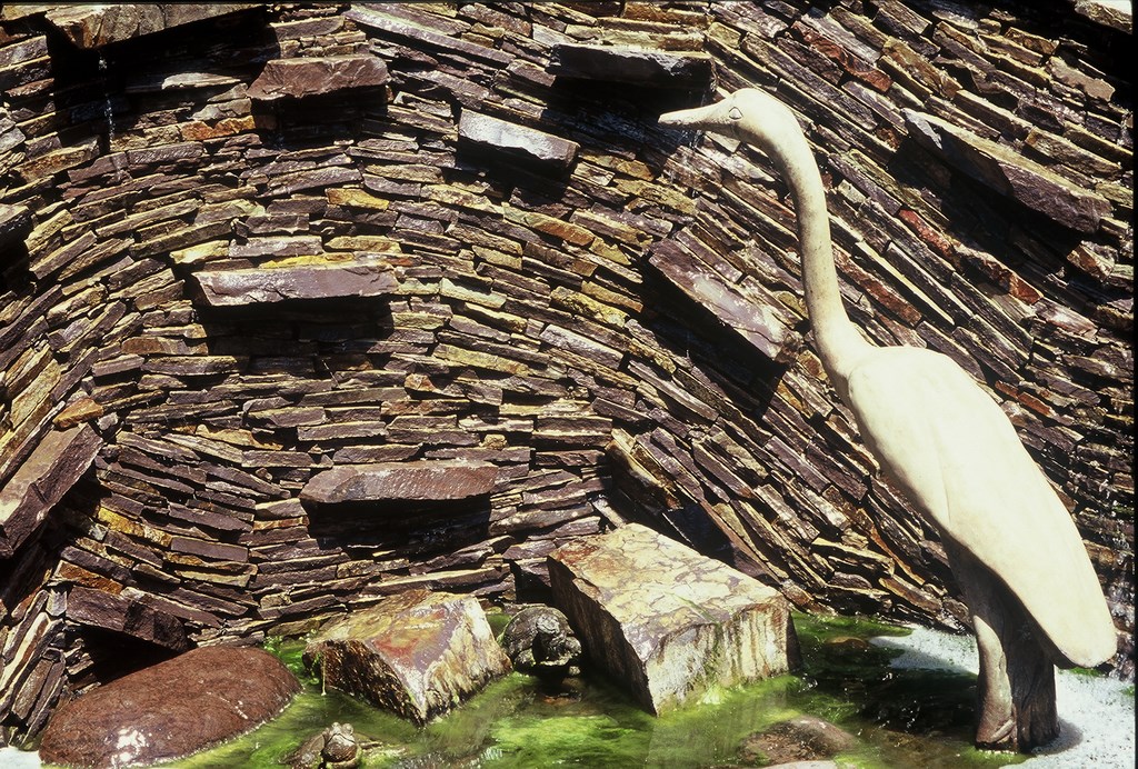
| Off the left side of the bridge, those approaching the door hear and eventually see a small fountain/waterfall that features the same ledgerstone found in various other architectural details – but it’s used here in a flowing, sinuous, organic pattern that mimics the water-pounded bluffs at Torrey Pines. This water source ‘feeds’ a dry streambed that leads under the bridge and around the side of the house (and is, by the way, a fully functional and much-needed drainage swale when the rains come). |
The existing yard featured a dated mix of plants coupled with a narrow, salt-finish concrete entry step/walkway treatment and a rotting phone-pole retaining wall that almost completely hid the early-1980s-vintage, wood-sided home. As it was, it gave me the sense of walking down a narrow staircase into a bushy ravine – not a particularly welcoming approach to the front door.
But the existing space was not without points of interest: There was an outstanding, hand-carved front door with an Agave motif and the existing footbridge that led to the door. Happily, the house was to be remodeled in conjunction with the exterior makeover and the front door was to be preserved, although a new covered bridge was to replace the original open span. In addition, the old siding was to be replaced by tan stucco (to pick up the color and textures of the bluffs) and set off by ledger-stone details.
Upgrades in the rear yard included incorporating the architect-designed deck into the overall garden scheme while integrating and augmenting an existing homeowner-built waterfall and pond. A new bluff-top seating area was to be included along with new garden paths that would link areas within the garden and offer access to adjacent open spaces.
PRELIMINARY PLANS
During the pre-design meeting, we reviewed the remodeling plans and discussed the changes to the front, particularly the covered bridge and the finishes specified for the structural footbridge-support system and the home’s exterior.
They showed me a sample of a cultured-stone veneer that had been recommended by the architect and the interior designer. I am not a fan of these products, so I asked if they were wedded to the choice and mentioned that I already had a natural stone in mind that would pick up the colors, textures and deep-plum shadow patterns seen in the bluffs at Torrey Pines State Park.
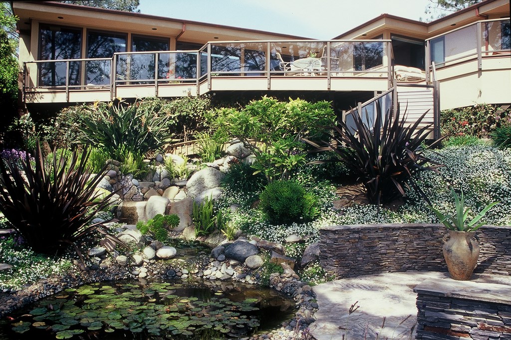
| The new deck commands amazing views off into the distance, but it also offers access to and views of the lower yard as it falls away to the top of the bluff. |
That material – Three Rivers stone – was something I saw being used for various applications throughout the project, including the fountain, the exterior-wall veneering and the pilasters flanking the footbridge. This would, I said, translate into visual cohesiveness and avoid the problems inherent in mixing natural and cultured stone.
To press the point, I brought the clients samples of Three Rivers flagstone. They still struggled, however, basically because they were uncomfortable deviating from the architect’s recommendations. This led me to schedule a meeting with the architect and interior designer: Although they told me they liked my ideas and fully understood what I was trying to accomplish with the stone and its connection to the borrowed view, they were still hesitant about switching.
This confused me until I recognized that I was dealing with a comfort level/familiarity issue, as neither had worked with natural stone in these types of exterior applications. Once I provided the architect with resources that would get him the construction details he’d need, he relaxed and left the decision up to the clients.
| Below deck level, you encounter a small bridge and a variety of pathways that lead to various viewpoints atop the bluffs. The sweeping paths pick up the curves of the entry walk and lead to special views, hidden sculptures and a range of visual treats up close and off in the distance. |
Although this is not a stone for every client or application because of its strong patterns and distinct purple overtones, it only took a visit to one of my completed projects to sell the clients on the Three Rivers option. Seeing it installed, they recognized it as the perfect choice for their home – so much so that it made the increased cost bearable.
To me, the lesson of this story is plain: As a designer, I can’t hesitate to go the extra mile in educating my clients and showing them how good design can work in their favor. Just telling them this stone was the right choice was not enough, but seeing certainly was believing – and it really did work in everyone’s favor once we were done.
At last, with all homework completed and hardscape materials selected, I was ready to start drawing.
IN THE STUDIO
Knowing which stone would be used was my guide as I visualized and laid out the conceptual plan for the driveway and a web of walkways using what I call the “river of stone” approach.
I started by laying out the Three Rivers flagstone in an irregular pattern that flows through contrasting flatwork – in this case a colored concrete paving and a seeded river-pebble finish that offered a wonderful match to the flagstone. (I also used this material to fill voids in the hardscape and in places where there was no planting.)
The front entry’s retaining wall, flatwork and steps are laid out in arcs that fall away from and out of view of the street, down along a series of sweeping stone steps that hug a stone-faced retaining wall. At the base of the steps is a circular stone landing that provides a transition to the composite-wood bridge, the leading edge of which is cut to conform to the irregular contours of the abutting flagstone.
Ledger-faced columns (designed by the architect) support the new bridge and its solid cover. The battered profile of these columns lend the home a subtle Craftsman-style aura that we gently adopted in our treatment of the street-level entry pilaster that terminates the arcing wall. It’s battered faces and Craftsman-style lantern (decorated with a Torrey Pine motif) pay homage to the region.
| The pathways flow around and through a variety of special destinations, including the small waterfall/pond system as well as interesting compositions in rockwork and greenery. Perhaps most welcoming of all, they lead to a small, bluff-top deck next to the pond. |
The new covered bridge passes a waterfall/fountain inspired by the splash zone of the nearby beach cliffs, where waves at high tide pound the bluffs and, between sets, the seawater trickles from the rugged stone cliffs into the tide pools below. Only here is the ledger stone laid in a sinuous fashion in emulation of the natural strata of the cliffs. Buried as it is and oriented to face the bridge and the house, it cannot be seen from the street and offers a wonderful surprise to those approaching the front door. (It can also be seen through the kitchen window.)
The fountain also seems to be the “source” of the dry streambed/drainage swale that runs under the footbridge before wrapping around the west side yard and heading toward the rear yard. This swale is fully functional when it’s not being purely decorative, collecting stormwater runoff from both landscape drains and the home’s downspouts for transfer to an unusual drainage system.
Set back from the bluff by about 15 feet and running across the property is a large, gravel filled, subterranean trench that acts as a sort of leeching field to capture and percolate water into the soil before it reaches the bluff. A gentle swale set just above the bluff is the key, directing any rainfall away from the edge and into the hidden trench, which has been in place since the home was built.
According to the homeowners, the bluff’s edges have not receded during that time, so we didn’t tamper with the system in any way or intrude into the dry zone between the drainage system and the bluff’s edge.
IMPROVED PLANTING
Our work in the rear yard above the swale was just as involved as our work out front. When we started, we encountered a haphazard array of Roses, succulents and turf, and the best features were a waterfall and pond that had essentially been swallowed by the plants. We began by redefining and reorganizing both the layout and the plantings.
Using the stream-suggesting flowing-pathway approach once again, the steps from the architect’s deck now tumble down to a flagstone-paved landing that serves as the hub for all the yard’s pathways. A small, arched, prefabricated footbridge was added where the dry streambed/swale crosses the yard and now conceals the true source of the waterfall. (This portion of the dry streambed is, by the way, just for looks: The actual drainage inlet is up the slope, where it collects runoff and routes it directly to the bluff-top drainage field.)
| Everything on the back of the house is dedicated to the simple proposition that the views are what make the home so special. The fact that we borrowed colors and textures from bluffs seen in the distance only heightens the sense that this space is part of a far larger setting that everyone who visits is invited to enjoy. |
The natural-stone steps have ledger-stone risers and groundcover frames, providing easy access through the lush planting along the watercourse and down to the lower areas around the pond. Ferns and tropical plants flank the rocky banks of the waterway as it falls gently to the newly enlarged pond, which is lined with Arizona River Run cobbles.
Incorporating another arc, a curving, ledger-stone garden wall defines a small flagstone patio. Viewed from above, this space beckons one to come and enjoy the vista, both of the garden and its watershapes as well as the ocean. Perched just above the bluff, the seat wall projects slightly into the dry transition zone, where we planted drought-tolerant, deep-rooted Mediterranean and native species to stabilize the cliff top and blend with the native landscape beyond.
We also used rectangular, poured-in-place concrete steppers (colored and seeded with pebbles to match the front yard’s paving) in addition to the flagstones to add a geometric element and some textural relief. This path flows through the garden and out into the transition zone between the gardens and the dry zone along the bluff.
We completed our work on site in 2005, and in April 2006 I received the call all designers love to get: My client was relaxing, glass of wine in hand in his new backyard, when he felt the urge to call, thank me and let me know just how much I’d exceeded their expectations. It was a special ending to an extraordinarily satisfying project.
Melanie Mackenzie is principal designer and founder of Biomirage Landscape & Garden Design in San Diego, Calif. She entered the business in 1980 while pursuing a career in fine arts in Sedona, Ariz., discovering great creative possibilities in blending her background in the arts with the technical elements of construction and horticulture. Returning to school to study landscape architecture, she accepted an internship at Wiley Group Landscape Architecture in San Diego, where she worked and studied for eight years. Mackenzie started Biomirage in 1992, focusing her efforts on creating highly personalized, custom residential watershapes and gardens.


