Imported Genius

 I lived about 20 miles from the heart of downtown Los Angeles when I was growing up, but it was a place I visited only rarely. I recall a school field trip to historic Olvera Street, and my father once took me to his office in a downtown skyscraper in the early 1960s, but I never felt particularly motivated to head in that direction.
This situation has changed through the years, and downtown Los Angeles now has a good bit to offer. There are several museums as well as Frank Gehry’s amazing Disney Center; the area in front of City Hall has been revamped as Grand Park, which has become a magnet for those who work in and visit the area; and then there’s Pershing Square – the wondrous subject of this Travelogue.
 This park – “historic” in California terms – has been around in one form or another since 1866, when it was set aside as an open public square. Neighboring businesses eventually planted trees and shrubs, and the space survived as a matter of local goodwill until 1910, when John Parkinson came on the scene and formalized the setting with a three-tiered fountain. (He later made a much bigger name for himself by designing City Hall and Union Station.)
After World War I, the park was named in honor of John “Blackjack” Pershing and became a place where monuments accumulated; even Beethoven is memorialized there. But that wasn’t enough, so in 1952 the park was razed to make room for an underground parking garage, then covered by a thin layer of soil and an expanse of lawn. Reflecting pools and fountains came later, but the elevated park was cut off from its surroundings, lacked amenities and declined steadily – so steadily, in fact, that it was bypassed when the city spruced itself up to host the 1984 Olympics.
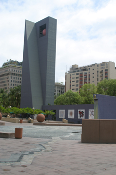
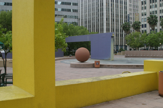
 By 1992, however, local businesses once again rallied to its cause and the park was closed for renovation by Ricardo Legorreta, the inspiring Mexican architect whose work has been highlighted by an article in WaterShapes (click here). Also involved were Laurie Olin, a landscape architect of international renown and influence, and the environmental artist Barbara McCarren. The impressions, however, are made mostly by Legorreta’s bold structures and colors.
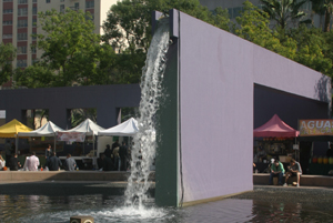
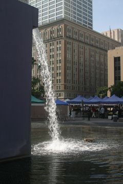
In the $14.5 million upgrade, the designers added a 10-story purple bell tower, numerous public artworks, a concert stage, artful pathways, small plazas, seating areas and raised planter boxes with trees. But the key to the entire space for me has always been the aqueduct – a purple bridge and monolith topped by a runnel.
Earlier this year, I was told by a representative of the park that there is no set schedule for running water through the aqueduct, and I can attest to that fact. Twice since April, I’ve stopped by to  photograph the flowing water only to find the feature standing high and dry. The third time, however, came early this month and was the proverbial charm.
The space has long been the object of criticism for being too much about concrete and too little about comfortable use, and there are plenty of people willing to bash the colors and the bolder elements of Legorreta’s design. I, for one, love the programming of the space and the way the colors and structures contrast and even conflict with their drab urban surroundings.
If I do have a complaint, of course, it’s that the water doesn’t always flow. But when it does, it is quite literally a breath of fresh air!


