Ignoring Instincts

Lots of us landshapers hear voices.
The longer we’re around, the clearer those voices become and the more we trust them. “Don’t take this job,” they’ll say. “You can’t make this look good. Do you really want to be known for this project?”
For the most part, these internal voices perform a valuable service in keeping us out of harm’s way. Every once in a while, however, I find myself ignoring them and will take on risky work anyway. Sometimes things go well – and the project depicted in this article is one of those rare cases.
One would hardly characterize this house, situated in the Sauganash neighborhood of Chicago, as either attractive or stately, nor was it the ideal “blank canvas” awaiting the artist’s touch. It’s a desirable-enough place to live, but like many such communities these days, the area consists of mismatched older homes interspersed by newer “knockdown” replacements.
Although the home I was called to evaluate was not quite a candidate for the wrecking ball, it was long overdue for a makeover.
FIRST IMPRESSIONS
From the moment I set foot on the property, my inner voices called out their warnings. Aside from numerous aesthetic irregularities that cried out for immediate attention, there was the impression I gleaned from my first encounter with the client – I wasn’t sure this was going to be the right situation for me.
Despite a growing sense that it was time for me to head the other way, there was a nagging something I couldn’t immediately put my finger on – something that told me this might be a rare gem, a diamond in the rough.
Those who work on custom landshapes know how important the client is to the process, and this situation was no exception. This one works out of his home and spends a lot of time there, mostly on the phone. This meant that there was no reason he couldn’t work from his back deck on nice days, which gave me some early ideas about priorities within the overall design.
I couldn’t help noticing that the inside of the home was immaculate: This is a man who likes things to be tidy, and although designing meticulous landscapes is no great problem, experience tells me that fastidious homeowners generate countless follow-up calls and demand numerous post-installation site visits when things aren’t just perfect.
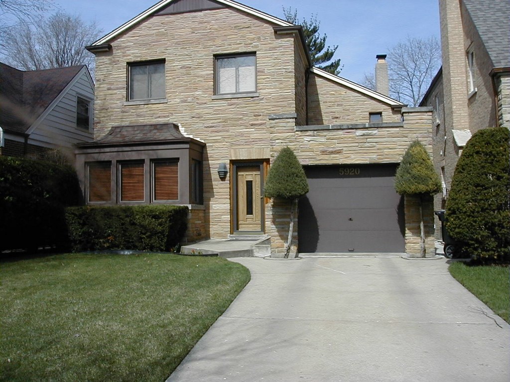
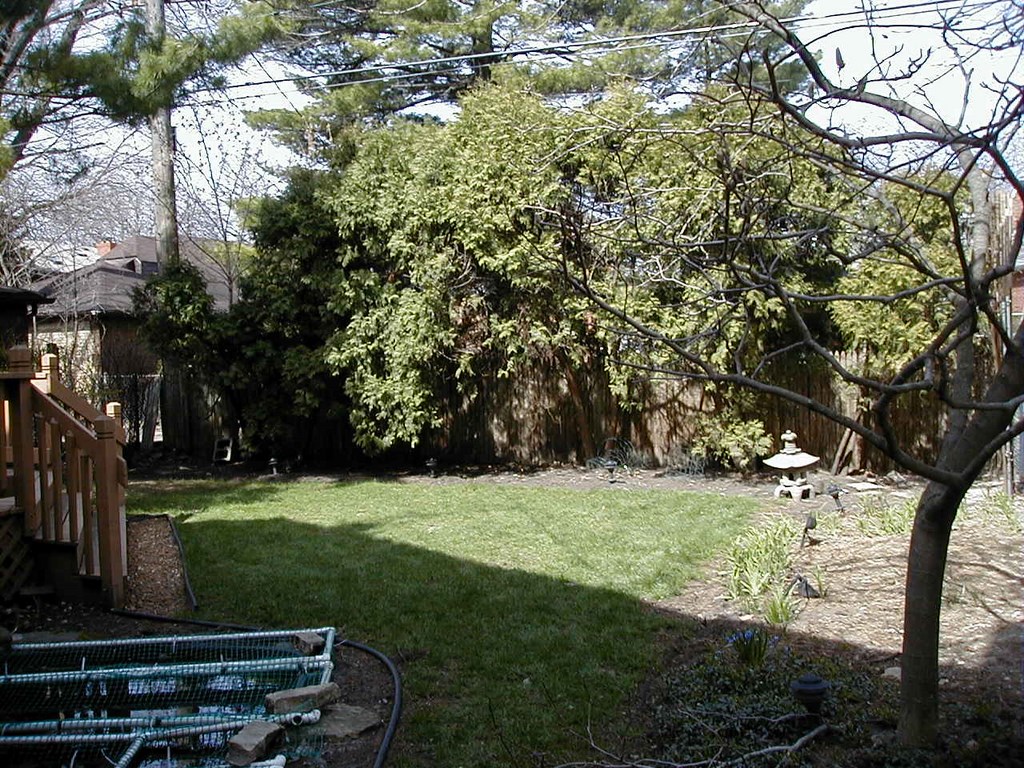
| When I first arrived, I wasn’t much encouraged by what I saw: Outdated plantings, awkward spaces, poor transitions, failed homeowner projects and a new house and garage next door that cast both literal and virtual shadows over a nondescript setting. |
I wondered if I was truly interested in dealing with every brown leaf or displaced piece of mulch and if I was feeling up to managing this client’s expectations in the detailed ways that would be required to make the project a success. Any miscalculation and what I was increasingly seeing as a doable project could morph into a source of prolonged annoyance.
I suppressed the negative voices and moved ahead, gradually discovering that the client was actually a dream: He thoroughly enjoys working in the garden and plans to keep it orderly himself instead of calling me to address every issue. Indeed, my fears were completely unfounded: It turns out that he loves plants, craves lots of color and appreciates quality. As a bonus, he clearly had a grasp of basic design concepts and was ready to go.
As the project progressed, I had no question that this garden would be showered with attention and would ultimately be a showpiece of which I could be proud. I quickly became confident that the layout we developed, though planted lushly, was just the ticket for this particular owner. The overall design was easy to explain, easy for him to understand and easy for him to maintain.
Easy is good!
THE DOWNSIDE
Although the client was an emergent dream, the site itself was still something of a nightmare.
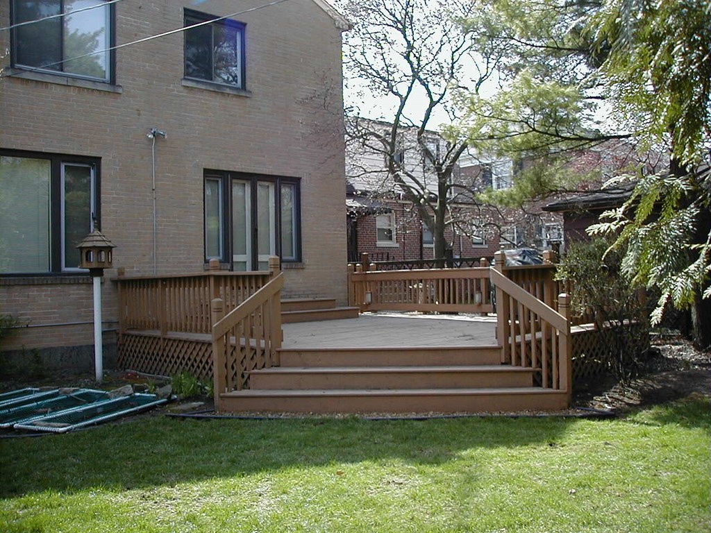
Part of the problem was the house next door, which had recently been knocked down and rebuilt in a form significantly more imposing than the original. Then there was the unreasonably awkward front stoop of my client’s house as well as the afterthought of a backyard deck that bore no relationship to either the landscape or the architecture.
My client had tried to remedy things, experimenting with a waterfeature to which he hadn’t really committed himself and that was therefore less than successful. But I was impressed by the attempt, which indicated both a level of interest as well as a level of creativity that hadn’t been apparent to me at first. The birdhouse in back also told me something about his attachment to the great outdoors.
But there were problems at every turn. The front landscape, for example, was composed of outdated, overgrown evergreens, a narrow concrete drive and the aforementioned front stoop. Nothing was inviting and, especially set beside the neighbor’s new digs, everything looked woefully out of date.
When the client suggested a sitting area in front, it loosened things up and signaled to me that almost every existing feature could go.
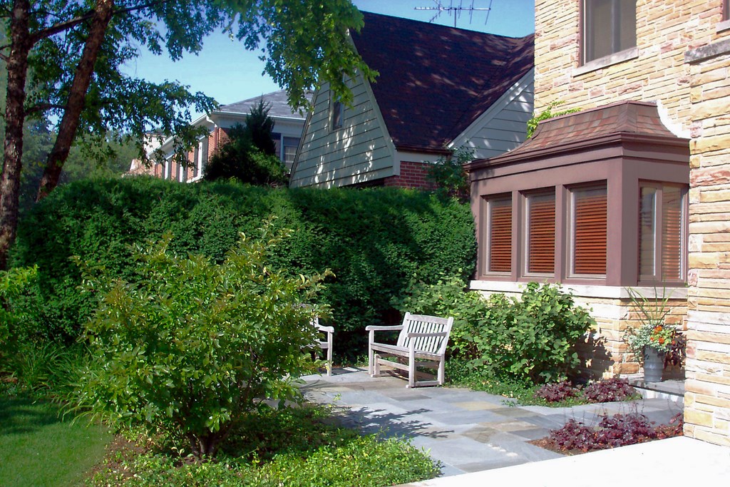
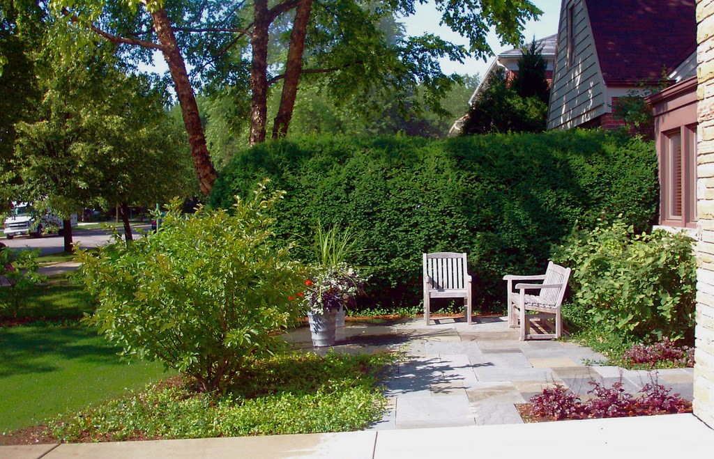
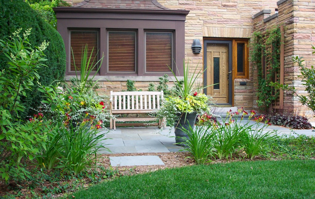
| In our discussions, I was heartened by the homeowner’s suggestion about a seating area in the front yard – an indication to me that everything was open to alteration. Between this new space and the borrowing of the front door’s style for the new trellis, we were on our way to a complete revamping of the spaces and their moods. |
We started with the front entry and discussed the fact that “curb appeal” is about more than what a house looks like from the curb: Actually, it’s the entire experience a visitor has when approaching a house – the first things seen and the last impressions made.
Too often, front-yard landscapes are more about decoration than design and therefore tend to feature plants splayed across the front foundation. In this case, we took a different path and set up a terrace: Functionally, it’s a place to sit or to meet and greet guests and could even serve as a social space for a party. Aesthetically and visually, it provides a much-needed transition from outside to inside – an outdoor foyer of sorts.
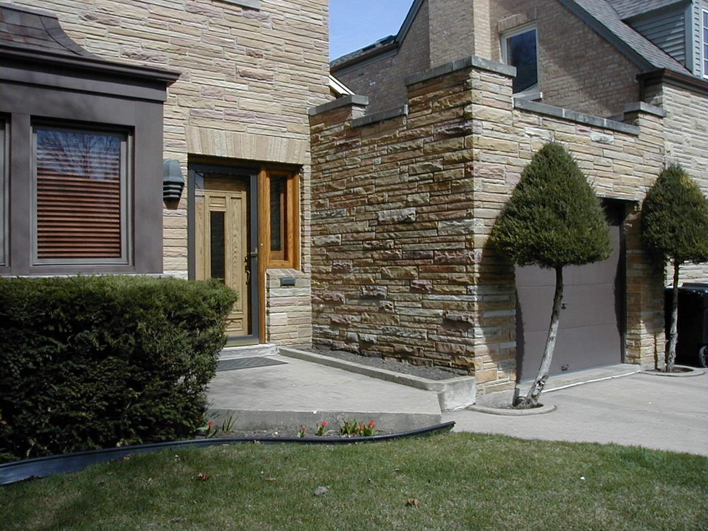
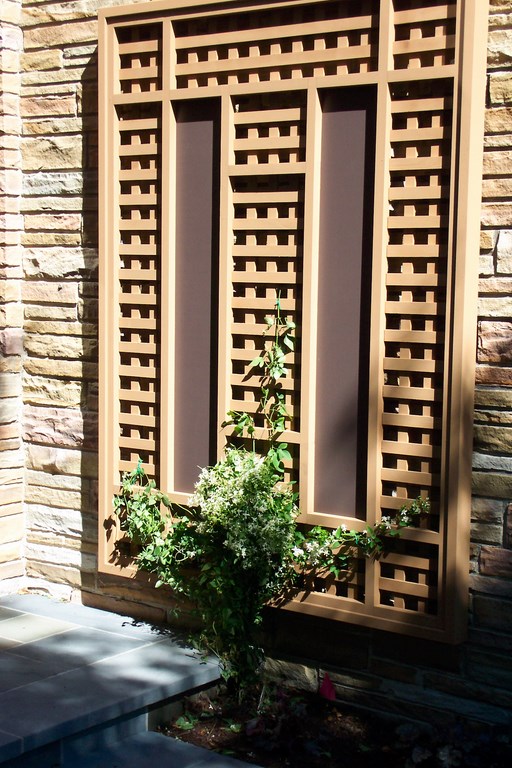
One of the few interesting architectural features the house had to offer was the front door -an element we could easily exploit elsewhere around the property. In this case, we mimicked the door design on the wall trellis adjacent to it and on some of the trellises in the backyard as well. As luck would have it, my client had some old paint cans in the garage and we were able to get a good color match that further linked the architecture and landscape elements.
TIED TOGETHER
By creating these connections between the landscape and architecture, the landshaper elevates the quality of that landscape compared to others that simply “decorate.” The lack of such connections is, in my view, what makes so many landscapes and landscape elements – plants, patios, walkways – seem to be afterthoughts.
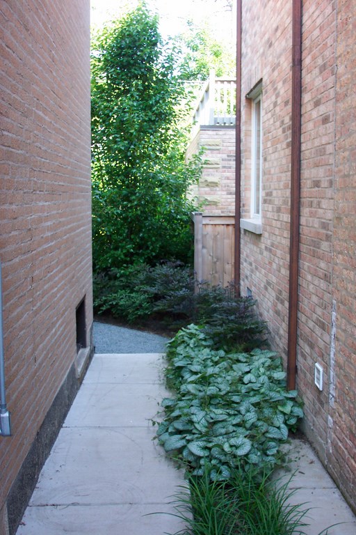
The space along the side of the house is a perfect example of how these connections work. It’s a very narrow area – typically one that’s difficult to make comfortable.
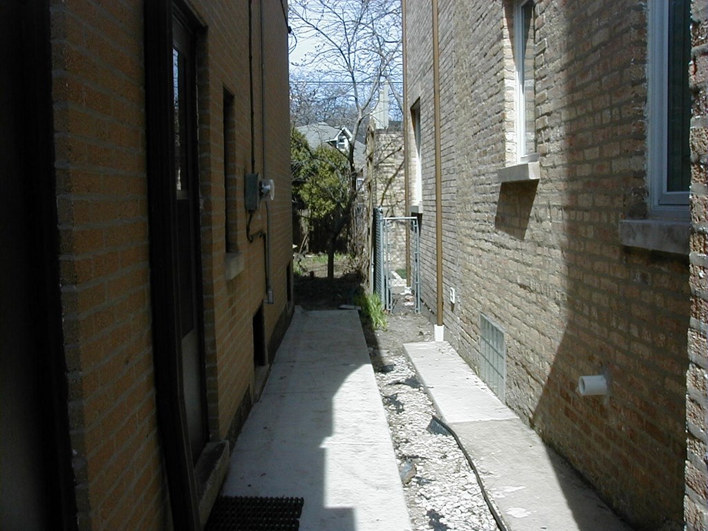
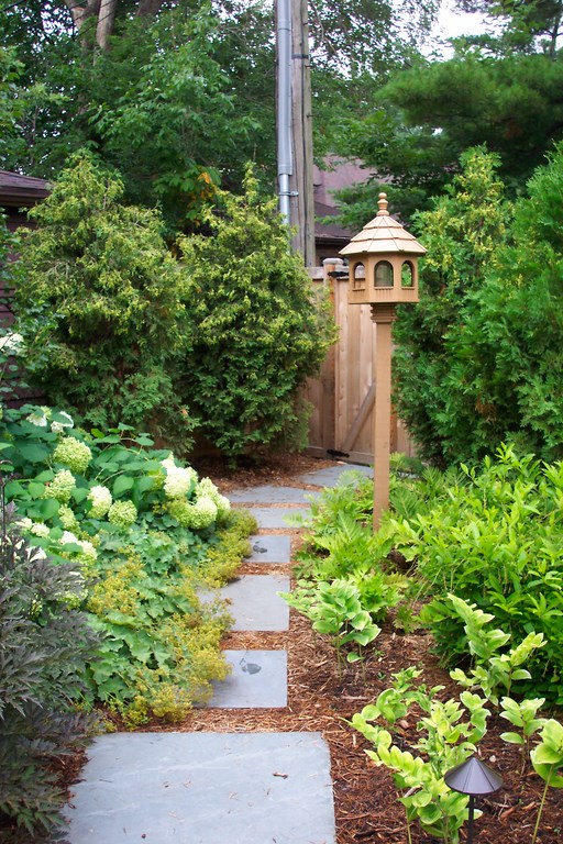
| Where the walk along the side of the house had once promised no visual rewards whatsoever, the revised corridor offers a refreshing, low spray of green as well as a view of a pear tree that fills the space and blocks off views of the neighbor’s garage. |
To make it inviting, we positioned one of three matching pear trees in line with the walk, so a visitor going from front to back would see a link to the other pear trees on the property. Moreover, this side-yard tree also fills a gap and provides a bit of screening from the neighbor – to me an ideal, multi-functional fit.
With narrow side yards like these, installation is often a challenge, but in this case we had access to an alley that simplified things considerably – especially since the existing alley fence needed replacement and its removal gave us plenty of room to maneuver a skid-steer loader and other equipment.
I also suggested to the owner that this would be a golden opportunity to get rid of the hideous overhead power lines. Doing this alone was a huge improvement and it fit perfectly with our schedule: We began our installation work just as the utility company finished burying its lines.
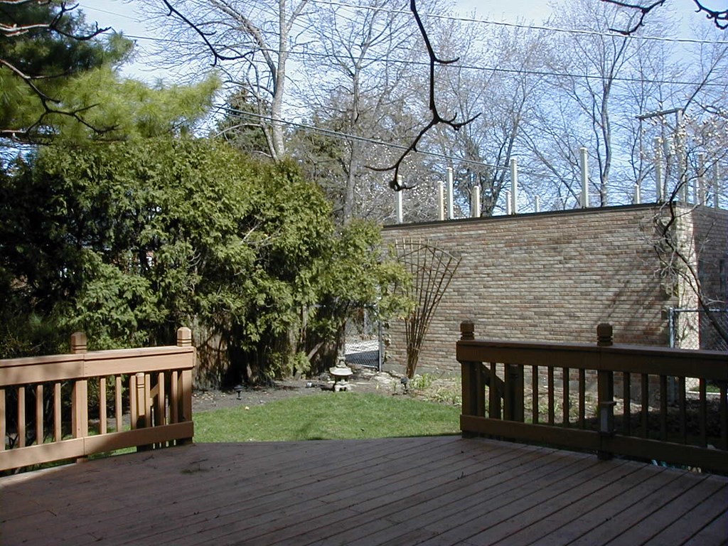
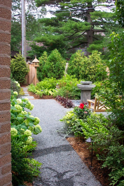
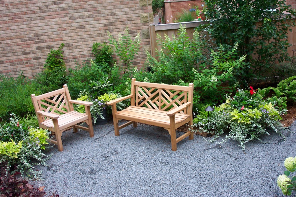
| The garage wall that had once dominated the view off the deck is now just a backdrop for a lush planting and a new seating area. |
The side yard had been a relative breeze, but we still faced considerable challenges in the backyard – including an imposing brick wall that served as part of the neighbor’s new detached garage. We elected to use the brick plane as a visual anchor for an inward-looking, enclosed, outdoor room.
For the most part, however, our work on the outdoor room had to do with the existing deck, which was not very exciting but was to remain. It featured a set of steps angled at 45 degrees off its back edge, so we decided to play off that shape in laying out the rest of the yard.
We started by removing the lawn as well as an ailing evergreen tree and an evergreen hedge that ran along the back property line. The failed waterfeature also disappeared, although we hadn’t abandoned the idea of including one.
IN WITH THE NEW
The new backyard layout does a much better job of relating the landscape to the home.
We altered the steps to the deck to get rid of an awkward flare and railings – a minor change that made a huge difference in how the existing deck and new seating area we set up at ground level now interact. At first, the suggestion to change the steps seemed trivial, but I was certain it was the right thing to do and persuaded my client to go along.
Centered on the steps is a small waterfeature. At concept stage, this had seemed the logical place for some sort of focal design element, and we explored a number of different options including some expensive, custom fountains. By chance, however, I came across an inexpensive concrete fountain at a garden center that fit the bill perfectly – another reminder that the most expensive option is not necessarily the best.
Aside from the steps, the deck had other issues in that it bore no connection to the house beyond being nailed to it. Where the front of the house was difficult, it was even worse back here: The deck was clearly an afterthought and had a visual failing common to a lot of added decks in that it looked like a stage.
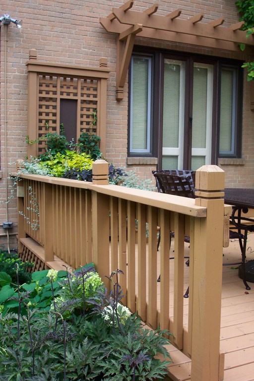
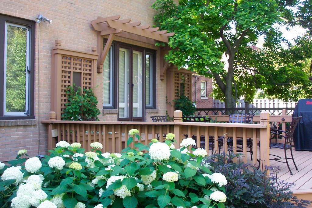
| The deck is basically unchanged, but we dressed it up with free-standing planters that pick up the design of the trellis adjacent to the front door and a pergola over the door that ties the deck and the architecture together. |
To compensate for this, we incorporated freestanding planter boxes that flank the sliding-glass door, patterning them after the front door and thereby tying them as well to the trellises in front and back. Above the slider, we added a sort of “eyebrow” structure that gives a bit of architectural character to the back of the house and ties the home itself to the deck, planters and trellises.
Standing back now, it all looks like it all belongs together.
Once the deck issues were settled, it was all about the smaller details. As was mentioned at the outset, the owner had a birdhouse in the yard. We gave it a new pole and moved it to a fresh location just off the deck, centered on the interior-to-exterior line of sight from the sliding door so that it now draws visitors outside for a closer look.
PLANNED SUCCESS
Our goal in designing and building landscapes – especially for residential clients – is to find ways to extend architecture into the landscape.
We approach the landscape and the home as if they are (or should be) one and seek to define and reveal their connectedness through our efforts. In that process, we blur the boundaries where one ends and the other begins: Just as plants weave among themselves, so too should the architectural elements.
At the start, this project was neither exciting nor particularly inviting: As I mentioned up front, little voices inside my head were sounding alarms from the time I first set foot on the property, and they only became louder when I met the client.
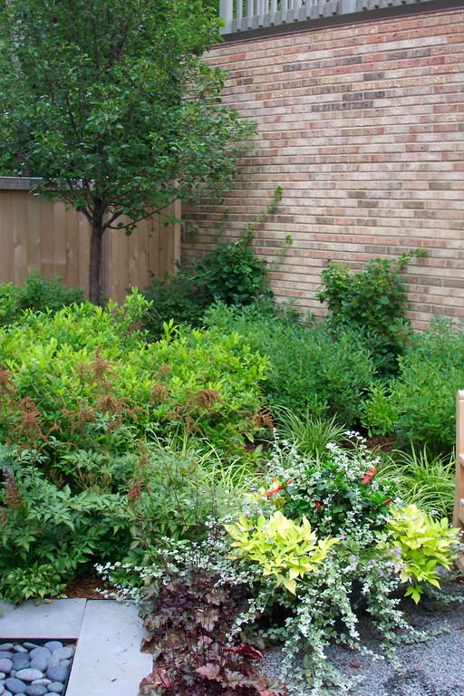
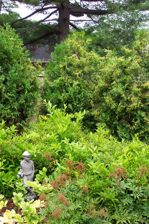
| The long-term success of this design program is tied to the homeowner’s willingness to get involved with maintenance. This allowed me to use a variety of plants with various colors and textures and fill the space in ways that I wouldn’t have thought possible when I first walked through the property. |
Through the clatter, however, another voice grew in confidence, telling me that the place had potential and that the client could be an asset rather than an issue. That voice turned out to be correct: I would never have guessed it in the beginning, but the owner turned out to be the key to the project’s success. He was interested in making serious improvements and was open to a variety of ideas – and even offered a few good ones of his own. Ultimately, the job became a collaboration that paid off handsomely in all directions.
As it turns out, this project was a huge lesson for me: I now hear my cautionary voices as a sort of radar, a system that alerts me to certain issues, but I no longer automatically follow their directions: Instead, I place their warnings in context and let things unfold to a far greater degree than I did at earlier stages in my career – all in the hope of finding more of these diamonds in the rough.
Tim Thoelecke Jr. is founder of the American Academy of Landscape Design, an organization that offers intensive short courses to landscape-design professionals. A past president and certified member of the Association of Professional Landscape Designers (APLD), he is also a certified arborist and a full member of the American Society of Landscape Architects and of the Landscape Design Association. His company’s work has appeared in many publications and won awards from APLD, the Illinois Landscape Contractors Association, the Perennial Plant Association and the Illinois Chapter of ASLA. In 2002, he was awarded the Harry Schuster Service Award from APLD and is a member of its Past Presidents Council. To learn more, visit www.aaldweb.com.


