Good to Glow

For the most part, the designers and builders of pools, spas and other watershapes visualize their projects in full sun, install them during daylight hours and seldom (if ever) see them after the sun goes down.
That’s both a problem and a shame, and it’s reflected in the fact that the run of projects you encounter by mainline pool-industry folks – and, to a lesser extent, by people from the landscape trades – tend to treat the lighting of exterior spaces as an afterthought if it’s really thought about at all.
In fact, I’ll go so far as to say that one of the very worst aspects of most pool projects is the lighting. And to my eyes, that’s true both for lights installed inside watershapes and for landscape lighting placed nearby. All too often, what you see is an assortment of hot spots, lots of glare and an almost uniform lack of any design flair.
To be sure, some of the newer lighting products, including various low-voltage systems and fiberoptics, have raised design consciousness and improved things somewhat by virtue of increasing the range of product choices while making installation a bit easier. Still, it’s an area where great and necessary improvement is possible.
IN THE DARK
I think we should all resolve to do better and to learn more about what it takes to design and specify lighting systems that do a better job of capturing and enhancing the beauty of our work once the daylight fades. After all, our clients live with their watershapes day and night, and I’ve found that I can greatly increase their appreciation for my work simply by paying attention to this one big detail as part of the design process.
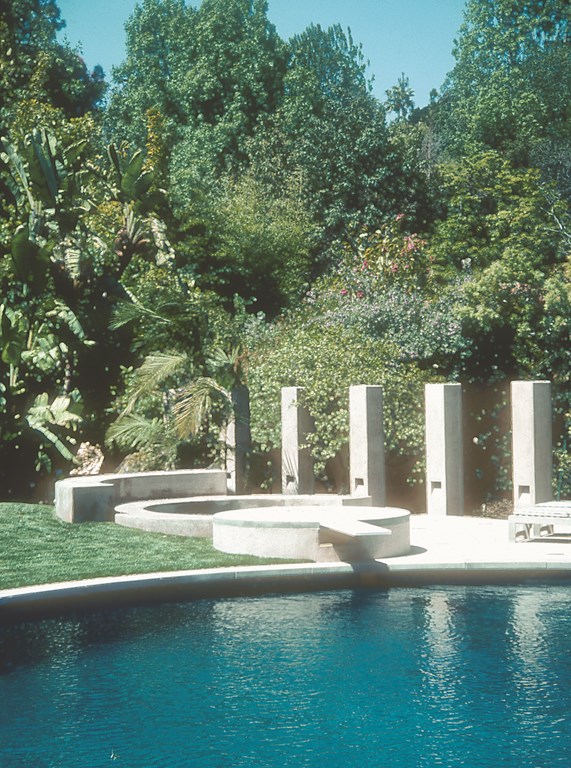
One of my favorite lighting touches is the recessed-lighting detail shown here – one I’ve installed with a variety of settings in California and New Jersey. It’s relatively simple to do and yields beautiful, subtle and stirring results.
| Even in daylight, this Legoretta-inspired lighting detail lends a special look to just about any architectural feature. In this case, the small, shadowed areas add wonderful, dramatic visual interest to a sequence of pillars. |
Backing up a bit, one of my first experiments with recessed lights was back in 1988, when I set up several spas with lighting recessed beneath the benches. It worked, and it was an approach that’s kept evolving as I’ve kept my eyes open and explored the world of design to see what others have been doing to address the lighting challenge. Basically, the message that kept getting reinforced is that light is good, but exposed bulbs are a problem – hence the value of indirect lighting.
Before long, I started noticing how much the great Mexican architect Ricardo Legoretta was accomplishing with his lighting and soon came to appreciate his special mastery of indirect lighting. I love his work, have visited as many of his projects as I can and have books that cover even more, and I’ve always admired the particular way he sets up his lighting niches. In fact, I’m the first to admit that I owe this detail to him.
And it’s become a significant debt of gratitude, because as I’ve tried to develop ways to tie the exterior environments I create with the architecture of the home and the surrounding area, I’ve found myself using his approach over and over in many different contexts. It can be used in pillars (as seen just above), or it can be set up in other structures to accent walls, light pathways or highlight key features of landscapes or interior spaces.
It’s a wonderfully simple detail: All you do is suspend some type of light fixture inside a flue of some kind that opens at the bottom to light a vertical surface below by way of an angled aperture.
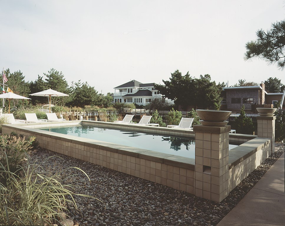
For the project pictured below, for example, we built a small pilaster out of concrete block and cut the blocks at the opening to a 60-degree angle. A single low-voltage lamp hangs inside the pilaster and can be serviced by removing the capstone. The aperture can be any size, depending on how much light you want. To be sure, there’s some skill involved in creating the opening, but this detail is not about tricky construction. Rather, it’s about understanding the aesthetics of lighting.
SOFT IS THE NIGHT
We all know that lighting serves great utilitarian purposes in making outside spaces useable at night and in making them both safer and more secure. For those reasons alone, any lighting is better than none at all. But with a simple detail such as this one, you serve utility at the same time you lend beauty, warmth and even a measure of romance to the space.
| The recessed niches work in settings far removed from Legoretta-style architecture – in this case on a project at Long Beach Island, N.J., where the niche has been worked seamlessly into the tile pattern. |
Lighting that is warm and soft serves up a beauty that builds the ambiance of the space. And when you combine that soft presence with water and/or the sounds of moving water – especially in a space that draws connections between structure, landscape and watershape – you create a sense of elegance that’s hard to describe.
Indirect lighting of the sort discussed above isn’t the only way to achieve such harmonious effects. It’s also possible, for example, to use flames in the form of torches or a fire pit to capture and convey the desirable visual qualities of warmth, softness and light’s indirect interaction with surfaces, objects and faces.
And it gets even better when flame is used as an indirect source – and better still if you’re able to use a flame you can’t see directly as a source for reflections off the water. (This last point folds back to the earlier comment that light is good; it’s the bulb or flame or any point source of light that’s the problem.)
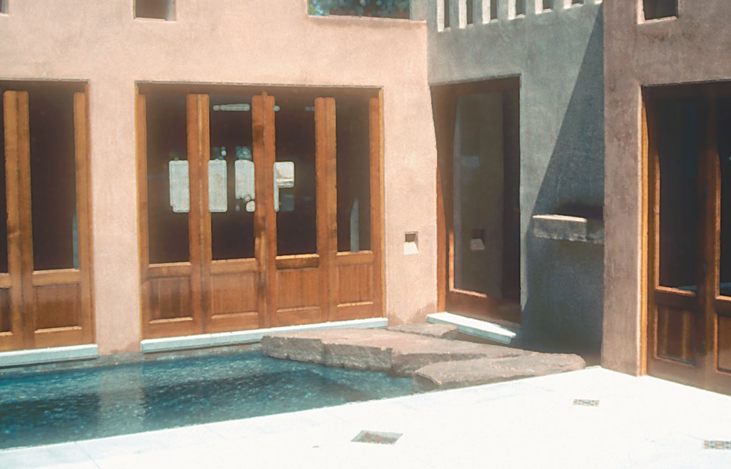
| One of the things I like most about this detail is its subtlety: With staggering simplicity, it breaks the wall’s plane, harmonizes with other voids in the wall, comments on details of the decking – all while serving its primary function in lighting an important transition from house to pool and yard. |
With flame and other light sources, you see diffused patterns of light and defused shadow and fantastic reflections off the water because the reflection is always darker and softer than the originating light source. I believe Legoretta understood this, which is why he sought to conceal the abrasive glare of light bulbs and instead worked to deflect that light by hiding its source while still using it to illuminate surrounding surfaces.
As one who has wrestled with lighting’s potential, I see errors in lighting design as colossal missed opportunities. When someone indiscriminately places high-wattage lighting out in the open where the glare of the naked lamps is almost blinding, wonderful opportunities for establishing ambiance, romance and mystery are obliterated.
With indirection, by contrast, you don’t see the lamp, glare is eliminated and a hot spot has been buried beyond view. Look at it this way: Eliminating harsh visual contours of light is not unlike the watershaping trend toward softening the edges of a pool by allowing them to vanish into infinity. In both arenas, sharp visual boundaries within a space are removed and the eye is freer to make connections on a subtle and more satisfying level.
That’s why I see these little lighting niches as such a wonderful touch to use in conjunction with beautiful decking or pathway treatments.
THE WRIGHT STUFF
Reaching back beyond Legoretta in design history, setting up lighting fixtures in this way recalls the work of Frank Lloyd Wright, particularly when it comes to integrating the structure that contains the fixture with the space.
Wright was the one who first had the idea, now omnipresent in interior design, of placing fluorescent lights behind soffits to light up ceilings or wash light across walls. The resulting light is soft and warm and draws your eye to the surface of the structure and the contours of the space.
When this effect is used in structures away from the home, as with the pilaster light seen in Figure 1, the structure now becomes part of a unified space rather than an afterthought that stands separate from the architecture of the home.
Some might say this is no more than an expensive alternative to sticking strings of Malibu lights in the ground. I would argue that what is sacrificed by adhering to the status quo of creating hot spots and glare (or, worse, trying to turn nighttime into day) is nothing less than turning away from one of the most intriguing and inviting of all visual qualities – the warmth and beauty of the night!
David Tisherman is the principal in two design/construction firms: David Tisherman’s Visuals of Manhattan Beach, Calif., and Liquid Design of Cherry Hill, N.J. He can be reached at tisherman@verizon.net. He is also an instructor for Artistic Resources & Training (ART); for information on ART’s classes, visit www.theartofwater.com.


