Gallery Views
Looking for inspiration in an urban environment can leave a designer with precious few useful references. Take downtown Chicago, for example, where our indigenous waterfeature is Lake Michigan and our public art is too often plopped in the middle of concrete plazas.
Be that as it may, I do my part by trying to introduce both water and art into my projects. So I was thrilled to be retained by Mary O’Shaughnessy, owner of the Wood Street Gallery in Chicago, to design a sculpture garden. I knew it would give me the chance to create a balanced, beautiful space – even though I also knew the job wouldn’t be easy.
What she wanted was a garden environment in which she could display and sell contemporary American sculpture – a place that would help clients visualize the way the art might look in their own gardens.
As we dug deeper, we uncovered additional goals: It needed to be a space that would accommodate a changing variety and number of pieces; it had to be functional for large parties; and it had to incorporate and acknowledge the garden’s urban neighborhood while still providing a sense of enclosure for gallery visitors (and, of course, security for the art).
GARDEN VARIETY
One of the keys to balancing all of these objectives within a confined space was the inclusion of delicate watershapes. These, we agreed, would define and unify the various spaces we’d set up within the garden and bring a sense of tranquility despite the fact the garden was in the midst of the Midwest’s largest city.
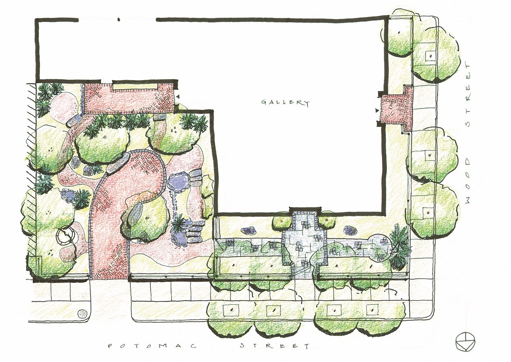
The sculpture garden has two parts: An entrance courtyard on the north side of the building of about 20 by 80 feet, and a main garden of about 75 by 75 feet bounded on three sides by building walls. The street-level views were important, but because the garden could be seen from the gallery’s upper floor windows, we also wanted the space to be inviting and draw visitors to it.
These dual perspectives are significant because it’s not so easy to make their needs line up. From a bird’s eye view, for example, the plan needed to be simple and easily understood so as not to seem forbidding. By contrast, once a guest actually enters the garden, there had to be enough complexity that visitors would be encouraged to explore and see the sculptures. Further, ground-level visitors needed to see the sculptures both from a distance and up close through careful arrangement of lines of sight.
Then there was the X factor: We had no way of knowing what piece of art might be on display at any given time. All we had to go on was a general sense that the art would be “human scale,” which meant anything from four to 12 feet tall and four to eight feet wide or deep.
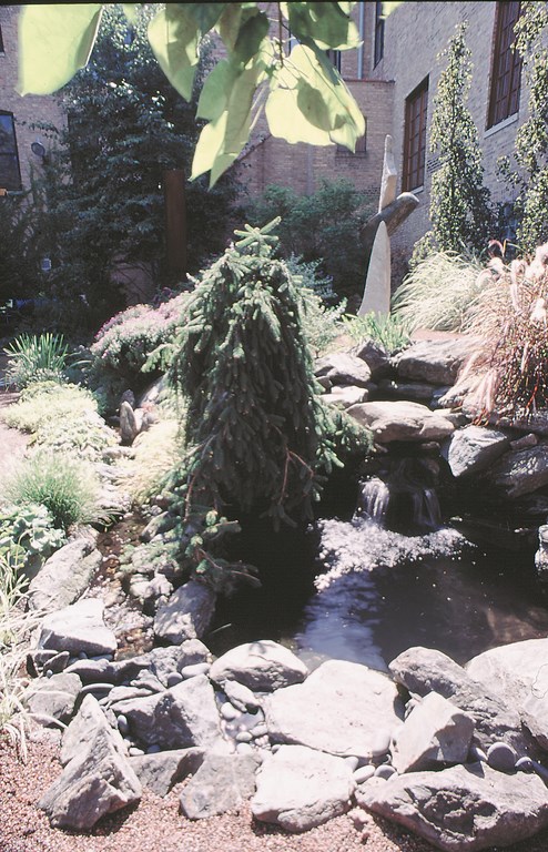
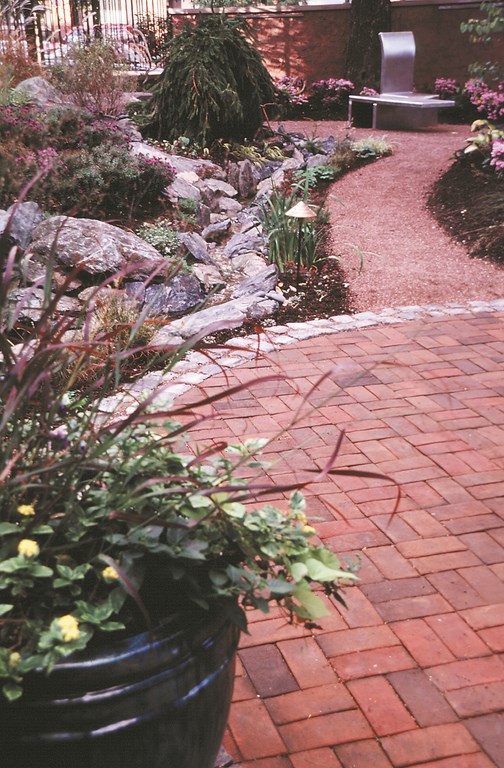
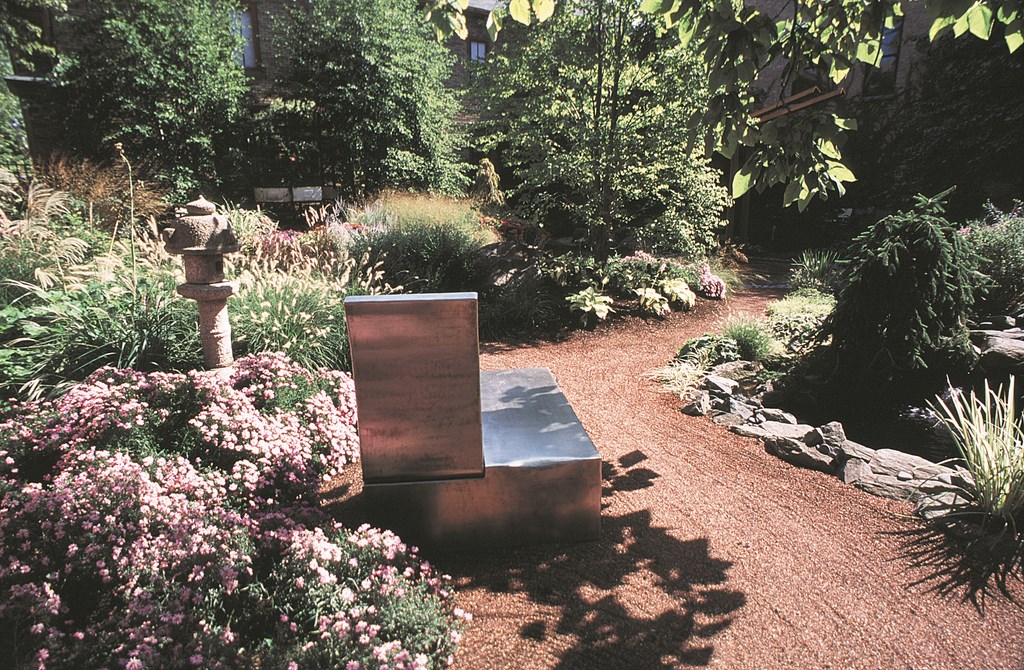
| The upper pond creates a focal point at the intersection of the main courtyard and the entry garden (see the center of the drawing at left). The branches of a weeping Norway spruce don’t mind trailing into the water (middle left), which flows along a path-side stream (middle right) and into a lower pond (right). By design, this watershape draws people deeper into the space, leading them to a prospect from which they can take in both parts of the garden. (All photos by Linda Oyama Bryan) |
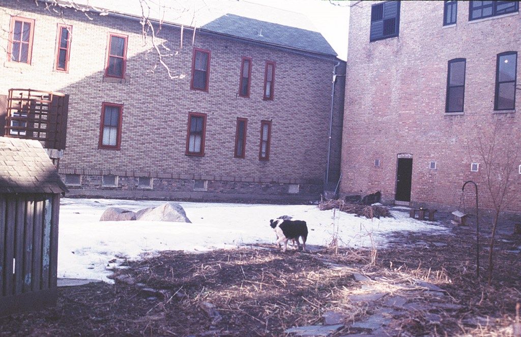
When we started, the site was mostly weeds with a slate patio right next to the door to the main gallery. As is the case with many patios and watershapes and as was certainly true in this instance, this location right by the door was the worst possible placement: It cut off the rest of the garden and made it forbidden terrain. It placed limits on the entire space and gave people no need or desire to enter and explore.
Our aim here was entirely different. We wanted to encourage wandering, to encourage visitors to get close enough to feel the artist’s mark on a stone or lean against a piece or sit inside the space, so we made first steps into the space inevitable by moving the patio into the center of the courtyard.
Weather and climate also were factors in settling on this gathering point: Sunshine is a valuable commodity here in Chicago, especially in the fall, winter and spring, when we have one. We know from experience that a gathering site on the north side of any building makes the probability of year-round shade approach 100% – and that was something we very much wanted to avoid.
DIVIDE AND CONQUER
Some of my favorite garden spaces are found in Charleston, S.C., where small courtyard spaces very often are divided into even smaller spaces and have the effect of making the whole garden seem bigger. We applied that same principle to the gallery’s garden, creating a series of paths radiating from the central patio.
One of the key pathways off the central patio had a practical purpose: It flows to the street as a driveway that offers access to boom trucks used to bring new pieces into the garden and within reach of virtually all potential sculpture locations. Beyond that, the rest of the paths fit into the overall program of encouraging visitors to use their feet and follow their eyes to carefully placed displays.
Chicago in general is very flat – especially downtown near Lake Michigan – and this site was no exception.
Working and watching here through the years, I have often observed how much difference even a small elevation change can make in defining spaces and helping visitors feel a sense of enclosure. That in mind, we set up five distinct berms in the main garden. This gave us elevation changes of as much as 36 inches from the highest to the lowest points. Now the berms serve to create more visual “distance” between sculpture locations and separate the garden into distinct areas to explore.
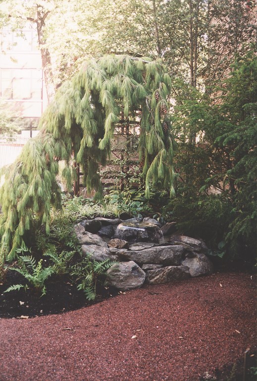
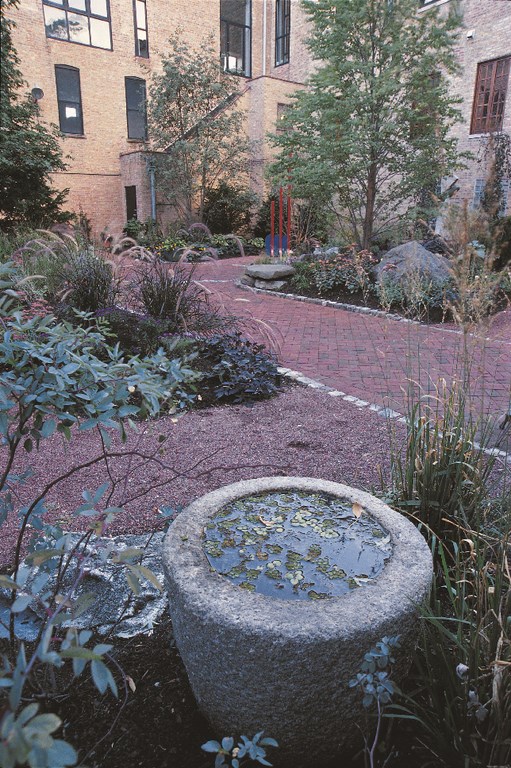
| The small pond on the east side of the garden becomes a sculpture in its own right with the aid of the weeping white pine that frames it. The gentle sound and visual quality of the pump’s spray attachment makes this a most contemplative part of the main courtyard. |
To avoid the potentially hulking look of berms, we made certain to incorporate many small elevation changes into our elevation/drainage scheme. We made them appear to rise gradually, for example, by pitching paved surfaces and paths at one or two inches of slope per 10 or 12 feet of surface. We also incorporated stone steps to pick up an additional four to six inches of grade change and used stone seats and boulder retention at key points to offset any bulkiness of the berms.
We also changed the perception of grade changes, elevations and berms through the use of water. In fact, watershapes are the main landscape element we use to draw visitors through the garden.
In the major berm, which stands more or less between the main and side gardens, we designed a two-tiered pond that flows into a stream that empties into a third pond. The sound of falling and flowing water attracts people to pass along the course of the stream and up to the double pond and, from there, to move between the two large patio areas.
Another, smaller pond on the other side of that garden provides an equal draw. Without the berms, any one of these waterfeatures would have looked artificial, but because we contoured the whole space, the waterfeatures snuggle into the slopes and feel “natural.”
MATERIAL ISSUES
Managing movement through garden spaces is one thing. Making watershapes and sculpture feel part of the space is quite another and requires use of a range of congenial, harmonizing materials.
Typically, I don’t specify the hardscape materials until the landscape plan been settled and I know where plant masses will go. This project was no exception. Complicating matters here was the looming presence of building walls; in such cases, you also need to consider the color of those structures and the texture of their materials of construction because they will tend to be the most dominant features on site.
| The main courtyard is a space in which we set up berms and used plantings and twisting pathways to create small “rooms” to feature selected sculptures (left). The before image shows how clean and flat a slate we started with (right) – and how possible it is to use plants to screen out unwanted views. |
This set of concerns is especially applicable in parts of the country where there is winter and where, from November through April, deciduous plant material will be devoid of foliage and constructed detail is truly going to dominate the scene.
In this case, the Wood Street Gallery’s entry garden offered us a limestone façade on the first floor with brick facing above, while over the main garden loomed the building’s back wall of Chicago common brick with its warm buff color. The adjacent apartment building (on the east side) has beige asbestos shingles. Our goal was to divert as much attention from this view as possible.
|
Working in a Window The last and perhaps biggest challenge in making natural-looking watershapes work in a project like the one described in the accompanying article is finding a contractor who can interpret the aesthetic values my client and I imagined and take care of the installation. Mackey Landscapes was the primary contractor on this site. Their team, led by John Evans and Al Haisman, worked closely with us every step of the way. Teamwork also counted in another respect. In Chicago, we basically have a March-November installation window – as amended by weather (including frost and snow), a seasonal work force and average rainfall of 36 inches. This leaves everyone in the landscape trades feeling like they are jamming ten pounds of work into a one-pound bag, especially in the last two weeks of May. Even with a fast-track construction schedule, all landscape construction work virtually stops while every available man, woman and child is pressed into service while semi-truckloads of impatiens (our ubiquitous flower in most high-end residential suburbs) are planted. Fortunately, Chicago has a can-do attitude about getting things done, and while it is the third largest city in the United States, we still operate with a small-town business atmosphere in which a person’s reputation and word are important aspects of a resume. It is one thing to recommend a contractor to a client and oversee the installation of a project when all of the details are specified before we begin. It is quite another thing to fast-track a project on a small site where, in addition to Mackey Landscapes, we also needed close coordination among various masonry, stucco, ornamental iron, irrigation, electrical, landscape lighting and arborist contractors. Through constant coordination and close oversight, the project moved along smoothly with few hitches. — R. R. |
To facilitate our material selection, we laid samples of various materials out, trying different combinations of stone and brick – rather like putting together an outfit or matching a suit, tie and shirt. To contrast the Chicago common brick, we used a simple color-wheel approach and settled on blue as the basic hardscape color (that is, the opposite of orange) and a deep, dark red-brick color (that is, a complementary or echo color).
To avoid any sort of institutional feeling that might have come through using large expanses of the same paving material, we used a variety that included clay brick pavers, cut bluestone, old granite cobbles and compacted gravel path mix. We also used four different wall materials, including face brick, stucco over concrete block, limestone caps and ornamental iron.
As for the watershapes, it’s usually a good idea to use indigenous stone if you’re striving for a natural look. But in Chicago, which is basically land reclaimed from the lake bottom and swamps, our local stone is blocky gray crushable limestone and a few glacial boulders. We took this as a declaration of independence as far as stone selections were concerned: It freed us to work with the sculpture garden as a designed environment in which the selected stone only had to be integrated with the rest of the hardscape and building materials to feel like it belonged on site.
As it turns out, the waterfeatures, stone seats, and berm-retention stones were of two types: aqua blue boulders (a quarried hornblende gneiss from Michigan, high in mineral content that creates veining in the deep blue/black stone and makes for a great appearance when wet) and grindstone (blue quarried sandstone, also from Michigan, which has a natural grit that makes it an excellent choice for stone steps when used in large slabs).
POND AND STREAM
The project’s four ponds are constructed with vinyl liners. We went with a double thickness to avoid any punctures from the sharp edges we encountered on the aqua blue boulders. The ponds are all four feet deep to minimize liner visibility, and we were careful to extend the stone below the waterline so the liner will not show in winter when the waterfall is shut down and the water level drops.
By contrast, the stream connecting the ponds is very shallow, with only an inch or two of flowing water. The stream runs next to a major path in the garden, so we did some thinking and decided that using a vinyl liner here presented too great a risk for punctures from things like spiked heels.
So we opted to design the stream on a concrete, frost-free footing, 42 inches deep. We set larger rocks directly into the dyed-concrete streambed, and later placed small, loose stones to direct water flow. As intended, the stream is a “little kid magnet,” and it’s a relief to know the liner will never show no matter how many decorative stones young hands move from here to there.
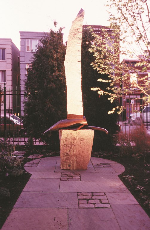
| The entry garden has a more formal look than the main courtyard, making it a great setting for strong sculptural statements, even at night. The paving materials were mixed to make a mild sculptural statement of their own – but not in competition with any piece that might find its way into this key display area. |
Once the hardscape materials were selected, the selection of plant material to fill predetermined spaces was straightforward. We knew we needed to meet certain criteria – ability to thrive in the site, characteristics suited to landscape lighting for nighttime viewing and suitable leaf colors and textures.
Those needs in mind, we started with a number of unique specimen plants, such as two weeping copper beeches (Fagus sylvatica ‘Purple Fountain’), weeping Norway spruce (Picea abies ‘Pendula’), fastigiate European hornbeams (Carpinus betulus ‘Fastigiata’), weeping white pine (Pinus strobes ‘Pendula’), weeping Sargent hemlock (Tsuga canadensis ‘Pendula’) and two western red cedars (Thuja plicata) we found growing together in a nursery.
These sculptural plants, almost exclusively placed near the watershapes or stonework, add impact to the landscape in the winter. Their sculptural qualities also enhance the art and add a plantsman’s touch to the garden.
From the start, we agreed that the garden wasn’t to be about flowers, although there is always something blooming. Foliage colors tend toward dark greens, reddish bronzes, chartreuse and blues, with grass-greens at a minimum. Perennials and ornamental grasses are planted in bold sweeps, so if only one species is blooming in the garden, it still has an impact. What flowers there are have deeply hued pastel shades, unless of course we are talking about springtime, when everything seems boldly colored as bulbs sprout and we wait for trees and shrubs to come into leaf.
SETTING THE STAGE
Appreciating a piece of sculpture generally means being able to see the whole work. Knowing that, we set up lines of sight that took advantage of the berms and pathways to offer visitors both long and up-close observation points.
Many sculpture gardens and galleries seem to feel a piece of art isn’t complete unless it’s resting atop a concrete slab or a nice bed of white marble chips (or worst yet, atop a network of railroad ties). We see these as poor solutions that distract from and even demean the beautifully crafted and often very expensive pieces of art on display.
It’s certainly true that many pieces of sculpture look best when slightly elevated, so we use the berms as naturalistic display platforms for smaller pieces. When it comes to big bronzes and larger stone pieces, we use compacted gravel or paved surfaces on the flat to provide more than adequate stability – even in our winters.
We began our work at the Wood Street Gallery and Sculpture Garden in January 1999, and the project was completed by August of that year. Making it all work took close, ongoing, three-way communication between the owner, the contractors and me, with each participant bringing his or her skills to the effort.
It was a challenging and satisfying process: In the end, we all had the pleasure of watching the sculpture garden emerge as a work of art in its own right.
Rosalind Reed is president of Rosalind Reed Associates, a landscape-design firm headquartered in Chicago. Reed founded the firm in 1991 following a successful career in the commercial real estate business. Her firm creates unique exterior environments for a variety of commercial and residential clients, and its work has been featured in a variety of publications including the Chicago Tribune and on the PBS television series, Victory Garden. In 2000, two of her gardens were awarded Gold Awards of Excellence from Illinois Landscape Contractors Association, and she’s a recent participant in the Genesis 3 Design School.


