


Enduring Beauty


Last month, I entered into a discussion of the emergence of a whole range of beautiful finish materials that have helped (in my humble opinion) turn watershaping into an art form. My focus there was on glass and ceramic tile; this time, I want to turn the same sort of attention to plaster and exposed aggregates – huge additional factors in the industry’s ongoing creative momentum.
Before I begin, let me draw an important distinction: The artistry in watershaping is not so much based on the types of materials we choose or how special or costly they might be; instead, it has everything to do with how we use them. It is possible to take the most precious material and create a visual abomination; conversely, modest materials can, in many situations, be wielded in such a way that the results are spectacular.
In other words, our aim as watershapers should single-mindedly be to figure out how to use the materials we have at our disposal in balanced and appropriate ways.
BEYOND THE BASICS
For all my passion about the jewel-like wonders of glass tile, my first love has always been plaster. It’s a wonderful material that, used correctly, can create a rich look that changes subtly through the years. As I see it, the key to using this material to best effect is an understanding of color and the ways the colors we choose work in the context of specific site conditions.
Many years ago, when I was chairman of the Builders Council for the National Spa & Pool Institute (now the Association of Pool & Spa Professionals), I brought up the subject of colored plaster at a meeting and mentioned my love of using green to create inviting water. One of the council members spoke up, questioning why I’d want to make the water look as though it was shot through with algae.
| By working with a plastering company that’s open-minded when it comes to color, I’m able to open a vast realm of possibilities for my clients and their watershapes. In addition to familiarity with color theory, knowing what works in which contexts takes experimentation, careful observation and experience, but a small investment here can lead to spectacular results. |
Beyond the limitations of that unimaginative point of view, the comment revealed to me the gap many builders of a past era had when it came to understanding color. Happily, that situation has changed (although there are still substantial pockets of resistance), and many more builders these days are willing to use color in ways that have elevated plaster beyond being a bland commodity to a point where it is now a design element that makes watershaping into an art form.
 I’ve been fortunate through the years to work with a plastering company – Tony Marquez Pool Plastering of Sun Valley, Calif. – that is open to working in color. Tony and his sons, Luis and John, are simply the best, and I’ve always admired their collective professionalism, creativity and unflinching attention to detail.
They understand that by using plaster with oxides and pigments, we can achieve an incredibly broad range of precise looks that reach well beyond the usual white, gray and black. They’re savvy enough to know (as few seem to do) that when you use a green oxide, for example, you get distinctly different looks when you combine it with white cement instead of any of the myriad gray cements. In fact, Tony was the first plasterer I ever worked with who was willing even to explore these variations and create samples for clients who were looking for unique or precisely toned finishes.
It is exactly this openness and flexibility that has ushered in the current era of adventurousness in watershaping. Yes, we were still working with the same basic plaster material the industry had been using for decades, but we were now applying an understanding of color and manipulating the material in ways that opened an almost infinite range of possibilities. Just with a basic green oxide, for example, we can create subtle hues, pastels and tints with variations in tones.
Having championed this sort of experimentation with plaster, I become frustrated when I’m confronted by those who still think in exclusive terms of white, black or gray. They’re simply missing out on a spectrum of possibilities they could use to give their clients something that no one else has.
BREAKING FREE
I look at this way: When you use plaster in the context of the colors seen in waterline tile, coping, decking or the home, it becomes something akin to paint. Yes, mixing samples and developing truly custom colors takes time, effort and resources, but what you can achieve will be light years beyond the limited palette that shackled pool design in years past.
In that sense, plaster is not a fallback option or a lesser choice. Instead, it’s an amazingly flexible design element and a critical component in creating an overall impression.
|
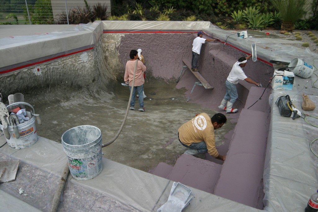
Key Considerations Installing plaster and pebble finishes is an art form unto itself, and doing it properly is all about skills in troweling and finishing contours, steps, benches and other internal structures that reach well beyond this discussion. At the same time, preparation for use of those skills is very much within my purview as a watershaper. First and foremost, for example, the shotcrete or gunite substrate must be finished properly. This is why I am ever vigilant when my shotcrete subcontractor is at work to make certain walls are straight and plumb without undulations: It should never be left to the plasterers to create the shapes and dimensions of the interior design or make up for deficiencies of the concrete applicator’s work. In addition, I make certain the concrete substrate is free of dirt and debris when the plasterers arrive on site, because I don’t want to compromise proper adhesion of the plaster and again think it’s my responsibility, not theirs, to make everything ready. The same holds true with plumbing penetrations: I make sure they’re all stubbed out far enough so the plasterers aren’t asked to leave divots in the plaster surface. This is among the many reasons why I work with quality firms and stick with them through the years. Good subcontractors know what their responsibilities are and complete their work in ways that set things up for the next crew that will come on site: When I find plasterers who know enough not to apply plaster anywhere other than the interior surface of the pool, keep the tile clean and pay attention to basics such as not dragging their hoses over new planting beds, I am a happy man. This isn’t rocket science, but it does require care, supervision and a generous dose of common sense. And when the crews are gone, I know for myself that I need to use a clean hose to fill the pool. Yes, that sounds incredibly simple (and it is), but if you use a hose that’s dirty, you can completely ruin a fresh plaster finish. And for goodness’ sake, a new hose costs, what, $50 tops? At that rate, it just seems crass not to buy your client a new hose! — D.T. |
These days, I routinely work with plasters in varying shades of green, gray, brown, cream, red, lavender, mauve and, very occasionally, white. The only limitation is my imagination and my understanding of the relationships among colors, water, external light sources, the environment, details of the setting and the way they all interact. Explaining those relationship can get complicated in a hurry (time to break out the physics books!), but the simple fact is that experimentation and careful observation can help just about anyone see how dazzling the effects can be when everything comes together.
In more practical terms, the colors I use in pools are about the architecture and the surrounding environment and the role of water in a given space – whether it is to be, for example, a highly reflective surface or a free-standing, glass-tiled work of art. In that context, I seldom use white plaster because it amplifies the conventional sky blue cast of pool water. If that’s what the setting calls for and my clients want to head that way, I’ll use white. But as a rule, I think the visual effects are much more compelling with other choices.
Unfortunately, among those who’ve paid attention to those “other choices,” relatively few of them are plasterers. That’s understandable, because few have been challenged to open their minds and eyes to the range of available options. What this does, however, is make it incumbent upon designers and builders to get involved in the educational process and insist on doing things in new ways.
The good news is that a number of plastering companies now “get it.” Nonetheless, experience shows me how much more work needs to be done. Helpfully, my good friend Randy Dukes and others at the National Plasterers Council have moved to the forefront of this educational process, investing time and the collective energy of its membership in advancing the state of the art. What they’re doing is creating situations in which plasterers become true collaborators rather than people who just show up to do their jobs.
What Randy and others have taught all of us is that plaster – and especially colored plaster – is a natural material that does not provide a visually uniform finish: It will always have a somewhat mottled look and will change over time. Some consider that a drawback, but I see it as adding visual interest and beauty.
The key here, of course, is clearly informing clients about the nature of the finish and the fact that it will almost certainly change as time passes. In addition, I let them know that plaster is a relatively “soft” watershape finish and that expert, routine maintenance is always a good idea if the aim is to keep it looking great.
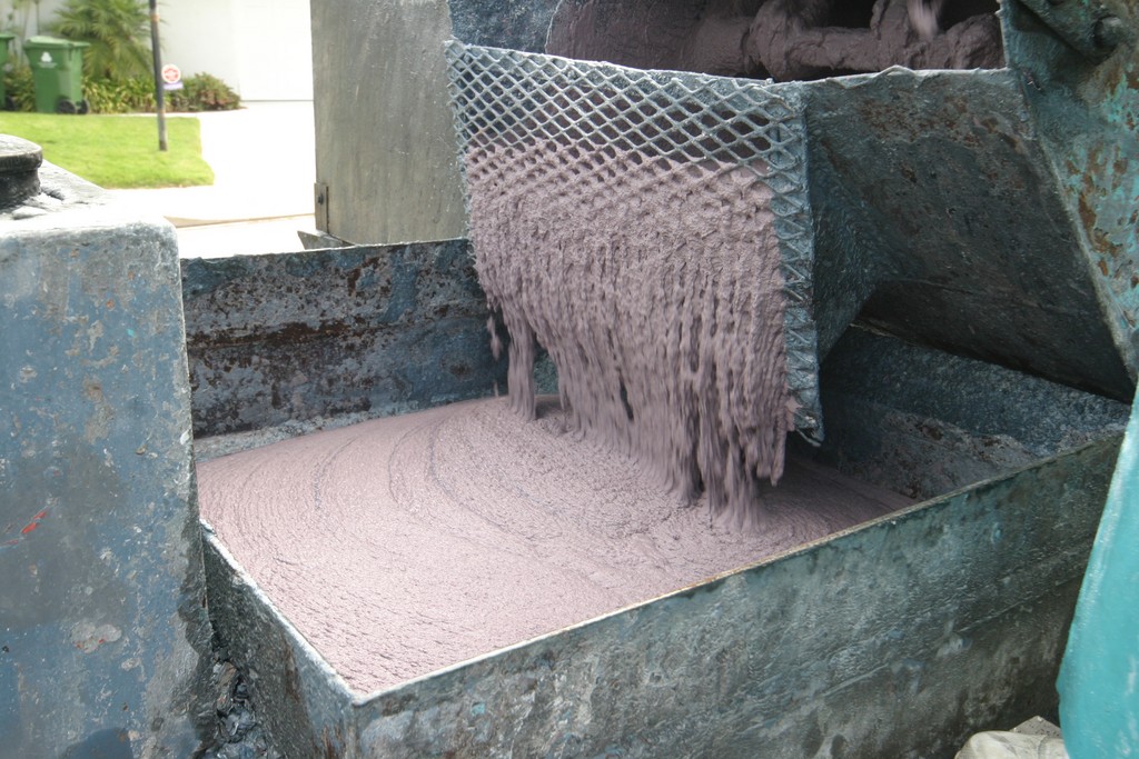
THE PEBBLE REVOLUTION
While plaster finishes for watershapes date back to ancient times, the use of exposed-aggregate (or pebble) finishes is of much more recent vintage. I’ve heard a number of claims about where it all started and when, but it’s my simple position that none of that matters because these finishes are now widely available and truly wonderful.
Of the many options out there, I have the most direct experience with those from Pebble Technology of Scottsdale, Ariz. That’s not to demean other suppliers in any way; in fact, I’m happy there are so many choices because the competition among suppliers seems to be leading to an ever-broadening range of design possibilities.
Personally, I love the available color palettes and the look and feel of these finishes. In my case, I tend to stick with one or two favorite Pebble Tec colors – either the Bordeaux (also known as Majestic Plum) or Sandy Beach. Both of these soft, rich colors change appearance depending on the depth of the water, which is a variability I love to exploit. Both also have the advantage of working wonderfully well with a wide variety of stone materials.
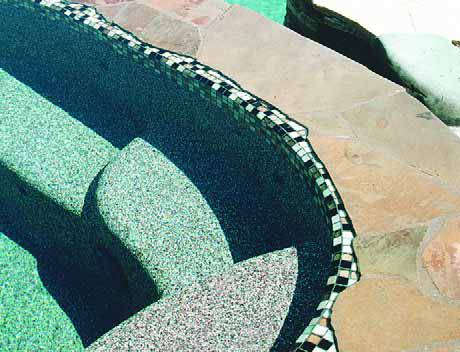
| I’ve always been intrigued by the differences in appearance reflected by pebble finishes at different depths, and it’s a phenomenon I often exploit on behalf of my clients – particularly those who are interested in more naturalistic looks for their watershapes. |
Pebble finishes in general also have an edge over plaster finishes in that the former is much harder and more durable than the latter. Pebbles also suit clients who are after a more naturalistic, rustic appearance in their watershapes.
By the same token, I rarely use pebble finishes in modern or contemporary designs: I see the look and feel of these finishes as not harmonizing well with crisp, clean, sharp lines and angles.
What I think I like most about is their texture, which represents a complete departure from plaster or tile. Some say it’s too rough to the touch, but having been in literally hundreds of pools with pebble finishes, I find the feel to be extremely comfortable. The key here is making certain clients know what to expect with respect to both appearance and texture.
Some have said through the years that pebble finishes have had problems with delaminations, especially on benches and steps. My observation has been that this isn’t a problem with the finish at all and is instead a problem with substrate.
As I’ve written countless times in this space, whenever and wherever I see finish delaminations, in almost every case the problem rests with the fact that rebound was used to create portions of a vessel’s interior structures. If the issue manifests itself in the finish falling off, that’s not the fault of a pebble (or plaster) product, yet the fact remains that it puts plasterers in the difficult position of defending their work.
I dodge these issues altogether, insisting on proper shotcrete and gunite application and supervising the process to make certain everything is done as I think it should be – no rebound!
BACK TO COLORS
Another oft-repeated note in these columns has had to do with colors and how they are combined in and around watershapes. I’ll bring it up again here, simply because choices made about colors are generally more critical with plaster and pebble finishes than they are with other surface materials. (For more on the subject, see also the sidebar below.)
|
Finding Harmony As a design principle, it’s my firm belief that a plaster color should harmonize with the color of the tile at the waterline – no ifs, ands or buts. In most cases, I find that it’s far easier to select a tile first and then work my way back toward a color for the plaster rather than the other way around, basically because there are so many waterline options available to me now that it simplifies the process to work this way.
Once the tile is chosen, I then make a decision about plaster that will make the vessel’s interior as monochromatic as possible. This concept extends past the plaster itself, which is why I’m so big on using trim pieces (drain covers, inlets and spa jet fittings) that work with the finish color as closely as possible – or can be made to do so by applying some of the finish material directly to the trim pieces. I’ve worked a lot through the years with the folks at Color Match Pool Fittings (Surprise, Ariz.), who make a variety of products that help me make fittings and drain covers effectively vanish into the background, whether it’s the color of the materials they use or has to do with inlaying a trim piece with pebbles, plaster or tile. Better still, their line includes 10-inch drain covers – a must if you’re a believer in using big plumbing to create efficient hydraulic systems. — D.T. |
Perhaps the most egregious of all color-choice miscues involves the use of black plaster with blue waterline tile. If you take one and only one point away from this discussion, let it be that this combination should never, ever be used! What happens when you combine black and blue at the waterline is that you essentially create what emerges as an almost neon band of blue that attacks the eyes and completely deflates the deep, reflective quality you were after with the dark plaster.
Happily, this blue-on-black abomination seems to be fading away with time, but I’m still confronted almost daily by another ridiculous selection decision – that is, white plaster with blue tile: To my eyes, this is almost as offensive as the blue-on-black problem just mentioned. It’s so common a usage that it’s basically become traditional, the result being that many people unquestioningly accept these blue-on-white monstrosities without thinking, despite the fact that the combination attracts undue, undesired and unreasonable attention to the waterline.
For my part, in cases where I’m not using glass tile to create a work of art, I believe that the waterline treatment is best taken in one of two directions: Either seek to make the tile look as though it’s an extension of the interior finish, or make it seem as though it’s tied to the coping. There’s also a third possibility of making the waterline work in both directions by creating blends that work between the interior finish and the coping.
Look at it this way: Do you really want someone to walk into the backyard and say, “Oh, my! Isn’t that beautiful tile at the waterline?” Or would you rather have them say, “Wow, isn’t this backyard just gorgeous?” It’s all about context, and it’s my belief that a thoughtful design process should inevitably lead a competent watershaper to wise choices.
Next: A look at coping and decks around watershapes.
David Tisherman is the principal in two design/construction firms: David Tisherman’s Visuals in Manhattan Beach, Calif., and Liquid Assets of Cherry Hill, N.J. A designer and builder of custom, high-end swimming pools since 1979, he is widely known in the pool and spa industry as an advocate for the highest possible standards of design, engineering and construction. He has degrees and credentials in industrial design, scientific illustration and architectural drawing from Harvard University and Art Center College of Design and has taught architectural rendering and presentation at UCLA. An award-winning designer, he serves as an industry expert for California’s Contractor State License Board.