Emotional Foundations
In most projects, great work requires the watershaper’s personal understanding of who the clients really are, deep down.
That doesn’t mean we have to become our clients’ best friends or marry into their families. Rather, creating watershapes at the highest level involves a different kind of relationship, one in which a shared vocabulary and common vision develop through discussions of water, stone, art, plants and the orchestration and staging of experiences that will occur in given spaces.
Take the project covered here as an example: The scope of the work, an unlimited budget and a mandate for the highest possible levels of quality were enough on their own to force us to explore the limits of our skills and creativity. More important from our perspective, however, is that we think of what we accomplished as the truest possible expression of our clients’ personalities – a distillation we see as residing at the heart of all the very best designs.
As is the case with many large projects, this one grew from relatively limited scope to encompass every square foot of a large estate’s exterior spaces. Through the various phases, we’ve come to know this wonderful couple as people whose affluence and prestige are more than matched by their sensitivity, humanity and openness. The result, we think, is a work of art that has transformed both us and our clients.
ONE TO ANOTHER
Our relationship with these remarkable people dates to the mid-1980s, when his parents hired us to design and install their landscape. At the time, it was the most sophisticated and involved project we’d ever tackled. Indeed, it instantly elevated us to a whole new level with respect to the scope of our work and the caliber of architects, designers and other talented people we joined on project teams.
We came away from that initial experience both enlightened and inspired by the potential that can be unleashed when exterior design is approached as an art form.
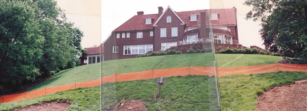
| PRECARIOUS: When we arrived, the house sat uneasily on its perch – ready, it seemed, to roll down the hill. The tennis court and pool below were nice, but the access was so awkward that the family usually hopped in a car and drove down instead of trying to traverse the slope. Almost as soon as we began construction, the house settled into its position more comfortably as the new ‘support’ structure began transforming the hillside. |
Many years passed before we heard from the son’s wife. We hadn’t met her when she called us in 2004 with a request to help her in the placement of a piece of sculpture. Their home, she explained, was in the midst of a $20-million renovation – and we picked up the sense right away that the project was in trouble.
We’ve worked with many wealthy clients through the years, but this couple is a cut above. Although they are intensely private folks who maintain a low public profile, they are also among the very wealthiest people on the planet and are accustomed to having things turn out exactly to their liking. Soon, it was apparent that they thought the landscape work on their estate had rolled way off track.
As we saw it, the problem was too much segmentation in the design: Various elements were disjointed, incongruent and utterly lacking in continuity – and the clients had noticed, which is why they asked for our input on the basis that the outcome of our work for his parents had been so positive.
|
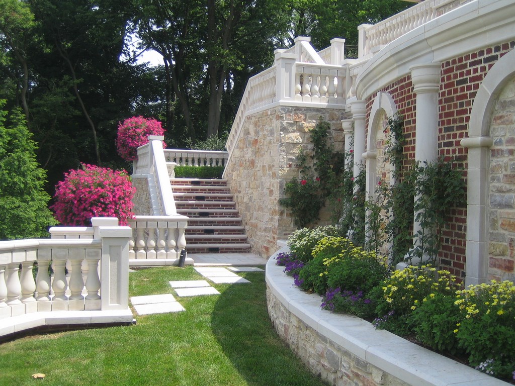
Formal Details The stairways and balconies of the terrace structure described in the accompanying text all have classic balustrades. We included them not because they were our first choice, but rather because they’d been included in an upper veranda designed by the architect. We think they’re a bit much for the space, but our use of them makes an important point about our approach to landscape design: We rarely (if ever) make architectural decisions about primary structures, but if we ignored such features in our work it would create obvious disconnects between home and landscape. In this case, we set aside our inclinations and embraced the balustrades in a big way. This is an important point: One of our primary charges in this and all other cases is to find ways to integrate architectural design with the landscape. In that spirit, we decided to press the balustrades forward and celebrate them as a key design feature, using them to define pathways and border the terrace structure’s architecture as distinctly sculptural details. — C. & G.K. |
As it then stood, the plan called for a diverse landscape with lots of different “rooms” and a disturbingly narrow terrace off the back of the home, which sits atop a 60-foot slope overlooking wooded acreage and a river that marks the back border of the property. To that point, nobody had mustered the courage to say that the program was basically a non-starter.
To get the ball rolling again, we had to bring the clients into our world – that is, we invited them to come to our studio to discuss ideas, develop a rapport and establish common ground and a unified vision of the work. Many ultra-wealthy clients won’t engage in the process at that level, instead working through architects or property managers, but we pressed for the meeting anyway: We think it opens important doors and gives us insights we need into clients’ tastes, personalities and passions.
In this case, we suspect they were desperate enough that they agreed to join us in our studio – at which point we confronted them with exactly what we saw as the design’s deficiencies. We made it clear that we thought the project’s architects had done a wonderful job with the home and its interior spaces, but we had no idea how they’d respond to so unvarnished a critique of the exterior program.
Our aim as we moved past the critique was to define a grand set of possibilities and specific strategies for forging connections between the glorious home and its surroundings. Their response couldn’t have been more positive. As it turned out, they both welcomed and respected the straight talk and brought us onto the team on the spot to head up design and construction of all the estate’s exterior spaces.
CASE WORK
The neighborhood in which the home stands is the most exclusive in Columbus, Ohio – right near the governor’s mansion on a quiet, wooded street. It’s right in the middle of town, but it feels secluded and rural nonetheless. (When we started, the property included just three acres, but they’ve since bought an adjoining two-acre lot and are developing it into a private arboretum.)
As cosmically wealthy as these people are, their home is relatively modest. It sits on a lot that’s about 600 feet deep (with a drop of more than 75 feet from front to back) and has an eclectic look with the simple lines and linear fenestration of the Arts & Crafts movement along with suggestions of English Tudor style. The appearance is formal, but it seems neither pretentious nor ostentatious.
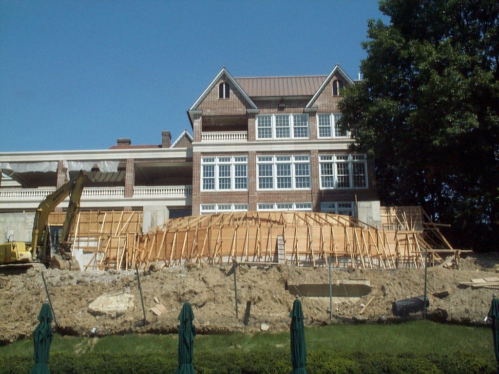
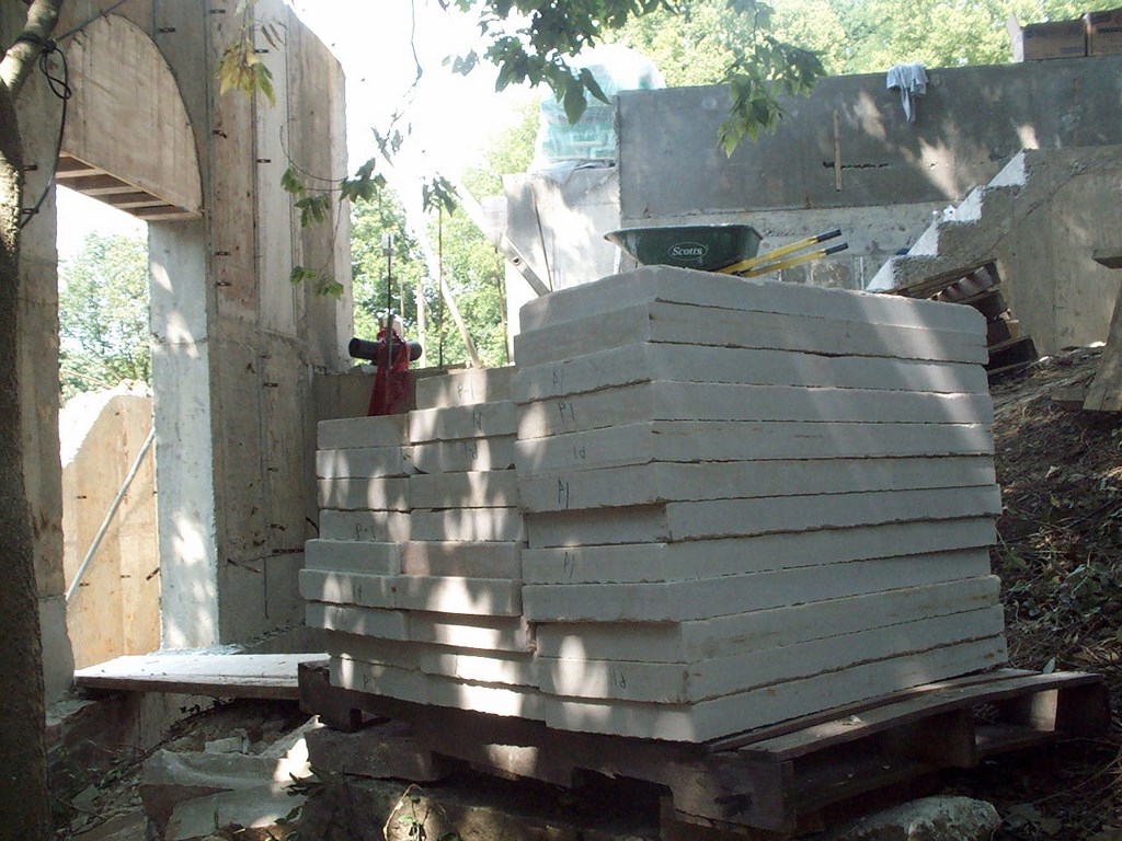
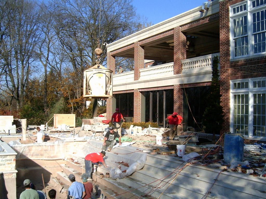
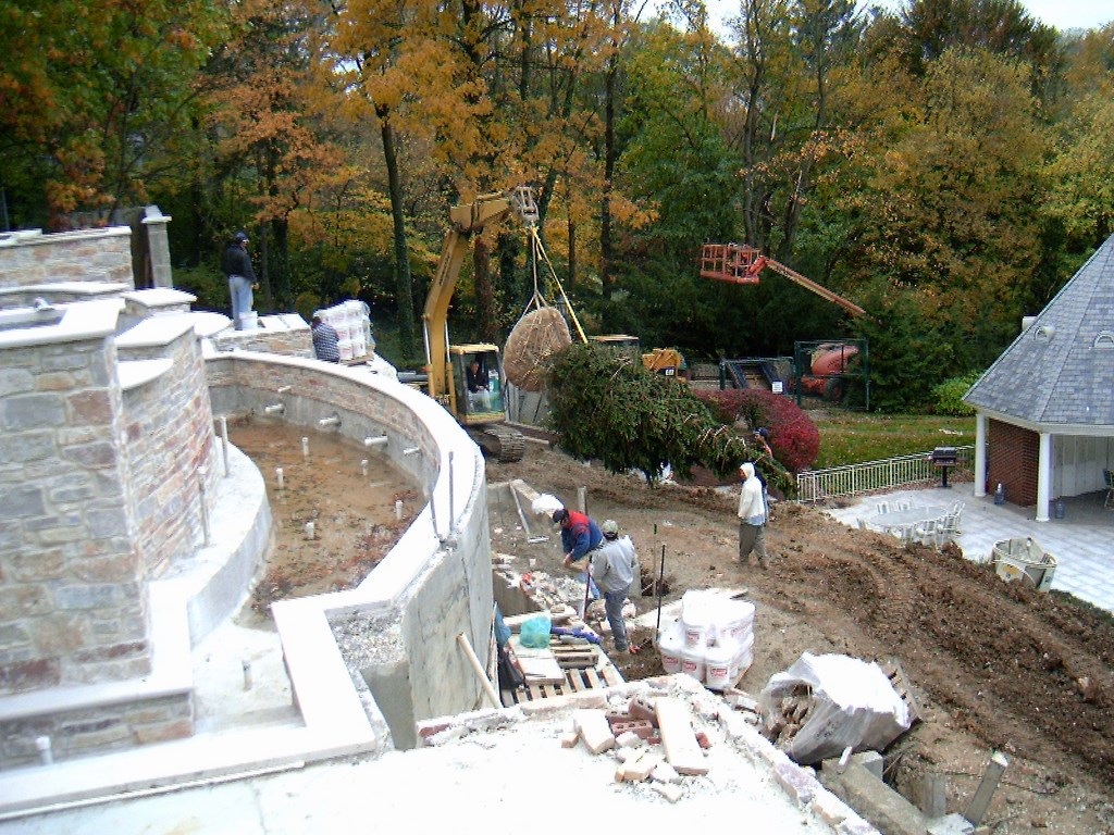
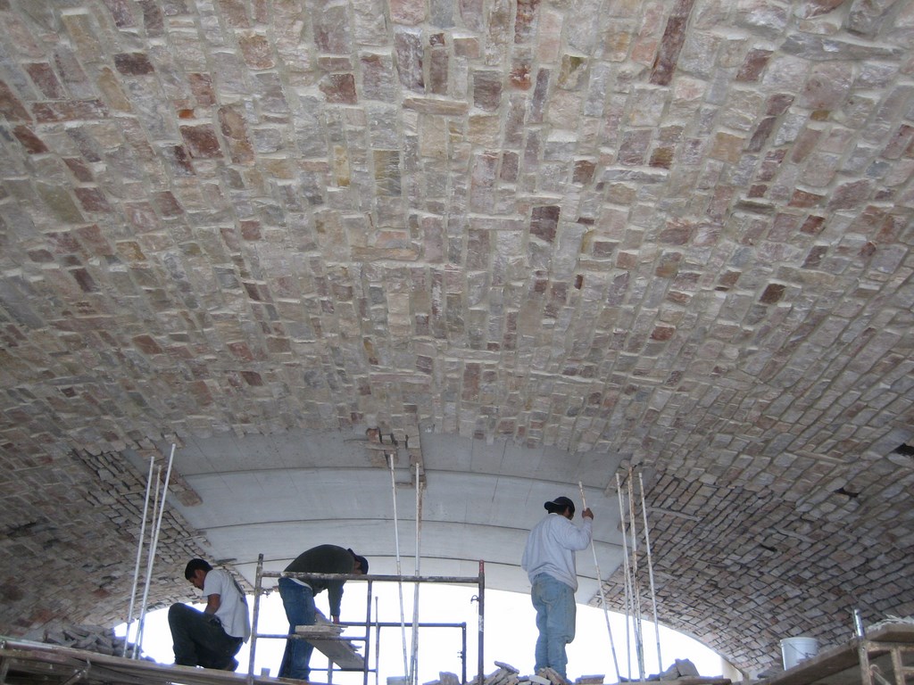
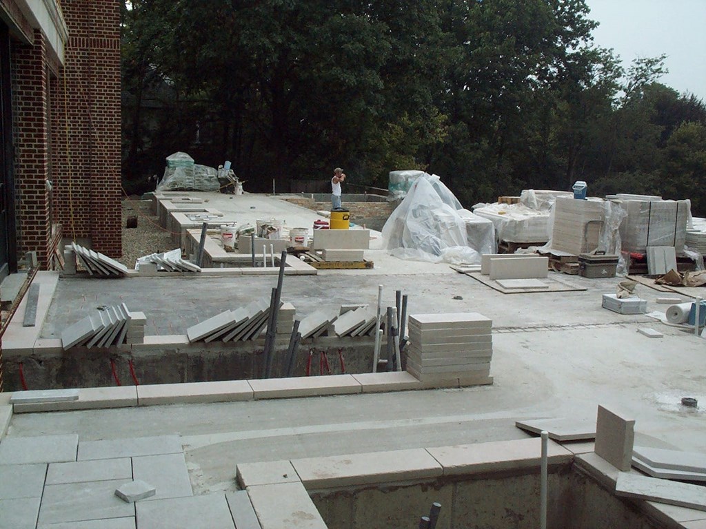
| OVERSIZED: Everything about this project challenged our usual perception of scale. We didn’t just accommodate stone, for example; instead, we handled lots of stone. We didn’t order up a couple scaffolds; we called them in by the truckload. And when you consider forming, steel, plumbing and the sheer volume of concrete involved with creating this huge pedestal, the normal concept of what’s involved in a job expands to amazing new levels. |
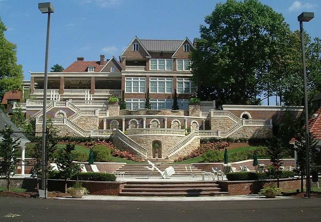
Our first task involved reconciling the rear profile of the house with its surrounding topography. The renovation had raised the home to a full four stories on the back side, and given its perch on the edge of a dramatic slope, there was a problem of visual balance and weight: The structure seemed ready to jump into the air and dive down the hill into the river.
The solution was based on the simple concept of base-plane extension. With something that tall, the idea is to extend the base in order to balance the vertical dimensions with horizontal geometry. (This is why, for example, the base of the Statue of Liberty is so large: It gives the viewer the immediate sense that the statue is well supported and anchored firmly to the ground – just what’s needed to create a visual comfort level.)
In this case, we drew just a couple of simple lines on an elevation plan to show the dimensions and spatial orientation of the basic concept. As it turns out, those lines eventually became a 300-foot-wide base structure that rises more than 50 feet up the slope in a series of terraces.
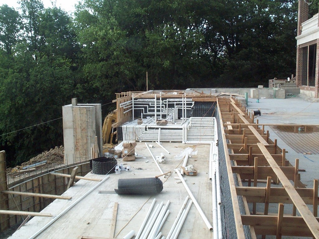
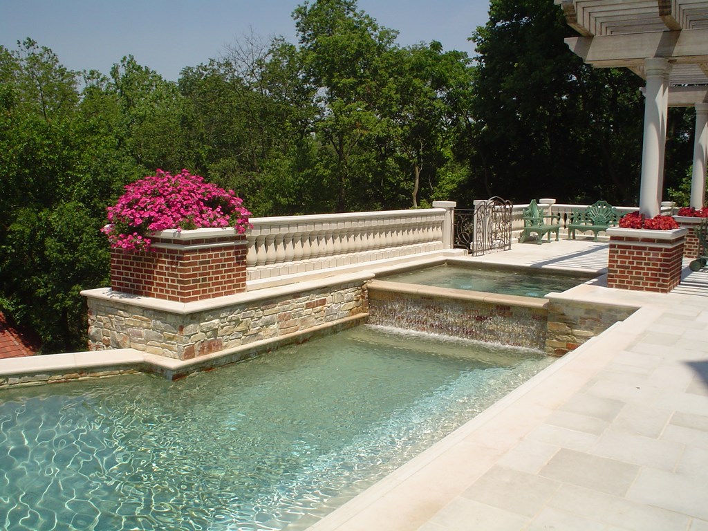
| DRAMATIC: Our aims in designing the watershapes for the top of the terrace structure were two: We wanted to establish a center for family relaxation, but we also wanted to exploit the view and set the stage for entertainment. But what meets the eye in the finished product reveals little of what went into actually building the pool, its three-section vanishing edge and the spas on deck level and below: It has an overall look that’s a dead-certain indicator of the precision and care with which we worked. |
Through our discussions with the clients, they came to see that the terracing served two fundamental purposes: First, it created a base that made the house visually fit into the space; second, it gave us the spaces we needed to tie the home to its landscape, both visually and functionally.
We took the preliminary idea and developed scale models as well as an extensive library of three-dimensional AutoCAD drawings for use in evaluating details and adjusting hardscape configurations. This is a case where two-dimensional renderings were simply inadequate: We needed three dimensions to give the clients a true picture of the solution we were proposing.
STEPWISE LOGIC
The terrace structure begins up top with a broad deck adjacent to the home’s exercise facility and lower living areas. As mentioned above, the original design had called for a narrow terrace whose space was restricted by the presence of a large vanishing-edge pool. The whole thing was cramped and out of scale.
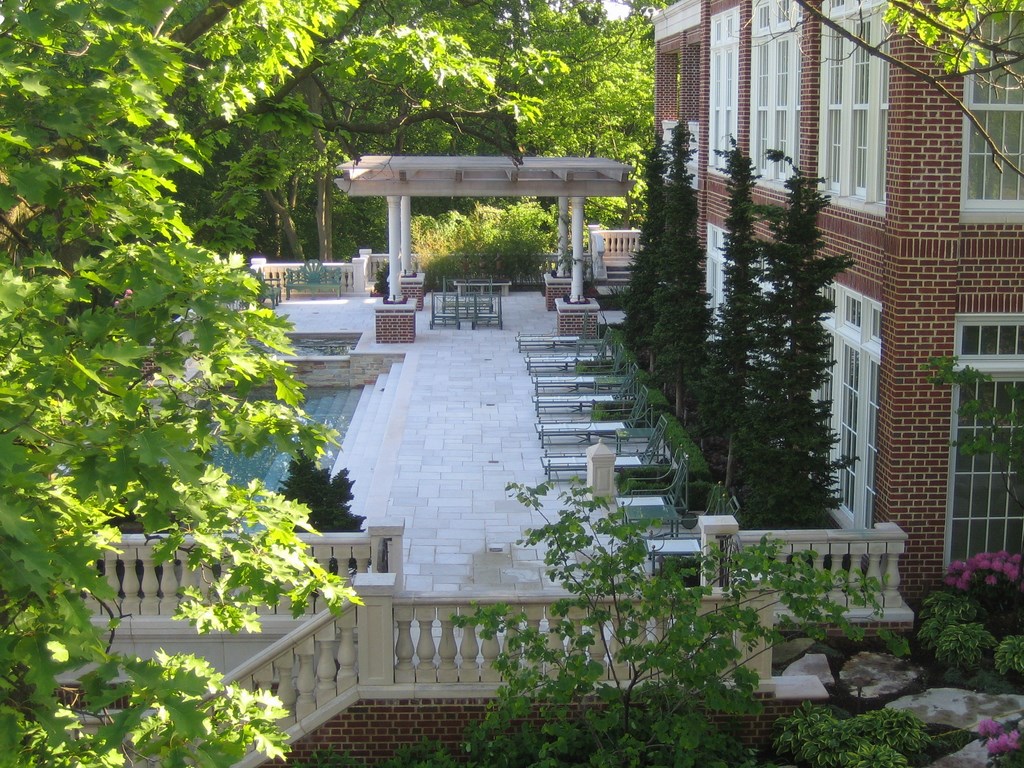
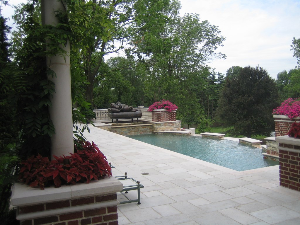
Now, the spaces inside and out are set up for warm and very casual living. The wide doors and windows that mark the limits of the interior space open onto a deck that is some 130 feet long and more than 30 feet wide. The outer edge of this uppermost level is configured as a sweeping curve – and still includes a big, 50-by-30-foot lap pool that incorporates the sweep of the deck’s outside contour.
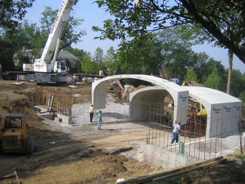
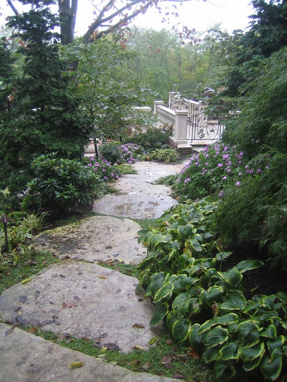
| THE BIG PICTURE: Our work on the estate went well beyond the terraced hillside and included everything from multiple formal gardens to a huge, stone-veneered bridge and a large, informal garden that leads around the side of the house to offer access to two of the terraces. We’re also involved in developing a private arboretum on an adjoining lot to complete this incredibly involved suite of projects. |
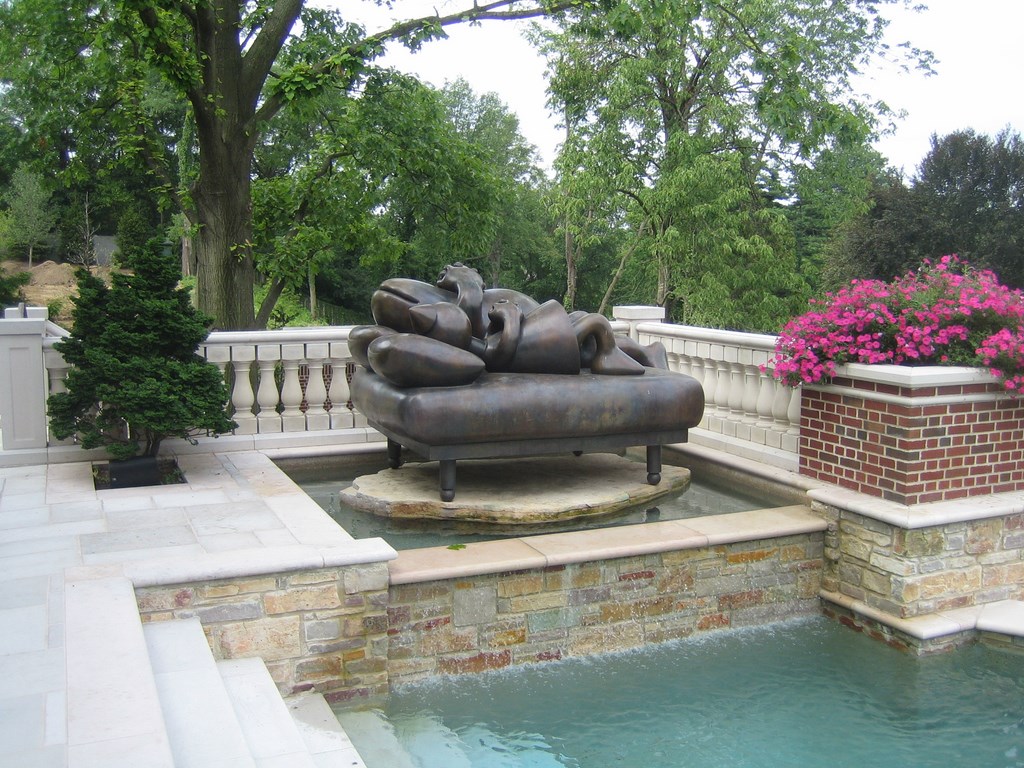
Water spills over the edge at three separate spots. At one end of the pool is a spa that includes a pedestal supporting a whimsical bronze sculpture of a frog and a princess.
The deck and edge details are all surfaced in a cut, flamed limestone material we found at a quarry in Wisconsin. The color palette here ties directly into the house and its expanses of red brick and gray-toned finishes. The stone has all the right grays – and in firing, all sorts of wonderful marbleized red veins emerge.
|
All Hot There are three bodies of water in the system described in the accompanying article: The upper-level spa doubles as a reflecting pool for a bronze sculpture and spills into the main lap pool. In turn, the pool spills over three weirs into the therapy spa below, which is essentially the catch basin for the segmented vanishing edge. All are linked hydraulically, so, for the lower pool to be effective in hot-water therapy, the entire upper pool must be heated to spa temperature. This would not be a ready option for clients looking to save money on energy and is admittedly a highly unusual configuration. It’s also worth noting that the upper spa can be isolated from the rest of the system to save the homeowners time in getting the water to appropriate spa temperature. That time can be considerable, as the entire system holds well in excess of 50,000 gallons! — C. & G.K. |
It’s a rich, elegant look that embodies warmth while aligning with the generally formal architecture of the house. In fact, the stone worked so well that we ended up using it all over the site – as decking, weir stones, edge banding and most significantly on the stairways that are a major feature of the design.
We accented this base material with Chilton stone, another complex Wisconsin limestone that has a vivid range of buff, red, cream and gray colors. We used this in a variety of places, generally as borders and for details on walls, stairways and around the watershapes.
By extending the upper deck away from the house, we were able to accommodate a large swimming pool while leaving plenty of room for relaxing or entertaining. This space also affords one of the property’s prime observation points: You almost feel like an eagle perched to monitor the landscape far below.
Almost immediately, this became the casual destination of choice for the family and perfect indoor/outdoor transition. From here, however, stairs on both ends of the pool invite visitors to explore lower levels of the terrace structure – features that are only partially visible from above.
GRACEFUL TUMBLING
Where the top level is wide open and spacious, the second level offers a far more intimate set of experiences.
Our main idea was to create a completely separate environment here, the key feature being a second watershape. Functionally, it’s the catch basin for the trio of vanishing edges above, but we’ve enhanced its role by turning it into a long, narrow, shallow spa in which the waterfalls from above pour down onto seating areas and themselves become therapeutic features.
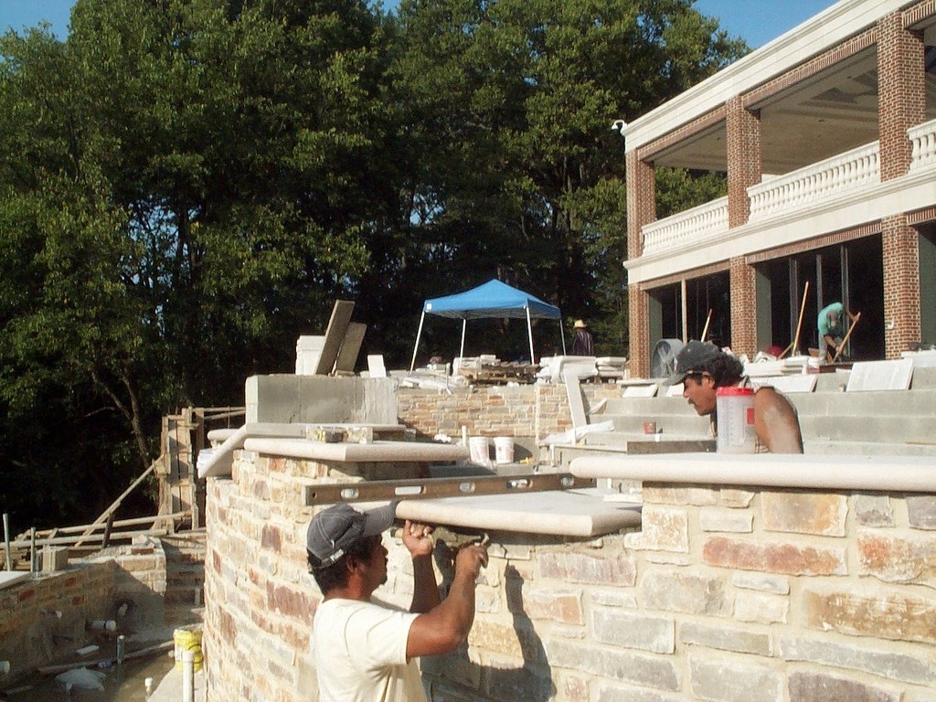
| FINISHES: As soon as any part of the base structure was complete, we swung into action to apply tons of stone, brick, pebbles and assorted other materials to finish various surfaces. This is where the precision we applied in setting the base structure was so important: With a composition so large and so fundamentally balanced, being off even a little would have meant a distinct (and completely unacceptable) visual flaw. |
This is, in fact, one of our very favorite spots on the entire property. The pathways toward this lower pool move through walled porticos and a variety of planters and hardscape features that follow the sweep of the deck above. This has the effect of hiding the water (which can’t be seen from above, either) from view as you move from the edges to the center of the space and creates a distinct sense of the watershape as being part of a separate “room” – a pleasant surprise for those walking down to the second level.
We knew in designing this space that we were on to something special, but it wasn’t until the entire composition was finished that we perceived its full effect: You really have to see it to know just how romantic and intimate it is.
We especially love the contrast from level to level: The lower pool is almost completely private, yet it shares the same breathtaking views as the upper terrace and is open to the landscape. You’re surrounded by all these rich stone details and plantings in an enclosed space, yet you are still connected to the beauty of the surroundings and distant views. Moreover, we planned movement through the space in such a way that when you come down the steps, you are suddenly directed toward the water and must make a 90-degree turn at a landing to avoid stepping down into the spa. There is no visual boundary: The water is completely linked to the dry space.
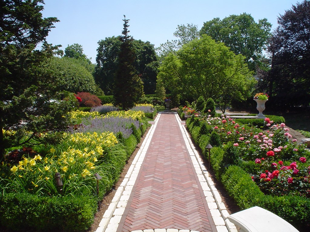
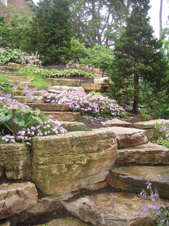
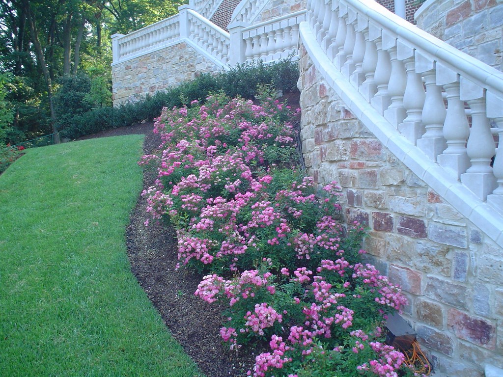
| FLORAL DELIGHT: With all of the stone- and brickwork, the addition of large volumes of plant material – trees, shrubs and flowering plants in endless varieties – served to soften the hard edges and make the spaces flow seamlessly from one to another. The colors are a major ingredient in that softening, and maintaining their contribution is something that keeps the maintenance crew busy – other than when snow blankets the ground, that is. |
This detail was directly inspired by Frank Lloyd Wright’s Fallingwater, where there’s a set of steps that leads down from the heart of the living space and directly into the river that flows beneath the home. Although the style is distinct from Wright’s organic modernism, the effect of linking footpath and water works in a similar way.
Another design reference is to the multi-tiered gardens, pathways at varying levels and complex terracing captured in artists’ renderings of the Hanging Gardens of Babylon – a reference not lost on our globe-trotting clients, who are students of history, art and religion.
Tying such references into the experience and beauty of their own spaces created a direct sense of value for them and serves to make these areas integral parts of the home itself rather than separate exterior statements. We’ve been gratified to learn that the clients love to take their friends through the various areas to share the surprises.
LOWER LEVELS
The third level down the slope is just above the grade at the bottom of the terrace system and is meant to provide a transition to the softscape that covers the rest of the property.
The steps from the spa level bring the visitor to a broad, lawn-covered terrace bordered by railings and other transitional architecture. We had originally thought of finishing the area all in stone, but the clients wanted more green space and thought a grassy veranda reflected a sort of Italianate sensibility that seemed appropriate at the base of such a grand structure. Again, there’s a mild element of surprise in that planted balconies are not all that common.
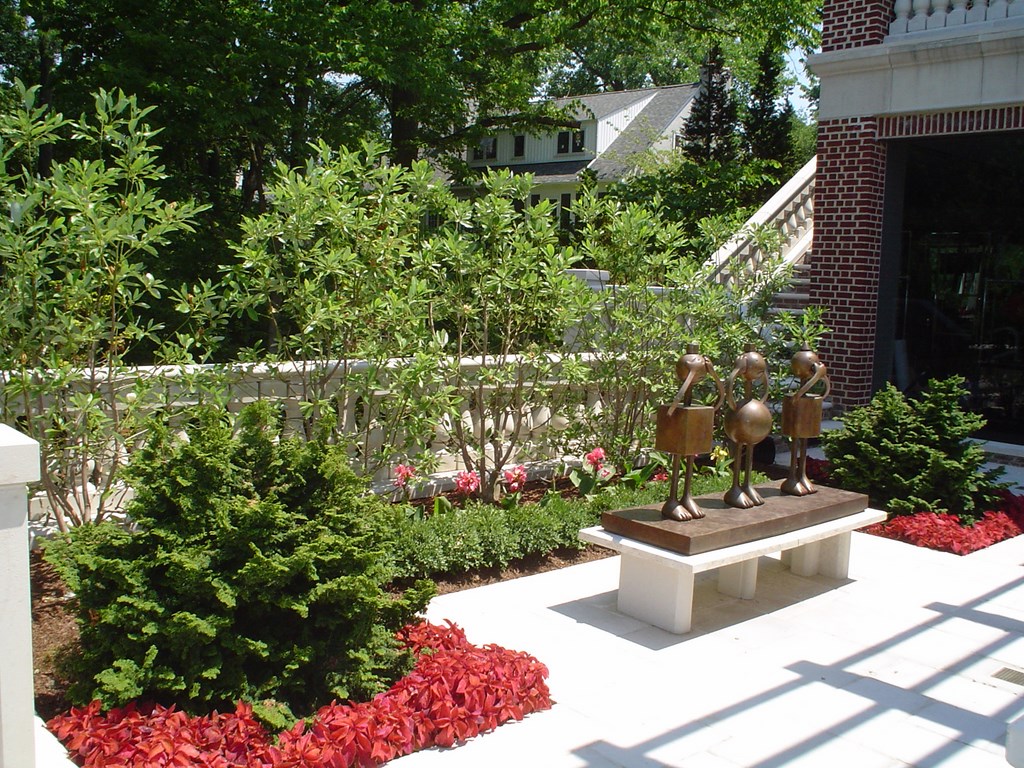
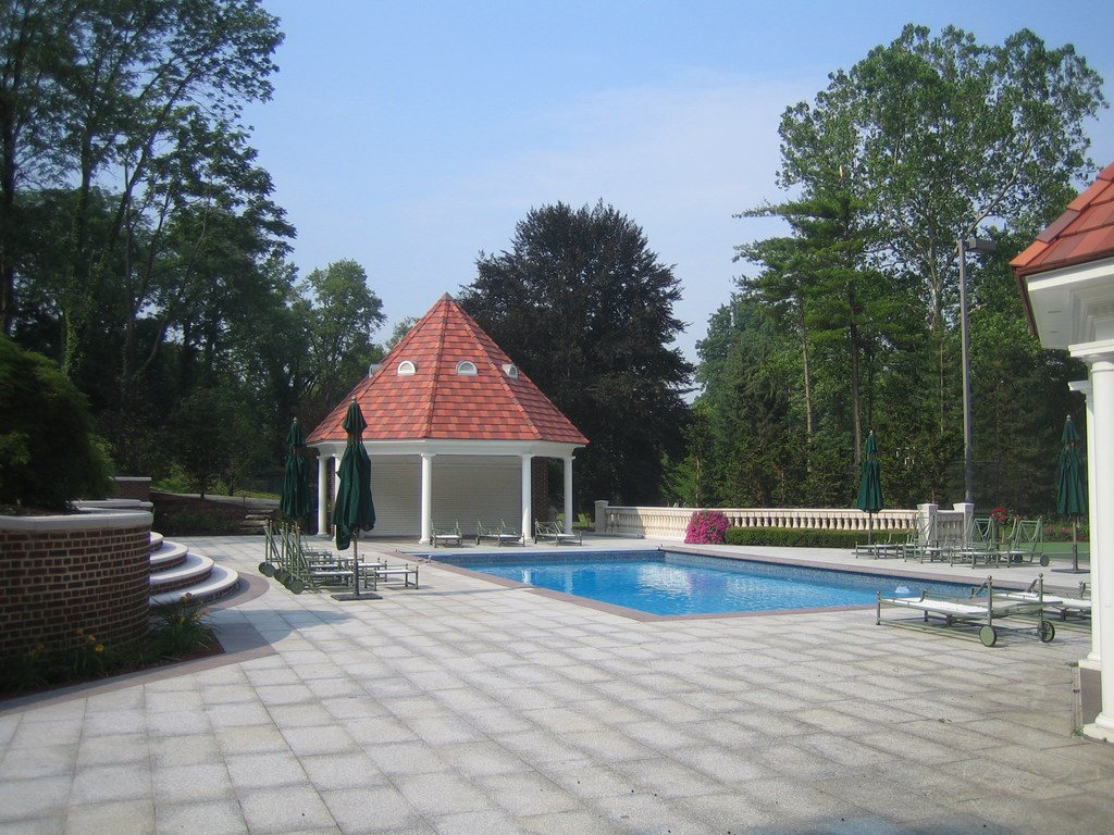
| AMAZING GRACE: In our work on the terraces, we sought a suitable sort of formality but without any pretentiousness or ostentation – especially on the upper terrace, which is primarily a family space that also serves admirably when it’s time to entertain. The touches the homeowners added on the top level are particularly welcome, including two amusing sculptures that reflect their down-to-earth attitudes. Best yet, the formerly inaccessible lower terrace and its pool, tennis court and gazebo is now fully integrated into a grand, balanced, proportionate composition that does the home proud. |
From that level, visitors make a final descent to the space beyond the terrace structure through a stairway treatment known in French as a piano novil – a classic treatment in which two sets of stairs sweep in opposite directions toward a common landing around an arched wall. Very aristocratic, very continental – and something that reminds the clients of places they’ve seen throughout Europe.
As you move away from the terraces, there’s an entirely new experience to be had in turning around to see the entire structure from below. Arched alcoves, balustrades, stone walls, cast columns and bursts of climbing roses that frame architectural features give you a sense of the lightness and symmetry of the structure that isn’t apparent as you work your way down. Now, all at once, you get the sense that you’ve just traversed a massive pedestal upon which the home comfortably and appropriately rests.
The inspiration for the lines and basic look of the terraces came partly from Old Westbury Home, a classic in rural Connecticut that features one of the most spectacular rear elevations of any residence in North America. Again, this link to the past appealed to the clients, who are ardent, self-professed admirers of historic structures.
|
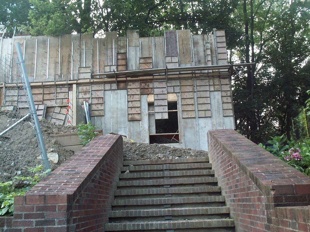
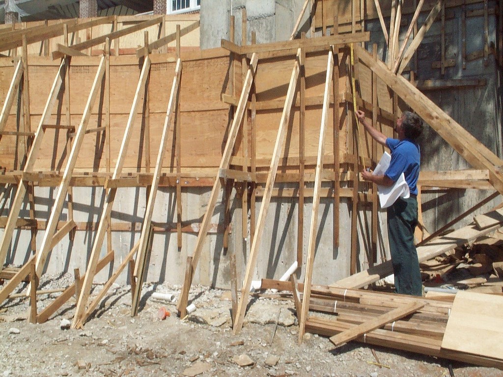
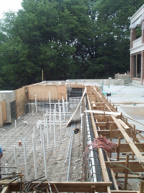
Rugged Construction The project seen in the main text was completed in less than nine months through a harsh Ohio winter. Our crews worked seven days each week – and literally around the clock on many occasions. To make this possible, we deployed a huge inflated-canopy system to keep the workspace dry and warm. The terrace structure is supported by a system of footers that are essentially huge concrete masses layered with multiple curtains of steel. In some areas, the footings reach more than 25 feet below grade and are almost that wide. Above grade, the structural walls are reinforced poured-in-place concrete, the forming of which took weeks to complete. Below each of the terrace levels is a concrete floor made up of pre-cast panels set three to four feet below grade. The space between the decking and the sub-floor system is filled with gravel along with tens of thousand of feet of conduit and assorted plumbing. We set things up in this way to make the substructure a massive drainage system: Water flows to collection points for orderly passage to the base of the terrace system. With the terraces’ massiveness and detail came a need for utter precision. Everything had to be formed to exacting tolerances that would accommodate all finish materials and every contour. We knew going in that being off by a fraction on such large spans could mean that entire hardscape masses would be out of position or unable to accept the finish. If we’d gotten it wrong, the project would have become an exercise in jack-hammering that would have destroyed the schedule and crushed the profit margin. We spent literally thousands of hours measuring, checking, re-checking and re-re-checking every conceivable dimension. By the time we were through, the count of those measurements was probably in the hundreds of thousands. Through Herculean effort, the entire structure was completely dead on when it was poured and a thing of perfection when the forms were removed. As a result of that upfront diligence, the finish phases were relatively easy, with everything working out and fitting according to plan. — C. & G.K. |
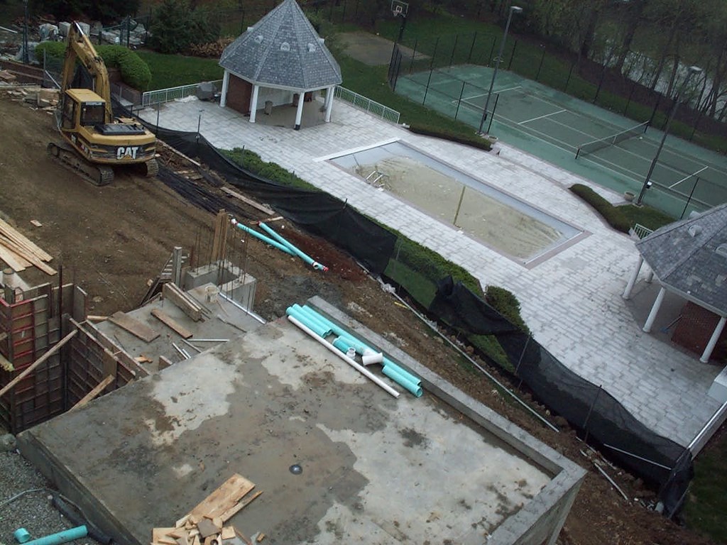
Classic references aside, however, the entire terrace scheme responds to the site and to the clients’ desire for flat areas within a mostly sloping property. At the bottom of the slope between the terraces and the river are an old swimming pool and a tennis court: Those facilities were almost never used because the topography was so forbidding. In fact, before we developed this grand transition to the lower area, the family usually accessed this lower space by driving down to it by car!
Now, those features are easily accessed and much in use. Even though we didn’t do anything in those areas (at least not so far), the work with the terrace and other pathways has essentially transformed this lower space as well.
TOGETHER FOREVER
When we started this process with the clients, it would have been fair to say that they didn’t fully appreciate the potential of their exterior spaces. As the linkages described above unfolded, both practical and symbolic, their outlooks changed dramatically and they began to see how exteriors could truly become extensions of their high-art, extremely well-appointed interior spaces.
What they’ve told us is that they particularly enjoy the way you can always move from one area to another with a sense of aesthetic continuity but with noticeably different experiences taking place with each comfortable stride.
Watching them go through this process of transition and recognition and seeing them experience the surprises and joys of their watershapes and decks and balconies and gardens reinforced for us the notion that issues of scale and budget are far less important than is the essence of a design that flows from the setting and even more so from the clients themselves.
It all has a beautiful sense of integration – the home, the exteriors, the artwork, the plants, the stone, the clients, the family – that makes this project among the most satisfying we’ve ever tackled.
Gary Kinman is president and founder of Dublin, Ohio-based Kinman Associates, widely regarded as one of the top residential landscape design/build firms in the country through the past 30 years. A strong believer in professional education, Kinman also established the Kinman Institute and framed its landmark course “Focus on Professionalism.” With characteristic passion, he sees himself as being on a mission to redefine the landscape design/build industry, and his seminars are designed not only for the working landscape professional, but also for those just starting in landscape businesses or on landscape architecture careers. Cynthia Kinman joined the firm in 1999. Already a student of the “Kinman philosophy” when she came aboard, she sees herself as testament to its success in real-world applications. She, too, has contributed to the Kinman Institute’s development, helping take Gary’s approach and translating it to a form that’s accessible to others in the industry. Before joining the firm, she had 11 years’ experience in the Michigan landscaping market, where her projects included the restoration of the Dodge Mansion’s Rose Garden. She also produced and appeared in weekly gardening segments for local and national television shows and has been a guest on Martha Stewart’s show. She also has lectured and taught at various community colleges.


