Detail A802: Vanishing Edge Perspectives


Movement is one of the foundational principles of design. That doesn’t mean necessarily moving through space in the literal sense, but the way design can pull your attention and your eyes to certain elements. Vanishing edges, as Dave Peterson explains, are a compelling source of movement — drawing our eyes across a reflective surface to another space beyond.
Dave Peterson
How does a visually non-existent watershape edge actually draw your attention to it? After all, few invisible things actually get any attention. For a watershape, the answer lies in two important effects: reflection and continuum.
Reflection is the visual mirror-effect of the flat water created when it flows over a level weir. This is not nearly as effective when the surface is contained by a vessel with a tiled waterline that bounces waves throughout the watershape. As the water “vanishes” over the edge, it draws our gaze across the surface and into the view beyond disappearing reflections.
This type of “continuum” is the concept that the missing traditional tile waterline edge connects the watershape to the backdrop without interruption. It’s one of the great visual effects in all of watershaping.
BACKDROP
The continuum concept means that the backdrop of the vanishing edge is directly connected to it. There is no band of tile or coping to separate the scene from its reflection. And, the scene does not need to be the Golden Gate Bridge with the Pacific Ocean beyond. The backdrop can be a planter or a wall, and can be just as visually arresting.
In the small gutter of my own pool, we use a pair of nine-foot-tall posts supporting a 16-foot crossbar and silver screen so that we can project movies onto it. When we do this, the backdrop of our vanishing edge is, quite literally, a continuous scene reflected across the water back to our family and friends seated on the deck or in the spa.
 While designing vanishing-edge watershapes, it is important to study the continuum concept. Imagine if the owner desired their pool to look like it was part of the ocean beyond only to be disappointed when the catch basin came into view between the pool and the scene beyond.
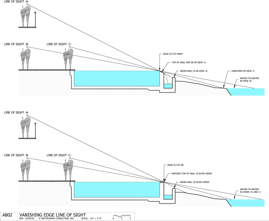
This study is typically done with a line-of-sight section where a person’s eye can be traced out to the edge and beyond, searching for interferences.
In Detail A802 there are two section views showing one simple difference in the design: the cut-away edge (above) versus the cut-in edge (below). The idea here was to show that simply changing the edge profile might solve the visual interruption of the landform in line of sight -B- (above) to connect it to the lake in the cut-in version below.
This is simply because the actual edge is pushed out another foot towards the lake.
Of course, the issue can be solved by raising the whole watershape, moving it towards the lake, extending it wider towards the lake or only inviting short guests to the house (just kidding). The point is, the design begins by planning for the critical sightlines that capture the vanishing edge magic.
WHERE TO STAND
One question that arises is where do we place the viewer in these studies? Line of sight -A- could represent a bedroom balcony where, perhaps, the view criteria is different than other locations. Line of sight -B- could represent the primary view from inside the main living area – perhaps the most important and frequently used view. Line of sight -C- shows the viewer at the edge of the watershape and I think this is an important position at which the continuum illusion should be maintained.
The vanishing edge will create movement and will draw everyone’s attention to the edge and the lake beyond. Naturally, they will invite themselves closer to that scene and may find themselves at the position -C-. We can’t let them down here! Notice that the line of sight is steeper at -C- than -B-.
This will potentially expose more of the foreground, including the basin and, as indicated in the upper section, the landform between the watershape and lake. If we can maintain the desired views at the edge of the pool as in position -C- then they will be good as we move away and towards position -B-.
Key Points:
[] The section view must be drawn to scale, including the proper distances to the house, balcony or other viewpoints. [] We typically use an eye height of five-feet, six-inches [] Once the concept is worked out on paper, consider setting a batter board or string-line to mimic the vanishing edge so the actual completed installation can be verified by the owners and design team.When you correctly establish these edgy perspectives, the visual movement will be there to captivate anyone who appreciates a great view.
Author’s note: I explain the use of this detail in greater depth as part of my recent Wolfpack Webinar Wednesdays presentation on vanishing edge design. Access it here.
| There is much more to this than meets the eye: Dave Peterson’s 2-day ENGINEERING 4311: Advanced Fluid Engineering program dives deep into the mechanical aspects of these details February 26-27. Register here. |
David J. Peterson, P.E, IWI, is co-founder of Watershape University and president of Watershape Consulting, Inc. For additional assistance with this detail he can be reached at dave@watershape.com.


