Designing with Color

My clients’ eyes light up when they first discuss color. They describe intense images of saturated reds, violets, and blues. The more color we can pack in, the better. No one yet has asked me for a garden awash in neutral grays.
But what do they really want? As a landshaper, am I delivering the best service by designing a landscape overflowing with pure, vivid colors? As the hired expert, how am I to produce a landscape design that evokes the feeling they really want?
That end result – the feeling, or emotional response, that the client gets from the garden – will not necessarily be achieved by placing bright colors everywhere. What we want is a garden that sings, not screams, with color. Of course to design this kind of garden, we designers must understand color ourselves.
There is, unfortunately, an abundance of misunderstanding and misinformation on the subject. Let’s aim at a more thoughtful understanding of color by approaching it in a logical, sequential manner. Let’s explore how color really works, and how to design with color to form compositions that produce the feeling your clients want in the garden.
HOW COLOR WORKS
This is one area where knowing some basic science will payoff big for the designer. The following points are critical for any designer or artist who hopes to master color.
All color begins with light. Where there is no light, there is no color, only darkness. For practical purposes, light originates from two sources: (1) the sun, and/or (2) artificial lighting.
Whether the source is the sun or an old lamp in the garden, light is a form of energy. Contained within this energy are all the colors of the rainbow in the form of “wavelengths.” These color wavelengths are invisible to the naked eye as they move through the air.
If we can’t see these waves, how do we know they exist? At the turn of the 18th Century, Isaac Newton discovered that light energy contained color wavelengths when he passed daylight through a clear prism. The prism refracted and projected different bands of colors – red, yellow, blue, orange, violet and green – so each of the six component wavelengths of light could be seen by the naked eye.
Knowing the specific colors of these wavelengths is important, because all colors in the world around us are mixtures of two or more of these six colors.
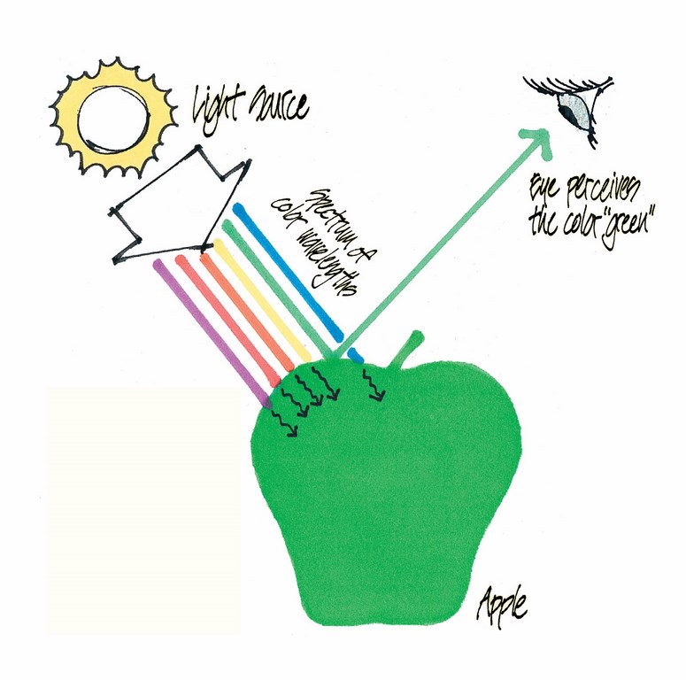
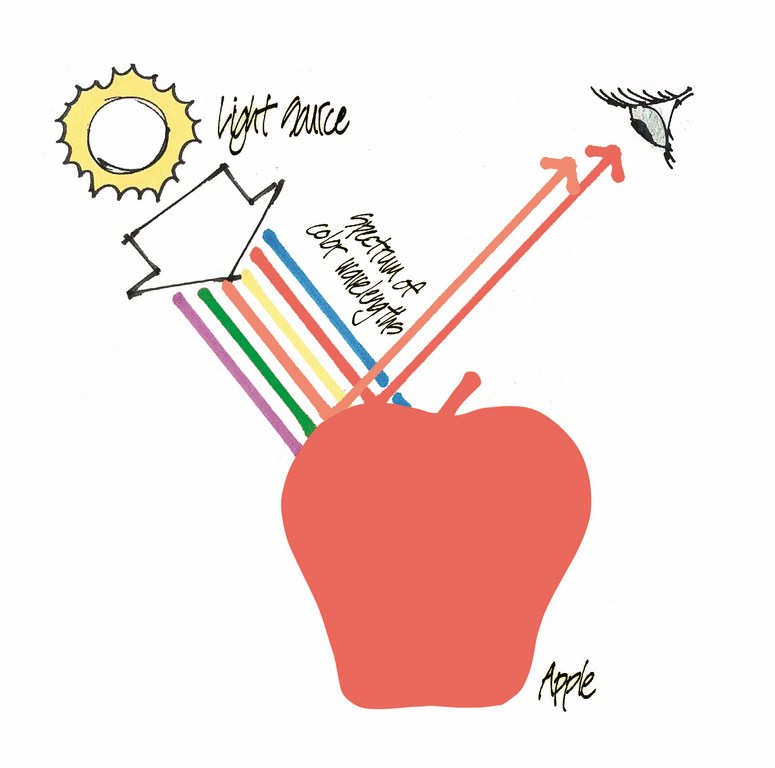
| Figure 1: The green pigment in the skin of the apple reflects the green color wavelengths and absorbs the remaining color wavelengths — violet, red, orange, yellow and blue. |
This light energy moves through the air unnoticed until it makes contact with an object of some kind – a leaf, a brick, or anything in the landscape. At that moment, two things happen: (1) some color wavelengths are reflected off of the object, and (2) other wavelengths are absorbed by the object
It is the reflected colors that our eyes see. For example, a green apple would predominantly reflect the green wavelengths. That’s why our eyes perceive the color “green.” The other wavelengths – red, yellow, blue, orange, and violet – in this example, would be absorbed into the surface of the apple. These are the colors we do not see when looking at it (see Figure 1, just above).
Thus, the “color” of any object is nothing more than a combination of the color wavelengths that are reflected by that object. Trees, flowers, and boulders do not radiate colored light (like a computer screen, for example), they reflect it.
To sum up, we’ve seen so far that color is a form of energy; that the colors of these wavelengths of energy are red, yellow, blue, orange, violet, and green; that the perceived color of an object is a combination of the color wavelengths that are reflected by that object; and that all of the colors of nature are these reflected colors.
Now let’s turn our attention to how the six wavelengths combine to form a vast range of colors, and how we can best understand, organize, and use these colors, with greater confidence.
UNDERSTANDING COLOR
The six color wavelengths combine to form the at least 7,000,000 colors that the typical human eye can distinguish. This fact is amazing and overwhelming. How can we hope to gain a grasp on such a vast range of colors, and confidently apply them in our design work?
Our confusion with color is not helped by a visit to the local paint store. Color titles such as “mocha” and “buttercup” tell us nothing about the attributes of a color, and therefore do not help us design with color. Plant materials are no different. Colorful flowering plant varieties such as ‘Petite Salmon,’ and ‘Spreading Sunshine,’ describe the general character of a plant, but do not tell us what we need to know to effectively design with color.
So how can we gain clarity with color, and use it to our advantage? From this day forward, look at a color, any color – the color of a pine needle, or the bark of an old tree, or a paint sample, or a brick paver – and ask these three questions about the object’s color: What is its hue? What is its value? What is its intensity? By answering these three questions, you will have useable information at your fingertips that you can apply to design striking color combinations and more attractive landscapes.
| Figure 2 |
Let’s define some key terms:
[ ] Hue is the name of a color (red, yellow, blue, orange, green, or violet) – this dimension has a range of six basic colors that match the six color wavelengths
[ ] Value is the lightness or darkness of a color (a light blue, or dark blue, for example) – this dimension has a range from white (or off-white) to jet black
[ ] Intensity is the brightness or grayness of a color (a bright spring green, for instance, or a grayish olive green) – this dimension has a range from very bright to almost neutral gray
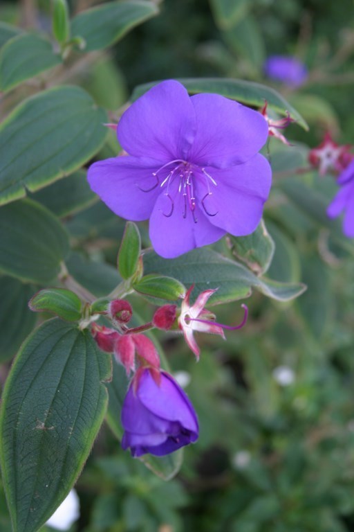
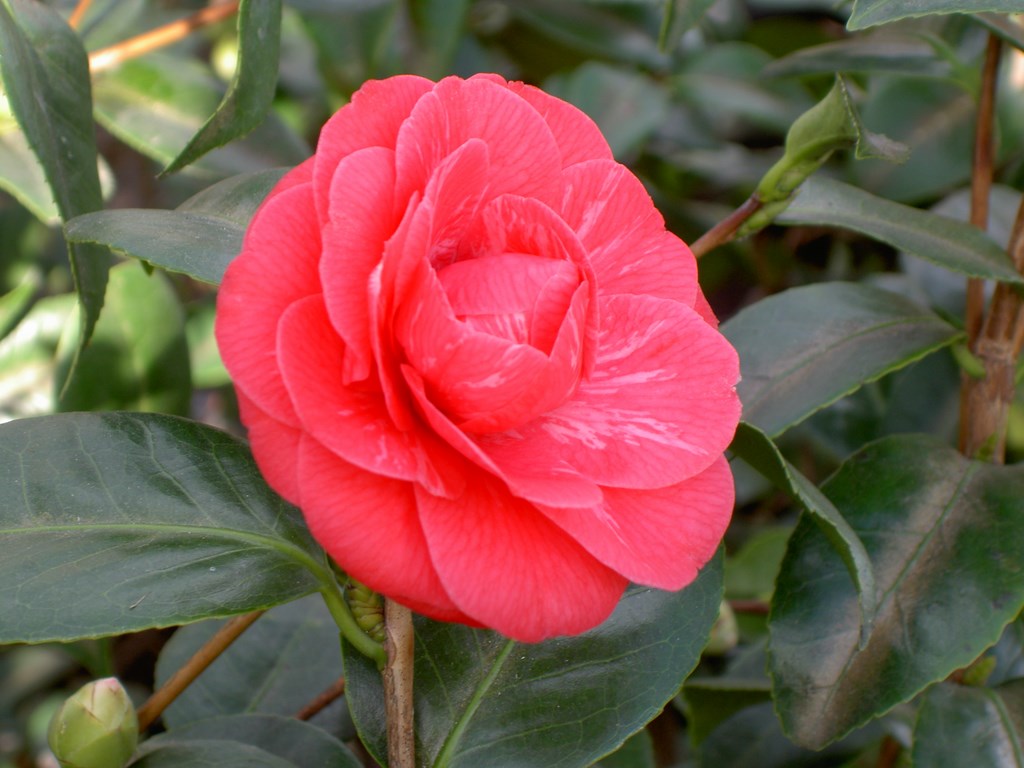
Hue, value and intensity make up the three dimensions of a color. Knowing what they are and how they can be used is a key to using color effectively. Take a look at Figure 2 (above) to see an example from the landscape. Here, the flower’s hue is red; it has a medium value (about halfway between white and black); and it has a high (bright) intensity. By contrast, the leaf’s hue is green, it displays a slightly darker value than the flower, and it has a low (grayish) intensity.
What we have now is a means of describing colors in a more precise way.
So what does this have to do with designing with color? The following is one example of how we might use this understanding on a project.
IN THE GARDEN
Here is a quick example of how you might apply just a single dimension of color to your work in developing a garden. Imagine that you’re designing a patio that is located at the bottom of a hillside. As the designer, you decide to locate a statue amid a bed of flowers inside the patio. This statue will be your focal point.
You begin to think about color intensity. What types of flower colors would you choose to surround the statue with? Bright, intense colors, or muted, grayed colors? Keeping this example simple, if your goal is to make the statue area your focal point, planting bright, intense colors will attract the viewer’s eye to your focal point more than neutral gray colors. This is obvious, you think.
But what about the colors of the hillside? Since your focal point is the statue area, the role of the colors on the hillside is to act as a pleasing backdrop to your focal point, but not to compete with it. In this context, planting the hillside with bright Bougainvillea vines would be a mistake. Instead, you should consider plants with softer, less intense colors.
This is one very simple example of color use, limited to only one of the three dimensions of color. Of course, you would also consider a plant’s mature size, texture, water use, sun exposure and appropriateness to the climate zone as well, but those are subjects for other articles.
Let’s return to our foundational study of color. We’ll now learn more about the first dimension of color: hue. Hue is the name of a color, and at this level there are just six: red, yellow, blue, orange, green and violet. This perfectly corresponds to the six color wavelengths we described earlier.
This means that brown, tan, and all other names for colors other than the six listed above are not hues. Any brown (for example) is simply a darker value, and less intense version, of the hue red, or orange, or yellow. This distinction helps to keep color theory simple, and easier to use.
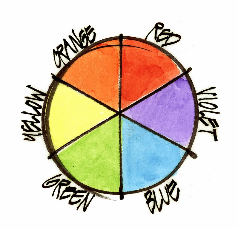
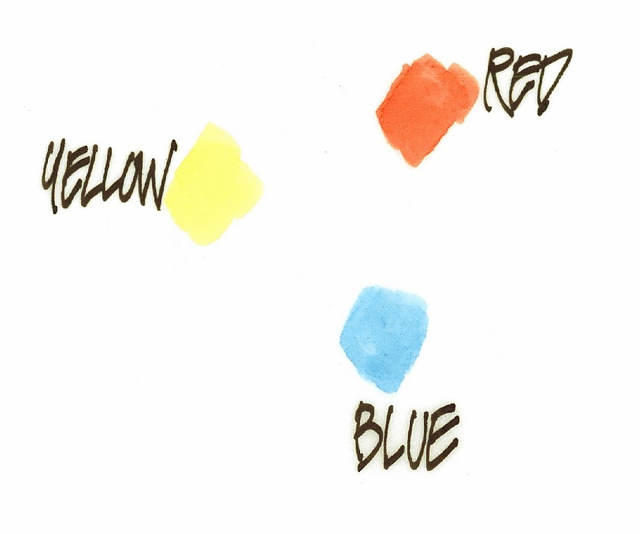
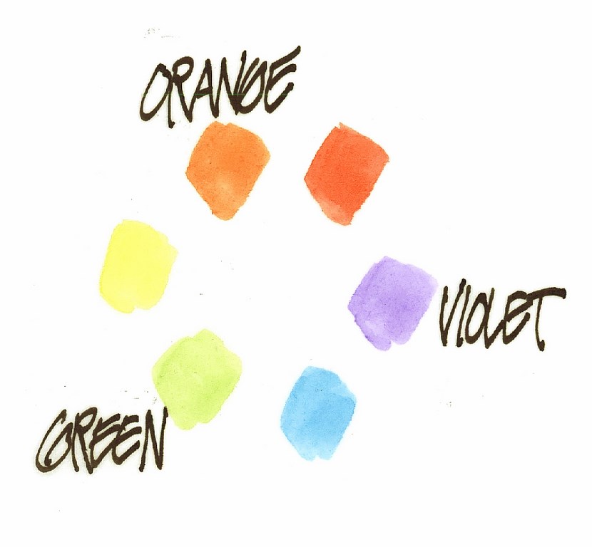
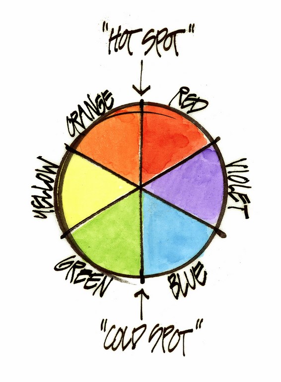
The six hues relate to one another in a specific, logical way that makes color mixing completely predictable. To visualize this in a practical way, color theorists developed a simple, circular tool called a color wheel (Figure 3, below).
| Figure 3: The color wheel (left); Figure 4: The primary colors (middle); and Figure 5: The secondary colors (right). |
The color wheel will eventually become an important tool for you in understanding, mixing, and composing with color.
The easiest way to understand and remember the color wheel is to start with the three primary colors – yellow, red and blue (Figure 4, above). These are joined by three secondary colors: orange, violet and green (Figure 5, above). By arranging all six colors together, they form a simple circle, or wheel, hence the name “color wheel.”
At the moment, we are looking at a simplified version of the color wheel, to show only hues. Next, this Color Wheel will get slightly more complex with the addition of “color temperatures.” Color temperature is simply another ingredient of the “hue” dimension of color.
Have you ever heard designers or artists describe a hue as a “warm” violet or a “cool” green? Describing a hue by its “temperature” is a good way to define a color with greater precision.
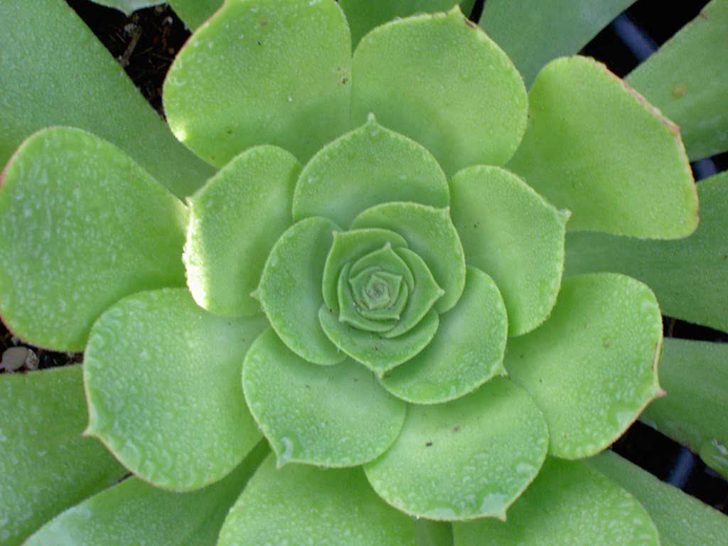
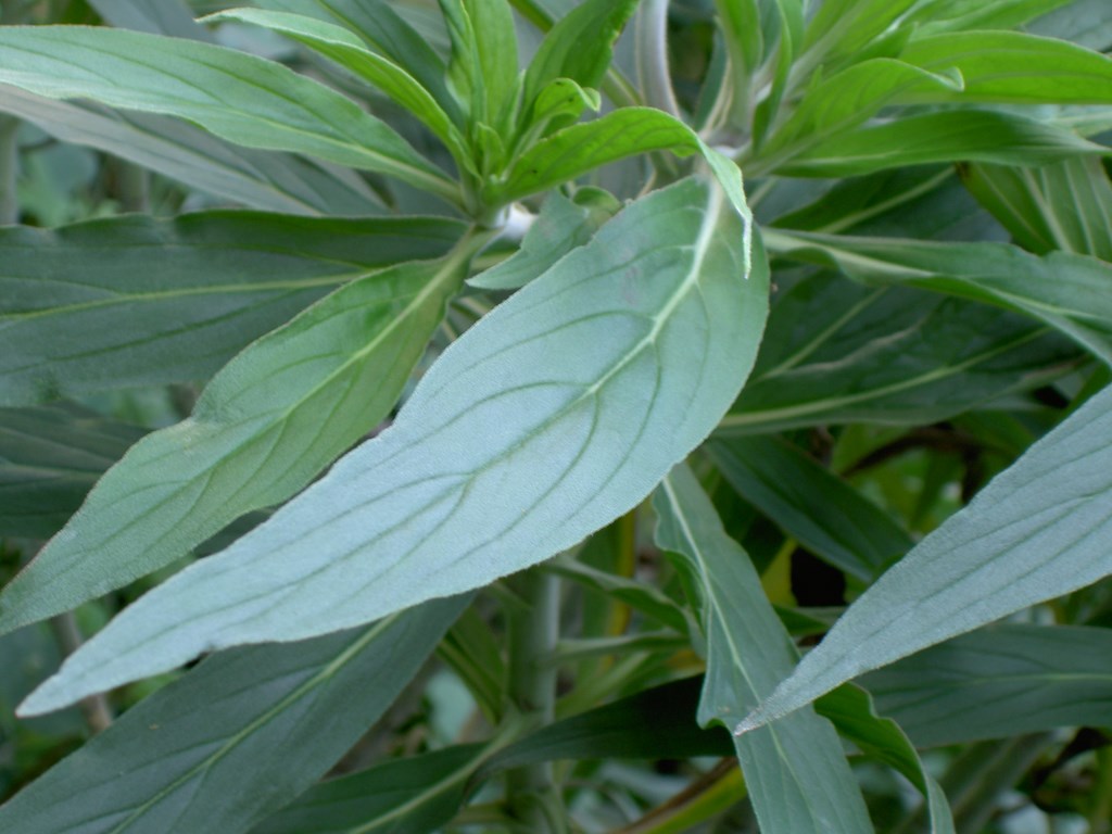
Since there are only six hues in all of color, this means there must be a fairly broad range of colors in any one hue. For example, look at the green leaves in Figure 6 (below). They are both “green,” but there is a perceivable difference between the two – the one on the left appears “warmer,” while the one on the right appears “cooler.”
| Figure 6: The leaves are all green, but the ones at left are perceptibly ‘warmer’ than the ‘cooler’ ones to the right. |
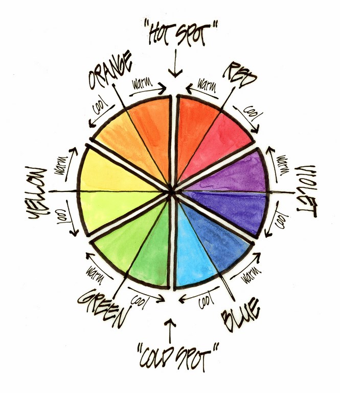
Color temperature is based on the simple idea that reds and oranges appear warmer and greens and blues appear cooler to the human eye. With that in mind, we can look back at the color wheel and pinpoint a “hot spot” between red and orange and a “cold spot” between blue and green (Figure 7, below).
Why is this important? Because the perceived temperature of any one hue will be dictated by it’s proximity to the hot or cold spot on the color wheel. Take the green seen to the left in Figure 8 (below), for instance: it “leans” toward the hot spot of the color wheel and therefore appears to be a warm green. The green to the right “leans” toward the cold spot of the wheel and therefore appears to be a cool green.
| Figure 7: ‘Hot’ and ‘cold’ spots on the color wheel (left); Figure 8: ‘Hot’ and ‘cold’ spots within hue on the color wheel (middle); and Figure 9: ‘Hot’ and ‘cold’ spots in all hues on the color wheel (right). |
Every one of the six hues has a warm and cool range (Figure 9, above). A red can be a warm red or a cool red; a violet can be a warm violet or a cool violet, and so on. It’s all dictated by which direction a hue “leans.”
SHARPER FOCUS
This article offers a simple introduction to the terminology scientists have developed to help them more precisely describe the colors we see around us. Developing our own skills with this vocabulary can play a critical role in designing with and manipulating color – issues we’ll approach in far greater detail in articles to come.
Your ability to use this terminology can help you not only at the nursery, where you can speak of the colors you want in ways staff there will understand, but also in working with clients whose understanding of what they want is intuitive and emotional, but needs clearer definition and greater specificity if you are to satisfy their desires.
The best part of these discussions is that we’ve finished with the hard part: If you’ve made it this far, you should find the information in upcoming articles easy to understand and use.
As for those upcoming articles, here’s a quick preview. We’ll start by exploring the second and third color dimensions (value and intensity) in greater detail, then move on to using the color wheel to compose and mix colors with confidence. After discussing the all-important factor of contrast, we’ll cover ways to use the three dimensions of color to create mood, space and a sense of direction in a landscape. Later, we’ll get into color harmony and complementary colors and consider the use of white.
We’ll get there soon enough. For now, simply observe the colors around you. Even now, you have the tools to see and appreciate colors in new ways – precisely the foundation you’ll need to make your landscapes sing with color!
Richard E. Scott, ASLA, ASAI, is a teacher, landscape architect and architectural illustrator in the landscape architecture department at California State Polytechnic University in Pomona and offers workshops in color theory and sketching for landscape designers. His renderings have appeared numerous times in Landscape Architecture magazine, Los Angeles-area newspapers and books on architectural design and rendering, and his landscape design work has been featured by National Public Radio station KCRW in Santa Monica, Calif. His projects have included rendering work for the University of California, the J. Paul Getty Museum, George Lucas and Christopher Alexander (author of A Pattern Language) as well as design work for Donald Trump, UCLA, the City of Los Angeles and the ABC Network Studios. His workshop schedule can be viewed at www.graphicsteacher.com.


