Desert Rhythms

One of the things I love about working in the southwest is the way the openness and rugged, sculptural appearance of the natural landscape opens the door to those who want to make bold architectural statements in concrete, stone, steel and glass. Even the plants here have an overtly sculpted quality.
I appreciate this all the more by virtue of having worked in more tradition-bound places: Here in the southwest, I feel free to use a strong, contemporary design vocabulary in forging unique connections between built spaces and their dramatic surroundings.
Although I’m perfectly comfortable working in those traditional styles, I’ll admit to being heavily influenced by the masters of Modernism – particularly Frank Lloyd Wright and the German-born American architect Ludwig Mies van der Rohe – and love the way those amazing mid-20th-century designers used clear, sculptural geometries to direct the eye and define intricate spatial relationships.
The project depicted here is a direct channeling of their influence, aided and abetted by
the client, Paul Ranheim (a former professional hockey player turned equally professional spec-home builder), who shared my appreciation for modern architecture.
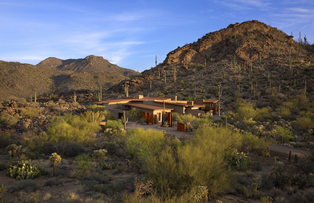
Everything about this project was dramatic, starting with the setting. Located just north of Tucson, Ariz., in a development known as Saguaro Ranch, the property is part of an upscale enclave spread over a set of canyons in which spectacular geology is on display at every turn.
To provide access to the area, the developer bored a tunnel through a mountain: When you arrive, you emerge from a portal and flow into a magical landscape of chiseled topography dotted with five-acre lots and their custom homes. It’s truly an amazing place: There seem to be more Saguaro cacti and big boulders per acre here than I’ve seen anywhere else in the Sonoran Desert.
TEMPORAL EXPERIENCE
The development has a resort-style feel, with everything organized around equestrian activities. All of the homes are custom, and all are to be designed to complement and make the most of the setting.
I came on board at a point when my client had only just started building the home, which gave me the wonderful opportunity to interact with the architect – Michael Franks of Seaver Franks Architects (Tucson) – and other members of the project team. What I saw on paper was a masterful design that succeeded both in contrasting with and accentuating the nature of the desert setting.
I became involved in the project as a result of some great local press coverage: In 2005, several of my projects were featured in a special annual edition of Phoenix Home & Garden Magazine in which local artists are showcased as “Masters of the Southwest” – an honorific I proudly accepted. My client, who had already begun pool construction based on what he had been offered to date, saw the article, halted construction and contacted me in the hope that I could come up with something more architecturally cunning than the naturalistic vessel then under way.
As he explained to me, his parcel was to be one of the first to be built in the development and he wanted to set a high standard for others to follow. At that point, I was given carte blanche to organize the exteriors based on what I saw as being appropriate to both the home and the setting.
| The setting we were working with was truly magnificent, and the ambition throughout was to create structures and spaces that harmonized flawlessly with the surroundings. In addition, this was one of the first homes built in the development, so the design team had the additional mission of establishing a standard we hoped others would meet. |
Joining the design team at this early stage gave me the chance to develop the exterior design as the home itself arose before our eyes. This timing enabled me to integrate everything I was doing into a single design program. That’s not a door that opens to watershapers every day, so I was determined to walk right on through it.
In this case, I built the anticipation early on, developing the design around the experience a visitor would have in arriving on the property, approaching the front door, moving through the house and then passing into the backyard. This led to an immediate enhancement of the preliminary concept, which had placed guest parking right at the front gate: This struck me as a missed opportunity, especially given the five-acre extent of the property, so I moved the parking away from the entrance and established a pedestrian introduction to the home that would generate a sense of anticipation and discovery and allow guests to stop, reflect and take in the breadth and beauty of the home from one of the best of all available vantage points.
To amplify the initial impression of the home, I introduced a sensual, feminine form by using a pair of low (but ascending) 30-inch-thick walls. The resulting visual tension and interplay energizes the entry experience as the curving walls juxtapose with the distinctly masculine, ascending planes of the home’s façade.
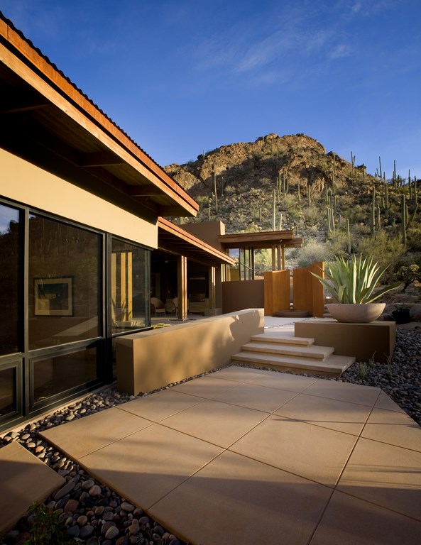
Visitors are greeted by the open embrace of these walls and led along a path past a trio of rusted steel panels that lend a lyrical quality to the pathway with their alternating folds, sequential spacing and ascending heights – and echo of both the pitch and material of the roofline beyond. As the path narrows in the curvature of the walls, there’s a sense of compression followed by expansion as the path turns and opens up again as it nears a front gate that offers access to the forecourt leading to the front door. The notes of this song continue in the shadowy recesses of the cantilevered stair-tread detail; in the repetition of the organic geometry; and with the striking interjection of tree forms that cast twisting shadows on the planar backdrop.
MOVING ALONG
The approach to the courtyard is meant to elicit feelings of curiosity and exploration.
First, the broad, pivoting gate conceived by Franks orients the scene by masking views of the inner architecture while defining a path to the front door. But before visitors get to that point, anticipation for what’s beyond the gate is augmented by the strategic use of firelight: Working with an aperture the architect placed in the forecourt’s wall, I set up a fire feature that emanates its light through the opening and out into the desert foreground, thereby enticing visitors with a dancing glow well before they ever see the source. This soft light also illuminates a Joshua Tree that rises above the courtyard’s wall, further escalating the anticipation.
When visitors pass through the gate into the forecourt, they see another array of cantilevered steps that “float” up to the front door. I set this rhythmic path to echo the lines and ascending forms of Franks’ dramatic rusted-steel entry pergola. Once in the space, however, visitors gain access to a wider view beyond the path and now see a lounging/entertainment area to the left.
| The path from the parking pad introduces visitors to the colors and textures they’ll encounter beyond, but the wall and the pivoting gate conceal spaces that can only be fully appreciated upon entering the forecourt, perceiving the front door and turning to the left to drink in the overflowing reflecting pool, bench system and fire feature that make up a large entertainment space. |
This large space features a trapezoidal reflection pool that doubles as a divider, channeling visitors for several paces along the entry path by reaching out from the courtyard wall near the gate before allowing them access to the forecourt’s lounging area. An Ironwood tree serves as the sculptural focal point from this perspective, making a serene first impression with its form mirrored in the shimmering water.
This watershape starts out at a level 30 inches from the deck: As that surface rises toward the steps, the vessel stays level and has a final elevation just 12 inches above grade. Shallow (at just two inches deep) and filled with pebbles, it is approximately 12 feet long and nine feet wide.
Water flows over the rusted-steel edges of this feature and down into a small channel also filled with pebbles. This whole structure was set to finish flush with only a half-inch gap between the water surface and a cast-concrete seat wall that extends along the courtyard’s perimeter. The pool’s form is mirrored by a trapezoidal fire pit that, now visible, sits in a snug corner of the space with the aforementioned window aperture just above that allows visitors to peer out at the desert scene beyond.
| Passing through the home, visitors emerge into a backyard highlighted by expansive deck areas, a finely detailed perimeter-overflow pool, a gem-like raised spa and a spillway system that seems to flow from the rugged slope behind the pool. |
Everything in this front area is a direct response to the shape of the space and the geometry of the home. The concrete decking, for example, is laid out in a grid pattern that extends directly from the concrete floor treatment inside the house – a pattern I picked up and repeated throughout the exterior design.
The decking has an exposed-aggregate finish made with highly refined sand of an earthy color chosen to blend in visually with the surrounding desert terrain. This is a key design detail: From the ground up, the home’s architecture is interwoven with the exterior experience, providing the entire space with an underlying sense of order and a direct connection to the natural landscape.
Indeed, just about everything in this design flows from that sort of unifying perspective. In the case of the step system that leads to the front door, for example, there’s a repetition of geometry I used in the form of using two risers separated by three concrete pads that lead to two more risers and another set of three pads and a final set of three risers. There’s a certain rising rhythm to all of this – a visual music built into the design as it leads visitors to the front door.
CLEAR PERSPECTIVES
As guests pass through the door to enter the home, they are greeted by a broad, open space with views that stretch through to the backyard area. Again, the guiding concept is one of exploration and of moving through the space to destinations beyond. To enhance that sense, the backyard area is organized at an angle that skews away from the back of the house: To see everything, in other words, visitors have to keep moving.
Once they reach the backyard, they find the pool and spa tucked up against a slope cut into the canyon wall. The spa, which has a raised, seating-height profile and a circular shape eight feet across, was the first element I placed in the backyard and essentially functions as its visual hub. I used this as the primary anchoring element because I believe that nothing says “you’ve arrived” in a space better than a spa: Among all watershapes, it’s the ultimate in comfort and luxury.
| This ‘morning patio’ stands on the east side of the house and continues visual themes and motifs found throughout the project, including the decking grid, the use of rusted-steel details and the selection of plants and planters. And of course, there’s water – here in the form of a trickling fountain set within the arc of the steel walls. |
Everything else in the backyard swings away from the spa like encompassing arms – a sense reinforced by the fact that the limits of the built space are marked by low walls (also cantilevered as are the steps out front to “hover” over the surface) above which the natural landscape rises. Indeed, the whole design plays off the rising terrain in a set of terraces organized around the grid pattern established inside the house and flowing out as six-by-six-foot pads of smooth concrete to match the interior finish.
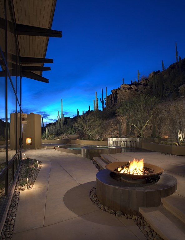
Visitors can step up to raised levels on both sides of the spa and pool: To the right is an outdoor seating area with a circular fire feature mounted in the steps. This feature mimics the form of the spa and has a sculptural fire element created by local artist Elena Colombo. To the left is a deck with a fireplace – this one square and also embedded in the continuing line of the steps.
|
Notes of Appreciation The project described in the accompanying text was the product of many skilled minds and hands. Special thanks go to Donna Winters of Enchanted Garden Landscape (Scottsdale, Ariz.), who helped in refining the plant palate and lighting concepts; to T.A. Caid & Sons (Tucson, Ariz.) for their perfectionist work in steel; to Ted Miller of Sapphire Pools (Gold Canyon, Ariz.) for his tenacious detailing in pool construction and for first introducing me to this wonderful industry; and to Butch and Brent at ArtCraft Granite & Tile (Mesa, Ariz.) for their exquisite work. Ultimately, we all owe debts of gratitude to the client, Paul Ranheim, for having the courage and vision to put the team together and persist through adversity while maintaining his gentle, humble disposition. Above all, we have him to thank for believing that if you build it right, they will come. K.B. |
As guests move from level to level, the surface changes slightly from smooth concrete to the sand exposed-aggregate finish in a three-by-three-foot grid (a half module of the base plane) that echoes the approach used in the forecourt. Throughout the design, I lent visual interest and a sense of openness to these concrete slabs by separating them with narrow, pebble-filled channels: I liken this visual relief to undoing the top button of a shirt: It provides everyone with some room to breathe.
The 25-by-15-foot pool echoes the trapezoidal shape of the waterfeature in the courtyard, but the leading-edge overflow reinforces the feminine curve introduced out front and imparts a sensuous line to the otherwise masculine, angular framework. It, too, has perimeter overflows on three sides, rising 12 inches above grade at the front curve but set flush with the upper deck in the same way the courtyard pool’s water level is flush with the adjacent benches.
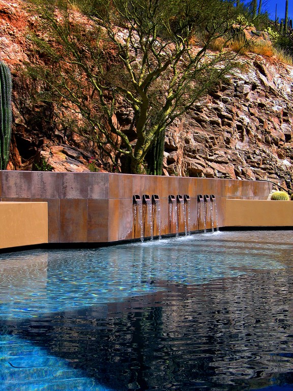
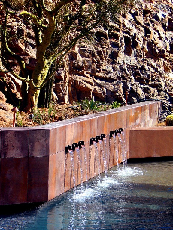
For the grand finale, I used a series of small spillways to accentuate the central planter wall behind the pool. Faced with Palo Verde stone selected for its sculptural qualities, this structure rises as the primary focal point of the watershape composition. The spillways are clustered in three sets of three to reinforce the musical themes found elsewhere around the property. These were inspired by the work of Mexican architect Ricardo Legorreta, but I owe a more direct debt here to David Tisherman, who introduced me to Legorreta’s work and whose own work with spillways drove my interpretation of this beautiful fountain detail.
Again, the idea throughout was to use repetitions of shapes and a clear, modular hardscape treatment. As we were staying with concrete throughout, this led to a tricky slot detail where the edge of the pool interfaces with the deck and steps. The concrete subcontractor, Carson Concrete of Tucson, did a wonderful job of forming this detail as part of the pool. (They also did the amazing flatwork and the cast-concrete seat walls in the surrounding hardscape.)
Throughout the design, we used varying earth tones to add visual depth and contrast and play off of the natural landscape and the colors used in the architecture. The spa and outer edge of the pool are finished with an unusual ceramic tile named Corten, a tile from Spain I obtained through Ceramica, a boutique tile shop in Scottsdale, Ariz. This material has a baked-on finish that has the appearance of rusted metal and takes its name from corten steel. The interior of the pool is a custom PebbleSheen finish from Pebble Technology (Scottsdale, Ariz.) that works beautifully with the tile.
OUTDOOR DELIGHT
Visible from the kitchen and guest bedrooms, the third primary exterior space is a “morning patio” located on the east side of the house. Broad and finished in the ubiquitous concrete grid pattern, this private area repeats the motif seen throughout the exterior of large bowls placed on trapezoidal pedestals and planted with agaves. It’s another space in which the landscape rises above a series of low walls, but in this case, the sweep of those walls offers a curvilinear geometry that contrasts with the deck’s grid pattern.
The star of this space is a curved and ascending rusted-steel wall in the form of a half spiral. Its presence intentionally divides the space, making the guest patio private. On the guest patio side, the steel wall encompasses a small waterfeature in which a delicate plume of water rises just a couple of inches above the water’s surface to provide a tranquil, trickling sound that conjures feelings of serenity in the calm, quiet space.
| Benefitting from the thoughtful arrangement of lighting fixtures and rich in firelight, the property takes on a special luminosity at night marked by a subtle, flickering illumination that harmonizes beautifully with the special qualities of the desert after dark. |
The sweeping wall also has a continuous, six-inch-wide vertical cleft that allows an axial glimpse of the plume from the public side and, from the opposite angle, a sliver view of the public space. A cantilevered steel sluice spills from the cleft into a pebble-filled reflecting bowl that overflows yet again into a final pebble-filled basin set an inch below deck level.
At night, the plume, the lower basin and the “impact zone” of the sluiceway are all lit from beneath the water’s surface, projecting a dancing light onto the graceful arch of the rust-colored steel.
When we all finished our work, the client put the property up for sale and, even in a tough market, sold it within 45 days to an ecstatic, discerning couple from Toronto – thus making believers out of the naysayers along the way who’d told our client to cut corners “because it’s just a spec house.” Indeed, the property set a record for the most expensive home sold in Tuscon, raising the bar for the new neighborhood and establishing a pattern for quality and architectural excellence to be emulated throughout the development.
For my part, it was a thrill to work with a fantastic, talented team that inspired me to create exterior spaces that fully embraced the rhythms of the beautiful desert surroundings.
Kirk Bianchi is principle and founder of WaterScapes by Bianchi Design in Phoenix, Ariz. An award-winning student of architecture and the visual arts both as hobbyist and as a professional, Bianchi credits an interest in film and photography and a month-long visit to Japan with influencing and developing his design sensibilities. After leaving the Midwest to attend Arizona State University’s College of Architecture, his entrepreneurial ambitions led him to the pool industry. After six years of working in the trenches as a designer, salesperson and project superintendent, he ventured out on his own as a freelance pool/landscape designer to serve the needs of clients and other design and contracting professionals who were seeking the extraordinary. Bianchi’s firm now serves as a design and project-management firm for those who seek him out in Phoenix and around the world.


