Defining the Flow
November 9, 2011
0
Shares

 At the same time I’m interviewing my clients about their patios and determining exactly what they want and how they plan to use them (see my article in the October 9 edition of WaterShapes EXTRA!), I’m already thinking about traffic flow. As I see it, this constitutes one of the keys tothe entire design.
In fact, as soon as I see the raw setting, I start thinking about how the space is going to be traversed, where the dining table will sit and where the outdoor cooking area will be placed relative to the home. (That last point is a particular issue in cooler climates: When the clients are interested in wintertime grilling, this area needs to be close to the house.)
I also think about who will be using the space. If it’s generally for adult use only, I’ll consider traffic patterns in a fairly relaxed way. But if it will instead be inhabited by multiple young children (either living there full-time or in the form of occasional or regular visits of grandchildren), I look at everything with the thought in mind that they’re likely to traverse the space rapidly and in straight lines, jumping over or ducking under anything they encounter along the way.
To me, this process of imagining how people of all ages will move through a space cuts to the core of the design challenge. It’s also, I might add, a fun part of the exercise.
Visualizing Motion
When the time comes in our conversations, I start discussing these traffic issues with my clients.
Generally, I’ll start with an in-home demonstration, using the dining-room table to show them I don’t want people to have to shift their chairs in or out to allow others to get by. I’ve also noticed that lots of breakfast nooks are set up adjacent to back or side doors: In such cases, this means that someone in a chair near the door will have to scoot out of the way if someone else needs to get by.
I use these simple situations to illustrate for my clients the virtues of good traffic management – and to explain why I refuse to allow any of these scenarios to happen with my patio spaces.
The single best way to avoid these traffic-flow issues is, of course, to make the patio large enough for all of its intended purposes. A common rule of thumb suggests making the dining table’s area at least ten by ten feet, but I consider this a bare-minimum allocation: Once you drop a four-foot-diameter table and six chairs into that space, it’s all but used up.
There are several ways to communicate about these details. You can mark off an area of the desired size in a large indoor space or out in the patio’s intended location to approximate the physical space, or you can prepare scale drawings at your drafting table to represent the actual space you’re proposing. Both are highly effective.
With some clients, it helps to run through the ages-old “bubble diagram” many designers are taught to use, blocking out specific areas for dining, fire pits, grilling areas, sitting areas and more. (Even quick circles on paper can help clients see how complex these spaces can become – and help you enlist their support in creating generous-as-possible allowances for foot traffic.)
By the time these discussions are concluded, everyone understands what’s involved and sees just how important making the right decisions about space allocation can be.
Managing the Space
Our discussions also generally cover ways of discouraging traffic in certain areas or directions. One good tactic with dining spaces, for example, has to do with wrapping plants around the area to curtail direct traffic flow through this area to the rest of the yard. (This has the added benefit of isolating the dining area amid beautiful colors, textures and fragrances.)
We also run through the ways furniture, sculptures and large plants can be used to alter the physical flow through the space and hence organize traffic moving within it.
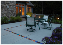
In some cases, we’ll discuss using different paving materials to define particular areas or pathways as a means of accomplishing our traffic-management objectives. I’ve always been a fan of creating “area rugs” of different paving materials, setting a brick carpet into a bluestone patio, for example, to define a space as a dining terrace – much as might be accomplished with an Oriental rug on a hardwood floor in an interior dining room.
We can also discuss insetting planters into otherwise solid hardscape areas to distinguish or separate certain spaces; placing glass panels into the surface (with lighting below for amazing nighttime effects); and setting up sweeps of cobbles or broad linear strips of brick as pathways through fields of flagstone – just a few of the many options we have for managing traffic through our clients’ patios.
Next time: With the basic layout in mind, it’s time to run through a punch list of details and finishing touches that can be used to make a well-organized patio even more enjoyable.
Bruce Zaretsky is president of Zaretsky and Associates, a landscape design/construction/consultation company in Rochester, N.Y. You can reach him at [email protected].


