Libation Sensations

Most people I know have a favorite vacation spot, a favorite leisure-time activity and a favorite form of self-indulgence. In creating backyard environments for these folks, we as watershapers and landscape designers often find ourselves able to roll elements of one, two or all three of those “favorite things” up in a single package in ways that closely reflect our clients’ passions and personalities.
At my company, we strive to make a direct connection with those preferences by letting our prospective clients know that we want to enable them to vacation in their own backyards and come home to outdoor environments that epitomize the good life. In some cases, that means establishing family fun zones, but quite often these days, it also means providing an environment for entertaining adult guests.
This concept of aligning projects with client desires is nothing new, of course, but our take on it at The Green Scene (Canoga Park, Calif.) involves zeroing in on their very specific notions of fun, leisure and entertainment in ways that lead us to designs that definitely distinguish our work in their eyes.
ALL ABOUT FUN
These days, with aging Baby Boomers rapidly embracing food, wine, high-end spirits and other symbols of success – and coming to value the ability to enjoy them with friends in the safety and comfort of their own homes – we’ve focused our efforts on developing thematic approaches to our work that reinforce their perceptions of living the good life.
Make no bones about it, this all about fun. But it’s also about them being proud of their homes and their achievements and represents their desire to share fun experiences with family and friends.
|
Conversational Cues It’s important to note that our designs are the result of a systematic approach we use with all of our clients. At the outset of each project, we run them through a questionnaire that asks them to reveal their favorite travel destinations, what do they like to do when they’re not working, what they collect, what’s their favorite reading material, what sorts of movies they most enjoy and more. We use the information to get inside their heads and find interesting, creative ways to tie our work to their personal lives. That gives us the opportunity to do something special. Often, that means work that is decidedly fun or even humorous in nature. For the clients in the projects featured in the accompanying text – and others besides who’ve pick up on this libation theme – it’s clear that they all enjoy a good party! — S.C. |
To demonstrate what I mean by this and how it translates into the practicalities of design and construction, we’ll visit three projects in which we’ve gone well beyond simply providing a venue for bathing, eating and drinking and have developed themed features that overtly celebrate our clients’ lifestyles. Bottom line: We want them and their guests to talk about these bold spaces and have fun in them.
I write this knowing that watershaping and landscaping can be so challenging (and costly to clients) that it’s easy to forget that our work can be about fun and whimsy. To counter that, we deliberately avoid getting too serious about our work and roll through possibilities that are off the beaten track in attempting to keep our eyes squarely on the essence of recreation while making things amusing, light-hearted and openly indulgent.
Our lack of “seriousness” has nothing to do with the high standards to which we hold ourselves in designing, engineering and constructing these projects. It’s just that we self-consciously inject a sense of joy and keep the trappings of the good life in mind and do all we cannot to sink our clients’ good moods.
One of the great things about working with the libation theme seen in the projects discussed here is, of course, that there’s never any question that the result will invariably say something about having a good time. To be sure, these projects are few and far between, but they do speak to the fun and whimsy you can deliver when you take the time to delve into clients’ interests and favorite recreational activities.
As we see it, there’s great fun to be had (and good business, too) in making clients happy. In these cases, it’s also great to think that these folks in particular will be toasting to the good life in the midst of environments they helped us create.
With a Twist
These clients just love entertaining, but they originally didn’t have the yard for it.
The space was small, confining and completely lacking in personality, with a steep upslope that consumed much of the available square footage. Despite the limitations, however, they wanted a pool and an outdoor stage for parties. More than that, they wanted to make a statement about their lust for life, which, among other things, included a passion for mixing, serving and drinking martinis.
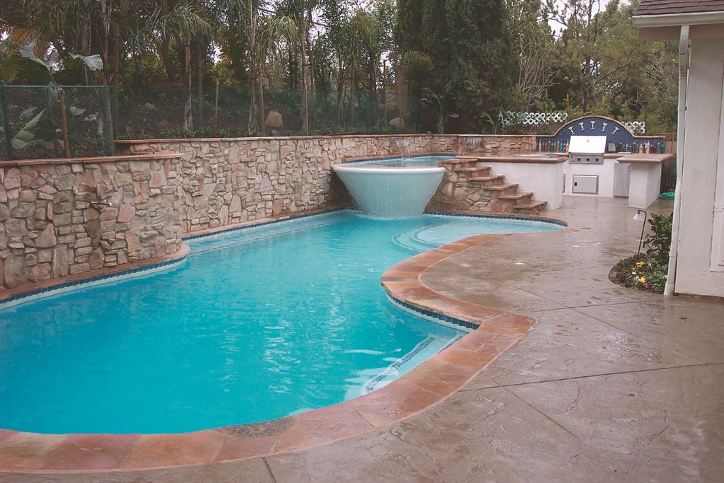
In our design, we cut into the slope, used the far side of the pool as a retaining wall and opened up the space to include not only the pool but also some waterfeatures and a serving area.
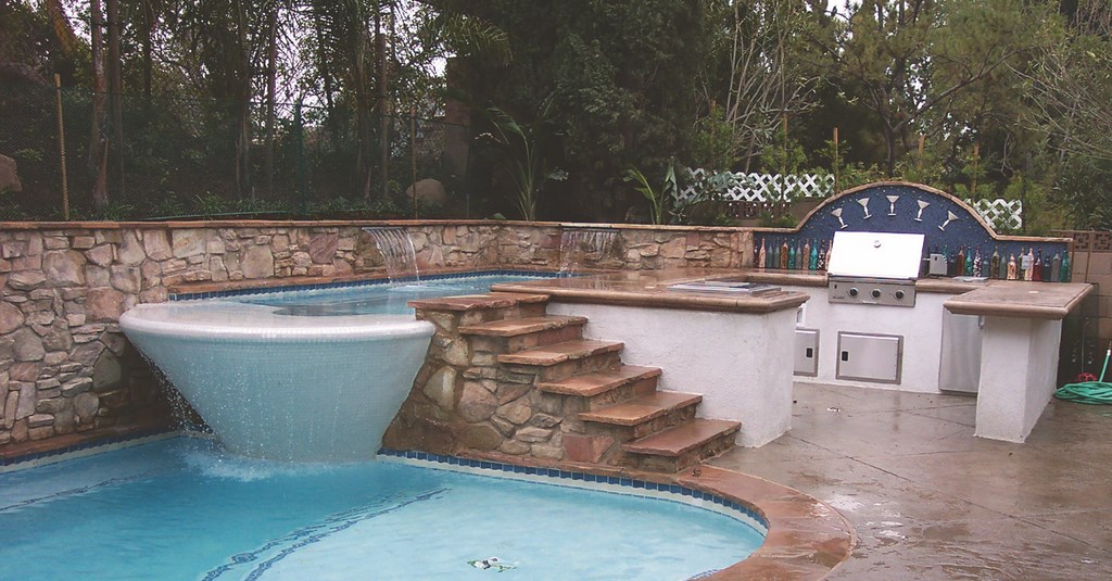
Early on, we came up with the idea of creating an actual martini glass in which a bather could stand. The “glass” is actually a deep spa on one end of the pool that measures six feet in diameter by five feet deep. As one stands in it, sets of six jets either pulsate or create a whirlpool, giving the bather a choice between being shaken or stirred amid pearlescent one-by-one-inch tiles.
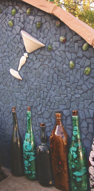
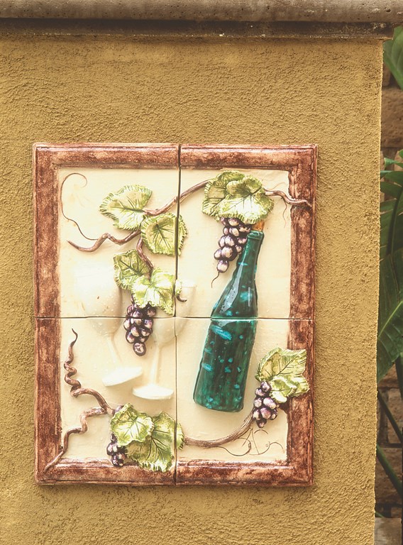
There’s a large swim-up bar with four stools and ready access to the serving counter. There’s also a barbecue counter with a backsplash that echoes the martini theme. To personalize things, we borrowed a martini glass from the clients and used it to make a mold for the porcelain half-glasses installed within the tile finish. We also used real olives in casting those tiles, as well as gin bottles for the detail that cuts across the bottom of the backsplash.
The clients were involved in this process, visiting my ceramics studio with their kids to paint the olives and the bottles. It was great fun that reveals itself in the final product, but in more practical terms, when you find ways like this to involve the clients, their focus shifts from what the square-foot cost of a material is to the idea that even during construction they’re having a good time.
Vintner’s Delight
During our interviews with these clients, they told us that they were passionate about collecting and drinking fine wine and let us know how much they enjoyed sharing it with friends. These folks definitely aren’t alone: Many of our clients, especially well-to-do Baby Boomers, have gotten into wine with gusto in recent years, and we’ve found success in a couple of cases by indulging their hobbies in decorative ways.
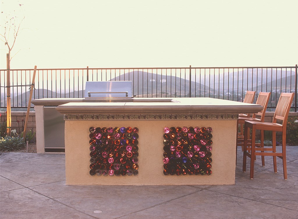
The project shown here is second time we ever used real wine bottles in a design – in this case in a barbecue center located just outside the clients’ dining room. The structure is quite heavy – a cast concrete countertop supported by a steel-reinforced, concrete-block frame – but none of the weight is carried by the bottles themselves.
We fixed the bottles in place with a clear silicone caulk. We then worked in a deep concrete grout joint that can’t be seen. (Only the bottoms of the bottles are visible, as we were concerned about exposed tops being broken and becoming hazards.) We worked carefully to mix bottle colors in a random way, but we encountered a surprising challenge in finding enough bottles of a consistent diameter.
In all, there are 330 wine bottles in the counter, illuminated with a color wheel feeding 500 fiberoptic strands – one strand each for light-colored bottles and two or three for dark-colored bottles. This was important in achieving a soft, consistent glow.
In setting up the lights, we learned an interesting lesson: To hold the strands in place, we pushed corks back into the bottles after dipping them in vegetable oil. We had cleaned the bottles, but they weren’t dry inside when we set the corks. When the bottles heated up that summer, the moisture expanded in the bottles and many of the corks popped out, leaving us with a tangle of expelled fiberoptic strands.
It took us hours to figure out which strands should go to which bottles. As a result, when we illuminate wine bottles these days, we use liquid silicon to ease the corks in – but only after thoroughly drying the bottles’ interiors!
Spa Nectar
Shortly after we finished the wine-bottle barbecue counter, we were contacted by close neighbors – another pair of passionate wine people – who’d liked what they’d seen and wanted the same treatment for their own backyard. We let them know that we didn’t think it would be proper to do the exact same thing but assured them at the same time that we’d come up with something special just for them.
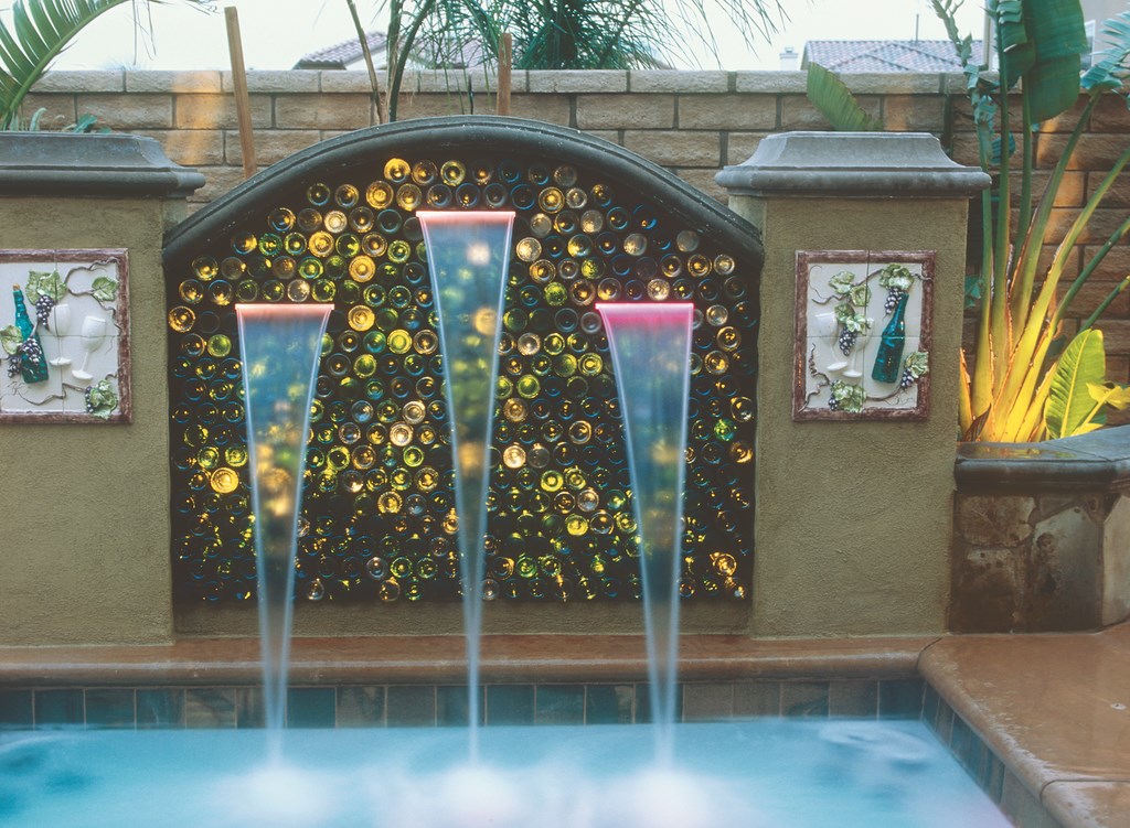
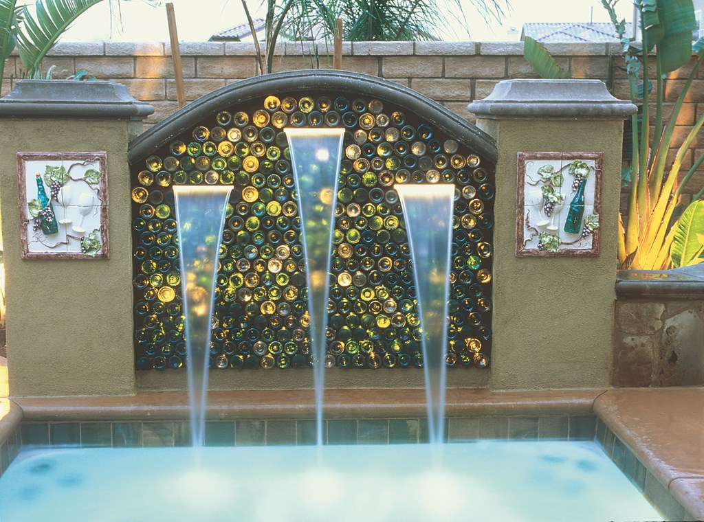
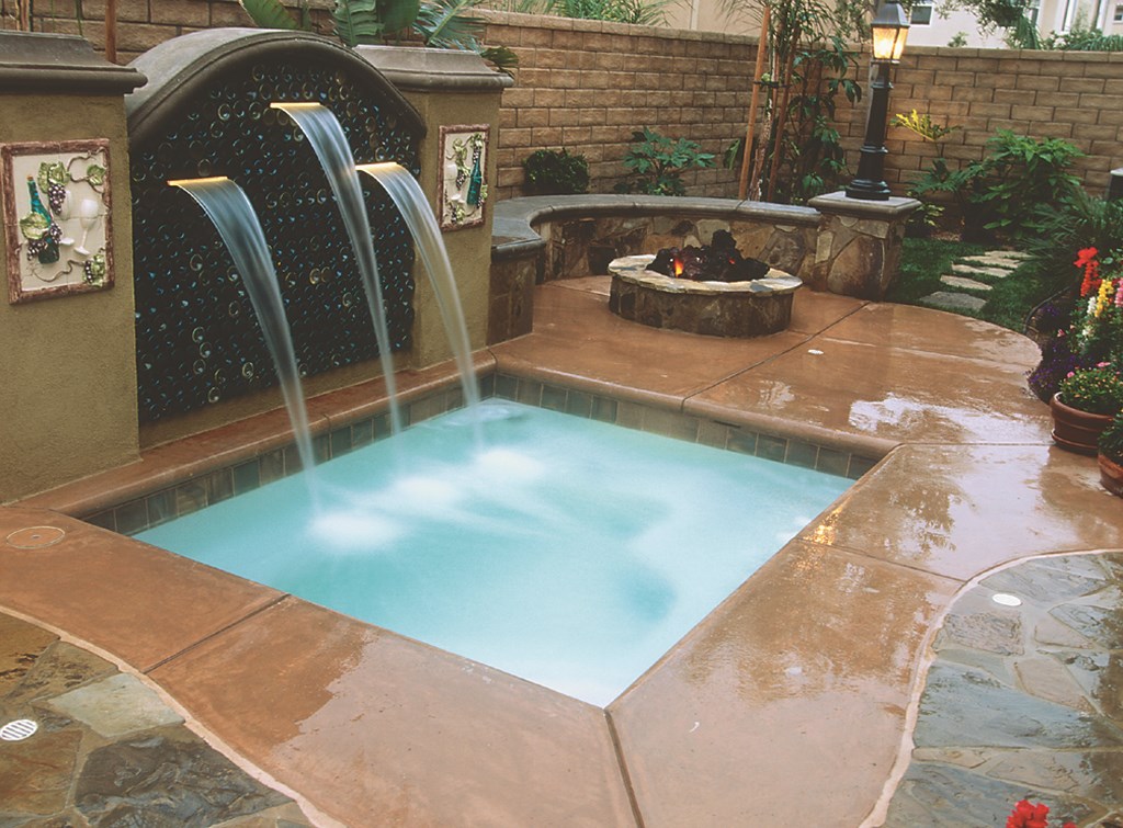
We built them a beautiful barbecue area to meet that need, but for the wine-bottle detail we shifted our attention to the spa and a design that includes a raised wall outfitted with a waterfall and 450 stacked wine bottles. (With so many bottles, we conferred with our structural engineer to make certain they would be strong enough to carry the weight. With some testing, we determined that they had as much strength as glass block!)
The spa is a pre-fabricated shell that wouldn’t sustain any surcharge, so we designed the waterfall with a footing that reaches five feet below grade – that is, below the depth of the spa. The wall is 14 feet across and five feet tall, with bottles spanning ten feet flanked by two-by-two-foot pilasters on each end.
There was a hitch in that nobody at the permit office had ever seen wine bottles used in a waterfall before and we had to prove to official satisfaction that the bottles could support the weight and would be stable enough that the wall wouldn’t collapse and fall into the spa. With the engineer’s help, we won them over.
Placing the three waterfall weirs in the bottles was a bit of a challenge, but once we cut the tops of the bottles and accommodate the reservoir on the back, the rest of the installation process was easy. One difference this time is that we used a sparkler wheel in the fiberoptic illuminator: This lights only some of the fibers at any given time and makes the bottles appear to dance – a spectacular effect.
Scott Cohen is president The Green Scene, an outdoor design/construction firm in Canoga Park, Calif. An accomplished ceramicist and sculptor, Cohen specializes in custom-designed tiles and sculptures that add imaginative personal touches to his designs. His work has been featured on HGTV’s “Landscaper’s Challenge” and “Designing for the Sexes,” as well as in local and national media including The Los Angeles Times, Sunset Magazine Pool & Spa Book, Woman’s Day and Better Homes & Gardens. He is member of California’s Contractors Board Industry Expert Program and lobbies for ethical Workers’ Compensation practices in the construction industry.


