Blended to Perfection

My last two “Details” should make it pretty clear that I’m more enthusiastic about tile than I am about any other surface material for watershapes. In October, we covered the use of color while focusing on tile, and in November there was a discussion of my favorite suppliers and their distinctions. This time, I’ll bring the sequence to a conclusion by looking at the process of selecting tile and at the ways I blend tile mosaics.
My enthusiasm extends from the fact that tile in watershapes is incredibly dynamic – so visually flexible, so durable and, if done well, so elegant. It can be used either as a complementary material that recedes into the design to blend seamlessly with plaster, coping or other edge treatment – or, by contrast, as a distinctive design element that makes a strong statement.
The first step in defining and refining the options you’ll share with clients requires you first and foremost to understand which path you’re following and the basic intent of the overall design scheme. For this discussion, let’s assume that the choice of tile is based on a decision to develop a harmonious color scheme and a watershape that is a coordinated part of an overall environment.
MATCH GAMES
Let’s start the development process by considering tile accents that will blend with other elements.
In such cases, my usual approach is to select tile that matches the plaster. This works beautifully when you succeed in matching tile and plaster so closely that you eliminate any variability in appearance at the waterline and all boils down to how good your plaster is and how custom you want to go.
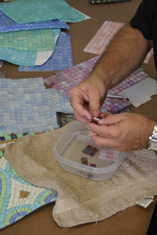
| Working up evocative blends for tile mosaics requires having lots of choices on hand to fuel the selection process. You can work with what suppliers offer or, as shown here with tiles from Sicis (Ravenna, Italy), you can cut up samples, free tiles from their backings and develop new blends on your own, as I typically do. |
Matching plaster to tile means first mixing plaster samples that will, when fully cured and then placed under water, will match the color of a selected tile. This can be a painstaking process and involves working with oxides while accommodating the basic color of the cement (white in some cases or any one of a number of shades of gray, including reddish or greenish grays and and many more). It’s not unlike mixing paint or plaster for the exterior of a house: You keep making samples until you get a nearly perfect match, which might mean just a few tries or lots of attempts.
One of my favorite plaster colors is green – something I’ve mentioned in this column many times. When I work with green, I typically select one of two one-by-one tiles from American Olean (Dallas). Through experience, my plasterers know exactly how to match the color of these tiles, and the look is terrific.
I have similar preferred combinations for other colors as well – and enough experience to show me that there’s never a need to hesitate with any sort of tile/plaster combination if the design and the client’s preferences lead me in that direction.
To me, working to achieve a match of tile to plaster is the best way to go – unless, of course, you’re using tile to make a distinct artistic statement. I’m not a fan of trite bands of cutesy tile at the waterline – or of tile that looks like stone when it doesn’t blend with other design elements. And as I mentioned in October’s “Details,” I consider blue tile on gray or black plaster a fluorescent abomination that runs exactly counter to the concept of creating a body of water that blends seamlessly with its surrounding environment.
ON THE WALL
In selecting a specific tile product, you must be familiar with the way its supplier mounts it. Some products, for example, come only in stacked form, which means trouble any time the tile needs to cover a curved surface (the top of a spa dam wall, for example). For curved surfaces, in other words, you are limited to products that come in an offset (or jog-jointed or running-bond) pattern that will help you avoid big, ugly, pie-slice grout joints.
This same consideration applies especially when tile is used to surface an entire vessel: If you have an interior shape that offers anything other than perfectly perpendicular surfaces, you’ll find yourself facing the same issue of covering radii, particularly in corners where walls meet floors.
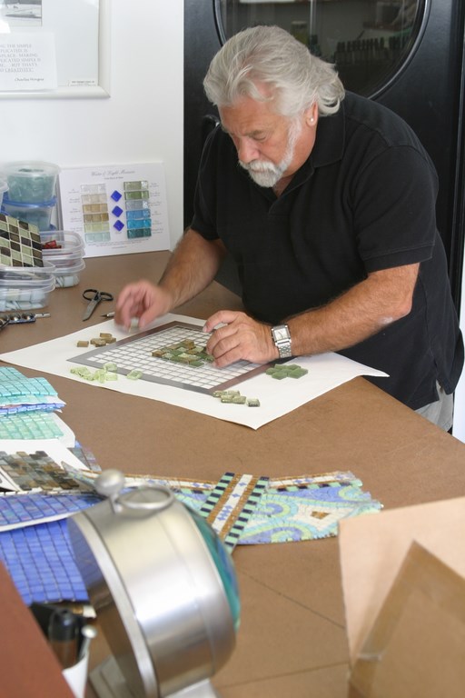
| The process of developing custom blends has been simplified by the people at Boyce & Bean (Oceanside, Calif.), who provided me with a grid that makes experimenting with tile combinations a relatively simple process. One neat thing about the grid is that it helps you visualize the grout joins as part of the composition. |
What I’ve seen far too many times are tile surfaces that run a stacked pattern on the flat surfaces and then switch to offset patterning on the curves. This can really mar and otherwise beautiful surface by disrupting the continuity and flow of the tile pattern and basically indicates a lack of knowledge on the part of the installer or those directing the installer.
In one amazing case of installer ignorance, a self-styled tile expert who had been hired to fill a pool with gorgeous mosaic glass tile on the basis of lots of experience actually put the tile on backwards, with the mounting paper up against the wall rather than the other way around. That one was a total disaster of an immediate sort.
I’ve also seen cases where installers have tried to mix tile sizes – big ones high up on the walls with smaller ones to deal with the radiuses in the cove – with chaotic overall results with absolutely no visual continuity across the tiled surfaces. Then there are those who start out on the walls with stacked patterns but shift to offset patterns when the surfaces get tricky lower down in the pool.
I’ve also seen projects where the designer has apparently run into problems in selecting a grout color. Some have a tendency to select dark grouts with the idea that they will blend more smoothly with dark-colored tile – and I think that’s almost always a mistake.
First of all, dark grout will noticeably change in appearance over time and will really show scale when it forms, which can completely distract from the appearance of the tile. More important in my view, dark grout makes even the most vivid tile recede into the grout lines and detracts from the overall appearance.
BIGGER PICTURES
As much as I love tile in general, I really love tile mosaics. I’m not talking about figurative mosaics of sea creatures here: What I mean is broad fields of tile in different colors that blend together visually to create dancing seas of color, texture and visual energy.
To me, developing these blends of colored tile is among the strongest of all ways we have to create watershapes that are sculptural works of art. As I mentioned in November’s column, there are many products out there that work in these applications, and the suppliers I mentioned there are just a handful I particularly like. Truth is, there are myriad products out there that cover a broad spectrum of possibilities that need to be considered.
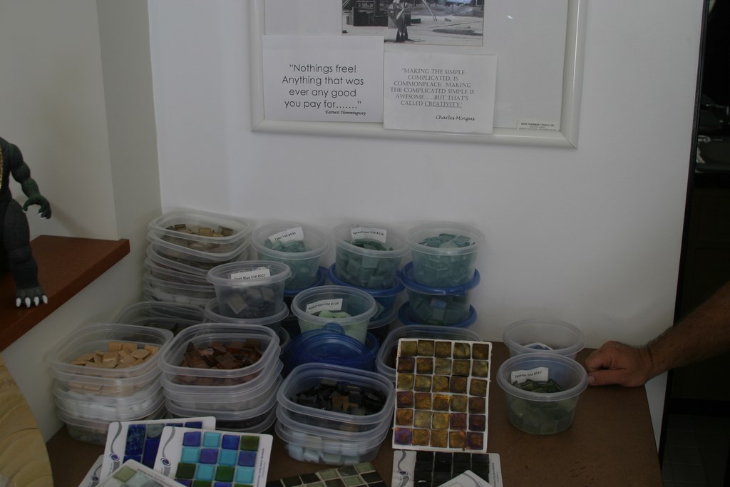
| For me, the key to developing custom tile blends is having representative sets of samples on hand, as with my collection, seen here, of specimens from Oceanside Glasstile (Carlsbad, Calif.). Amassing these samples takes a substantial investment – suppliers don’t give this stuff away! – but the results are well worth it when you work up the right combinations of colors, finishes and reflective qualities. |
To work in tile mosaic finishes, you really do need to familiarize yourself with these product options. You need to keep up with the available colors and the new ones that seem to emerge every day. You need to learn as much as you can about mounting options and the willingness of suppliers to provide custom as well as off-the-shelf blends.
Just as important (if not in fact, more important), working with these surfaces means you actually need to offer them to your clients! I know that this is difficult for many people in this business, but to work seriously in tile, you need to overcome any hesitation you might have to suggest that your clients need to spend their money to make greater pleasure in their backyard environments a real possibility.
My experience is that clients become extremely passionate about tile surfaces when the option is presented. These products are so beautiful across such a wide visual spectrum that clients will often make getting it a top priority and allocate significant resources to getting just what they want. Naturally, we must be mindful that it is a significant purchase, so it is absolutely incumbent upon us to make certain you’re giving them something they will love just as passionately when it is finally installed.
Often, that means taking the time to present these clients with a variety of options. For my part, I spend a great deal of time and effort creating custom blends and presenting them to the clients for their careful consideration.
IN THE STUDIO
Developing these options for my clients takes time, because I prepare each of the samples by hand. In my studio, I maintain large supplies of mounted and individual tiles to use in making up blends. Yes, acquiring all of that tile has represented a significant investment, but I now have hundreds of tile pieces on hand in dozens of colors.
When I begin playing with these samples, I’m typically aiming to blend three or four colors in varying ratios to achieve different looks. When I light on something I like, I will mount it on light crescent board, which has a nicer appearance and finish than standard poster board.
Two suppliers in particular have aided this mosaic-development process: My friend Walter Iberti at Boyce & Bean (Carlsbad, Calif.) providing me with a metal-grid template that makes it easy to move pieces around while letting me see consistent “grout” lines. The folks at Bisazza (New York) went well beyond that, giving me a table that reminds me of an old typesetter’s bench complete with tile-storage areas, trays for individual tiles, film for binding selected tile patterns together and a generous work surface.
My initial approach in blending tile mosaics involves working with relatively tight color combinations. When I’m working in greens or blues, for example, I’ll set up colors that range from light to dark over a very narrow bandwidth of shades. That’s not to say I won’t break out of the box and add in a dramatically color or shade from time to time; generally speaking, however, I’m aware that wide variations in color will draw attention to individual pieces rather than creating a smooth, harmonious field of color.
Bottom line: Mixing mosaic samples takes time, practice and considerable patience. It’s also largely an intuitive process that requires randomly mixing tiles while keeping in mind the way the colors are being dispersed in the mix. I don’t want some areas to appear darker or lighter than others, for instance, nor do I want to see anything that looks like repeated pattern.
I’m definitely not a fan of uniform-appearing tile surfaces because, in too many situations, those surfaces pretty much disappear or dissolve to become an uninteresting blob of color as opposed to a vivid blend of color.
When my samples are ready, I’ll present two, three, four or more possible mixes to clients and give them the time they need to consider each one. If none of this first batch hits the mark, I go back to my studio and start over, adjusting color selection and ratios and sometimes coming up with completely fresh color schemes to provide contrasting examples.
THE RIGHT MIX
Yes, working with tile in this way is a major investment of time and money, and at this point I’ve put several thousand dollars into keeping my studio supplied with the best products I can find in the vast tile marketplace. But it’s also a great pleasure to work with these beautiful materials, and I’ve come to see it as a relaxing and entirely enjoyable process.
In approaching the work, I always make a point of blocking out enough uninterrupted time that I’m reasonably certain I’m not operating in any sort of distracted hurry. It’s a process that requires a “feel” – and one that becomes more interesting and effective (and fun) the more you do it.
These efforts are almost always well worth the trouble when a client signs on and approves an all-tile surface – a sense of satisfaction topped only when the surface is installed and the watershape is filled with water.
David Tisherman is the principal in two design/construction firms: David Tisherman’s Visuals of Manhattan Beach, Calif., and Liquid Design of Cherry Hill, N.J. He can be reached at [email protected]. He is also an instructor for Artistic Resources & Training (ART); for information on ART’s classes, visit www.theartofwater.com.


