Big Ideas, Small Space

It’s a class of projects I’m coming across more and more often these days: Clients with homes in new developments want swimming pools and spas for their backyards, but the buildings are so big and consume so much of the available real estate that finding places to put worthy watershapes is a real challenge.
The difficulty, of course, is that these homeowners are just like the owners of larger properties in wanting more than just pools and spas these days: They’re thinking about generous seating and dining areas, outdoor kitchens, fire features, waterfeatures, landscaping and all that comes with creating a space for entertaining as well as relaxing and exercising. With all that on the agenda, it’s left to me to size up the situation and accommodate their wishes as best I can.
I don’t know exactly what it’s like in other parts of the country, but where I work, these new developments are everywhere now, with two-story, 4,000-square-foot houses situated on lots that, 30 or 40 years ago, would’ve accommodated a much smaller ranch-style home. The backyards of today’s behemoths are generally no more than narrow strips running along the back of the house, with slim passageways along either side. And by the time our conversations begin, those accessways are often dotted by air-conditioning units, solar system control panels, gas meters and more.
The good news I have for my clients is that it’s possible to make these projects work. In fact, I’ve found that good things really do come in small packages.
READY TO PARTY
Not long ago, I received a call from the owner of a house in Porter Ranch, Calif., with a request for a backyard design. This community is on the northern edge of the San Fernando Valley, a place where swimming pools are as close to standard residential equipment as they get anywhere in the world.
He let me know that he was in the entertainment industry and wanted a space where he could host parties and have fun with his guests. In visiting the property, I had two immediate observations: Access was extremely tight, and the yard was extremely small. I could make it work, I told him, but I knew there were some interesting design decisions ahead.
He started the ball rolling with an ambitious wish list, including a pool, a spa, an outdoor television, an outdoor kitchen, some fire features and a great sound system. He was also keenly interested in establishing a free-flowing relationship between the home’s interior and the backyard and wanted it all to look fantastic.
I went back to my office and began balancing his desires against the available space. As I see it, this is an exercise in ergonomics and figuring out how a space can best be organized for efficient use. Knowing that he was not unlike other clients I’ve worked with in similar situations and that he wanted as much as possible in his backyard, I called on my 30-plus years as a designer and pulled it all together in a way that made sense and had the visual integrity I always focus on delivering.
I began by defining traffic patterns and projecting how multiple people would move through the space simultaneously, whether in the same or opposite directions. This opening gambit already pushed me out into a large chunk of the available space, but there was still some room to maneuver.
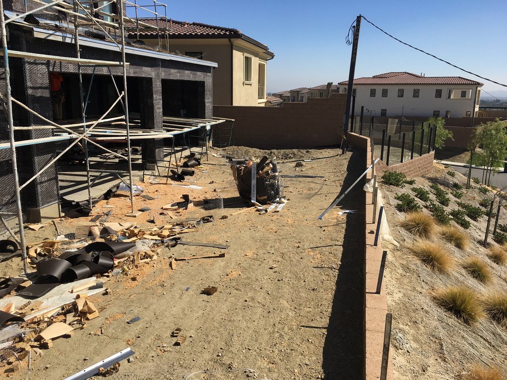
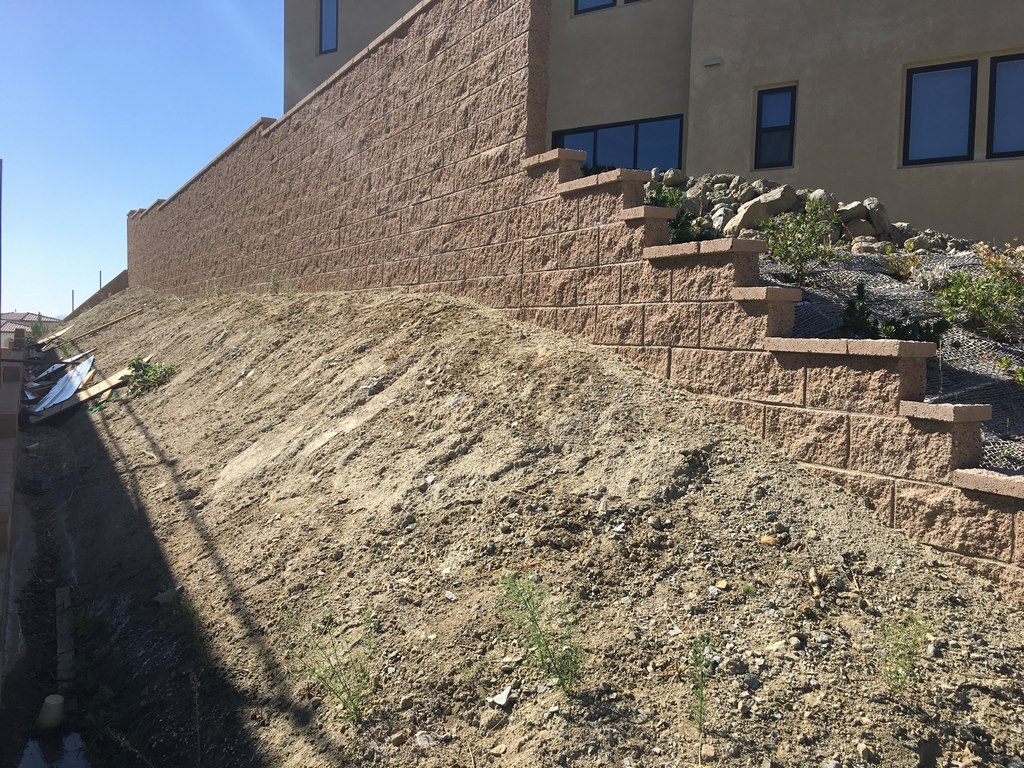
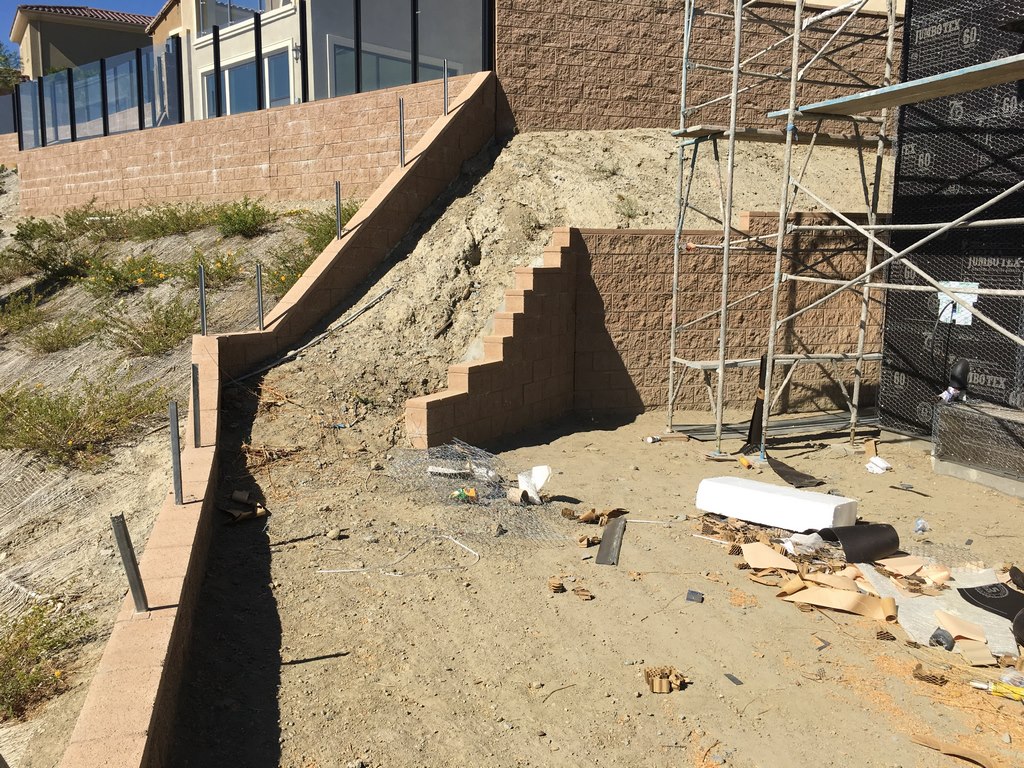
| The site was long and narrow (left) – and so was access, which amounted, on one possible path, to a drainage swale on the edge of the lot bounded by an internal block wall that constricted our alternate path to a slot next to the house. We’ve learned through experience that we can’t let limitations like these get in our way, because properties of this description are increasingly common in new developments in areas where we work. |
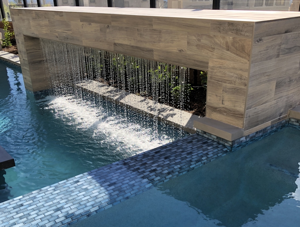
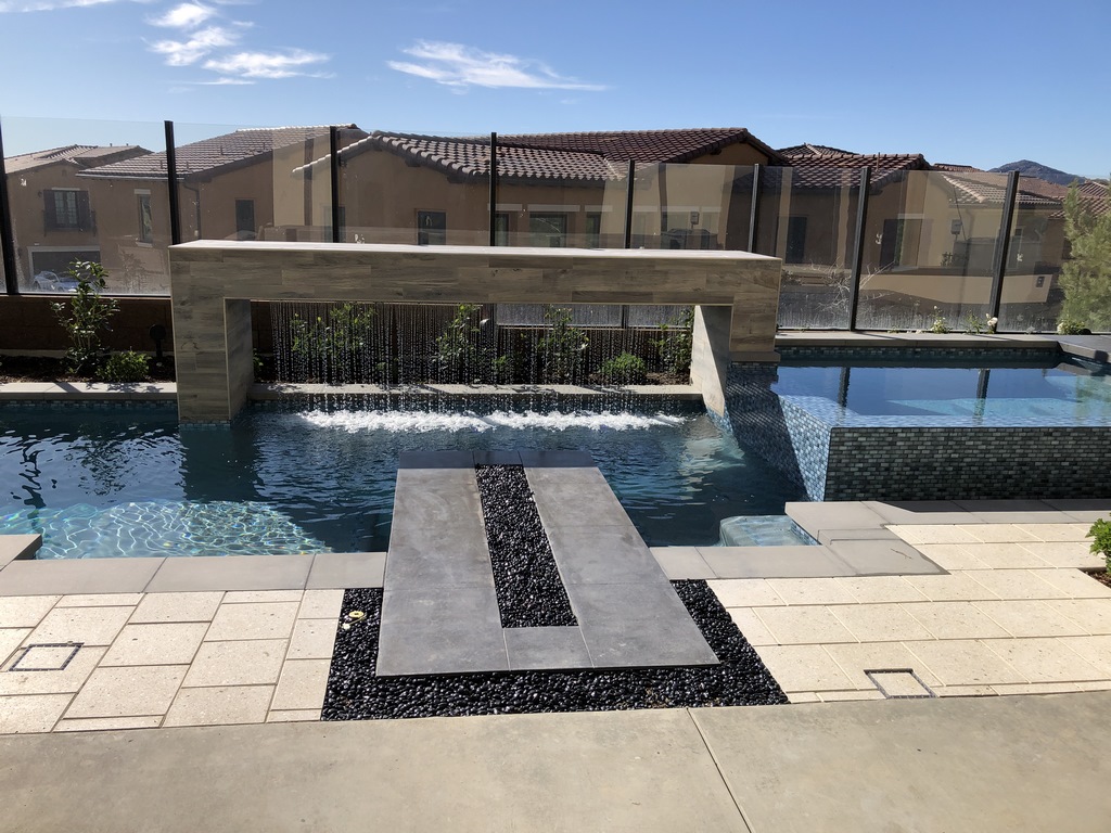
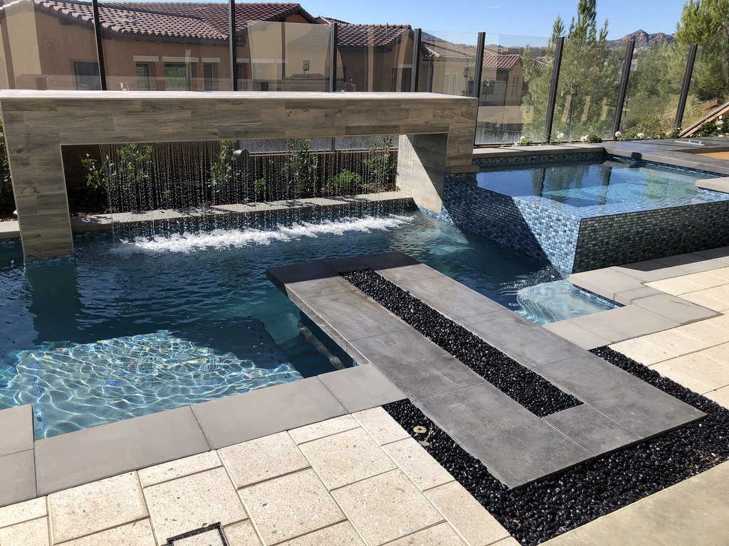
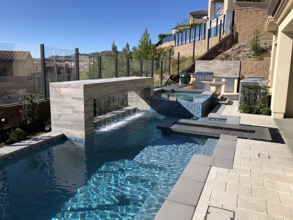
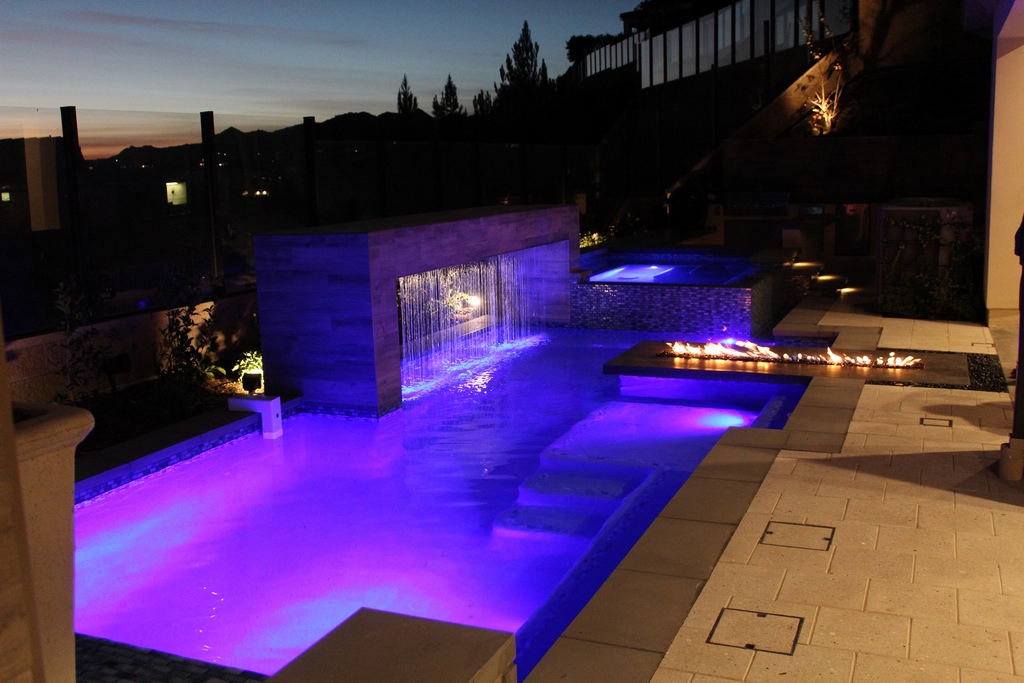
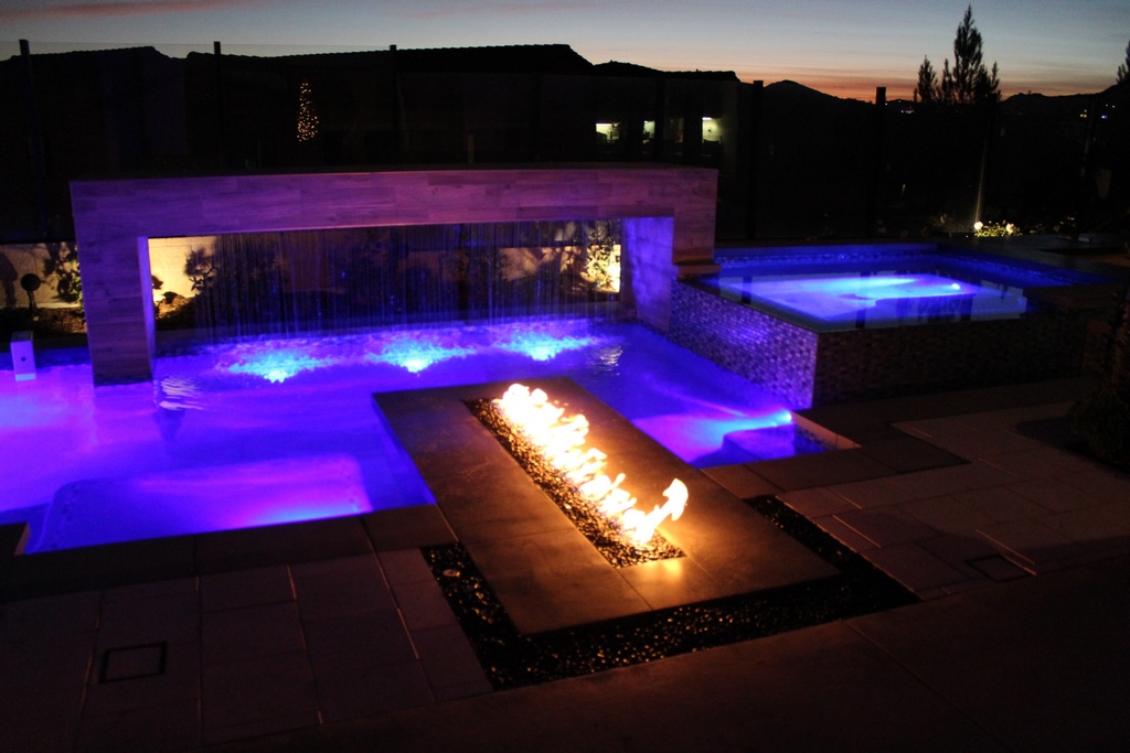
I then considered where key elements might be placed relative to the main view from inside the house. Two oversized, fold-away glass doors defined the main access point, so this was where the fire feature would be. Behind it, the view was of multiple neighboring homes, so I framed the fire feature with a rain-curtain structure to reset the way eyes would move as people stepped toward the deck. The pool was placed in the gap between the fire feature and the rain curtain, with the television on the left side and a raised spa on the right. Beyond the spa was a partially sunken outdoor kitchen.
There was no thought of creating a lap pool, so I decided to reduce its size and dedicate more space to the spa. The thought here was that the spa could easily be used as an entertainment resource all year long; even if it was heated, the pool would have a shorter party season. Flanking the television would be a waterfall topped by a planter bowl – something for visual effect at that end of the pool when the big screen wasn’t on.
I prepared the basic plan knowing that I’d have to explain certain tradeoffs to the client, who had, for instance, requested multiple fire features. I figured I had compensated for such “deficits” with multiple cool details he hadn’t considered, from the rain curtain to treating the surround for the fire feature as a table where people could sit in the water and warm up while having a drink or eating tapas.
It was actually a fun presentation: He quickly understood what was going on and we were on our way.
WORKING THE SPACE
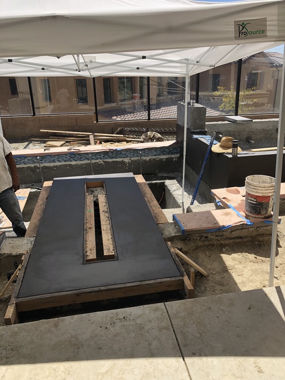
Immediately, however, we hit two snags: First, the available access was as bad as I had anticipated – a narrow passageway about four feet wide at the bottom of a tall, engineered slope set at a 45-degree angle. This meant we had to bring in the smallest Bobcat we had, adding time and effort to the extensive excavation process.
Second, the air-conditioning folks placed their fan units off the home’s back wall as planned, but the units were larger than we had anticipated and had been set well away from the wall – an unexpected intrusion that pushed into the available deck space by well over three feet in two key places. This threw a bit of a monkey-wrench into the traffic allowances I had made, so what would’ve been a comfortable space for two people was shrunk down to a tighter squeeze. But still, it was possible!
Beyond that, the construction process moved along at a good pace and the picture started to come together.
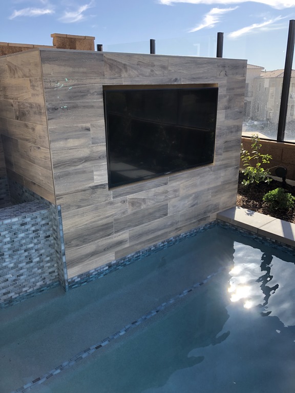
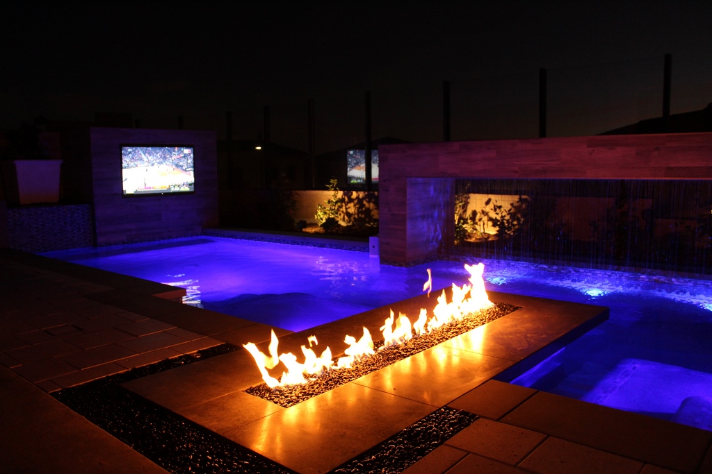
We placed the television behind an acrylic panel to protect it from the elements and used its structure, set in a corner, to hide the pool, spa and waterfeature equipment. The facing for the television stand and the rain-curtain arch is a large-format porcelain tile with a wood-grain texture. This same material is found as flooring inside the home – a big step in our plan to create visual links that flowed seamlessly from indoors and out into the poolscape.
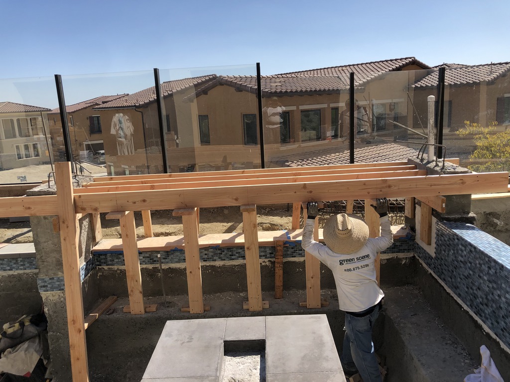
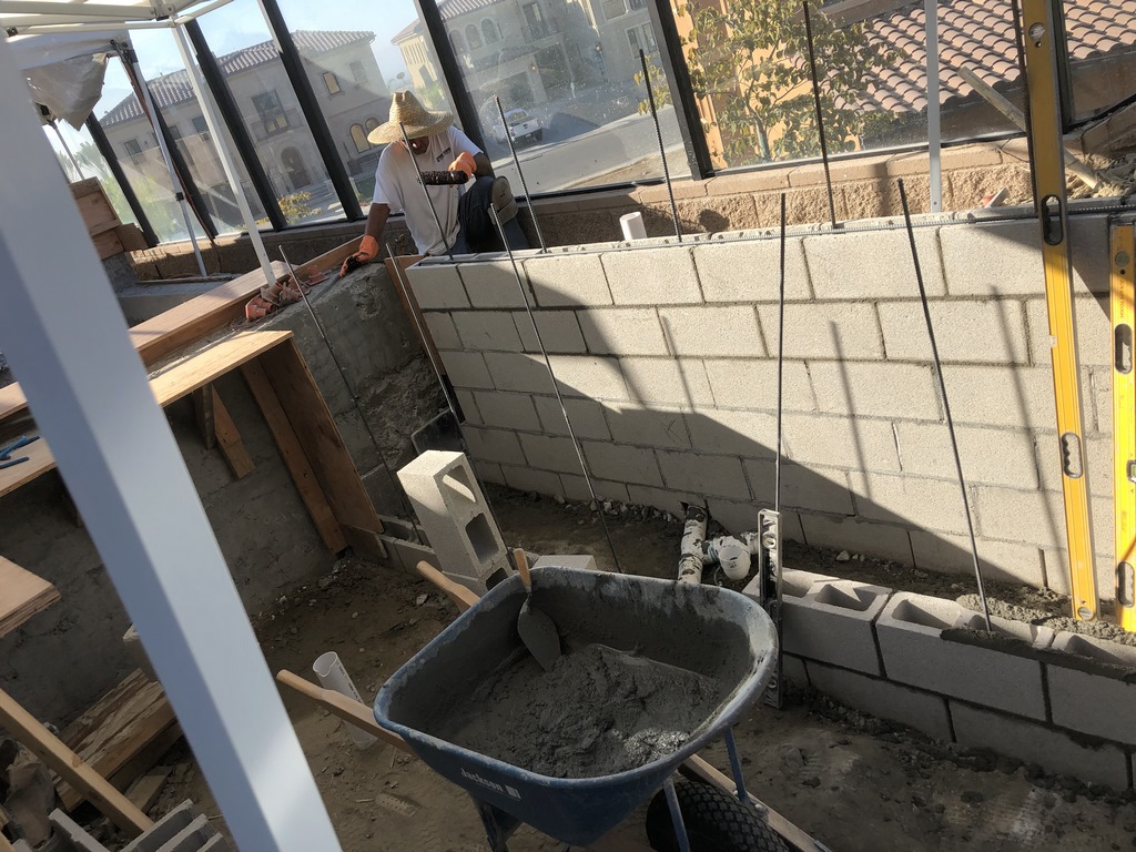
| Our work on the project’s signature fire feature and rain curtain moved along smoothly in relatively open spaces, but our progress in the intimate kitchen/bar space was another story: Here we were challenged by the need to fit multiple counters, storage areas and transitions into distinctly tight spaces – sort of like working inside a spa without all the plumbing but across a much larger area. |
In fact, the entire color palette worked to tie interior and exterior spaces together. The cream-colored decking, the gray coping, the black surround for the fire feature, the blue tile and the pool’s interior finish all harmonize with interior details and create easy visual transitions throughout the space. The plantings are a key part of the program as well, livening the low-key impressions made by the muted colors around them and softening the edges of all the structures set above water level.
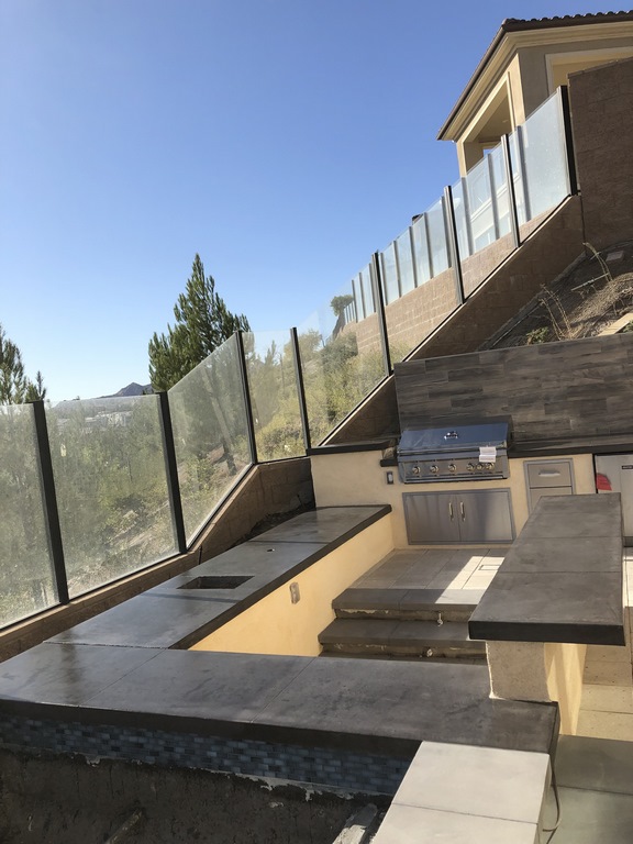
In another cool detail, we sank a section of the outdoor kitchen down to the level of the spa to create a spa-edge bar area – but we kept the main portion of the kitchen at deck level to maintain its visual connection to the surrounding space. It’s all pretty straightforward, with these easy-flowing relationships designed to encourage movement through the space and create a variety of gathering places, all in the name of maximizing entertainment value despite the site’s physical constraints.
Sound was keenly important here: The rain curtain operates on a WiFi-enabled, variable-speed pump so the client can adjust the flow to the situation. And even if it’s off, there’s a helpful bit of noise emanating from the waterfall as well as the perimeter overflow that surrounds the spa. The television plays a part, too, with a sound system that runs throughout the yard with an array of high-quality speakers capable of turning the space into a concert hall.
The good thing is that much of this sound stays within the yard: The speakers are directional and point toward the house, and the glass wall that surrounds the space does a good job of containing the sound within the backyard.
THINKING SMALL
The result of all of this is that the drawing we gave the client in our presentation was essentially what we produced for him.
The dynamics of small spaces are often approached as simple problems of scale and proportion, but in the course of working on so many backyards like this, I’ve come to see them as encompassing the fullest possible spectrum of design considerations. It’s not about dialing things back and simply going small. Rather, it’s about rethinking the possibilities with respect to traffic patterns, visual flow, textures, contrasts, materials, gathering places, relative “room” placements and all of the factors that make today’s watershaping such an all-encompassing design challenge.
| By day, the rain curtain is the visual key to the space, pulling the eye down instead of letting it wander to neighboring structures as you explore the rest of the low-profile space. By night, the backyard comes fully to life, with fire, television and lighting added to the picture as the setting awaits the arrival of guests and the start of the evening’s festivities. |
Look at it this way: These projects can cost nearly as much as those we build in much larger yards. The shell may be upsized in the latter case, but quite often the main difference is the price of a thousand square feet of lawn and a big irrigation and drainage system. And there are ongoing advantages to compact yards with respect to operating costs, maintenance, water use and more.
In this case, the key decisions had to do with oversizing the spa, shrinking the pool and extending the fire feature out into the pool instead of running it lengthwise on the deck. We moved the outdoor kitchen to the far end of the yard, but we integrated it into the setting by lowering part of the space to relate directly to the spa. We took advantage of colors and materials used inside the house to create visual and tactile links with the space outside.
In doing so, we applied principles of good design that serve giant backyards as well as tiny ones – and it worked like a dream here. These projects are different, yes, but that’s because doing them well can be even harder than is the case when you have all the room in the world.
There was a time when I recoiled when spaces prospective clients offered me were “too small.” Now I embrace these opportunities, approaching them as a problem-solver who does all he can to come as close as possible to meeting all of my clients’ needs. Easy to write about, hard to do!
Scott Cohen is president of The Green Scene Landscaping & Pools, a design/build firm based in Chatsworth, Calif. He provides consultation for clients nationwide and gives seminars on designing landscapes, swimming pools and outdoor kitchens in addition to being a construction defect expert witness. For more information, go to www.greenscenelandscape.com.


