Beyond the Lawn

Last month, I discussed the benefits of sustainability and its place in landscape and watershape design. As I hope I conveyed, I think it is incumbent upon us as professionals to be responsible for our actions and constantly aware of the effects our work has on the environment, now and in the future.
With the current severe drought desiccating the southeast, ongoing water problems in the west and increasing pressure on the water-supply infrastructure nationwide, it’s more important than ever that we practice our professions wisely. This is why I am always trying to find ways to convince my clients that the all-American patch of lawn is one of the worst offenders when it comes to sustainable design.
Yes, much has been written in defense of lawns: They help remove pollutants from the atmosphere, provide local cooling effects, help reduce water runoff and serve as playgrounds for children, sporting events and entertaining. But in my book those advantages are outweighed in many cases by the fact that lawns also gobble up huge amounts of resources (including water and fuel) and contribute to pollution resulting from the use of gas-powered mowers and various fertilizers.
So how would I replace this icon of American suburbia? The answer, as always, involves thinking outside the proverbial box and engaging in a bit of responsible design.
ALTERNATIVE THINKING
I’ve done what I can to educate and enlighten my clients about the lawn issue for years. Usually, it comes up when we discuss irrigation systems and what it takes to maintain the large expanses of close-cropped greenery so many of them want to keep as green as the fairways at the local country club.
Now that the water crisis has become better known and has reached the point where most of us are aware of how dire the situation is, clients have become more receptive to our reservations and are reconsidering their lawns. Often, they’re willing to scale them back, but in some cases, they’re open to eliminating them completely – even in cases in which water shortages aren’t a direct issue for them.
As a case in point, let’s look at a project that began as a perfectly normal call from a potential client that turned into the talk of the town.
That call came from someone who’d purchased a five-year-old, hilltop home in an exclusive private community. The neighborhood includes about 20 homes on varying-sized lots and backs up on a large wooded area protected by conservation easements and Department of Environmental Conservation regulations. Any work to be done on site had to be presented to the local town board for a variance; without such a variance, nothing at all could be done.
As is so often the case these days, the architecture of the house is a conglomeration of ideas inspired by various styles. From the street, for example, it has many features of a Cape Cod, with dormer windows and a porch as dominant features. But the columns holding up the porch have details reminiscent of a Colonial, while the back of the house, to quote one of the clients, looked like a “two-story double-wide trailer.”
When I design, I always start by taking three major factors into account: architectural style, the clients’ wishes and what falls out of my head. Of the three, the architecture is almost the most significant point of departure for my design thinking: I use it as my guide unless the clients’ desires dictate otherwise.
In this case, there was no dominant architectural feature or theme to latch onto or match, so I felt a good bit of freedom to pursue the clients’ wishes and see whatever might fall out of my head in the process.
FINDING A STYLE
The home in question had been the original model for the entire development, so the landscape had been something of a we-need-to-install-some-landscaping-for-the-model-to-make-it-look-expensive-but-we-don’t-want-to-spend-a-lot-of-money-doing-it situation. In my experience, developers don’t invest much in the landscapes of these homes and instead drop in some plants and walkways on the cheap – as though landscaping were no more than a necessary evil.
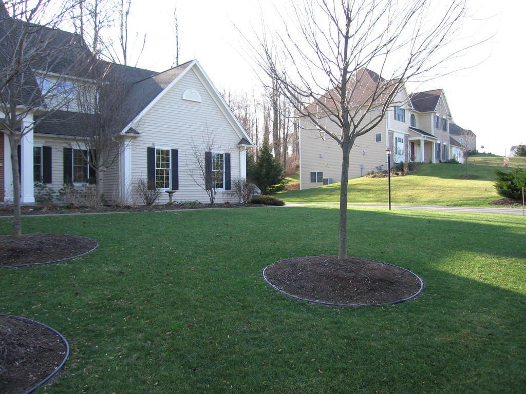
| The home had been the model for the entire development, and only minimal attention had been paid to its landscaping. There were a few nice trees out front, but beyond that there was nothing more than an unimaginative foundation planting and a broad expanse of lawn. |
The results of that effort in this case was an uninspired foundation planting, a walkway made of inexpensive concrete pavers and a smallish Trex deck off the back of the house. To their credit, however, the developers also planted a few red maples out front and a couple of large evergreens in the rear, mainly to provide privacy from neighboring properties.
Right off the back of the house, the grade dropped about eight feet to a lower level patio and from there reached across the abovementioned conservation easement. This wooded area continued downslope to a 100-foot-deep ravine and featured some fairly impressive and well-established maples and oaks along with a variety of native plants.
The installed landscape near the house, however, had little going for it – the cookie-cutter design typical of subdivisions everywhere. Compounding the problem was the fact that the original purchasers of these homes hadn’t upgraded the provided landscapes, nor had any of them done much to take advantage of the sites’ wooded, amply contoured features. These were upscale homes, but nobody seemed inclined to treat them that way.
Our clients, however, were newly arrived in New York from their home in Colorado, and we soon learned that they’d both grown up in the Canadian Rockies. They spoke so wistfully of mountainous terrains and the visual drama of lakes, waterfalls and alpine plants that it didn’t take much for us to figure out what would make them happy.
She was particularly communicative on what she missed about living in Colorado, noting in the pre-meeting questionnaire we’d sent them that she loved the large fields of daisies and other alpine wildflowers she’d grown up with.
With cues that clear, it didn’t take much to get the creative fires burning.
INTO THE TREES
While I was on site with them, however, I held back just a bit: I usually try to give clients some idea of what I’m thinking – perhaps mentioning my thoughts about using a particular material or addressing a specific grade change – but I always like to hold a few things in reserve so we can surprise them in presenting our ideas.
In this case, one of the surprises was our plan to convert the existing front lawn into a mountain meadow planted with an endless wash of daisies. As I saw it, this was an access point to my usual discussion about sustainable design – a perfect opportunity, in fact, because the repurposing of the lawn area would carry both of them back to their happy childhoods. Even during our initial meeting, this lawnless front yard was a fixed part of the design forming in my mind.
The clients’ responses to the questionnaire also indicated that they wanted some sort of watershape to be included in the overall design. With the slope out back, it seemed a no-brainer to work up a dramatic waterfall, but the problem was that it would need to fall away from the house and down the slope, so they wouldn’t be able to see it easily from inside the house.
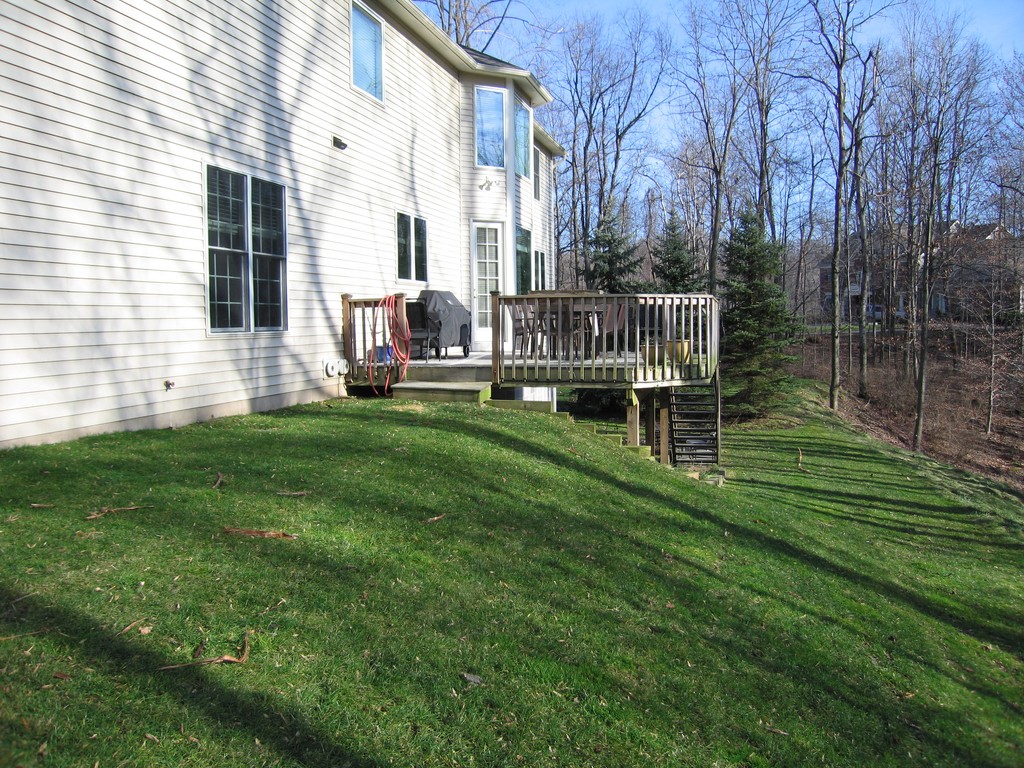
| The scene out back was just as uninspired – this time without even the break of a foundation planting up against a home that the homeowner described as having the look of a ‘two-story, double-wide trailer.’ The deck was small and awkward, there was too much lawn and the design did nothing to exploit the beauty of the trees just beyond the ravine. |
This problem was solved when we walked out onto the existing deck and the husband made a derogatory comment about it.
The deck was an uninspired 20-by-14-foot rectangle with a staircase leading down to a lower-level patio in a straight shot – 15 risers with no landings or turns. It was long enough to make it seem like a never-ending staircase and did absolutely nothing to invite anyone to use it.
Standing on that deck, I had an overwhelming desire to reach out and touch the trees, but they were a good 20 feet away. If you approached the steps, you looked down onto a small swath of grass and then down the slope and into the ravine. My immediate thought was to extend the deck out over the slope, essentially putting it into the trees to make those standing on the deck feel as though they were in a forest.
This deck extension would be a number of steps down from the original deck’s height, thus creating a multilevel space and setting up the lower deck as an intermediary between the top deck and the patio space below. Also, this lower deck would cantilever out over a pond we would build as the terminus of the waterfalls we’d install. This platform would be the perfect viewing spot for the watershapes and would also, to address the theme of sustainability, eliminate the lawn.
TAKING SHAPE
This program left us with one last concern – that is, the view from the lower patio back up to the house, where the prospect was dominated by the slope and the underside of the original deck.
It wasn’t a pretty picture: The dense shade precluded growth of most plants, so it was essentially a dirt incline that was slowly washing down into a small planter box that had been built between the underside of the deck and the lower-level patio. I asked the clients what their vision was for this area, and their response was quite direct: “You’re the designer. You figure it out!” – and I already had.
What made this project wonderful were two things: First, the site incorporated some challenges, none too overwhelming to solve in terms of either design or budget. (While the clients had given me a budget, their body language assured me that there was some flexibility so long as I came up with ideas that made them happy.)
Second (and more important), this project involved clients who gave me freedom to design with no micromanagement: They made it perfectly clear that they expected a top-quality design and top-quality installation. All I had to do was present them with a plan of action and move along.
Next, we’ll take a close look at the project in words and images.
Bruce Zaretsky is president of Zaretsky and Associates, a landscape design/construction/consultation company in Rochester, N.Y. Nationally recognized for creative and inspiring residential landscapes, he also works with healthcare facilities, nursing homes and local municipalities in conceiving and installing healing and meditation gardens. You can reach him at [email protected].


