Suburban Spaces
I’ve always been fascinated by the concept of urbanism as defined by Thomas Jefferson: He boiled it down to the notion that everyone should have his or her own private space as well as a buffer against the outside world.
In a sense, the physical concept of the front yard fits perfectly within Jefferson’s utopian ideal. At root, it’s an ingenious setup that has probably endured for so many centuries because, on some level, it addresses our primal need to have land all around us. By the very configuration of our residential spaces, we each have a small, open, pastoral area that separates the privacy and sanctity of the home from adjacent public areas, sidewalks and streets.
The problem is that in many modern cities and suburbs, the amount of room allocated for front yards in particular has dwindled as property values have soared and lots have become smaller and more tightly packed as a result. And when you combine that spatial shrinkage with the increased desire for safety and privacy on the part of many homeowners, it all works together to place ever-higher premiums on how we choose to make use of our small slices of front-yard land.
To my mind, this dynamic set of trends spells opportunity for forward-thinking watershapers, landscape architects and architects: By making creative use of small front yards (and side yards as well), we can help our clients find a greater sense of peace and privacy in their homes and essentially expand their usage of their precious available space.
SIMPLE TRUTHS
Of course, watershapers and architects would all love to work more or less exclusively with limitless tracts of land, but in today’s urban and suburban contexts, more of us need to focus on the needs of clients who live only a few feet away from the street and their next-door neighbors’ walls.
The project pictured here is a precise example of this type of value-added focus and is all about working deliberately with and making the most of that all-important, buffering frontage that visionaries such as Jefferson saw as essential to the happiness of regular folks.
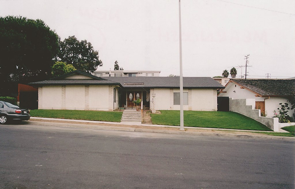
The home in question is located in a middle-class neighborhood in an area of Los Angeles known as Ladera Heights. It’s a pleasant-enough area, with lots of well-kept single-family homes on relatively busy streets – not much different from thousands of other suburban areas in cities throughout the western world.
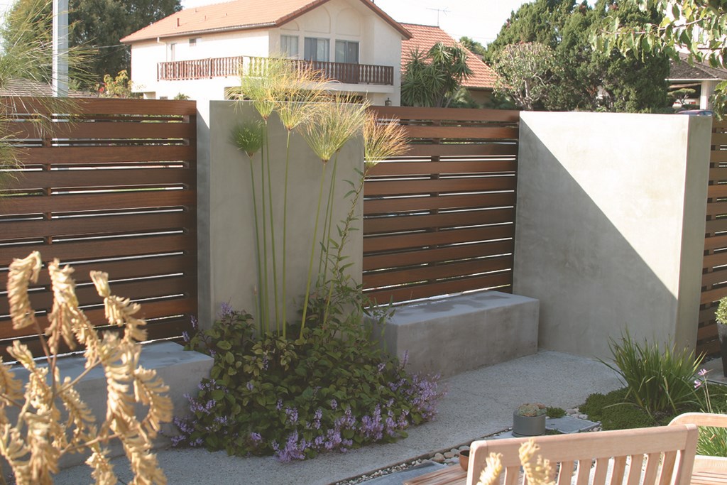
| People who pass the home in cars or on foot no longer have the unobstructed view of the house they once had, but the new boundary between private and public spaces is much more inviting than an ordinary masonry wall fronted by flower beds, especially when the water flows. |
In my estimation, most of these homes offer almost no transitional space between the lives people lead inside their homes and their pursuits in the wider world. Basically, you are either at home, or not. By creating a middle ground for them – a sort of mediating, in-between space – I’d argue that you’re creating a transitional experience in which those leaving the safety of their homes enter more gradually and easily into the community environment around them (and vice versa).
In this case, the gently sloped yard between the front of the house and sidewalk is about 60 feet wide and runs anywhere from 20 to 40 feet deep. As is the case with the vast majority of front yards, this one was originally covered in lawn with a few gestures to landscaping in the form of small flowerbeds at the front of the house. The home itself is in a non-descript style with cream-colored plaster.
The client had seen some of my work in a similar setting and approached me to discuss treatments for yards in front and back of the house. I drew up detailed plans for both, but it was clear that reworking the front yard had priority. (Indeed, at this writing the front yard is finished and the backyard hasn’t been touched, although they do plan to complete the work in the very near future.)
With small projects such as this, the range of elements in play is still quite broad: We were working with the sights and sounds of moving water, the color and textures of hardscape and plantings and the all-important sense of discovery that’s possible when the environment leads observers from one experience into another.
Above all, we were after something beautiful that would harmonize with the house and its surroundings. I soon lit on a contemporary design that made use of a simple material/color palette and a set of clean-lined structures that made a statement without becoming overpowering.
SOFT BARRIERS
One of the clients said she was after a restful environment that would provide a sense of privacy while connecting the front of the home with the space beyond it. She liked the thought of moving water especially, thinking it would conjure a peaceful ambience in the space.
The basic scheme called for a wooden slat fence/plaster wall structure rising over a set of rectangular fountains, planters and seating areas – all intended to add warmth and interest to the setting. Between the wall and the house, we were to add a small, rectilinear pond next to the walkway leading to the front door. The new courtyard would also include a deck finished in textured concrete as well as planted areas and stone pads that would form a new front-yard patio.
The choice of simple materials and warm, mostly neutral colors enabled us to craft distinctive front yard structures that do nothing to overwhelm or disrupt the simplicity of the house itself or give it a look that would seem out of place in the context of a relatively modest neighborhood.
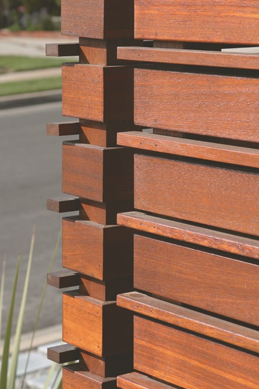
| There’s an awesome amount of detail in the fence/waterfeature structure, including the measured gaps in the wood fence, the careful arrangement of shadow lines and the balanced proportions of wood, masonry and water. It’s all intended to separate two distinct but related spaces – one facing the street, the other an outdoor sanctuary. |
The one hitch was the fact that we needed to obtain modifications from the county to encroach on the minimum 20-foot setback from the property line in building the walls that were to enfold the mostly rectangular 38-foot wide, 16-foot deep courtyard and associated structures. These were obtained, and the project moved forward.
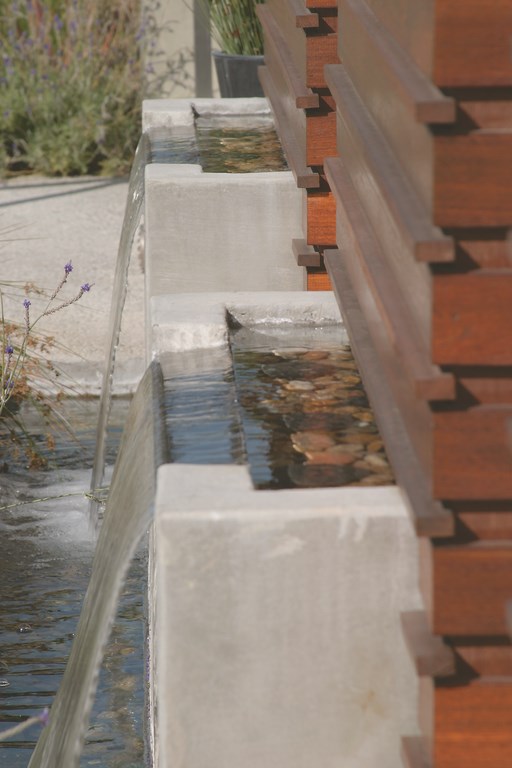
When you approach the house now, a sloped, planted area backed by the wall structure is what greets the visitor in place of the old expanse of lawn. This visual barrier alternates between plastered sections and wooden panels. Beneath the three main panels are three rectangular-trough waterfeatures with sheeting water spilling gently into a 25-foot-long catch basin. (The entire composition is all part of a single concrete structure engineered by Los Angeles-based structural engineer Nader Nohroodi.)
The rectilinear walls and waterfeatures are echoed in a series of three raised planters that separate the remaining, narrower portion of the front yard from a walkway that traverses about a third of the span of the home’s façade. Although not part of the main courtyard, the space behind the planters creates yet another shielded area.
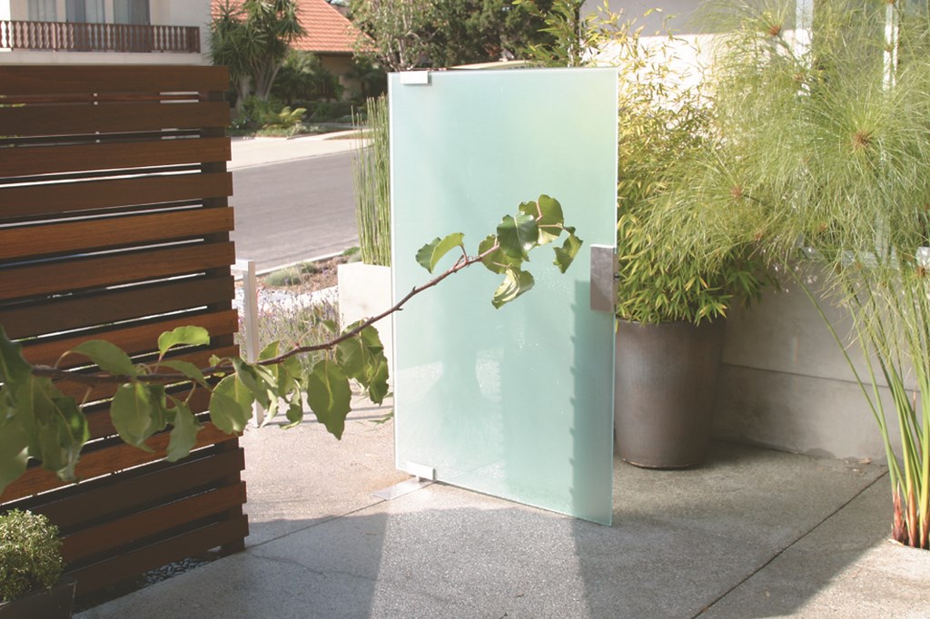
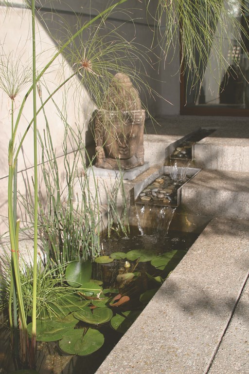
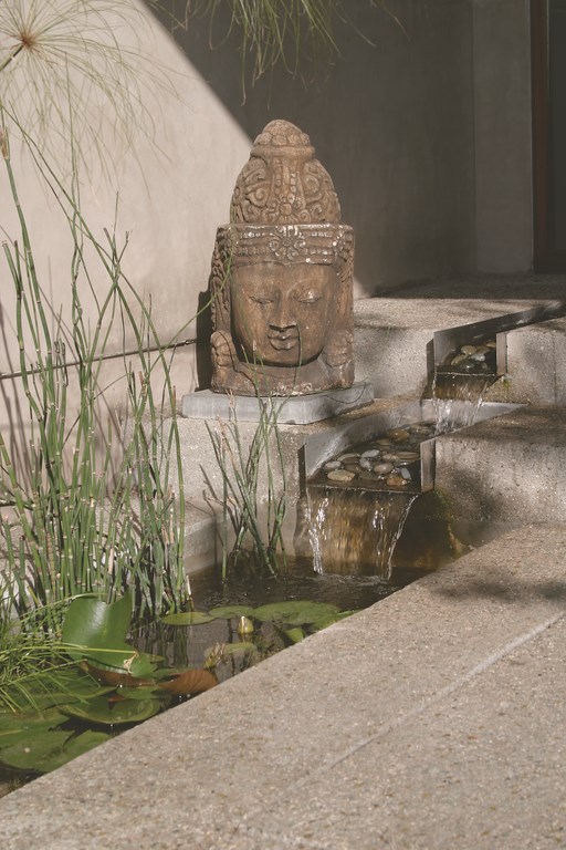
Visitors enter via a new set of concrete steps that lead to the front courtyard through a wide gate made with the same wooden-slat treatment used on the wall. Once inside, they are immediately greeted on the left by a small pond located at the base of one of the wall sections and, on the right, by the intimate courtyard area. A small, two-tiered spillway emerges from the steps leading to the front door, flowing into a trough-like pond.
DOWN TO THE DETAILS
The courtyard space is taken up by rectilinear planting areas, pathways and a small deck. A series of raised benches extend from the walls inward, directly opposite the similarly shaped waterfeatures on the street-side of the wall.
When seated on the courtyard benches, one can hear the unseen water; when approaching from the street, you can see the water and are curious about what’s on the other side. This infuses both spaces, inside and out, with a sense that the wall structure separates a pair of interesting spaces.
One of the keys to the success of this simple design is use of the wooden slats. Made of a richly colored ironwood, the slats are set up with 1/2-inch gaps to provide a visually permeable barrier. From the street, you can see that there is a space between the wall and the house, especially at night when some of the light from the house and landscaping filters through the gaps. From inside, you can see the motion of cars or pedestrians walking by; there’s a sense of privacy, but not so much so that those in the house or courtyard feel entirely cut off from the outside world.
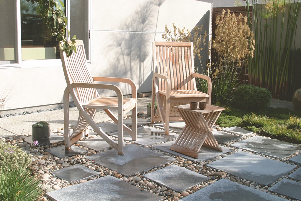
| Between the wide gate and the front door, those either arriving or departing find a private, modestly sized courtyard touched alternately by sun, shade and darkness – a gathering place, a focus for relaxation and a means of establishing a buffering, transitional space between private and public worlds. |
As is the case in all such projects, attention to detail is crucial – especially in intimate areas in which the homeowners and visitors will be in close physical proximity to the work and are likely to notice the smallest visual inconsistencies or disruptions. In this case, even before we started our work in earnest, we spent a good deal of time addressing minor issues with the house itself, including cleaning up and re-stuccoing the eave details and, for example, relocating a laundry vent that poked out right next to the front door.
The waterfeatures were installed by Paragon Pools, a Los Angeles company that did a wonderful job not only in building the system but also in taking the time to develop a circulation system that provides just the right amount of flow over the custom-made, five-foot stainless steel weirs.
In small features such as these, the correct flow is critical for both aural and visual aesthetics – and for making certain that water doesn’t splash out of the catch basin and into the planter. The troughs and catch basin are all filled with a colorful river rock selected by the homeowners.
LESS IS MORE
The hardscape is simply configured, but it is also nicely detailed with a textured gray surface expertly installed by Los Angeles-based contractor Eurotech Construction. The expansion joints ensure the structural integrity of the deck, but they’re also used in an aesthetic fashion by being aligned with the corners of the building, the planters, the waterfeatures and the raised benches.
Where the hardscape meets the house, we left a narrow, foot-wide space that is filled with the same river rock used in the fountains. This offered a welcome degree of visual consistency and helped us avoid interfering in any way with the integrity of the house’s footings.
The square pads are pre-cast concrete, surrounded as well by the river rock. That detail is picked up in front of the sidewalk in similar areas of pads and river rock – again projecting subtle aesthetics beyond the courtyard and adding to the sense of discovery on the inside.
| Water in motion is critical to the overall impression made within the courtyard space. The sounds of the unseen sheet falls on the outside of the courtyard wall pass through the slats and carry refreshingly into the space, while adjacent to the front door a small waterfeature offers a balancing source of sound within. |
The plantings were selected by Santos, a Los Angeles landscape-design firm. Again, the palette was simple and subtle, consisting mostly of black bamboo, ornamental grasses, succulents and various shrubs chosen for their almost-sculptural appearances as well as for drought-resistance. A handful of small granite fieldstone boulders were used as accents throughout the planting areas.
For its part, the courtyard pond is stocked with a small number of Koi that swim among water lilies and papyrus planted directly in the water. The lighting throughout is fairly minimal, with some recessed pathway lighting and uplighting in the planters. We considered fiberoptics for the watershapes, but opted instead for standard incandescent pool lights.
To my mind, the key to a project such as this one is not to have the architectural or landscape features overpower the space, but instead to make them look and feel like a natural extension of the home. To a large extent, this means that everything is toned down in size and overall visual effect to create a sense of comfort and tranquility rather than to make a huge statement about the prosperity of the homeowners or the complexity of the design.
This less-is-more approach is perhaps counterintuitive for designers who are accustomed to making big statements. For those, however, who can step far enough back from grandeur to consider the simpler needs of small spaces in modest suburban settings, there are vast opportunities to enhance the quality of life of middle-class consumers and to create settings that harmonize with the environment while making homes more beautiful – and more livable.
Mehrnoosh is a Venice, Calif.-based architect who focuses on high-end contemporary buildings and exterior designs for both residential and commercial clients. Born in Iran, she moved to the United States with her parents in the mid-1960s and went on to study architecture at the University of Oregon, where she earned her bachelors in 1973, and then at Harvard, where she earned her masters in architecture in 1979. Early in her career, she worked for I.M. Pei & Partners and then Skidmore, Owings & Merrill, tackling a range of major projects in the United States and abroad. She moved to Los Angeles in 1983 and has established a reputation for creative, modernist designs in a range of urban and suburban settings.


