An Elegant Inception

Beginning a project can be wonderfully exciting, especially when you’re working in a beautiful place with a terrific client who wants something truly elegant and special. In fact, I can honestly say that there’s nothing quite like the exhilaration of stepping into a new situation with great potential, defining those possibilities and watching a client’s eyes light up with the fire of inspiration.
Case in point: Not long ago, my partner Kevin Fleming and I were called out to a job site on Long Beach Island, N.J., by local landscaper Mark Reynolds, who’d heard of us and our reputation for using top-quality materials in top-flight designs.
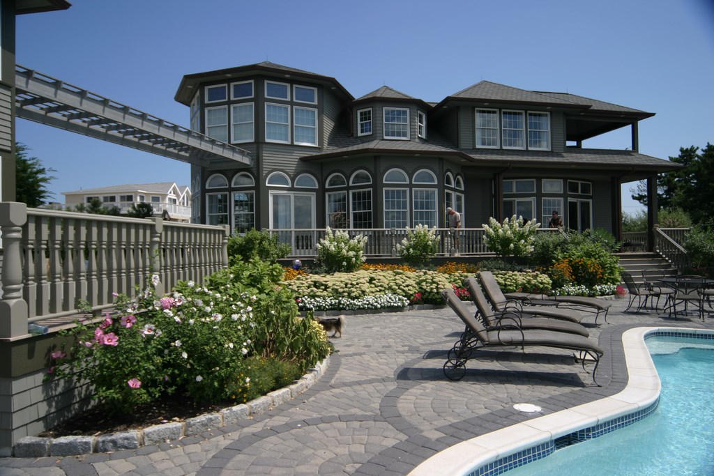
When we pulled up, the first thing I noticed was the classic architecture of the home and a beautiful color scheme that turned on dark-olive shades of green. Situated on a large, flat lot right on the water, the structure had tremendous presence: grand yet inviting, elegant but warm. Everything inside was just as tasteful – rich, dark colors and great art throughout along with several eclectic touches. It all looked so good that I was somewhat surprised to learn that the client was planning major renovations inside and out.
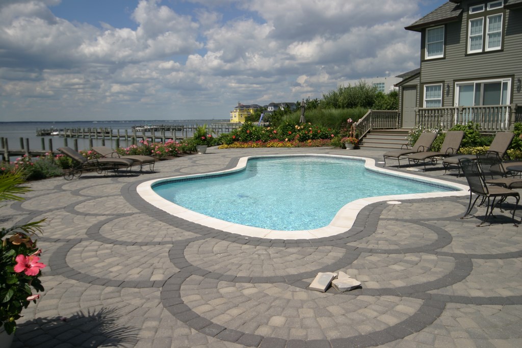
Moving into the yard, I saw that the landscaping was gorgeous as well – but then we came to the hardscape and pool. What utter abominations! A whole series of paver-covered decks was poised at awkward, disjointed angles around the pool, and the pool itself was a nondescript freeform affair best described as “ugly” – radii that made no sense, blue waterline tile and boring white plaster and safety coping. It was everything about common pools that makes me ill.
The big question: How could anyone come into such a gracious setting and perpetrate such a visual crime? It could only have been someone with no design savvy whatsoever – a hack who was only in it for a buck.
GAME ON
I’m not exaggerating: It really was a mess. Beyond some nice plants, the yard was saddled with the wrong colors and a whole set of injudiciously oriented shapes and lines – everything out of step with the exquisite character of the rest of the home.
Kevin just looked at me and smiled: We both saw how much this place was crying out for a beautiful watershape and a hardscape treatment that would extend out from and express the taste and personality of the client and her home. Suffice it to say that the project looked like big time fun.
Meeting the homeowner only served to reinforce that impression. She was extremely sophisticated and intensely concerned about design, and it was clear immediately that she wanted to be intimately involved in the process. As is often the case with such clients, our job ultimately would be to translate her ideas and tastes into our working design – a creative collaboration in the truest sense.
I’ve been telling Kevin for years that we don’t sell anything, and that was particularly true in this case. The process isn’t about hawking a particular program, but is instead about presenting ideas based on specific discussions of materials, joinery, layout, texture and line. In this case, the client said she wanted us to create something “wonderful,” and it was clear from the start that she had a firm understanding of the sort of interactive process that would lead us to the best results.
That process was actually the opposite of the norm: Rather than start with a pool shape and location, we focused first on colors and materials that would attain our goals. Only then did we start working our way toward the pool itself.
Our first meeting lasted approximately 90 minutes and covered all aspects of the design, including her ideas about the look and feel of the space as well as her preferences with respect to style, color and materials. We spoke at length about how the pool was to be used (which in this case amounted to daily exercise and entertaining on weekends) – beyond which the watershape was to serve mainly as an aesthetic element within the landscape – not a focal point, but rather an element that would complement the setting through its materials and reflective qualities.
If there was anything unusual about the way things unfolded, it was that we didn’t actually talk in specific terms about what the pool was going to be or how it would look through these early discussions. Instead, our initial sessions were all about materials rather than about laying out a watershape and then trying to fit in the parts. We didn’t even consider the physical shape of the pool until we’d nailed down the color and materials – no drawings at all until later on.
COLOR KEYS
Because the house and its color scheme were so distinctive, we knew that tying what we were doing outside into the home and its interior would be the best starting point. That in mind, we began by working with the client to select materials for the hardscape – a design element we saw as a bridge between the home and the exterior space.
I flew back to Los Angeles, collected stone samples and carted them back for my next visit with the client. After some careful consideration, she chose an extremely dense, hard stone known as Lompoc – just perfect for outdoor applications on the flats, with rich, oatmeal-colored surfaces marked by blue-colored veins.
I was delighted with her choice: The stone is quite subtle but is nonetheless beautiful and rich in appearance. It’s also perfect for outdoor/poolside applications because it is dense and doesn’t get too hot under a summer sun.
| It’s a magnificent home in an amazing setting and deserved, I think, better treatment when it came to everything having to do with the pool and deck. The shapes and patterns were all wrong, the materials and colors were inappropriate – in other words, it was an ugly mess that needed complete reconsideration. |
This first choice led us directly to discussing the internal surface of the pool. We still hadn’t considered the shape of the pool or anything else about the design at this point, but we’d decided how the hardscape was going to look and applied what we knew to this latest round of explorations.
To get things started, I went to my library of glass-tile samples and looked specifically at options from Sicis, Oceanside Glasstile and Boyce & Bean before settling on about a dozen colors from Sicis. (Although buying tile sheets for my library has set me back a fair penny, I’m aware of the fact that I have effectively distributed the cost over many projects.) I now began playing with mosaic combinations and developed multiple samples for the client.
Once they were ready, we dropped these samples in the existing pool to give her a sense of how they would look under water. I really love demonstrating surfacing options in this way: It gives the client an accurate sense of how the surface will interact with both water and light, and it’s just plain fun to watch clients’ eyes light up when they see how beautiful some of these options can be.
As a rule, I think a client needs to see about a square foot of material in order to come anywhere close to visualizing a tile surface. I sometimes see samples that are only a couple of square inches and can’t say they’re adequate by any means. It’s even worse when clients are asked to select stone based on seeing a single piece: There’s so much variation in these materials that it’s impossible to get an accurate feel that way, which is why I always set up panels with at least two or three square feet of material.
With tile, the material generally presents much less by way of variation, so a square foot will do. In this case – and after additional lengthy discussions – the client settled on a mix of pinks, blues, lavender and white to be set off by an antique white grout.
INSIDE OUT
With these issues decided, designing the pool was actually a simple process. I established scale and proportion based on the space and in this case came up with and placed a simple, pure rectangle that would allow us to place the visual focus on the beautiful materials while using the reflective qualities of the water to great effect.
The design also accommodated the fact that both swimming and entertaining were important. There weren’t any children involved, so we concentrated on easy lap swimming and included steps that run the length of the pool for easy access and relaxation. We also established thermal ledges for lounging and large spa for entertaining guests, with the ledge located adjacent to the spa to facilitate conversation.
Because the house and its setting are so spectacular, we wanted the pool to be rich in appearance but subtle in presence, accentuating the surroundings rather than making the pool the key to the space. As a result, we didn’t raise the bond beam or go for a vanishing-edge effect, instead keeping the pool just about flush with the surrounding deck.
In general, I appreciate the water-on-water vanishing-edge or perimeter-overflow look, but at this point it’s almost become old hat – and certainly didn’t emerge as the right choice here, even with the prime waterfront exposure. We could have gone that way easily, but our choice here was to resist the temptation to compete with the Atlantic Ocean.
It’s a point I’ve made in many of these columns: Watershape design is quite often best served with a large dose of restraint. In this case, less with respect to visual wrinkles really did feel like more. Certainly, we could’ve pushed a water-in-transit effect of some kind and that certainly would’ve driven up the price tag, but as I’ve said often enough, just because you can do something doesn’t mean you should.
Instead, the edge treatment here is going to feature an elegant, double-sided bullnose coping that will be surmounted on the deck, giving the vessel a classic, old-world feel that harmonizes beautifully with the home and its surroundings. It’s a simple detail that will accentuate the rectangular shape without making a huge statement – just the right note of subtle invitation.
As I said at the start, there’s a particular thrill that goes with the onset of a project such as this that is so well situated and thoughtfully conceived. In fact, it’s at times like these that I’m reminded there’s nothing in the world I’d rather be doing.
David Tisherman is the principal in two design/construction firms: David Tisherman’s Visuals of Manhattan Beach, Calif., and Liquid Design of Cherry Hill, N.J. He can be reached at tisherman@verizon.net. He is also an instructor for Artistic Resources & Training (ART); for information on ART’s classes, visit www.theartofwater.com.


