Amazing Grace

It’s one of the most famous buildings in the world, but few people know that Frank Lloyd Wright designed Fallingwater in a matter of hours.
In 1935, when Wright first received the commission to design and build a vacation home for Pittsburgh retail tycoon Edgar J. Kaufman and his family in Mill Run, Pa., he didn’t get to the project right away. After several months of preliminary discussions and delays, Kaufman decided to force the issue, telephoning the architect and saying that he was going to visit Wright’s studio to see what had been done.
It was at that point Wright decided he’d better design the house. He had a weekend.
The construction process was no more direct, but it took longer. Work began in 1936 and was completed by 1939 in a series of costly fits and starts. The project was originally set to cost in the neighborhood of $40,000, but the final tally rose to nearly ten times that amount – not inconsiderable in post-Depression America.
The result of the dramatic (and, at times, traumatic) process of design and construction is nothing less than one of the greatest achievements in American architecture, a work so compelling that it never stops
challenging us to comprehend and embrace the lessons and wisdom it embodies.
DRAMATIC DEVIATIONS
Although scholars and designers have long regarded Fallingwater as a quintessential example of “organic” architecture – the philosophy of design most closely associated with Wright’s legacy – the project in many ways defies Wright’s own convictions and conventions.
The house, for instance, ended up situated opposite the place Kaufman and Wright initially thought it should be – at a spot on the other side of the river, overlooking the waterfall. That approach would have been completely consistent with the precepts of organic architecture.
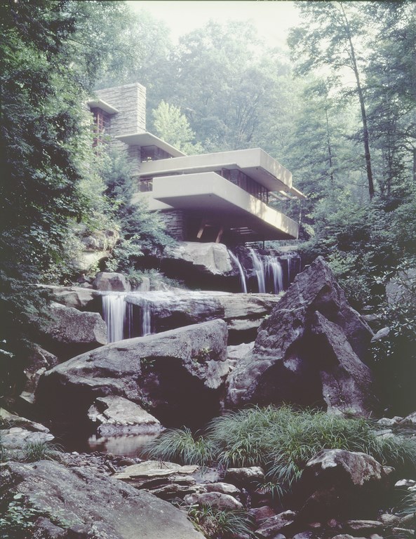
Wright, however, chose to do otherwise: He moved the structure to the other side of the river and incorporated it into the river itself, a radical idea even for an architect of Wright’s stature and reputation for innovation. And it turned out to be an historic choice: I’m convinced that had he stuck with the original plan and built the home adjacent to the river, Fallingwater would never have become so well known, admired or beloved.
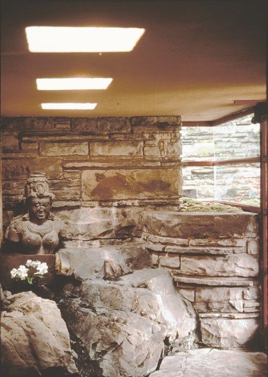
| Fallingwater has two dramatic entrances, both of which incorporate water. One takes you through a conventional doorway (left), where you encounter a statue, the rock outcropping on which it sits and a small flow that seems to issue from the outside, seeping through the walls and into the space. The other, which isn’t used by visitors today but must have been used by the Kaufman family and their friends (right), can only be accessed by wading through the river to a landing that literally floats over the water. (All photographs in this article courtesy Western Pennsylvania Conservancy) |
What’s so remarkable about this project to my mind is that it represents a master architect working completely outside the box. He looked well beyond what made sense, even from his own philosophical and practical perspectives. It was with good reason that many of his contemporaries considered him a screwball, even a rogue, but it’s people like Wright – people who are willing to defy convention – who ultimately create the most original designs.
In the case of Fallingwater, it wasn’t merely the aesthetic values that were considered crazy: When construction began, everyone – including reputable engineers and many of Wright’s peers – said the building couldn’t be built. From its precarious position over the river to the dramatic cantilevers that do more than simply appear to defy gravity as they jut into space, this structure was so ambitious and unconventional that no one was sure it could stand under its own weight.
Although today, more than 60 years later, some structural problems have developed with the cantilevered decks, it’s fair to say that Wright proved them all wrong. The structure appears to float above the cascading waterfall in what can best be described as an almost hypnotic harmony with the surroundings.
ARTFUL BALANCE
The house stands approximately 30 feet above the rock ledges, but the height is masked by the horizontal geometry of the cantilevers. Vertical elements of the design echo the structures of surrounding trees, and the work also makes great use of natural earth tones, with reds, creams and browns drawing on the beauty of the soil and the river bottom.
So although it’s a departure in many structural respects, the remarkable use of natural forms, textures and colors here is vintage Wright.
When I look at Fallingwater, I’m also struck by the use of wood as a structural element and an interior finish material. Wright often said that wood was his favorite material because of the grain patterns and the warmth it conveyed. Another great example of Wright’s penchant for borrowing from nature is the use of dry-stack stone: The linear design mimics the striations and geological forms found in the sedimentary rock seen all around the property.
The joinery and juxtaposition of materials used to achieve these forms is also truly wonderful. The attention to detail in the way the materials are used and joined is key: Every element – dry-stack stone, brick, wooden structural members, formed concrete and, of course, the water – are carefully defined and orchestrated.
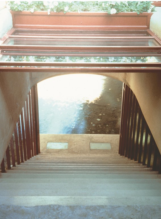
| The degree to which structure and river are integrated is perhaps best observed from inside the home, looking down the stairs from the living room to the river landing below. Because of the direction of the water flow, the river literally enters the home as a steady breeze that both cools the space and brings with it all of the sounds and scents carried by the water. One view here looks right down the stairs to the water (left). The other reveals the context of the opening and gives a sense of the colors and textures Wright used to weave the design into its surroundings (right). |
The lessons to contemporary designers and builders are clear and compelling: When you give proper attention to materials and forms, you do a great service to the work and the client. For his part, Wright always worked to create an environment that enhanced the surroundings and that, in turn, was complemented by the greater environment.
This is not an easy thing to do – and he did it over and over again, in a variety of settings with a variety of structures.
Today, we see organic architecture all around us in the work of scores of designers who learned from Wright and have applied his ideas in their own ways. But because Wright was so creative in works such as Fallingwater, the Unity Church, the Guggenheim Museum and the Imperial Hotel, to name a few, he stands apart from those who followed in his footsteps.
Although there will never be anyone like him, following his example lends great quality and strength to the work of those who embrace his ideas. We see his influence, but his work is unique to him. We cannot replicate him, but we certainly can allow his genius to inform our own creativity.
OVER THE WATER
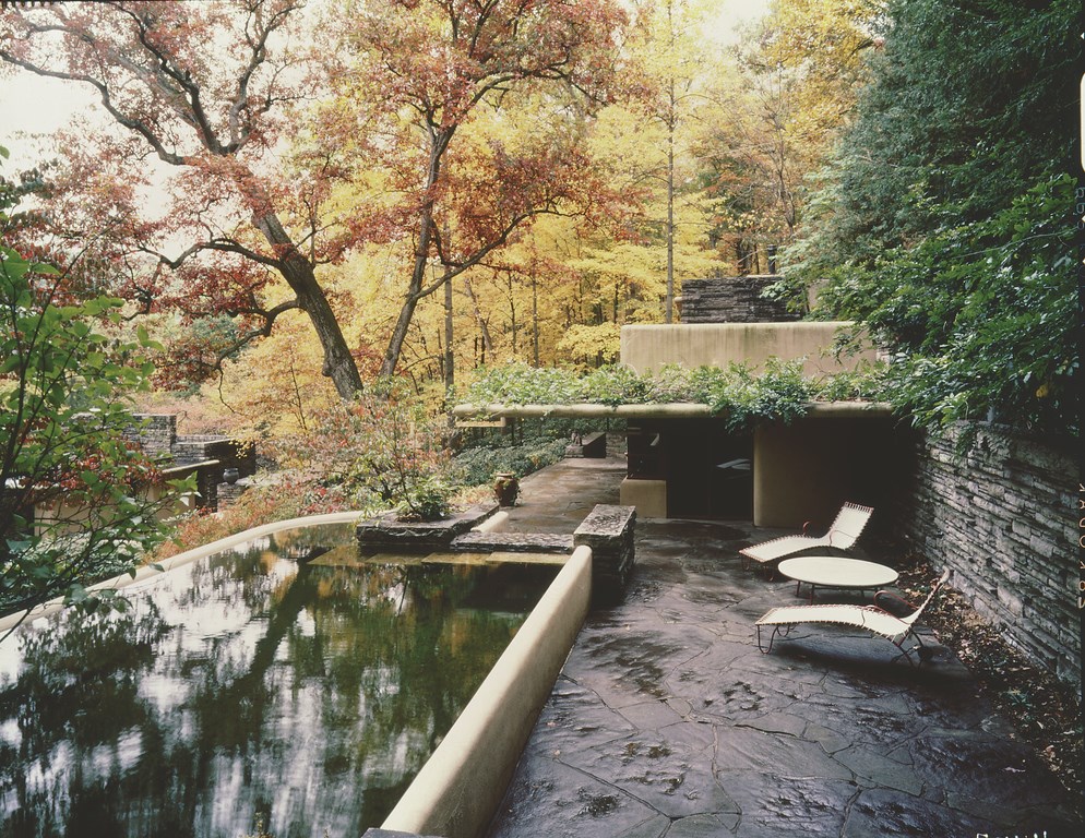
For watershape designers, Fallingwater has a special set of meanings, largely through its integral use of water. And it’s not only the dramatic proximity to the waterfall: There’s also a simple yet elegant swimming pool on the upper deck that offers its own dramatic reflections of the surroundings.
In both cases, Wright worked around nature and with nature, accommodating it and thereby respecting and accentuating it. The fact that this particular building literally straddles a river is remarkable and makes a fairly obvious statement: The structure doesn’t disrupt the waterfall; instead, it draws its visual strength from it, largely by leaving it alone. The structure spreads over it, placing the visitor in intimate contact with nature at an array of key focal points.
I often make the point in my columns, articles, classes and client presentations that watershapes should be secondary, no more than respectful accents in their surroundings. To a large extent, I learned that principle from Wright, who said that we are really nothing, that nature is what’s beautiful.
| The upper deck, with its guesthouse and swimming pool, is the hidden treasure at Fallingwater. The structures follow in simple ways the themes developed in the much larger, cantilevered main building down the slope, but the pool serves a special purpose by bringing the experience of river-like reflections to all who stayed with the Kaufmans. It also bears mentioning that the pool was sublimely integrated into the space by virtue of the fact that it was originally a fill-and-draw vessel, to be filled for use with fresh river water. |
Too many designers – and far too many pool builders – believe you need to wipe out everything that’s present in a design space and recreate the setting from scratch. By contrast, Wright uses visual/structural elements such as existing rocks and trees and harmonizes with natural forms, in a sense co-opting the beauty of nature by drawing it within his design space.
In other words, the structure becomes part of the environment rather than a form separate from it. This is a radical counterpoint from people who obliterate a setting to build within it. Wright teaches us that for all our ego and ingenuity, the work we do should be secondary.
Many of his own major influences encompass and reflect this central, organic ideal. He was heavily influenced by Native American culture, for example, and at Fallingwater, if you look carefully at details, you’ll see patterns in the posts leading up the guesthouse that appear to be feathers or the fletches of an arrow.
He was awed and inspired by Native Americans’ ability to coexist peacefully with the grandeur, power and spirituality of the natural world. He was amazed by the vastness of the North American prairie. He also studied the art of Japanese gardeners and the way they replicated the complexity and variety of natural environments in contained spaces.
With a distinct and wildly creative flare that functioned even under tremendous pressure, Wright encompassed all of these rich influences in this astounding work of architectural art. To my eyes, Fallingwater is a masterpiece because it is a creative innovation, yet at the same time makes a statement that is true to the vision that design can provide a harmony between man and nature.
David Tisherman is the principal in two design/construction firms: David Tisherman’s Visuals of Manhattan Beach, Calif., and Liquid Design of Cherry Hill, N.J. He can be reached at tisherman@verizon.net. He is also an instructor for Artistic Resources & Training (ART); for information on ART’s classes, visit www.theartofwater.com.


