A Window on Our World

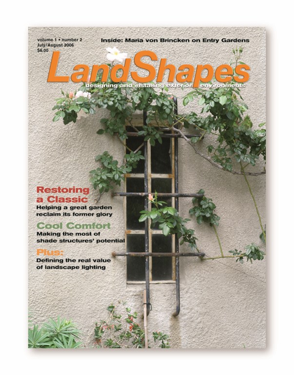
With a first glance at last month’s cover of LandShapes, a colleague of mine said he thought it more properly belonged on the cover of an architecture magazine instead of on my landscape publication. It was beautiful, he said, but he felt that the dominance of the wall in the image made him wonder if he’d received the right magazine.
In defending the choice of this photograph, I found myself flooded by all sorts of thoughts and considerations, many of them having to do with my 17 years as a landscape designer and design concepts I now largely take for granted. Where it hadn’t occurred to me that anyone might perceive this beautiful image as being out of place, in discussing it I found myself more convinced than ever that it was just the right choice.
 In my view, a lone, graceful climbing rose branch clinging to a wall and framing a rustic window is absolutely and completely something LandShapes is about. Our aim is to inspire and help landscape professionals find ways to improve their craft and in turn elevate our industry, and raising consciousness about the fact that landscapes don’t occur in a vacuum is a big part of our magazine’s emerging portfolio.
At its core, landscaping would seem to be mainly about integrating plants and hardscape in a harmonious fashion. In a broader sense, however, its goal is to unify an entire environment – one that encompasses architecture as well as the landscape that serves as its complement and foil.
To me, those who create landscapes that are only about the arrangement of plants or hardscape within a space are missing the essence of environmental design and developing projects that fall short of meeting a site’s entire need. As several who have written for LandShapes have already attested in columns and articles, we need to consider all factors when creating landscapes, including the architectural context.
Without this, the goal of achieving aesthetically pleasing visuals and emotionally satisfying spaces most likely will be met by chance rather than by design.
Back to the climbing rose: What would it look like without the architecture behind it? It’s so scrawny that it would probably go unnoticed, vanishing into the background. With the architecture – that is, with a context that gives it purpose and shows off its sinuous beauty – the rose tells a story of growth and survival that certainly inspired me, the art director and the publisher when we saw it.
Our clients might not see things with that degree of sensitivity, but I see our job as landshapers as being about doing this thinking for them and creating vignettes that meet their desires and aspirations in ways they might never fully appreciate or be able to express. That’s what they’re hoping for, I believe, when they hire us.


