A Garden Surprise

LeRoy, N.Y., is an historic village that’s most famous (or most notorious?) for being the birthplace of Jell-O.
Far more significant to me, however, is the fact that the town is filled with beautiful 19th-century homes that run the architectural gamut from Colonial to Italianate to Victorian in style. It’s a beautiful place, and the site of one of my firm’s most unusual projects in recent memory.
The home featured in this article is a Second Empire Italianate estimated to be about 140 years old. It’s a prime example of 19th-century craftsmanship, from the Mansard roof with its scrolled cornices to the drive-through porte-cochere and the wraparound porch with its beefy wood railings.
It’s definitely an architectural treasure, filled with the kinds of details that have been lost as far as today’s custom-built homes are concerned. Mindful of those special touches, we set about designing a similar level of detail into the landscaping in creating gardens and watershapes that brought real tranquility to the setting.
THE LAY OF THE LAND
Our initial discussions were pretty conventional: The clients wanted a range of entertainment spaces and some landscape lighting as well as perennial and rose gardens.
During our first meeting, they mentioned more than once that the husband traveled frequently to Asia and was always bringing back items and artifacts that reminded him of the places he’d seen. I didn’t think much of this – until, that is, they mentioned that they wanted a pond as part of the overall package. And they didn’t want just a simple pond, but a creative and unique watershape that they could interact with and not just look at.
Existing structures on the approximately one-acre site included a large barn/garage and a small outbuilding that may have been a woodshed at one time. The barn is larger than the home and provides plenty of storage space for the family and the husband’s collection of Sprint racing cars.
As we walked the property, I asked the clients what they had in mind for the shed. They said that their roofing contractor wanted to tear it down “because it was old.” I suggested that the roofing contractor had fallen off too many roofs and offered to find a way to incorporate the shed into the final design – and I already had something in mind.
In fact, as we sized things up I recognized that the shed, which we believe was built at the same time as the house, would actually become the focus of this project. With a 20-by-20-foot footprint, the small structure sits about 100 feet from the house on the same axis.
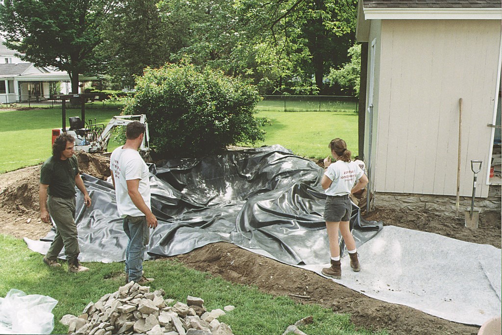
| The storage shed was a pretty humble structure, but we saw its potential as a dividing line between two different backyard worlds. Here, we’ve started on the lower pond and have already opened the far side of the building to overlook what will eventually be the upper pond and Japanese garden. |
Because the placement of the storage building was squared against the back of the home, the far side was completely invisible from the patio and a privacy terrace we had designed in Phase One of the project. This gave us an opportunity to create a completely new world on the far side of the small building. Inspired by their desire for an elaborate garden and playing off the husband’s taste for Asian styling, I decided to remodel the shed as a Japanese teahouse.
The clients loved the idea, but this left us with the challenge of making the teahouse and Japanese watergardens fit in with the 19th-century, Italianate surroundings.
The solution turned out to be straightforward and simple: We didn’t do anything to the portion of the building that faced the home, leaving its compatible architecture intact. This meant that when anyone looked out into the yard from the patio areas, they’d never know what was going on with the far side of the building.
Now we had the element of surprise working for us – and a truly unique design was in the works.
FRONT TO BACK
The layout we settled on incorporates two ponds. The first (and lower) pond is on the side of the shed that faces the home.
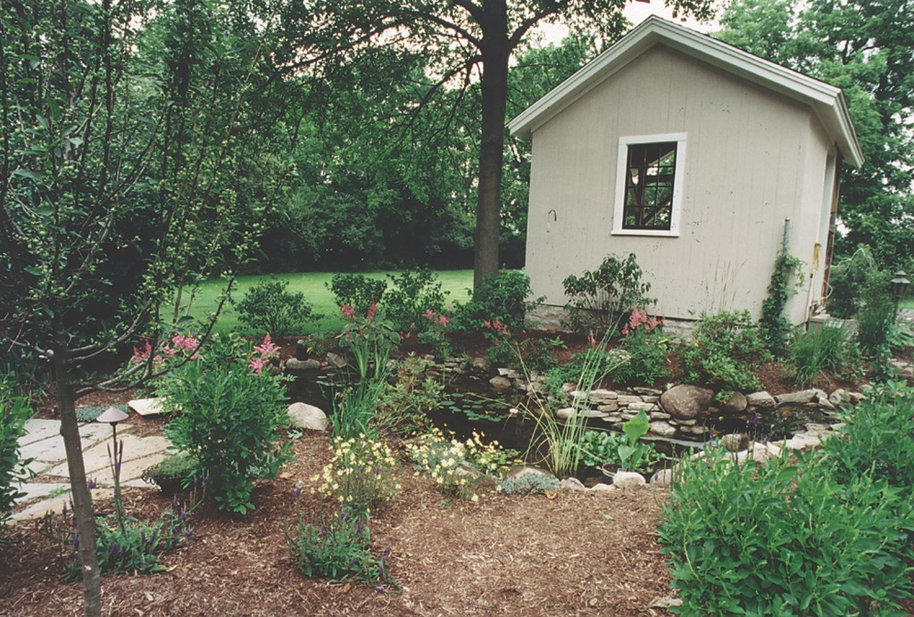
The lower pond is only about 10 feet long and 15 feet wide, tucked neatly into a nook formed by the building and a large specimen quince to its left. A running creek that can be seen from the house and terrace areas leads to a waterfall that drops about 18 inches into the pond – an ideal scale for the site and just about all we could muster from the relatively level lot. Surrounded by lush plantings and accessed via a stone path and terrace, it’s a great place to sit and relax after a long day.
| The flatness of the site was the biggest practical challenge we faced. We tucked the lower pond in next to the shed (left), pushing the water level as far down as we could. On the upper side, we raised the level of the pond as high as we could against the structure (right). The result was an elevation change we used to set up a stream and a small waterfall. |
The surprises start when you walk around the building to see where the creek originates. There, on the far side of the building, we built a larger Japanese-style garden and pond. The water in the upper pond spills into the creek, feeding the lower pond. (We were able to accomplish this on this flat site by building up the height of the Japanese pond and lowering the water surface of the lower pond.)
The upper pond itself fills and circulates from the bottom, creating the illusion of complete stillness. Not only does the bottom circulation make for a nice effect, but it also is my preference because it helps the keep all the water moving, unlike surface-skimming circulation.
Continuing the walk around the building, you access the teahouse by a moss-covered stone bridge placed over the creek. Two bamboo plants (confined in pots) create a visual screen that separates the two “worlds.” (We also have plans to build a fence incorporating a combination of Arts and Crafts and Oriental styles to further separate the areas.)
| The rustic flagstone deck next to the lower pond offers observers a tranquil setting gently punctuated by the softly babbling stream and its small waterfall (left). The stream rises along the right side of the building and moves out of sight (right), inviting my clients and their guests to follow its course to a surprisingly different setting. |
The back third of the building overlooking the Japanese pond was removed, exposing the rafters and collar ties. We added a new stone foundation up to floor height and extended the floor to cantilever it out a foot over the pond. Then we added translucent (but not transparent) Japanese Shoji screens that keep the view from the teahouse focused on the pond while hiding the barn from view.
While the lower pond is perfect for relaxing, conversing and entertaining, the teahouse is just the place for quiet, peace and contemplation.
The overall effect is magical. In fact, the clients tell me that of the four distinct seating areas we have created for them – a patio, a privacy terrace, the flagstone patio near the smaller pond and the teahouse – it is in this hidden area where they spend most of their time outside.
DELICATE SELECTIONS
Plantings around the Japanese pond are sparse, but carefully chosen.
We used a contorted, weeping White Pine, an Exbury Azalea and a few Liriope for greenery, then carefully placed boulders in and out of the water to lend traditional Japanese gardening touches to the scene. We’re particularly happy with the column of hidden boulders we placed in the water – a moss-covered island in the middle of the pond.
| Following the stream yields quite a reward: You come around the corner to see this Japanese-style upper pond surmounted by a picturesque teahouse. The serenity at this level is complete – all of it achieved without disrupting the garden’s classic 19th-century surroundings. |
In keeping with the sense of peace and tranquility, lighting in the upper garden is understated. We re-wired a Japanese lantern that the client had brought back from China with a low-voltage fixture and buried a single spotlight to bring a subtle glow to the contorted White Pine – and that’s it. There’s a lack of clutter that makes this setting the essence of tranquility.
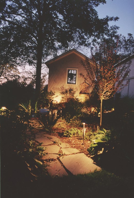
With the lower pond, we were more “generous” in our finishing touches. A flagstone path leads to a matching flagstone terrace with enough room for a café table and chairs and a good-sized bench. Here we included Astilbe, Summersweet, Hosta, Iris and other festive plants, creating an ideal place to enjoy a Sunday morning cup of coffee. Our lighting program here includes a simple sharp spotlight on the small waterfall, path lighting using fixtures that look like cattails and a soft wall wash on the face of the building that silhouettes the plantings in front.
The challenge of creating unique projects like this one is what keeps most of us in this business. In this case, bringing elevations to the flat site was stimulating in many ways; in addition, with a budget of under $30,000, we also ran into some financial challenges as well. But the ends do seem to justify the means, particularly when we the result is so much fun.
In fact, this project proves to me that I don’t need a huge budget to bring pleasure and delight to my clients: All it takes is a vision – and the desire to make it reality.
Bruce Zaretsky is president of Zaretsky and Associates, a landscape design/construction/consultation company in Rochester, N.Y. Nationally recognized for creative and inspiring residential landscapes, he also works with healthcare facilities, nursing homes and local municipalities in conceiving and installing healing and meditation gardens. You can reach him at bruce@zaretskyassociates.com.


