Moving in Miniature

One of the clearest trends I’ve seen in watershaping through the past few years involves the use of water in the front spaces of properties, usually along a driveway or close to the main entrance. It’s something I’ve noticed on both the residential and commercial sides of the business, and these projects really do seem to be gaining traction as more time passes.
In some cases, they might be the only watershape you’ll find on site. In others, they introduce a presence of water to be echoed in other parts of the property, front or back. No matter what form they take, architectural or naturalistic, these watershapes serve as lovely, welcoming presences for visitors – or for homeowners happily returning after long hours at work.
Some out-front features make statements to people driving or walking past the property. I’ve installed several, for instance, near the street on a driveway or in a central spot on an island in a circular drive. I like those designs for the interest they add, but I have to say that I actually prefer those watershapes I’ve placed close to front doors or main entrances: I like them because my clients and their visitors will spend more time there, and I’m so big on mood elevation that I like the fact that being greeted by this sort of feature has a predictably positive influence.
I’ve also seen designs where these front-yard features are flanked by benches and become destinations that are every bit as refreshing as similar places of repose located in the midst of backyard gardens. Boil it down, and I plain like the idea of the fronts of homes being much more than blank spaces you pass through on your way to the front door.
MEETING A DEMAND
Lots of design approaches work in these up-front settings.
A feature might be as simple as a small wall-mounted fountain, for instance, or it can be an elaborate, cascading, multi-tiered fountain or a beautifully executed pond. Personally, I like my out-front features to foreshadow design elements found in larger backyard watershapes: Whether simple or complex, the water in front can set the stage for a fuller experience to come in entering a home or a business.
The water in these cases also serves a more primal need: In good times and bad, the demand for our products exists in part because it’s part of our natures to want to be in or near bodies of water. As I see it, in other words, these front-yard watershapes represent yet another way we can fulfill the basic desire humans have to make water part of their lives.
Indeed, in considering pathways through and around this current economic slowdown, I can’t help thinking of these smaller, front-yard watershapes as a bridge to better times: Clients these days may be interested in smaller-scale, purely decorative watershapes if only because they represent a lower-cost means of bringing water into their lives.
This isn’t an all-new observation, of course – for years, we’ve run into prospects with homes on postage-stamp lots who have no alternative to acquiring downsized watershapes – but the fact of the matter is that, for the foreseeable future, these smaller-scale watershapes may be where a good part of the action will be.
In point of fact, I see adopting a positive outlook on these street-side watershapes as having a potential that reaches out well beyond current economic woes and as being something we all should have embraced long ago. I’ve heard people in the landscape trades refer to front yards and commercial entries as the “Last Frontier” in exterior design: If they’re even partially correct, it’s time to get involved.
Taking things a step farther, I would argue that this is a natural progression for those who excel in watershape design and construction: If what we do is all about understanding and applying the greatest possible attention to detail, certainly that principle applies just as much (if not more) to tiny projects out front as it does to big ones in the backyard.
With these small projects, you may rest assured that the details are absolutely crucial because every one of them must bear up under closer, more intimate scrutiny: If you execute the fine points in design and construction at a high level, even the most diminutive design can come to life, bring joy to clients’ lives and be considered art.
In fact, where given my preferences, I might like all of my projects to be large and comprehensive; these days, however, it just makes sense to conform to the new expectations many of our clients have and start thinking small.
GOING SMALL
In rolling through ideas before writing this column, I realized that I’ve been doing these small-scale projects all along.
Several years back, for example, I worked on a project designed by Miami-based landscape architect Raymond Jungles. In this case, he used an angled, acid-stained concrete bridge that led directly across water as a means for people to reach a home’s front door – a situation in which failure to pay attention to the water and where one might place one’s feet could result in a quick dip. There’s no choice here, in other words, but to notice the water.
That’s an extreme case, but water at the front of a home can completely transform a mundane experience into something very special and worth savoring. And if that’s not the definition of what great watershaping is all about, I don’t know what is.
In one sense, small watershapes call on the designer to be unusually creative, no matter the location. For example, I’ve seen a number of small features where various types of objects and artifacts have been inserted to make one sort of statement or another. Some of these items are fairly tacky, but others make very special statements.
Done well, for example, I can even imagine making a rusted plow into a weir of sorts and have water cascading down from it over a steel structure to great effect. In fact, my Genesis 3 co-founder Skip Phillips once used an old livestock feed trough as the core of a small feature: It’s quite cool how the water flows over edges that have been gnawed away by animals through years of use – a fascinating repurposing of an otherwise mundane, familiar object.
I recently took a similar approach in adding an entry waterfeature to my home office. The space already had big glass doors that looked out toward my backyard and its all-tile pool, but I also wanted to make statement at the front door that would demonstrate my firm’s’ complete, total involvement with water to clients who might stop by.
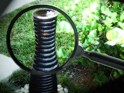
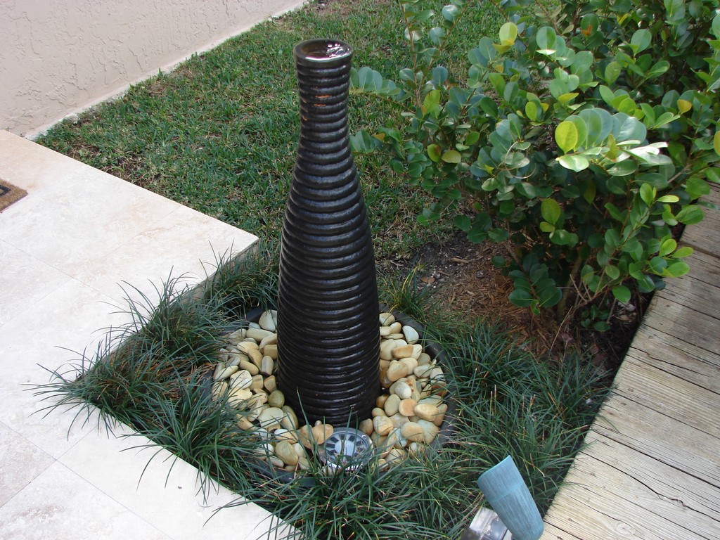
| I’ve worked in miniature in my own front yard, adding this water element to accent the street-side entrance to my home office. It’s a simple effect, made with inexpensive, off-the-shelf materials on a scale dictated by the compact available space – and it makes a statement about what I do and my ability to develop suitable, site-specific solutions. |
At first, I’d considered off-the-shelf systems and found many that I liked, but ultimately we decided a custom look was required to be emblematic of the work we do. I spent a good while looking for something appropriate, and one day while trying not to get lost in the maze at my local IKEA, I found a black vase with an interesting, ringed profile I thought might look good with water flowing down across its surface.
I then hunted up a two-foot-diameter basin at a Home Depot (I visit all the trendiest shops!) that would house the system and would also work perfectly with a grill I’d saved from an old Weber barbecue kettle. I dug a hole for the basin, drilled a hole in the bottom of the vase, epoxied flexible tubing into the hole, made sure it didn’t leak, hooked it up to a submersible pump in the bottom of the basin, set the vase on the grate and then covered the grate with green river rocks. Presto: I had a small (and, if I do say so myself, simple and presentably elegant) waterfeature.
Interestingly, the most expensive part of the project was the river rock: The entire system cost just a couple hundred dollars and required only a few hours of labor. Best of all, it does exactly what I had hoped it would do by providing the entryway with a significant sculptural statement attached to a subtle use of water.
THE COMMERCIAL FRONT
Of course, the decorative watershapes found in front of commercial properties are typically more involved than the simple system I installed in front of my own enterprise, but the thing they all have in common is that they are about small spaces.
I’m not discussing anything as grand here as the entry fountains at Bellagio in Las Vegas: Such large, elaborate fountains are events in their own right in addition to serving as entry markers. For the most part, watershapes at commercial and residential entries are much more modest than that – and tend to be as modest as the little fountain I set up in my front yard: They welcome tenants or visitors with the soothing and alluring sights and sounds of water, and they can be used to echo elements and details found elsewhere in the design.
Illustrating this point, I’m currently involved in a mixed-use office/condo property in Hamilton, Bermuda. In approaching its watershape, we saw this as an opportunity to turn up the heat and work on an extremely creative level.
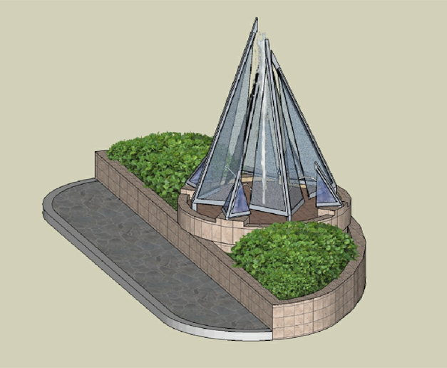
| I’ve learned through the years that compact spaces often present huge creative opportunities. In this case, a small, very public space required a bold design to call attention to and even define the aspirations of the mixed-use commercial/residential property behind it – just the sort of look we ultimately delivered. |
We were brought into the project by Linberg & Simmons, a local architecture firm we’ve worked with on several other projects. They showed us the space and asked us to come up with something special – no further direction beyond the fact that they wanted water and that it should both make a statement and attract the attention of people passing by or entering the building.
That building itself featured a beautiful, light-blue-tinted glass and an interesting angled steel structure at the center of the entrance that reached up to the roofline. Playing off that program, we organized a set of tilting, rectilinear glass panels with water flowing over them and proposed a fire feature for the center of our structure so flames would be seen through glass and water.
The clients weren’t immediately keen on the idea of using fire, saying it was too unconventional for Bermuda and asking us to try again. After a few more iterations, we ultimately agreed on a set of pyramidal glass panels that resemble sails for the space. We also included laminar jets that will be shielded from the prevailing winds by the glass.
The point is, our clients’ desire for a comparatively small watershape gave our firm a wonderful opportunity to do something truly different from the projects we typically tackle, and it’s going to provide them with a beautiful sculptural statement that will enhance their property.
OPENING UP
What I’ve found through the past several years is that working on small watershapes is just one more creative task we might tackle while creating – and just one more creative opportunity. As I mentioned in both of my last two columns, when you consider the current economic conditions we’re facing, firms that make it to 2010 and beyond will be those that adapt their expectations to current circumstances without sacrificing their commitments to quality.
What I’m saying is that, while smaller projects alone might not lead anyone out of the woods, my sense is that these jobs are worth serious consideration and should be viewed not only as something apart from our usual line of custom work, but also as part of a well-rounded perspective in which we view any project involving contained, controlled water is a possibility, no matter the scale. It isn’t much of a stretch to see that installing these small watershapes for clients now can be a key to future work!
Brian Van Bower runs Aquatic Consultants, a design firm based in Miami, Fla., and is a co-founder of the Genesis 3 Design Group; dedicated to top-of-the-line performance in aquatic design and construction, this organization conducts schools for like-minded pool designers and builders. He can be reached at bvanbower@aol.com.


