The Heart of the City

The plaza island at Columbus Circle in New York is an example of urban and civic design at its best. Encircling the heart of this grand space is a subtle fountain system that has turned a busy traffic hub into a welcome gathering place for the city’s residents and visitors. Here, principal designer Claire Kahn Tuttle of WET Design in Sun Valley, Calif., describes the project and the philosophy the company brought to bear in bringing it to fruition.
Tradition has it that, in measuring the distance a place is from New York, the geographical tape measure is placed at the center of Columbus Circle. This makes it easy to see this southwest corner of Manhattan’s Central Park (and the intersection of Broadway, 59th Street and Eighth Avenue) as the true heart of the city.
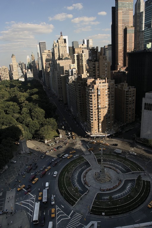
A massive 70-foot obelisk topped by Gaetano Russo’s statue of Christopher Columbus has stood at the center of the bustling traffic circle since 1892, when it was installed to celebrate the 400th anniversary of the explorer’s arrival in the Americas. The circle itself was part of Frederick Law Olmsted’s original vision for Central Park (which included a major plaza at the Eighth Avenue entrance) and has long been seen as both a landmark and a critical traffic hub.
As is true of many New York neighborhoods, the area around the circle has seen both good times and bad. Recent years have been good, with new commercial development bringing renewed vitality to the area surrounding this highly visible confluence of pedestrian and automotive traffic. Despite its pivotal location, however, the circle has for years represented a hazardous goal for pedestrians facing a risk of life and limb to reach the circle’s central plaza.
THE MEASURE OF A PLACE
All that changed in the fall of 2005, when work was completed on a new circle island reinvented as place of repose and relaxation for the walking public. Designed and managed by the Olin Partnership, it represents the objectives for the project established by company founder Laurie Olin.
For our part at WET Design (Sun Valley, Calif.), we designed and supervised the installation of the fountain system that’s an integral component of the new Columbus Circle. In a great many respects, this fountain is a case study in the role water can play in densely urban settings.
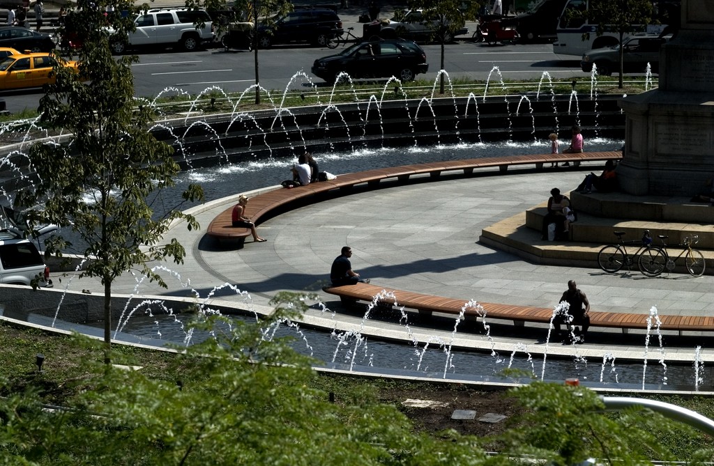
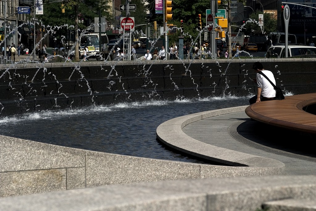
| Cars have long dominated the scene at Columbus Circle and have made it into one of the world’s busiest intersections. The newly designed island surrounding its famous obelisk and statue is likely to make it one of the city’s great pedestrian magnets as well – a calm space amid a bustling urban landscape. |
When designers consider water as an element in these contexts, they tend to look at it in one of two ways: Either as an element that exists separately from its surroundings, or as an interwoven part of the setting that draws its design cues and personality from the environment while directly responding to the needs of the given space.
It’s the latter possibility I was interested in for the Columbus Circle project – that is, creating a waterfeature that is distinctive and dramatic but also clearly reflective of the interests of the clients, the needs of people moving through the environment and the aesthetics and spirit of a unique setting.
The art of designing water for any environment comes down to understanding the program, or what our friends in England refer to as the “brief.” When applied in a thoughtful design that’s mindful of the brief, water becomes an intrinsic element to the entire experience of being in a place. It fills a void, and the project at Columbus Circle was all about that notion.
As mentioned above, the vision for the project came entirely from Laurie Olin, whose stated goal was to “enliven and invigorate” this popular location. The design accordingly focused on reinventing the location with beautiful materials, landscaping and water.
As a consequence, the Columbus Circle plaza has become a renewed public area that exists purely for the enjoyment of people working and moving around it. This basic concept is elevated and enriched by the further sense that these pedestrians might either be coming from or heading into Olmsted’s magnificent Central Park.
ENRICHING THE ENVIRONMENT
Unlike redevelopments that focus on drawing people to a space for purely commercial reasons, this project was conceived entirely as a pedestrian mecca: You don’t have to be in the process of spending money to go there. The brief in this case turns on the idea of creating a space that is atmospheric rather than narrative. With no themed elements on any level, anyone can just go there and enjoy the water, the beautiful materials, the trees and surrounding views of the park and nearby buildings.
In other words, Columbus Circle is its own reward, a place for people to enjoy themselves and the urban landscape. The space responds to that landscape and becomes part of it, creating a destination that has fully assumed its role as the city’s heart.
With the water itself, our goal was to accentuate and enhance the space, adding to the comfort and ambiance rather than using water to create any sort of overt spectacle. Our design is essentially one ring in the circle, just a part of its collected environment, with water encompassing a 150-foot-diameter loop around the obelisk and statue at the center. A series of low terraces and plantings create an outer barrier, thereby creating a sense of seclusion within the loop.
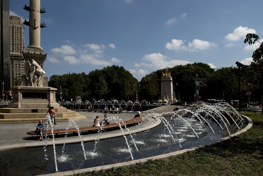
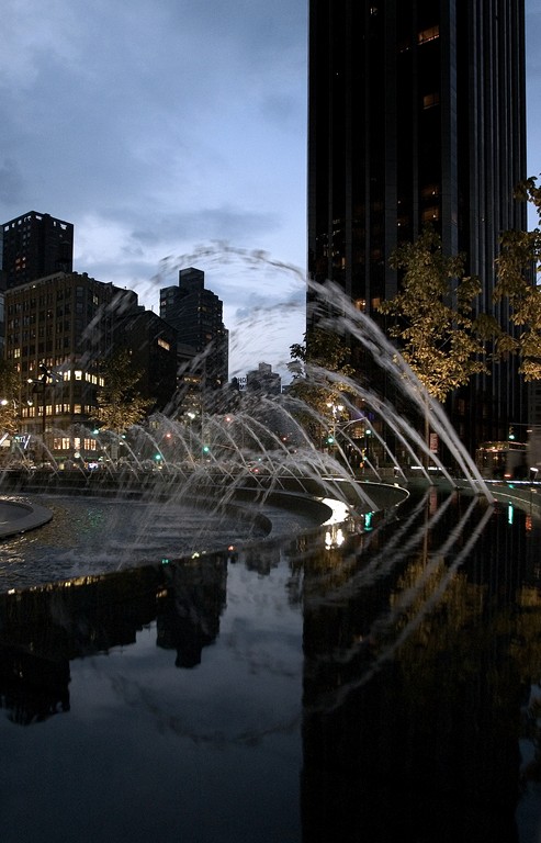
| By day, twilight or evening, the concentric terraces that drop the core of the island several steps below street level offer New York’s residents and visitors a gathering place that is surprisingly well isolated from direct traffic noise. The cars, taxis and buses can still be heard, of course, but the sounds of splashing dominate down here. |
The outer ring of the island consists of raised cobble that offers pedestrian initial refuge from the traffic beyond. A second ring of low, flowering plants and evergreen shrubs introduces an element of greenery that transitions to a ring of trees (evergreens and yellow American buckeye) used to frame views of the monument. In the very center are elegant wooden benches.
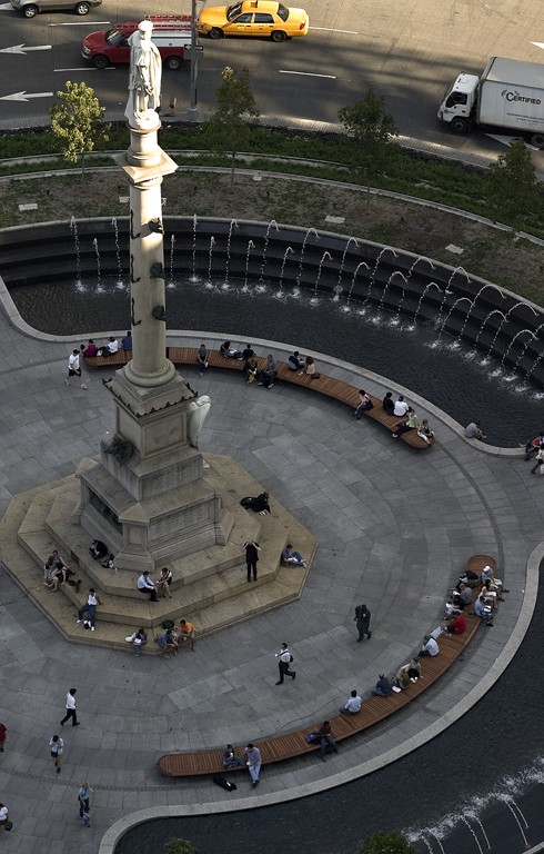
Everything is symmetrical, with three broad pathways at 120-degree intervals providing access to the inner spaces. Inside, the terraces descend back to grade, creating a concave area. It is on these internal terraces that we placed the waterfeature.
The existing circle had a small fountain that encircled the central tower. That was removed, so now pedestrians can walk right up to the center of the circle. The water has been pushed back to the terrace structure that rings the core area – a spacious “room” created by the architecture of the island. Between the pathways are three identical water elements descending over three broad terraces. When you’re within the circle, the water essentially surrounds you on all sides, adding to the sense of relaxation and escape.
CLARITY OF PURPOSE
Unlike many of the projects we tackle, this one didn’t involve exploration of a range of design options. We knew we needed to develop a system in which water would inevitably be part of the terrace system – a fact that led us to some obvious and straightforward solutions. During the design phase, members of our team visited the Olin offices in Philadelphia and enjoyed their collaboration with Laurie Olin and his team.
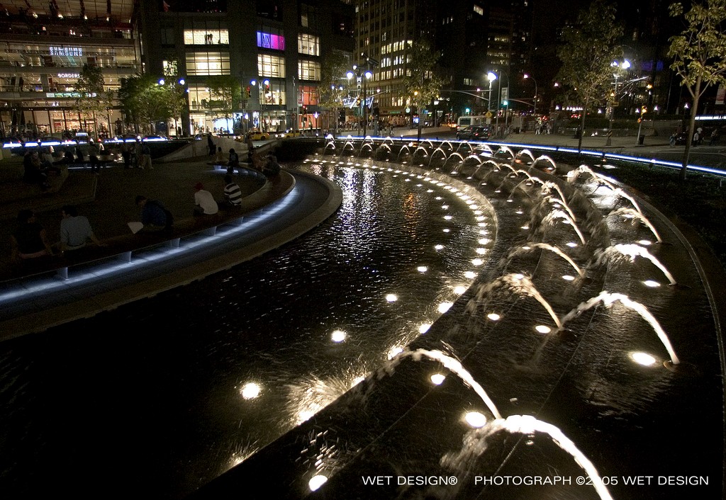
The resulting configuration of the waterfeatures is relatively simple: There are three identical basins covering three terraced levels, each stretching to 60 feet in length and 25 feet in width. Water flows from a concealed weir on the top level, over the terraces and down to the plaza level, where it’s collected in a concealed slot. The sheet of water is very thin – just an eighth of an inch or so – but it lends a beautiful reflective quality to the granite hardscape.
The two upper terraces in each section contain arcing jets that send inch-and-a-half streams of water toward the center at variable heights and distances. Each section includes 33 jets set at staggered intervals, with 99 total jets in the system. The streams are not smooth or laminar; instead, they have a more ragged flow and a rougher texture.
| The 99 fountain jets issue from the dark steps with a ragged flow and a rough texture and have a special beauty all their own. The water’s motion isn’t meant to provide any kind of spectacle or discernible dance and has been set up instead simply to add water to the environment in a visually interesting way. |
The water is collected in a sub-grade trough located beneath the adjustable deck surface. The raised deck accommodates the troughs, plumbing and electrical conduits while concealing everything from view, and the equipment vault is buried beneath the northeast side of the circle. Nobody who visits the island has any visual sense of the mechanisms powering the fountain system: The water emerges into the space and simply disappears.
The system is programmable and can achieve a variety of combinations of behaviors and sequences. The water’s motion isn’t meant to provide any kind of spectacle or discernible dance; rather, it is designed to add interest simply by the way the water is introduced to the environment. The resulting transitions are subtle, the idea being that someone who spends a few minutes there will perceive shifts in the “shape” of the water that differ from what they might have observed when they arrived.
WELCOME INVITATIONS
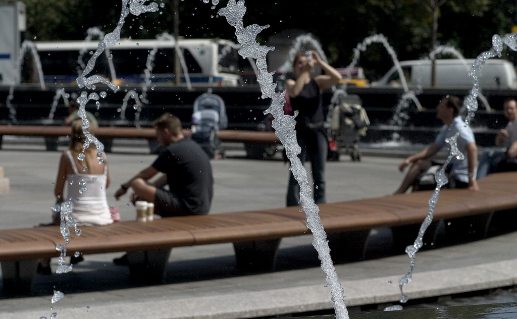
There are no barriers between the water and the dry hardscape, so even though this is not an “interactive” system per se, we do expect children and others to play in it during the warm months. Visitors are free to stand as close to the water as they like, just touching it or getting completely soaked, if that’s what they want.
When the fountain isn’t operational – during the winter, for example, when the water system is shut down for the duration – the dry terraces are perfect for seating. That was one of our goals: When the system’s not running, the casual visitor should have no idea that he or she is sitting in a fountain. There’s no question that this is a subtle watershape.
Experience has shown us that in situations such as this, where the place defines its own mood and magic, water does not need to be aggressive or spectacular to be effective. The idea here, on this island amid the city’s tumult, is to foster tranquility and relaxation. Yes, we expect the water still to be engaging (and even exciting when children come to play in it), but it’s an ambient feature that works as one of the islands concentric layers – all a part of the setting as opposed to a display that declares its presence the moment you see it.
The water system itself is quite complicated. In fact, with designs such as this one that are basically unadorned, it’s critical that the water be proportioned and spaced correctly relative to the space. Because it’s not clad in layers of decoration or ornamentation, the water effects must get their spatial relationships just right – a design issue that required a great amount of careful consideration and adjustment during the project’s initial stages.
| If there’s a special magic at work on this island at the heart of the city, it’s tied up in the way one of the world’s busiest places has been given a calm center – a place to relax, recuperate, play and, in true New York fashion, a place to watch other people relaxing, recuperating or playing. |
Ultimately, Columbus Circle’s plaza is a layered combination of plants, hardscape and water that conspire to create a surprising sense of tranquility and of separation from the traffic constantly spinning around the island. We knew, of course, that the sound of the water would play a major role in masking traffic noise, but it wasn’t until we were on site and starting the system that we heard just how effectively that masking had been accomplished.
Flat out, this is one of the busiest intersections in the world, but when you’re inside the circle, you really don’t have the sense of being in the middle of a major traffic hub. Yes, you can hear the cars, buses and taxis if you listen for them, but the sound of the water, the tranquility of the greenery and the unique perspective on the corridors of buildings marching away from Columbus Circle take you away from the street and into a setting that has its own character and ambiance.
A PLACE FOR PEOPLE
When we were programming the fountain choreography, I had an opportunity to spend several days on site and saw at first hand just how well the entire design scheme works. From the time the space opened to the public it’s been packed with people, and I had the immediate sense that the residents who live and/or work in the area had taken ownership of the space.
(True to the spirit of New York, a number of people came up to me to offer suggestions about the way the water ought to behave.)
The discussions and work that go into a project of this kind can be filled with nuance, but the results are often at their best when they are completely straightforward. This is now a place that provides enjoyment for people who stop by: While achieving that reality may have been complex, the result is as simple as the smile on a child’s face.
Claire Kahn Tuttle is a principal designer for WET Design of Sun Valley, Calif. She has been with the firm since 1985 and through the years has worked on some of the firm’s most noteworthy projects. A graduate from Stanford University in 1977 with a degree in graphic design, she was soon hired by the giant architectural firm of Skidmore Owings & Merrill, for which she served as a designer in the interior and graphics design division of its San Francisco office. Her work with WET Design focuses on the seamless integration of often-spectacular watershape systems into a range of institutional, civic and commercial settings.


