Persuaded by the Past
As I see it, watershaping is ultimately about its emotional effects: As designers and builders, it’s our job to bring a variety of technical and aesthetic elements together to create spaces and structures that leave our clients with enduring feelings of vitality, relaxation, comfort and luxury.
In my case, the quest to realize this emotional component actually drives the process. As I strive to generate spaces that have real meaning for my clients, I’m always putting my heart into the work and am fully aware that what I do is an extension of who I am. Indeed, I’ve never been shy about letting my designs reflect my passion for art, architecture, history, color, form and even poetry.
By working on this level, I find that I’m able to carry my clients along and make them as excited, inspired and engrossed by the process as I am. It’s an unabashedly romantic approach, but it can be infectious – and clearly satisfies everyone who gets involved.
Of course, there is plenty of perspiration that goes along with the inspiration. For all of my enthusiasm, I spend a tremendous amount of time designing these spaces and selecting elements that will populate them, from the largest waterfeature to the smallest plant. I also closely manage the construction process, never relinquishing control because with each and every project, I’m expressing my own belief in the concept of creating highly personalized paradises.
The key here, I’ve found, is careful selection of a style that works for the property, for the clients and for me as the designer.
REACHING BACK
If I had to declare a stylistic preference (or even a speciality), I’d have to say that I’m a huge proponent of Classic looks and have spent much of my adult life educating myself about Classicism and a number of related design traditions.
What you discover through study of this sort is that just about every stylistic compartment you consider includes long lists of variations, sub-movements and quirks. In fact, what we even mean by the term “Classic” is quite varied and vast. That’s why, when I’m working with clients, I find that I need to narrow the focus and get specific as I can with them as early in the process as possible.
Let me define why that’s important: When my clients and I talk about, say, Classic design, the reference might be to forms of Greek, Etruscan, Roman, Islamic or Asian architectural design – or even to details of High Renaissance, Baroque or Rococo art. There are even references to “Classic Contemporary” – all of which can confuse my clients if I’m not careful with the terminology and how we share it.
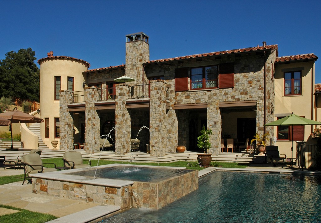
Recently, for example, I finished an elaborate project for clients who had relocated to the United States from Italy and had distinctly European frames of reference. But once we started talking about their desire for a “Classic” project, it took us some time to work through all of the possibilities before settling on forms of the Renaissance from the 15th and early in the 16th Century.
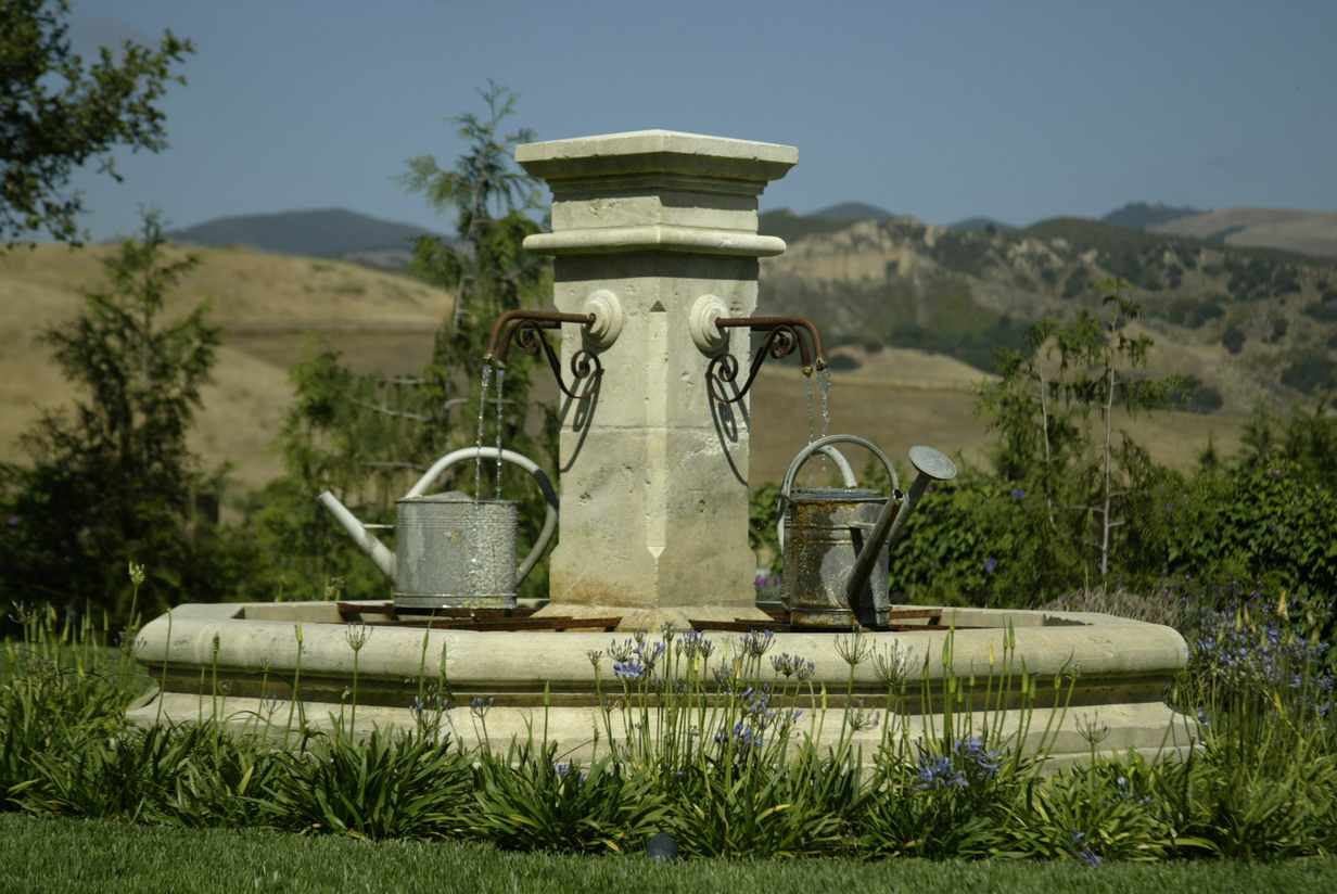
| Not only do these historic fountain forms display the evolution of these special watershapes, but they also represent a variety of looks that can be used today with specific clients, settings and projects. Sometimes, depending on the stylistic target, a simple wellhead or waterspout will be a perfect fit, while other times only an elaborate tiered structure or leaping jets of water will do. |
To get there, we had to run through all sorts of precursor and successor styles, explore Moorish Spain and get past the French and German and Italian influences woven into the design fabric of that era. In this case, we soon boiled things down to a rather specific moment early in the 16th Century and a period known as the Italian High Renaissance.
This was the great period of Leonardo da Vinci, Raphael and Michelangelo as well as Bramante, the great architect of that time and place – and we used it as a filter in assessing the elements we were considering for use in our own project.
The art and architecture of that time is all easily accessible in books, of course, which is one of the reasons why I’ve amassed a collection of nearly 2,000 such volumes covering just about every type of architectural and landscape style and tradition to share with my clients.
But I am also a firm believer in the value of travel and of seeing these objects with my own eyes, and I’ve been very fortunate to have spent a great deal of time traveling throughout Europe and especially in Italy, where I’ve absorbed everything I can from the streets and galleries of Florence and Rome and visited such places as the Villa d’Este and the Vatican among many others.
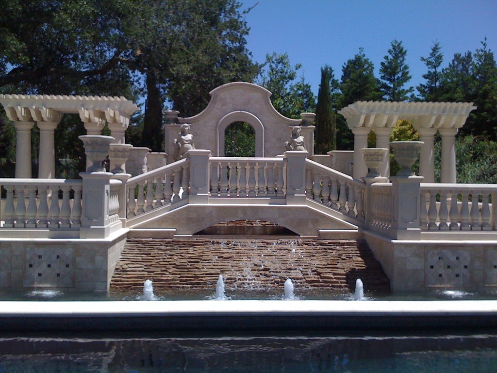
Those experiences (and more) are on display in the columns, steps, pilasters and colonnades I selected for these Italian expatriates. In one way or another, everything within the package qualifies not only as Classic, but as Classic of a very specific sub-type.
PART OF LIFE
Of course, the Italians had no monopoly on Classicism. There are Classics in the German style, for example, and in French, British and Spanish styles as well. I’ve spent my career figuring out and working with the distinctions, in each case responding to some particular quality desired by my clients as expressions of their passions, backgrounds and romantic impulses.
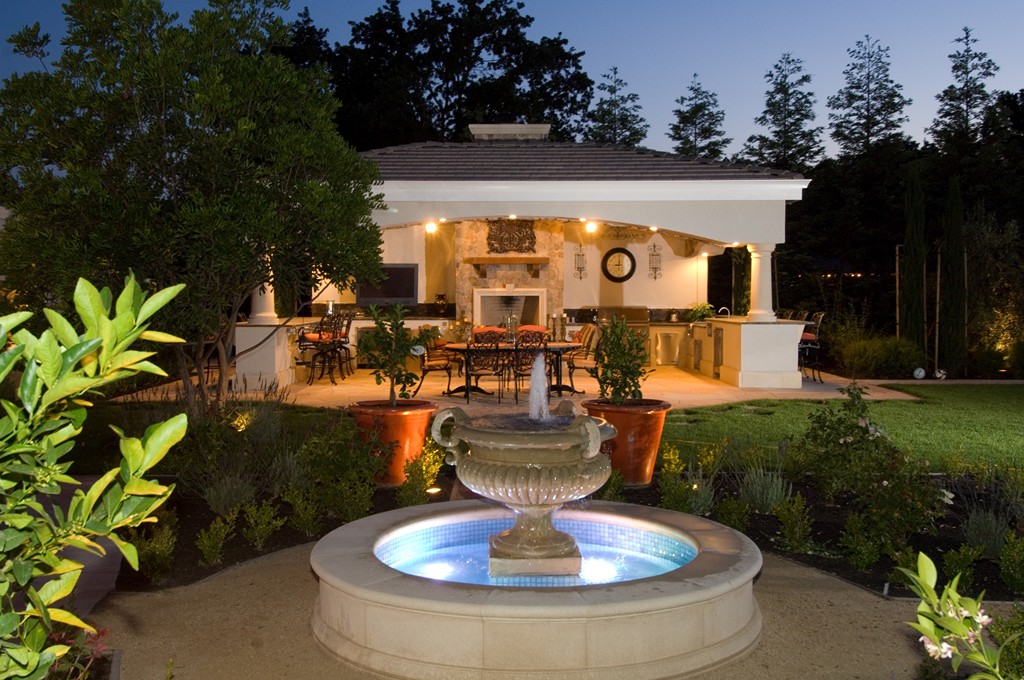
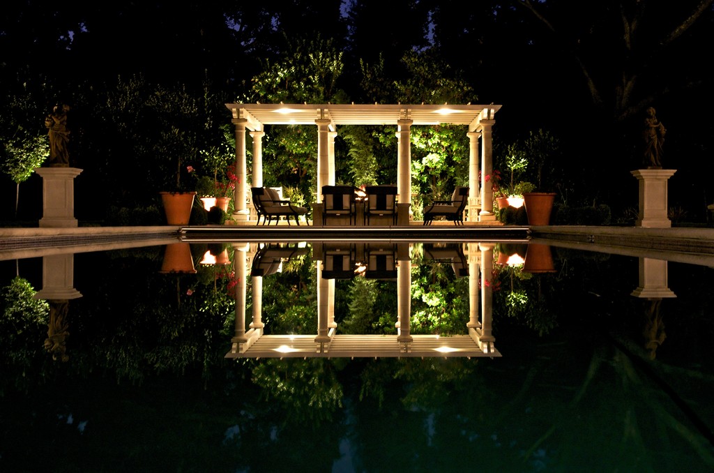
| Spaces designed in classic styles are almost always governed by axial symmetry — a complulsively formal grid that organizes primary viewpoints, pathways and placements of objects within these compositions. Experience shows that getting this right is often the most direct way to please classically oriented clients. |
At this stage of my career, this doubtless means that I’m attracted to projects of a certain type – and very likely that clients come to me because I’m known for my fascination with the Western traditions of art and design. Whether it’s about culture, royalty, governance, travel, resources or vernacular structures, I pursue timeless links to the romance, struggles and triumphs of the past.
In short, I seek connections in my own work and do what I can to link my clients to traditions that have defined us through important stretches of human history.
That’s all heady stuff, but it’s only worth indulging because it also has a practical side: As part of the design process, I always encourage my clients to purchase some genuine artifact (or artifacts) from the past (if they can in any way afford it) so that these new watershapes and landscapes have something of our subject period as part of the composition. Even if it’s no more than a single reclaimed brick, its presence creates a distinct tie to the past that lends significance and meaning and emotional connectivity to the project.
And if that artifact is a wall fountain or a sculpture or some other object of substance, all the better!
As mentioned above, these elements carry narratives that clients will value themselves and will share with family and friends. Let’s say they traveled to Rome to purchase it and had side adventures along the way: Through these objects, the new spaces are vested with stories that reflect ages long past as well as current personal history. They are infused with life in ways that cannot be achieved with replicas, no matter their quality.
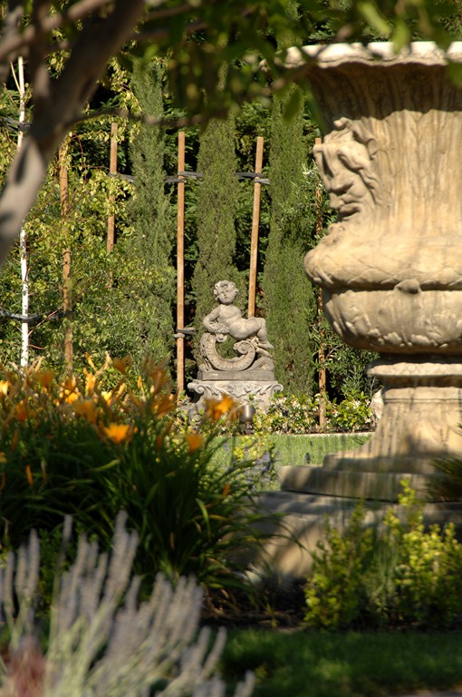
In design terms, these artifacts become wonderfully powerful focal points or accents within a given space, serving as destinations, setting up vignettes and establishing tone that will pervade and enhance their surroundings.
And this works even if the artifact is encompassed by new materials and objects created to render the illusion of age and tradition. In that sense, the designer is using education and life experience to channel the works of artists and artisans of the past, using the insights drawn from their styles and approaches to create spaces that bring them to life once again.
Happily for those of us who work in these styles, there are good resources at hand including several suppliers who offer products that replicate works of antiquity. The availability of these statues, fountains, columns, finials, and assorted other details enable us to work more or less as set designers and significantly enhance our ability to transport our clients to other times and places.
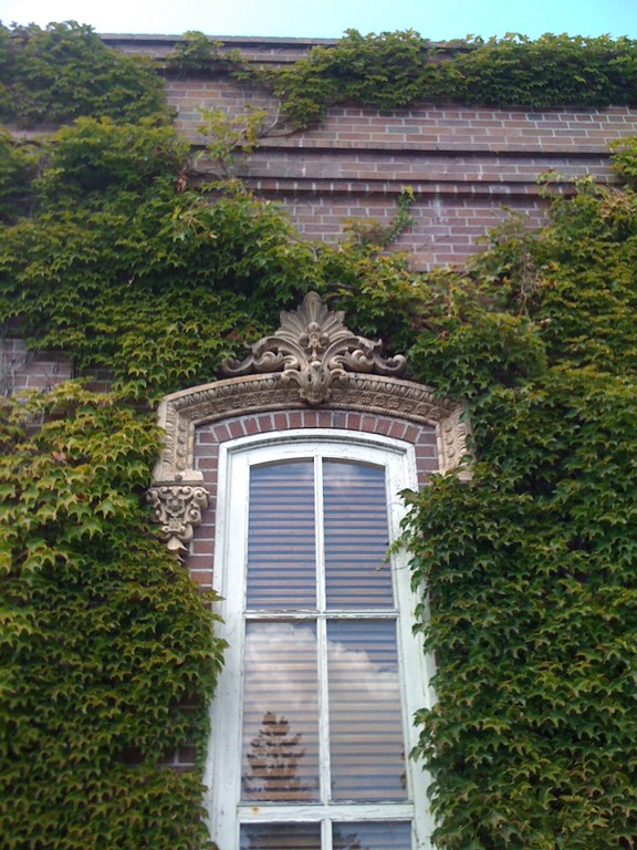
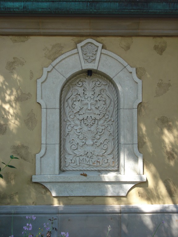
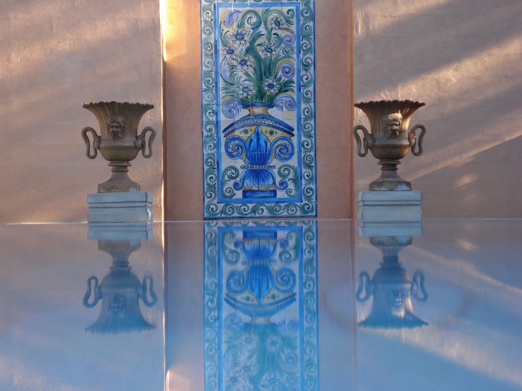
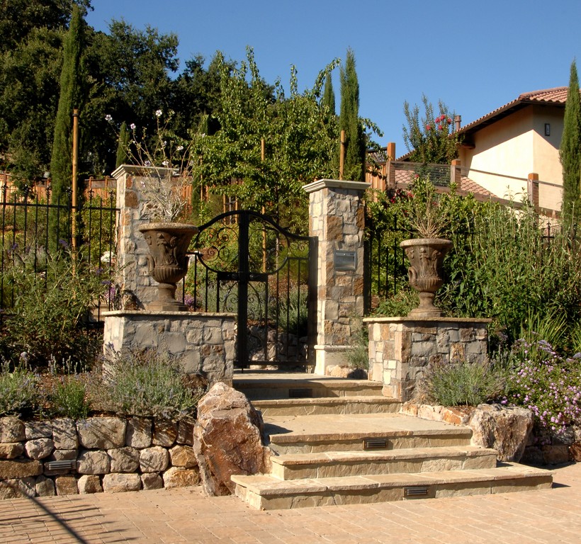
| No matter whether my clients are after spaces reminiscent of Classical Rome, Renaissance Italy or Baroque Spain, I know I can find accessories that will mentally transport them to just the right time and place. These include everything from window brackets, wall fixtures and urns to iron gates, garden statuary and architectural fixtures — all available in modern reproductions. |
But again, this is not a casual exercise: To make the illusion work, you must understand the details, know the vernacular and nuances of the particular style and, most of all, know how the various elements all fit together. There are no shortcuts. You have to be sure of yourself, know what you’re pursuing – and figure out a way, of course, to bring your client along on the journey.
FOLLOWING LINES
When working in one form or another of a classic style, there is always going to be some sort of framework or grid or pattern or array of elements that define the look you seek to invoke.
That may seem confining, and I’ve observed with some projects that it can lead to conventional or even humdrum results. For my part, however, I find the conventions of these forms to be liberating. As in jazz music or improvisational theater, the structure is what propels and shades the creative decisions the artist makes.
Once you hit certain notes or echo a distinctive delivery, you’re on your way. If you’re working in French Gothic, for example, once you’ve accommodated the sensations created by Gothic arches, flying buttresses and ribbed vaults – and defined distinctions between what you’re doing and the contours of, say, Islamic arches or Roman barrel vaults – then you’ve paid the necessary homages and can move along creatively.
It also helps that precision isn’t always necessary, basically because there are few sharp lines to be drawn among classical forms. The designers of the High Renaissance worked with a design vocabulary dictated largely by the Romans and by the Greeks before them, with each subsequent movement picking and choosing among elements and using them as seemed appropriate.
The colonnades and domes of Roman architecture, in other words, were reborn (literally) during the Renaissance, but they also existed in the more recent context of Moorish influences from Spain and Gothic influences from France. Knowing these lineages makes it possible to work with and across styles so long as what you’re doing doesn’t violate the spirit of what you’re after and you and your client have developed a vocabulary that lets you discuss these nuances and cross-currents.
In my experience, navigating these waters means adhering to a few core values. With Classic landscape designs, for example, spatial organization is critical, and I know I must observe certain principles related to symmetry, rectilinear geometry and development of axial sight lines. And this is true no matter the project’s scope, whether I’m working with a grand estate the size of Versailles or on a private residence with a constricted suburban yard.
|
Matters of Style When I begin working with clients, style is a topic from the start – both underlying and expressed. From the first second of my first site visit, I’m all eyes and ears, noting the home’s architecture, spotting any art on the walls, sizing up the furnishings and even thinking about the neighborhood in which they’ve chosen to live. From the outset, I’ll do all I can to pick up cues that will guide the design process. My clients are very important in this process, of course, but I’m always aware that I the one who is guiding the work, using my own thoughts and ideas to stimulate theirs as we develop wish lists and put some flesh on the skeletons of their ideas. During our discussions – all of them, but especially the early ones – I’m drawing them out, getting them to relate experiences and memories and developing a language we will share through the entirety of the process. It’s also about references and helping them develop a visual vocabulary we’ll have in common as well, which is why I will share books and magazines with them and lead them to explore key web sites. As we communicate along these lines, this educational process typically grabs hold and my clients almost always become excited and inspired. I guess it’s just human nature to want to be knowledgeable, and I see what I’m doing as helping them expand their frames of reference and classify past experiences with greater clarity and vibrancy. Those mental connections also set the stage for their sustained emotional involvement with the project once it’s complete. Taken together, all of this groundwork generates momentum as we move forward. From the earliest stages, I’m choosing materials and objects to inhabit their spaces – items that have both physical form and some sort of function but that also have certain narratives attached to them. If a client can look at the material chosen for the decking (let’s say it’s a nice Travertine or marble) and recall conversations we’ve had about the material’s origins and historic uses, they will not only take pleasure in sharing what they know with others, but will also have an emotional attachment to it as a familiar, understood part of their own personalized space. From my perspective, the more specific these discussions are with the clients, the more freedom I have to respond creatively while simultaneously guiding their expectations. As I mention in the accompanying text, my design work is extremely detailed, and following along as the process unfolds places certain responsibilities on my clients to keep up and understand what’s happening. And I have found this to be true no matter the style in which I’m working. Whether it’s Contemporary, Prairie Style or European Classical, it all works best when their involvement is both emotional and all-encompassing. — C.L. |
As a result, every Classic design I do starts with some form of axially defined layout, which can mean centering a fountain or statue in view of a key window or doorway and using it as a focal point to govern pathways and placement of other structures, no matter the size of the space.
From there, I work with additional stylistic elements, planning an English garden, for example, with crisp, orderly rows of hedges or a Spanish Colonial quadrangle with wonderful garden gates. This flexibility is what I love about digging into the Classics.
And you can even break the rules if you really know what you’re doing. In fact, asymmetrical balances can be extremely stimulating: If you have a good reason for doing so, a bit of imbalance that would typically be objectionable can work within these spaces.
WATER’S PRESENCE
Beyond design traditions, I’m also passionate about using water in my projects. Whether it’s a wall fountain, a runnel system, a tiered fountain, a swimming pool or a pond, these features can be the key to almost any design in any style.
Whether it’s quiet and reflective or animated and turbulent, water is always a dynamic design element. Designers of days long gone knew this, of course, and it would be interesting to meet the first artists who figured out that simple wellheads could be transformed into majestic fountains serving triumphal civic purposes in town squares and hear what drove their designs.
As time passed and whatever specific paths were taken, water-as-utility eventually became water-for-display. In some cases, water that was used for drinking or for air conditioning became water used to demonstrate wealth and power or artistic ambition. In fact, the modest wellheads Rome’s past did eventually evolve into grand, water-driven fountains of great beauty.
Fortunately, my clients typically share my love of water, so it’s not very difficult to convince them to invest in some type of watershape – or several watershapes, as the case may be. Examples of fountains abound, but I am also well aware that Bramante didn’t specify a single swimming pool with any of his projects.
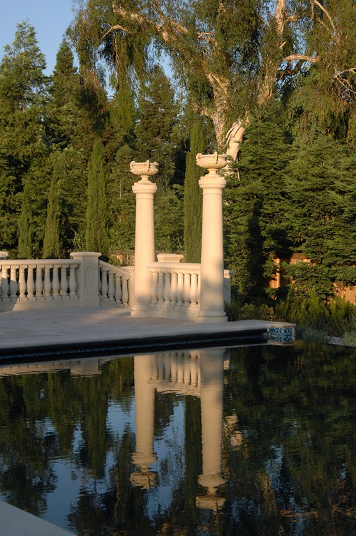
Water of swimming depth is indeed a modern anachronism in a Classic setting, but there were many gardens that included reflecting pools or even rain-collection basins that are not out of place. It’s not much of a reach beyond either one of those to consider a vessel suitable for human immersion.
Beyond basic shapes (and depths), it’s all about the details with pools. They must be adorned appropriately – meaning mosaics rather than fields of glass or ceramic tile, for example – using materials the way builders of the Renaissance would have inherited from their Roman forbears. An air of authenticity is the key, which is why I often accent these pools with statues and small fountains.
And always, surrounding these vessels appropriately is of crucial importance. Architectural details, statuary and plants are all vital, and they all must be placed in the space using the governing principles of axial organization. Doing this well is of special concern around watershapes, because they can draw too much attention and ultimately become disruptive.
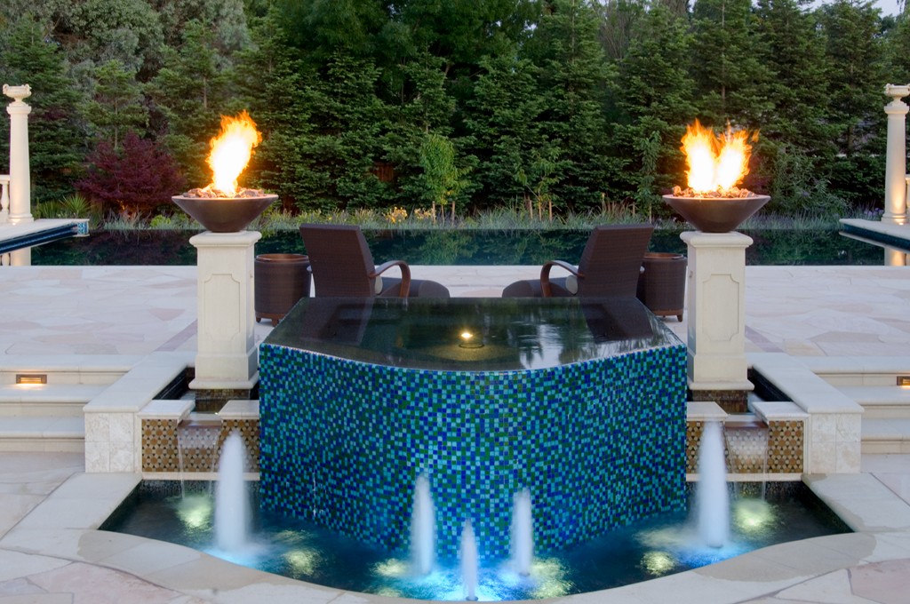
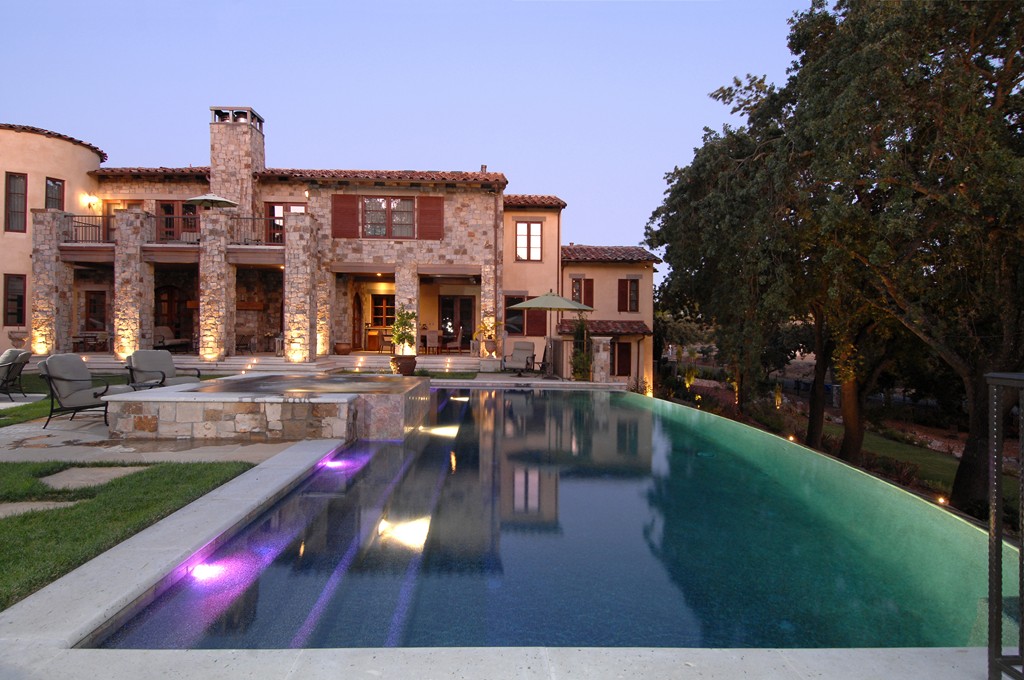
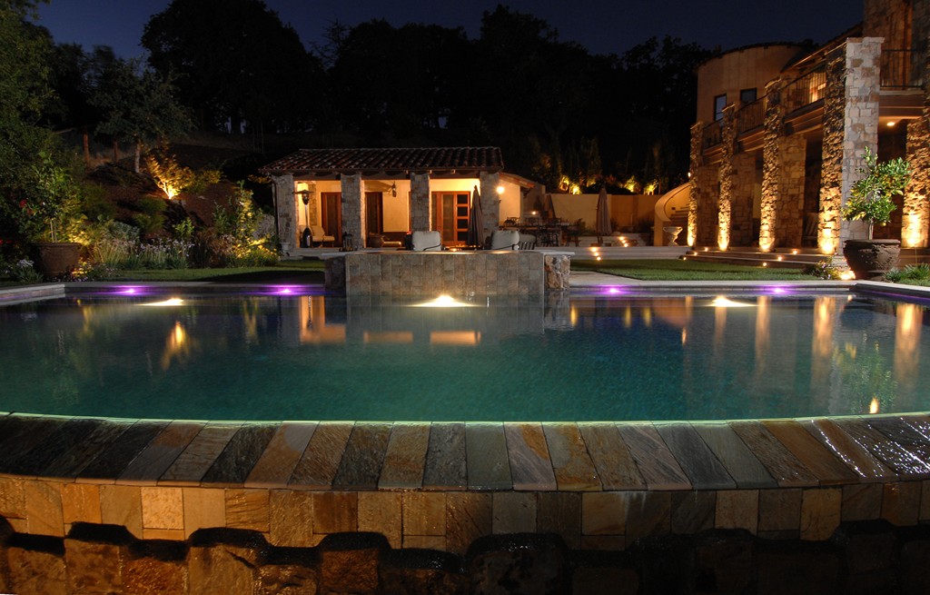
| When I develop a project in a particular style, I know that the results I achieve will be measured against my clients’ understanding of the features of that style and their perception of how I’ve organized the space, dealt with its symmetries, used appropriate materials and included objects and details that attach them emotionally to what we’ve achieved together. If it all works, the fact that I’ve altered the program by using, for example, a sweeping vanishing edge is less a disruption than it is a welcome variation on a theme. |
This is why I like using aged or distressed materials as coping for these waterfeatures: It gives the impression that the rest of the space was planned around a much older structure at the core.
MAGICAL ROMANCE
This text is meant to illustrate my belief that, far from being confining, working within established design styles and traditions is actually liberating. Yes, these designs require a disciplined approach, but there’s room for great creativity here.
For me, the factor that helps me move easily under the Classic umbrella is the fact that I bring a sense of romance to the table. It’s the X factor that keeps me moving and makes it possible for me to forge the kind of connections that must be there if I’m to satisfy my clients.
No matter how organized the space, within each of my landscapes I make certain to include something stirring and emotionally evocative that will pull my clients into the space over and over again – something that will get them so fired up that they’ll never tire of telling the umpteenth guest the story of how they went to a shop just outside Rome and found the old horse trough that now feeds water to their swimming pool.
That sort of linkage will make family afternoons, garden parties and quiet evenings all that much more special: the food will taste better; the wine will be superb, and everyone there will be enveloped by a sense of timeless beauty not only in visual terms, but also in smells, sounds and tastes.
And if the tomatoes in the salad and the herbs in the sauce were grown in part of the garden; if the fragrant flowers floating in the table’s bowls came from vines tracing their way up the loggia; if beautiful music accompanies the gentle sounds of moving water, then this is a space that will link my clients and their guests to moments long past, half a world away from their daily routines.
You can spend a lifetime chasing the ages in this way. If you do so with passion and romance, I can think of few better ways to spend your time.
Christopher Lines is founder of Christopher Lines & Associates, a landscape-design firm based in Walnut Creek and Carmel Valley, Calif. He has worked in the industry for the 18 years since completing studies in art and design at the University of San Francisco and at San Francisco’s Academy of Art. Through the years, his work has been featured in The Robb Report, Architectural Digest and by Sunset Books. His international work has included participation in what has become known as the “World’s Largest Pool” in Dubai. He is widely known for highly stylized, expressive designs that are both historic and romantic in nature.


