Learning from the French

When you approach a design challenge, it always helps to be aware of the work of those who’ve gone before. That’s why college programs for designers, including architects and landscape architects, so often incorporate courses intended to teach students about the history of art and architecture. It’s a foundation that equips us with a language of design.
As I’ve pursued my own education as a landscape architect, I’ve collected images and information about classic designed spaces, and I am always adding to the file. Lots of these spaces are familiar to those in watershaping industry – the Alhambra in Spain, the Villa d’Este in Italy and Fallingwater in Pennsylvania, for example – but some of the sites are not so commonly considered even though they should be.
One of these for me is Versailles, the palace and gardens built for Louis XIV a few miles outside of Paris starting in 1662. I love its grandeur and immense scale, but even more, I love the fact that it is so filled with ideas that it’s basically a clinic for designers. And because the scale is so vast and obvious, it’s relatively easy to “read” what’s going on, even if you’re looking at satellite images.
Most important for all of us as designers, if we’re ever asked to create a formal garden space as part of a watershaping project, we can’t go wrong looking to these gardens for inspiration. This is beyond a doubt the iconic example of formal French garden design.
A Quick Tour
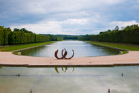
Let’s start with the Grand Canal, which stretches straight as an arrow from the middle of the back of the palace out to a vanishing point so distant it almost seems infinite (Figure 1). This is the kind of scale a man like  Louis XIV (known as the le roi-soleil or ‘sun king’) could appreciate: The longer the canal was, the more it drew the eye outward across the estate. To awestruck courtiers, this practically shouted, “Go ahead and look: As far as you can see, I control it all.”
Paths along both sides of the canal are framed by grand allées of trees, all reinforcing the strong line of the canal. Using line this way wasn’t new, but on a grand scale like this, it is easy to see how designers can use any line to guide the eye and influence the viewer’s experience. To be sure, it’s unlikely anyone’s client today will command such a property or be able to lavish endless cash on developing it, but this concept of a strong line is remarkably scalable and something to be considered in any formal design.
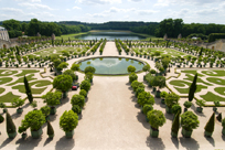
Next consider l’Orangerie, the garden outside the conservatory where citrus trees were stored though harsh Parisian winters (Figure 2). This area’s main design element is a pattern laid out in low, cropped hedges  (referred to as parterres). As if an imaginary mirror ran down the center of the garden, the elaborate swirls and patterns of the parterres are perfectly symmetrical.
L’Orangerie sits two stories below the palace, so as you approach, what catches your eye is the patterning of the paths and parterres – so much so that it looks like a flawless tapestry made of fabric rather than a garden made of plants. Again, it’s about control and Louis XIV’s ability to bend nature to his purposes rather than permitting it to run wild.
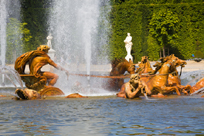
Another designer’s trick that can be learned from the gardens at Versailles is the idea of using a strong design concept – perhaps a symbol or metaphor – to unify a design. Because Louis XIV was the Sun King, for example, it’s no surprise that solar metaphors can be seen throughout the gardens. The most famous example of this is the Apollo Fountain. Here, the Greek god of sun and light is depicted in his role as the solar charioteer, rising from the waters on a cresting wave (Figure 3). The fountain is dramatic and impressive – and, as a metaphor, says a lot about Louis XIV’s sense of control over his kingdom.
Engineering played a role, too, in supporting this sense of god-like control. Versailles is in the middle of a flat, riverless plain, so the multiple fountains on the grounds could not be driven by gravity and head pressure alone (the approach that had been used so well, for example, at Villa d’Este). As an alternative, the engineers devised an elaborate system of horse-driven pumps that were the hydraulic marvel of the age. All of the waterfeatures were valved and would activate as the King marched in procession around the estate, followed by his train of guests and servants.
As he left one fountain behind, the one ahead was activated and was fully functional by the time his royal majesty approached. This game continued until the procession was complete, meaning none of the fountains ever operated for more than a few minutes at a time. That’s about as sweet as it gets in metaphorical terms: The waters were inert until the royal presence called them to action. Not even Apollo was excluded from the influence of regal whim.
Finding the Meaning
So what does all of this mean to the modern watershaper who is called into a typical backyard to work with an awkward space and a limited budget?
First, all of the concepts embodied in the design of the Gardens of Versailles are completely scalable. Symmetry is almost always within reach, as are axial organization and finding a strong line. If a client wants a formal yard, consider a watershape with clear geometry: a rectangular pool, for example, or a quatrefoil fountain. Beyond that, a sense of formal symmetry can be conveyed by rows of carefully trimmed box hedges, matched pairs of fire bowls or clear lines of Italian cypresses.
Second, even if there’s no desire for formality, once again the concepts carried by a place like Versailles represent the building blocks of sound design. On that level, choosing asymmetry is a conscious choice that you need to justify in your nonformal design. Also, if symmetry is about the exertion of control over nature, asymmetry can be used to show a symbolic connection with nature.
That second point leads directly to a third: Whether our clients express it or not, they all come to the design process with certain expectations you can help them define and either use or set aside. If you know all about symmetry and the Gardens of Versailles and they don’t, you can use what you know to persuade them to move forward with your suggestions, whether they include symmetry or not.
By contrast, if your clients know a thing or three about Versailles and formal garden design and you’re clueless, the plain fact is that you’re at such a disadvantage, you’ll probably never get the job. On that level, it’s all about communication and knowing the design vernacular well enough that you can express yourself using its basic concepts.
For most of us, attaining this conversational knowledge of the basics of design means spending time in class as well as reading books and getting out to see the world. To me, if we all made that investment in professional education, watershaping would be much the better for it.
Kate Wiseman is Principal at Sage Outdoor Designs, a San Diego, Calif.-based landscape design firm specializing in waterwise garden design and outdoor living. She is an instructor for the Genesis 3 education programs and may be reached at kate@sageoutdoordesigns.com.


