Art of the Angle

Most people probably don’t think of geometry as being “cool.” While studying points, planes, protractors and the Pythagorean theorem may not have seemed like any fun back in high school, when you use the mathematics of form to create a beautiful hillside watershape, lines and angles become far more interesting.
As modernism permeates our world, the use of geometric forms in architectural watershape design takes on greater relevance and popularity. This project is a perfect example: the house and landscape are boldly contemporary, using complex geometry to celebrate the million-dollar views, create intimate spaces, and produce a powerful sense of place.
There aren’t a lot of curves in this project, but the angles are something to behold.
TEAMWORK
The property is dreamy, perched on a steep hillside parcel in Rolling Hills, Calif. On the Palos Verdes Peninsula, overlooking the Pacific Ocean. It’s the kind of place where it’s easy to get lost in the view.
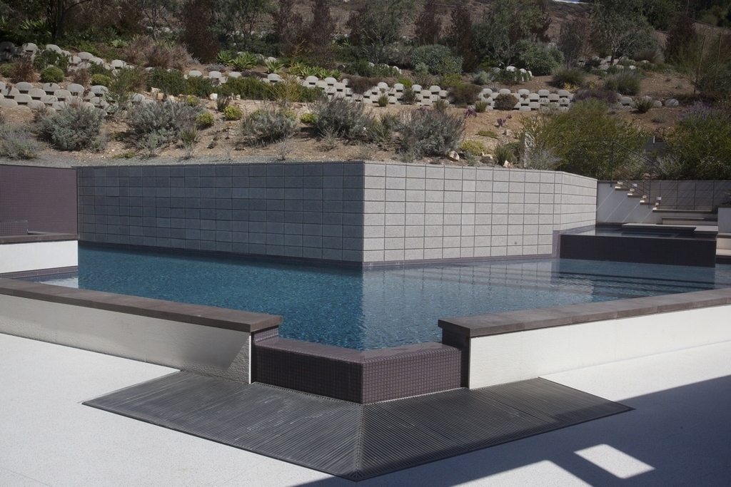
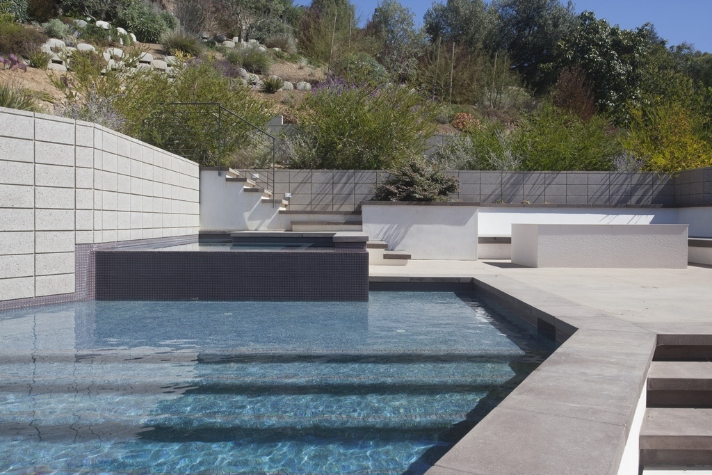
| The system of retaining walls sits on top of the pool, creating an angular backdrop for the complexly shaped pool and surrounding deck area. The tiled water wall panels create an intriguing asymmetrical architectural vignette that adds color and the glint of moving water. Finish photography by Corinne Cobabe Photography Manhattan Beach, Calif. |
Back in 2014, the house was undergoing a major renovation, including removal and replacement of an existing, and entirely non-distinct pool. Our company was brought in by the general contractor, who we’d worked with several times in the past.
There was a rough design by a local landscape designer, Marlene Breene, who in addition to working on the pool design, was in the process of reimagining the entire sloping landscape in the backyard; and, the front of the house which slopes down to the street.
Coordination and integration with other trades is always important and especially so on this project. The house was in the framing stage when we came on the scene. We were the first trade on site in the landscape. In effect, we pulled the pool from the shape of the house and everyone else came and worked off of the pool layout.
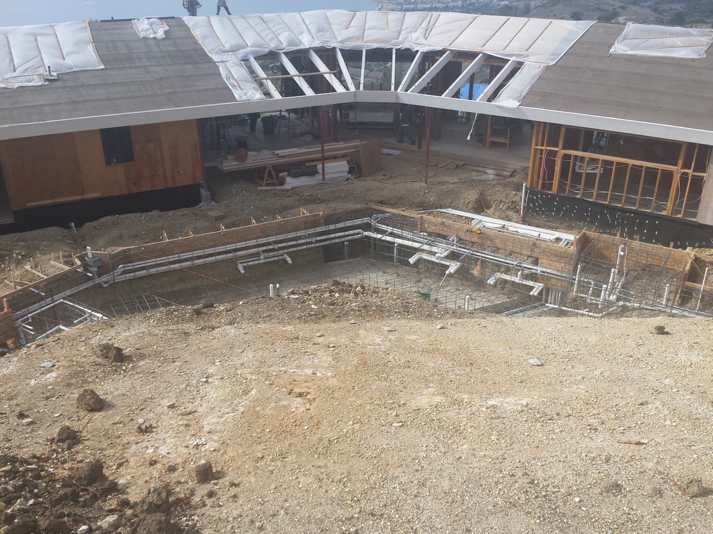
| The pool shape follows the footprint of the house. We could tell from the initial excavation the pool would visually define the landscape. It helped that we were working on solid bedrock and didn’t have to support the complex structure with any kind of additional foundation. We basically carved the pool out of solid rock. |
There were a number of players on the project team and it was very much a group effort when it came to making final design decisions. It seems like there’s a story behind almost every aspect of the project. I’d say I agreed with most of the choices, and was happy that many of my suggestions wound up being installed.
So, even though there were all sorts of subs and trades creating different aspects of the house and landscape, it all looked like it’s part of a singular composition.
ON A SUNNY DAY
The watershapes and hardscape design are extensions of the architecture of the house, which falls into the very clean, almost stark category of contemporary design. It’s all very white, with contrasting grays and purple hues.
| This project stands as one of the most dramatic applications of geometric design we’ve done. From nearly every viewing angle, the composition makes a different visual statement. Designer Marlene Breene developed the basic watershape and landscape design, which we and others completed with a host of visual and functional details. |
The project consists of a complex pool, spa and waterfeature design that is nestled in the narrow backyard at the base of a large slope that takes up the back part of the property, and a large sculptural waterfeature in front of the house.
The design takes full advantage of the available space. While there is a lot going on in a relatively small area, it doesn’t feel confined. The design of the house includes lots of windows and from the pool and deck area you can see through the house to ocean views.
Also, the layout includes a system of six-foot retaining walls that are cut back into the slope, expanding the useable flat area. The pool is tucked against the base of walls and actually serves as a giant footer. The slope continues above the walls to the top of the property and now includes a system of paths and steps so you can look down over the pool and over the house onto the sweeping vista.
FOOT OF THE SLOPE
I’ve built many pools in the Palos Verdes area and encountered a variety of soils conditions. It’s all about getting down to bedrock. In some places you might have to dig down 80 feet, in others it’s right below the surface.
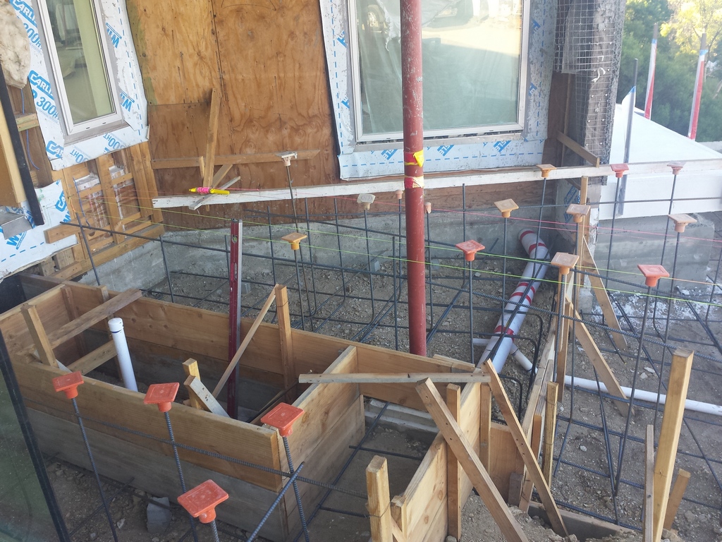
| The waterfeature on the front of the house was extremely complex, both from a construction and design standpoint. Forming the multi-leveled structure required checking and rechecking every dimension. Creating the perfect even flow over the edges required a special return trough detail where water slowly upwells and floods the edges of the upper basin. |
On this project, the solid rock was just a few inches below the bottom of the pool, which gives you a solid place to put the pool and saves on the cost of having to build some type of foundation or system of piles and grade beams.
The flat area behind the house, where the pool and deck are located, was dramatically expanded by excavating back into the slope and building the aforementioned staggered system of CMU retaining walls. The blocks are known as Trend Stone, from Trenwyth, a manufacturer of decorative masonry material. These pieces have a subtle exposed aggregate finish, with very carefully chosen grit and color, giving the walls a sharp architectural look.
The block alternates with three wall panels that are finished with violet glass tile with sheer descent water features sending a thin sheet of water down the tile surface.
On the slope side, the retaining walls emerge from the water’s surface providing a stark backdrop. On the house side, the pool has an 18-inch raised bond beam that creates an inviting place to sit next to the water.
In effect, the pool participates in the vertical transition, with terraces and steps around either side, a raised perimeter overflow spa, and a separate raised waterfeature that, combined, create a layered look with water moving between levels.
Inside the pool, the complexity continues with a shallow lounging area and a broad set of stadium steps transition to the spa area.
The pool is shaped like a distorted flying V, with uneven sides, 25 feet on one side and 15 feet on the other, by about 18 feet wide. It’s mostly shallow with varying depths. The point of the V is the deepest part at five feet.
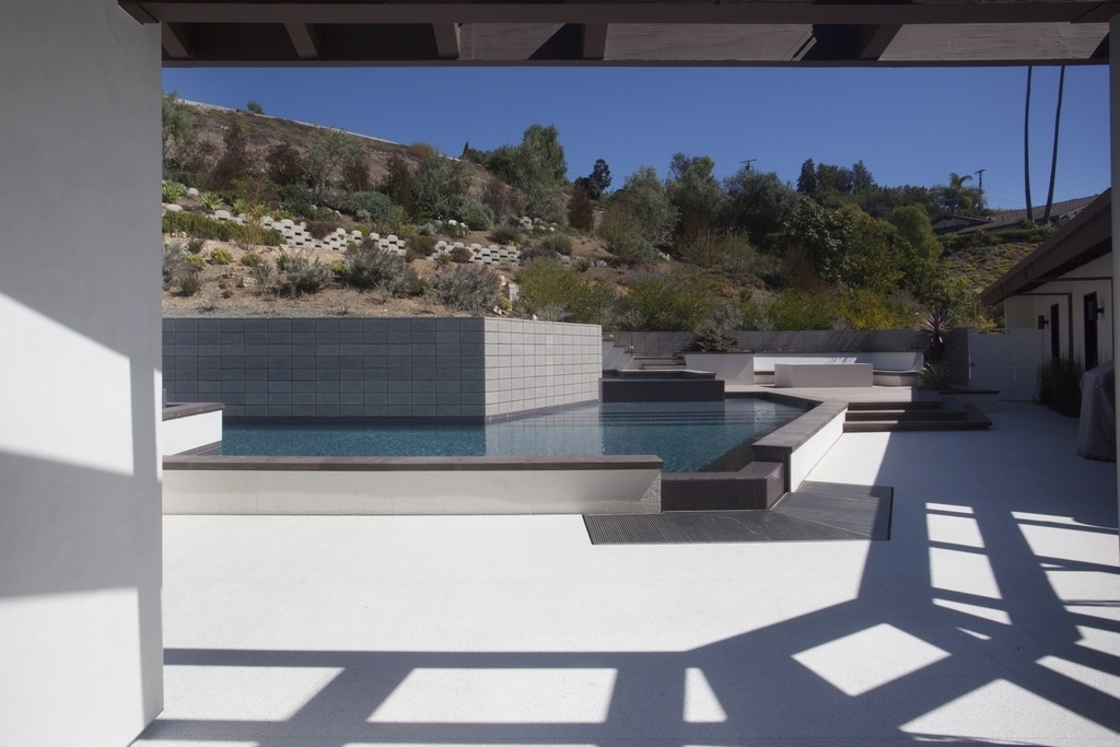
There are all sorts of geometric variations throughout the pool and surrounding area. The layout follows the footprint of the house, which forms a large obtuse, 120-degree angle. The pool layout emanates in two directions from the vertex of the angle, at the same point that the house layout makes the same change in direction.
It all works together to create a sense of spatial organization and movement.
ECHOING LINES
At the “prow” of the pool, there’s a gap in the raised bond beam where we located a small, but prominent four-foot vanishing edge. The water flows through a deck-level grated trough that projects the angle onto the deck. In effect, it’s the visual center of the entire scene and points into the main living area inside the house. Even though it’s a very short edge, it has to accommodate bather surge, so the basin beneath the custom-fabricated steel grate is seven feet deep.
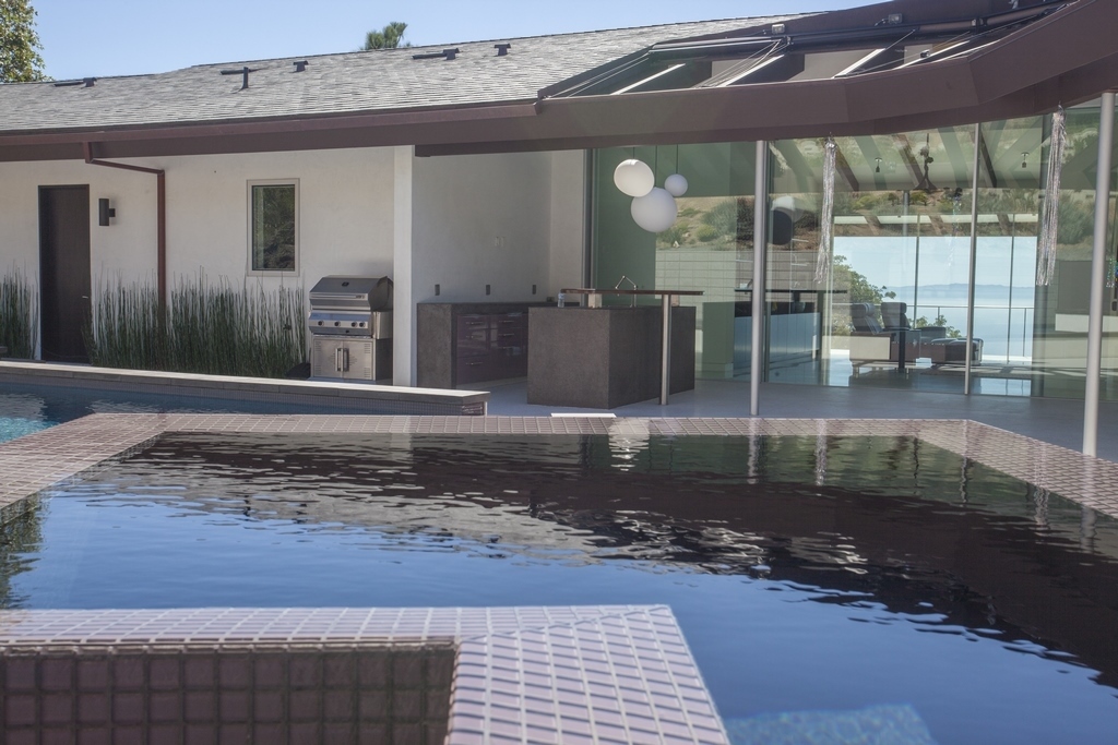
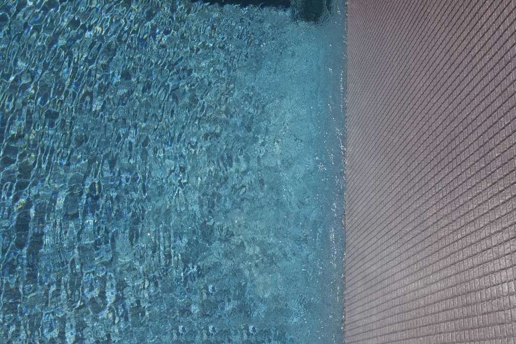
| When my sister, photographer Corinne Cobabe, captured the project in images, she found a number of close details that reveal the power of contrast and the interplay of form, color and texture. |
(This was a situation where I felt the need to test the surge capacity by doing a cannonball off the retaining wall. It wasn’t particularly stylish, but the pool passed the test as all of the surge flowed neatly into the catch basin.)
The shape of the pool with its innumerable angles and elevations did require some head scratching at the forming stage. In fact, we did have to rework some of the forms because we just didn’t get it right the first time, and with so many water-in-transit edges, the levels had to be close to perfect.
The raised spa and waterfeature both have similar asymmetrical flag shapes, although the spa is much larger. The water feature was originally meant as a lily pond, so it functions as a completely separate body of water with its own filter and circulation system.
As mentioned above, the retaining walls on the slope-side of the pool including three narrow, all-tiled water walls. The original plan called for the entire wall structure to be all tile with water flowing over the whole thing. As it worked out, the expense of custom-fabricating the desired stainless-steel boxes and weirs needed to wet the entire wall was prohibitive, so we went with the smaller walls, which could be built with off-the-shelf components.
There was discussion about the flow rate over the walls. The clients wanted something bold, but because of the way the pool is tucked in close quarters between the house and the slope, we were concerned that a robust flow would turn the space into a giant echo chamber.
MATERIAL CHOICES
There are some interesting material choices throughout the project that work to support the feeling of modern minimalism.
The aforementioned glass tile used on the water walls, makes several detail appearances throughout the design and outlines the interior steps, benches and beams of the spa and pool.
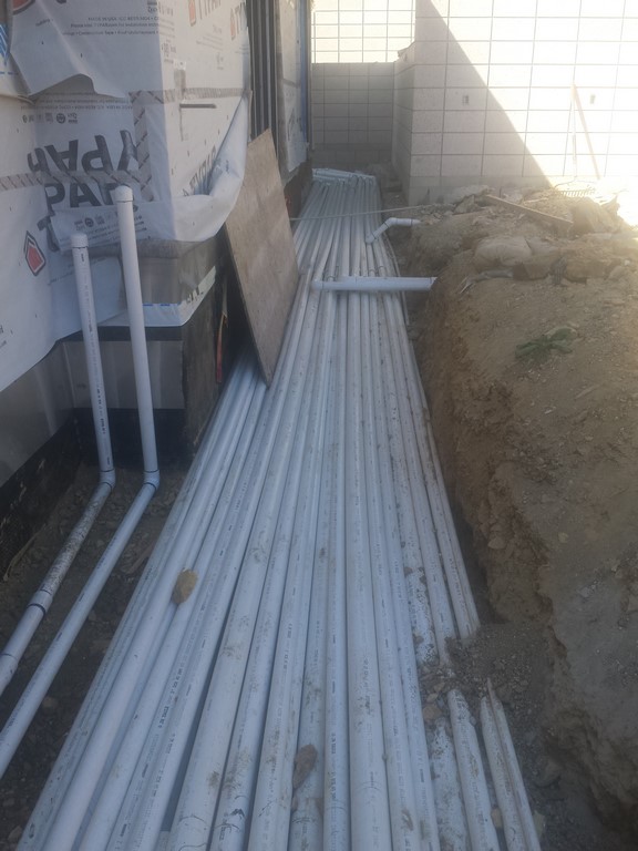
| I take tremendous pride in our hydraulic designs and equipment sets. This pool with all its different water-in-transit elements required 10 pumps and dozens of plumbing runs. In this case, if we didn’t carefully organize the space and plan the equipment layout, it’s scary to think how chaotic it could’ve become. |
The interior of the pool is finished in a blue pebble finish, Jewelscapes Yacht Blue from NPT Pool Finishes, which translates into brilliant blue water and works as a striking visual contrast with the pool and surrounding structures.
The raised bond beam is capped in grayish/mauve pre-cast concrete coping pieces.
The lower decks between the house and the pool are surfaced in a non-slip terrazzo, which extends from inside the house. The upper deck area adjacent to the spa has a soft, brushed concrete finish.
The waterfeature in front of the house is finished in a dramatic Neolith iron gray slate. We didn’t start on the feature until about halfway through the project. Because of the way the house is situated above the street, it’s visually prominent, and it’s strikingly complex. The water feature is located right at the same critical angle at the front of the house, and again the design plays off of the obtuse angles and complex geometry.
The waterfeature starts with a triangular reflecting pond right by the entryway, with the water cascading down multiple step-like levels that fan out at street-level. It’s made with poured-in-place concrete and extremely tricky and precise forms.
From a technical standpoint, the most interesting aspect of the feature is the way we handled the returns. In the top triangular section, there’s a small channel that runs around the vessel just inside the edge, where water slowly wells up and floods the edge.
It’s a small trough fed by a manifold, sort of like a perimeter overflow detail, but in reverse. It’s a detail I’ve used on a couple other projects where you want a very low flow over the edge with no waves or turbulence.
EQUIPMENT CONFINES
The equipment pad is located on the side of the house and enclosed by a set of walls that echo the hardscape design throughout the property. It’s an extremely complex hydraulic system with pumps dedicated to primary filtration and the variety of water-in-transit effects: the three water walls, the vanishing edge, the spa’s perimeter overflow and hydrotherapy jets, and the overflow over the lily pond.
| The shadows from the house further express the flow of the geometric design and integrate the architecture of the house with the landscape. The use of line, proportion, color and, of course, angles creates an artistic statement that is both unified and complex. |
In all there are 10 Jandy variable pumps lined up on the pad, driving seven different systems depending on how you count. The plumbing is laid out and organized so everything is accessible and hydraulically efficient, not to mention it’s not an eye-sore compared to some equipment sets we see.
The biggest challenge was locating the plumbing. We had to run everything under a narrow walkway that leads from the backyard to the side of the house. The walkway’s only about four feet wide and we literally had dozens of three-inch pipes. So, we wound up stacking the pipes four deep — creating the biggest slug of plumbing I’ve ever seen on a backyard pool.
It wasn’t ideal; but, it was either that or start removing features, which was not an option.
Overall, the installation process was relatively smooth, but the level of difficulty was high. The result is a beautiful project that stands as a strong example of working all the angles in the surrounding environment and architecture.
Kevin Cobabe is president of Dynamic Pool & Spa Construction, a high-end watershaping firm based in Redondo Beach, Calif.


