Modern Precision

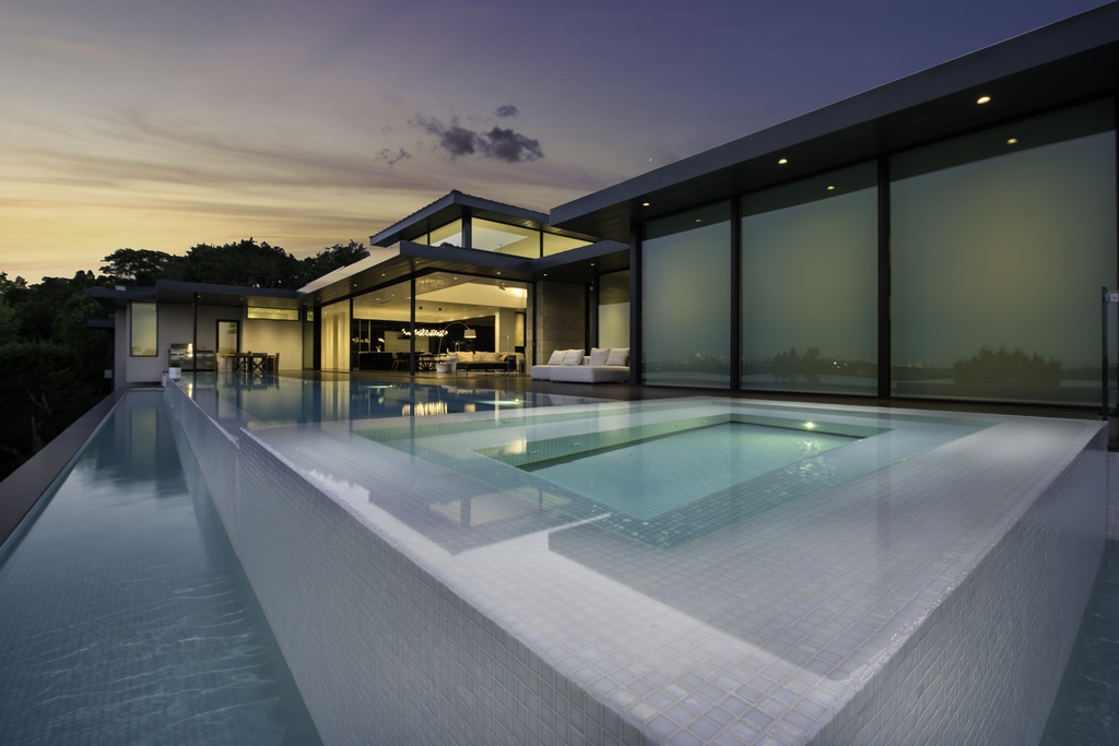 Ben Lasseter welcomes challenging projects, especially those where watershapes are integral to the home’s design. Working as part of an exclusive project team, one that included a legendary architect, Lasseter’s firm recently completed a shimmering all-white pool that is as much a part of the property’s aesthetics as the roofline of the house itself.
While precision should always be integral to all forms of watershaping, some projects are almost entirely defined by it. The project pictured here is a perfect example of one where “getting it right” was the primary objective in every conceivable aspect.
We’ve worked with a variety of designs that fit into the modern, or contemporary category. Modern designs are both extremely popular with high-end homeowners these days and they can be extremely demanding. Every detail and every dimension has to be lined up perfectly with everything else and all aesthetic decisions must perfectly harmonize with the spirit of the design.
From the footprint of the pool, down to grout lines, you are constantly measuring, re-measuring and thinking ahead as much as possible, because you have to always get it right or you’ll wind up tearing something out and rebuilding it. There is little to no room for error, and you can’t make everything “right” on paper – you have to see it in place.
ON SPEC
For this project, we worked with local luxury homebuilder, Jon Luce. It was the third we’ve done together. Working exclusively in the contemporary genre, Luce only builds spectacular spec homes. It makes working with him interesting because these are highly custom projects in which there is no end-user input.
Instead, the objective is to include design features that could appeal to broad range of tastes and uses, while avoiding others that might be too specific or extreme for the open real estate market. In effect, you’re using your imagination on behalf of someone you haven’t met, yet the work must carry a sense of personality and self-expression. That can be a fine line and, in this project, it was amazing how every detail was considered and reconsidered, and in some cases installed and then removed and replaced.
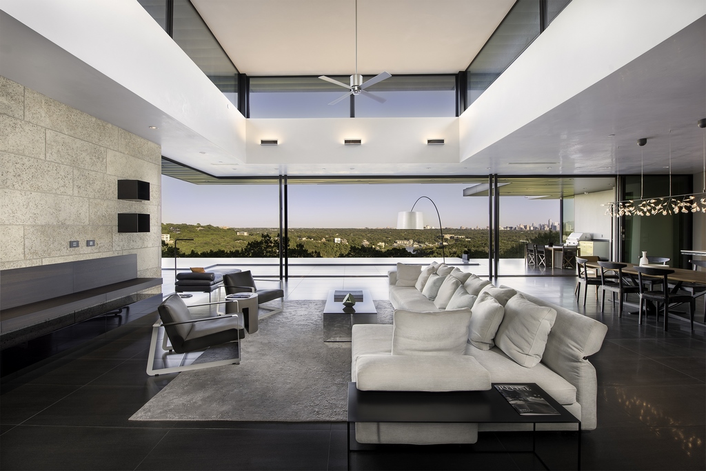 The project team included renowned Texas architect Dick Clark, founder of Dick Clark and Associates. Unfortunately, Clark passed away shortly after this project was completed and it may be the last of his designs he saw come to fruition.
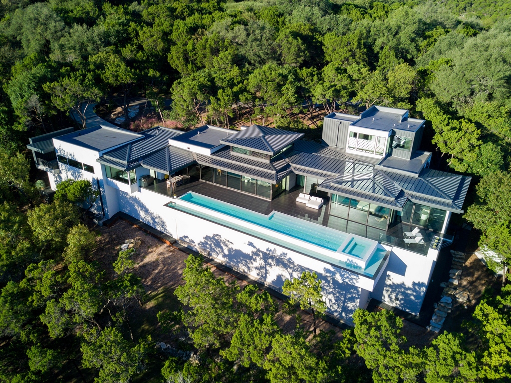
The house is perched on a large hillside property in a heavily wooded, exclusive neighborhood overlooking the Austin, Tex., skyline in the distance. It’s a wonderful example of his mastery of line, shadow, dimension, sight lines and detail, all expressed in a composition of rectilinear variation.
The architectural plan was amazing, as you might expect coming from an architect of Clark’s stature. Yet, by design, many of the finish details were left to the construction process, largely because of Luce and Clark’s shared belief that you need to see something installed to truly know if it works or not. When we became involved the plan was spatially and dimensionally complete, but it wasn’t structurally or mechanically complete, and many details were yet to be decided.
Once the bones of the house were in place, we had to mock up almost everything, from the color of the deck, to the tile finish of the pool, to the steel retaining walls in the front yard, to the varietal grasses we used in the landscape, it all had to be seen before it was set in stone.
BACK AND CENTER
The pool is an art piece and the dominate exterior feature, cantilevered from the back deck and visible from most of the interior views. The water’s surface sits right at 27 feet above grade. Although rectilinear, it is far from simple.We knew it would function as a reflecting pool, potentially a lap pool, a social hub, and a place to relax and enjoy the sweeping view.
Because the buyer was unknown, we had to accommodate different possible uses and we thought in specific terms about different types of buyers, working, retired, large families and groups of friends, or more private. It had to be A-plus functional and A-plus aesthetic.
That flexibility is directly reflected in the design. The pool is 66-feet long, 80-feet including the spa and basic dimension. The pool is more than ample for lap swimming. It’s six-feet wide on deep end, then transitions to twelve-feet in width on the shallow end approaching the spa.
The pool’s step area creates a social area where people linger in the water at different depths. Again, imaging possible use, we were accommodating people of different ages and different heights. The steps are not a shallow lounging area, which is common in many pools these days, but it functions the same way in that it affords users the opportunity to enjoy shallow water. It provides easy entry and egress from the water and it’s consistent with the flow of all the straight lines on the house.
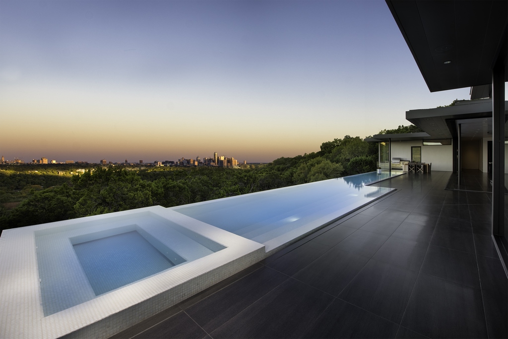 Also, we didn’t want to take up valuable pool space with a large shallow shelf. The local codes dictate that you are limited to building the pool 30 feet above grade. This pool is at 27 feet elevation, but had we pushed it out further to create more space, given the steep slope, we would’ve exceeded the 30-foot above-grade limit. So, we were limited by the allowable width of the pool.
The spa is six-by-12 feet and is located right off the master bathroom suite. That way, the owners, whoever they would turn out to be, would be able to enjoy their spa year ’round.
The pool and spa have three different water-in-transit details. The view side of the pool is a long vanishing edge, the other two sides include a three-inch raised overflow into a runnel-gutter. The spa has a 360-degree perimeter overflow design. The trough around the pool and the spa flow by gravity to the vanishing edge catch basin, which contains the system’s surge capacity.
The depth profile was an important topic. We wanted it to be “bar height” where you put your elbows on the edge and enjoy the view without having to tread water. We determined that the 5-to-3 foot range was the Goldielocks zone for a majority of view gazers.
The bond beam at the overflow is 12 inches wide, but the cross section of the wall below the gutter is 20 inches, which allows for the toe kick detail. The perception is that the wall is thinner than it is because we used the porcelain deck material continuously from the deck through the gutter, then transitioned to white tile on the overflow part of the wall.
CREATIVE GIVE AND TAKE
While the basic shape and dimensions of the pool were established before we came on board, there were numerous design details that remained undefined. We had to fine tune the design determining things like the depth of the spa bench, how deep is the deep end, or the width of the overflow channel.
Those kinds of decisions unfolded in a great team environment. We were certainly part of the creative decision-making process, and sometimes our ideas prevailed, sometimes we did not.
For example, I really believed the pool should have been finished in absolute black. My idea was the 24-by-18-inch ceramic black tile on the deck would visually run into the pool, which I wanted to tile in iridescent black glass tile. My thinking was it would create a powerful contrast with the mostly white house, which seemed to me consistent with the overall design intent, which is very stark and bold.
 We tiled the common wall between the pool and the spa in all black tile, to see what it would look like from the master bathroom, which is conveniently located adjacent to the spa. The consensus was that the white tile finish contrasting the black deck was the way to go. Although I still think the black surface would’ve looked great, I also cannot argue with choosing white.
The interior surface is finished entirely with a white glass-tile mosaic by Kolorines, a Mexican supplier well known for colorful tile mosaics. In this case, the mosaic concept is expressed in a perfectly random 50/50 blend of iridescent and non-iridescent one-inch tiles. The subtle variation in the tile surfaces is only visible in certain light and viewing angles, but from any angle at any time it is a brilliant white.
The equipment is located underneath the pool in an enclosure that’s formed by the wall that supports the pool area. It’s a convenient location that gave us ample space to layout the equipment set so that it’s easy to access and hydraulically efficient.
The treatment system is a robust combination of ozone and UV as the primary sanitizers, with a very low concentration of chlorine to prevent algae and provide bather-to-bather disinfection. We considered going with just the ozone/UV combination, but here in the Austin area there so much pollen and mold in the air, along with the heat, we’ve found that a low level of halogen treatment helps.
The primary circulation system is run by a single 2.7 h.p. variable-speed pump that runs through a 580-square foot cartridge filter. There are two 2 h.p. pumps on the edge overflow pump, which has two smaller cartridge filters – all by Jandy.
Overflowing 140-feet of edge on the pool and 44 feet in the spa overflow requires moving a lot of water. To accommodate the necessary volume, we used six suction and four-inch return lines, all evenly disbursed through multiple intakes and outlets hidden in the toe-kick detail. The suction fittings for the vanishing edge are located in the floor of the collection basin.
Much of the industry focuses on high turnover rates, but we take a different approach where we find the sweet spot of efficiency, somewhere around 50-60 gpm gets us the flow rates we need for the heater, UV, and Ozone systems while allowing the pump to run at a very efficient speed, and then we don’t ever turn the pump off. It runs 24/7. Having the system run continuously ensures superior water quality and it’s affordable because of the variable-speed pump technology married with the super-efficient hydraulic design.
INTO THE GARDEN
Turning away from the pool, the landscape was almost entirely a process of constant revision. The area we focused on is nestled between the house and a slope that leads up to the street. It’s an important area because it includes the approach to the front door and an intimate view from inside the house via floor to ceiling windows.
From inside, you’re looking out at a slope that’s held back by a weathering steel retaining wall. The view forms a natural vignette featuring some beautiful limestone surface boulders that were part of the natural landscape. I knew from the start that I wanted to use these boulders, so after a great deal of discussion, we came up the low weathering steel wall and mostly indigenous planting palette.
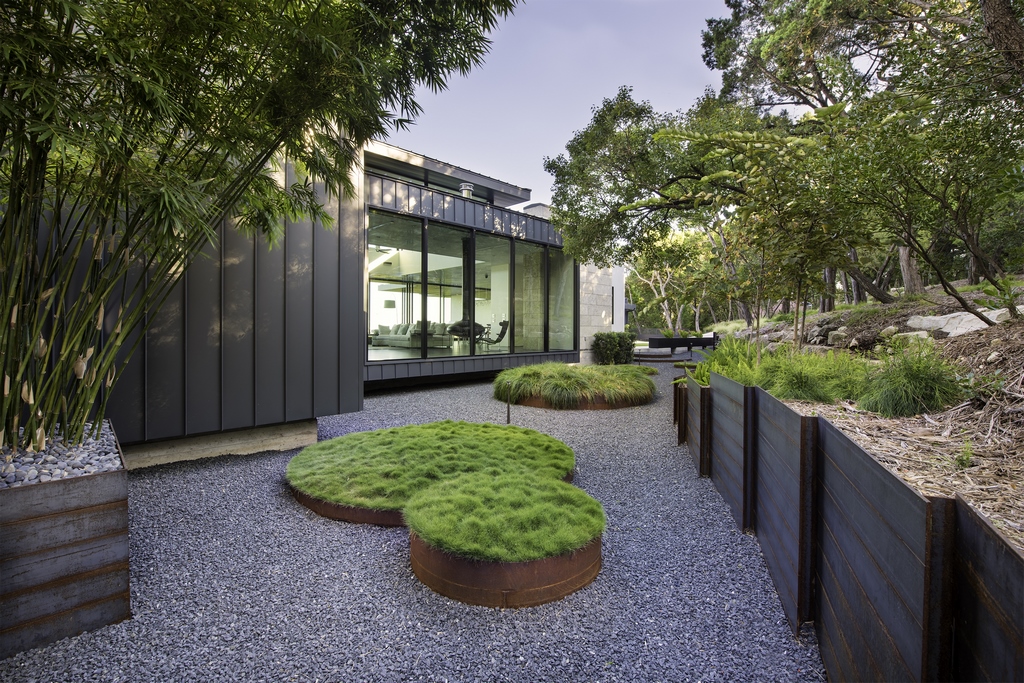 It’s a perfect space for a fountain, waterfall or a sculpture of some kind, but we didn’t want to be too “defined” so we let the rocks and plantings make the statement. Later on, the people who purchased the home did place a large metal sculpture of a panther there and it does look great.
The space includes five circular raised planters, three of which contain combinations of grasses, the other two are filled with gravel and serve as landing pads for the front entry. With all of the right angles and straight lines, I though it would be interesting to introduce circles in the landscape for contrast.
We used the same steel material as the retaining wall to create the circles, which we took to a welder we know in nearby farm country who does a lot of steel bending for farmers’ hay bins and stock tanks. He bent our steel into circles in no time, and while they were not perfectly circular, they were close enough to let us perfect them when we welded them in place, and do lend an attractive artistic touch to the space.
We organized the landscape design so that when you’re right by the house, everything is very orderly and structured. As you move away from the house, it becomes less disciplined and more natural. It’s a very subtle transition. The idea is that there’s no distinct boundary between the home and the verdant landscape.
Like everything else on this project, there’s precision in how the design interacts with the natural settings.
Ben Lasseter is partner and director of construction for Design Ecology, a landscape architecture and watershape construction firm located in Austin, Tex. Lasseter earned his B.S. in horticulture from Texas A&M. He joined Design Ecology in 2010.


