A Study in Contrasts, Part 2
While some designers are known for a particular style, I’ve always believed it’s far better to be comfortable working across a spectrum of design modalities. Creative bandwidth enables the designer’s ability to focus on the clients’ ideas and desires, as well as the needs of the site itself – and it keeps you from falling into a creative rut.
Case in point: Last month in Part 1 (click here), I described an unusual situation in which I was asked to design two pools on adjacent properties for a pair of business partners and their families. Although right next door to each other, the pool projects could not have been more different; one was entirely rustic in personality while the other was about as contemporary as it gets.
It is that high-flying contemporary project which takes center stage this time.
BLANK CANVASES
When I first met with both sets of clients, their homes were in the early stages of being built. Neither had any plans for their exterior spaces. They both knew they wanted ample space for entertaining and they both wanted to take advantage of the view of a lake.
They gave me the site plans and the topography diagrams and basically said, “let’s see what you can do.” As I mentioned last time, the projects unfolded simultaneously, but were completely different, both from an engineering and stylistic stand point. Ironically, the initial design for the rustic project, which is far more complex from a visual design standpoint, was barely revised beyond adjusting the orientation of some of the primary viewpoints. The contemporary one was an entirely different story.
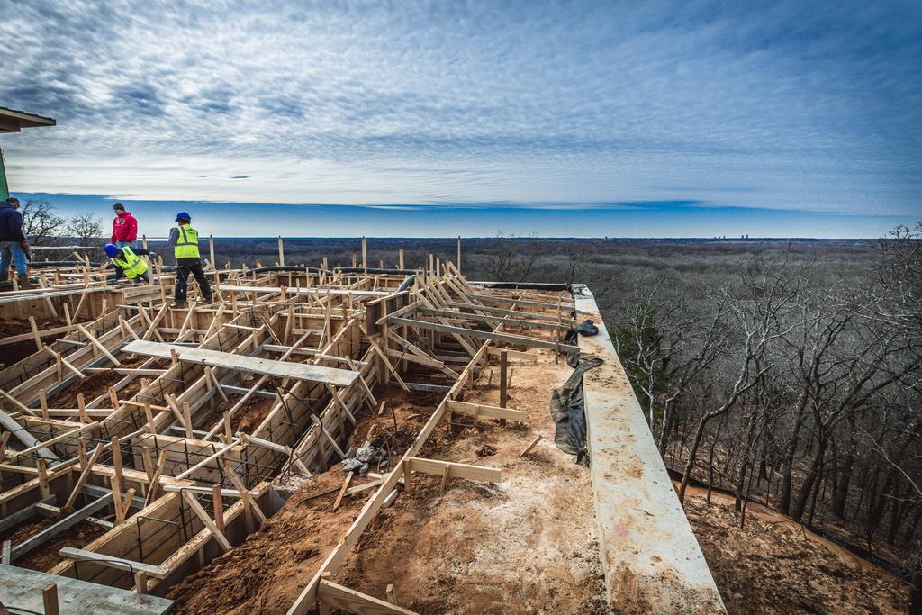
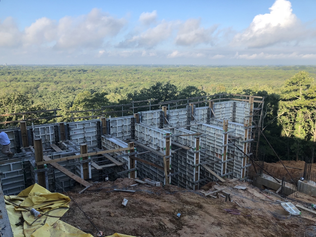
| Construction on this project took us high above the natural grade, using a system of poured-in-place walls. Here a giant box contains gravel that supports the pool and surrounding deck area. |
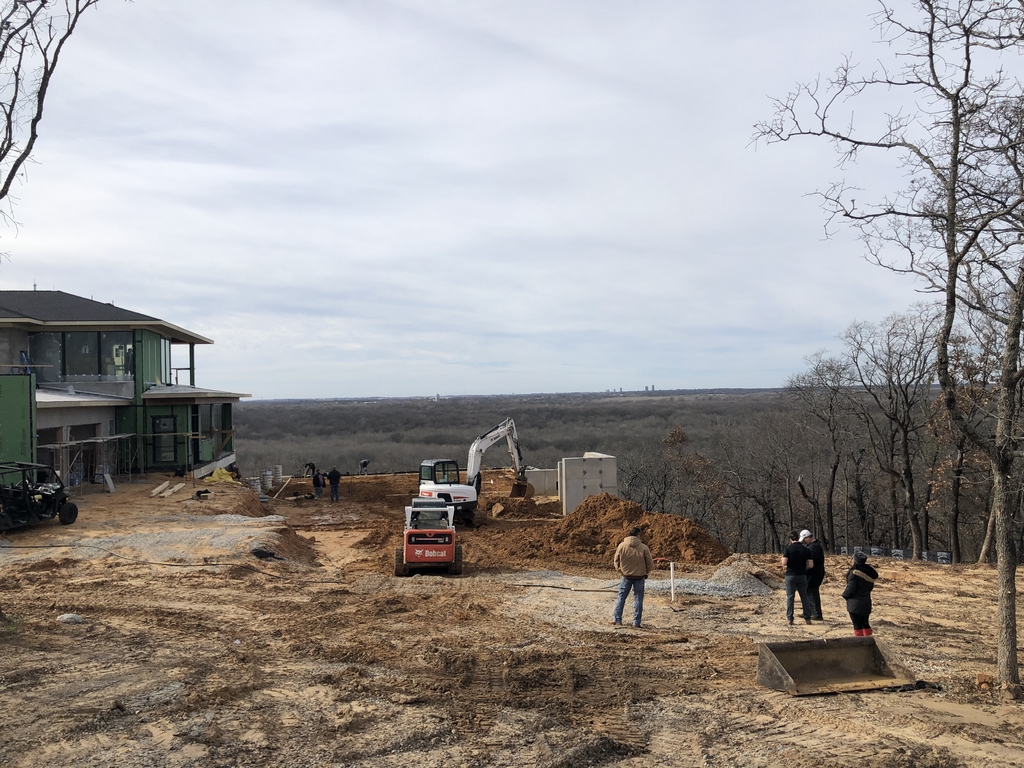
Nearly from start to finish, we went through a wide range of changes after the initial design, largely due to the challenges and expense of the pool area’s foundation, but there were all sorts of other issues including location of the spa, the deck treatments and where to put the equipment, among others. Even though the properties are side-by-side, this one has a far more dramatic grade change, and we knew that it would need some kind of above-grade support structure, which dramatically added to the project cost.
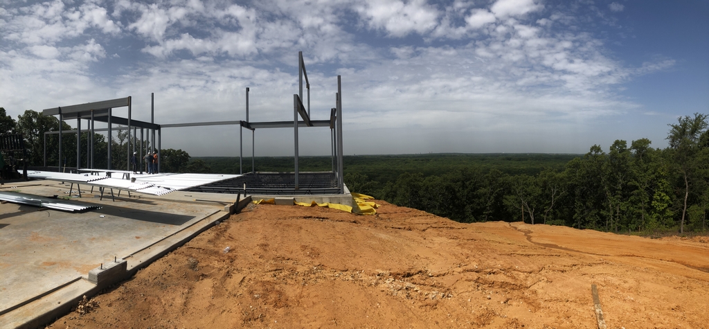
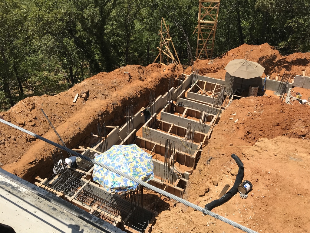
The dramatic topography meant than in order to have the pool on the same level as the house, the outside area would have to be raised far above grade on a system of piers and grade beams. In this case, the entire area is also supported by a system of retaining walls.
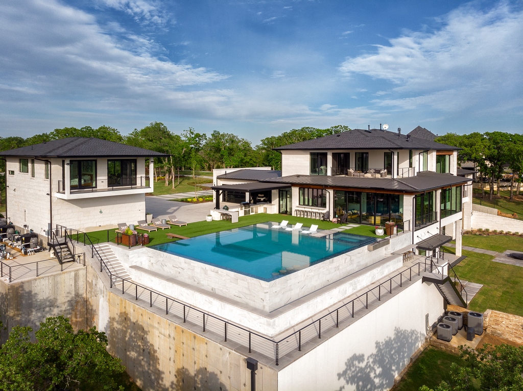
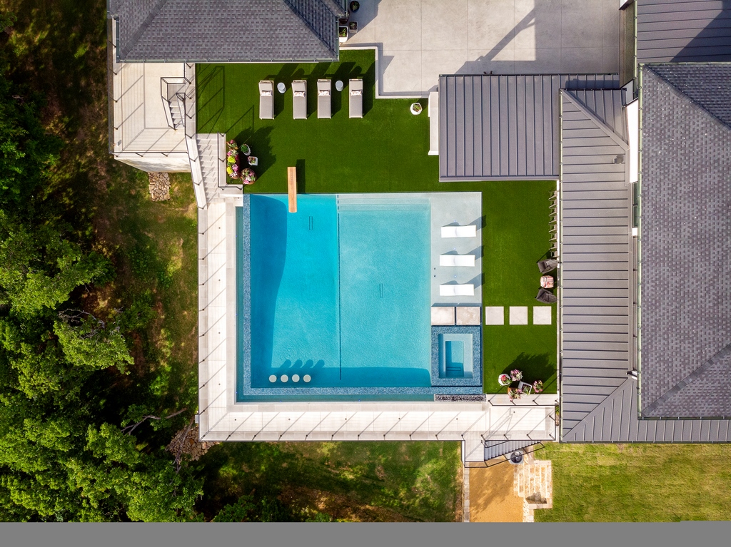
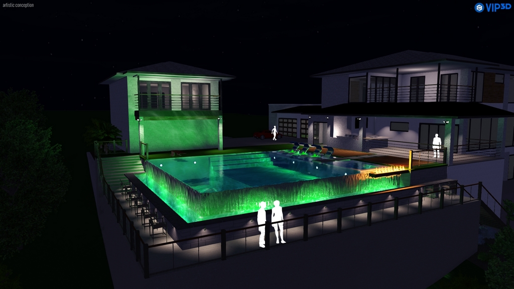
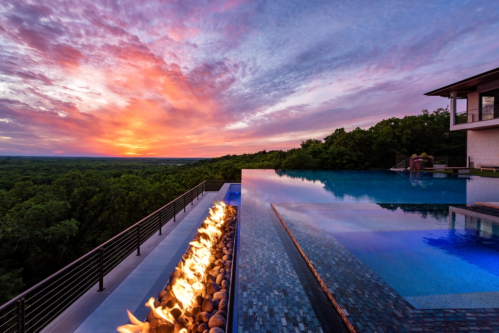
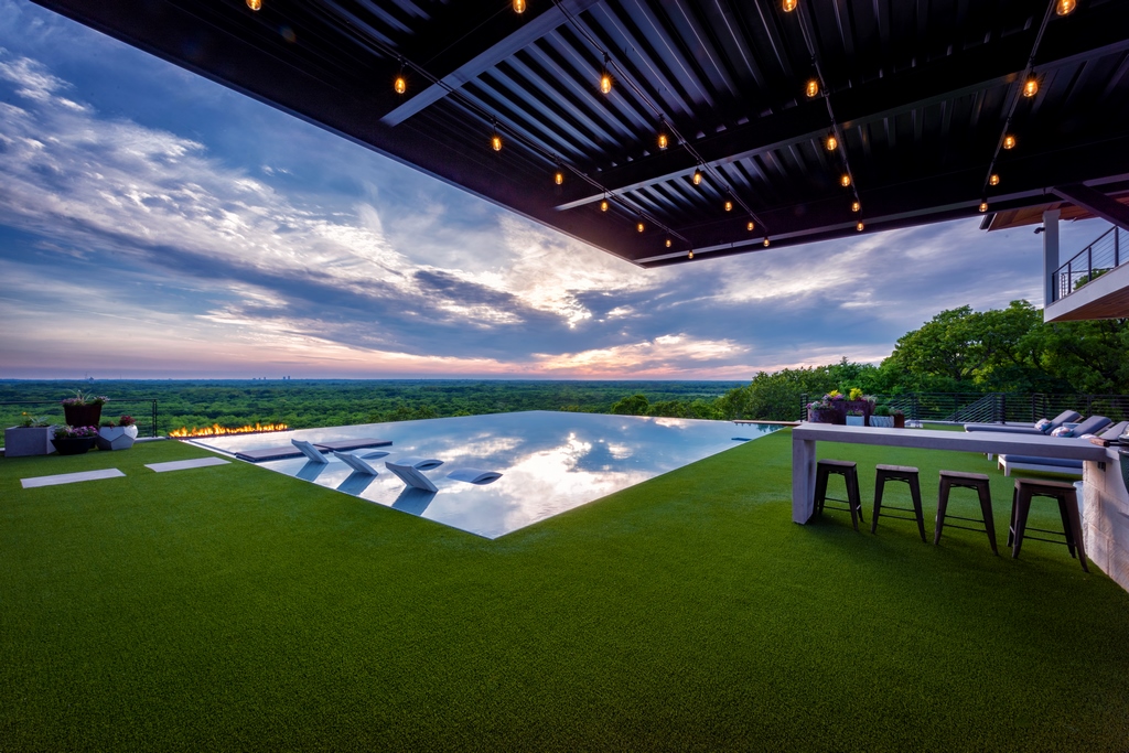
| From the house, it’s very difficult to tell that that the entire backyard is suspended up in the air. From a drone’s eye view (and in computer illustrations) the dramatic construction comes into much clearer focus. (Finished photos including the opening image above by Jimi Smith, Jimi Smith Photography, Port St. Amelie, U.S. Virgin Islands) |
The pool measures 36-by-42 feet with a vanishing edge on two sides and a perimeter overflow on the deck-side edges. The pool and surrounding area are a full 30 feet above natural grade, sitting on 45, 24-inch wide, piers, which and a system of grade beams. The structural retaining walls further support the pool and deck structures.
The structure is both massive and precise. When you have water spilling over on all four sides, you have to work with no more than a 16th of an inch tolerance in all directions. We had multiple engineers involved, checking each other’s work because there was literally no room for error. It had to be perfect when installed because once in place, making any structural changes would be close to impossible.
It’s essentially like building a rooftop pool, except there aren’t any living or work spaced underneath. (We talked about putting rooms inside the superstructure, but the clients decided against it. We did go back and forth about at least creating an equipment vault beneath the pool shell, but it wasn’t to be, meaning that the equipment pad takes up part of the side yard.)
INTEGRATED DESIGN
The walls were formed and poured-in-place on site by crews the owners had used in a number of commercial properties they build. Then the space was filled up to the top with gravel and then actually “excavated” back down to the grade beams. The forms were tricky, not because of the above-grade design, but more from the vanishing edge/perimeter overflow details.
Similar to their neighbor’s pool, the clients did want to accommodate different activities. For a long time, we were working the concept of three terraced pools, a wading pool, diving pool and then a large catch basin at the bottom of the whole thing.
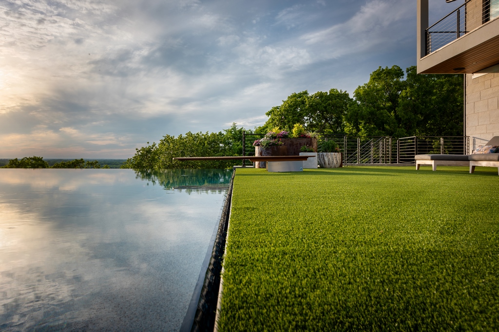
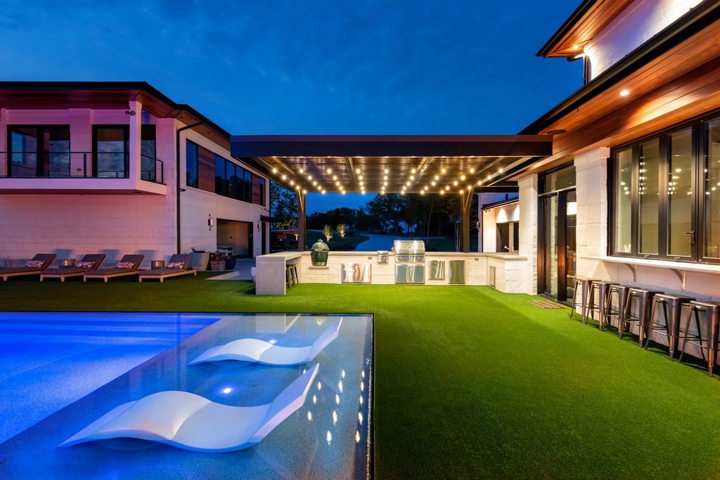
| Edge treatments were critical in this crisp contemporary design. The perimeter overflow makes a razor-like transition between the water and surrounding space, which is all covered in artificial turf. |
Given the elevated design, that concept was getting extremely complicated and expensive. At one point, I suggested that we go with an entirely different approach where we put the diving area, shallow pool and a lounging area all in one big pool. The resulting interior design in effect steps down from the lounging area into the wading pool and then again down into the diving pool. By containing all theree “zones” in one vessel, I knew we would simplify both the engineering and the aesthetics. The clients agreed and we turned down that path.
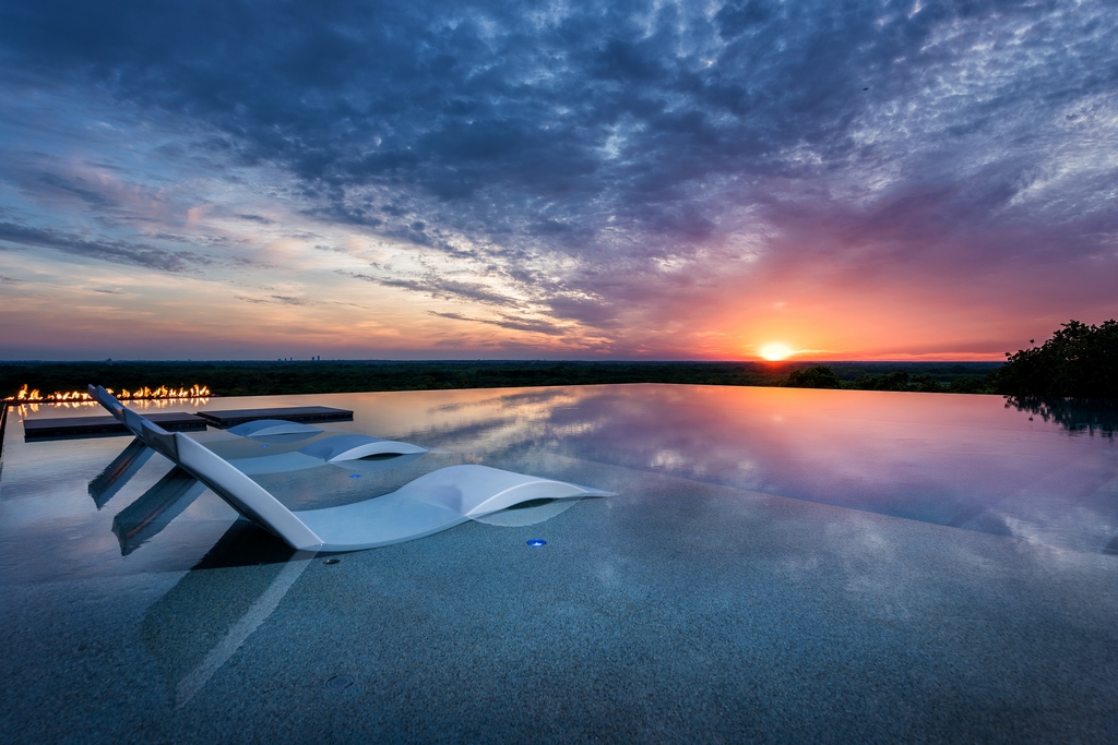
The shallow lounging area is nine feet wide and six inches deep, the wading pool is also 10 feet wide, and three feet deep, while the diving pool is 16 feet wide and nine feet deep and transitions into a shallow area with a swim-up bar. We built it so the clients can easily install an acrylic divider between the wading pool and diving area, although they haven’t, deemed it necessary, so far.
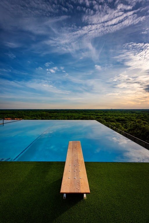
The diving board is custom-made with Ipe Brazilian hardwood, manufactured in Belgium. In a case like this where we want to be sure everyone knows where to dive and where not to, I like the fact that the diving board defines where you enter the water, which adds a safety factor.
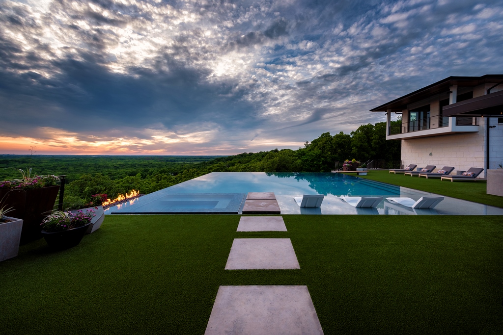
The attached spa is a relatively simplistic seven-by-nine-foot rectangle. Its location was a point of debate. I thought it would be great to have the spa on the edge to take advantage of the view. The clients liked that idea too but for safety reasons we placed a rectilinear fire feature right by the spa and cantilevered over the vanishing edge. Any time there are kids in the spa, they light the fire, which actually serves as a safety barrier, along with the fact that the spa itself is set back inside the vanishing edge.
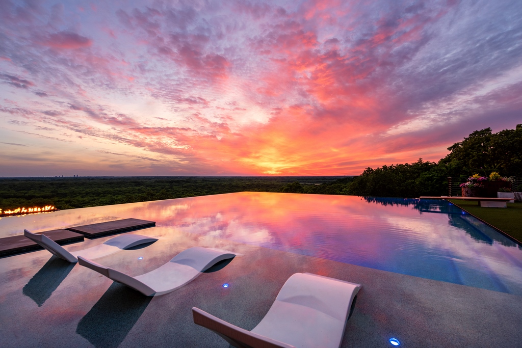
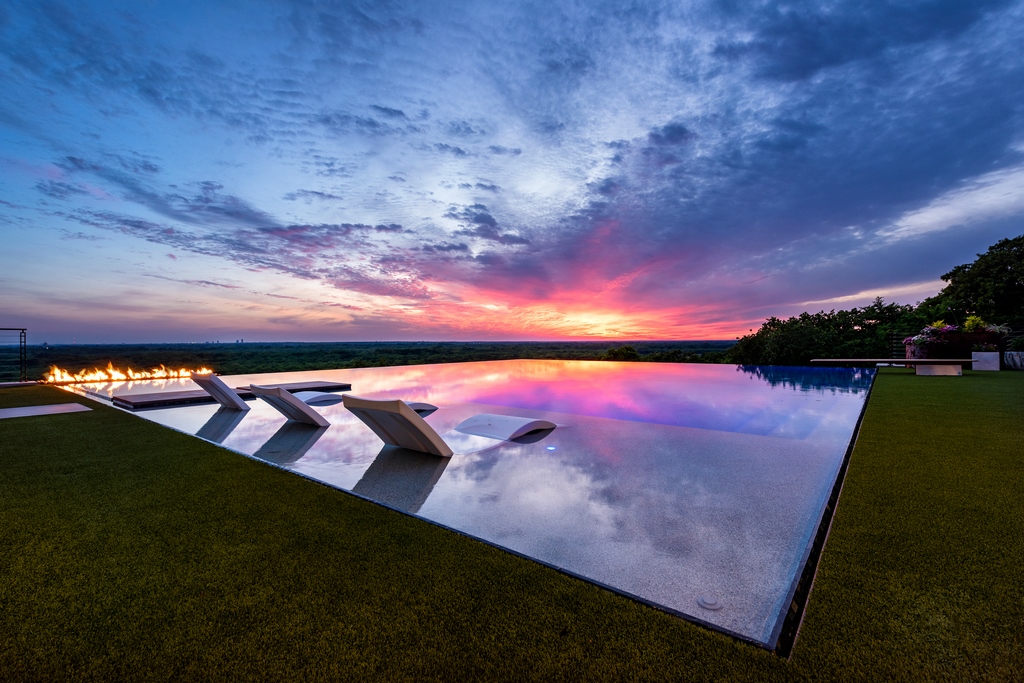
The color palette is simple and elegant, with an Aqua Blue Pebblesheen, polished aggregate finish, with steely blue and gray glass tile mosaic on the tile line and over the edge walls and spa walls. The net effect is a beautifully simplistic body of water that serves as grand reflecting surface of the sky and surrounding landscape.
MAKING CHOICES
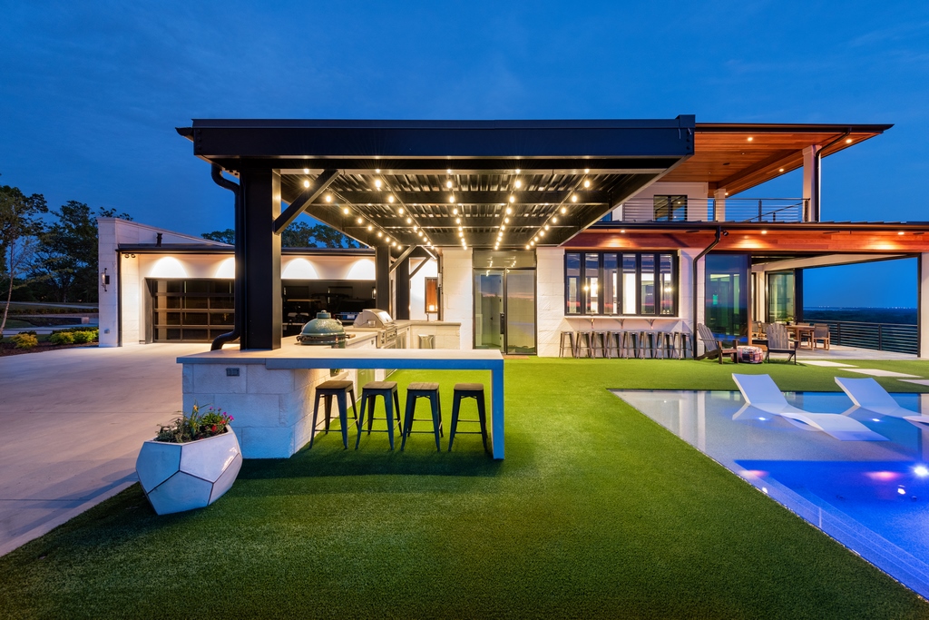
The deck areas were another point of ongoing discussion. I had designed various deck treatments that blended wood areas with artificial turf. In the end, the clients were concerned with keeping everything as visually simplistic as possible, so we went with all artificial turf. There was something kind of appealing about the only non-turf deck area was the floating walk way that lead out to the water.
| Just as was true at the neighbor’s “forever home,” this design was ultimately all about celebrating the views. Here the flat geometry and simplicity work to frame landscape and sky in a beautiful interplay of light, space and the water’s reflections. |
It was interesting watching the pool take shape adjacent to the neighbor’s project. As mentioned in Part 1, the other pool was painstakingly excavated into solid rock, while this one was suspended up in the air on a precisely engineered support structure. One was going into the earth, the other rising high above it.
The crews at Claffey Pools, who I was working for at the time, executed both projects with almost seamless precision, despite the almost
complete opposite construction techniques required. While both projects couldn’t be more different in terms of design, they do provide both families with multi-functional watershapes and generous areas for entertaining and enjoying their “forever homes.”
Reid Schindler is president and founder of SchindlerDesignCo., a design and construction management firm located in Edmond, Okla.


