Design and Desire

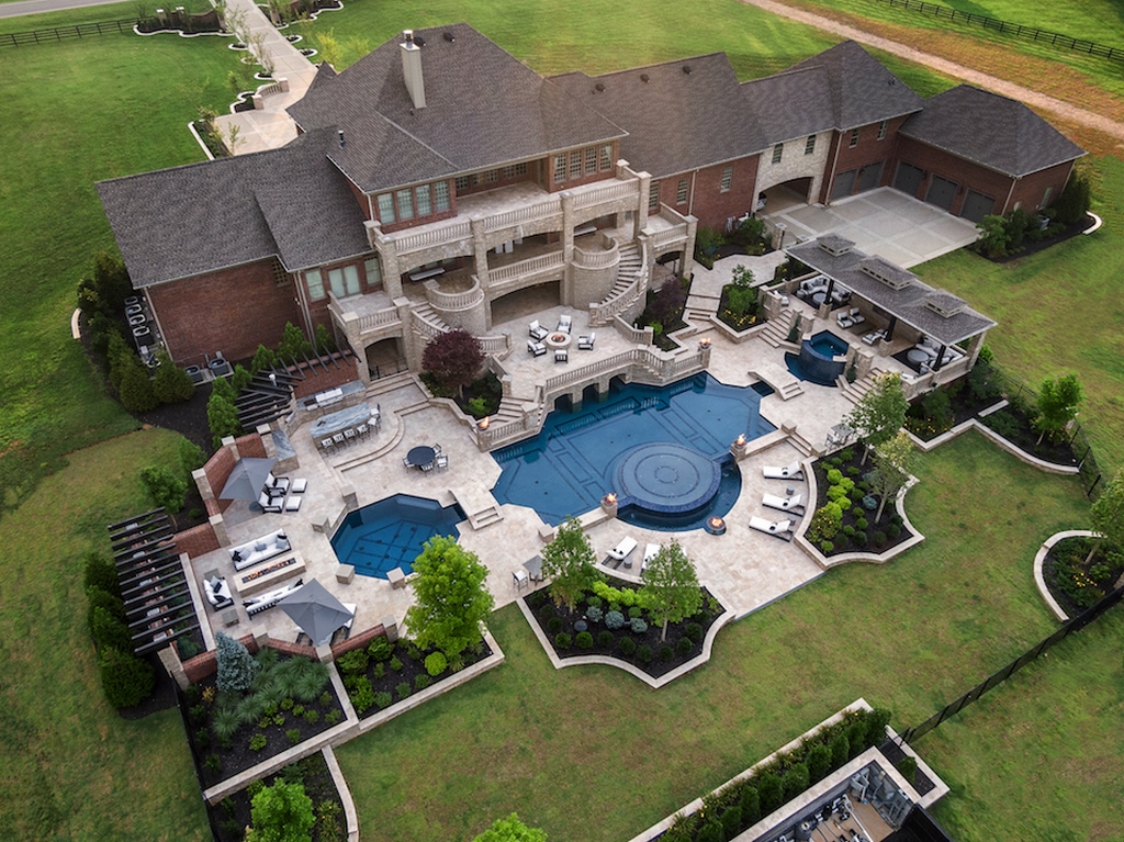
This project had it all – balance, symmetry, style and luxury on a grand scale, and fantastic clients. More than three years in the making, and recently finished this past spring, the design integrates a number of key principles and modalities with the clients’ desires for elegance, all with a European flare. It was the kind of project that makes you love being a watershape designer.
I’d worked with the pool contractor, Lee Seelig of Waterscapes Backyard Resorts in Nashville, on several past high-end projects. In this case, he was in the early stages of working with the clients and brought me into the process to envision the exterior design. The approximately five-acre property is pastural with generous space to create a lavish outdoor environment – all nestled in an upscale Nashville neighborhood with gentle rolling grassy hills and scattered stands of trees, laced with streams and impressive custom homes scattered throughout. It’s a truly beautiful area.
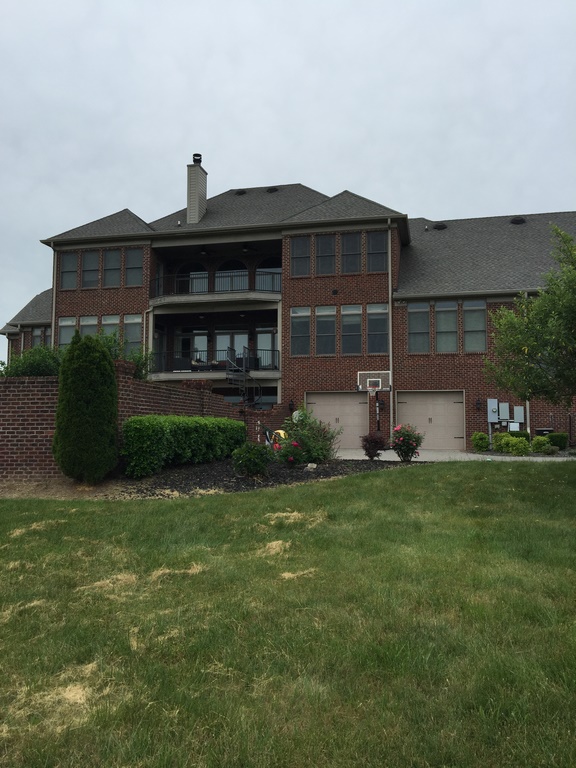
The work we were doing was part of an entire remodel of the existing house, which was originally about 10,000 square feet, very boxy and non-descript. When I became involved the structure was in the process of being completely recreated almost from the ground, effectively doubling the square footage and reimagining the style.
It now boasts all sorts of opulent features you might expect in a luxury home. Everything is out-sized and beautiful in a continental kind of way. Our objective was to continue that luxurious European design into the outdoors.
MOVING IN STYLE
I worked closely with the interior designer, Deidre Lampley of Southern Modern Interiors and the clients, who are a truly wonderful and fun-loving family with kids ranging from young adults to teens to toddlers. The idea was to not only harmonize the home’s interior and exterior design with the outdoor environment, but to also create different outdoor rooms offering a range of ways to enjoy yourself in the tastefully opulent surroundings.
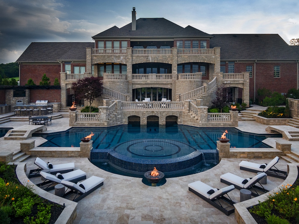
That direction led to a number of specific features including sweeping staircases, multi-leveled terraces, copious balustrades and ornate fenestration, all of which were added on to the back of the house within the scope of our exterior design.
The design is European, drawing on different aspects of classic design. That said, it’s also not overly ornate. There are no decorative colonnades or heavy Romanesque influences. It relies much more on the classic shapes, symmetry, use of line and organization around axial views, which gives it an almost subtle quality that underlies the grandeur.
| Viva La Difference! The home’s original architecture leaned toward the austere lines of Federalism. The exterior makeover moved in a more European direction, creating a very different scene. |
From the start, scale was one of the primary driving factors. With such a large house, surrounded by mostly wide-open spaces, it was a situation where a more typical residential-size pool and surrounding area would look badly out of place. It had to be big, essentially on the order of a resort pool, with a variety of destinations within the space to accommodate different activities and age groups. (The clients do like entertain on a large scale, and it’s easy to imagine them hosting an amazing outdoor wedding someday.)
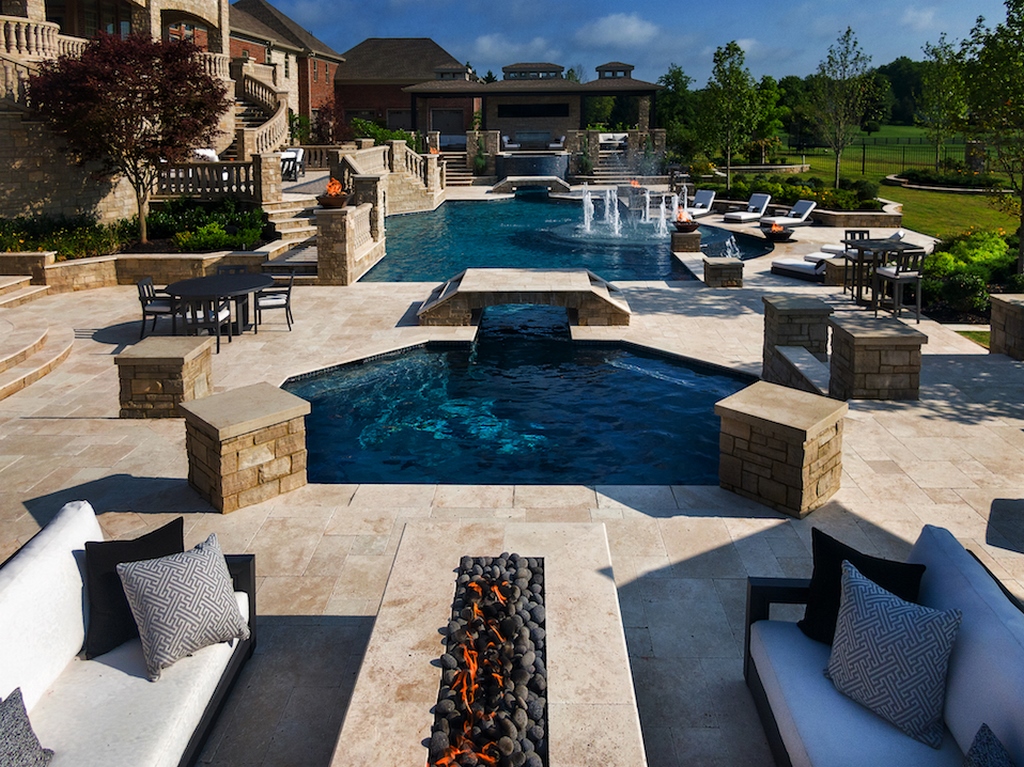
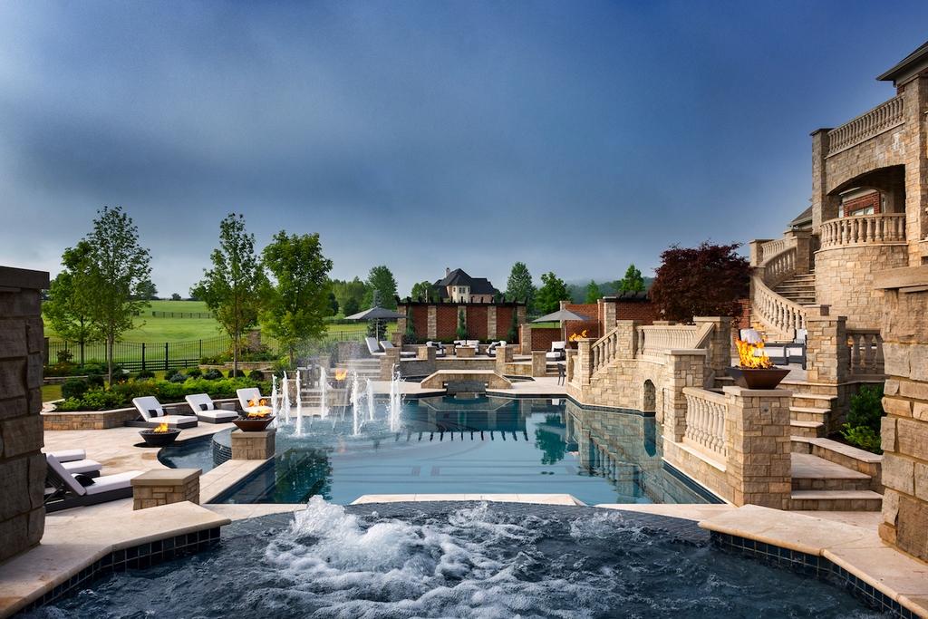
The pool is 110 feet end to end, varying in width, from narrow runnels only a couple feet wide, to the main pool that’s 25 feet at the widest. On one end there’s a nine-foot deep, 16-foot octagonal diving well, on the other a raised nine-foot square spa with a radial front that spills five feet into a trough. Both the diving area and spa are connected to the pool via the runnels on either side, where two low bridges cross the runnels providing easy access to the deck areas beyond the pool.
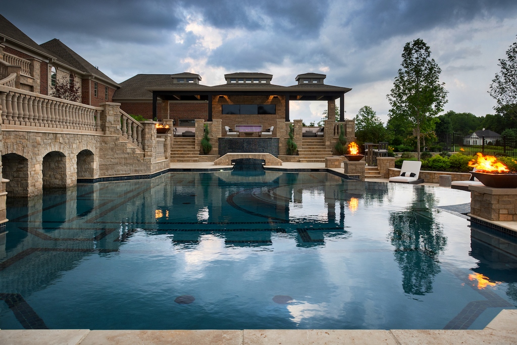
Although the pool is not perfectly symmetrical — meaning that each side is a mirror image of the other — the main pool area is perfectly symmetrical, and the entire scene is anchored by balancing visual weight. The sightlines up and down the length of pool offer a beautiful layered view in either direction, while the view from the house side across the pool lead your eye into the surrounding vistas. Looking across the pool back toward the house, the water reflects the soaring architecture.
GENEROUS GEOMETRY
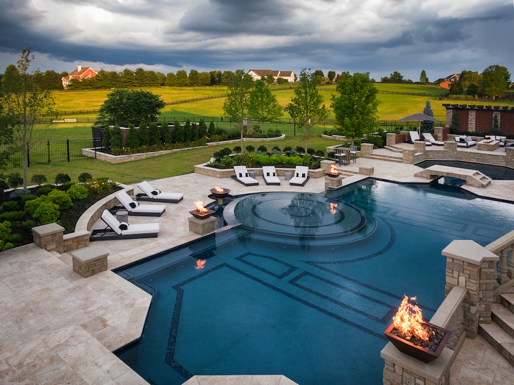
Starting in the center of the main pool area, there’s a 12-foot circular shallow lounging area that serves as the visual hub of the design, located right down the centerline of axial view from the house. It features 12 leaping fountain plumes, turning it into a beautiful fountain feature that’s kind of Bellagio-esque.
The lounging area has a forward-facing vanishing edge, which works as a waterfeature for the lower deck on the far side of the pool. Inside the pool, the lounging area steps down to a wrap-around bench treatment that then laterally extends the length of the pool in both directions.
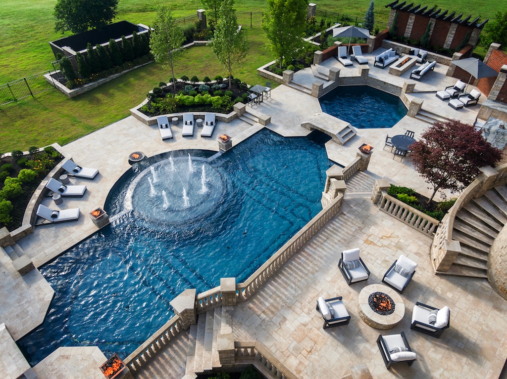
| Organizing the space along axial views was key to balancing the scene and creating a sense of visual continuity. From either side, looking down the length of pool you see layers of shapes and features that invite you to cast your eyes and move your feet. |
The lounging area is both a visual and social hub, an area where you can linger in the shallow water while others move in and out of the pool via the benches. The octagonal diving pool is also a social destination, but one designed for vigorous play, perfect for teenagers.
Rather than a diving board, it has four pilaster/diving platforms located on the corners of the octagon.
On the opposite end of the pool the raised spa is tucked into a large cabana with an outdoor kitchen and lounging area, suitable for more adult entertainment. This niche alone could easily host a small party.
The expansive deck areas are terraced, taking advantage of the gently sloped topography. The decking further divides the large space into different entertaining and lounging areas, all of which offer different viewing angles. It’s all very incremental and gentle in terms of how we managed the vertical transitions.
LEADING THE EYES
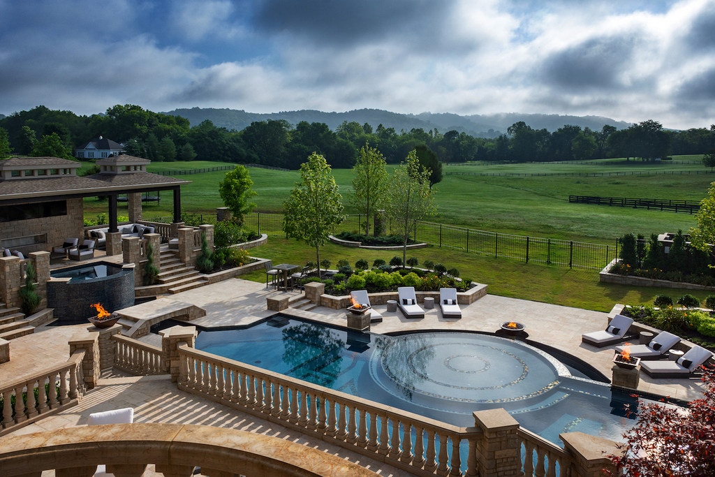
As an important part of the design process, we carefully considered views from the balconies and main terrace. On the lower levels you’re looking across the water in perspective view and into the surrounding landscape from various angles and viewpoints. On the upper balconies, you’re looking down at the entire scene with an almost drone’s eye view.
From higher vantages, you can immediately see how geometry and symmetry are further articulated by the decorative tile line mosaics inside the pool, which evoke the kind of classic opulence you see the Neptune Pool at Hearst Castle. Here we used steel-blue iridescent glass tile from Lightstreams against a Mediterranean Hydrazzo polished aggregate interior finish. We picked up that same motif in the interior design in the diving pool and the spa, as well.
| From the house, the pool can be seen from high vantage points on the back balconies and terraces. From those views, the symmetry and European-influenced shapes and patterns are on full display. |
We had to balance things on both ends of the pool to reinforce the sense of symmetry. The spa/cabana area carry considerable visual weight, as well as being an attractive destination. On the other end, we needed to add some features around the diving area to even out the scene. There I located a linear fire pit that appears as though it’s an extension of the pool’s sight line on the same axis as the runnels and bridges, linking your view down the length of the pool. I also created a visual terminus with a large masonry wall and cantilevered shade structure that serves as a backdrop. In effect, the long sprawling pool has visual bookends on both sides, starting and ending points that define the axial line.
The layout gently transitions from purely architectural forms emanating from the house to softscape as you move further into the landscape. On the far side of the pool the planters increase in size, but still echo the architectural lines with low raised walls that define the planters’ boundaries.
| The property is set amongst a sweeping landscape that stretches far and wide. The large house and exterior spaces feel right at home in verdant expanse. |
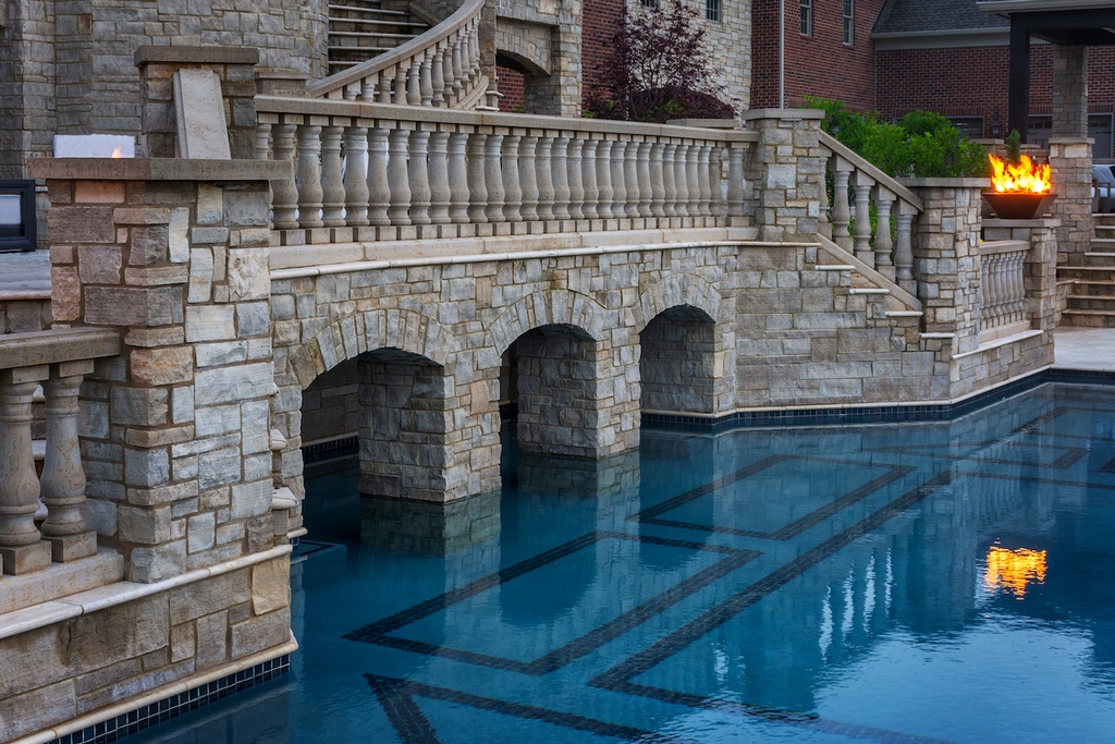
Materials selection is always an important part of the design process and in this case, we moved through a wide range of options. Again, the design motif led us to choose travertine for the decks and a rich limestone cladding for the vertical surfaces called Aux Vases, which has an unfinished, rough-hewn appearance.
| Archways of MysteryWe used arches (seen most clearly in the opening above) throughout the design in another nod to classicism. In fact, one of the most intriguing features is a set of arches that open into a grotto, which from the outside appears to lead into what might be watery catacombs beneath the terraced deck structure above. In reality, it’s another play area for the kids, but it serves a wonderfully intriguing purpose.
I’ve always believed that when you can’t see the entire body of water, it adds a sense of mystery and expansiveness to the setting. When you look at the arches from the pool, you don’t really know where they lead, so you’re prompted to check it out, which adds a sense of discovery and even a little bit of adventure. Anytime you don’t see where the water ends or begins, it makes your eyes, and often your imagination, go there. By contrast, when you can see the entire water surface all at once, there’s nothing left to discover. That’s why I’m always on the lookout for ways to include conceal-and-reveal elements in my designs. The arches kind of serve as portals to the unknown, which the kids especially love as does everyone else. It’s a great way to use design to unlock and satisfy our inherent desire for a bit of mystery. — J.B. |
We were somewhat challenged by the red brick on much of the outside of the house, but the subtle, earthy color palette enabled us to smoothly integrate the exterior structures with the house.
CLIENT APPRECIATIONS
Of course, the most important harmony is all inside the clients’ mind. In general, successful design does mean aligning the work with the clients’ desires and ideas. That’s why through all of this, there was an ongoing educational process, which is particularly rewarding when working with such engaging clients.
Going into the process, the clients had general ideas of what they wanted but it was up to us to explain to them how to execute that kind of design; to, in effect, show them what they like. I’m a big proponent of explaining the reasons why different things work. When I describe things like using symmetry to evoke gardens in Italy and France, the clients gain an underlying framework of understanding and a set of specific references.
The process of engaging clients almost always pays huge dividends. They gain a deeper appreciation of the design and ultimately greater perceived value for their investment. All of this adds interest and talking point when they share the space with others, which could lead to referrals.
Jason Brownlee owner of J. Brownlee Design, a firm specializing in custom and creative outdoor living projects for residential and resort environments. He serves as the principal designer and works collaboratively with both homeowners and contractors across the country to develop a complete outdoor lifestyle design for his clients. Brownlees is a registered member of the Society of WaterShape Designers and a member of Genesis University faculty.


