Organic Emergence

This project began with a client’s dropped jaw.
I’d been called to the site by one of my usual subcontractors to help resolve a minor problem he was having. While that was being resolved, I noticed that the new steps in the remodeled pool were far more troubling.
With the client and a bunch of other people standing there, I asked for a demo hammer – and saw the looks of astonishment as I smacked the top step and watched it crumble.
To that point, I’d had no role at all with the project, hadn’t met the homeowner until minutes before and had just taken a large hammer to a set of steps for which he’d just paid good money. But by the time the dust settled, everyone there could see that I had done little more than accelerate the demise of the steps: There was no steel, and the void beneath the veneer of low-compression concrete was filled with loose material including aggregates, dirt, plastic, spent concrete and a range of other construction-site debris. I have no doubt that the added structure would eventually have broken away from the shell with any degree of water penetration and regular use.
While nothing we uncovered was quite enough to take the shocked look off the homeowner’s face, my actions started a conversation that led to a complete rethinking of the space, its potential and, most important, the kind of environment the homeowner really wanted.
A NEW APPROACH
The property is located in Tarzana, a Los Angeles suburb in the heart of the San Fernando Valley. The neighborhood is clearly in transition: Property values have increased enough that older ranch-style homes are being replaced by larger homes in other styles – in this case a popular form of Tuscan/Italianate architecture, with a tan-colored stucco, a grand entry and a little pool in the small backyard.
The pool, as was noted above, was being treated to a mild renovation, moving up from a simple rectangle to a more stylish square.
As the homeowner recovered from the shock of seeing his new steps broken down to dust and junk-strewn fill, we gradually stepped onto a new path. His dream, he said, was for a Modernist-style home, with clean, clear lines (hence the squared-off pool) and a much more deliberate, refined design sensibility than the home now revealed.
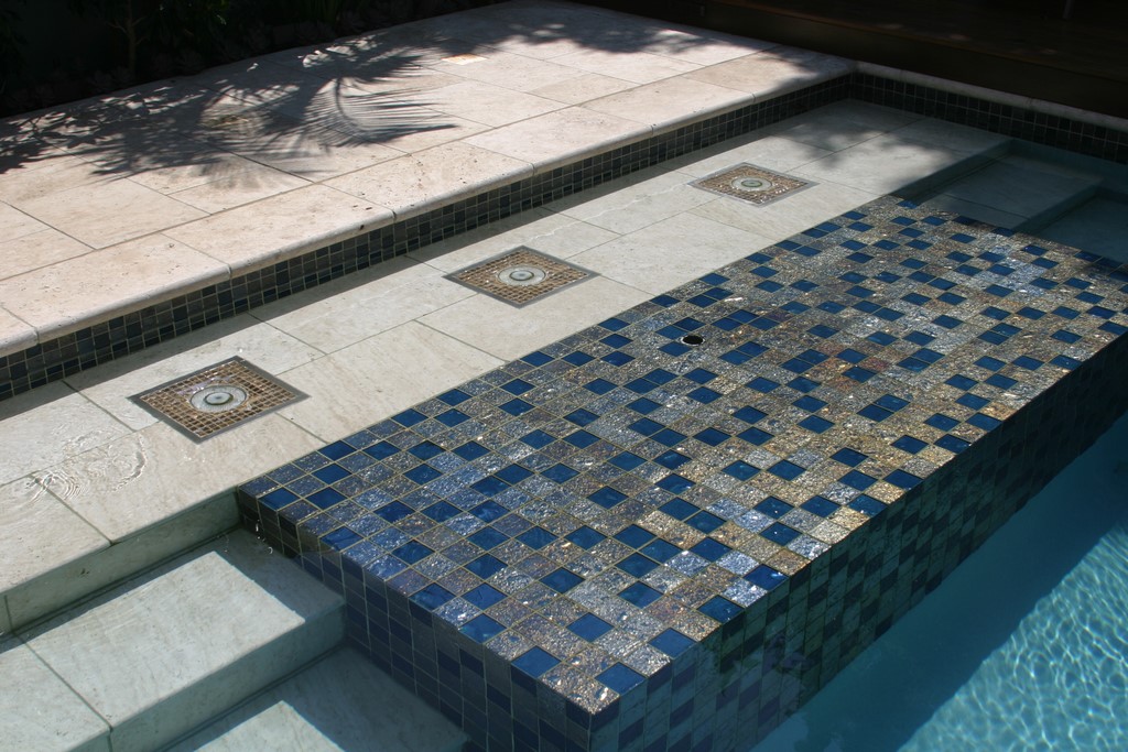
| The pool was the first project element we covered, mainly to make and keep it functional through what we knew would be a long overall construction process on site. But that didn’t mean it was static: We revised certain details as we went along, framing and adding tile surrounds to the bubblers, for example, and refining a variety of other details. |
Before long, what had been a minor renovation aimed at updating an old rectangular pool turned into a full-scale, high-end remodeling job for us at Green Pastures Group (Topanga, Calif.), complete with a full revision of the home’s look both out front and in the backyard. It was the beginning, despite the unsettling memory of the hammer’s blow, of a beautiful working relationship.
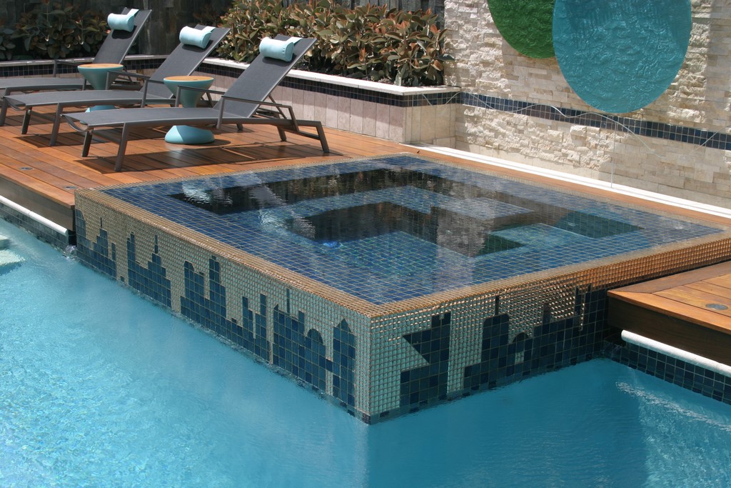
We started with the pool, which made sense given the heat of summers in the valley and the homeowner’s desire to maintain his kids’ access to the water. We removed all of the work that had already been done and reconfigured the space to include a basically square pool with a full-perimeter spillover spa, slot spillways to convey the spa’s water into the pool, a big rain curtain and a small tanning shelf with three bubblers.
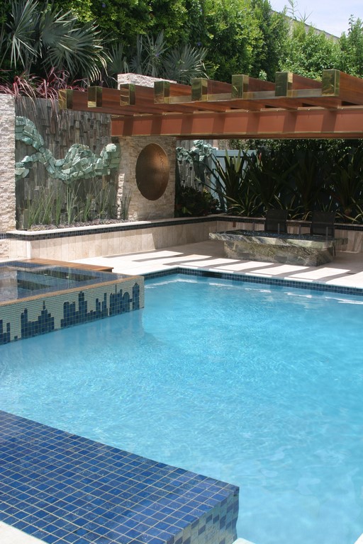
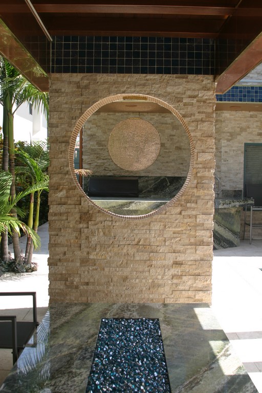
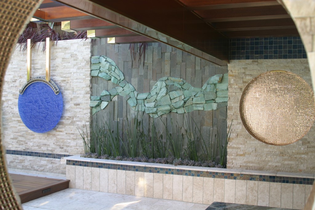
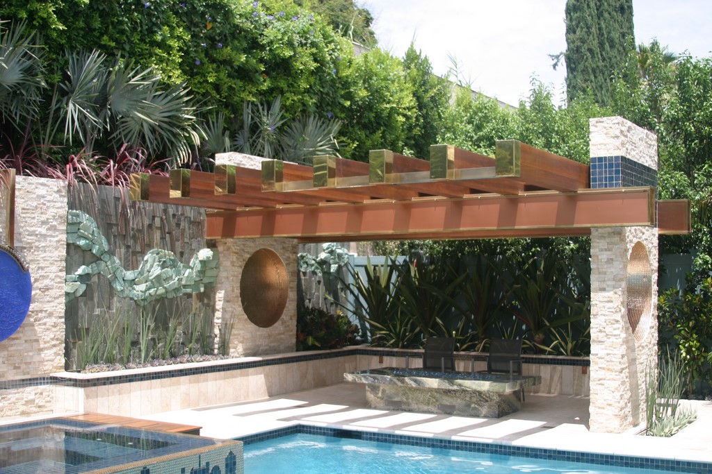
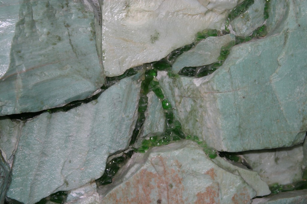
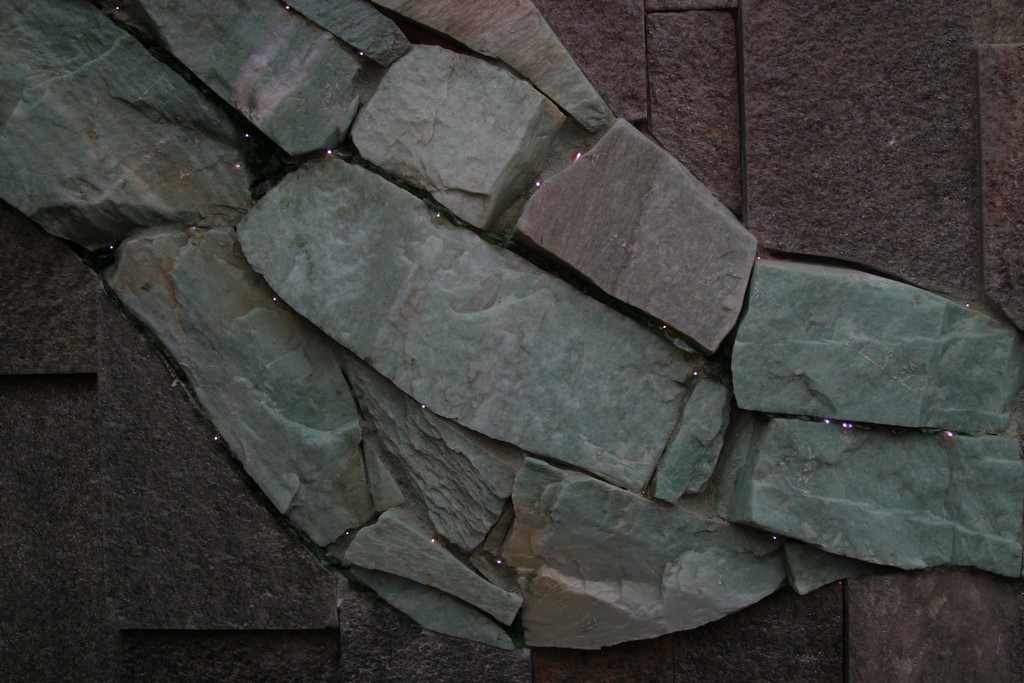
We also planned on adding a misting system and two fire features, one in the space beyond the rain curtain, the other in a strip down the middle of a large dining table. And we began devising a number of other poolscape features, including ledger-stone back walls bisected by veins of rough green quartz as well as a collection of circular medallions imbedded in various walls around the site. In addition, we began figuring out a grand water wall that would ultimately serve as the yard’s main focal point.
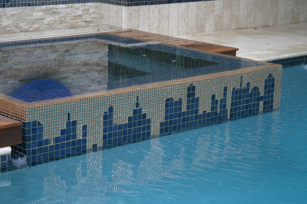
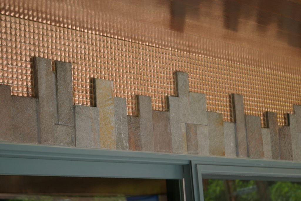
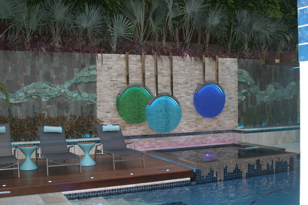
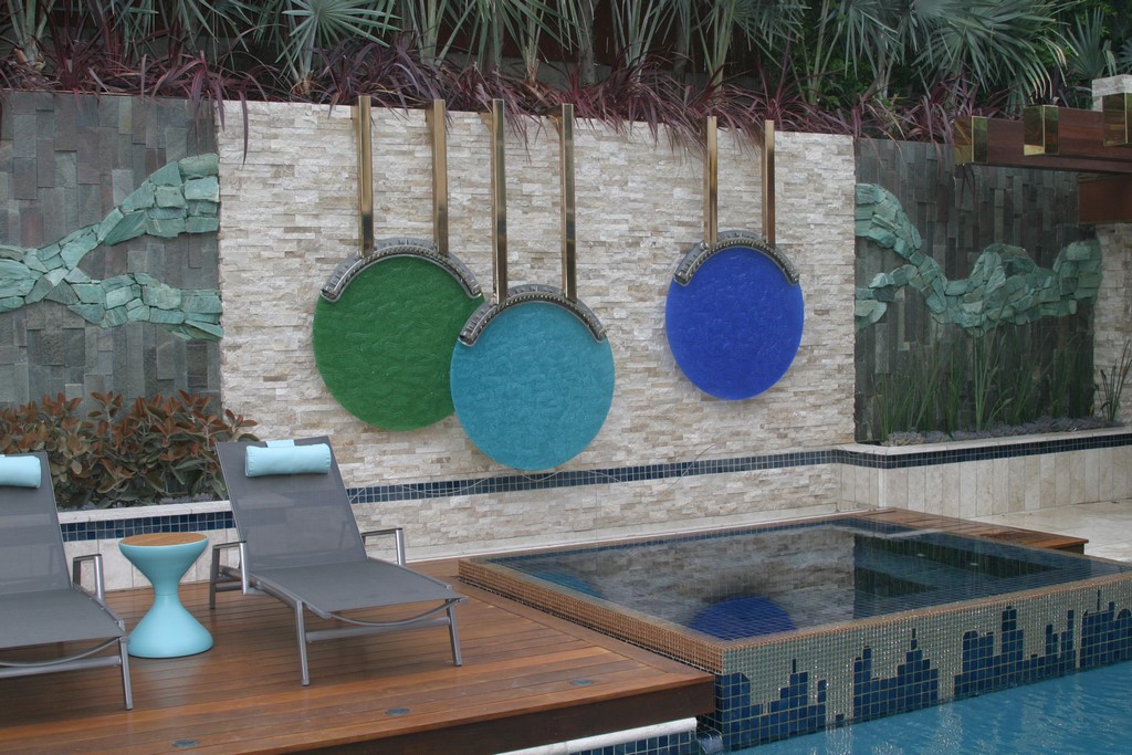
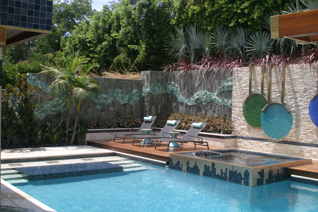
| The fully tiled spa occupies a key position at the heart of the design, serving as a reflective surface for the disks that hang behind it and, with its ‘cityscape’ tile detail, linking visually to a similar detail we placed over the doors on the opposite side of the pool. This was another case where we stepped past our original plan, which had called for a far more conventional spa-wall treatment. |
In the process, an upscale remodeling job turned into the pursuit of a work of art.
As we moved along with the pool, we started “Modernizing” the home itself. We began by treating the exterior to an application of a pale, ledger-stone quartz veneer and redoing a set of perimeter planters.
The same contractor who’d done such a bleak job with the pool had also played a part here, setting the narrow, elevated planting strips up with no drainage system and running the irrigation pipe right down the middle of the plantable space, limiting use to specimens in four-inch pots. Those two issues led us to start over here, too, reorganizing the planters with a new program in mind.
We knew from the outset that this project would take quite a while to unfold. As it turned out, we were involved on site for more than 18 months.
GETTING PLAYFUL
In approaching all of the tasks at hand, we did what we could to work with the space as a set of outdoor rooms and destinations – an extraordinarily useful design philosophy that guides much of the best work being done in today’s landscapes.
But we had a problem: The yard we had to work with was just 50 feet wide and 50 feet deep, give or take a bit along the back of the house. There was no point of view from which you couldn’t see everything that was happening in the space, so we had to find other ways to create a sense of unfolding mystery and suspense.
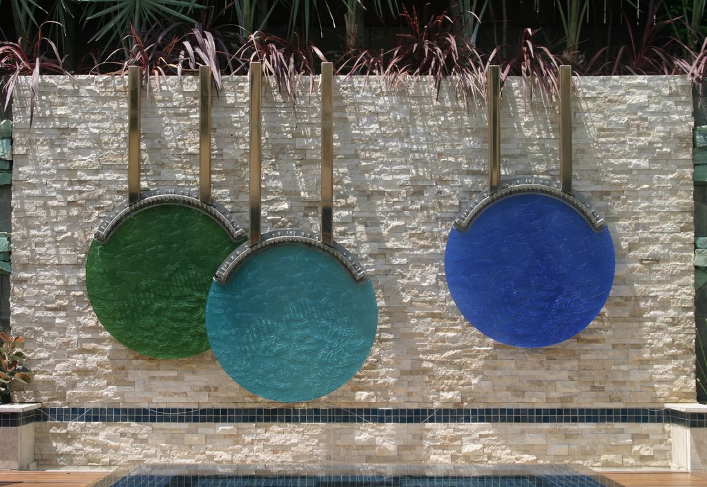
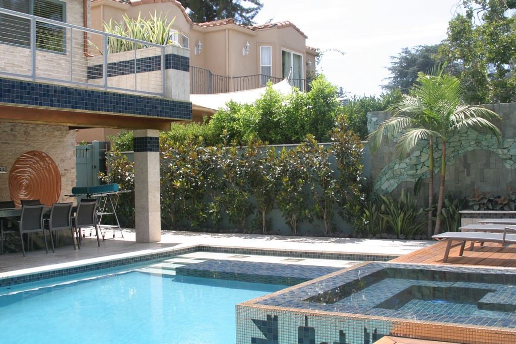
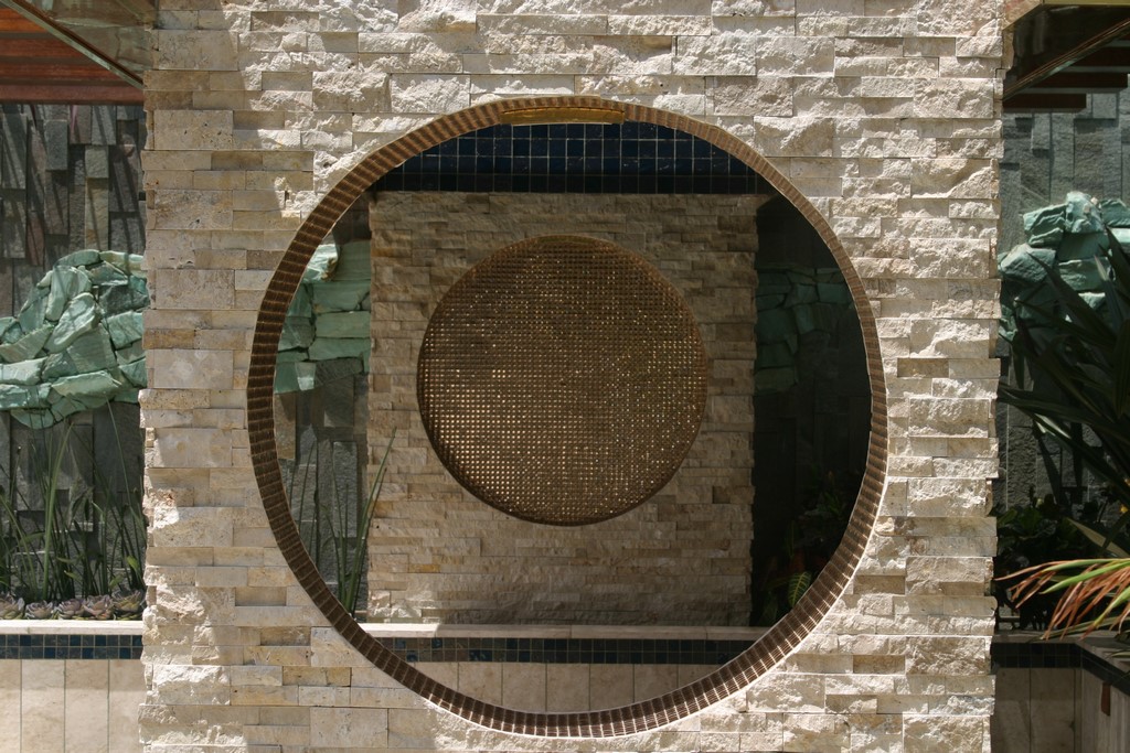
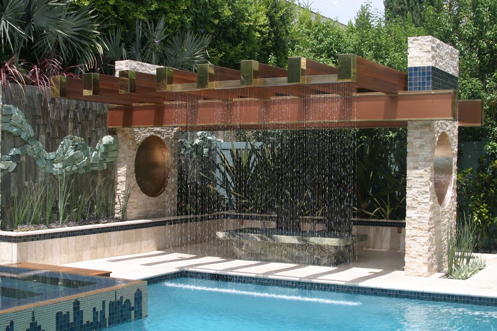
| The overall space features a number of round forms, including a set of tile-lined circles bridged by a circular void (part of the shade structure) running from beyond the fire feature over to the outdoor kitchen. These forms are echoed high on the home’s back wall on two surfaces, then on the patio and in the three-disk sculptural waterfeature that hangs over the spa. |
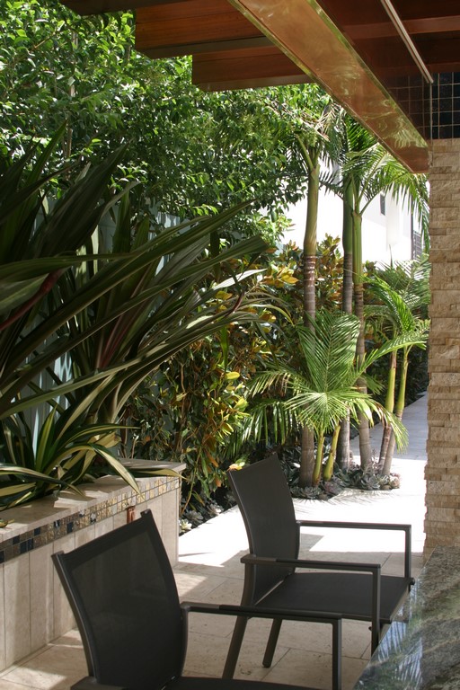
We did so with the guiding inspiration of the great Brazilian landscape artist Roberto Burle Marx, thinking in three dimensions and, in particular, actively pulling the viewer’s attention up above eye level – to the source of the rain curtain, for example, or to the warm, brass end caps on the shade structure or the gleaming copper and beautifully finished wood of the pergola over the patio space. Even more, we used what had once been the defining visual feature of the backyard – that is, a huge retaining wall that separates the property from an upslope neighbor – and made it a key visual attraction by topping it with three planting bands that seem to march up the slope.
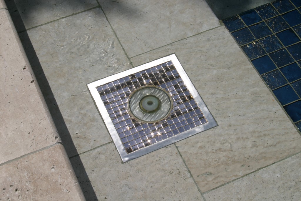
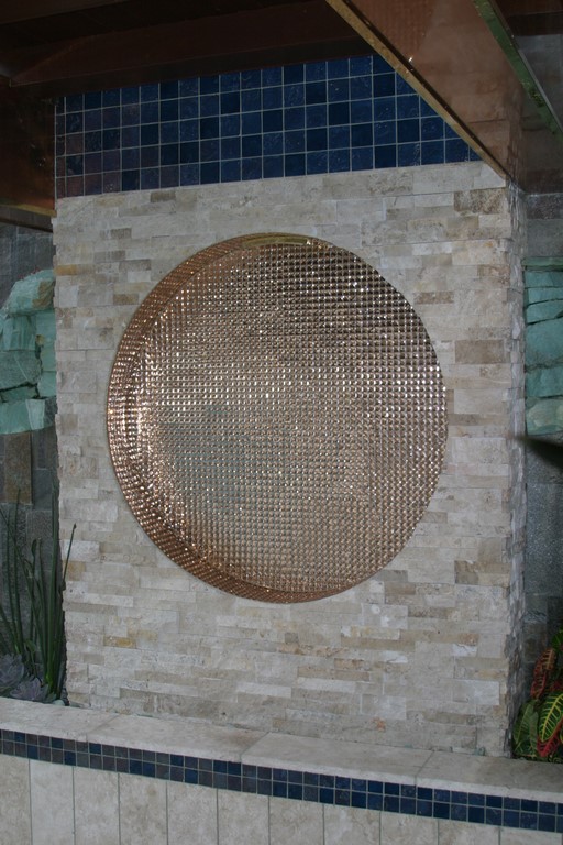
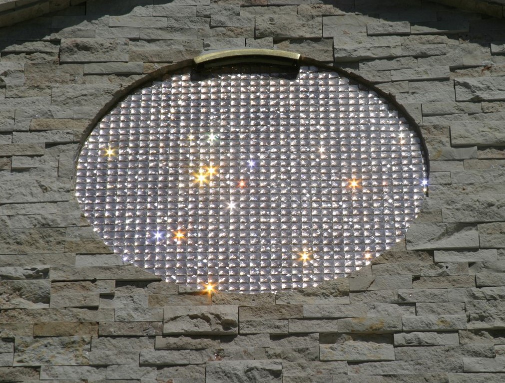
Those were the grander details, but we also used smaller ones to create reverberations throughout the space. First there’s the faceted, copper-colored glass tile – a Chinese product supplied to us by Westside Tile & Stone of Canoga Park, Calif. – that we used first atop the spa. Then we playfully echoed the look in framing the bubblers (from CMP, Newnan, Ga.) and in lining a set of three-foot-diameter medallions scattered through the space on two levels.
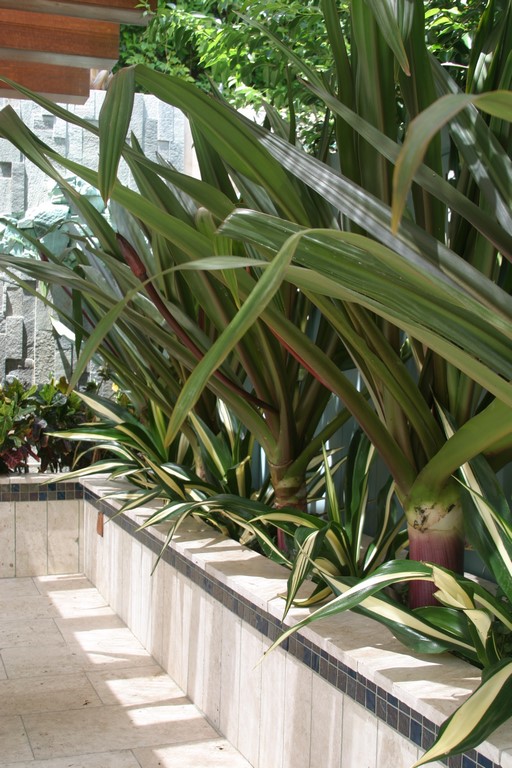
| Plants are an integral part of the compositiion, softening the harder edges, setting a brisk tone for the general color palette and also playing an unusually active role in guiding the onlooker’s attention above and beyond a reflexive eye-level focus. It’s a smallish space: The plants help by bringing varied depths, textures, elevations and colors to the visual program’s rectilinear boundaries. |
One of these big, faceted circles is at eye level by the fire feature, another behind the outdoor kitchen – with the two of them linked visually by an empty hole that penetrates the wall between them. Two more circles are found high on the back of the house, where the faceting of the tile makes them twinkle when the sun shines, as it does so often here.
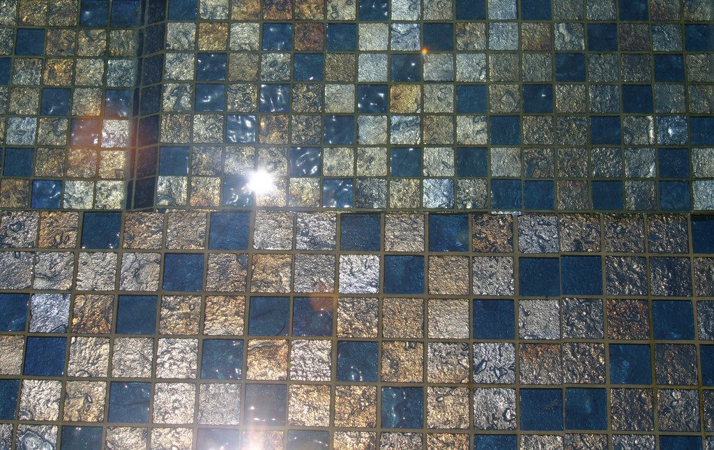
Then there’s the repeated use of the tile, starting on the tanning shelf and at the waterline: Made by Lightstreams Glass Tile (Santa Clara, Calif.), the same gleaming iridescent material appears as a narrow band along the top of the perimeter planters; on the tops of various posts; and along the edge of the pergola. Finally, there is a subtle color palette, with various greens in the plantings mirrored in the veins of rock cutting through the back walls and in the fire tables and the outdoor kitchen.
It’s a rich visual environment. In fact, it verges on overloading the senses while rewarding those who take the time to scan the space in all directions, high and low, as they move through it.
FINE DETAILS
So far, this discussion has been about a nice, high-end remodeling project. But at a certain point for both our team and the client, it turned into the pursuit of a work of environmental art.
For the client, this direction became clear early on when we were discussing the use of the band of glass tile along the top of the planters: It was as though a switch had been flipped, and all of a sudden he saw the sorts of relationships and connections we were building into the space. With his commitment and imagination hitting that level, all sorts of things that might have been difficult to pursue immediately came within reach.
In so many cases, these were wild ideas that took shape in our imaginations before the practicalities could be fully considered. But with his support, we were always able to go for it, working a steady diet of creative experimentation into what we were doing.
Two examples, first the rain curtain and its shade structure, then the glass-disk waterfeature:
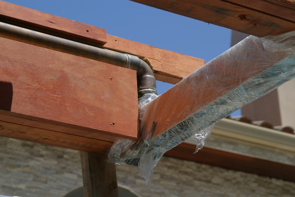
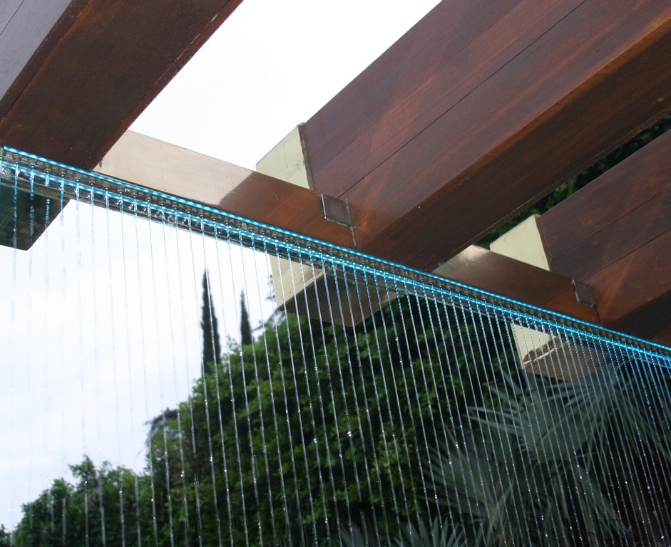
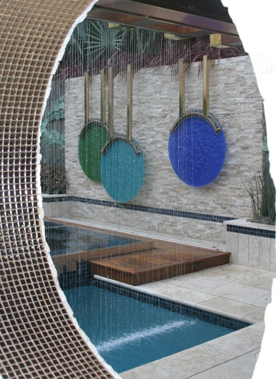
[ ] We always knew that the shade structure needed to be a real statement, with beautiful lines, great highlights and perfected visual impact. To us, this meant that everything from the rain system to the lighting had to be fully integrated with no tell-tale signs that anything at all was an afterthought.| The shade structure creates a distinct outdoor room, particularly when augmented by its rain-curtain feature, which we hid within the wooden components of the structure to a complex and unusual degree. Even here, as ‘free-standing’ as the structure may seem, it’s all about echoes and visual links, including the wood and brass details also found within the patio well as the ubiquitous tile banding and the repeated use of the multifaceted copper-colored tile. |
In that spirit, we integrated the feeder box within the beam system, making its nozzles perpendicular to and aligned with the bottom edge of the beams. We also built the plumbing system into the beams and hid everything within them and the posts with no visual breaks. Trouble is, these big wooden beams had to be pre-cut to accommodate the pipes and conduits and then blind-craned into the yard, placed over the rain-curtain components and slid onto dowels.
There was lots of frantic communication between us in the backyard and the crane operator on the street as we ever-so-carefully lowered the pre-trimmed beams into place, hacking away bits of wood as needed to ensure proper clearances. It was nerve-wracking in the extreme, but it eventually all came together – at which point we became involved in applying the formal wood finish and adding the brass and copper detailing.
It was a stressful exercise, but all part of the artistic mission we’d set for ourselves.
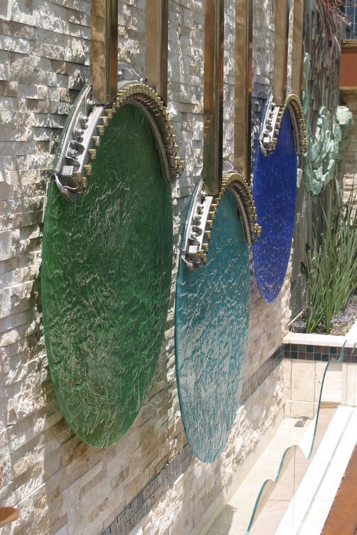
[ ] As the prime visual focus and most overtly “artistic” feature of the backyard, the three glass disks suspended as a waterfeature/water wall involved a mind-blowing level of detail. The concept was simple – three big glass disks suspended on frames that would drip water down the glass surfaces and into a narrow trough below – but achieving that reality to full artistic effect was another story.First, finding the glass proved to be a challenge. Our initial supplier had our specifications and color selections at hand but supplied us with laminated glass (without our knowledge and definitely not at our request) that failed in storage before we even had a chance to mount it on site. Looking back, we consider this a semi-lucky break, because the consequences of having the panels fail once mounted would have been far more troublesome.
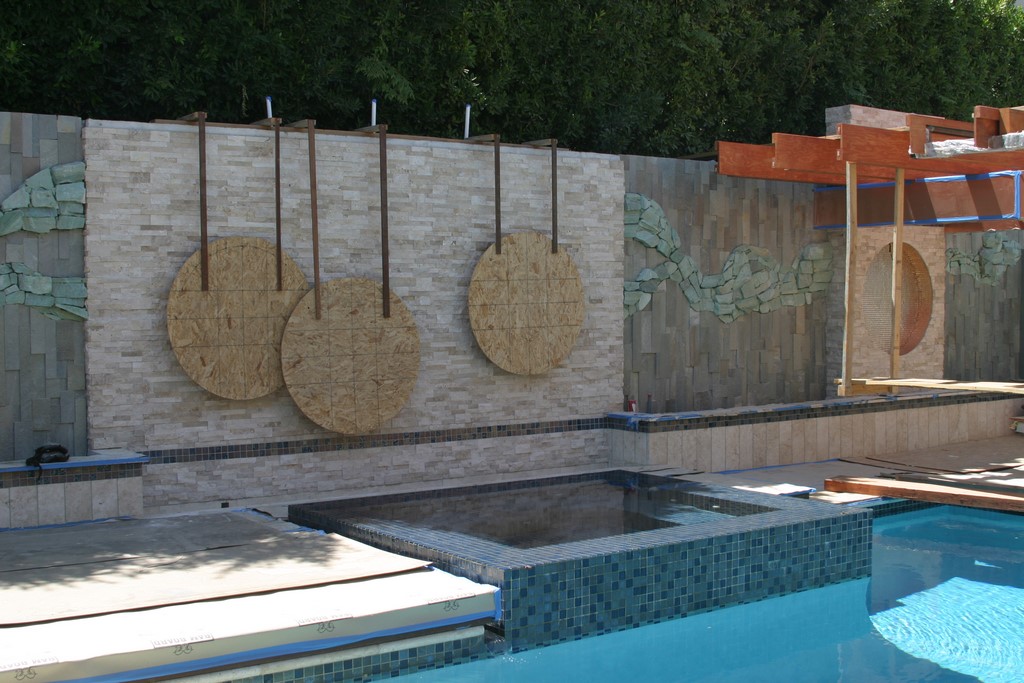
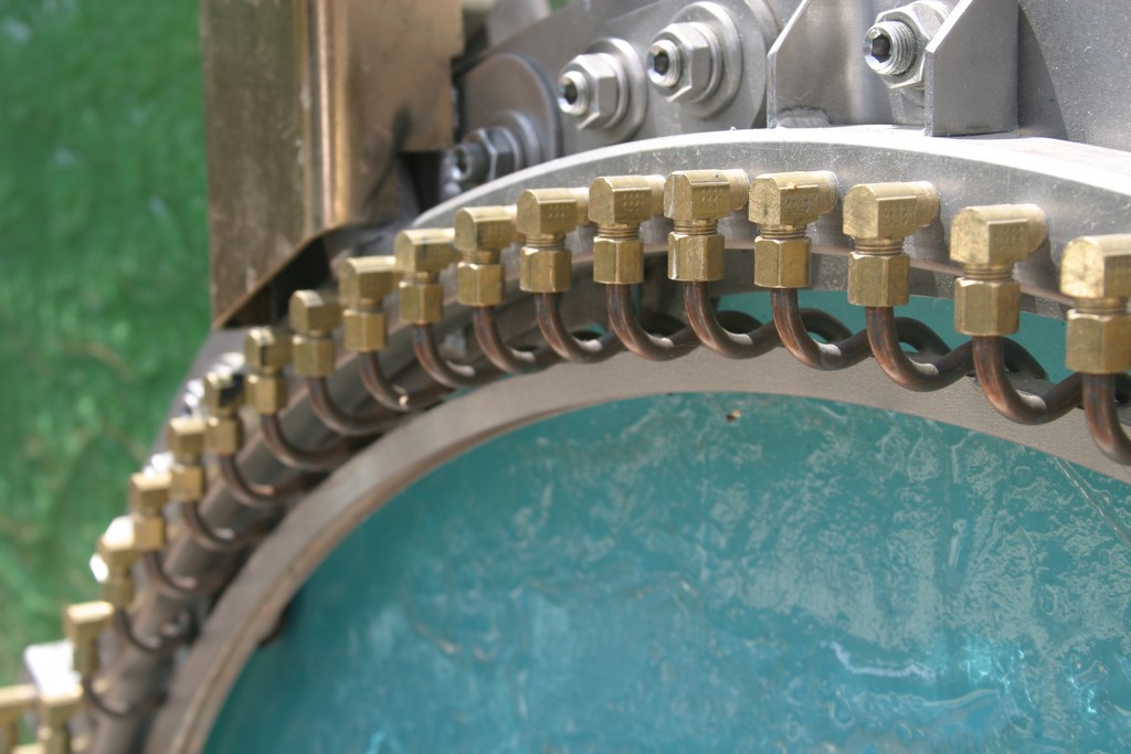
| The artistic heart of the setting is the three-disk waterfeature suspended on the property’s back wall. Early on, we set up plywood blanks as constant points of reference; when the glass finally arrived in complete form, the design began coming together on every level. The nozzle systems are just astonishing: They look like the internal workings of a piano – expressions of precision engineering and great artistic awareness on the part of the fabricators. |
Our second supplier (Ultraglas of Chatsworth, Calif.) pulled through with solid pieces of tempered glass, prepared with the precise degree of texturing we wanted. The colors were a bit different from the specifications, but we knew what was coming and were ready for this slight divergence from the plan. Once the circles arrived, we mounted them in fixtures painstakingly and beautifully prepared for us by Fountain Supply Co. (Santa Clarita, Calif.), which had also prepared the custom rain curtain’s nozzle system for us.
With the glass suspended in place and the three disks hung on brackets from the top of the wall behind the pool, we were ready to initiate the system to check things out and try various flow rates. We were all blown away by the intricacy of the nozzle system: It looks something like the interior of a piano, and as we moved along we had the sense that we were “tuning” the flows in reaching for the exact visual and aural effects we wanted.
Again, this was a monumental, ultra-high-risk/ultra-high-reward detail, and, for all the stress, it came together beautifully.
DESIGN ETHOS
I know I’m an acquired taste, but when my clients and I merge sensibilities the way we did here (and have done before, happily, in many other projects), the results can be unique, eclectic, unorthodox, idiosyncratic and, if I do say so myself, quite spectacular.
As mentioned above, the outcome approaches visual overload, but that risk was consciously relieved by the fact that we were purposeful, playful and deliberate, considering each detail from every perspective – especially that of the homeowner. My commitment to my clients in these projects is total: We never work on more than two or three at any given time, and we schedule things in phases so that my time is entirely focused at each key stage of a given process.
Through years of being out on the edge of design and technology – and after countless hours spent doing the research required to find materials and systems that will perform for the long haul, reliably and consistently – I’ve learned so much about the way things work and the problems that result when perfection isn’t the mission that I am frequently called in for forensic examinations of construction projects.
This gives me the kind of practical, real-world experience that, combined with my guiding design philosophy and dedication to the legacy of landscape masters including Roberto Burle Marx, gives me the confidence (and guts) it takes to swing a hammer to a step to reveal its inadequacies. It’s also the source of my determination to do my homework, think things through and get the details just right when we’re on site.
It’s the way I pursue my art – and have a good time doing it!
John Cohen is owner and founder of Green Pastures Group, a watershaping and landscape-design firm based in Topanga, Calif. Cohen’s career began in working with his father, planting trees and installing landscapes for upscale properties and public spaces in southern California. He founded his own firm in 1975 and has since won a range of awards and appeared on episodes of design-oriented television shows, including “Backyard Nation” on The Learning Channel. Mostly self-taught, Cohen also studied Chinese gardening at UCLA. A pioneer in the field of non-toxic water-treatment systems, his projects include highly stylized and distinctive watershapes and landscape compositions for upscale clients throughout southern and central California, including the Beverley Hills Hotel. His work has also appeared on the cover of Architectural Digest.


