Transparent Advantages

This is the story of a project where I’m still not sure which was tested more – my creativity or my patience.
It was one of the first design tasks I tackled after moving to Katy, Texas, in 2009. In retrospect, it may not have been the ideal time to relocate: The full force of the Great Recession wasn’t clear at that point; I had a job but no direct way to bank on the good reputation I’d built where I’d worked before; and it was a market in which the client was absolute king because so few were investing in high-quality watershapes.
That’s why my work with these particular clients was so important: I was the new kid on the block and had a good portfolio, but I knew I had to break through quickly and start building a local following – no time to waste!
By that point, I was already quite adept in working with digital design software – in my case, Pool Studio (produced by Structure Studios, Henderson, Nev.) – and I have to think it was this system and my sheer determination that led to a burst of creativity on my part and, on my clients’, a whole lot of willingness to come along for the ride.
GIVE AND TAKE
The early going was pretty rough: I produced design after design for the homeowners, but nothing seemed to grab them. After we’d gone back and forth with four completely different plans that seemed to be moving in a positive direction one by one, however, there was a breakthrough at last.
It was at this point that I introduced more dynamic shapes and a vanishing edge into the mix to go along with a sleeker, more stylish look. The clients, whose kids were grown and no longer a factor, were thinking of their backyard as a place for entertainment. They saw my fresh, shapely approaches as more dramatic and appealing than a conventional pool and spa – as a piece of art in addition to being a place to swim or soak.
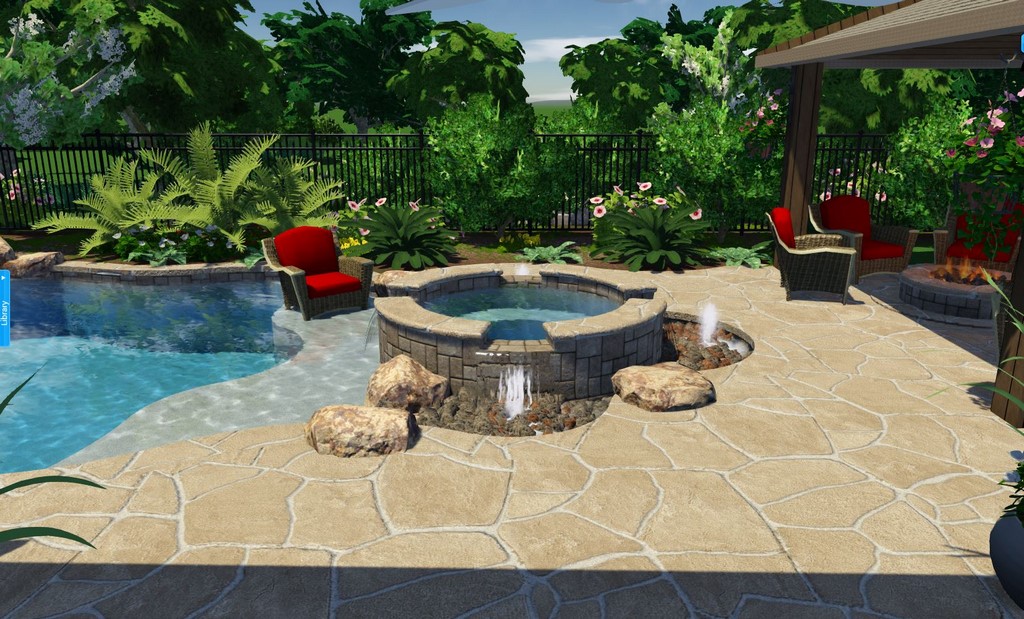
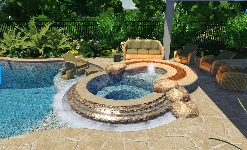
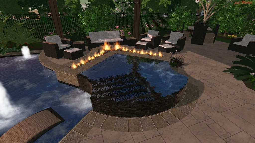
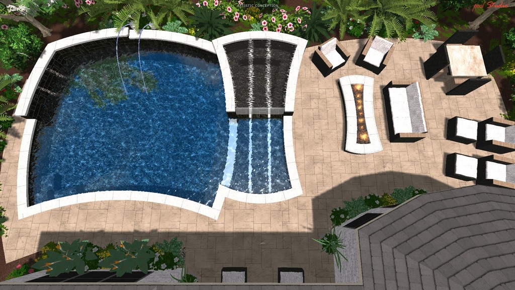
| The design process involved eight versions in all. The second and third in the series (left and middle left, respectively) show us rolling through fairly conventional round-spa possibilities. We started moving along more productively when I introduced dynamic shapes in the fifth and seventh rounds (middle right and right, respectively). Finally, with version number eight, seen below, we were ready to go. |
Yet it continued as a game of back and forth, with three more possibilities discussed and three more designs sent back for revision. But I stuck with it because I knew the clients really wanted to work with me regardless of how much time it was all taking.
Through this period, I had been taking on freelance digital-design assignments to keep things going and did some projects for a couple of Australian pool companies. (They’d been impressed by what they’d seen of my work through Pool Studio’s design competitions.) Soon, they introduced me to a detail that had really taken hold Down Under: acrylic panels in pools.
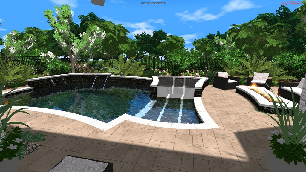
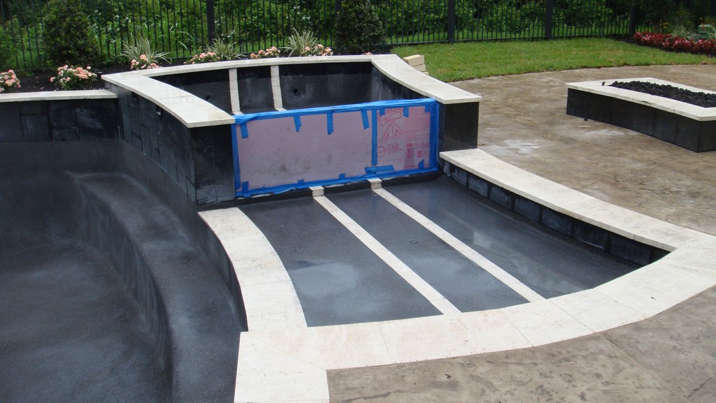
| Once the basic idea of the eighth version was adopted, the design process took flight. With the clients fully on board with the shapes, materials and, most important, the acrylic dam wall for the spa, we were ready to begin the construction phase. |
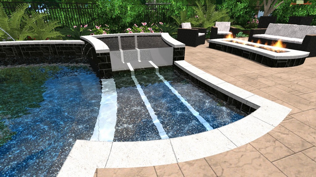
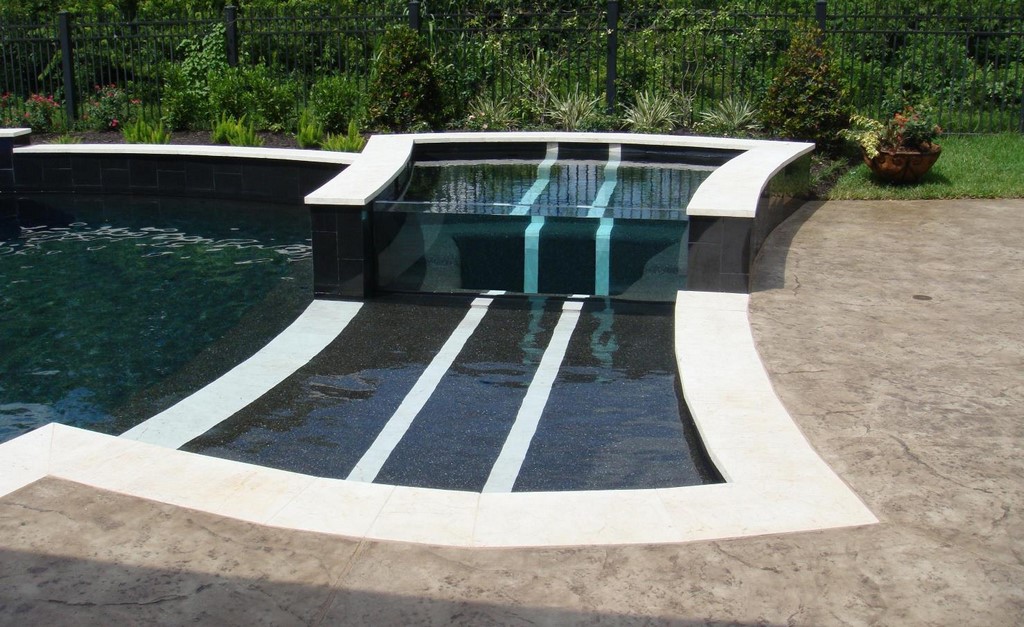
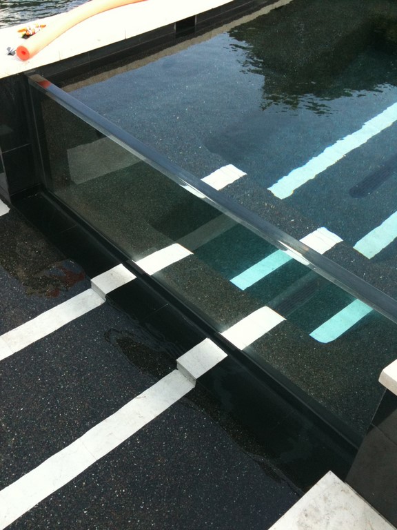
They were using these translucent slabs in all sorts of applications, and I liked the way they looked. Back home in Texas, it eventually occurred to me that one of these panels might push what was to be my eighth design iteration over the hump, so I included an acrylic panel as the dam wall of a raised spa. Pulling in another look that was popular in Australia at the time, I also included tile inlays running through the pool and spa and up the spa’s back wall as a unique opportunity to show continuity.
Sweet success: The clients absolutely loved the idea and the project finally started moving from the screen to the backyard.
DISAPPEARING ACT
But this is when I discovered that there was another big hurdle to cross.
In preparing and pricing out my proposal, I had worked with a local acrylic shop that had the capability to produce the panel I needed and could install it at a much lower cost than would have been the case had I worked with a national supplier. In the latter case, not only would the panel have cost more, but I would also have needed to work flying in an installation crew and putting them up for a night or two into a tight budget.
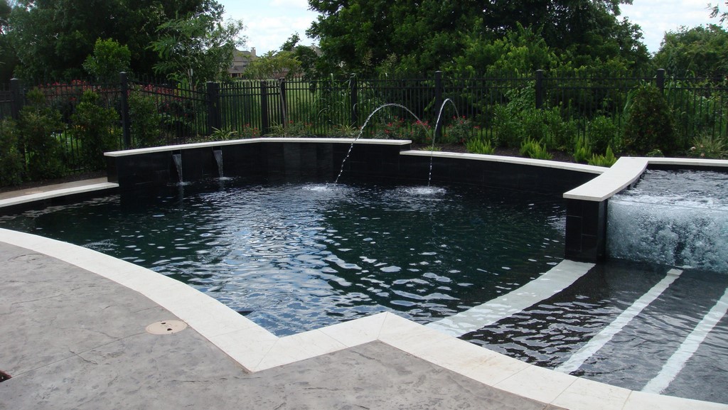
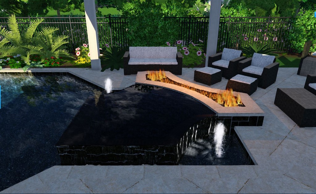
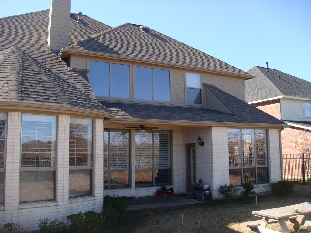
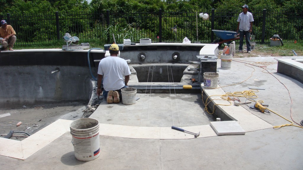
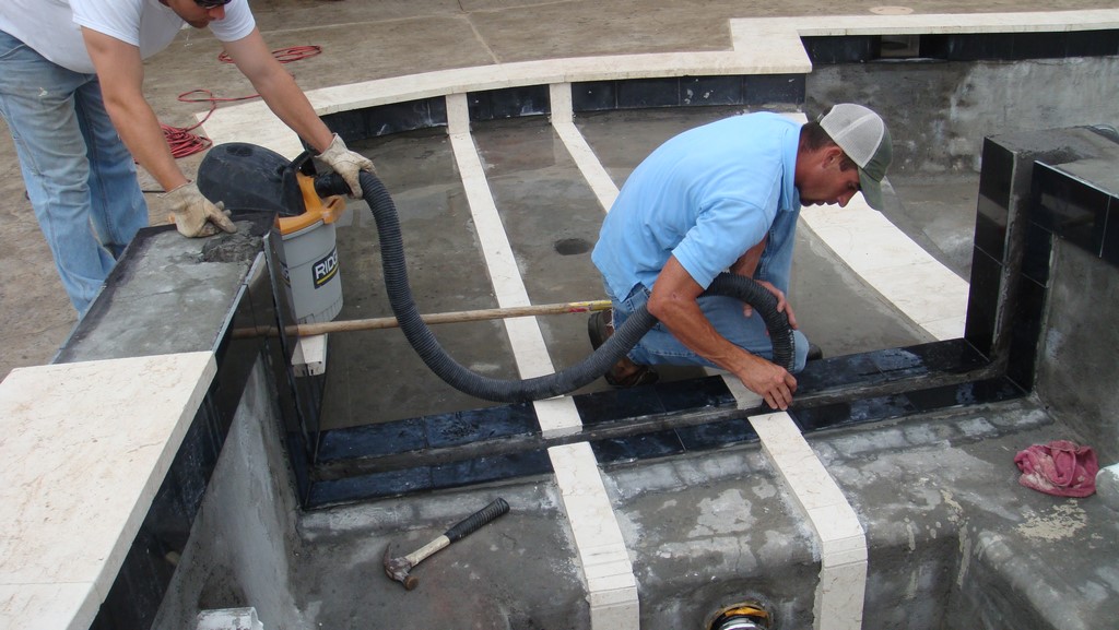
| The design plays off the contours of the home, with the pool and spa bringing a shapely sensibility to the space along with a few details I picked up from my adventurous Australian contacts, including the acrylic panel and the distinctive lines of white tile. We worked to particularly exacting standards in building the recess for the panel, all in an effort to make installation go as smoothly and efficiently as possible. |
We started construction, and it finally came time to get precise specifications from the acrylic shop so we could create the slot into which the panel would ultimately be inserted. No response: The guy had vanished, and so had my local bargain.
After some soul searching, I decided that the only way to keep this defection from undermining the whole project was to eat the additional cost and call in Acrylic Tank Manufacturing (Las Vegas, Nev.) to complete the dam wall. To minimize the hit, we did as much of the fine preparatory work as we could in order to shorten the time ATM would need to spend on site. Long story short, all it ultimately took was a single installer, and he came and went in a bit more than a day.
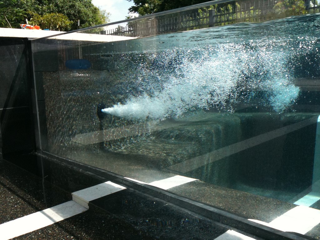
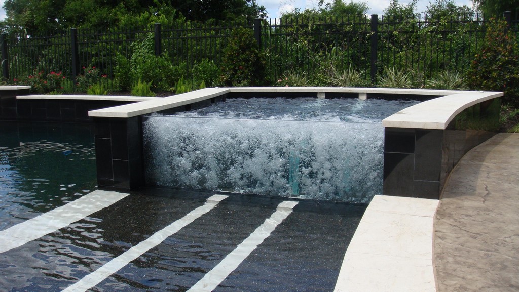
| Once the acrylic panel was in place and the spa filled with water, the white tile lines began to refract in a dance that the clients truly love. They’re also happy with the panel’s transparency and the unusual view it gives of the spa’s operation – and even happier with the wall of bubbles that can be deployed to make the hot-water experience a bit more private. (To see a video of the bubbles in action, click here.) |
I learned more than a few obvious lessons as a result of this experience – the chief of them being that trying to execute top-drawer looks on restricted budgets is just too risky. Everyone was (and still is) thrilled by the way it turned out, but having to retrench and take another direction (and a financial hit) was a surprise I never want to see again.
Just the same, it wasn’t all bad – and it actually got better, because at one point the clients and I agreed that personal privacy would be an issue for people sitting in a clear-walled spa. This might even have become another idea killer, but as it turned out, the solution was simple: We included a channel for an air line in the concrete just behind the panel, so now a wall of wonderful bubbles obscures the view through the panel when the spa is occupied. In fact, it’s such a cool effect that the clients often keep it going even when there’s nobody in the spa.
TRANSPARENT BEAUTY
If I had to do this all over again, I like to think things would have gone differently.
Never again, for example, will I put up with a client’s pushing me back to the drawing board (or computer screen) eight times in trying to figure out what we’re doing. I was pretty hungry then, of course, and I also have to say that it’s hard to resist people who were that excited about working with me: With every version the last thing I heard was, “We can’t wait to see what you come up with next!” – and I believe they meant it, every single time.
Looking back, I also know that I had the advantage of having more than the usual amount of time on my hands. When you combine that with the fact that I work very quickly once I get going, I really don’t have any regrets – and picked up some valuable lessons on the way.
And despite all the turmoil, there are the results to consider: This is one cool-looking project, and the effect of the bubbles rising behind the transparent dam wall gives a whole new depth to the hot-water experience. So despite the risks involved in going so far out on a limb, it’s impossible not to be happy with the way things turned out.
Tanr Ross has been sales manager and lead designer at Sunset Pools in Katy, Texas, since 2009, and founded Intelligent Blue, an independent watershape-design firm, in 2011. A long-time advocate for computer-assisted design technology, he has served as an adviser in development of the Pool Studio software system and has taught a number of courses in its efficient, effective use. In 2014, he was recognized as designer of the year by the Houston-area chapter of the Association of Pool & Spa Professionals.


