Intersecting Sensibilities
I live on the eastern-most fringe of the west side of Los Angeles, a neighborhood with an eclectic urban concoction of mixed nationalities and wide-ranging aesthetics – including a lack thereof.
This hilly East Hollywood region has views of the downtown skyline and cars lined up regularly at four-way stop signs deployed in an effort to minimize the number of streetlights we must navigate to get from our homes to nearby Hollywood and Sunset Boulevards. In short, we are bursting at the seams with overflow traffic from the increasingly dense population base at this intersection of the east and west sides of Los Angeles.
Constantly reminded of this resulting lack of space, the initial motivation for my courtyard makeover was to annex more living area at the front of my property while establishing a place of peace and tranquility. I wanted a space that would be cloaked in an aura of protection just outside my office window.
FIRST STEPS
As with any makeover project, the first physical step involved the dreaded demolition phase. Even the most seasoned professional will draw in a deep breath and steady his or her stance before embarking upon this type of thing on their own turf. And, as with all other aspects of life, this process begins with thought before any type of other action can begin to take place on any front.
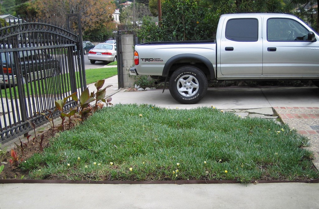
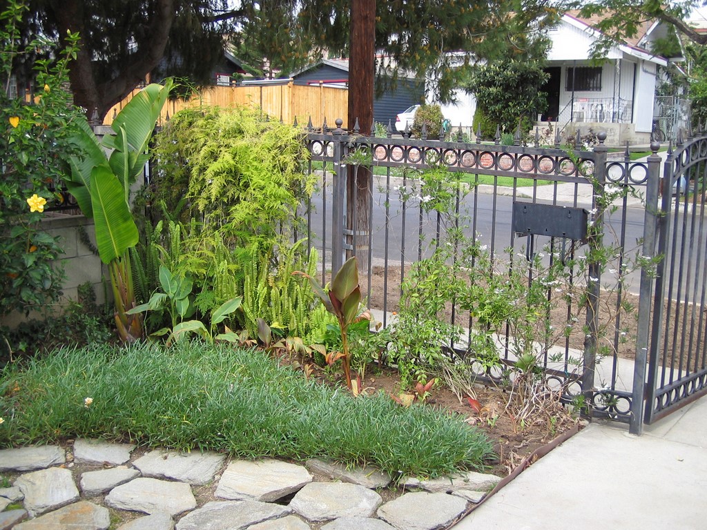
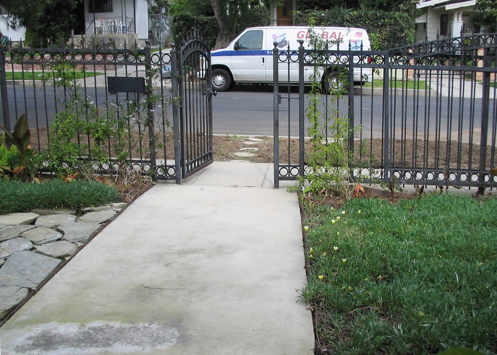
I was reluctant to remove an older-looking wrought-iron fence. It had a cottage-style charm and seemed to fit nicely with the steep-pitched roof and the eclectic architectural adjuncts that make up my 100-plus-year-old residence.
The driveway too was based on old needs. It was originally scaled to accommodate a Model-T and was way out of step with the size of vehicle that we use to navigate life these days. My goal was to widen the base of the driveway to match its width next to the house and allow for more functionality. This meant that the wrought-iron gate had to go since it was designed for the small opening. So I opted to take all the iron fencing out and bring up the existing block walls to match the columns that served as dividers in the side fencing.
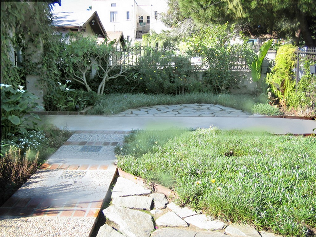
| Before the enclosed courtyard took shape, the front yard was far from a satisfactory space. I liked the old fence, but once it was out of the picture, the possibility of creating a private area surrounded by walls that blocked out the cars and noise (but not the distant views!) more than made up for the sacrifice. |
I knew that I wanted a hedge of plant material along the sidewalk for privacy, and I took my cue from the existing trees along the driveway: I decided to plant a Podocarpus gracilior hedge for front screening as a counterpart to the driveway’s Podocarpus macrophyllus. I knew that the edge could be kept soft, lacy and unobtrusive to the people on their neighborhood walks who would be forced into rather intimate encounters with my plant material.
Another goal was to borrow from the satisfying views that deep space afforded: In this case, it is a hillside of charming individual houses and lush trees.
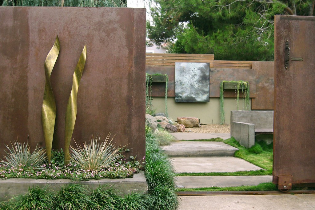
We also needed something tall enough to screen the sight of an automobile parked in the driveway, and yet low enough to allow for a view. Then we needed a wide gate for ease of access. I decided that panels of steel would create a barrier of privacy and a sense of security while establishing an exciting backdrop for art and plants.
DESIGN CUES
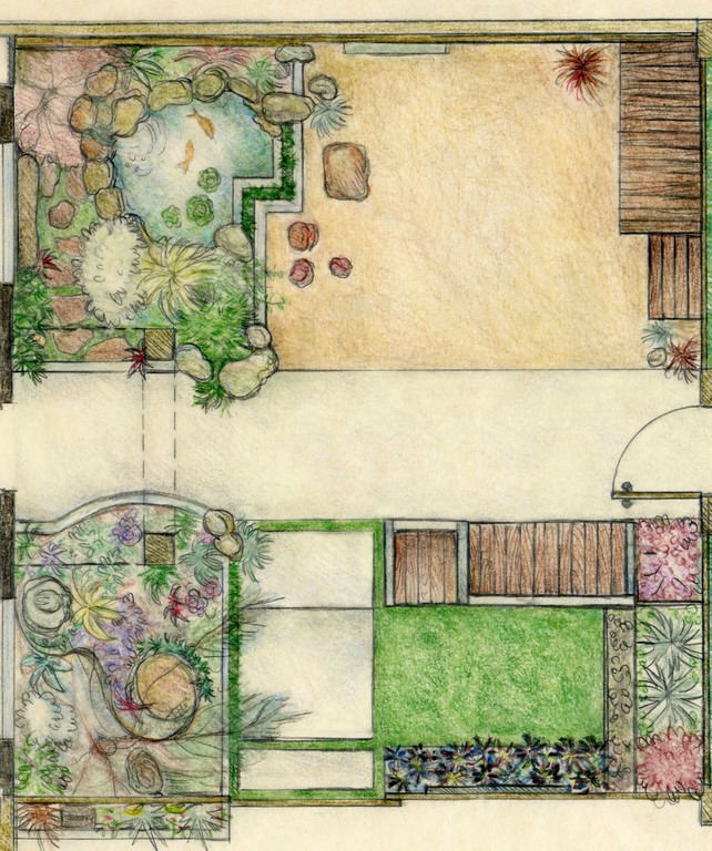
Now that I had envisioned the parameters, it was time to examine the functional needs of the enclosed space. My wish list included squeezing in a pond with a little waterfall, some seating, perhaps some statuary and large art panels for privacy and contemplation. I also had the thought that some part of the space would contain pebbles to remind me of childhood time playing with rocks. I envisioned the gravel bed as reminiscent of a Berber carpet floor.
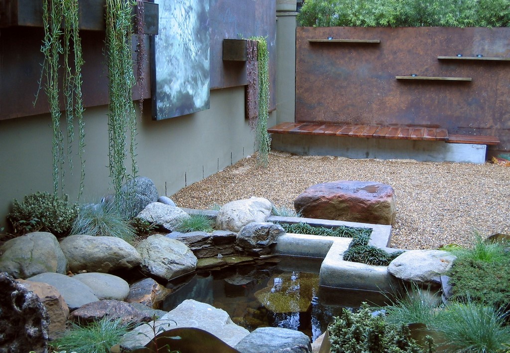
I decided to place the pond immediately outside my office window so that the sound and the energy of the water would be intrinsically connected to my work space. At that point I began to sketch out what I call energy patterns. This exercise usually reveals traffic flows and sometimes serves as a device to drive the design.
It’s my experience that, once a project is named, that too can serve a useful purpose in inspiring a design concept. I wanted a blend of open space punctuated with design detailing in this small courtyard, and I noted that the interior spaces are currently Asian-influenced. I also saw that a perfect name was already formulated by our location in the city’s socio-cultural infrastructure: “East Meets West.”
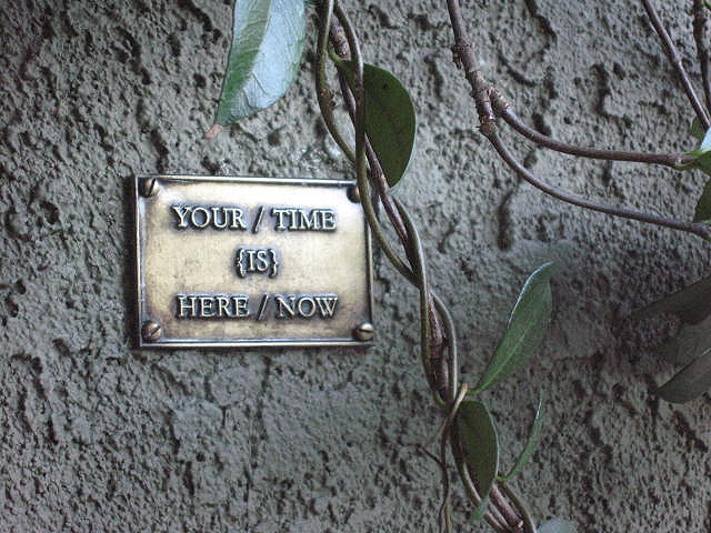
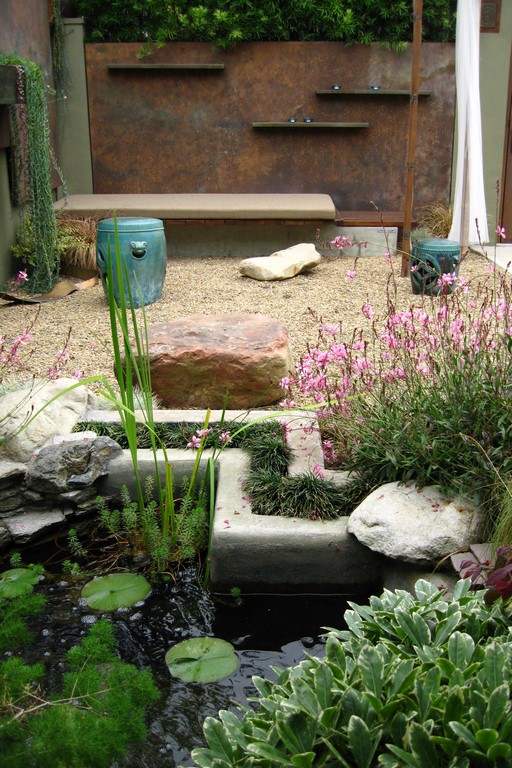
| The courtyard is still relatively small, but by scaling various elements properly we were able to include enough to turn the front yard into a protected, meditative space as well as a gallery for my art pieces – plaques, sculptures and prints along with copper planters and concrete furnishings. |
With a design sensibility to superimpose upon the matrix of my interests and a name in place, a new item appeared on my wish list: Paint the house a more appropriate color. This was a perfect add-on task for the tail end of the demolition phase.
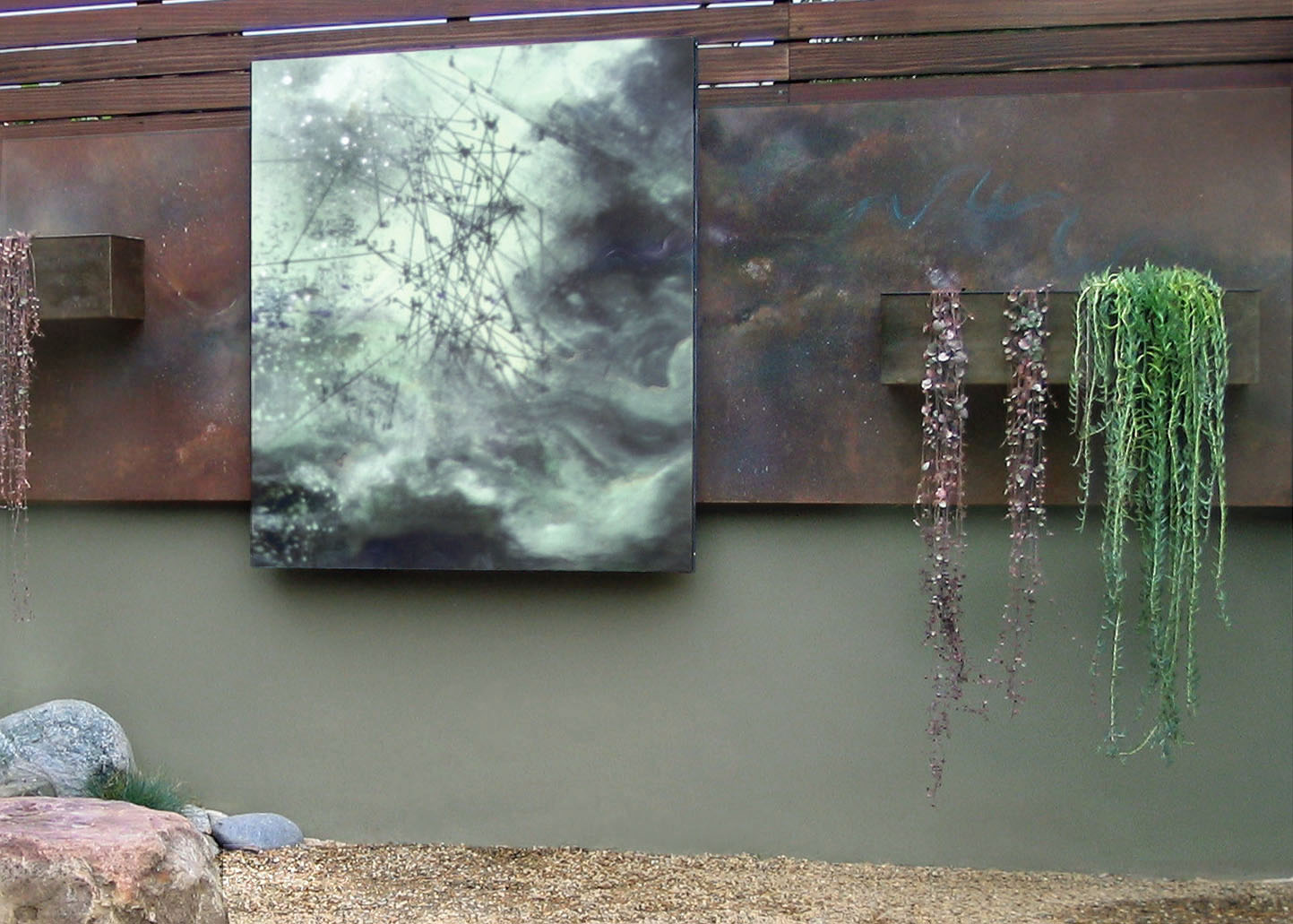
Because my goal included a gallery for art, the placement and choice of the artworks informed other functional needs. I chose three of my pieces with similar teal-gray colors, knowing they would integrate well as analogues to the main color scheme of the house and pillars. (See the sidebar below for descriptions.)
All in all, the space is designed to create a sense of expansion and yet protection. I’ve implemented layering that alludes to a depth of field; poetic encounters to establish the spin of unanswered questions; and the sense that there is more to explore around every turn. I like the idea of flow: Both my two- and three-dimensional art and design employ flowing imagery as a reminder of our transience and the inevitability of change.
WELL-DESIGNED SPACES
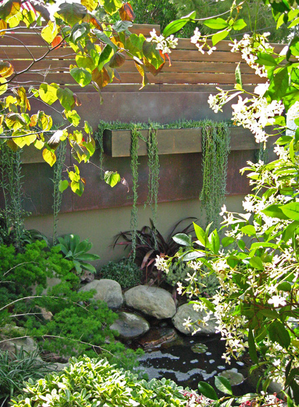
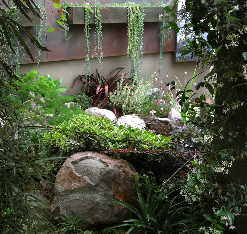
To advance this concept of flow, I developed an interplay of rectangles for the steel panels that “float” the print “Bearings” in front of its background. The copper planter boxes on that side extend the concept of movement with the stepped rhythm and a cascade of fish-hook senecio and other low water plants. I found an automotive trim to insulate the edge of the planters.
|
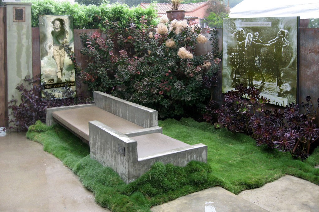
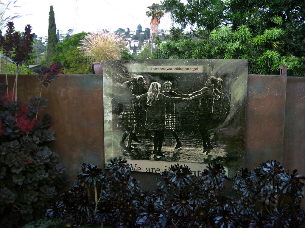
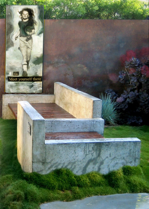
Art in the Garden My outdoor prints are designed to withstand the sun, wind and rain for years. In this garden project, I also backed them with galvanized steel for added durability, then sealed them with an industrial-grade UV sealer. The piece entitled “Five Graces” is used as a theatrical element, installed on the east side of the fence against a nightly backdrop of twinkling hillside lights and, by day, a beautiful rusted-steel patina. I designed a bench to provide a museum-like experience with an invitation to sit and contemplate the art. Next I choose “Meet Yourself There.” This vertical figure is a reminder that each exit from my sanctuary space carries the opportunity to encounter my own true identity in all my interactions in the world outside.
On the west we installed “Bearings,” a projection of thought-provoking explorations. I developed this painting from an early photograph I appropriated that charts the eye fixations of 40 subjects studying “The Great Wave” by Hokusai (1760-1849). I painted around the graphic study with cloud-like imagery then photographed my work and redeveloped it into yet another generation of art in Photoshop for this final print. To me, this piece represents our natural aspiration of continually reaching for markers that define our place of being as “bearings” for our life. To some extent we all feel our way through our day blindly touching the edges of where we are currently for comfort and a sense of direction. In fact, we can learn more about where we might find opportunities for growth by studing the changing personal landscape of our life-choices and noting where we are at any given point in time. This image, in particular, appears to have a glow coming from within when it is lit at night. — K.K. |
The benches in this space are custom designed to allow for viewing of all the works of art in the garden. They are a little lower than is the norm to promote the Asian sensibility and influence. We built them with four-inch block finished with a smooth, green-tinted stucco for an aged look.
The benches are constructed of redwood cantilevered over block foundations and include custom seat cushions that can be placed or removed as desired. The undersides of the benches are lined with rope LED lighting for a nice glow in the evening. The concrete S-shaped bench and the bench on the other side of the yard are long enough to lay down on and rest.
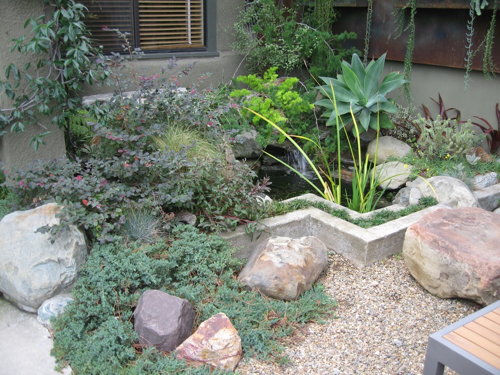
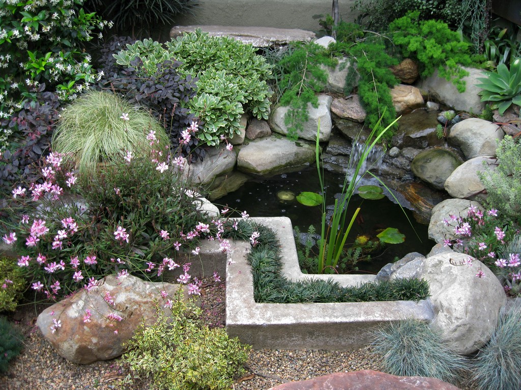
Details are important in small-scale projects such as this one. A tiny rug of Korean Grass, for example, anchors the S bench with a change from the gravel, providing a seductive texture under foot. For it’s part, the pond is a combination of natural looking rock clusters juxtaposed with a zigzagging concrete planter filled with dwarf Mondo Grass.
Gardens in this kind of “up close and personal” setting come with a responsibility to choose materials that will hold up to the microscope of intimate inspection. It certainly is a myth that a small garden is more affordable or easier to develop than a large garden. In fact, often quite the opposite is the case.
One day my daughter Brie was shopping for boulders and called describing a perfect russet-colored sitting boulder that she had discovered. She wondered if I would support her bringing this new-found treasure home: It has since become a perfect counterpoint to the zigzag shape of the pond front.
FINAL TOUCHES
After the hardscape was completed, it was time to concentrate on the plant palette – one dominated by succulents and microclimate-appropriate material. We looked to the most dominant need and searched for a mature tree to serve as a linking element from the house to the garden. I loved the notion of a tree with a weeping structure to repeate the cascading look of the planter boxes and we found a beautiful Tolleson’s Weeping Juniper specimen.
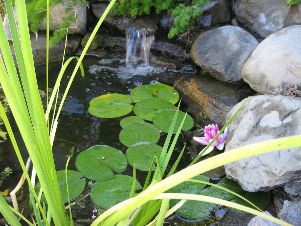
| The pond sits just outside my office window an provides just the right amount of sound to fill the space and help me keep the noise and pressure of urban life at bay. |
We also opted for low maintenance, selecting Dwarf Pittosporum ‘Crème de Mint,’ Pittosporum tenuifolium ‘Silver Sheen,’ Asparagus macowanii, Loropetalum, Cotinus and False Aralia.
In the end, my daughters and I converted this small slice of suburbia into a tranquil meditative space filled with plants, hardscape, water and many forms of artwork.
I enjoy watching the birds bathe at the top of the small waterfall. And I no longer gaze out the window of my office wishing for privacy while being holed up inside: Now I’m drawn out into my garden retreat and immediately enveloped by a sense of peace, comfort, satisfaction and pride.
Ketti Kupper is owner of Conscious Living Landscapes and owner and creative director of Ketti Kupper Art & Design in Los Angeles. She received her bachelor’s degree in fine art from Brigham Young University and her MFA in visual art and painting from the Vermont College of Fine Art Widely published, she has also been featured on HGTV and taught university-level courses in painting and design. She may be reached through her web site: www.KettiKupper.com.


