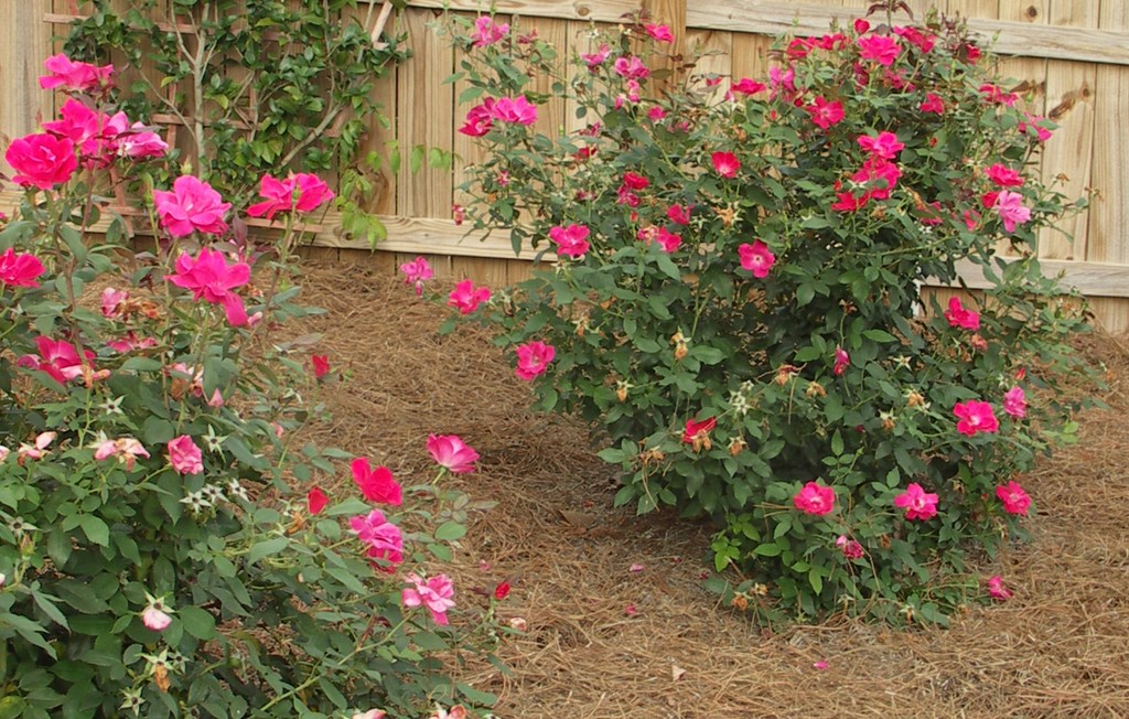
Inside Out
It has always bothered me a bit that designers tend to restrict their thinking to just the physical area that fits the definition of their design specialty. Landscape designers stick to outdoor spaces and interior designers work on interior ones – and seldom the twain shall meet.
To my way of thinking, that’s shortsighted – which is just one of the reasons I’m both a landscape designer and an interior designer. I would argue that, when it is appropriate, professionals on both sides of the divide need to open their eyes and work with the visual flow through and between clients’ interior and exterior spaces to achieve optimal design results.
As landscape professionals, we already accept the importance of the “borrowed view,” a wonderful term used to describe the deliberate capturing of other properties’ assets by creating living or artificial frameworks that make them an artistic component of our clients’ landscapes. If we are good at capturing neighboring views for our landscapes, I’d suggest it’s a short step to make certain that we achieve the same sorts of wonderful views between the interiors and exteriors of our clients’ own homes.
I’ve discussed this issue with many landscape designers, and I often sense a reluctance to ask clients for tours of the insides of their homes. After all, they seldom invite us in when we arrive for initial meetings – and in fact we are mostly led around the house and directly out to backyards for these sessions. Basically and through no fault of their own, we’ve let our clients pigeon-hole us in a way that, I think, greatly limits our effectiveness.
PEEKING INSIDE
I’m all for breaking out of that box with the firm belief that, once we include consideration of homes’ interior environments and views in our landscape planning, we qualitatively improve our projects and, as an added bonus, give our clients more pleasure and a greater appreciation of their overall home environments.
To get started on this all-encompassing design path, this is all you need to do: When scheduling initial meetings with new clients, explain to them the importance of your coming inside their homes to view their landscapes from all the important windows and doorways.
I see it as a means of adding value to the process right from the start: Explain that, with this information in mind, you will be better able to locate some of the major elements in their new landscape so they can be viewed from indoors as well as outside. If they resist, remind them that the weather is not always conducive to walking around or sitting in the garden but that they can enjoy delightful garden views year ’round from their climate-controlled interiors.
Now set the conceptual stage: Talk about the overall need for flow with respect to color, textures, styles and attitudes – and about the importance of unity and rhythm in your work. By discussing these key points up front, you prepare your clients to let you inside on your first visit as a matter of course.
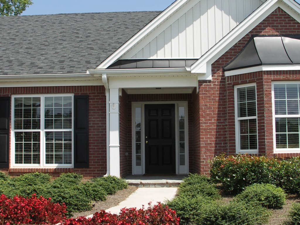
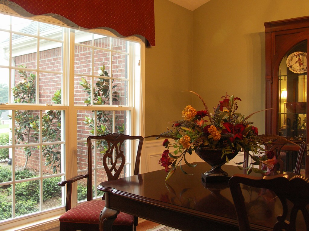
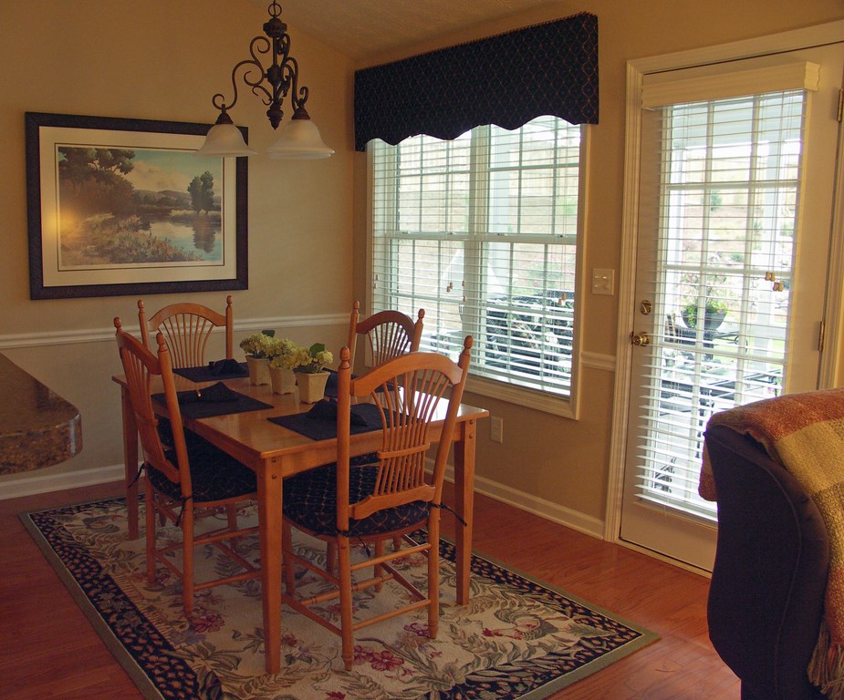
| The home’s exterior is nice enough, but it’s not much of a springboard for an inspiring landscape design. This is why I like to get inside and have a careful look around, because the colors that work inside can often be transposed to the outdoors in ways that visually bonds the two spaces – as in this case with the reds of the ‘Gin’ Begonias I borrowed from the window treatment and furnishings of the dining room). |
And if they don’t offer a tour at first, do not fail to ask when one will be convenient. The aim here is to be persistent and get the information you need to do your best work without, of course, placing clients in embarrassing positions courtesy of dirty laundry on the floor, unmade beds, messy kitchens and more.
When the opportunity comes, take the tour and always keep your clients with you. Ask them to identify their favorite views, where they like to sit and read and where they dine when alone or with guests. Ask about the times of day in which they use the interior spaces – very important. Maybe you’ll discover that a client would love to use a certain space as a daytime reading nook but that strong sunlight renders the space unusable. That’s a problem you might be able to solve with proper plantings – or, if you want to preserve a view, with an interior window film.
Have a camera with you for these meetings and ask permission to take photos of the important window views as well as shots of key interior furnishings. Explain that these photos will help you remember things once you are back in your office, hard at work on their plans.
THE DRAWING BOARD
As you move through clients’ homes, you’ll pick up all sorts of significant information that will add detail and nuance to your work outdoors.
Perhaps your client wants to watch birds from the window over the kitchen sink. Perhaps it’s a view and the sounds of a waterfall from a favorite reading nook or the desire for a white, scented garden outside the bedroom door. (A word of caution: As you explore, never push clients to state what they want to see from any viewpoint if they can’t immediately express themselves. This can take you down blind alleys in a hurry.)
Of all the benefits that flow from these initial meetings, perhaps the greatest is that you and your clients will become comfortable about working together on a bigger picture than they probably anticipated. Sometimes this new perspective will incline them to latch onto something clearly beyond the budget or unsuitable for the site, and now’s the best time to clear up any misconceptions about what they can expect. Ultimately, what you see and hear on this larger interior/exterior playing field will help you come up with designs they’ll like.
Keep your eyes open at all times and make notes so you don’t forget colors, textures and design styles you see inside. Also note any eyesores you see through the windows and doors: In many cases, you’ll be able to screen these from view.
When you get back to your office, study your notes and the photos you took along with a base plan of the property. Now’s the time to make it all work by balancing the information you’ve gathered against a range of basic design considerations:
[ ] Color is the first thing our eyes see, both indoors and out, and is the logical starting place in devising visual connections between indoors and outdoors. When you were inside the home, were you able to discern your clients’ preferences? What about the exterior color scheme? Does it flow well with the interior colors, or do they fight each other? Don’t hesitate to suggest making a change with exterior colors so long as it complements the style of the house and fits within the context of the neighborhood.
The easiest way to create visual unity for your clients is with color repetition. If I discover that a client tends toward red in home furnishings, for example, I will generally recommend its use outdoors as well. If another client’s interior design features neutral colors, I’ll shy away from an overabundance of strong colors outdoors and will consider instead a monochromatic plant scheme with hardscape elements done in a single neutral color such as black or bronze.
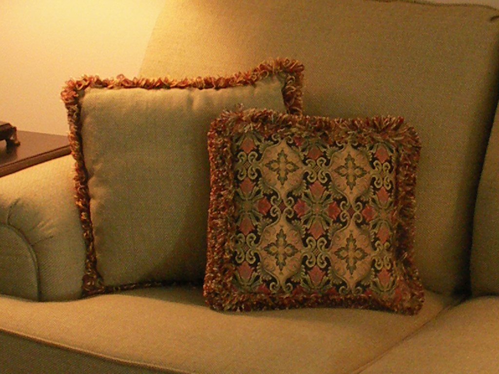
| Design cues take many forms, from paintings on walls and window treatments to wall-paint colors and highlights found in throw pillows or carpets. These bits of information add up to tell me a lot about colors and color combinations that put my clients at ease and therefore have a distinct, probable value when I work with the same hues outside as well. |
The hardest projects and the toughest clients to please are those in which the home’s style is in direct conflict with the furnishing styles and attitudes. If you don’t get a strong sense from these clients about their real preferences, I’d suggest thinking twice about even accepting the project: These situations can be rough in that it is hard to please the clients and do good design work at the same time. And if you do tackle such a job, I’d suggest that color will be your best bet for ensuring a sense of unity.
[ ] Attitude and style encompass the next most logical way to link interior and exterior spaces. Obviously, if the interior of the home is furnished as a rustic mountain retreat, it’s unlikely you’ll propose a formal Italian garden in the backyard.
As you look at the interior, you need to fine-tune your observations. Are the furnishings predominantly composed of simple, straight lines in a Modern, Scandinavian, Amish or some Asian style? What about accessories or the lack thereof? If the lines are simple and the interiors light on decorative touches, it’s likely your clients will be happiest and the interior and exterior spaces will work together better if you keep the landscape design simple and uncluttered.
By the same token, if your clients have a traditional farmhouse or a low-country house or a cute cottage, you’ll probably see some friendly clutter indoors. If so, consider more of a busy cottage-garden look for exterior spaces.
[ ] Texture comes next in my list of considerations. If my clients’ windows are framed with drapes with large-scale prints, I would not be inclined to give them a backyard full of petite florals and neatly trimmed Boxwood hedges. Instead, I would take my cue from the window treatments and have key plants that pick up on the large scale of the interior décor. I would use a variety of textures in both leaf and flower sizes just as I always do, but the bolder highlights will make a difference in unifying indoor and outdoor spaces.
[ ] Outdoor furnishings‘ styles and colors should blend with interior pieces both to create unity and flow through repetition and also to give your clients the option of moving chairs and seats from inside to outside and vice versa. This is a huge asset when it comes to party planning.
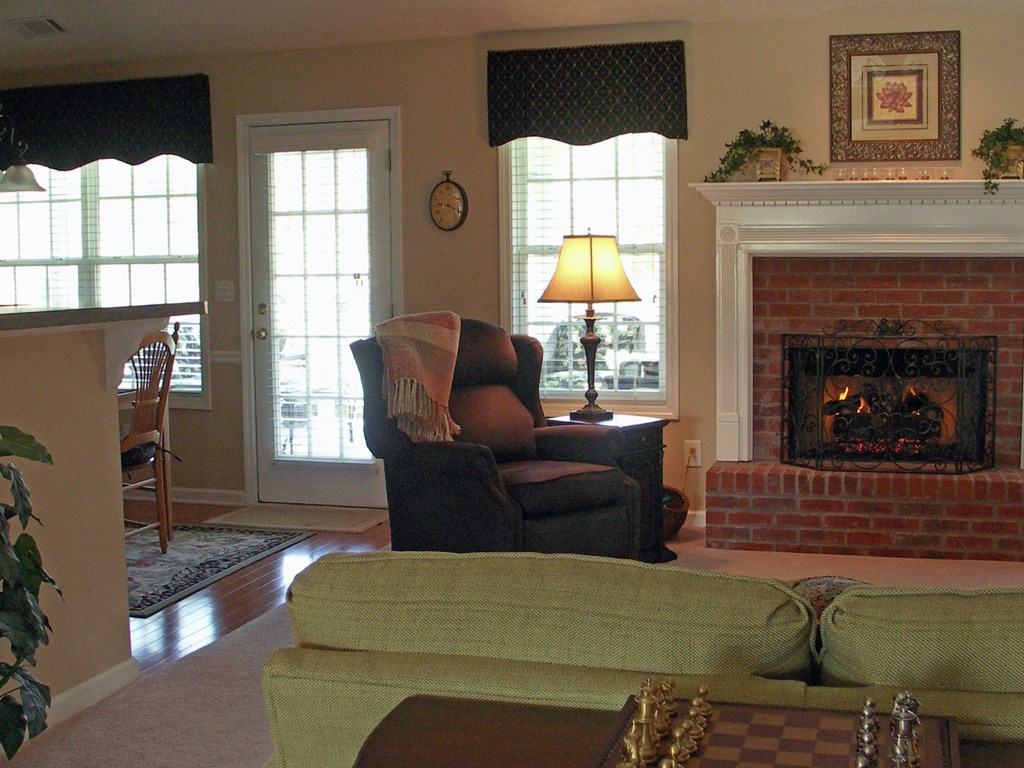
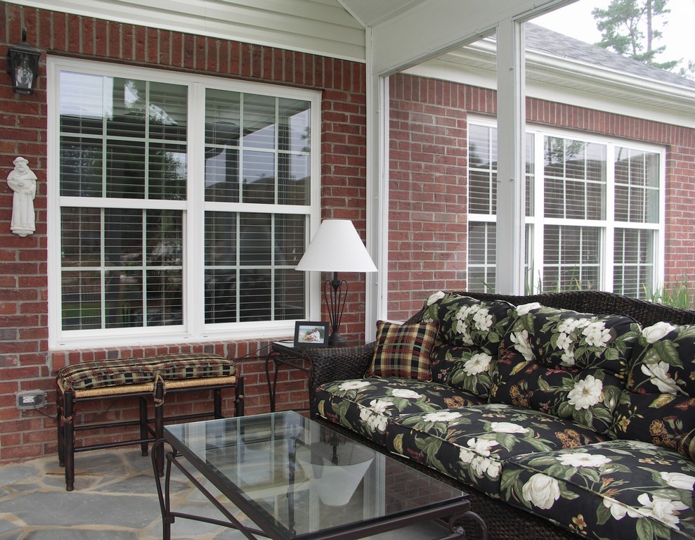
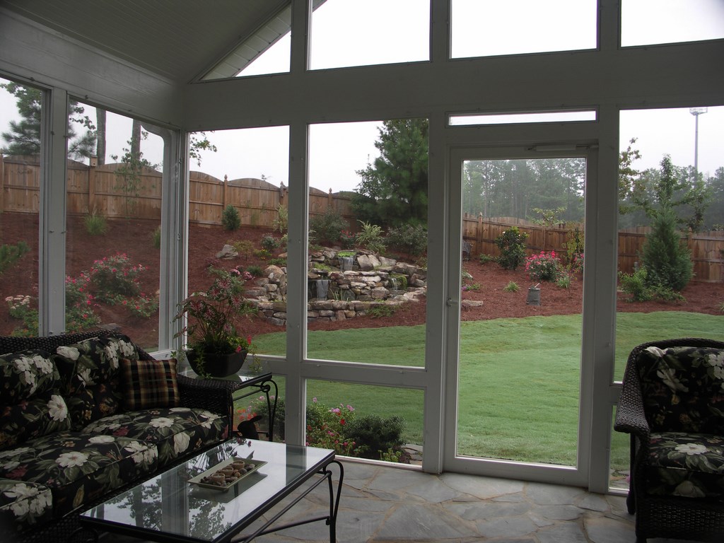
| In this case, an enclosed porch serves as an intermediary between inside and outside, a golden opportunity to bridge visual gaps in both directions. The metal furniture on the porch, for example, relates to the bronzed amenities outdoors, while the fabric of the furniture picks up interior colors from the carpet, fireplace and walls that also now flow through into the backyard. |
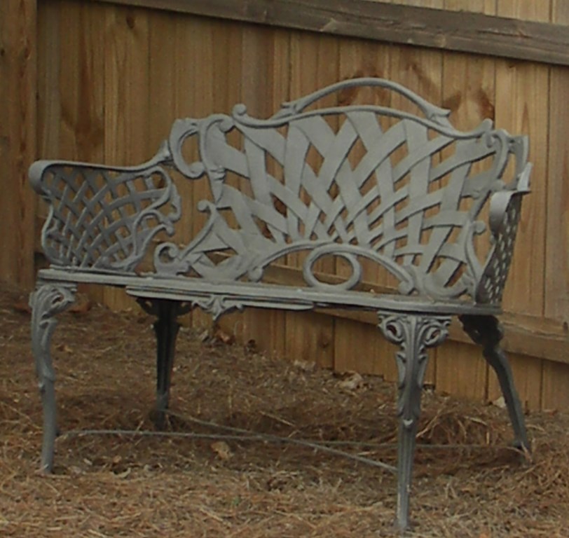
Another trick with outdoor furnishings is to paint the metal pieces to match the home’s metal interior accents – a subtle unifying touch. At the moment, bronze is a favored metal finish for interior lighting, faucets, door hardware and more, so why not let it flow to the outdoors as well?
Think in layers, too. Just as an interior designer will layer fabric prints indoors, carry that concept out the door and into the landscape. Unifying colors will certainly be of benefit here, but it helps if your clients also see different patterns and changes in scale.
Also consider views from key areas in planning outdoor functionality: In looking out breakfast-nook or dining-room windows, it’s probably not the best idea for your clients to be looking at another dining area. Instead, break away from redundancy and rearrange outdoor furnishings to avoid this undesirable form of repetition.
[ ] Accessorizing in the garden is another great way to blend interior and exterior spaces. If the kitchen and the breakfast rooms have a rooster theme, then consider adding a few decorative roosters to the garden. And depending upon the color palette, you may want those roosters to be colorful and folksy in style – or perhaps very sophisticated bronze pieces.
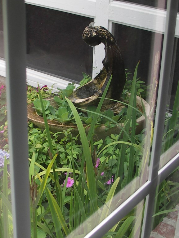
Fountains and watershapes are fine accessories as well, especially if they are visible from several angles and are attractive from all sides. This way, your client sees one view while out in the garden and another while looking through the windows.
All too often, these water elements are either placed way out in the backyard (so they can be viewed from all the windows) or shoved right up against the house (so their sounds can be heard). Why not compromise? Place a pond or fountain where it can be seen and heard from just one or two major window views, or frame it in a major window to make a dramatic statement.
[ ] Lighting is more often neglected in the garden than it is indoors. That point aside, it’s wise to balance the outdoor lighting to the same comfort level your clients enjoy indoors. If they like low lights and seem to prefer task lighting to general illumination, then they’re unlikely to be happy with a backyard lit up like a stage. Instead, think in terms of occasional, soft lighting to point out steps, a path’s directional changes or a tree’s silhouette.
FINAL TIPS
When working on my projects, I try to consider all of the above factors as well as any special considerations for specific situations – for instance:
* In some cases, you need to pay attention to exterior walls that are viewed from inside the home. Often these are garage walls that are visible from dining rooms. If the interior room is formal in style, then exterior plantings in front of the wall will look best if they are somewhat formal as well.
In this context, it’s helpful to think of windows as picture frames: When you look out a client’s window to the landscape, your eyes pick up the interior wall’s color, the window trim color and any window treatments before they reach open air. In other words, these details become part of your landscape imagery, and it’s your challenge to make everything work together.
* With older clients, recognize the fact that for many of them, increasing age will limit their capacity to get outside and enjoy your work. Not only does this put a premium on enhancing views from inside to out, but it also requires some sensitivity in working with them and setting expectations.
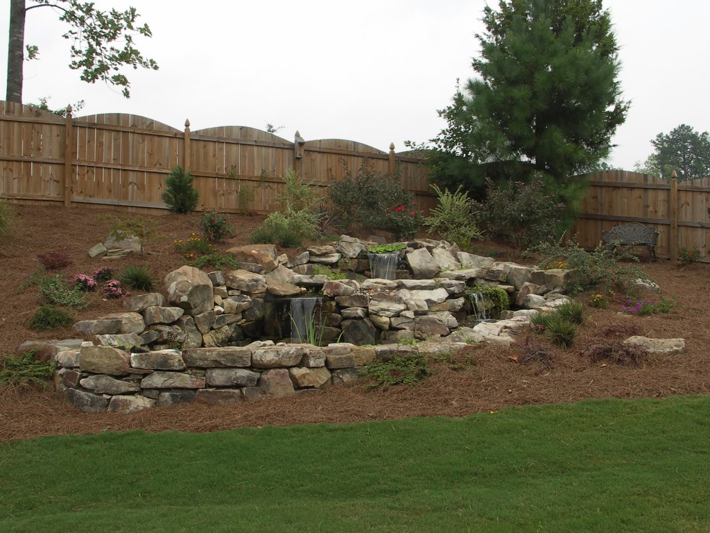
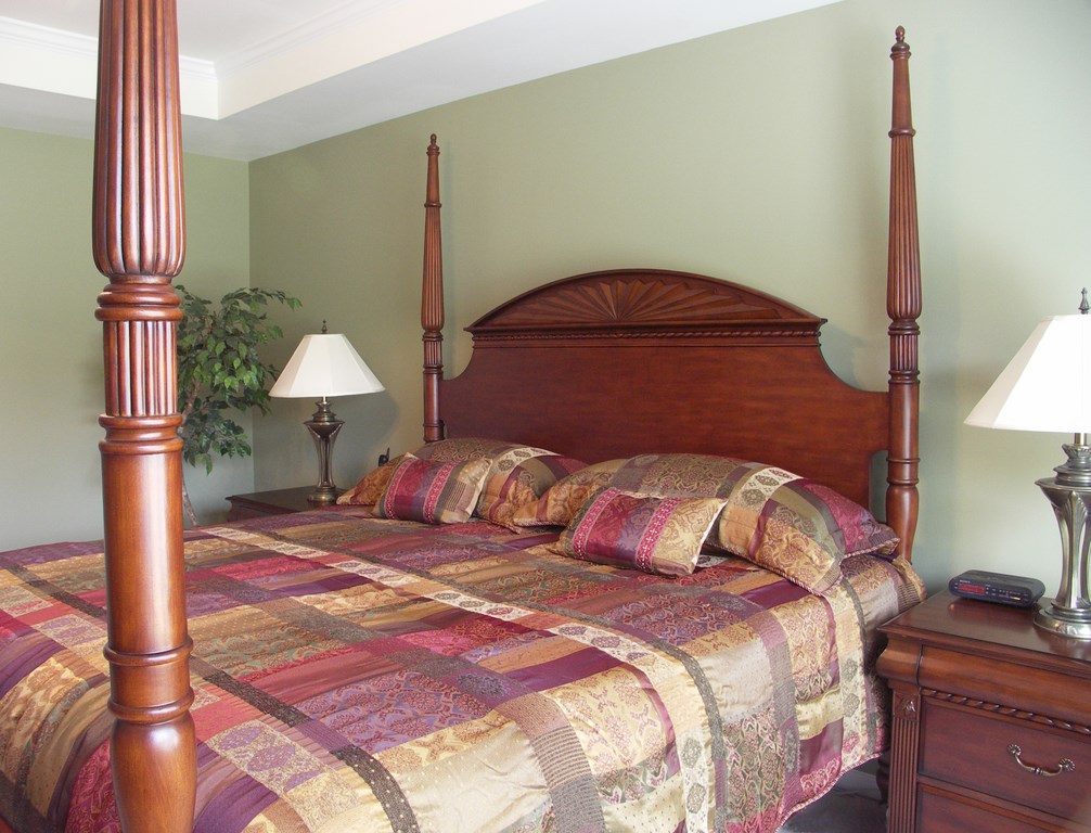
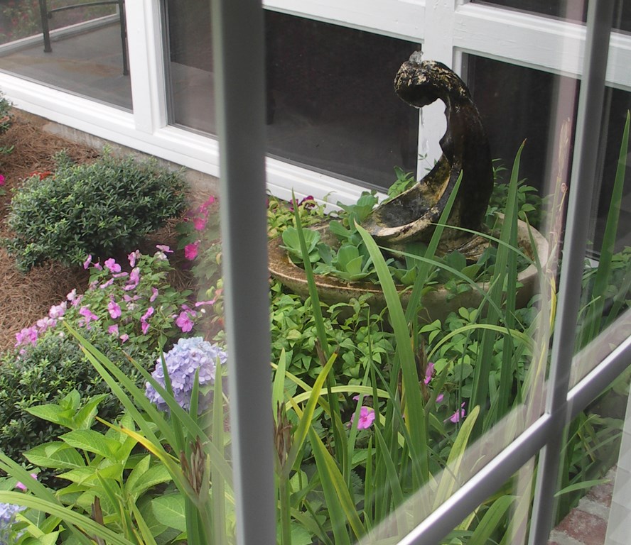
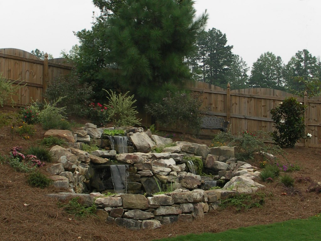
| The bedroom is a key source of inspiration for this exterior design, with the bed’s soft colors translating to the bedding plants that surround a small fountain just outside the window as well as to the selections (‘Homestead Purple’ Verbena, ‘Knockout ‘ Rose and ‘New Gold’ Lantana) that make appearances around the pond. Note that the bedroom affords the best view of the pond, which has been placed in an intermediate position to one side rather than right next to the house (the small fountain lends the sound in this setting) or off in the distance where it could be seen to equal advantage from everywhere inside the home. |
* If homes in a neighborhood are close together or sight lines are particularly direct, remember that a neighborhood as a whole benefits from a sense of visual unity and flow. You certainly don’t want neighbors’ house colors and garden styles to dictate what you do; by the same token, you don’t necessarily want what you do to clash harshly with the looks of surrounding properties.
* If the home you’re working on has a porch, consider them as the first outdoor room and a key transitional space from the interior, climate-controlled space to the great outdoors. Suggest that lower panels be transparent, just like the top ones, so they can appreciate the landscape top to bottom – and suggest the use of removable plexi-glass panels to extend the utility of the porch into colder weather.
Beyond all of this, be aware that basic color theory can be applied to all design specialties. Don’t be afraid to suggest a different front-door color, for example, and if you lack the training and confidence to suggest changes in exterior house colors, collaborate with a professional who does.
Most important, always listen to your clients and work closely with them to create a seamless blending of their interior and exterior environments. If you’re successful, they’re likely to gain even greater enjoyment from both settings – or, better yet, will simply consider it all as one.
Mary Donovan, ASID, CAPS, owns and operates Donovan Design in the northern suburbs of Atlanta, Ga. With two different college degrees – the second earned later in her career – she handles interior, exterior, and landscape design projects for residential clients. Donovan is a Georgia State Registered Interior Designer, an educator and a public speaker. She is also president of the Association of Professional Landscape Designers’ Georgia regional chapter, which includes Georgia and both North and South Carolina. She can be reached through her website: www.donovandesign.net.


