Integrated Style
As the first columnist among several who will be writing in this space, I’ve been elected to explain what this “Material World” thing is all about. I agree with the editors that it does require some explaining – but not much.
The thought is that we in the landshaping business, designers and installer alike, seldom use a single material all on its own. Even a huge, monolithic concrete deck outside a grand office building will have ribbons of stone or brick to break up the monotony.
The aim of this and subsequent articles – whoever writes them – is to discuss the process we go through in selecting plant and/or hardscape material combinations that ultimately work together to become beautiful and seemingly effortless explorations of style, texture and color. In other words, we’ll be looking at projects for which all the pieces seem to fit just perfectly.
By following me through this analysis of how I selected the materials for this particular project, I hope to provide an approach that you may consider implementing the next time you’re in the position to make similar decisions about materials.
ARCHITECTURAL CUES
In my own business, I focus primarily on custom residential landscapes in ways that encompass everything from hardscape to planting design. My design philosophy treats all exterior design elements as one functioning, interrelated unit, which is probably why I was so eager to get involved when Stephanie Rose called me to discuss writing on this topic for the magazine.
Before I ever put pencil to paper, I do my homework, dismiss vague concepts and focus on developing a clear vision. This forces me to slow down, listen to my clients, carefully evaluate sites – and uncover clues that guide the design process and facilitate selection of materials, colors and finishes.
To me, it’s all about eliminating the guesswork.
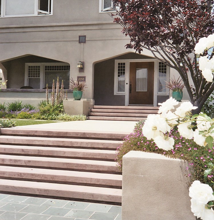
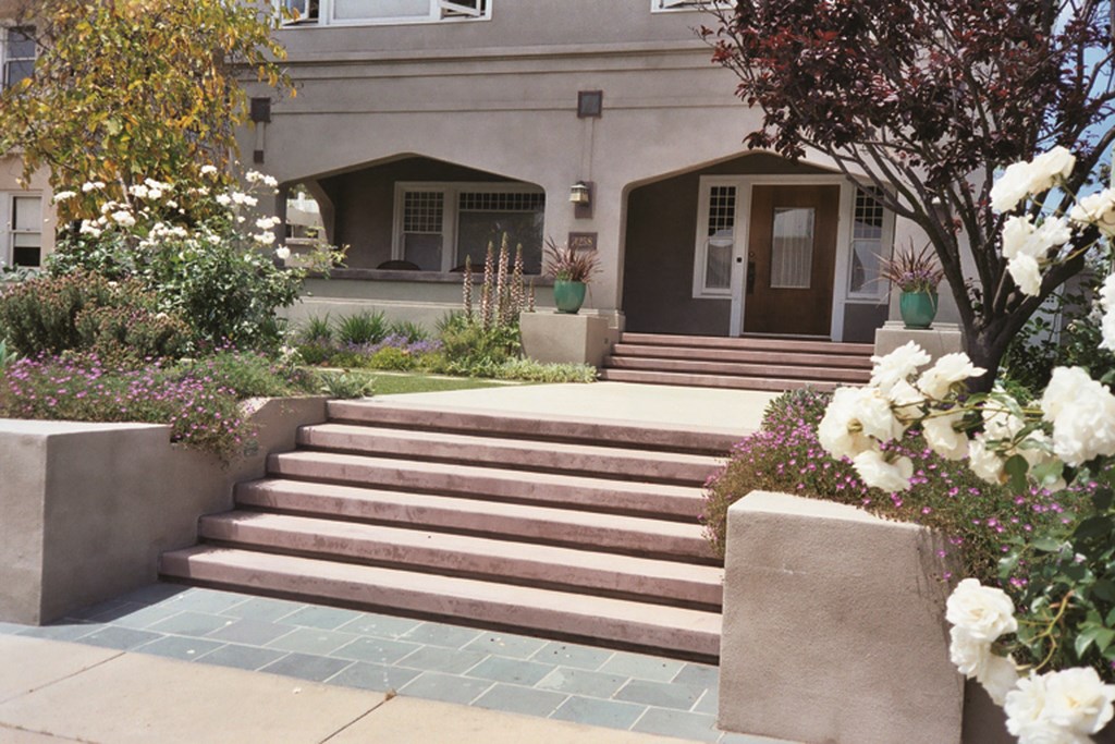
The residence seen in the accompanying photographs offers a good example of how my process works and the way I come to conclusions about the combinations of materials I will end up using. Built in the early 1900s, its distinctive architecture reveals an interesting collision of architect Irving Gill’s Mission/Craftsman style and an unusual Byzantine arch detail.
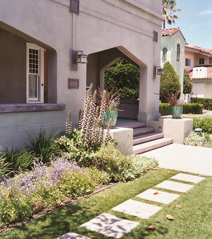
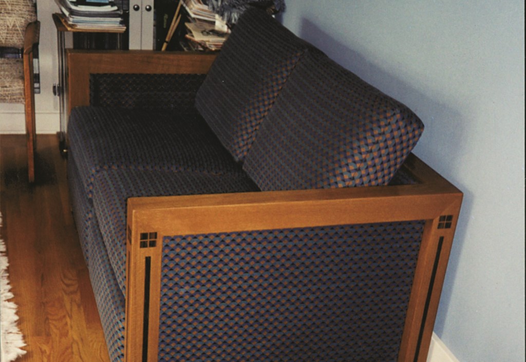
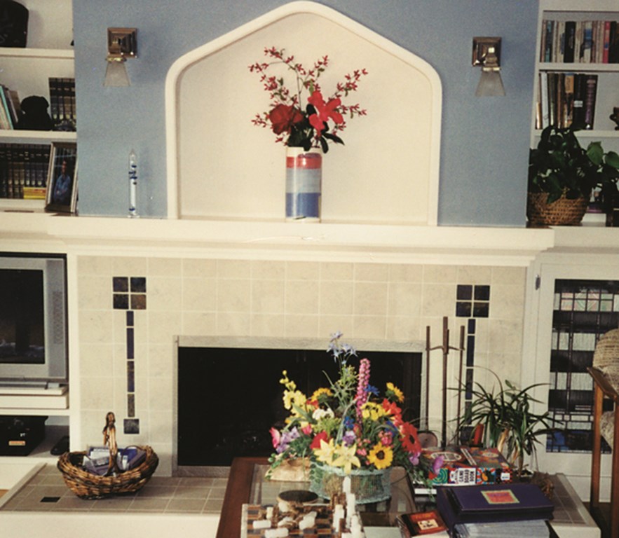
| The home’s architecture suggested several motifs we used in our design, with the Byzantine arches, the divided-light windows and the ‘Mackintosh Rose’ all figuring thematically in the new gardens, patios and other exterior spaces. |
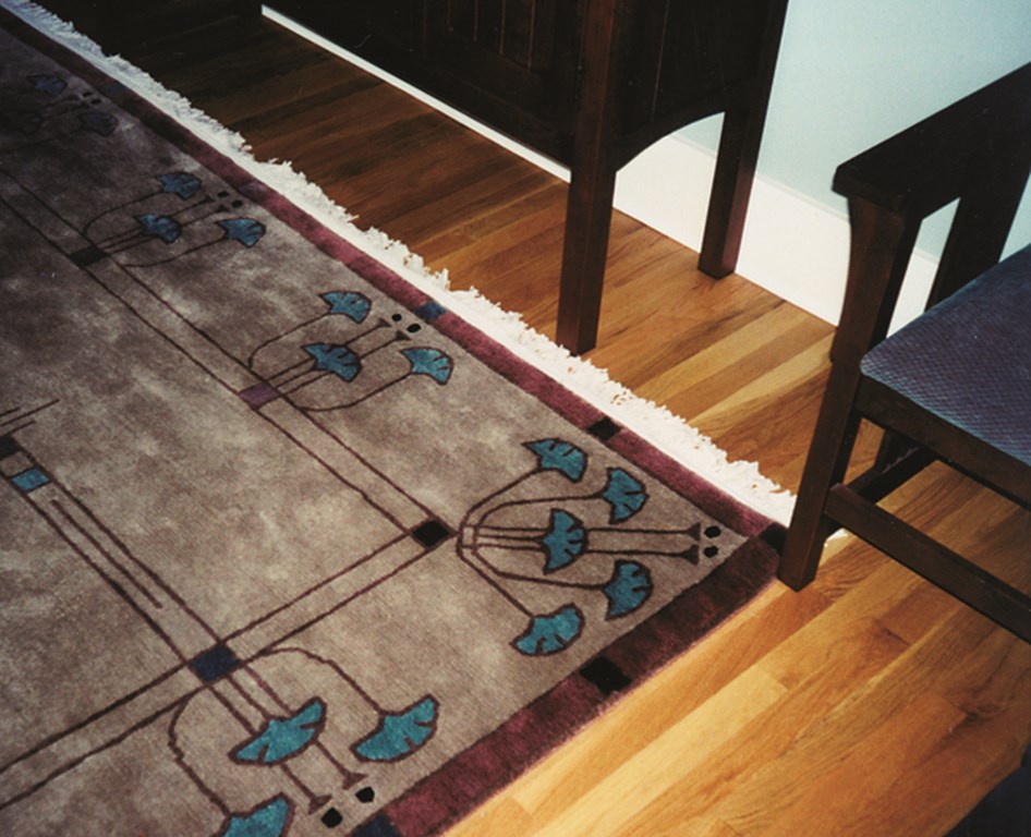
I was hired to remodel the landscape. As I came to know the clients, their obsession with the philosophy and artwork of the Arts & Crafts Movement became readily apparent – particularly their interest in the work of Charles Rennie Mackintosh, a leader of the movement in Scotland and Great Britain at the turn of the 20th Century.
Through the years, I’ve learned to listen to my clients, but I’ve also picked up on the value of analyzing what I see in the architecture and use it to keep the material palette simple and logical. In doing my homework on site, I note colors, textures and recurring motifs both indoors and out – anything I can translate to the landscape.
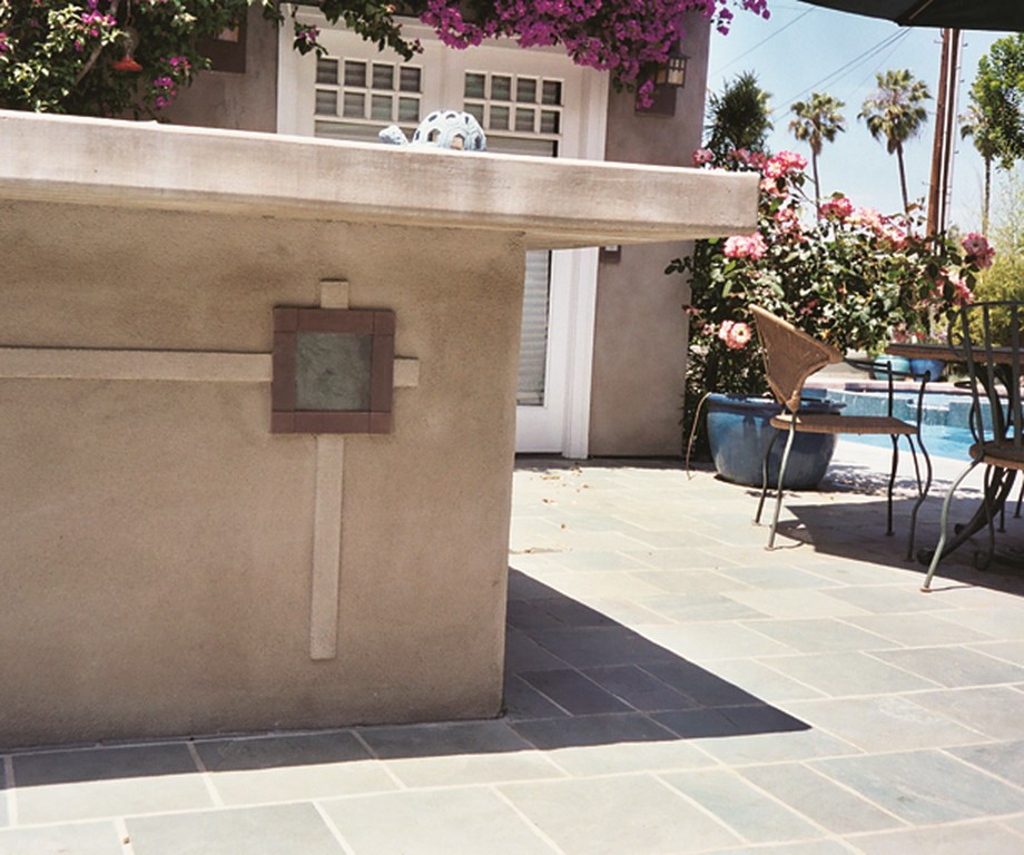
The home itself had recently been resurfaced with a natural-grey stucco and accented by a deep-maroon, cantilevered concrete wall cap on the front porch. I noted the square-grid details of the windows and, most important, a repeated detail in teal and maroon slate of the “Mackintosh Rose.” (There are many variations of this motif, but it’s typically a four-square grid suggesting a stylized rose blossom with a stem of aligned squares.) These were all the clues I needed to make material selections that came together in my preliminary layout.
NATURAL PROGRESSION
Even in these earliest stages, I was laying out the design with the materials I wanted to use uppermost in mind. It’s never an afterthought: I don’t do layouts and then plug in materials. Instead, I look at each material’s unique and inherent qualities and let it dictate how and where it is to be placed.
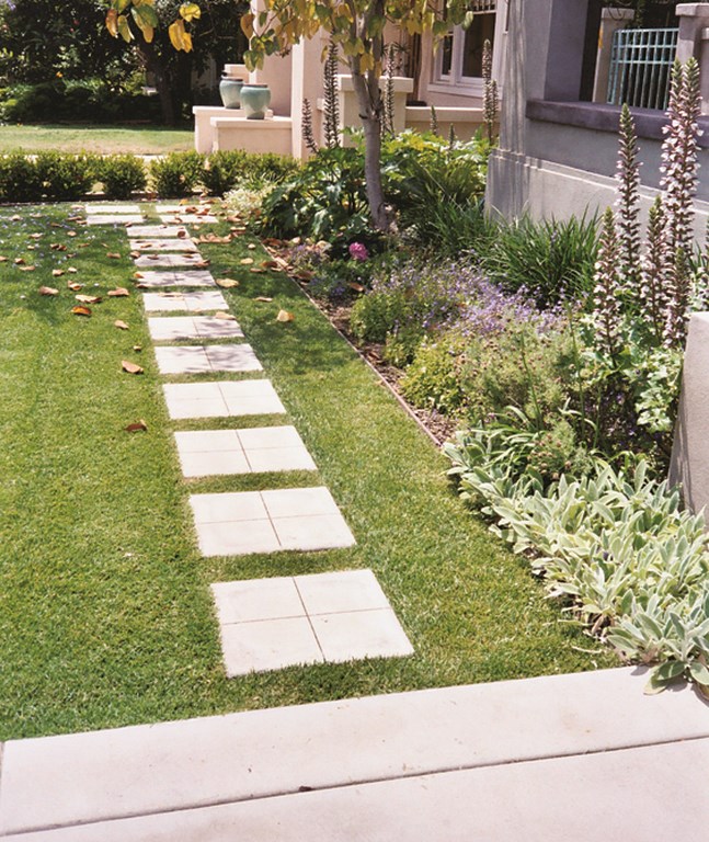
In this case, I mirrored the grey stucco on the house in color and texture by using natural-grey concrete with a sandblasted finish and saw-cut joints. This material’s flexibility was crucial, enabling me to form it in a pattern that matched the Mackintosh Rose motif with the steppers in the lawn. Moreover, the saw-cut joints crossed on each stepper afforded me an opportunity to repeat and reinforce the geometric pattern.
| The clients’ love for the Arts & Crafts movement is reflected in interior furnishings and finishes, so we picked up these details outdoors – as with the stepping pads along the front of the house, which pick up the Mackintosh Rose as well as the divided windows. |
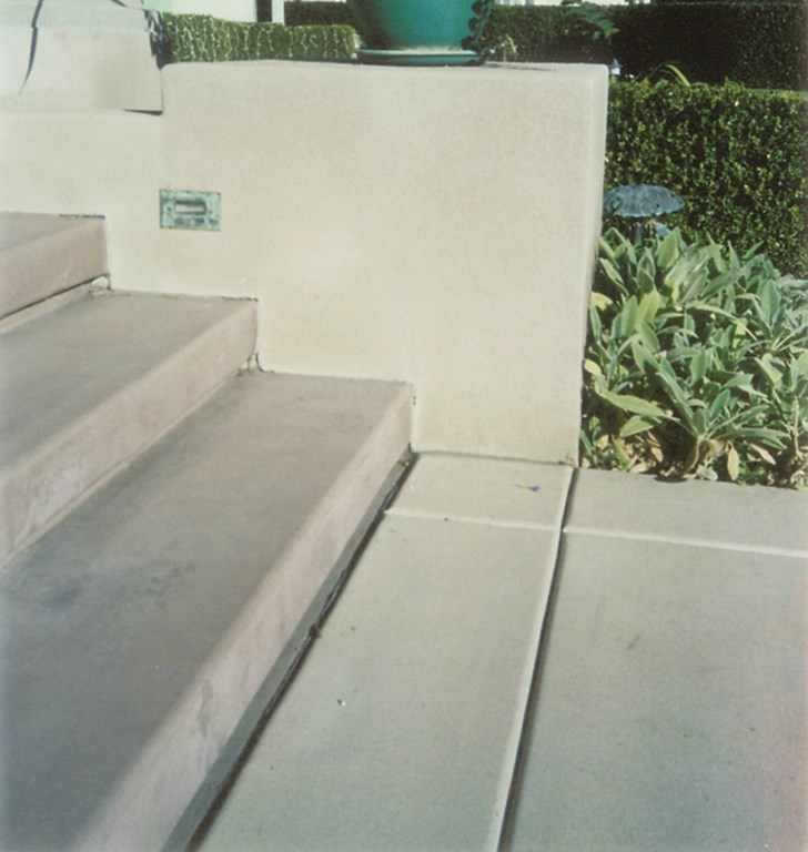
The next cue I took from the house had to do with the cantilevered concrete cap atop the front porch wall. This long, crisp line and its maroon color has been picked up in the new cantilevered entry steps, also in concrete. These are finished with a light broom finish, because sandblasting would have bleached out the color and revealed the hairline cracks that frequently develop in cantilevered concrete details. The change in color and the smooth finish are a great contrast when juxtaposed against the sandblasted grey paving.
| We worked the basic design motifs into the project in a number of materials, working with the home’s colors (mostly grays and greens with occasional accents) to compose a setting in which everything is sensibly integrated into the overall vision. |
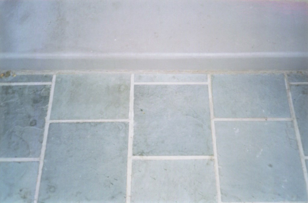
The final flatwork material is Cloud Green Slate. (As a rule, I try to have no more then three materials or textures in the flatwork. Any more than this, in my opinion, looks too busy.) Although I rarely use slates or travertine in exterior applications to avoid the excessive shaling, mineral deposits and fragility of many of these products, I have found a few that are dense enough to withstand the rigors of weather and exterior applications.
Cloud Green’s deep and consistent green slate tones beautifully compliment the maroon concrete steps. We also used a natural-grey grout and sanded it so that in areas where the natural-grey concrete paving abuts the slate, the concrete’s grey color and sandy texture flow into the slate’s grout lines, offering a gentle integration of materials. Where a matching grout would neutralize the slate’s running-bond pattern, the grey grout emphasizes this feature.
ALL-ENCOMPASSING
The grey concrete steppers continue around the house and lead you to a small sitting area paved in Cloud Green slate. A large, freestanding pergola screens the view to the two-story home next door. Even here, the poured-in-place columns are consistent, done up in natural grey with a sandblasted finish.
|
Material Recap [ ] Concrete Flatwork: Natural Grey with a sandblasted finish and saw-cut joints[ ] Concrete Steps: Cantilevered, with integral color to match the existing cantilevered wall cap [ ] Slate Paving: Cloud Green laid in a running-bond pattern with natural grey grout [ ] Stucco: Natural Grey, sanded [ ] Tile: Italian glass, one-by-one inch in teal green and gold with natural grey grout [ ] Stucco Detail: Natural Grey with maroon paint to match the cantilevered concrete — M.M. |
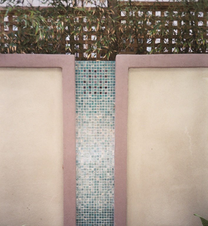
As a focal point beyond a sitting area that is also viewed from the dining room inside the home is a small fountain set in front of a six foot block-and-stucco perimeter wall. To add some style and integrate it into the overall theme of the garden, I expanded on a Mackintosh detail I found in one of my beloved books.
In this case, I placed a standard pre-cast concrete wall cap across the top of the wall; down the face, I finished the wall in stucco and painted it maroon. In the areas between pillars, I ran one-by-one inch teal-and-gold Italian glass tile and repeated a simple Mackintosh grid pattern with black glass tiles. The light shimmering off the small glass tiles creates the illusion of water running down the wall’s face.
Taken individually, none of these materials or colors or textures is anything to shout about. In the context of the clients, their home, its site and its architecture, however, they come together in extraordinary ways.
Melanie Mackenzie is principal designer and founder of Biomirage Landscape & Garden Design in San Diego, Calif. She entered the landscape design business in 1980 while pursuing a career in fine arts in Sedona, Ariz., discovering great creative possibilities in blending her background in the arts with the technical elements of construction and horticulture. Returning to school to study landscape architecture, she accepted an internship at Wiley Group Landscape Architecture in San Diego, where she worked and studied for eight years. Mackenzie started Biomirage in 1992, focusing her efforts on creating highly personalized, custom residential gardens.


