Roadside Attraction

Some projects grab you right from the start, and this was definitely one of those cases.
As the principals at Herzog Development Corp. explained in our initial meeting, their new development was to be a “golf course community with a rustic feel, but refined.” To embody that refinement, Don Herzog and his son, Daryl, wanted some sort of elaborate waterfeature – something that would break the monotony of the stark, flat terrain of northeast Dallas County and welcome prospective homeowners and guests to a new planned community.
My Dallas-based company, Elite Concepts, specializes in design and construction of just this sort of high-end water environment. We had worked with this developer before on some interesting projects, and we were in on the ground floor for this one. I like it that way: Being involved from the concept stage forward familiarizes me with all project parameters (rather than just my small part of it) and allows me to come up with a fully integrated finished product.
That involvement was particularly helpful in this case, because the desired watershape was to convey not only a specific message about the aesthetic values of the development, but also about the quality and sophistication of the developer.
FOUR-LANE SCALE
The main entrance where the signage and waterfeature now stand is located along a well-traveled highway. The Herzogs saw their highway frontage as prime space for promoting the special qualities of the development – if presented properly, that is.
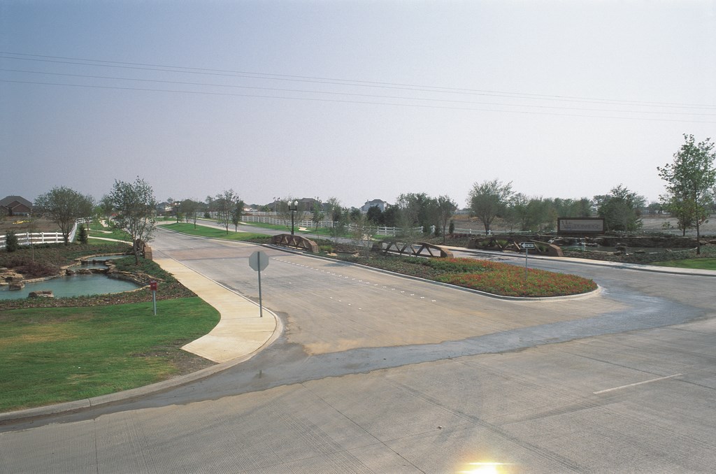
Farmland bordered the road for several miles in both directions, so the waterfeature would have to be visible from great distance if it wasn’t to pass by in the blink of an eye. Proposed access to the community was to come by way of a pair of two-lane streets (one an entrance, the other an exit) separated by a median. The waterfeature, we agreed, would front the existing highway and straddle the access roads as three ponds – including one on the median.
Obviously we were talking large – but just how large was something I didn’t completely grasp in my initial drawings. That initial plan featured a mere 300 square feet of water surface – which quickly evolved in a second meeting to a project that included 3,800 square feet of water surface over nine elevations.
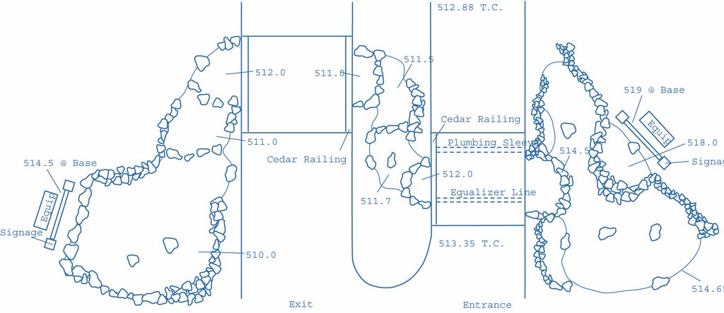
Suffice it to say that this new design was larger in just about every other dimension as well: three separate bodies of water, each with several separate basins on different elevations, the largest on the entrance side, the smallest in the median and the other on the exit side. Together, they give passersby the illusion that they are connected to one another, as if by a natural stream.
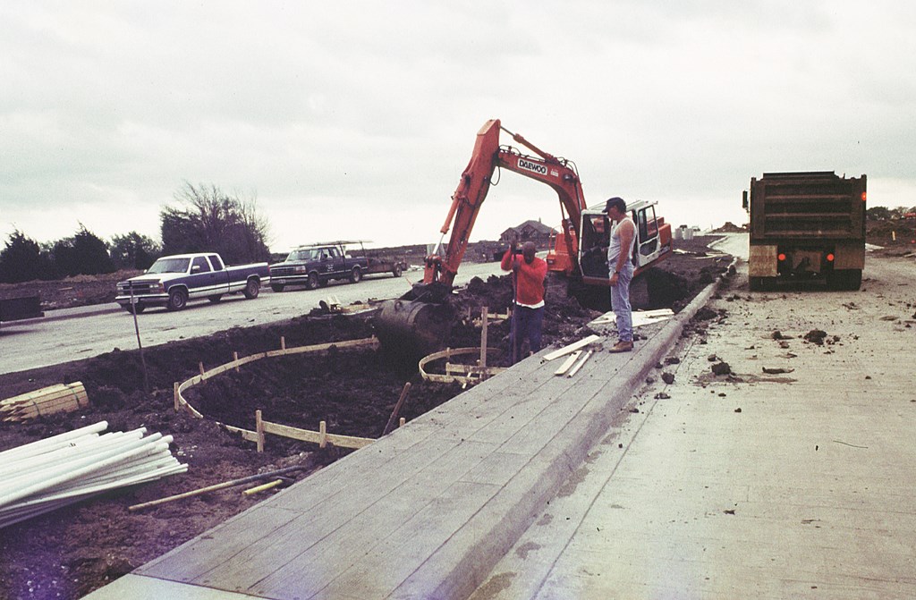
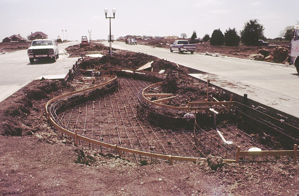
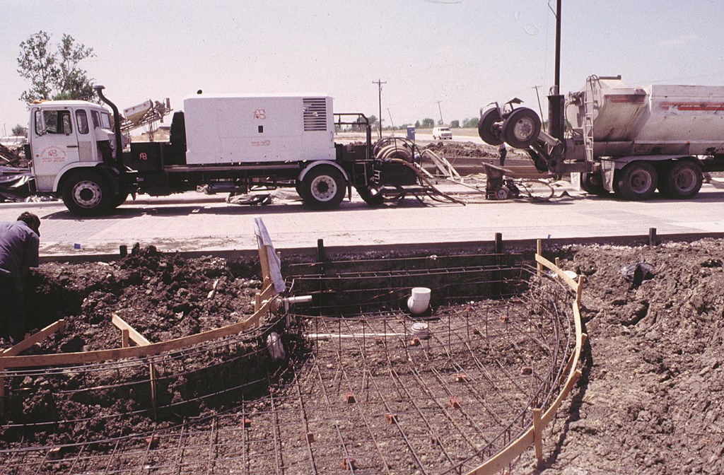
| We didn’t think much of it going in, but working around (and under) the existing access roads without damaging their concrete stampings or curbs offered some special challenges. First, it meant we had to place our track hoe on the 10-foot median rather than on the roadway (left) – a less-than-ideal situation for the operator, who let us know exactly what he thought about his ‘perch.’ Second, to preseråve the sense that the median pond was actually a streambed linking the two larger ponds, we ended up doing some tight curves and tricky forming in the 10-foot gap (middle). Fortunately, everything we did here was helped by a bit of preplanning – and the laying of sleeves and equalizing lines beneath the roadways before our phase of the project began (right). |
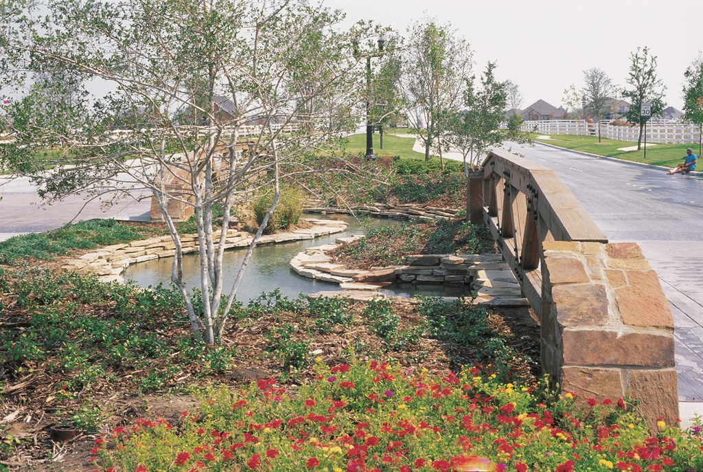
The key word here is “natural.” The community was to be called Woodbridge to reflect its rustic sensibility. Appropriately, a faux-wooden bridge with a rough, cedar railing was to be incorporated with the access roads and signage – a project that kept a concrete-stamping crew busy for quite a while.
Elevation and highway department restrictions wouldn’t let us install a true wooden bridge, but we knew we’d have to suggest that a stream connecting the ponds flowed beneath the timbers. Real or not, what better way to complement a wood bridge?
CLOSE WORK, WIDE-OPEN SPACES
Once I’d gotten a fuller sense of the scale of the project, drawing up the plans and then selling the idea were easy – particularly because the developers had a good notion of what they were after and had conveyed it to me clearly. Now it was time to deal with the details – including the site itself.
This is where we ran into our first surprise: As we shot the grade, we realized that the site-topography plan we’d been provided was a bit inaccurate. There was simply not as much change in grade as we’d been led to expect.
Theoretically, the plan would still work, but the existing grade fall of just 18 inches from one side of the access road to the other meant we’d need to tuck some of the water effects into a relatively small grade change – and deal with things like curbs as part of the bargain. Yes, it was a “grade change” and it went in the right direction, but the final plan called for a 9-foot drop from one side of the feature to the other, and we hadn’t counted on such a gradual transition across the median strip.
At a minimum, we knew we were in for a bit more preparatory work than we had originally thought.
At first glance, the site, which spans more than 220 feet from side to side, seemed to give ample distance to achieve the proposed grade change. But the access road filled about 100 feet of that span and was, with just an 18-inch drop from side to side, painfully level for our purposes. What this meant is that we would have to pack the 9-foot grade change into a fairly short distance without making any part of the structure seem as though it shot abruptly out of the ground.
Pushing the task at hand back into focus, we moved to the 10-foot median and set up a spot as our elevation benchmark. This served a dual purpose: The slope across the median was basically level and would contain a single median pond; with this constant elevation set, we could do a bit of playing with the elevations above and below the median mark to get the effects we wanted.
The developers were very much involved at this point, because they needed to decide how to set up their signage with the most advantageous exposures to the highway. That in mind, we decided to put the high side of the waterfeature on the entrance side of the access road and drew up plans for the berm that would carry both the signage and our “natural spring” and its small pond. The low point would be near the center of the exit-side pond, backed up by a second sign.
(Decisions about the berm also factored in the planned construction of a convenience store on the highway just down from the entrance side of the access road. We all saw that a good-sized berm would hide the store from anyone turning onto the access road. It’s also interesting to note that the berm helped establish the visual proportions of the installation with respect to the surrounding area: The expanse of the surrounding flatland could easily have dwarfed even our massive waterfeature!)
A TIME TO BUILD
Once we finalized our site plan and basic design, grade stakes were driven and excavation began on the entrance side. We piled the spoils – that is, the clean, usable soil – in the berm area and compacted it in six-inch lifts at the location of the water-origination pond.
The access road had been set up well before we arrived on site, but enough was known about the waterfeature ahead of time that we were able to set up sleeves beneath the roadway to accommodate our planned plumbing runs. The sleeves were set at a 4-foot depth to prevent any damage during road stabilization and construction.
This is an instance in which preplanning (and even a bit of overplanning) was essential. Thinking ahead, we set an 8-inch equalizer line underneath the entrance side of the access road between the lowest pond basin on that side and the median pond’s first basin, again at a depth of 4 feet but with 90-degree turns at each end.
We also planned on placing drains in each basin and setting up each with its own plumbing; this would help us balance the various water levels and simplify maintenance. In addition, we set up for strategic placement of returns and bypasses that would enable us to enhance the waterfall effects, if desired.
| The site plan shows the multiple levels and meandering-stream effect we worked to achieve — despite obstacles presented by the roadways. |
In all, there are nine different water elevations on this project, six on the entrance side (and median) and three on the exit side. To dig the pond on the median, we had initially thought to stage the track hoe on the access road and load from there. We were worried, however, that the tracks might damage the newly stamped faux-wood road surface, not to mention the possibility of damaging the inside of the curbs. Ultimately, we decided to unload the machine onto the median itself and work from there, making the perch a bit precarious for our cautious operator.
The entrance pond, at an elevation of 514.00 feet on the plat, sits just below the origination pond at 518.00 feet. Even though the upper pond is only six feet in diameter, we set it on a pier anchored in the same bearing strata as the lower pond because the smaller structure was cantilevered over the larger one and we wanted to prevent any possibility of a hinging effect or a differential in movement.
We did this despite the fact that geo-technical inspections showed soil at the site to be only slightly sensitive to changes in moisture and to have a low potential-of-vertical-rise value. Although the piers were an expensive precaution, the good soils report enabled us to limit other costs by installing standard gunite shells. The cages used 60 #4 bars, 10 inches on center in each direction, with four-bar bond beams around the perimeters of all the ponds.
MAKING READY
Woven within the pond cages are more than 1,800 feet of 1-1/2-, 2- and 2-1/2-inch schedule 40 PVC pipe. The circulation system runs off two full equipment sets, one for the entrance side and the other for the exit side. There are sand filters for each side, with two 3-horsepower pumps on the entrance side and one on the exit side. The equipment sets are located behind the signage on either side of the road.
Even with the nine-foot elevation change and the 3,800 square feet of water surface, all we needed to do to manage the waterfalls was set up 42 total feet in weirs. We used the weirs to amplify the flow over the falls at specific points without the need for very large pumps.
As it turns out – and again despite all the changes in elevation – the check-valve requirements proved to be simple because the systems are designed to run 24 hours a day.
A single 2-1/2-inch flapper valve with a union was placed before the pump (and after the manifold). We also installed brass gate valves on each of the common lines; when closed, these prevent water-level equalizing during maintenance.
In the event of a power failure, there will be some equalizing on the common lines. This shouldn’t pose a serious problem, however, because in normal operating mode only two gate valves – those controlling basins on the lower levels of the system – are left open, so flooding will be minimized and contained in the overflow system.
True, additional check valves could have been installed to avoid any potential flooding problems. But beyond being what I consider an unnecessary hassle, the addition of more check valves would only invite line blockages, especially on the smaller pipes on the suction side.
We shot 8-inch-thick gunite floors along with 7-inch walls and 12-inch beams. We also shot two 6-inch-thick gunite retaining walls atop the beams. These walls were set up to deal with low-level lateral pressures we expected from the soil as a result of the extensive grade modifications made during excavation. No further structural work was called for, given the shallow depths prescribed for the ponds. These depth parameters greatly simplified the structural demands of the site and helped us keep down overall costs.
After the gunite was shot, we water-cured the entire pond complex for two weeks. A waterproofing agent was then applied to the stone ledges and surfaces below the proposed water line. Any gunite surface that was to be veneered in rock was covered with three coats of Thoroseal. After the final 24-hour drying period passed, our stonemason went to work.
OFF-ROAD ROCK
Pursuing our plan, we managed the transitions between pond levels by feathering out our stone walls. This tactic masked any sharp elevation changes across the relatively flat terrain.
The big challenge here was to set all this naturalistic rockwork without any visible mortar lines. The mason on the job – Charles Hetmer of Hetmer Contracting – was familiar with “chinking,” a method passed to me by friend (and sometimes partner) David Tisherman of David Tisherman’s Visuals in Manhattan Beach, Calif.
In this technique, stone is stacked with mortar on only the back three-fourths of the stacked surface, revealing the flagstones’ cleft edges and fissures but no tell-tale mortar. Chinking just about quadruples the time involved in fitting and setting the stones, but the results are worth it for projects such as this.
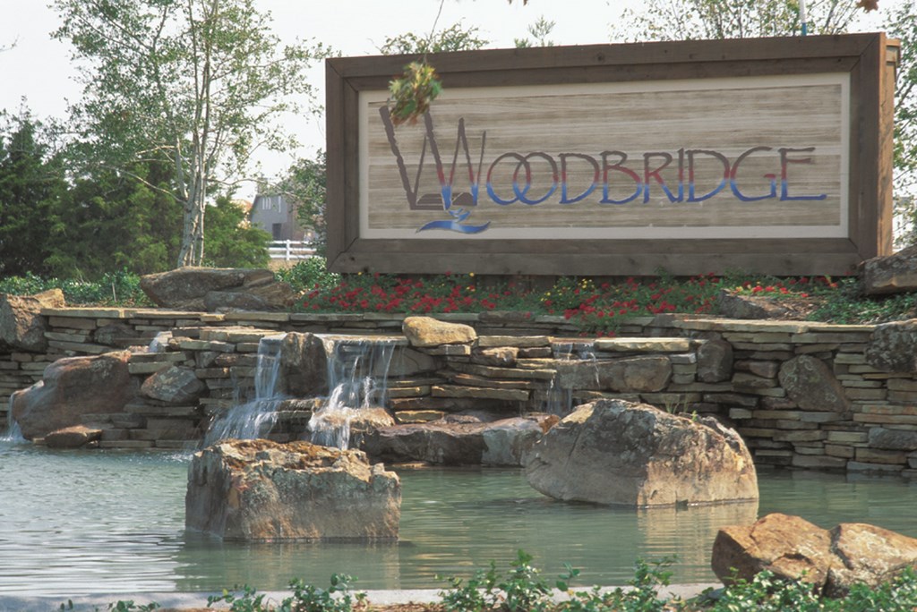
| I didn’t have a helicopter to work with, and I’ll admit to a certain amount of frustration with trying to photograph this project at ground level. Nonetheless, closer looks at the components of the installation offer evidence of the upscale, refined impression we were asked to make for the developers and their property despite its dusty, flatland setting. (Note, by the way, the flagstones – stacked and secured with no visible mortar!) |
By the time we finished, 20 tons of boulders and 50 tons of flagstone had been used in and around the waterfeature.
We detailed the pond’s edges by using the coping to retain the soil rather than cover the top of the beam. And where retainment wasn’t needed, we rolled back the beam to expose only a minimum amount of gunite and allow the landscape to push right up to water’s edge. We then painted any exposed gunite a dark gray to camouflage it.
Inside the ponds, we used Thoroseal tinted a dark gray for waterproofing – and to achieve a natural look. There are few (if any) rock pools or lakes in the Dallas area, so we took our cue from the mud-bottomed local waterways – but without their characteristic murkiness. A dark gray Thoroseal with some black dye added for good measure gave us the look we wanted. Three coats later, the basins were good to go.
As a final touch, we set up low-voltage, underwater Hadco fixtures to shed light on the vertical stone surfaces. The idea here was not to burn holes in the rock, but rather to gently wash shimmering moonlight onto the stone. The signage is also lit from the water in a similar (but more illuminating) fashion.
AN EXCITING MIX
In many respects, design and installation of this waterfeature were fairly simple and called for nothing more than standard techniques once we were ready to go. But as work progressed on the project and the visual elements of grade, stone, water and landscaping began to come together, I had a sense that we were operating on a higher plane.
Naturally, there were those tense moments leading up to initializing the pumps and starting the waterfalls, but once the water started flowing and our watershape came to life amid the bleakness of the surrounding plain, I knew we’d done ourselves and the developers proud: Nature at its best – with a little help from Elite Concepts!
Michael Nantz owns and operates Elite Concepts by Michael Nantz, a Dallas-based design/build firm for swimming pools, spas and waterfeatures. Educated in construction management and architectural design, he is often called upon by architects to offer design and consulting services for elaborate watershape installations in the United States and abroad. Nantz joined the pool industry in 1988. Previously, he’d spent several years as a project manager for large commercial construction projects, including several high-rise buildings that grace the Dallas skyline. Nantz currently chairs the National Spa & Pool Institute’s Builders Council, of which he has been a member since 1994; he’s also served on NSPI’s Design Awards Committee and his work has won design awards in the United States and Mexico.


