A Gem from Every Angle

The first thing I tell myself when looking at a prospective job site is that the pool is unimportant.
That may sound strange coming from one who has spent years of his life in designing and building the finest pools money can buy, but in a very real sense, I think it’s absolutely true: The pool itself means nothing.
What’s important is the site, its prevailing geological conditions, the visual strength and influence of the house or other structures and the natural elements of landscape and physical setting. All of these directly influence the design of the pool – its shape, size, elevations, materials and position on the property.
When all of these elements of the pool’s physical structure come into balance with the surroundings, then the experience of someone entering the area can be utterly transforming: They will draw impressions of beauty, elegance, relaxation, tranquillity and even a distinct connection with nature.
You’re off to a good start simply by recognizing this potential. To maximize it, however, you need to know a lot about design, art, architecture, color and history. Most of all, you need to be able to visualize.
BREAKING GROUND ANEW
From the time I entered the yard seen in the photographs that illustrate this article, I was drawing the setting in my mind’s eye, developing a new design and knowing that, by the time I was finished, the experience of being in this space would be completely different.
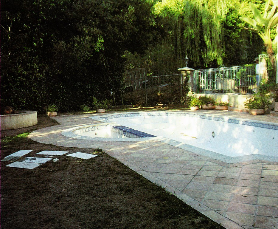
| The old pool had been set within a few feet of the back door, where it completely dominated all lines of sight and robbed the scene of any sense of discovery as homeowners or guests accessed the yard. |
Visualizing is something that the previous pool builders did not do: The existing pool had been set right outside the home’s back door, not more than five feet from the house. Simply by stepping out into the yard, you put yourself at risk of falling into the pool. In other words, the space was dominated and had essentially been destroyed by this unimaginative body of water.
| An Adaptable Palette
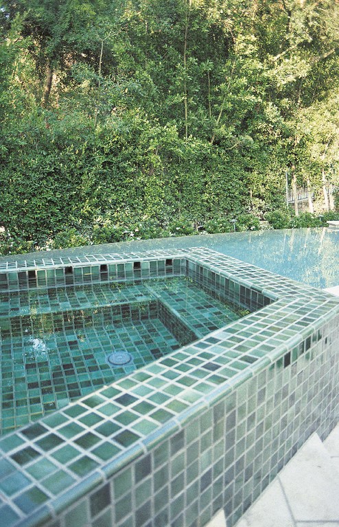
To me, color is the be-all and end-all when it comes to achieving balance – both with the natural features surrounding a watershape and within the watershape itself. On this job, everything is soft greens and creams: The handmade, hand-glazed tile in the spa and around its exterior are a rich, custom blend featuring hues from phalo to a light hunter green. The pebble surface of the pool is a standard sand color, but its cement is a subtle green enhanced and deepened by refraction of light through the water. The coping and decking are both a soft-looking, cream-colored material. I often say that green is the best of all colors to use with water – a pronouncement that draws stares from those who associate green with algae problems. I suppose this is why so many watershape designers’ color palettes begin and end with shades of blue: Water is supposed to be blue, right? To me, however, green is the perfect color for many pool designs because it is the single most common color in nature. This job offers a perfect example: The cool stucco of the house, the row of trees just beyond the usable area of the yard and the new expanse of grass dictate a natural look in the pool that simply wouldn’t work as well in blue or gray or any of the other “popular” pool colors. – D.T. |
By contrast, I’m always after the effective use of the entire setting, not just in “building a pool.” I design a space and arrange features within it so they can be appreciated and enjoyed from all angles – not just up close, but also from a distance. In all ways, I want my work to be valued as art, not merely as a pool that someone without imagination slapped up against the back of the house.
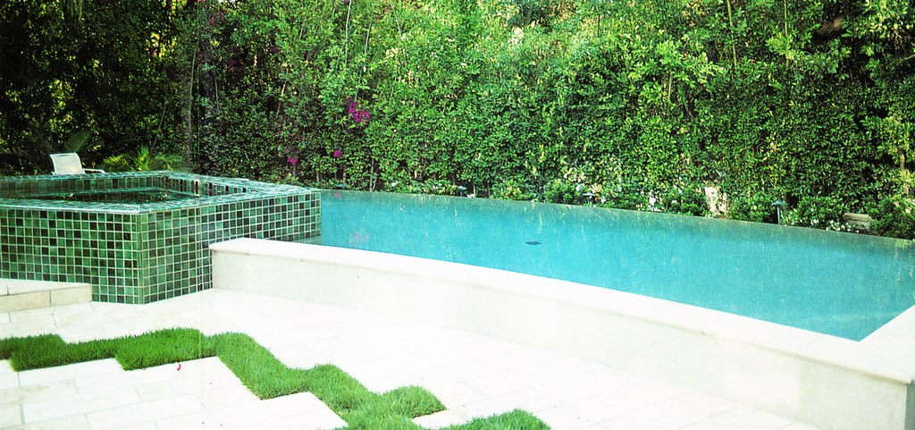
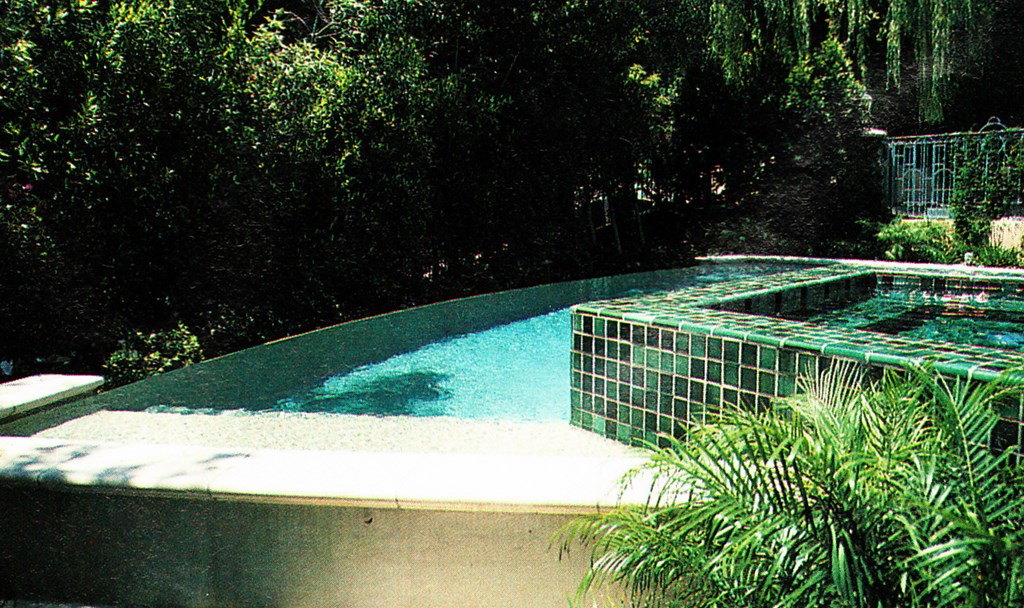
| In the revised scheme, you must step into the yard and turn to the right to take in a view of the pool. The eye goes quickly to the vanishing edge – but moves just as quickly to the green wall of trees and shrubs surrounding the property. |
With the original pool placed in such a dominant position in the yard, all sense of discovery was nullified as you approached it, as was any sense of balance in the way the space had been used. All you got was the pool and nothing more – except on the far side of the pool, where a bland fountain stuck out almost literally like a sore thumb.
To me, great design means walking into a yard and thinking, “This is beautiful!” You don’t have that thought here: Basically, you’re watching your step to make sure you don’t get wet. I don’t want my clients to look at a pool and say, “Wow! What great tile! What a gorgeous swimming pool!” I’m after an altogether different and, I think, more satisfying sense of balance through management of the whole scene.
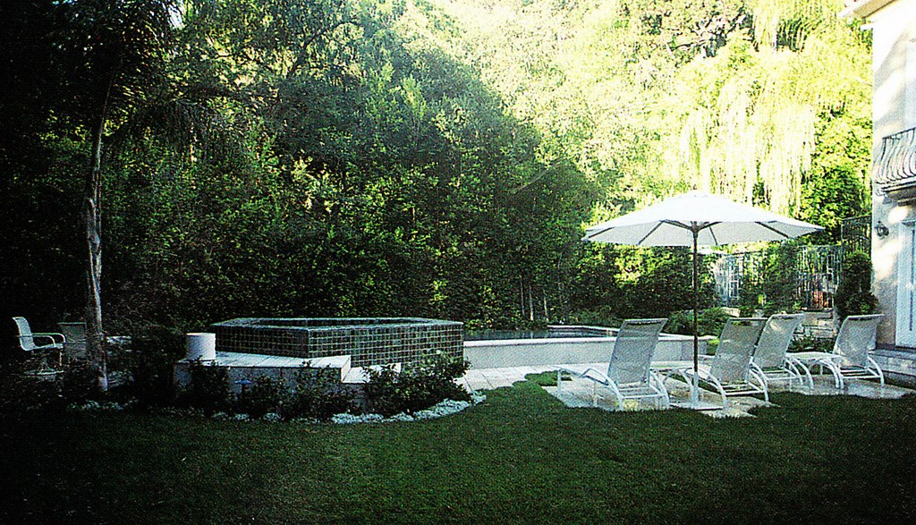
| Now the homeowners have a yard in which the emphasis is on the lawn and the open space. The pool and spa are simply components of that space – a part of the scene, but not the dominant one. |
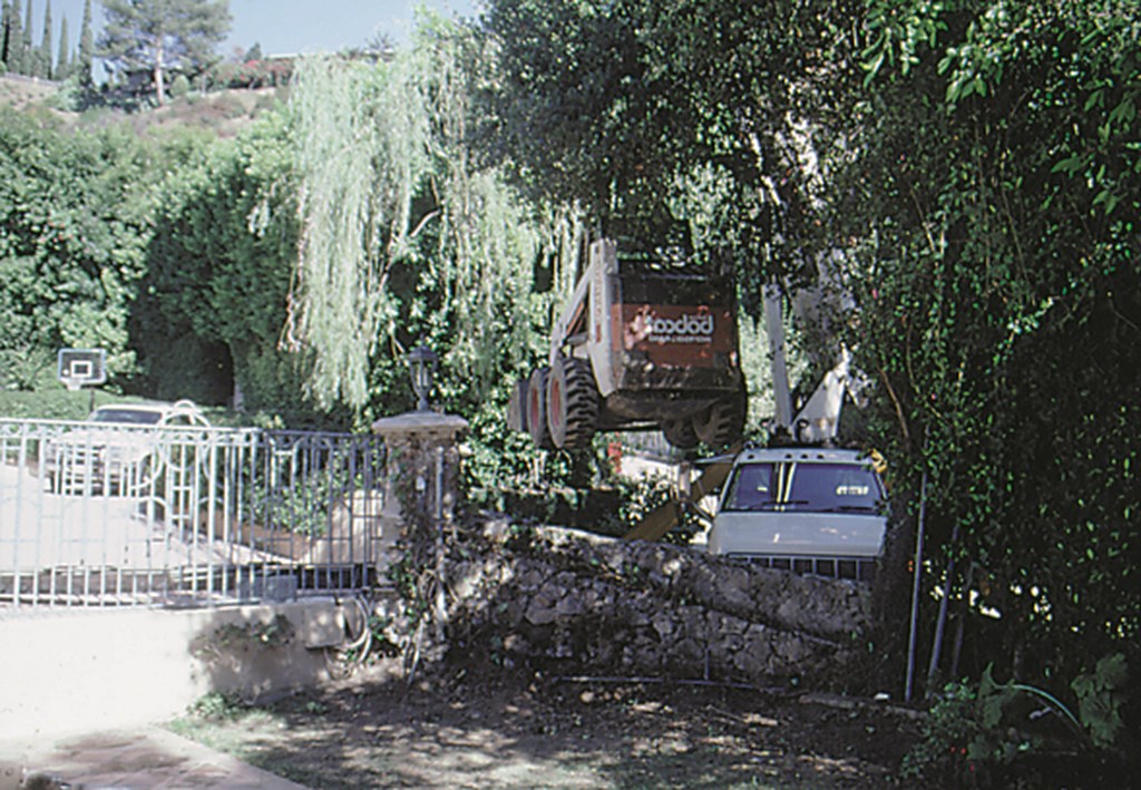
An interesting point about this particular project is that the pool you see in the “before” picture is actually the third pool built on the site, one atop the other. Each had failed because none was adequate to withstand the soil conditions. In a way, this ongoing set of disasters was a blessing in disguise, because it gave me an opportunity to work with the client on turning a horror into something truly elegant and beautiful.
| Internal Consistency
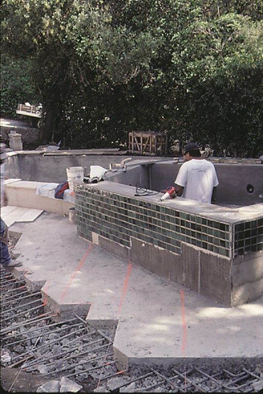
In large measure, design work is about controlling lines and making them work together in defining a space. The key concept in that definition is control, which is why we spend a lot of time on site making things work with great and uncompromising precision. Look at the grout lines on the spa’s exterior walls, for instance, and the way they will align perfectly with the steps. This may look like a small detail, but it has great significance for what it says about the level of planning and care we bring to our projects. What this does is create a sense of continuity of shape and texture. The lines created by the grout harmonize perfectly with lines created by the basic shape of the structure and is another contributing factor in balance. The lines do not fight one another, but serve to reinforce each other and the impressions made by shapes and surfaces. – D.T. |
Immediately, I began thinking of how to position, proportion and design a new pool so that it would blend with and echo the feelings conjured by its surroundings. You do this by working with shapes, elevations, materials and color – and you start by visualizing where the pool might go and imagining what the person walking into the backyard will see from various points of view.
UP, OVER AND SIDEWAYS
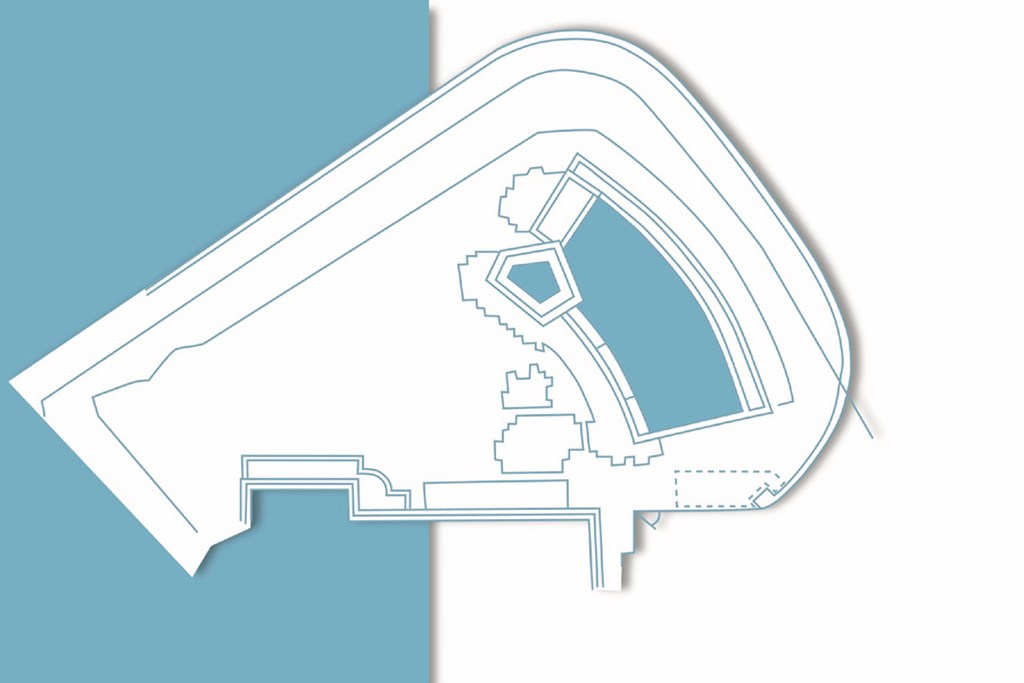
With this kind of remodeling project, I’m never bound by what came before – and in this case, I didn’t hesitate for an instant in moving the pool to another spot in the yard and rotating it relative to the angles defined by the house.
Turning it almost ninety degrees and pushing it toward the far corner of the yard created a broad area for a new lawn. So instead of falling into the pool when you walk out the door, you now see a green expanse backed up by the beautiful trees that edge the property and, off to the right, a pool elevated 15 inches above grade.
| The small deck on the far side of the pool behind the spa offers a great vantage point for taking in the full array of cream and green colors that make up the new backyard. Even from the close perspective of that deck, the vanishing edge detail works: The pool was raised 15 inches above grade, so we were able to lower the trough and keep it out of sight. |
This repositioning and reshaping of the pool was essential to the backyard’s new design. The new shape – a gentle, sweeping curve with a vanishing edge on the far side – blends perfectly with the majestic trees lining the space just beyond the yard.
Vanishing edges are typically used to accentuate infinite vistas on hillsides or mountaintops; in this case, however, it pulls the line of sight to a considerable wall of green that stands back only a few feet from the edge of the pool. (The pool’s elevation provided lots of special seating areas and also enabled us to drop the trough down low enough that it is invisible from any usual vantage point in the yard.)
| Learning to See
I’ve been asked many times how much of the design work I do is based on instinct and intuition and how much of it is rooted in technical discipline. The honest answer is that I don’t really know. On the one hand, I know that the soil conditions on a site like this have a lot to say about the structure, which in turn tends to lead me to express a specific set of design principles. I also know that I’ve spent a large part of my life studying architecture, art history, color and design. Certainly, those formal disciplines have a tremendous, direct influence on the design work I do. Indeed, there’s no substitute for education in all aspects of design. On the other hand, when I’m on site, visualizing a design, I let my own personal experience and creative sensibility guide me. I look at a space and think, “If money were no object, what would I put here?” I consider specific lines of sight and how they appear to someone viewing the yard. I even think about my client’s height and imagine seeing it through his or her eyes as well. I also think about human behavior and how people will interact with the space created by the design. And I think about nature and the sublime beauty of natural forms. The legendary architect Frank Lloyd Wright said that he did not seek to mimic nature in his designs so much as he sought to create forms that appeared to belong in a natural setting. That’s what I try to do on jobs like the one covered in the accompanying article. Obviously, the pool pictured here is man-made, the decks are man-made, the spa is man-made – and the design makes no pretense to be otherwise. Yet there’s no doubt that the curvilinear vanishing edge and the colors and textures of the materials all work to accentuate and comfortably coexist with nature. The more you increase your knowledge of architecture, line, shapes, colors and textures, the better able you are to meet customers’ needs. You’ll be able to draw on a great frame of reference in obvious and not-so-obvious ways. I also believe that if you’re wise enough to recognize the fact that you have a lot to learn and take courses and read books that let you see and appreciate the works of the true masters of design – and begin to apply their principles to your own work – then you will quite naturally begin to see things differently. – D.T. |
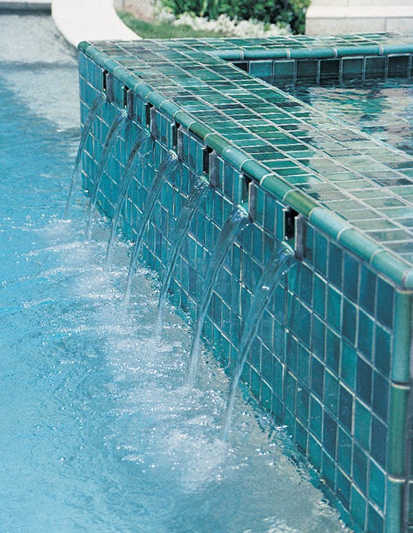
At the far end the of the pool structure, a raised spa was installed using a harder, more geometric approach with lots of sharp angles and crisp lines – a bold green-clad accent that echoes both lawn and trees. The spa’s seven spillways bridge the gap between the turbulence of the spa and the gentle action of the water flowing over the vanishing edge – a combined aural effect that brings a natural feel to the entire installation.
In everything you see here, the governing principle is balance. In the pool industry, too many people equate balance with symmetry, but nothing could be less accurate. The balance I’m pursuing is achieved by properly considering the visual weight of the various components of the design, from the house and existing trees to expanses of lawn and both still and moving water. In this case, much of the balance comes in playing the soft edges of the rest of the yard off against the harder geometry of the pool and spa.
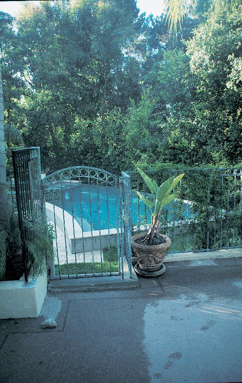
| The new pool with its sweeping curve affords a pretty picture from the driveway of the house as it follows the curve of the property and the tree line (left). Yes, we had the advantage of working with a great site – but making the design resonate on so many levels and from so many different angles is far from accidental. And the view from the spa is as good as it gets (right). Imagine being surrounded by churning water and looking toward the serenity of the vanishing edge and on to the trees and shrubs beyond. Note as well athe use of quarter-round tiles on all the edges of the spa – an expensive touch, but one that softens the spa’s hard geometry and completes a picture of comfort and tranquility. |
In the watershape itself, any sense of hardness or heaviness is balanced and softened through the gentle subtlety of the colors, all greens and creams, and the sweeping curve of the vanishing edge.
This isn’t a simple juggling act by any means, but it is attainable if you recall my opening statement and come to see your watershapes as part of greater compositions rather than as yard-dominating behemoths.
David Tisherman is the principal in two design/construction firms: David Tisherman’s Visuals of Manhattan Beach, Calif., and Liquid Design of Cherry Hill, N.J. He can be reached at tisherman@verizon.net. He is also an instructor for Artistic Resources & Training (ART); for information on ART’s classes, visit www.theartofwater.com.


