The Power of the Pencil
People who know me are aware of the fact that I can be quite outspoken. They know I’ve been extremely critical of the pool and spa industry and have made it my crusade to argue that, as an industry, we need to elevate our game. My particular concern lately has to do with the areas of design and presentation.
Before I get started, please note that what I’m about to say is directed mainly to readers who come to WaterShapes through what is traditionally labeled as the pool and spa industry. (To be sure, this information should also be of interest to those of you who come to watershaping from the landscape industry because it spells “opportunity” in big, bold letters, but you aren’t the focus here for reasons that will become apparent.)
Here’s the unvarnished truth: No more than a hundred pool builders out there can legitimately call themselves designers (and that may be overshooting by a couple dozen), while only a handful design at the very highest level. Almost always, the difference between these top-level designers and the rest of the pack is formal education in art and design as well as an open-minded career marked by serious independent study.
IT’S FUNDAMENTAL
Let me talk about my own experience to illustrate what I mean. I have an edge over just about everyone in the business because I have been educated in formal ways in which others have not. I have a further advantage in that I’ve taught college-level courses in drawing and design and was good enough at it that I was named teacher of the year at UCLA in 1988.
I won’t belabor the point with a full list of credentials, but the simple fact is that developing true design skills requires a long-term (and almost certainly a lifelong) commitment to education. There simply are no shortcuts – and that’s a tough pill to swallow in an industry that historically has ignored the importance of educating its members in skills they truly need.
I put it this way: When it comes to designing and building, the person with the pencil has the power. That’s true among architects, landscape architects, interior designers, industrial designers and others who clearly and deliberately shape our environments. The problem with the pool industry is its widely held perception that a pencil is all you need to declare yourself a designer!
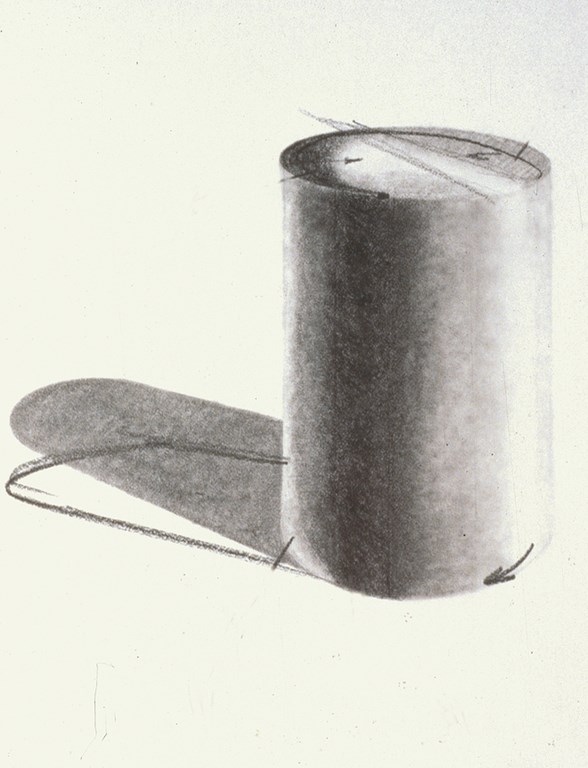
| The capacity to render three-dimensional shapes with pencil and paper is invaluable to the watershaper. It clearly calls for an understanding of geometric forms and the relationship of light and shadow. Not quite so obviously, it’s also about how you use pencils and tools made for manipulating graphite once you’ve put shapes down on paper that make the biggest impression. |
Sure, some of you draw well enough to impress yourself and even pull in a client or two or ten – but until you acquaint yourself with the true power of the pencil and get serious about what it is to be a designer and the responsibilities and historic burdens that come with wielding that kind of power, chances are you won’t even recognize your own shortcomings.
The truth is that few pool people know enough about the tools with which you’re working. You don’t know, in many cases because you never had the opportunity to learn, about things such as the dynamics of line, proportion, scale or color. Yes, you might know the words and even what they mean, but you don’t know about them on a cognitive level the way a trained designer does.
The same holds for knowing about the relationships between shapes and the nature of materials, joinery, perspective, light, shadow and a thousand and one other design components. Most of you are probably fuzzy on the tools of the trade, too, including pens and pencils and markers and paper and printing techniques. Unfortunately, many in the trade don’t know the difference between a bond beam and a beam compass, let alone how to use one to make your life easier.
Then there’s the output of the designer, including perspective renderings and three-dimensional effects that literally jump off the page and drawings that communicate about textures, work with shadow and properly render water and reflections. This is the designer’s workaday world, and I have to say it’s an interesting place to be.
GAINING THE EDGE
What I know about all of this “design stuff” gives me a tremendous competitive advantage. And it’s not all about drawing or drafting skills, because that’s only part of a designer’s education.
For one thing, there’s a huge amount of specialized information about construction that a pool designer – especially a designer who also builds – must know to be able to generate projects that work in practical as well as aesthetic terms. So I’ve spent a career learning about soils, structural engineering, hydraulics, steel, concrete, finish materials, tile – and I still learn something new just about every day because I’m always pushing myself to the limits of what I know.
|
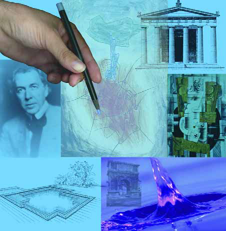
Dead Architects I’m sure many of you have heard my story about an industry gathering in Phoenix during which I asked a group of fellow builders if any of them had visited Taliesin West while we were in town. I was disappointed to meet with silence – with the single exception of a friend of mine who was versed enough in Frank Lloyd Wright’s work to recognize the name of the great man’s western design studio. After I explained what it was and how important a place it had been in educating a generation of famous designers who followed Wright, I was floored by the comment of someone who should have known better, who said: “Who cares about him? He’s dead.” I could write a book about that ludicrous response, but let me boil it down to a sentence: You need to care about the pioneers and practitioners of modern design because they matter to your clients and, know it or not, shape just about everything you do. — D.T. |
Once I completed my formal education, I also began what I am certain will be a lifelong exploration of the work of other designers. My home and office are filled with books by and about people I admire – an eclectic group that includes Charles Rennie Mackintosh, Le Corbusier, Rube Goldberg, Georges Braque, Mies van der Rohe, Paul Klee, the Archigram group, John Lautner, Claude Monet, Riccardo Legoretta, Fernand Leger and dozens of others who shaped design, art and architecture of the 20th Century and whose influence on my own work is unmistakable.
I travel a lot, too, and make a point of going to see first hand what all the fuss is about. I’ve been to the Alhambra in Spain, to Greek and Roman ruins in Turkey and to Japanese gardens in Kyoto and other cities in Japan and the Picasso Museum in Paris. Travel is indeed broadening, and the places I’ve seen have had a profound influence on the way I look at all other places and my own projects.
I’ve been all over the United States as well, and I’m willing to go well out of my way to see things I consider important, from Wright’s Taliesin studio in Wisconsin to Hearst Castle in California or Fallingwater in Pennsylvania. If it’s there and accessible, I want to see it with my own eyes.
What I see, I use to inspire my own designs. I also use those places and things to be conversant with my clients, many of whom are as well educated in the arts and art history as I am – and who sometimes know a lot more about the things they really like than I ever will. I’ve mentioned this before in my columns and articles: Being knowledgeable on this level is a real competitive advantage.
And remember, it’s not my customers with whom I’m competing: Generally speaking, I compete with other pool builders – and I usually come out ahead.
PENCIL POWER
Here’s where we close the circle.
The reason I come out ahead is because I can take all of this background and the experience I’ve gained since my formal education ended 25 years ago and can channel it from my brain to my hand and onto paper or whatever else it is I’m drawing on.
It’s all about drawing and the way I use this skill to communicate with my clients. This skill enables me to stand in a space and help my clients visualize its potential. It lets me help them see details, understand the elevations and begin to get a sense of textures and contrasts and materials and how they relate to one another. In effect, it lets me pull them inside the design – and that’s the real power of the pencil.
I do this drawing stuff very, very well – and as I learned in 12 years of teaching drawing/design classes at UCLA, it’s a skill I can communicate to others. For the past few years, it’s been the focal point of my role as principal instructor for the Genesis 3 Schools, and it’s going to be the entire focus of a Genesis drawing school we’ll be conducting at Arizona State University in March 2002.
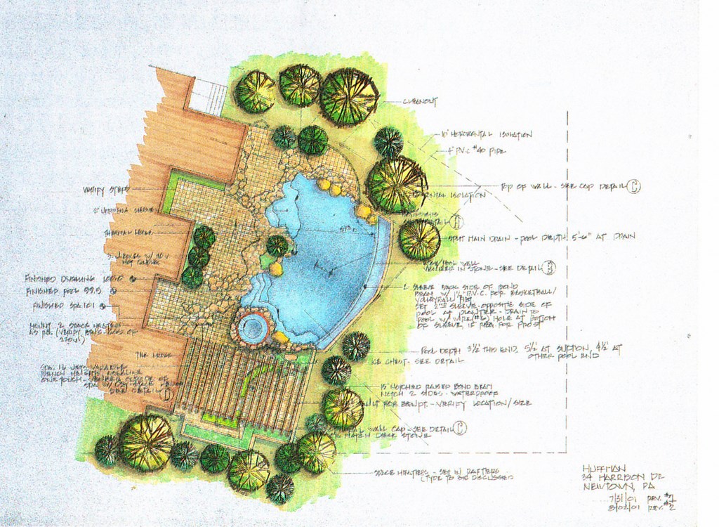
| Making effective, professional presentations for clients is radically simplified if you know how to convey basic information about color, contrast, materials, textures, line and spatial relationships in a rendered flat plan. Not only is art like this invaluable for work with clients: It’s also a valuable tool on the job site when you need to explain the space to subcontractors. |
One of the things I enjoy most about teaching is that it gives me as much of an opportunity to learn from my students as they have to learn from me. I love to sit down with others and compare drawings, point by point. I’m often critical of what I see (and am not known for pulling punches), but where there’s merit, I get excited.
This is what real designers do: They learn from each other. They spend time studying and discussing the masters and then take that knowledge and apply it to new situations. And the best vehicle for communicating at this level is almost always pencil and paper – the designer’s indispensable tools.
Before I continue, let me emphasize a point I made up front: This discussion isn’t about those of you who have been formally educated in the landscape trades and who read this magazine because of our common bond with water. Many of you do have extensive backgrounds in design theory, art history and presentation skills. And I’m well aware through my discussions with some of you that you, too, are aware of the huge gaps in the pool and spa industry’s bootstrap approach to design education (and see wonderful opportunities as a result).
You see us as folks who just can’t shake the “pool guy” image – a broad brush and an unfair generalization, but an easy image with which to saddle the only construction trade I know of that offers its practitioners nothing by way of formal education.
A THOUSAND WORDS
If simple love of good design isn’t enough to motivate pool guys to work at transcending that label and image, maybe we can all break through if we get practical and look at drawing and presentation skills as a clincher in the sales process.
Watershapes are primarily visual in nature. Yes, they need to function properly and there are important auditory and tactile elements to them, but they are first and foremost about looks. As clients are buying, they are visualizing – and I would argue (as my own experience has taught me) that the presentation process exists to help them visualize in a way that inspires them to buy.
When I sit down with clients, I impress them immediately with my ability to pull out a pencil and start sketching ideas as we’re discussing them. Later, when I come back with a fully rendered image, there is usually no turning back as far as they’re concerned.
|
Half Baked A fellow pool builder once told me, “I build the same way you do with the same degree of quality in construction. But I don’t design as well as you do.” In saying this, he revealed a common misunderstanding of the relationship between design and construction: Just as poor construction can make the best design a mediocrity, the best construction isn’t adequate if it follows a poor design. So even if this person’s construction approach were completely bulletproof, his projects would tend to be less than successful because the visual and aesthetic components would be lacking. A good project is a whole project: When excellent design is matched with excellent construction, the work will stand the test of time. — D.T. |
Some of my critics think this is so because I work with wealthy clients, but I say that’s a load of bunk because I know for a fact that an upper-middle-class client looking to spend $40,000 to $60,000 is just as interested in a good presentation as the client who might be spending $400,000 to $600,000. It’s all about quality, and it all begins with the presentation.
Fact is, watershaping is a design-driven process, no matter whether you come from the pool and spa industry or from the landscape trades. Whatever your background or experience as a watershaper, the basic requirement for participating at the design level is education – and the edge always goes to the designer rather than the pretender.
What I’ve said here so far will almost certainly rub many of my friends in the pool and spa industry the wrong way – and that’s my intention. If I’ve made you mad or offended you in a milder way with my perspectives, then for heaven’s sake challenge me to do something about it! After all, there’s not much point in lambasting an entire trade if you can’t suggest a solution.
I’ve written before about my wish that someday pool design will be adopted into some forward-looking university’s landscape-architecture curriculum and that tomorrow’s pool designers will have access to formal education in the craft. Short of that, there are the Genesis Schools – and, in particular, the drawing school I’ll be teaching March 10-16, 2002, in Phoenix.
I want to teach you how to draw and how to design. Obviously, one instructor in a one-week course can’t accomplish perfection, but I’ll give it my best and at least set you off in the right direction.
PUTTING UP
Yes, this is a blatant plug for the program, and I must say I had to pull out all the stops to get the folks at WaterShapes to let me use my column in this way. But I argued with them as I will with you that this isn’t too far removed from “Details” of the sort I’ve discussed in the past, if only because the way I get my clients to see what I see and how I get construction crews to do what I want them to do with respect to those details all comes from my ability to use pencil and paper effectively.
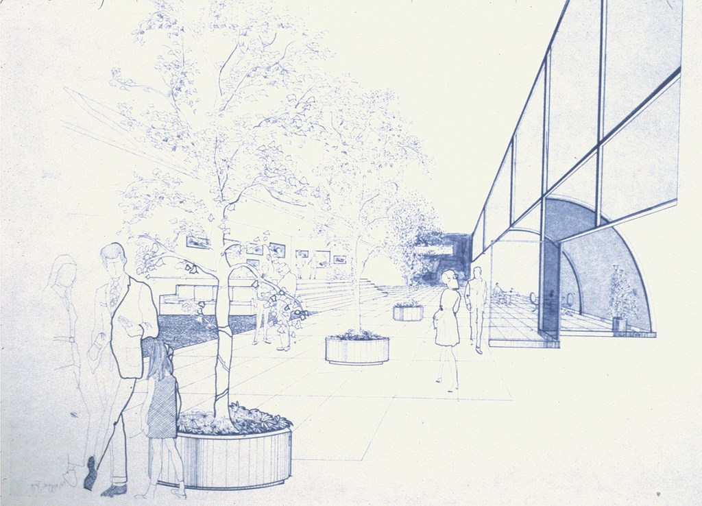
| To communicate ideas effectively, a designer must be able to work with one- and two-point perspective. In a way no flat plan can, perspective drawings help clients visualize a three-dimensional space – the relationship of object to object, an impression of scale and proportion and movement through the space – in ways that can be crucial to their acceptance of your designs. |
So now you have a chance to show up and challenge me to teach you how to draw in a serious, focused, challenging week of intensive training. There will be homework, critiques and tons of useful information. Will I be able to teach you everything you need to be a designer? Of course not, but I guarantee that you will walk away with a far larger pack of skills than you’ll start with.
For years, I’ve been branded as abrasive and arrogant – a provocateur who constantly raps his own industry. That may be a fair characterization, but what some people don’t understand is how much I love this business and how much it pains me to see an art form abused by people who should know a lot more about what they’re doing.
Now let me do my best to show you a new beginning.
David Tisherman is the principal in two design/construction firms: David Tisherman’s Visuals of Manhattan Beach, Calif., and Liquid Design of Cherry Hill, N.J. He can be reached at tisherman@verizon.net. He is also an instructor for Artistic Resources & Training (ART); for information on ART’s classes, visit www.theartofwater.com.


