Woven Beauty
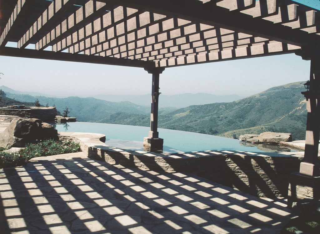
This project is all about making connections – connections between the inside of a home and the outdoors; between surrounding wide-open spaces and an intimate backyard; between the colors of the hillsides and the materials used in crafting the watershape; between the clients’ desire for recreation and their passion for beauty; and between the beauty of nature and the modern, sculptural lines of the design.
If you’ve followed my “Details” column in WaterShapes in recent months, you’ve seen many of the components that have been incorporated into this particular tapestry: the thermal ledge (July/August 2001), the massive shade structure (June 2001), the stacked ledger stones (March 2001), and the boulders placed below the waterline (October 2001) – all these details are featured in the project that you see on these pages in fully finished form.
In style, this freeform, vanishing-edge pool and raised spa are something of a departure for me: For one thing, it’s a large pool for the space, more prominent than most others I’ve been doing with respect to its placement in a space. It also makes extensive use of natural stone and shapes, although I’d never be tempted to call it a “naturalistic” design.
Still, this project picks up themes that are important in my recent work. It’s all about orchestrating the experience of someone walking into the backyard from the home and directing viewers’ eyes to selected features. It’s also about creating a rich environment full of opportunities to enjoy the space – as the photos accompanying this brief text will demonstrate.
FRAMED VIEWPOINT
The homeowners had one thought in mind when they hired me: They wanted something spectacular – a design that took complete and total advantage of the home’s dramatic physical setting.
And talk about dramatic: From the backyard, all you see are hillsides that have been set aside by the local conservancy as environmental easements that will never be developed. And those hills roll on as far as the eye can see, dissolving into the coastal haze that rolls in on all but the driest summer days.
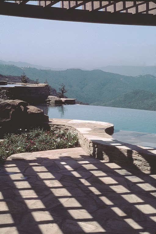
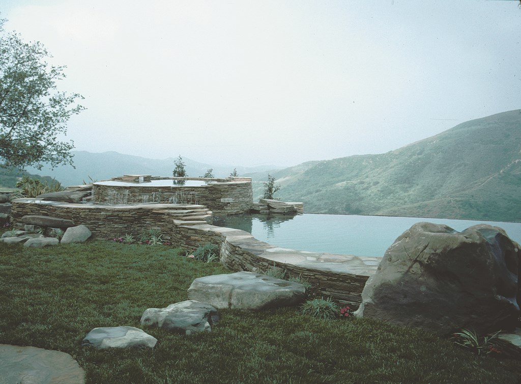
Just below the house, however, are rows of upscale tract homes – not something anyone needs to see. To control the view – keeping the upper level of the prospect in focus while blocking the lower level, we elevated the pool and cantilevered it and the vanishing edge’s catch basin out over the hillside. This had a dual advantage of giving us more space to work with while completely concealing the structures below.
Now that the pool is complete, all vantage points inside the home and in the backyard hinge on the long arc of the pool’s vanishing edge.
Because you don’t see the homes below, the space feels far more isolated and private than it ever did before. And because of the way the design ties the watershape directly and dramatically into a 180-degree panorama of wide-open spaces, the fact that the pool is prominent in the yard in terms of size and placement loses significance: The pool is only a component in a composition that stretches out for miles.
Setting the Stage
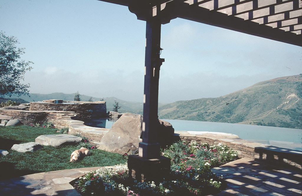
From inside the home, reflections off the water draw the eye across the yard and out into the view, making the first connection between interior and exterior spaces. As you move past the threshold and onto the deck, you move into a grand exterior “room” created by the expansive shade structure – an easy transition from indoors to outdoors.
Weighted Perspectives
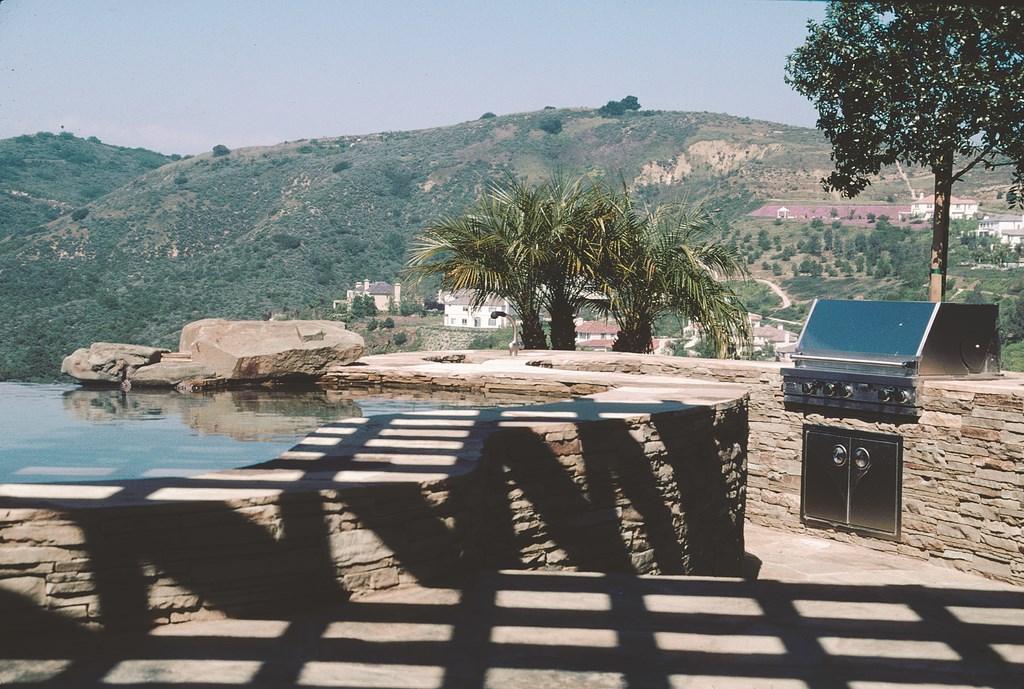
As you move into the yard, the lines of the pool and deck are weighted so that your eyes travel to the right side of the property, over toward the barbecue area and the thermal ledge. As you move toward those features to get a closer look, you take in shapes that echo the hills beyond, from the elevated perch of the spa to the undulations of the pool’s edge and the sweep of the vanishing edge.
A Shallow Shelf
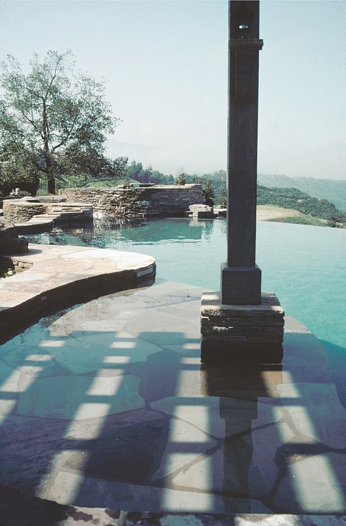
As you continue to the right across the patio, you finally see water up close on the thermal ledge. It’s really the first time your eye is drawn directly to the water itself rather than to reflections off of it: The flagstones just beneath the surface invite the eye to linger – and make you wonder what it would be like to lounge in the space on a hot day with a cool drink.
Room for Gourmets
The barbecue is nestled in a nook on the right edge of the property and has been set up to mimic the canyon forms beyond. The winding path and the stacked ledger stone draw the eye along the pool’s edge to this beautiful spot. Once again, the careful interfaces between the steps, ledger and boulders all weave together to create connections within the overall composition.
From all these points on the right side of the property, you look out across the water and drink in the views – past the raised spa to the hills beyond and across the vanishing edge to the horizon. The direction of lines and their gentle contours are all meant to harmonize with the prospect, while the use of stacked ledger stone throughout echoes both the geology and geometry of the canyon setting.
Cool Transitions
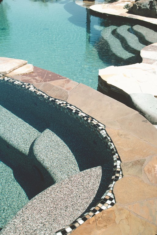
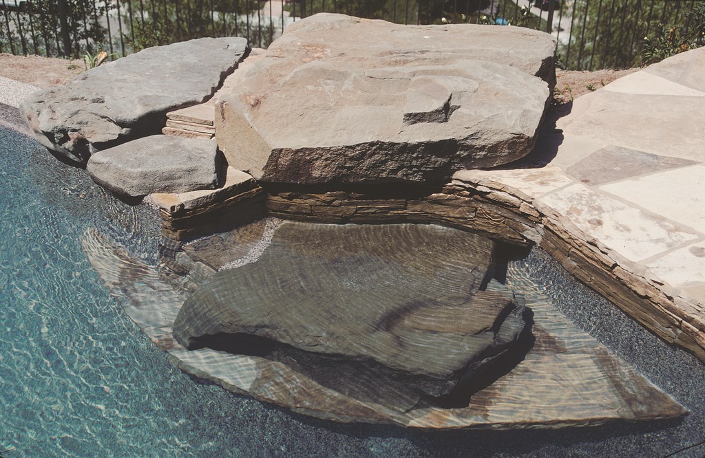 The subtle hues of the blonde stone and boulders, with their beige, gold and cream highlights, offered another way of connecting the new structures with the golden grasses seen most of the year in the rolling hills beyond. The cool colors, as tied into the landscape, serve to soften the overall appearance of the pool structure.
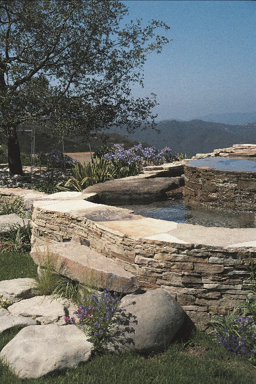
Throughout, the transitions from ledger to flagstone treatments are critical in creating a seamless flow of line, color and texture. The use of stacked ledger stones in particular creates several key transitions: from the deck to the raised beam; from the pool to the barbecue pathway; and from the spa to its winding stream.
Deep Purple
I’m deeply fascinated by the refractive interplay of light and water and how various depths of water influence our perceptions of color. The custom purple pebble surface developed for this project offers a subtle depth to the broad (but not particularly deep) expanse of water, providing a gentle gradation of color from the shallows to the deeper levels. (This special color surface was developed in collaboration with Luis Marquez of Marquez Pool Plastering. We call it “Georgian Plum.”)
At the surface, use of such a deep color enhances the reflective quality of the water, readily picking up the cool blue sky and the gold or green of the hillsides.
Spatial Echoes
Raising the spa on the left side of the pool would seem to violate my intention of weighting everything to right side of the composition, but it works because I used a range of visual tactics to keep the spa from dominating the view.
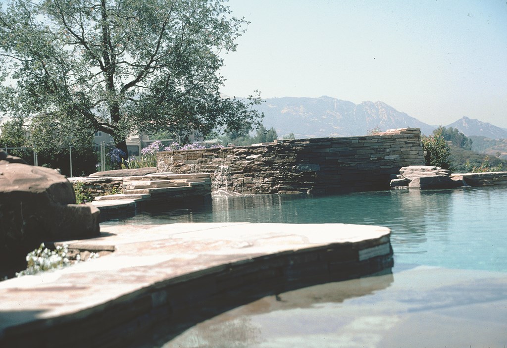
For one thing, raising the spa gradually above the beam using stones and steps set at intermediate heights lets the structure echo the graduated, rolling shapes seen in the hills beyond. For another, the use of gently cascading water softens the appearance and adds a soothing aural presence.
In this case, the situation truly called for having a small amount of water moving over an irregular rock surface rather than for a big flow of water shooting out from the kind of manufactured spillover seen so often on raised spas. I’ve never been a big fan of that effect: I believe that water spilling over vertical intervals of only a few inches is far more appealing to the eye and ear – and to the soul – than is a gushing torrent of water.
Too often, in fact, I see spillovers that are oversized for their surroundings – the volume of falling water is too great for the pool and/or spa, and the sound it generates is overwhelming in the space. The key to the effect pictured here is the balance it strikes in its surroundings with respect to visual and auditory weight.
The project you’ve just toured was designed with just this sort of scene-by-scene visual progression in mind – from the interior space out into the overhang-covered exterior room and then into a series of special architectural spaces beyond. There aren’t many surprises here, just a careful, measured, gradual unfolding of a scene.
The pool is at the center of things and might be said to dominate that scene with respect to geography, but because of the way views are directed and controlled, it simply doesn’t carry that much visual weight. Instead, it blends in as part of a huge composition that encompasses countless acres of views – to the hillsides, hilltops and beyond.
At the same time, the pool conceals the “visual noise” that would otherwise be found in the surroundings: In place of red tile roofs, black asphalt and brightly colored automobiles against the green hills, we’ve set the reflective surface and visual softness of the water.
When all of these features are brought to bear in a fully integrated design, I think a magic can be made that speaks for itself.
David Tisherman is the principal in two design/construction firms: David Tisherman’s Visuals of Manhattan Beach, Calif., and Liquid Design of Cherry Hill, N.J. He can be reached at tisherman@verizon.net. He is also an instructor for Artistic Resources & Training (ART); for information on ART’s classes, visit www.theartofwater.com.


