Classic Persuasion
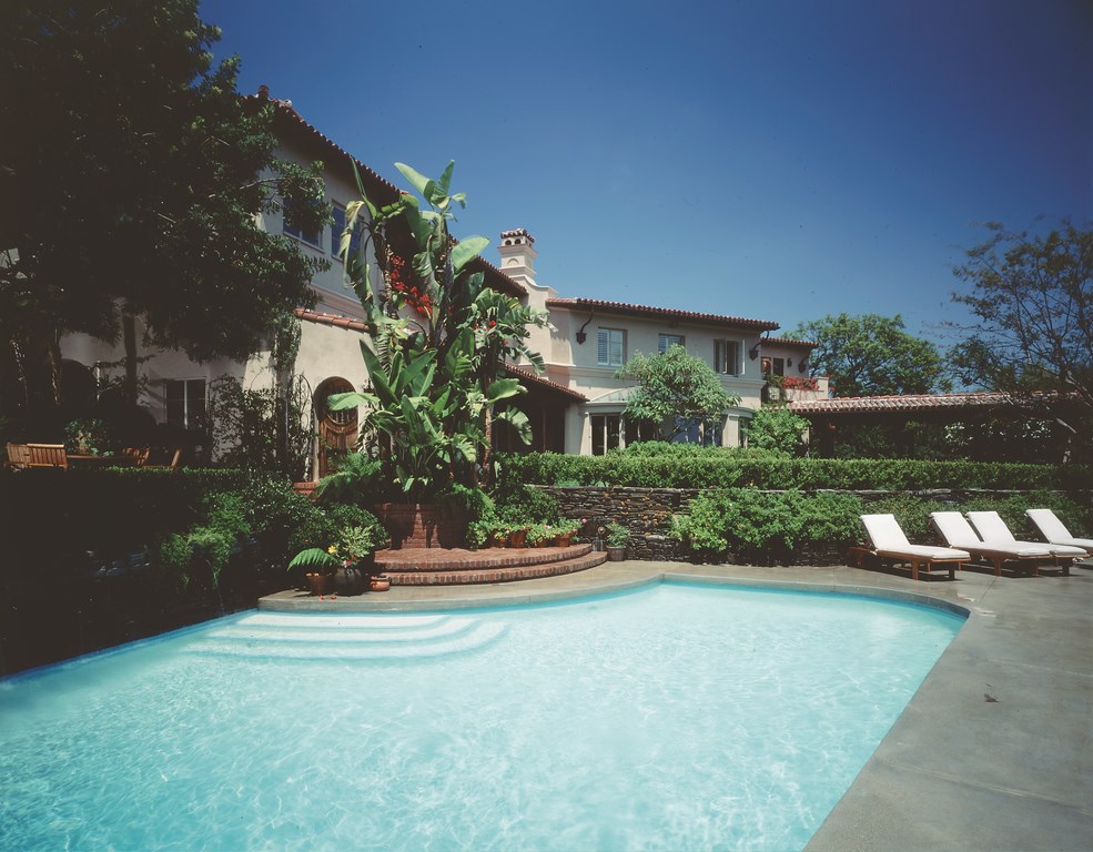
For more than two full years, this project was my personal and professional obsession.
It all started in 1993, when my client, a wealthy recording-industry magnate, called on me to design the landscape for a property he’d just acquired in Bel Air, one of the most exclusive neighborhoods in Los Angeles. The Spanish Colonial-style home had been built in the 1920s and was in a sad state of disrepair. By the time I arrived, it had been gutted to the studs, and very nearly all of the hardscape and plantings around the house had been torn out as well.
What he was offering me was a tantalizingly blank canvas in a most spectacular setting.
In the two years that followed, not only would we set up a variety of walls, terraces and patios as well as a new guest house, a pool and two small fountains – all surrounded and accented by extensive mature plantings – but we also became involved in a bit of alchemy by creating (and aging) 1929-vintage architectural woodwork and decorative pottery and a following through with a range of other period-sensitive touches.
This all took me well beyond my usual role as landscape architect and watershaper. By project’s end, in fact, we were integrally involved in details of the home’s interior design and furnishings as well. Through it all, I was a full partner in my client’s near-fanatical quest to get everything just right.
CAREFUL CONTINUITY
To be sure, my client had distinctive tastes and wanted everything to be very subtle and understated by way of lending his home a “timeless” Old World quality. In that context, nothing could look new or ready-made, and it became our goal to do everything possible to create new spaces that appeared as though they’d had been nurtured, occupied and enjoyed for decades.
The home’s two-acre lot sits on a winding road high in the hills and offers spectacular city views from a variety of smallish spaces draped across many elevation changes. The house itself – 9,000 square feet as purchased and in the process of being remodeled to 10,000 square feet – featured classic, mud-packed red-tile roofing, soaring arches and plastered walls. The slopes all around were dramatic, with a generous array of retaining walls set up to create workable flat spaces.
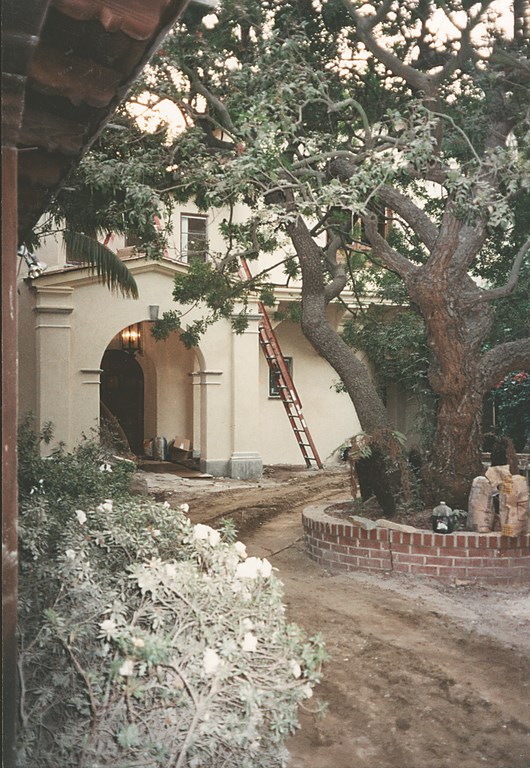
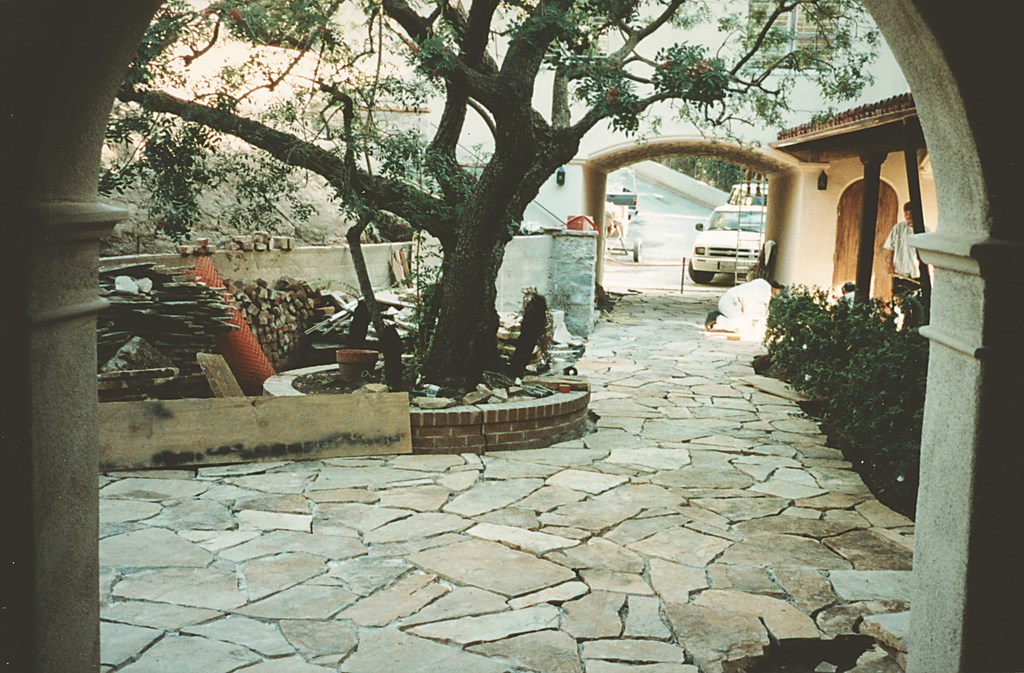
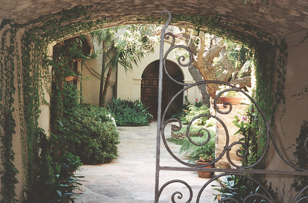
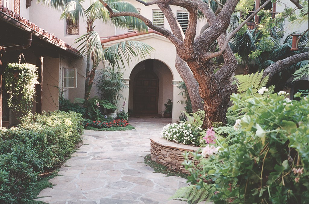
| GRAND ENTRANCE: The entry courtyard is the home’s heart and soul, a special space we reconstructed from the ground up. We started with a relatively open space (top left) and set about making it more contained and intimate, starting with the flagstone paving (middle left). The central tree was already there with a brick surround. We craned in additional trees (middle right) and added a large population of mature plants – including the trailing vines that gave what had been a wide-open porte cochere a sense of age that sets the tone for everything beyond (right). When finished (bottom left), the courtyard offers just the sort of staged approach we wanted to the home’s front door. |
By way of preparing ourselves for the job, we drew up extensive plans and careful renderings. But we soon found that every aspect of the project was subject to change at the drop of a hat and that none of our construction documents were likely to be carried through from start to finish. Instead, the project “evolved” on a daily basis as a result of constant discussions, conjectures and negotiations.
Every day was its own adventure. I would spend hours walking the grounds with the client, considering and reconsidering every possible angle, detail and facet. In this atmosphere of constant change – shifts in direction far too extensive to remember, let alone report here – this project was far more akin to sculpting that it was to architecture in any traditional sense.
In a way, the work we did on this project was closest in nature to set design, as though we were preparing this place for a theatrical production of some kind. The idea – our “scene” – was that someone entering the space would be transported to the late 1920s or early 1930s and experience a distinct sense of another time and place.
This meant that continuity (in the theatrical sense) was of prime importance and that we’d need to use “distressed” materials such as used brick or tumbled stone and work with mature and irregular plantings. At every turn and without compromise, we were to make choices consistent with the chosen era.
DELIBERATE GREENERY
The entire experience for guests at the home begins with the entry courtyard – the heart and soul of the environment.
The area is enclosed by the house on three sides and a steep slope on the fourth. We kept the space cool and dark, filling it with lush plantings selected for an ability to thrive in low-sunlight conditions. Indeed, the plantings are so dense and dark that it’s almost cave-like – an isolated, staged exploration leading to the point of entry: the front door.
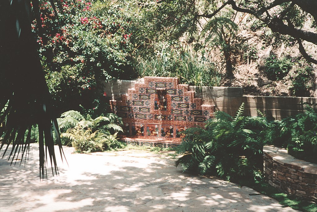
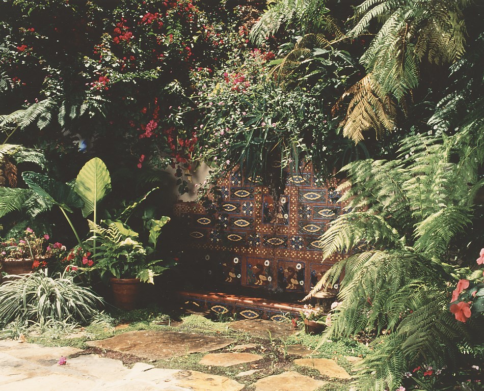
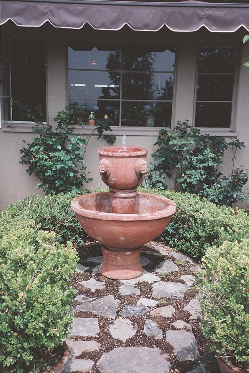
| HIDDEN RESOURCES: A key element in the overall courtyard plan was creative reconstruction of a small wall fountain we found on site. We dressed the original up with some classic hand-painted tile (left), then surrounded it with mature plantings to obscure the source of the gentle noises of the flowing water (right). Those who seek out the source are rewarded by ‘discovering’ this scene. |
The original courtyard featured a small, wall-mounted fountain that we restored with a variety of pieces of hand-painted tile and other materials. It’s tucked off in a side of the area and is not readily visible until you are right by it. But its primary purpose was never visual; instead, it lends the sound of moving water to the entire space, drawing visitors deeper into the sheltering greenery. (We also stocked the fountain with bullfrog tadpoles that grew up to dwell in the courtyard.)
The use of mature/overgrown plantings here was the key to creating an illusion that the environment had been around for a long time – a strategy we used in spots all around the property. Many of these specimens, chosen because we’d done our homework and knew they’d been popular choices at the time the house was built, were so large and overgrown that we had to set them with large cranes.
In stylistic terms, we employed an Asian approach to the planting program – large green areas set off by splashes of color – in carefully placing a variety of Tasmanian tree ferns, Japanese boxwoods, ivy, Birds of Paradise, various Impatiens, Bougainvillea and many other species.
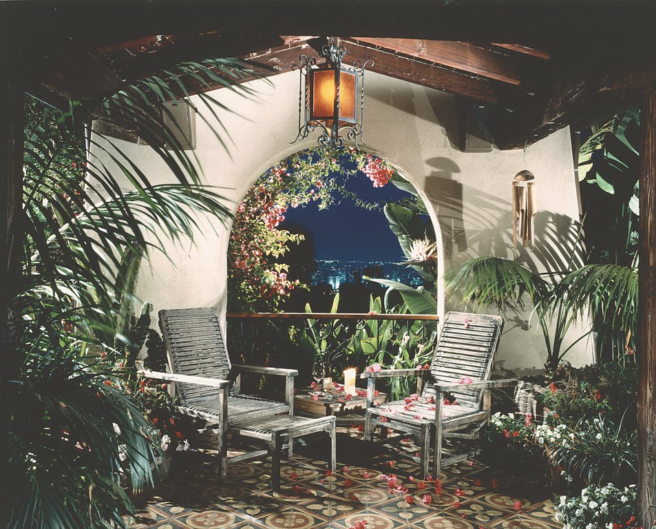
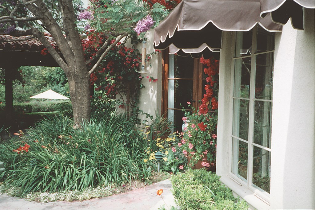
| SET DESIGN: As we worked on this project, we became conscious of the fact that much of what we were doing was not dissimilar from what set designers do for theatrical productions. From the courtyard to this patio (left), which sets up a view of city lights through a proscenium arch, we aimed at controlling moods, establishing distinctive vantage points and finding the drama in each and every space. And where distant views weren’t available, we used riots of color to achieve similarly dramatic effects (right). |
As tempting as it was for practical and/or aesthetic reasons, we stayed away from more contemporary plants such as Flax – very popular today but virtually unused in landscape designs of the early 20th Century. And not only did we search for mature plantings on this project (a process that led me to just about every nursery in southern California), but I also placed a premium on locating “distorted” plants that could be used to wrap around corners or serve as overhangs for certain areas.
As a result of the boundaries we placed on plant possibilities, what we ended up with is uniformly simple and subtle – a discipline we also observed with the hardscape.
In the courtyard, for example, the flagstone decking is Buckskin, a sandstone with subtle beiges, golds, browns and creams. In addition to using this material for flat surfaces, we also stacked it as ledger for walls and other vertical elements and milled it into tiles for several porch areas.
THE DISTRESSER’S ART
Once you move through the house, the backyard offers a variety of spaces, from the main lawn area and the pool area to a variety of small garden areas, decks and verandas. In these more open spaces, the materials and plantings we used were more varied than was the case in the tight visual confines of the entry courtyard.
We used a great deal of used brick and other masonry materials that looked authentically old. In some areas, however, we had to set up areas of poured concrete and then deliberately distressed them. In one spot, for instance, we let the concrete set and then hit it with a sledgehammer to give it some cracks and an obvious appearance of age. In high-traffic areas in particular, we inflicted even more damage for the sake of authenticity.
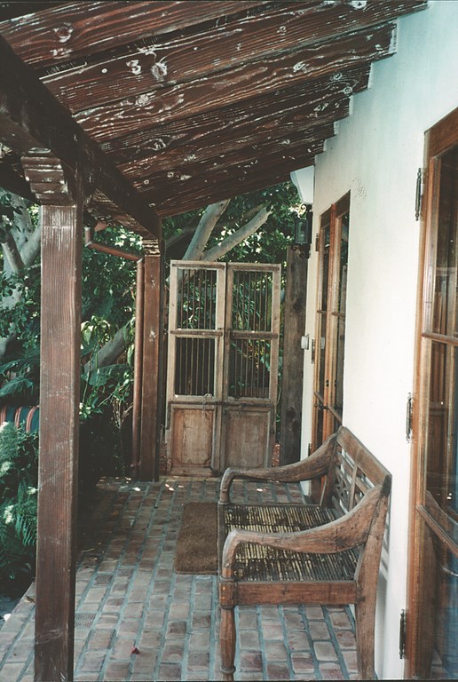
We matched all the care we put into “aging” the green and hardscape portions of the project with our attention to woodwork and carpentry. Again and again, we made new wood look old using such tricks as scorching the wood with torches and soldering irons or hitting it with motorcycle chains. We also used a range of staining and coloring techniques, or we might paint pieces, sandblast them to remove most of the paint, then place portions of the wood in liquid to create manageable amounts of water damage.
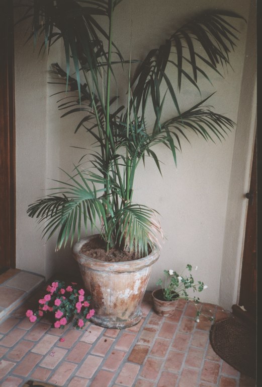
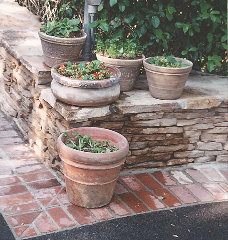
| INSTANT ANTIQUITY: This project took us well beyond what would be considered landscape design or watershaping, and that’s particularly evident in the work we did to make everything we did seem as though it had been on the property since the 1920s. The pottery, for example, was all worked over in a variety of ways to give it a well-worn patina (top left, middle left, middle right), and the same was true for garden furnishings (right) as well as woodwork (bottom left). |
Throughout this period, I spent hours scouring lumber yards, masonry supply houses and architectural salvage companies for old or discarded pieces of architectural woodwork or stone we might use. This was particularly important with the wood, because it’s virtually impossible with new wood to create convincing patterns of wear and the patina that come with years of use.
Even the more decorative elements came in for what might seem some fairly harsh treatment. All told, we brought in more than 500 new terra cotta pots and spent hours with each one to make them all look old and worn. We’d daub areas with white thinset, for example, then put green thinset over that and come back later with chemical stains in various colors.
There was so much to do with these pots that we even set up “assembly lines” where three or four people would apply the various treatments to the pots – and we would change roles on the line at regular intervals to avoid the occurrence of repeated patterns. We’d also chip the pots, always differently.
Some would be badly damaged in the process while others would be touched hardly at all. A few of the pots were completely destroyed, but many of these were repaired with tie-wire buried in cement. Interestingly, these appeared to be the most authentic of all our “aged” pottery.
Then there was the pool, which is a story unto itself.
THE POOL SAGA
As is often the case with old, high-end properties in places such as southern California, this one had an old swimming pool that had become a true eyesore. It had an odd shape somewhere on the spectrum between geometric and free form, and the owner originally decided to get rid of it.
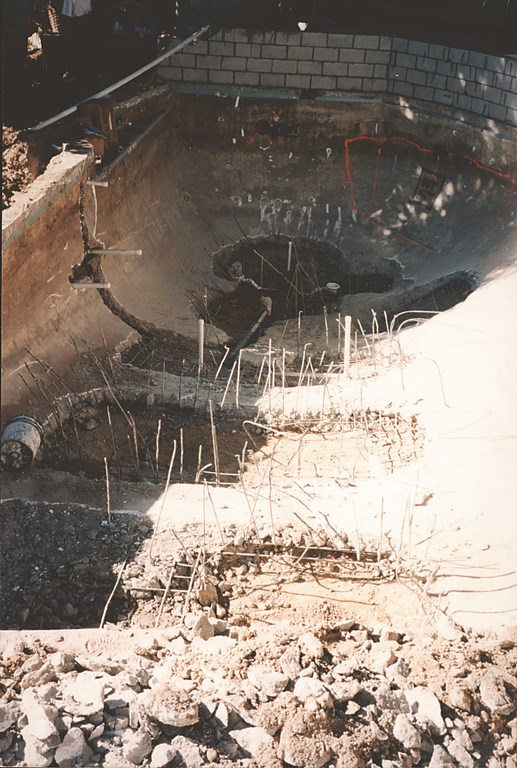
So we cut off the bond beam, punched huge holes in the shell and filled it with a suitable backfill by way of preparing the space for the addition of a new pool that would be cantilevered out over the hillside and supported by a series of deep structural piles.
The pool we’d envisioned was both dramatic and technically difficult, and at the time I felt I was getting in over my head with this part of the project. As I considered alternatives, I came across a copy of Architectural Digest that featured a cover shot of a John Lautner home and its elegant pool. I decided then and there that I wanted the builder of that project to work on mine – and that’s how I met David Tisherman.
He reviewed my plans, the structural design and soils report and offered a price and timeline for construction – approximately $250,000 on a nine-month schedule. The price didn’t faze my client, and despite the fact that he was displeased by the proposed project duration, he kept on moving in this direction and I went to pull the permits.
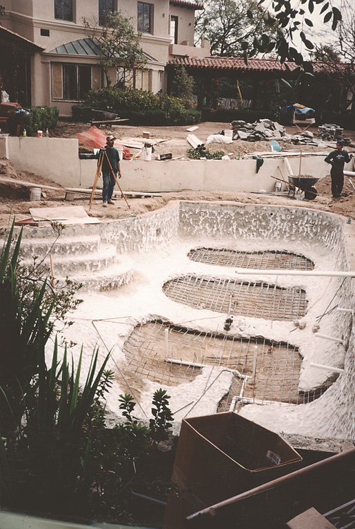
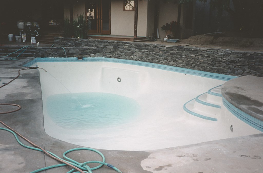
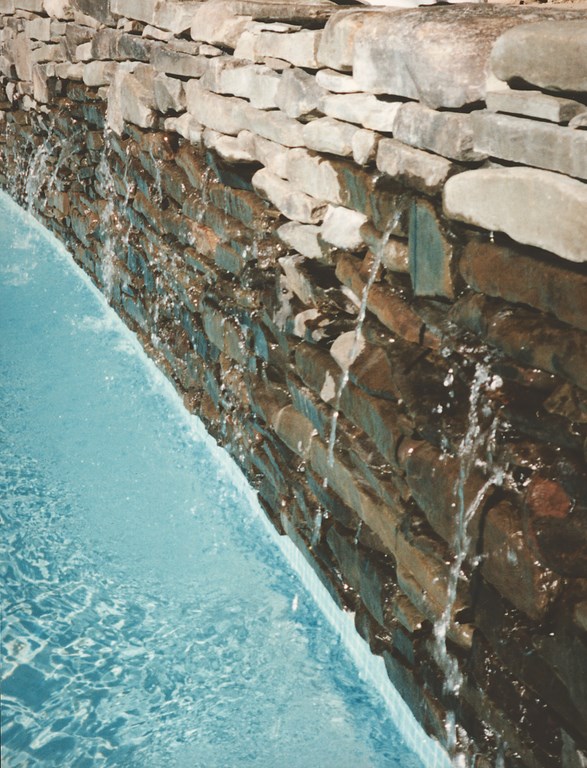
| RETHINKING THE POOL: With our original marching orders, we did an excellent job of robbing the pool of any ability to hold water (left). But a change in direction saw us dig it back out and prepare it for restoration as a shell (middle left) and eventual refilling (middle right). A key feature of the new pool is a weeping wall we set up on the long side of the vessel (right). |
That very day, however, the client called and said that he’d decided to scale back the swimming pool plan for two primary reasons: First, the sort of elaborate pool we were considering was unheard of in the ’30s and would be out of character with the rest of the project; second, he really didn’t want to wait nine months to go swimming.
Instead, and much to my amazement, he asked me to re-excavate the existing pool and rebuild it in the original shape and location, a process that would take about a third the time the hillside pool would’ve required at far less expense. So we pulled all the dirt out of the old pool and set to the work of rebuilding it.
By the time we started our renovation, all that was useable were portions of the vertical walls and very limited sections of the floor. We tied everything together with a new steel cage and completely re-shot the shell. We also set up a brand-new subterranean equipment vault, all-new hydraulics and a loveseat.
Here as everywhere else, we strove for visual simplicity, using a squared, cantilevered decking as the edge treatment, traditional white plaster and a simple light- and dark- blue glass tessera tile. And in fact the pool looks like it was built circa 1929, no doubt about it. (A year or so later, the client contacted me about upgrading the plain tile; we eventually did so with some beautiful, custom, hand-painted Catalina tile.)
PLAYFUL SOLUTIONS
The one significant addition to the original pool was a 30-foot-long, stacked-stone “weeping wall” that rises above the pool on the upslope side. We set up pockets behind the ledgered stone veneer, leaving the back of the stone open so that water could well up behind it. As the stones were mortared into place, I used a small skewer to poke dozens of tiny holes in the mortar that would allow water to weep out over the face of the stones.
|
The Cima Connection It’s no stretch to say that the work I did on this project in Bel Air, Calif., has led me to bigger and better things. The work I did on this vintage home was perfect preparation – both creatively and with respect to the drive and dedication required to do such all-encompassing, all-consuming work – for the project I completed for this same client at Cima del Mundo in Montecito, Calif., a few years later. (For information on that project, see WaterShapes, January 2001, page 32; March 2002, page 30; and July/August 2002, page 56.) More than that, however, the awareness this project gave me of the potential of approaching and managing landscapes and watershapes as elements of theatrical design has proved invaluable in all the work I’ve done since and has deepened my appreciation of how an infinite variety of small details are what makes big projects hang together and work in aesthetic terms. — M.H. |
This waterfeature was simple to do, and it works like a charm. The flow seems to emerge from nowhere, constantly wetting the stones and lending a gentle auditory element to the area, and it all fits because we used the same stone colors in a retaining wall that surrounds the pool area. To make all this stonework look old, I went to the effort of putting buttermilk in the cracks of the stones to encourage the growth of mold, moss and fungus.
As successful as this project proved to be, however, the story has a sad ending – one that ironically speaks to how well we pulled off the illusion that the place had been appointed with 1929-vintage plants and materials: When the house changed hands in the late 1990s, the actress who bought it immediately began “rehabbing” all the things that looked old and timeworn – including much of our all-new but old-looking hardscape, woodwork and plantings.
I had one occasion to visit the site after she bought it and had begun her campaign of depriving the place of its charm by obliterating period frescos on interior walls, for example, and painting over the carefully distressed gates and exposed beams. It was a devastating visit, because I was familiar with every shred of work that was being destroyed. In fact, the photos you see here are basically all that remains of the work we did.
For all that, I still took away a wealth of knowledge – and an attitude and approach to design and watershaping that has informed almost everything I’ve done since. In that sense, this project will always live in my heart and memory as a true classic.
Mark Holden is a landscape architect, pool contractor and teacher who owns and operates Holdenwater, a design/build/consulting firm based in Fullerton, Calif., and is founder of Artistic Resources & Training, a school for watershape designers and builders. He may be reached via e-mail at mark@waterarchitecture.com.
Normal
0
false
false
false
EN-US
X-NONE
X-NONE
MicrosoftInternetExplorer4
More than two years of paying full-time attention to thousands of tiny details: That’s what this project was all about, says landscape architect, Contractor and watershaper Mark Holden – not to mention close collaboration with a determined client who inspired Holden to reach for levels of craft, creativity and practical improvisation that have informed his approaches to design, construction and watershaping in every project since.
For more than two full years, this project was my personal and professional obsession.
It all started in 1993, when my client, a wealthy recording-industry magnate, called on me to design the landscape for a property he’d just acquired in Bel Air, one of the most exclusive neighborhoods in Los Angeles. The Spanish Colonial-style home had been built in the 1920s and was in a sad state of disrepair. By the time I arrived, it had been gutted to the studs, and very nearly all of the hardscape and plantings around the house had been torn out as well.
What he was offering me was a tantalizingly blank canvas in a most spectacular setting.
In the two years that followed, not only would we set up a variety of walls, terraces and patios as well as a new guest house, a pool and two small fountains – all surrounded and accented by extensive mature plantings – but we also became involved in a bit of alchemy by creating (and aging) 1929-vintage architectural woodwork and decorative pottery and a following through with a range of other period-sensitive touches.
This all took me well beyond my usual role as landscape architect and watershaper. By project’s end, in fact, we were integrally involved in details of the home’s interior design and furnishings as well. Through it all, I was a full partner in my client’s near-fanatical quest to get everything just right.
CAREFUL CONTINUITY
To be sure, my client had distinctive tastes and wanted everything to be very subtle and understated by way of lending his home a “timeless” Old World quality. In that context, nothing could look new or ready-made, and it became our goal to do everything possible to create new spaces that appeared as though they’d had been nurtured, occupied and enjoyed for decades.
The home’s two-acre lot sits on a winding road high in the hills and offers spectacular city views from a variety of smallish spaces draped across many elevation changes. The house itself – 9,000 square feet as purchased and in the process of being remodeled to 10,000 square feet – featured classic, mud-packed red-tile roofing, soaring arches and plastered walls. The slopes all around were dramatic, with a generous array of retaining walls set up to create workable flat spaces.
By way of preparing ourselves for the job, we drew up extensive plans and careful renderings. But we soon found that every aspect of the project was subject to change at the drop of a hat and that none of our construction documents were likely to be carried through from start to finish. Instead, the project “evolved” on a daily basis as a result of constant discussions, conjectures and negotiations.
Every day was its own adventure. I would spend hours walking the grounds with the client, considering and reconsidering every possible angle, detail and facet. In this atmosphere of constant change – shifts in direction far too extensive to remember, let alone report here – this project was far more akin to sculpting that it was to architecture in any traditional sense.
In a way, the work we did on this project was closest in nature to set design, as though we were preparing this place for a theatrical production of some kind. The idea – our “scene” – was that someone entering the space would be transported to the late 1920s or early 1930s and experience a distinct sense of another time and place.
This meant that continuity (in the theatrical sense) was of prime importance and that we’d need to use “distressed” materials such as used brick or tumbled stone and work with mature and irregular plantings. At every turn and without compromise, we were to make choices consistent with the chosen era.
DELIBERATE GREENERY
The entire experience for guests at the home begins with the entry courtyard – the heart and soul of the environment.
The area is enclosed by the house on three sides and a steep slope on the fourth. We kept the space cool and dark, filling it with lush plantings selected for an ability to thrive in low-sunlight conditions. Indeed, the plantings are so dense and dark that it’s almost cave-like – an isolated, staged exploration leading to the point of entry: the front door.
The original courtyard featured a small, wall-mounted fountain that we restored with a variety of pieces of hand-painted tile and other materials. It’s tucked off in a side of the area and is not readily visible until you are right by it. But its primary purpose was never visual; instead, it lends the sound of moving water to the entire space, drawing visitors deeper into the sheltering greenery. (We also stocked the fountain with bullfrog tadpoles that grew up to dwell in the courtyard.)
The use of mature/overgrown plantings here was the key to creating an illusion that the environment had been around for a long time – a strategy we used in spots all around the property. Many of these specimens, chosen because we’d done our homework and knew they’d been popular choices at the time the house was built, were so large and overgrown that we had to set them with large cranes.
In stylistic terms, we employed an Asian approach to the planting program – large green areas set off by splashes of color – in carefully placing a variety of Tasmanian tree ferns, Japanese boxwoods, ivy, Birds of Paradise, various Impatiens, Bougainvillea and many other species.
As tempting as it was for practical and/or aesthetic reasons, we stayed away from more contemporary plants such as Flax – very popular today but virtually unused in landscape designs of the early 20th Century. And not only did we search for mature plantings on this project (a process that led me to just about every nursery in southern California), but I also placed a premium on locating “distorted” plants that could be used to wrap around corners or serve as overhangs for certain areas.
As a result of the boundaries we placed on plant possibilities, what we ended up with is uniformly simple and subtle – a discipline we also observed with the hardscape.
In the courtyard, for example, the flagstone decking is Buckskin, a sandstone with subtle beiges, golds, browns and creams. In addition to using this material for flat surfaces, we also stacked it as ledger for walls and other vertical elements and milled it into tiles for several porch areas.
THE DISTRESSER’S ART
Once you move through the house, the backyard offers a variety of spaces, from the main lawn area and the pool area to a variety of small garden areas, decks and verandas. In these more open spaces, the materials and plantings we used were more varied than was the case in the tight visual confines of the entry courtyard.
We used a great deal of used brick and other masonry materials that looked authentically old. In some areas, however, we had to set up areas of poured concrete and then deliberately distressed them. In one spot, for instance, we let the concrete set and then hit it with a sledgehammer to give it some cracks and an obvious appearance of age. In high-traffic areas in particular, we inflicted even more damage for the sake of authenticity.
We matched all the care we put into “aging” the green and hardscape portions of the project with our attention to woodwork and carpentry. Again and again, we made new wood look old using such tricks as scorching the wood with torches and soldering irons or hitting it with motorcycle chains. We also used a range of staining and coloring techniques, or we might paint pieces, sandblast them to remove most of the paint, then place portions of the wood in liquid to create manageable amounts of water damage.
Throughout this period, I spent hours scouring lumber yards, masonry supply houses and architectural salvage companies for old or discarded pieces of architectural woodwork or stone we might use. This was particularly important with the wood, because it’s virtually impossible with new wood to create convincing patterns of wear and the patina that come with years of use.
Even the more decorative elements came in for what might seem some fairly harsh treatment. All told, we brought in more than 500 new terra cotta pots and spent hours with each one to make them all look old and worn. We’d daub areas with white thinset, for example, then put green thinset over that and come back later with chemical stains in various colors.
There was so much to do with these pots that we even set up “assembly lines” where three or four people would apply the various treatments to the pots – and we would change roles on the line at regular intervals to avoid the occurrence of repeated patterns. We’d also chip the pots, always differently.
Some would be badly damaged in the process while others would be touched hardly at all. A few of the pots were completely destroyed, but many of these were repaired with tie-wire buried in cement. Interestingly, these appeared to be the most authentic of all our “aged” pottery.
Then there was the pool, which is a story unto itself.
THE POOL SAGA
As is often the case with old, high-end properties in places such as southern California, this one had an old swimming pool that had become a true eyesore. It had an odd shape somewhere on the spectrum between geometric and free form, and the owner originally decided to get rid of it.
So we cut off the bond beam, punched huge holes in the shell and filled it with a suitable backfill by way of preparing the space for the addition of a new pool that would be cantilevered out over the hillside and supported by a series of deep structural piles.
The pool we’d envisioned was both dramatic and technically difficult, and at the time I felt I was getting in over my head with this part of the project. As I considered alternatives, I came across a copy of Architectural Digest that featured a cover shot of a John Lautner home and its elegant pool. I decided then and there that I wanted the builder of that project to work on mine – and that’s how I met David Tisherman.
He reviewed my plans, the structural design and soils report and offered a price and timeline for construction – approximately $250,000 on a nine-month schedule. The price didn’t faze my client, and despite the fact that he was displeased by the proposed project duration, he kept on moving in this direction and I went to pull the permits.
That very day, however, the client called and said that he’d decided to scale back the swimming pool plan for two primary reasons: First, the sort of elaborate pool we were considering was unheard of in the ’30s and would be out of character with the rest of the project; second, he really didn’t want to wait nine months to go swimming.
Instead, and much to my amazement, he asked me to re-excavate the existing pool and rebuild it in the original shape and location, a process that would take about a third the time the hillside pool would’ve required at far less expense. So we pulled all the dirt out of the old pool and set to the work of rebuilding it.
By the time we started our renovation, all that was useable were portions of the vertical walls and very limited sections of the floor. We tied everything together with a new steel cage and completely re-shot the shell. We also set up a brand-new subterranean equipment vault, all-new hydraulics and a loveseat.
Here as everywhere else, we strove for visual simplicity, using a squared, cantilevered decking as the edge treatment, traditional white plaster and a simple light- and dark- blue glass tessera tile. And in fact the pool looks like it was built circa 1929, no doubt about it. (A year or so later, the client contacted me about upgrading the plain tile; we eventually did so with some beautiful, custom, hand-painted Catalina tile.)
PLAYFUL SOLUTIONS
The one significant addition to the original pool was a 30-foot-long, stacked-stone “weeping wall” that rises above the pool on the upslope side. We set up pockets behind the ledgered stone veneer, leaving the back of the stone open so that water could well up behind it. As the stones were mortared into place, I used a small skewer to poke dozens of tiny holes in the mortar that would allow water to weep out over the face of the stones.
This waterfeature was simple to do, and it works like a charm. The flow seems to emerge from nowhere, constantly wetting the stones and lending a gentle auditory element to the area, and it all fits because we used the same stone colors in a retaining wall that surrounds the pool area. To make all this stonework look old, I went to the effort of putting buttermilk in the cracks of the stones to encourage the growth of mold, moss and fungus.
As successful as this project proved to be, however, the story has a sad ending – one that ironically speaks to how well we pulled off the illusion that the place had been appointed with 1929-vintage plants and materials: When the house changed hands in the late 1990s, the actress who bought it immediately began “rehabbing” all the things that looked old and timeworn – including much of our all-new but old-looking hardscape, woodwork and plantings.
I had one occasion to visit the site after she bought it and had begun her campaign of depriving the place of its charm by obliterating period frescos on interior walls, for example, and painting over the carefully distressed gates and exposed beams. It was a devastating visit, because I was familiar with every shred of work that was being destroyed. In fact, the photos you see here are basically all that remains of the work we did.
For all that, I still took away a wealth of knowledge – and an attitude and approach to design and watershaping that has informed almost everything I’ve done since. In that sense, this project will always live in my heart and memory as a true classic.
PHOTOS & CAPTIONS
Opener
No caption
Cluster 1
GRAND ENTRANCE: The entry courtyard is the home’s heart and soul, a special space we reconstructed from the ground up. We started with a relatively open space (A) and set about making it more contained and intimate, starting with the flagstone paving (B). The central tree was already there with a brick surround. We craned in additional trees (C) and added a large population of mature plants – including the trailing vines that gave what had been a wide-open porte cochere a sense of age that sets the tone for everything beyond (D). When finished (E), the courtyard offers just the sort of staged approach we wanted to the home’s front door.
Cluster 2
HIDDEN RESOURCES: A key element in the overall courtyard plan was creative reconstruction of a small wall fountain we found on site. We dressed the original up with some classic hand-painted tile (F), then surrounded it with mature plantings to obscure the source of the gentle noises of the flowing water (G). Those who seek out the source are rewarded by “discovering” this scene.
Cluster 3
SET DESIGN: As we worked on this project, we became conscious of the fact that much of what we were doing was not dissimilar from what set designers do for theatrical productions. From the courtyard to this patio (H), which sets up a view of city lights through a proscenium arch, we aimed at controlling moods, establishing distinctive vantage points and finding the drama in each and every space. And where distant views weren’t available, we used riots of color to achieve similarly dramatic effects (I).
Cluster 4
INSTANT ANTIQUITY: This project took us well beyond what would be considered landscape design or watershaping, and that’s particularly evident in the work we did to make everything we did seem as though it had been on the property since the 1920s. The pottery, for example, was all worked over in a variety of ways to give it a well-worn patina (J, K, L), and the same was true for garden furnishings (M) as well as woodwork (N).
Cluster 5
RETHINKING THE POOL: With our original marching orders, we did an excellent job of robbing the pool of any ability to hold water (O). But a change in direction saw us dig it back out and prepare it for restoration as a shell (P) and eventual refilling (Q). A key feature of the new pool is a weeping wall we set up on the long side of the vessel (R).
SIDEBAR
The Cima Connection
It’s no stretch to say that the work I did on this project in Bel Air, Calif., has led me to bigger and better things.
The work I did on this vintage home was perfect preparation – both creatively and with respect to the drive and dedication required to do such all-encompassing, all-consuming work – for the project I completed for this same client at Cima del Mundo in Montecito, Calif., a few years later. (For information on that project, see WaterShapes, January 2001, page 32; March 2002, page 30; and July/August 2002, page 56.)
More than that, however, the awareness this project gave me of the potential of approaching and managing landscapes and watershapes as elements of theatrical design has proved invaluable in all the work I’ve done since and has deepened my appreciation of how an infinite variety of small details are what makes big projects hang together and work in aesthetic terms.
— M.H.
Mark Holden is a landscape architect, pool contractor and teacher who owns and operates Holdenwater, a design/build/consulting firm based in Fullerton, Calif., and is founder of Artistic Resources & Training, a school for watershape designers and builders. He may be reached via e-mail at mark@waterarchitecture.com.


