Changes Hit the Deck

It’s impossible to know why some people change their minds the way they do or to predict exactly when it might happen, but in working with opinionated clients who demand the extraordinary, it’s a fact that accommodating their changes in direction can come to define and redefine a project more than once as you move from start to finish.
In many ways, our ability as watershapers to adapt and adjust midstream is at the heart of what we do – and no one says it’s easy!
The Malibu Colony project I’ve been writing about in several recent columns is absolutely a case in point. In fact, this project saw far more than the usual share of project-altering discoveries and shifts in direction along the way. And from beginning to near the very end, it was never quite certain just what sort of deck treatment would eventually grace the spectacular courtyard – a tale of negotiation, rethinking and complexity we’ll cover in this column.
FROM STONE TO GRASS
It’s easy to look back on the outcome and laugh about the process, but the story of how this deck came to be was no simple matter.
Our first idea was that the entire deck would be covered in bluestone, with two feet of bluestone coping wrapped around the dramatic, wavy contour of the pool. Indeed, that was how the project was originally designed, engineered and permitted. Not long after, however, the clients decided they wanted to keep the coping, but have a lawn in the rest of the courtyard.
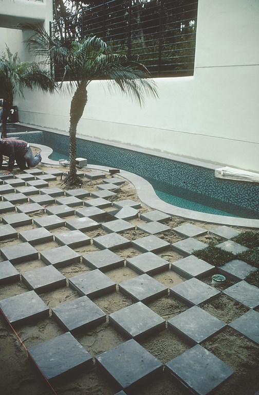
| Once the three palms, the four boxes for the laminar jets and the drain lines were all set, we were ready to bring in material to bring the grade to the desired level and begin the process of laying out the checkerboard deck. |
As I mentioned in my discussion of the coping a couple of issues back, the clients changed their minds again, this time paring the coping back to a one-foot width along with the lawn. Then we doubled back on the idea of a complete bluestone deck – this time to be installed atop an underground vault that might house a wine cellar. Then, if you’ll recall, we discovered that the house itself was in imminent danger of falling down.
Eventually, the underground vault fell by the wayside. The grade-beam system that would have been required was extremely complicated and incredibly expensive, and there was also a fairly simple question about how we could have created access to the space. And then there was the fact that creating the vault would have made it difficult to set up the system of laminar jets that were to be installed flush in the deck adjacent to the pool. We knew that whatever the deck treatment was, we would have to make it work with this highly advanced system of flush-mounted jets and lights.
|
Stepping Outside The give and take that was involved in developing and fine-tuning the checkerboard approach to the courtyard is more or less typical of the kind of extended creative process you can become involved with when it comes to major projects for intelligent clients with refined tastes. When confronted by each others’ ideas and comments, we tended to push those concepts around rather than allowing ourselves to get trapped by conventional thinking or by the seeming impossibility of developing a new approach to a difficult challenge. Ever since my days at design school, I’ve called this process “Lish Thinking” – pronounced “lease” for reasons I can’t quite explain – and it’s something perhaps best described as a tendency, when challenged, to think outside the box. Without lish thinking in this courtyard, I might have simply told the clients that what they wanted was impossible (or impossibly expensive) and done the courtyard in a more conventional way – or in the way I’d done some other courtyard in some other backyard. As it stands, the checkerboard courtyard is a spectacular deviation from conventional thinking – and another creative solution to a significant challenge in project that was filled with them from wall to wall. — D.T. |
I’m reviewing all of this to make a point: As this whole issue of the deck treatment kept changing, it had rippling effects on many other details of the project. In other words, none of these changes we were contemplating was isolated because of the way that whole environment had to work together visually, structurally, mechanically and electrically.
And the thing of it is that the customers, while demanding, weren’t being all that unreasonable. As the project took shape, their thinking about the space and how it would be used kept evolving, and they really did like the idea of walking out into a courtyard filled with greenery. We might have been able to do that easily had the house been built as it should, with proper concrete retaining walls as boundaries of the courtyard.
As it turns out, however, a huge mistake in construction of exposing its wood foundation directly to the soil not only threatened to topple the house, it also set the stage for all these changes in direction when it came to finishing off the courtyard. And for clients accustomed to having unlimited choices and to getting exactly what they wanted, the fact that their options were limited might have triggered all these rounds of give and take.
A CHECKERED APPROACH
Eventually, the concept of a lawn won the day, and for a time I thought we were in the clear.
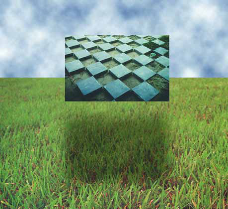
Things became complicated again, however, when the client brought in a landscape designer who suggested a checkerboard pattern in the courtyard, one that alternated one-foot squares of select bluestone with one-foot-square patches of grass. I wasn’t involved in the discussions that led to this choice and was in fact 3,000 miles away when this idea emerged – and was surprised and somewhat dismayed by what I heard when I returned.
In theory, it wasn’t a bad idea – and we ultimately made it work with spectacular results. Rather, the problem was that this design had been conjured without much consideration of scale, of maintaining the small patches of grass, or of how the deck was to be built and brought into line with key visual elements of the home itself. Specifically, the customer wanted the “grout” joints of the checkerboard to line up with the grout joints of the slate tiles used as flooring inside the home.
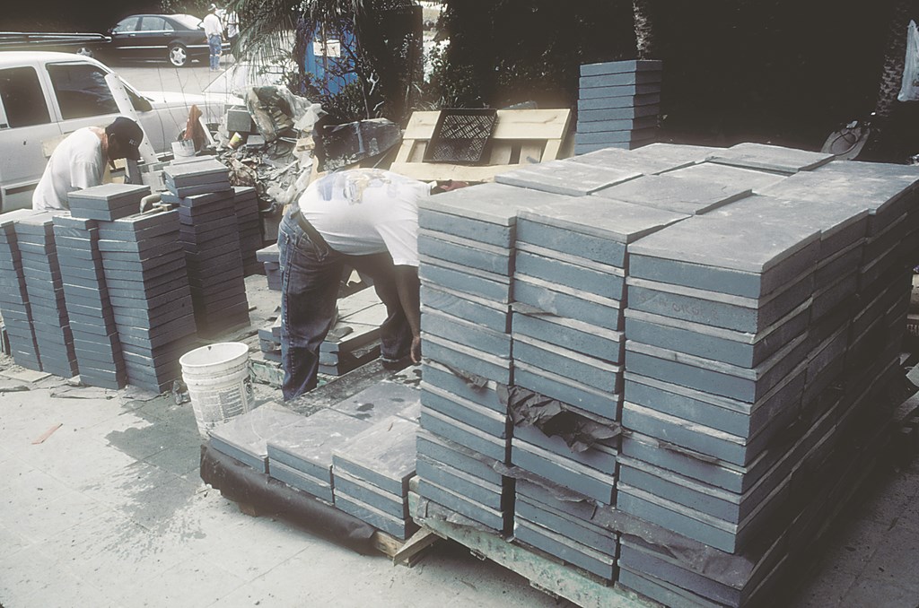
| Before the select bluestone decking squares were brought on site, the edges of the concrete had been colored a compatible gray-green color and attached to the bluestone with thinset. |
Again, not a bad idea given that inside is visible from outside (and vice versa) through plate glass windows that surround the courtyard. Yet while there was nothing wrong with the idea, the reality was that we ran into a huge number of small inconsistencies with the interior tile pattern that caused problems in projecting its grid out onto the courtyard. The simple fact was that the inside tile had been cut and laid out with only the interior space in mind and not with the thought of lining it up with anything outside the house.
But the die was cast, and it was now up to us to match up often irregular lines and make everything fit with the shape of the pool, the laminar jets, the lighting system and three palm trees that were to line up alongside the pool. Add in the fact that the pattern had to line up in two directions, and the notion of making the checkerboard work became daunting, to say the least.
We also had to work with and around the laminar jets, another key feature of the design. I’ll discuss this part of the project in detail next time, but what the checkerboard meant was that we had to move forward immediately with the installation of pads and custom-made boxes for the jets and light assemblies and their requisite plumbing and conduits – all without the benefit of knowing if they would be located in grass or in bluestone.
They couldn’t be moved, because they’d been placed to offset the radiuses of the pool’s outer edge – yet another complicating factor pertaining to one of the key elements of the entire design, and one we wouldn’t be able to figure out completely until we actually laid out the checkerboard.
BUILDING IT
We established the precise layout of the checkerboard pattern using a grid of guide strings we set up to cover the entire courtyard area. It took a great deal of measuring, repositioning, re-measuring and a little bit of luck, but ultimately we were able to set up a one-by-one exterior grid that very closely aligned with the interior tile’s grid.
| Setting up the grid was complicated by the fact that everything had to be brought into alignment, outside and in. All in all, it was a delicate operation with adjustments made in tiny, visually unnoticeable fractions of inches. |
Laying it out was one thing, but actually constructing this pattern was another matter. For starters, we knew that there was no good way to build forms and pour individual one-foot-square slabs to support the select bluestone: Each corner had to touch, so there would be no space to allow for the forms themselves around the corners. All the options here were outrageously expensive, even for these clients. So for a while we considered setting the bluestone directly on grade. But that wasn’t a good option, because the material we were using was only three-quarters of an inch thick and we were worried about its durability and stability.
I decided instead to get around most of the stability problem by attaching the 11-3/4-by-11-3/4-inch squares of bluestone (sized to match the dimensions of the tile inside the house) on pre-cast one-foot-square concrete pads – the sort of stepping stones you can buy for a couple of bucks apiece at any home center.
After trimming the pads to size, we attached the bluestone using thinset and put the squares in their places using our grid of strings as a guide. (Before we laid them down, we painted the sides of the concrete a gray-green color that harmonizes with both the bluestone and the grass so that, if exposed, the pads wouldn’t be visually disruptive.)
|
On-Site Dramatics The situation I ran into with this project, with all the changes that had rippling effects that led to adjustments in other parts of the project, is not an uncommon one so far as high-end designs go. This is quite distinct from the issues that arise with projects at any level where a nice concept on paper falls completely apart because nobody in the loop has any idea of how to build it. You can fudge dimensions on a pencil drawing, but when you get out to the field in full scale, real trouble will result if you don’t have the technical skills and know-how required to turn the drawing into something that works, mechanically and aesthetically. Working at half-inch or quarter-inch scale on a piece of paper is often very different from being on site and finding out that being off line by half an inch at one spot is compounded by another half inch in another – and by several inches by the time all the kinks unfold. In the case of laying out the checkerboard decking described in the accompanying text, any inconsistencies would be amplified by the repetition of the pattern. Here, there was no option to thinking everything through ahead of time and avoiding even the slight chance that we’d be surprised by anything we encountered once we started laying down the bluestone squares. — D. T. |
The whole affair was set down on a compacted-sand base. The pre-cast pads lent their thickness to the select bluestone and we now had enough depth that the squares have been locked into place by the topsoil and squares of sod we set in place. We know with time there might be some movement of individual stones, but they gain additional stability by virtue of the fact that they are locked in place between the pool structure and the retaining wall/ziggurat we set up at the foundation of the house. At this point, ten months after the installation, nothing has moved and the grass is still growing.
Also key to the look of the courtyard are the three palm trees that lived in pots all through the construction process. We placed them at the water’s edge in positions alternating with the laminar jets. Rounding out the landscaping, black bamboo was planted against the wall that looms over the outside edge of the pool.
When all is said and done, the checkerboard deck works beautifully in concert with the other visual elements within the courtyard – the pool, the palms, the surrounding interiors and the big wall that flanks the pool – and everything is tied together by way of lighting.
GREAT WALLS
From the outset, I’d planned to use that flanking wall as a reflective canvas that would capture the dancing play of light off the water’s surface. Even with the laminar jets in operation, this would draw attention away from the water and provide an entirely separate visual element that would be even more visible than the pool from a variety of locations inside the house.
The lighting actually begins with the laminar jets themselves, which are illuminated by a fiberoptic lighting system that enable the ultra-smooth jets to change colors and create a variety of visual effects as they arc into the water. This in turn creates a fascinating reflection on the wall.
| Working with the wave contour at the coping was an extremely involved process because we all knew that this was a key visual focus for the entire courtyard – and a place where our work would need to stand up to special scrutiny. |
There are also four lights in the pool that have been programmed to change colors in sequence with the jets and create a lighting effects that play against the glittering glass-tile surface of the pool’s interior. The palm trees are lit as well with low-voltage lights that caress their trunks and fronds.
This elaborate lighting program stands in stark contrast to the courtyard’s original lighting scheme of overhead floodlights and the single light in the deep end of the original pool. Now we see black bamboo climbing the wall above the water’s surface, a bronze sculpture representing a pattern of leaves on the wall above the pool, and an amazing play of light dancing on all surfaces.
In the midst of it all this, the contours of the pool attract the eye and give a sense of movement and drama to the space – truly a thing of beauty, but one that was not at all easy in the making!
David Tisherman is the principal in two design/construction firms: David Tisherman’s Visuals of Manhattan Beach, Calif., and Liquid Design of Cherry Hill, N.J. He can be reached at tisherman@verizon.net. He is also an instructor for Artistic Resources & Training (ART); for information on ART’s classes, visit www.theartofwater.com.


