Comfortable Adjustments

Wonderful projects often proceed at their own paces.
More often than not, high-end clients on either the commercial or residential side will require us to spend a great deal of time and effort in developing, adjusting and revisiting designs so they wind up with exactly the watershapes and spaces that best suit their needs and desires.
Sometimes that process is tremendously involved, as has been the case with a project I discussed in a previous “Aqua Culture” installment (May 2004, page 10). The clients are creating what they’re calling a “world-class pampering spa” as a major expansion of an existing facility in Jacksonville, Fla.
Our work on the project includes a broad range of decorative and recreational watershapes, all aimed at providing the firm’s customers with the highest possible levels of relaxation and enjoyment. As we’ve moved through the initial design phase and into the plan/document stage in preparation for construction bids, the clients and their project team have made a cluster of key adjustments that in most cases have improved the overall design.
AT THE ENTRY
In one small instance, however, I think they’ve compromised the overall watershape program.
We had originally designed an entry feature in the driveway that would have included a beautiful absolute-granite finish with a perimeter overflow and a fire feature at its center. Ultimately, however, the owners decided to go in a more conservative, traditional direction, and we’re now working on a basic circular fountain with a high-plume jet in the center and a circle of smaller spray jets surrounding it along with some tasteful lighting and a small landscaped area. The material will now be simple cast stone around the outside, with tile on the inside.
I’ve told the project team what I think, because I thought the original scheme would have gone further in grabbing attention and setting the mood for visitors accessing the facility. And frankly, I’m still puzzled by the decision, because the owners had made a big push about wanting to draw attention to the facility from all major exterior focal points. Ultimately, however, it’s their facility – and this is one of those concessions designers are sometimes forced to make.
Inside, by contrast, the design is much more in keeping with our original thinking. Once visitors enter the building, they pass through the lobby and move into a short corridor that leads to the main sections of the spa. On either side of this space – which we know people will be passing through quickly – we’ve set up an interesting (yet subtle) mood-setting feature.
What they see are two narrow, seat-level vessels ten feet long by 18 inches wide that are finished on three sides by glass tile and on the fourth by an annealed acrylic material. Bench seats have been placed atop these transparent walls. Inside each of the vessels, five small bubbler jets create water movement – and there are lights on both ends of each bench to accent the disrupted surface.
The idea was for a simple, dancing glow to emanate from beneath the benches and wash the surrounding floor with light deflected by the movement of the water. The glass-tile further influences the path of the light and enhances the overall effect. There’s nothing bold or forceful or noisy here – just a rippling surface transferred by the lighting to the floor between the benches.
One minor adjustment we made here was at the waterline on the non-tiled sides: There were concerns that scale might build up on the acrylic and become a maintenance issue, so we added a narrow band of tile at the waterline.
ONCE INSIDE
Moving from the corridor into an area known as the “Great Room,” visitors encounter a much more significant feature that includes dual-sided glass cabinets that contain rows gas-operated, electronic-ignition candles.
Two identical cabinets essentially frame a fountain area in the center – an ornate watershape with contoured edges and benches. The ceiling has been lowered a bit above the fountain and eventually (we hope) will have rain jets that will drop a curtain of water between the cabinets – a heavy flow in the middle with gradually diminishing flows toward the edges.
The idea here is to establish a unique visual and aural barrier to separate a dining area on one side from the area where guests prepare themselves for various message and therapy services on the other. As I discussed last May, there are concerns about the noise level in this space, and the current plan is to mock up the entire setting so the owners can see and hear for themselves just how strong the effect will be once installed.
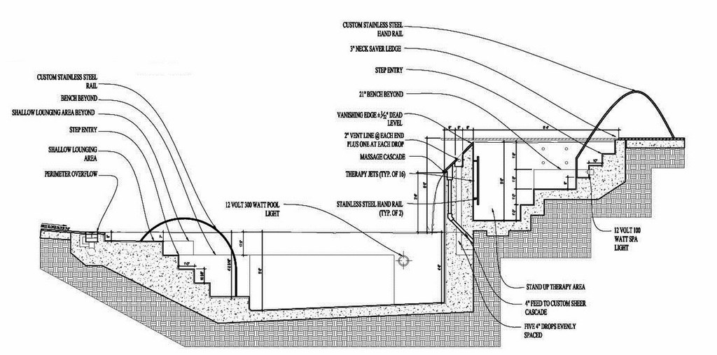
| This section shows the relationship of the exterior spa and the pool below along with some other key details, including the custom handrails leading into both vessels, the vanishing edge flowing from spa to pool and the shallow lounging area in the pool. |
Our original plan had called for a glass water wall with the name of the facility etched into it with a two-sided fireplace on one end. In this case, the owners liked the idea of the water and the fire but pushed us to develop the design further. The creative give and take here has led to a truly unique design that will make an extremely strong statement while serving as an effective barrier.
Our work continues at the back of the building, in a pair of couples’ massage areas with four-foot-diameter, five-foot-deep, Japanese-style soak tubs in stainless steel. These vessels are to be filled with water set at a desired temperature and then drained at the completion of each massage session. Small, wall-mounted drip effects will lend a sense of water in motion as well as a soft, soothing sound.
The idea here is that after couples have enjoyed their massages, they can rinse off in a nearby shower and then conclude their treatment with a warm dip in these tubs. To me as a huge proponent of massages, this seems a particularly brilliant plan.
Moving into the men’s and women’s locker rooms, we had originally designed an angled wall feature with water and tile that would separate the two areas – another space calling for a subtle, mood-setting effect. This space is a current focus of discussion and refinement, and we’re now thinking of increasing the visual appeal of this feature by recessing a decorative, hammered-metal panel to be back-lit with water running over it.
This will be much more artistic than the simple water wall we’d proposed, and I really like the idea. Here’s hoping the owners will buy into it.
HOT AND COLD
Inside the locker rooms’ “wet areas,” we went through several revisions on sets of hot-spa/cold-plunge vessels. The original concept was for floor-flush perimeter-overflow vessels – great visually and perfect with respect to easy entry and egress.
The facility’s staff, however, was concerned that in cleaning the floors around the tubs, rinse water would slosh into the vessels and cause problems. To meet that concern, we’ve slightly amended the perimeter overflow so the stone grates we’d been considering will present a slightly raised bullnose edge as a barrier to water flowing in from outside the vessels. (We worked through this detail with Harris Brothers of Marina, Calif. – the U.S. distributors for Sofikitis, a Greek stone supplier.)
We also adjusted the size of the hot spas slightly so that the women’s is larger than the men’s: Experience has taught the facility’s managers that more women use the locker-room spas than do men. Each of these vessels has its own circulation system.
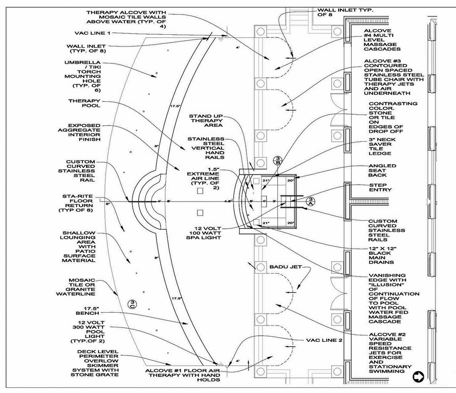
| This view shows the array of hydrotherapy features organized into the pool and spa, including the four alcoves (each with a distinct purpose), the stand-up area in the spa and, again, the shallow lounging area in the pool. |
Right next to the spas in the same rooms are small cold-plunge vessels that hold no more than one or two people. In order to conserve space for equipment and knowing that these systems will receive far less use than the hot-water spas, we combined the circulation systems for the two chilled vessels.
Outside the locker rooms is a large exterior spa that includes a broad vanishing edge that spills into a large swimming pool below. This design was modified to include a stand-up area with arrays of jets that massage guests from their upper bodies to their lower legs. We’ve configured the vessel so the people in the stand-up area will have a view over the vanishing edge to the pool below. On either side are two benches at different levels and decking with lounge chairs – also offering views of the vanishing edge.
The big pool has expanded through the design phase and now includes a large, shallow area that will accommodate 16 lounges set up in pairs with umbrellas between each pair. Originally, the design called for small platforms that would serve as small tables between paired lounges, but that was abandoned to maximize the possible number of lounges and give more flexibility to the space.
We used the same limestone grate system here that was designed for the locker-room spas, but in this case the stonework will be flush with the deck. The surrounding deck and the shallow lounging area will be finished with limestone material that will match the grates.
The pool also includes a stainless steel rail that leads down a broad set of steps to the central deep area of the pool. It has a sculptural quality and lends a graceful sweep to the composition that complements the arched vanishing edge above.
COMPLETING THE SCENE
In another neat twist, the pool also includes four therapy alcoves recessed into the wall of the pool opposite the perimeter-overflow edge. The alcoves are contoured like small, semi-circular band shells, with each offering a different type of hydrotherapy treatment.
One alcove, for example, will be outfitted with a swim jet that can be used for swimming in place or resistance exercise. Another will be set up with a submerged lounge constructed with stainless steel tubing. This will enable a guest to recline in the lounge above streams of water and air from jets below. (An important adjustment was made here to allay the clients’ concern that someone could trap a hand or foot under the tubing. We added solid sides to the lounge to prevent such an accident.) Another alcove will include a multiple-impact waterfall-therapy feature for neck, shoulder and upper-back massage action.
The clients may (and probably will) come up with additional alterations and new wrinkles as we move forward, but at this point I’m reasonably confident that the vast majority of the design decisions have been made. Even though the clients haven’t accepted all of the ideas we’ve presented during the long process, they’ve let us know how much they appreciate the range of ideas we’ve presented and seem satisfied that they’re going to get just the world-class pampering spa they’ve been seeking.
Ultimately, providing comfort and enjoyment is what watershaping is all about, and I remain excited by this project because, eventually, that is exactly what this project will offer anyone who visits for a day of pampering and relaxation.
Brian Van Bower runs Aquatic Consultants, a design firm based in Miami, Fla., and is a co-founder of Genesis 3, A Design Group; dedicated to top-of-the-line performance in aquatic design and construction, this organization conducts schools for like-minded pool designers and builders. He can be reached at bvanbower@aol.com.


