Creating an Identity

Although my practice primarily encompasses residential landscapes, I occasionally tackle a commercial project.
In one such case, I was recently asked to design the entry planting and make recommendations for the hardscape at the Riviera Country Club in Pacific Palisades, Calif. One of the most prestigious golf courses in the world, Riviera is the regular host to the Nissan Open, one of the sport’s premier tournaments.
It’s a high-profile site in every conceivable way, so image is everything to the facility’s owner and managers. After many years of placing what were essentially band-aids on the entry’s landscape, they decided it was time for a complete overhaul and a new look that would make a better first impression on visitors passing through the guard gate and rolling up the drive to the clubhouse.
At this point, visitors who pass the gate are greeted by unattractive views of parking lots, scarred paving and a landscape that, no matter how attractive it might once have been, simply hasn’t aged gracefully. As with any planting or landscape – even one that is initially well planned and executed – there comes a time when things need updating, changing or restoration.
GETTING STARTED
The purpose of my first meeting with the management team was, as always, to establish an understanding of what the owner wanted to accomplish. I met with his staff twice before generating any drawings or layout concepts, just to be sure I understood the mission.
It was clear from the outset that the staff had been grappling with “the entry situation” for a considerable period: They’d already explored hardscape options, traffic flows and possible reworkings of the landscape and had even gone so far as to submit a full set of plans to the city.
As often is the case with plans of this sort, the committees that generate them reevaluate the plan after estimates for the work are submitted and end up back at the drawing board to be sure they will achieve their overall goal. That was partly the case here: There wasn’t anything wrong with the plans per se, but as the process moved forward, bids came in and other ideas were presented, they felt a need to reassess the possibilities.
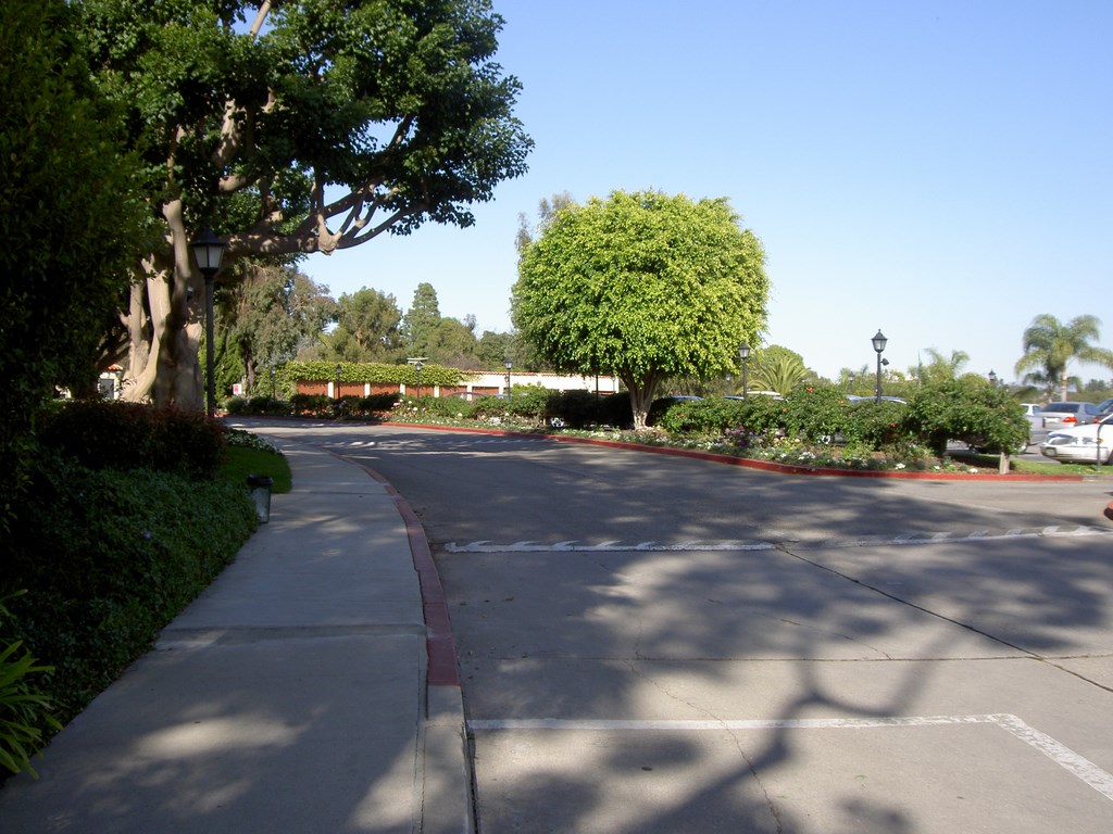
| The drive up to the clubhouse features a few trees, but mostly what members and guests see is the parking lots to both the right and left – a deficiency we aim to correct. |
I became involved when the club brought in Mike Nicholas of the Self-Realization Fellowship’s Lake Shrine (see my article in WaterShapes’ September 2005 issue for details on this site) to take a look at the current landscaping and offer recommendations. After a thorough evaluation, Nicholas let them know that while he felt comfortable in making recommendations about how the appearance of the plantings could be improved, his expertise really had to do with upkeep. He then referred them to me.
I subsequently met with the staff and began formulating ideas. What I had to work with was an entry drive that passes through a guard gate that somewhat shields visitors’ eyes from what’s beyond. Once through the gates, the visitor has three main options with respect to directions to take.
On the right is a large parking lot that’s not shielded from view by anything at all but is set back far enough that it’s less of a visual draw than the other options. To the left is a smaller parking lot, this one also in plain view. Straight ahead is the clubhouse, which visitors approach on a slightly curved drive that terminates at a triangular median marked by a flagpole, a tired planting and a topiary shaped to form the club’s “RCC” initials.
As diplomatically as I could, I asked how they felt about the median and was informed that any suggestions were welcome. They had been talking about a fountain, better plantings and a variety of other possibilities that included changing the shape and size of the median. So far, however, they said they hadn’t been satisfied with any of the choices they’d been presented.
NEW DIRECTION
Now that I had some sense of what they wanted and the latitude I could take in working with the existing layout, I scoured my architecture books to gain some perspective and gather ideas I might use.
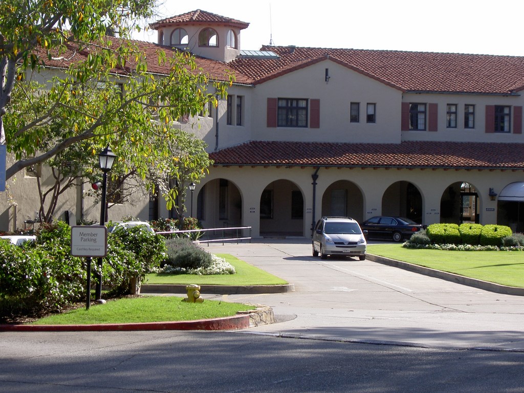
Although the specific style is hard to define, the architecture mainly evokes a Mediterranean feeling while pulling in details from the Italian and Spanish Colonial styles. I’ve found that this is typical when European styles are translated to California: They tend to become hybrids as opposed to pure styles – something I see, in a sense, as defining a “California” style.
With that in mind, I turned to the message I picked up from the staff and focused on developing a simple design that harmonized with the amalgamation of architectural styles of the clubhouse while making members and guests feel welcome. It was to be all about sophistication, elegance and prestige – and about directing eyes to the clubhouse once visitors moved past the guard gate.
| Once on the clubhouse level, drivers roll around a triangular island whose main feature is a topiary logo that probably means most to passengers in helicopters. Transforming this space and using it to establish the club’s identity is a key function of the redesign. |
The clubhouse, in other words, needed to become the focal point while the parking lots that flanked the drive were to be concealed.
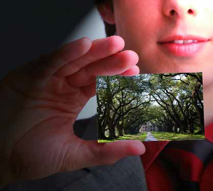
To hide the parking facilities, we determined that taller plantings were needed on either side of the drive – a need easily handled in a variety of ways. More important, it was expressed to me that the owner loved oak trees and was enthusiastic about the idea of creating an allée with them that would guide visitors directly to the clubhouse both visually and physically.
As it turns out, the inspiration for this idea is the famed Magnolia Drive at Augusta National in Georgia – another of the most prestigious golf clubs in the world. They told me about the feeling of importance, elegance and identity visitors get from entering the course via this very long drive lined with majestic Magnolia trees. Not unprecedented, but a great concept just the same.
By this time, I accepted the obvious: What was needed was an entry landscape that would create a clear, true identity for the Riviera Country Club. This wasn’t just about updating things: It was about making a strong first impression that would set the tone for visitors and even for those who watched golf tournaments on television.
As I now understood it – and hearing them speak so reverently of Magnolia Drive was the key – my mission was to brand the club on a grand scale through its landscape design.
DEFINING A LOOK
Creating that identity first required refining the style.
As mentioned above, the existing clubhouse is an amalgamation of design styles. Instead, I focused on fixing the club in people’s minds as an exclusive southern California setting and narrowed my consideration down to what is loosely termed “Mission style,” a prominent look in local upscale architecture.
This led me to think in terms of distinctly southern California plants and trees – selections that would place the club nowhere else but suburban Los Angeles, right where it needs to be identified and recognized.
This enabled me to include the oak allée as the central design element that will visually guide visitors to the clubhouse and past the supporting shrubbery I’ve proposed for either side of the drive to conceal the parking lots from view. Once at clubhouse level, members and guests will see a lush but simple planting of they sort they might find at a California Mission: roses, bougainvilleas and other plants clearly associated with these historic sites.
Another element I’ve suggested is a low fountain with a single bubbler in the middle – a typical look for Mission-style waterfeatures. Being low, the water will not obstruct views of the clubhouse, but its movement will draw visitors’ eyes to that spot, which is in direct line with the entry doors to the building.
I’ve also suggested redoing the drive using stamped, colored concrete in a European cobblestone pattern. Not only will this fit with the rest of the design scheme, but it also will allow for repairs to be made to the roadway without leaving the clear breaks currently evident all over the asphalt and smooth-concrete surfaces where plumbing or electrical work has been performed through the years.
This program has yet to be finalized and there are many issues yet to be addressed. We’ve already gone back and forth on many key points, particularly about which trees will work best and what it will take to establish an allée that won’t take 20 or more years to look the way we all want it to look.
Through everything, I am communicating steadily with the principals involved to make certain we maintain a collective focus on establishing an identity for the club, no matter which ideas emerge and either take hold or are rejected: As a designer, I will never get discouraged so long as I stick to the mission and goals set forth by the owner.
More to come!
Stephanie Rose wrote her Natural Companions column for WaterShapes for eight years and also served as editor of LandShapes magazine. She may be reached at sroseld@gmail.com.


