Elegant Intentions
Sometimes, the main idea that will drive a design jumps to mind as soon as you see the site.
That was the case with the project covered here: When I pulled up to the gate of the property – high in the affluent hills of Bel Air, Calif. – what I found wasn’t a big, showy home of the sort that have increasingly come to characterize the neighborhood; instead, what I saw was a place defined by subtlety and elegance.
It all started with the gate’s beautiful brick pilaster, beyond which I could just glimpse a large, lovely home with the distinctive architecture of an English manor house. Even though I hadn’t met the clients yet or seen the entire job site, I was already convinced that the project would be
a matter of understatement without lots of visual bells and whistles: No vanishing edges, no perimeter overflows – just simple, timeless beauty.
When I met the clients moments later, my thoughts never strayed from the initial impression I’d formed. What I couldn’t have anticipated then was that this would also turn out to be a project of profound technical complexity.
AT HELLO
The clients made an immediate impression, too. He’s a successful surgeon, she’s a retired business executive, and both are well-educated, well-traveled, keenly intelligent and accomplished. Their home is filled with art and exquisite furnishings – ample evidence of good taste and their cultivated design sensibilities. They were, in short, serious people who seemed to know how to get exactly what they wanted.
But what I also discovered was that they were surprisingly down to earth – less interested in being showy than they were in surrounding themselves with beauty and good design. In fact, unlike most clients I encounter on this level, they wanted to know absolutely everything about what I was doing or was going to do and became involved at a level I’ve seldom witnessed. From the very first moments of our initial discussion, I had the sense that this would be a rare and potentially wonderful collaboration.
Early on, they told me that they had spoken with a couple of other pool contractors who had come through the door claiming to be “designers.” They saw through them quickly, however, because the concepts the contractors brought forward were no more than simple parroting of thoughts and suggestions the clients themselves had offered.
| The gated entrance to the property and a glimpse of the manor house beyond gave me an initial impression that never faltered: I knew immediately that I would be working in understated terms to bring subtlety and elegance to the home’s exterior environment. And as it turned out, it was quite a space: a broad, open yard with great views – but also an existing, 15-foot-tall retaining wall that needed respectful treatment. |
I responded by letting them know that the process could move in one of two directions: I could start nodding my head, too, and simply give them exactly what they thought they wanted, or I could verbally and visually explain my own ideas about the design based on what I thought the project required.
I spelled it out in those blunt terms because, although they had developed a fairly sophisticated vision of what they wanted, it was clear to me that many of their initial thoughts would not have yielded the desired results. It was a clear case in which they had strong inclinations but needed a conscientious designer to reshape those concepts into a project that would far exceed their expectations.
By that point, I had apparently impressed them enough that they were willing to hear me out, so I began offering general thoughts about the yard, how everything should work together and how we needed to manage transitions from one area to the next. I didn’t paint myself into any corners by getting too specific: At this point it was more a philosophical discussion than anything else.
Our conversation lasted for about 90 minutes, and when I left, I suggested that they should think things over and that we should speak again when they were ready. They took full advantage of my invitation: Through the next couple of months, we met at least three-dozen times to discuss various design issues and, as important, to define the nature and boundaries of our collaboration.
TRADITIONAL SOFTNESS
Through all of this, the fundamental idea I’d lit upon the first time I saw the property never left my mind. In a nutshell, that concept had to do with creating a backyard that would look as though it had been built with the house in 1910 as a complement to the home’s English-countryside aesthetics.
To that point, nothing that had ever been done in the backyard advanced anything close to such a vision. It wasn’t an overwhelming space: The home sits on an acre lot, and the yard in which we were working was about 100 by 140 feet in size. In walking out the back door, we stepped onto an upper deck area marked by a hodge-podge array of used brick. Below our feet was a small retaining wall that held back a slope and did nothing by way of offering access or any sense of visual transition.
Beyond the wall was a lower deck made of concrete that dropped about five inches across its 17-foot width. Not only was it pitched with unnecessary steepness, but its main visual features were two large drain grates. In other words, the yard was all about controlling any flow of water, and it was easy to see why this was an issue: The home had originally been built atop a steep slope that flowed down into a canyon, and a long, 15-foot-tall retaining wall had been installed to create a level yard. It was clear that the space’s aesthetics had long ago been sacrificed in the name of preserving the wall’s integrity.
| The presence of the retaining wall and the need to set up a structural deck that would span only a portion of the pool’s far wall led us to use some unusual approaches with the shell. Note the large footing on the retaining-wall side of the pool, for example, which ensures that the pool will place no surcharge on the wall, and the stair-step approach to the spa that makes it a monolithic part of the shell. There’s also that huge, 24-by-36-inch bond beam: It’s engineered as a torsion beam to distribute the load of the abbreviated structural deck along the full length of the pool. |
It was also clear that the wall had been erected without any thought being given to the future addition of a structure as large or heavy as a swimming pool – but more on that below.
The basic design scheme was relatively simple. We would place a 50-by-16-foot rectangular pool about 50 feet away from the house and up close to the retaining wall. The idea was for it to function visually as a reflecting pool that would enhance views of the surrounding trees (already in place), the landscaping we would install later and distant views beyond the canyon.
At one end, there would be a seven-by-nine-foot spa that would be set back by a few feet and connected to the pool via a set of small runnels that would pass beneath capstones and gently spill into the pool. These big watershapes were to be balanced by a small, rectangular fountain at the edge of the upper deck – a structure that would serve an additional purpose by bringing a soft sound to the space near the house. Off to one side, we also plotted out a large outdoor kitchen/dining area.
Linking these destinations, we set up stone pathways, small decks, planting beds, rustic wall details and a host of other touches all directed at making everything seem to be a hundred years old. In this grand composition, the pool was to be visually subordinated to the whole – just another destination away from the house. Our aim was to make each component work as part of a visually integrated, well-appointed, elegant garden space in which plants and stone were the primary focus and the whole would be perceived as subtle, understated and sublimely elegant.
STRUCTURAL BONES
As we thought things through, we were all aware that the subtlety we were after would completely mask the technical difficulty of what we were pursuing.
As mentioned previously, we were positioning a big pool near the huge retaining wall that gave us a flat place and a large expanse of certified, compacted fill in which to work. We knew in selecting this spot that we couldn’t place any surcharge on the wall, which had been designed to support nothing more than the weight of the soil.
| The all-glass-tile spa has a special beauty of its own, with beautifully radiused corners throughout; an exquisite, green-toned tile blend that picks up the mood and colors of the surrounding landscape; and a line of notches for the runnel system that feeds the spillways flowing into the pool. |
In addition, the clients made it clear that they didn’t want to see any expansion joints that would create an obvious frame separating the pool from the surrounding decks, which meant not only that we had to design a benched cantilever to carry the spa and make it part of the monolithic structure, but also that we had to devise and hang cantilevered structural decks from the bond beam.
And there was one more challenge: On the side away from the house, the deck was to extend away only from a portion of the pool, which would impose differential stresses on the structures. This led to deployment of a specially designed “torsion beam” (explained in some detail in the sidebar below).
All in all, this was a tricky exercise in structural engineering I happily left to the associates of my gifted friend Mark Smith, an architect based in Tarzana, Calif. I always turn to him and his staff when I need sophisticated design solutions; as it turned out, this project involved structural details that proved to be far more advanced than are seen on most pool projects – even those being built on steep hillside lots.
|
Special Engineering One of the most unusual features of the pool described in the accompanying text has to do with the cantilevered deck that extends along only a portion of one of the pool walls. Typically, when a pool has such a deck projecting outward from the top of a pool wall, the deck will run the full length of the wall and therefore will apply a uniform outward force to that whole wall – which, of course, needs to be engineered to accommodate the added load. Normally, the added load is not a special problem because a full-length deck applies the same load to every part of the wall, so the tendency of the deck to bend the wall in the outward direction is distributed uniformly. In this case, however, the deck extends along just part of the length of the pool, which posed us with the problem of preventing the load from acting disproportionately on only one part of the wall. Failure to develop an engineering solution in this case would cause one portion of the wall to flex outward to an extent different from the rest of the wall – a fact that would likely cause serious cracking at points where the load differential existed. The solution developed by my friend Mark Smith and his staff at Mark Smith, AIA, of Tarzana, Calif., involved establishing the bond beam along that entire side of the pool as a torsion beam. What this meant was, instead of having the usual 12-by-12-inch bond beam, we expanded it to 36-by-24 inches and used a specially designed pattern of reinforcing bars that enabled us to spread the beam-twisting deck load along the entire length of the pool. This had two important results: First, it prevented localized overloading of the pool wall by integrating the strength of the entire length of the wall in resisting the deck load. Second and in turn, we were therefore able to add just a modest amount of extra steel to the entire wall, rather than face the prospect of having to use a great deal of extra steel and concrete in the affected area – an approach that would have increased the likelihood of cracking while also compounding the difficulty of installing the steel and shooting the concrete. D.T. I wish to thank Mark Smith, who participated in the preparation of this sidebar. |
The engineering started in the excavation phase when, on the far side of the pool’s floor, we cut a deep footing that reached down past an imaginary 45-degree line extending from the bottom of the far pool wall back to the base of the retaining wall’s footing. In doing so, we made certain nothing we would do placed any additional burden on the wall. (The obvious alternative would’ve been to move the pool away from the wall, but that would’ve eaten up space we wanted to leave for decks, lawn and garden areas.)
The cantilevered decks also required some unusual forming. We over-excavated around the pool to allow for the large torsion beam and the reinforced-concrete substrate for the stone-covered deck. Into this open space, we extended the steel from the oversized bond beam, passing it through the wood forms. We shot the pool shell up to the forms, then, after removing the wood and battering and roughing up the edges to ensure good mechanical bonding where it was needed, we poured the decks to the thickness required in the structural plans.
Inside the shell, we ran a bench 18 inches below the waterline along the full length of the pool. In the deep end, we added a large notch to be used to step down from the bench into the deep end – a wonderful way to get in and out of deep water comfortably without using ladders and rails. This bench detail served double duty by giving us a chase through which we ran much of our plumbing: This minimized penetrations of the shell and at the same time left the beam free for extra rations of deck- and spa-supporting steel.
It’s important to note that the bench and steps were all made of concrete and reinforced steel rather than by excavating their shapes into the soil. We used no rebound at all in shaping these internal features and took great care to make the scale of the bench sufficient to ensure complete shotcrete coverage around the steel and the plumbing lines. We used the spa’s dam wall in similar ways, exploiting its four-foot thickness as a convenient access point for several main plumbing runs.
GRANITE SOFTNESS
Once we shot the shell and poured the structural decks and gave everything time to properly hydrate and cure, it was time to start working on myriad finish details. (I’m often saddened by the fact that so much sophisticated, top-flight construction work is buried and forgotten, but I always bounce back when we start applying beautiful materials that will bring my clients untold years of enjoyment.)
The primary stone material we used on this project was 16-by-16-by-two-inch blocks of Porphyry, a granite quarried in the Italian Alps and imported in a process that took more than two months. (As a practical point, it’s always important in working with imported materials to factor in long delivery times, account for the delays that seem invariably to occur and prepare clients for the wait so they don’t become too impatient.)
We chose this material because, at about 100 million years old, it seemed perfectly suited to the task of making the backyard seem at least 100 years old. The material itself is simply gorgeous and, reminiscent of ancient granite curbs and cobbled streets of Europe, evokes Old World charm in every respect possible.
| The custom color we developed for the interior finish is a key to creating the impression that this is a reflecting pool that was built with the house nearly a century ago. This green is definitely not a standard color, but I’ve used it and similar hues for years because they offer remarkable backgrounds for reflections – just the effect I was after in this project. |
We used a lot of this stone throughout the design as a means of establishing continuity: It’s there in the pool coping and on the decks, where we took full advantage of its elegantly chiseled edges; it’s also been ledgered to form various steps and pilasters and was used to cap walls and make pathways. (Note that we stayed away from modern-looking cantilevers in all of these details to stick with the old-fashioned appearance we were after.)
Everywhere we used it, the stone’s rough edges and surface textures as well as its remarkable color variations all were perfect for the classic, countrified look we were pursuing.
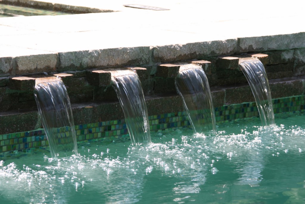
We also used the stone to create the spillways connecting the spa to the swimming pool. As mentioned above, the spa sits away from the pool by some 40 inches, and the gap is paved in Porphyry. Beneath the stones, we prepared eight three-inch-wide runnels that transmit water to spillways that rise just eight inches above the pool’s waterline. This creates an extremely soft, engaging sound of falling water as well as a perfectly balanced visual effect: Had we used a conventional wide-weir approach, the look would have been sacrificed and the flow would have made too much monotonous noise.
From the house, you now move from the upper terrace to the patio and then down one of two sets of steps into the area leading to the pool, the deck and their green surroundings. As always, we were going for subtlety, so we didn’t overdo it with the decks. In fact, most of the space between the upper patio and the pool has been left to expanses of lawn slightly interrupted at times by modest Porphyry pathways and low walls crossing swaths of green.
ALL IN THE DETAILS
As I’ve often stated in these pages and elsewhere, it is frequently my objective to use water only as an adjunct to the visual impression made by an overall space. In this instance, it’s useful in that context to note that, although the pool, spa and decks required complex engineering and construction, the project is an assemblage of a host of refined details, many of which are well away from the swimming pool.
One of my favorites in this project is another, much-smaller watershape mentioned above: the rectangular fountain basin with a brass bubbler nozzle in its center that sends a short, feathery plume up above the water’s surface. The basin is filled with seafoam-green river rocks and sits with its Porphyry coping in a planter at the edge of the patio. As suggested earlier, the fountain flow’s soft sound and retiring visuals both forecast and mirror the subtle impression made by the bigger watershapes beyond.
We carried a similarly subtle tone over to the dining area that starts alongside the house and reaches out into the yard. The cooking structure, which includes a grill, refrigerators, a pizza oven, side burners and a searing tray, is finished with ledgered Porphyry and has simple lines that show off the texture of the stone.
| Our effort to create a seamless visual sweep from the home through to the surrounding trees and distant views involved us in much more than just the pool and spa: We picked up on the home’s architectures, for example, in building brick surrounds for a series of posts on the upper patio and installed the same Porphyry material we’d used around the pool on that patio and all other walls and deck areas (including the outdoor kitchen) to bring continuity to the entire space. One of the key integrating details is the small, rectangular fountain off the upper deck: It’s a marvel of understatement with a bubbler nozzle lending a gentle sound up near the house that forecasts the gentle splashing of the spillways into the rectangular pool beyond. |
One of the most interesting details of this outdoor kitchen is what’s not there: We kept the size of the structure down by eliminating storage cupboards, which I’ve always seen as a waste of space because plates and flatware typically go inside for post-meal cleaning. In this case, we set up what little available storage space we had as open cubby holes for wood storage – a visual that adds to the classic look.
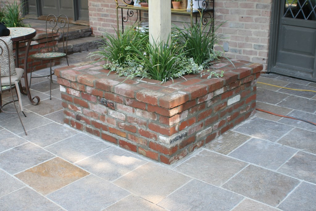
Outside the back door on the upper terrace, we picked up a detail from the architecture of the house to inspire seating planters at the base of the six-by-six-inch posts that support part of the home’s upper floor. Originally, these posts had tiny bases that made them look spindly and insubstantial. We took some of the old brick from the deck and installed large base planters to strengthen the impression the posts made, laying the brick in an imprecise, rusticated pattern to give everything an Old World feel.
Of all the project details, however, perhaps the most elaborate is the glass-tile finish in the spa. A custom blend of three green colors produced by Sicis of Ravenna, Italy (available in this country through Cactus Stone & Tile of Phoenix, Ariz.), the finish lends a beautiful green color to the water and picks up on the colors of the surrounding landscape. You don’t even notice the tile until you’re right on top of the spa: Once you peer down into the water, however, you’re treated to a shimmering spectacle of dancing colors.
The only craftsperson I allow to touch the glass tile on my projects is Willie Villanueva, the best tile installer I’ve ever met. His craftsmanship is on full display here, especially in the tiles hugging the rounded edges of the steps and benches.
We could’ve used quarter-round pieces to accommodate those edges with ease, but that would’ve created visible lines and disrupted the beautiful appearance of the tile surface. By hand-shaping a two-and-a-half-inch radius on the edges to accommodate the 5/8-inch-square tile pieces, Villanueva was able to wrap the material around the contours to create a seamless finish.
GREEN ON GREEN
We used the same tile blend in the pool, but only at the waterline. We could have used it on the benches (or on the entire interior surface, for that matter), but we wanted to reinforce the impression that the pool was there primarily for its reflective qualities. In this case, we opted for a far more subtle PebbleFina material – an exposed-aggregate product from Pebble Technology of Scottsdale, Ariz. – that would, when polished, look like colored plaster but with significantly less of the mottling found in those finishes.
We used a customized green color I developed with the help of John and Luis Marquez of Tony Marquez Pool Plastering (Sun Valley, Calif.). PebbleFina comes in just four colors, and so far as any of us know, no such finish has ever been done with this coloring. We spent a good deal of time experimenting with aggregates and green colorants to achieve the desired look. The result is a soft-green finish that provides a great reflective water surface while harmonizing with the landscaping.
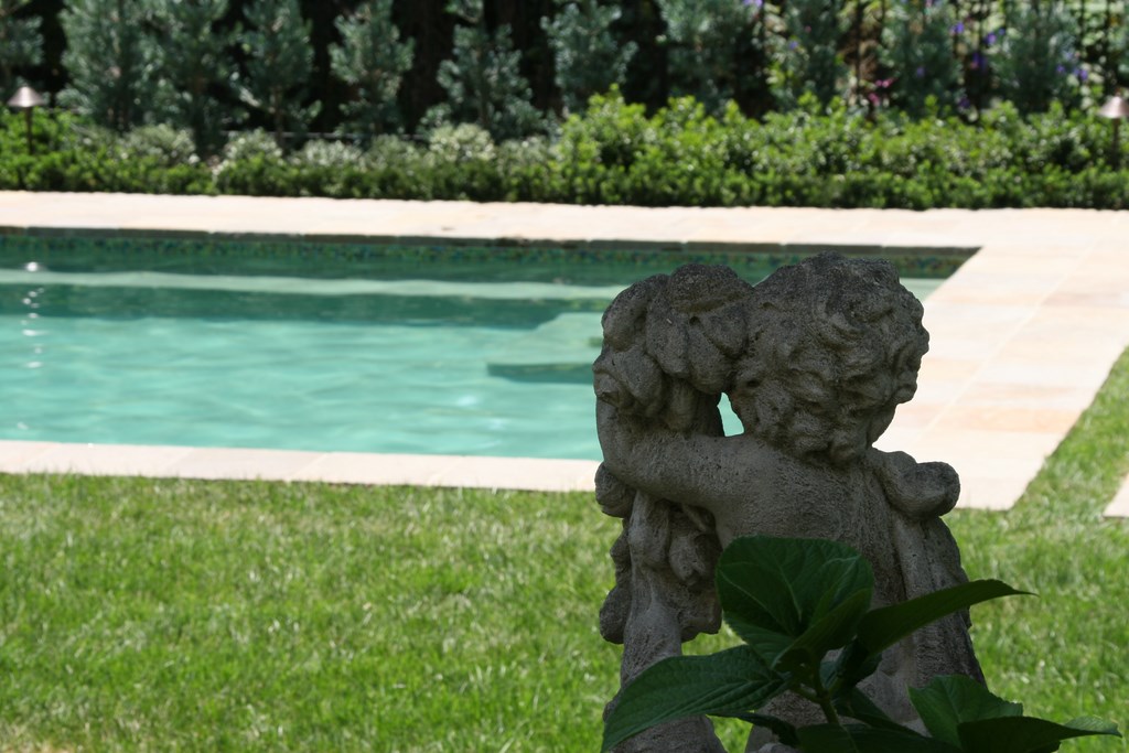
| From any distance at all, the pool seems for all the world to have been built along with the house in 1910: The rich texture and appearance of the Porphyry, the elegance of the formal gardens, the selection of classic garden art and accent pieces – everything works together to create the impression I’d envisioned when I arrived at the property for the very first time. When you get up close to the pool and spa, the sense of age is compounded by the timeless beauty of the glass tile and the rough-hewn quality of the slightly cantilevered spillways. |
That landscape plan was developed by Kenny Unger of Kenyon Landscape (North Hills, Calif.). He did a brilliant job of devising a formal English garden of the sort found around many of the classic manor homes dating to the 16th and 17th centuries. There’s an artful geometry to the arrangement of spaces, along with wonderful variations of color and texture as well as impeccable attention to detail.
By the time we all finished our work, the clients’ expectations had indeed been exceeded and they’d been given exactly what they desired even though, at the start, this wasn’t precisely what they had in mind. From my perspective, the special nature of the collaboration (and, of course, the beautiful outcome) makes this project stand as one of my favorites: Absolutely everything came together – water, stone, plants, hardscape – to create a singular, subtle garden experience in a place that truly looks and feels as though it’s been there at least 100 years.
David Tisherman is the principal in two design/construction firms: David Tisherman’s Visuals in Manhattan Beach, Calif., and Liquid Assets of Cherry Hill, N.J. A designer and builder of custom, high-end swimming pools since 1979, he is widely known in the pool and spa industry as an advocate for the highest possible standards of design, engineering and construction. He has degrees and credentials in industrial design, scientific illustration and architectural drawing from Harvard University and Art Center College of Design and has taught architectural rendering and presentation at UCLA. An award-winning designer, he serves as an industry expert for California’s Contractor State License Board. Tisherman was a 2008 recipient of The Joseph McCloskey Prize for Outstanding Achievement in the Art & Craft of Watershaping.


