


Vertical Orientation


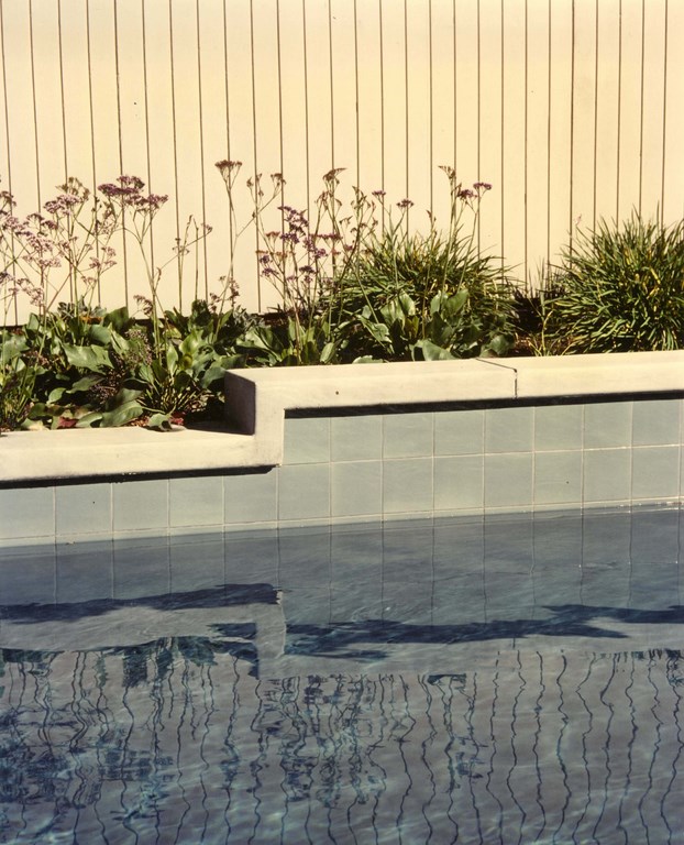
When I first entered the watershaping industry in the late 1970s, one of the details to which I took an immediate dislike was the practice of wrapping the tile that covered the walls of raised bond beams around the corner and onto step risers and various other vertical hardscape surfaces found around pools and spas.
We’ve all seen it – Spanish Colonial Revivalist tiles of questionable authenticity, extra-bold in color and used to cover highly visible vertical surfaces. To me, these swaths invariably look out of place and have the effect of drawing attention to features that often don’t warrant or benefit from the emphasis.
It happens to this day because installers don’t consider the value of making a clear, clean transition from the tile into another type of material, so they take the easy and obvious way out and simply wrap the material from the raised beam around the face of steps or whatever other structure the beam intersects. And to make matters worse, the tile often slams right up against other materials with no visual separation.
To be sure, there are times when the wraparound-tile approach works, as with true Malibu Tile/Spanish Colonial Revival pools and fountains – but such cases are very rare. Instead, I see the proliferation of these visual monstrosities as another case of the “pool guy” mentality in which clients are asked to choose among maybe a half-dozen flowery tile patterns the builder has selected – and then that tile is used everywhere a vertical surface needs covering.
This fast-and-cheap approach begs the question: Do you want to draw that much attention to the risers on a set of steps or, by extension, to the face of a raised bond beam? The honest answer almost always will be, “No, not really.”
A SIMPLE SOLUTION
The key here is that there needs to be some sort of transition that allows you to terminate and contain the tile within a space that actually serves the design – and accordingly lets you leave the tile off surfaces on which it just doesn’t belong. This generally involves developing some sort of offset, protrusion or cantilever – anything that enables you to terminate the flow of tile or whatever other surfacing material you might need to contain.
The grim alternative of which so many builders avail themselves results in focusing attention on surfaces that should not be so dramatically articulated. Simply put, this looks tacky, even garish.
And it’s not just with pools or spas: I see this awkwardness all the time with otherwise nice outdoor barbecues, for example, where one material butts awkwardly up against another, as when stucco runs right up against a tile line with no cantilever or protrusion to keep them visually separated. In such situations, even if quality materials are involved, the overall effect is a cheap look – not a good result.
Early on, I recognized that I needed to come up with a simple way to provide for effortless transitions between materials while offering a sense of visual termination. Quickly, I lit on an unconventional use of common coping.
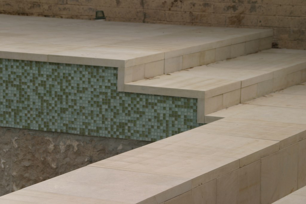
| Figure 1: The look here is clean and crisp and visually appropriate – something that would not have been achieved had the tile, no matter how beautiful it is, turned the corner and, as so often happens, marched awkwardly across the front of the steps. |
As we all know, coping is typically cantilevered just beyond the vertical edge of the bond beam and out over the pool. What I did was take that coping concept and turn it vertically: This created a natural border than enabled me to terminate the flow of tile in a way that made visual sense – and did so without drawing undue attention to design elements such as risers on poolside steps.
In basic terms, what this involves is taking a stone, brick or concrete element of some kind and using it to create a protrusion that extends just beyond the established surface of, say, a raised bond beam, and then I butt the tile up against it. The choice of material depends on the overall design and other material choices, but the idea is always the same: What you want to do is set up a three-dimensional border scheme.
In Figure 1 (above), for example, I set up the coping (a grayish/cream-colored Leuters limestone from Texas) on the top of a raised bond beam and on a set of adjacent steps. The coping stones stuck out far enough that I was able to terminate the tile – a custom blend of four colors from Boyce & Bean of Oceanside, Calif. – underneath them. It doesn’t matter that the material I was containing is a beautiful glass tile: It would have looked weak and degraded on the steps’ risers, but it works here visually because I’ve kept the tile where it belongs.
Don’t let the clean, simple look deceive you, however, because setting up these visual effects for best results is a lot of work.
EASIER SAID
Take a look at Figure 2 (below) as a case in point: What you see here is a glazed, six-by-six-inch, greenish-gray, machine-made tile on the face of a raised bond beam topped by a poured-in-place concrete coping. The look is quite simple and elegant, but achieving it was difficult because the vertical concrete coping had to be absolutely dead on. In fact, any imperfection here would have stuck out like a sore thumb.
Look at it this way: The detail is all about creating a clean transition in what might be a highly visible place on the face of a bond beam, say, as it flows onto the front of steps or some other hardscape structure. To use this approach, you need to know exactly what you’re going to do at the design stage and make certain everything leading up to installation is done with the needs of this detail firmly in mind.
| Figure 2: The difficulty in pulling off this vertical-coping look has to do with the fact that every detail needs to be thought out at the design stage – especially if, as in this case, you’re working with a poured-in-place concrete coping. Every step needs to be executed with a high degree of precision on site to make certain everything fits as planned, which means you need to know not only the materials, their variations and dimensions, but also the capabilities of those who form, shoot, trim and finish these details. |
In other words, you need to plan for the height of the wall in relation to the material you’ll be using to veneer the wall (whether it’s in three-inch or six-and-an-eighth-inch increments or whatever) and set up the spacing on the vertical surface so that the tile and it’s grout will fit without cuts and the protrusion created by the coping will be properly aligned in appropriate proportion. This means knowing your materials, understanding visual balance and designing the structure ahead of time so that everything fits.
Tiles, for example, aren’t all one-inch square: Some are seven-eighths square, others may be one-and-a-sixteenth square. To get this detail right, you need to work in appropriate, accurate increments related to the true dimensions of the material you’ve selected – meaning everything needs to be thought through and planned from the start whether it’s tile, brick or dimensional stone.
The toughest material choice for this detail is poured concrete. Not only do the forms need to be set to near-zero tolerance (otherwise, the disruption of line will draw attention to the coping and blow the entire visual effect by standing out too much), but also adjustments after the fact are nearly impossible. Even if you can go back, rip out a problem section and correct it, anyone who has worked much with concrete knows that, when you have multiple pours, it’s almost impossible to get colors and textures exactly the same.
And the issues go beyond forming: When pouring a vertical coping, it’s important to vibrate the material to create a consistent texture, and whoever does the finishing needs to approach verticals differently from horizontal surfaces, where minor imperfections in texture or finished pattern are not nearly as visible as they are on a vertical surface.
My mason, Kenny Palmer, has been working with me since 1980. Together, we’ve developed dozens of specific approaches to just this kind of visual effect in concrete. It’s a beautiful look, and he’s mastered it. Without my knowing that those edges and surfaces are going to be finished to perfection, I almost certainly would never be able to pull off this detail in poured concrete.
By contrast, with brick or stone coping you can go back and pop pieces off to make corrections. Given the fact that irregularities are often a desirable look with these materials, they can be far easier (and less risky) to use than concrete.
LOTS OF USES
This basic approach can, of course, be applied on all sorts of structures beyond raised bond beams. It will work with barbecues, for example, where the countertop material is cantilevered over the edge and the tile butts up beneath it, and the same is true with small decorative walls, pilasters or planters.
The key visual nightmare you want to avoid is the appearance of one material that seems to be colliding with another. In some cases, simply creating a visual gap can do the trick. To that end, I will sometimes use a U-joint or reglet to create a small gap at a point where tile (or whatever other surfacing material is being used) meets the vertical coping. (More commonly, these spacers are used on the broad surfaces of building walls to control cracking.)
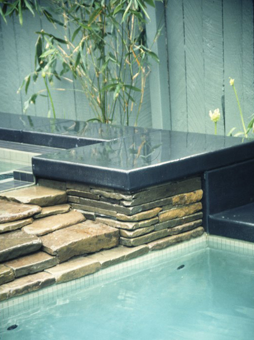
| This small section of vertical black-concrete coping may seem a minor visual detail, but it’s a great look in this application because it establishes a non-distracting visual frame for the stacked stone. But beware: The coping is poured in place, and it would be a nightmare to remove and repour even one small area, let alone redo the entire span if something’s not quite right. |
To me, the most distressing thing about the common use of the wraparound-tile approach is that most watershapers and their clients don’t take details like these into account. Perhaps they’ve just seen them so often that they’re no longer shocked by this visual mistake?
To say that something is being done in a certain way because it has always been done in a certain way is ludicrously inadequate. In this case, the wraparound- tile detail is a complete visual atrocity, something that was wrong the first time it was done and something that should be completely eradicated from the list of possible approaches any watershaper can or should take.
With my clients, all it typically takes is a few minutes to review the possibilities, run through a few quick drawings and engage in a bit of discussion about how the suggested detail works and makes visual sense. (This is yet another example of how drawing skills help me make key visual distinctions during client discussions.)
This approach isn’t the easiest to design or build, however, so clients will pay a little more to get these key transitions set up in this way. But it’s a certainty that if they let me install this visual break in materials, they won’t spend any time at all having their eyes drawn to an ugly detail that would look cheap no matter how wonderful the veneering material might be.
In visual terms, the choice is an easy one between something that looks discordant or garish and something that simply looks great. For my clients and me, there’s really no question about which way to go.
David Tisherman is the principal in two design/construction firms: David Tisherman’s Visuals of Manhattan Beach, Calif., and Liquid Design of Cherry Hill, N.J. He can be reached at tisherman@verizon.net. He is also an instructor for Artistic Resources & Training (ART); for information on ART’s classes, visit www.theartofwater.com.