Living in Color

Few things are as important to the aesthetic impression made by swimming pools, spas and other watershapes as the colors you select to use in it and around them.
Take tile as an example. Whether it’s just a waterline detail, a complete interior finish or some elaborate mosaic pattern, it serves to draw the eye into a design. If the color and material selections work, the scene can become extraordinarily elegant and beautiful. If they don’t, you can have a major eyesore on your hands.
The amazing thing to me is how few watershapers ever really consider the importance these color decisions have in the overall visual impressions their work makes.
PLAYING THE BLUES
About three years ago, I attended a seminar and watched a slide show about lighting in and around swimming pools. At one point, I made the comment that we should never use blue tile with a dark gray or a black pool.
Everybody in the room looked at me as though I was crazy. After all, people have been using blue waterline tile with dark plaster pools for years if not decades. But I held my ground and argued that when you put blue next to black or gray, the blue looks almost fluorescent and really pops visually.
As if to prove my point, the very next slide was a beautifully lit pool with black plaster and blue waterline tile. Everybody laughed, because the slide perfectly expressed the issue: The blue tile positively glowed compared to the rest of the setting.
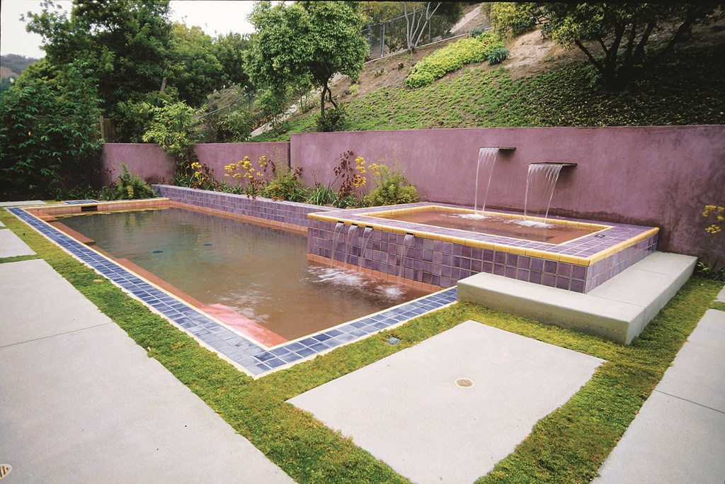
| The ‘red pool’ isn’t about applying red plaster in isolation, but rather putting it in a chromatic context that makes sense and offers a detailed statement about the environment in which the entire composition has been placed. |
So despite the fact that it’s been used forever, I’ll state as fact that blue on black is absolutely the wrong design solution for a watershape and generally a poor color combination in any context – unless, of course, you’re a fan of the Carolina Panthers football team.
Why the chromatic folly? I think it boils down to a lack of familiarity with color theory. In that context, black is considered the absence of all color (although in practice it’s usually either an extremely dark red or a dark blue) and works as a dead or neutral color when used in water or a landscape. That’s fine, but when you put a primary color such as blue right up against the black, the blue will jump out strongly.
In other words, using blue in this context makes a powerful (if unintentional) statement – and most of us don’t perceive a problem because we’ve seen blue tile on black-plaster pools so often that we’ve become conditioned to accepting what is actually a visual travesty.
Let’s take another common example: Red brick is one of the most common of all coping materials for pools. Very often, it is placed next to white plaster and/or blue tile inside the pool and butted up against greenery on the other side. Although Christmas has acculturated us to pairings of red and green, when you look at a color wheel you see they go together about as well as purple and orange.
Some may argue that red brick and green grass are a classic, timeless combination, and that may be true. But it still doesn’t mean it’s the best of color combinations, as a comparison of a red brick wall against greenery with a cream- or gray-colored stone against greenery will attest. In the former there is visual cacophony; in the latter, there’s a harmony of colors and a soothing elegance.
UNDER WATER
Let’s double back to the classic mass-produced pool, with its red brick over blue tile and white plaster and a ribbon of concrete deck or greenery all around. What happens with this arrangement is that bands of color are emphasized and even exaggerated at the edge of the water. It’s my belief that if we weren’t so accustomed to seeing this combination, most of us would be aghast at the garishness of it all.
To my eyes, it’s just butt-ugly.
It’s ugly because it violates the harmonies embodied in color theory and design. Those who walk into a backyard don’t want to see visual fireworks going off all over the place. Instead, they want to see an overall setting in which a watershape elegantly reflects and blends into its surroundings with respect to style, texture, spatial relationships and color.
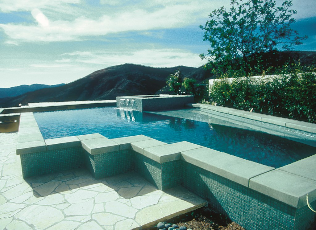
| Not all of my color selections shoot for drama or visual confrontation: In this case, for example, I worked with a range of materials – concrete, plaster and tile – in simple, similar greens to create an impression of sensory calm. |
This is not to say that you can’t use bold colors; rather, it’s a matter of using whatever colors you choose in the proper combinations and in ways that create balance and harmony. There are instances where brightly colored ceramic, porcelain or glass tile can be exquisite, as in a Spanish-styled environment where vivid color combinations capture a style and evoke an era and its design sensibility. Bright colors also work in modernist and contemporary designs, as the works of Ricardo Legorreta and Luis Barragan fully attest.
So why do so many watershapers rely on busy blue tile at the waterline – or bluish floral patterns that relate to nothing around them? As much as I’d like to assign specific blame, I won’t – but I can guarantee you that these are aesthetic decisions made without any basis in color theory!
When I’ve made this argument in the past, some people have pointed out that I use a tremendous amount of color in my projects – witness the notorious “red pool” published in WaterShapes in October 2002 – and offer the opinion that this or that combination doesn’t quite “work.” To each his or her own, I suppose, but I rest easy knowing that my design-oriented clients know what they want, know what I’m doing with color, know that it’s based in my study of and appreciation for color theory – and find nothing but good things to say about my choices.
The key is in the relationships between and among colors. When I use tile, for instance, I’m always trying to pick up on the color of the coping or of the deck or of the plaster or pebble finish. If it hit it right, the tile line visually recedes and becomes an element that is simply there to mediate the wet/dry environment at the waterline.
I love, for example, a particular gray-green tile made by American Olean (Dallas). It comes in one- and two-inch squares, and I match it with a pale green plaster or a green-tinted concrete coping or deck – a combination that makes the tile disappear.
CONTEXT CUES
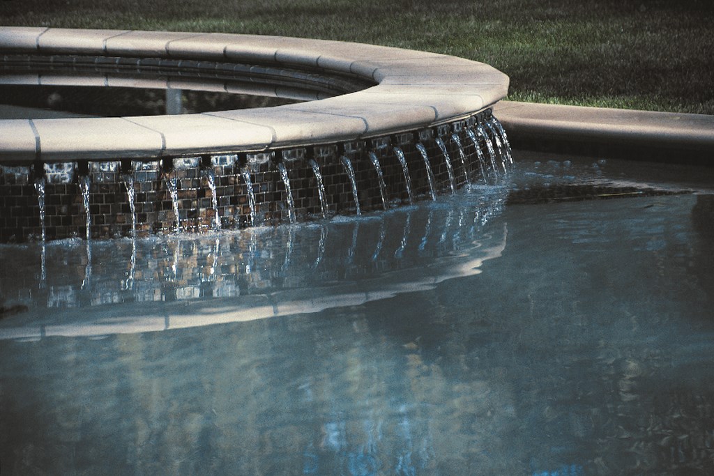
By contrast, when I work with a material such as glass tile, my desire is usually to accentuate the color rather than make it recede. I want to draw a certain amount of attention to the interior finish of the vessel, often with custom-mixed, multi-hued mosaics that involve three or more colors, because the sparkling, brilliant nature of the material makes it eye-catching when observers get right up next to the water.
I currently have four projects that will be finished entirely in glass-tile mosaics. In each case, I’m working with extremely “tight” combinations of color – with all decisions based firmly in color theory – in greens, blues, pinks and lavenders. And yes, I will use blue tile – either glass or ceramic or porcelain – if it picks up a color I’m after or strongly complements the deck or coping material and all of the colors relate to one another in ways that make sense.
| When I work with glass tile, I select combinations of color within a tight range – one that works with respect to color theory and also responds to other colors seen elsewhere either in or around the watershape. |
But what often makes sense to me is more adventurous: Take a gray limestone, for instance – a very neutral color – and place it next to a finish composed of lavender and pink tile shot through with gold veins. What happens is that the blue of the water combines with the lavender and pink to create a gorgeously colored water that runs to deep purple as the water deepens. It’s a beautiful complement to the gray decking.
(I don’t mean to complicate the discussion too much by bringing the water into it, but we should never overlook the fact that water influences the perception of color and adds further complexity to the issue of color selection – not to mention placing an even greater premium on an understanding of color.)
While I enjoy the opportunities I’m afforded to be adventurous, I also work on projects with much simpler color palettes. A few years back, for example, I installed an all-green pool – poured-in-place green concrete coping, green tile on the outside of the raised pool walls, a raised spillway spa wrapped in green tile and a big thermal ledge finished in a beautiful celery-green tile from Oceanside Glasstile (Carlsbad, Calif.) – all set off with a dark-green plaster. The landscaping was mostly green as well but with black-bamboo accents – a simple range of colors, wonderfully elegant.
Then of course, there is the “red pool,” a case in which I was emboldened by my clients’ love of vivid colors and ethnic artwork to have fun with a passionate color scheme. But even here, there were harmonious relationships between colors that worked together, including the red plaster, the coral waterline tile and the purple walls.
MEASURED HARMONY
I bring these specific projects up not to justify specific color combinations I’ve used, but rather to make the point that you can use color theory as a foundation for all sorts of palettes that work with the setting and within the clients’ tastes. In all cases, the idea is not to look toward the water and see riots of color, but instead to create environments that are both elegant and beautiful.
Sometimes elegance and beauty are achieved in subtle ways; other times it takes boldness. It can mean working with light colors or dark colors, warm ones or cool ones. You may be working with tile details or an entire mosaic finish. Bottom line: The fundamentals of color theory apply across the board – no exceptions. If your intention is to design truly beautiful watershapes, it’s important to develop an understanding of how to work in color.
It can’t be a hit-or-miss exercise.
As a designer, you really need to understand and know how to use color as you compose exterior spaces and make recommendations to your clients. Yes, some people have an intuitive knack for color, but if you’re not one of them, there are tools (starting with a color wheel) that you can use to achieve exciting and elegant color combinations.
As is the case with any other aspect of design, when you approach the challenge with a background that’s based on reliable methods and information, you’ll be able to hit the mark and ultimately create something that you and your clients will look to with pride for years to come.
David Tisherman is the principal in two design/construction firms: David Tisherman’s Visuals of Manhattan Beach, Calif., and Liquid Design of Cherry Hill, N.J. He can be reached at [email protected]. He is also an instructor for Artistic Resources & Training (ART); for information on ART’s classes, visit www.theartofwater.com.


