Mid-Range Mastery

It’s a basic and important idea: Quality and beauty can and should be provided across a wide range of pricing levels.
In my work, I design and build many residential and commercial watershapes with budgets well into six figures; I also tackle many projects firmly planted in the five-figure range. No matter the budget, I believe strongly that I owe it to my clients to deliver a watershape of lasting beauty each and every time.
Fact is, quality and artistry often can be achieved with a distinctly uncomplicated program. By bringing a watershape’s design into harmony with the architecture of the home and/or other adjoining structures, it’s often possible to enhance aesthetics and value without dramatically increasing the price tag.
Take the project seen here as an example: Through careful placement and shaping of the vessel, artistic edge treatments and minor elevation changes – none of which added appreciably to the cost – I left my clients with a watershape they love at a price they could afford.
EASY LISTENING
I first spoke with the clients while the house was still in the planning stages. That’s sometimes a disadvantage, because the backyard all too often is far from the top of anyone’s punch list at that time.
In this case, however, the homeowners were keenly concerned about the relationship between the house and its exterior design. In fact, I soon learned that understanding these relationships was essential to getting the job: None of the watershape designs they’d seen to that point had been acceptable, I was told, because none of the builders had picked up on architectural elements the owners considered as being especially unique to their half-million-dollar home.
That was fine with me because, with all of my projects, I always suggest that when one has the opportunity, it is wise to consider the architectural relationship between a home and its watershape. It’s a great way to build a rapport – and to get myself in on the ground floor of the project, creatively speaking.
Our first face-to-face appointment was also my first visit to the site. The house was still being framed at that point. I spotted the 36-inch soffits and the low-pitched roof and recognized them as elements borrowed from the late great architect, Frank Lloyd Wright. Just after we made our introductions, I shared my observation. The client’s eyes lit up and he said, “Exactly!”
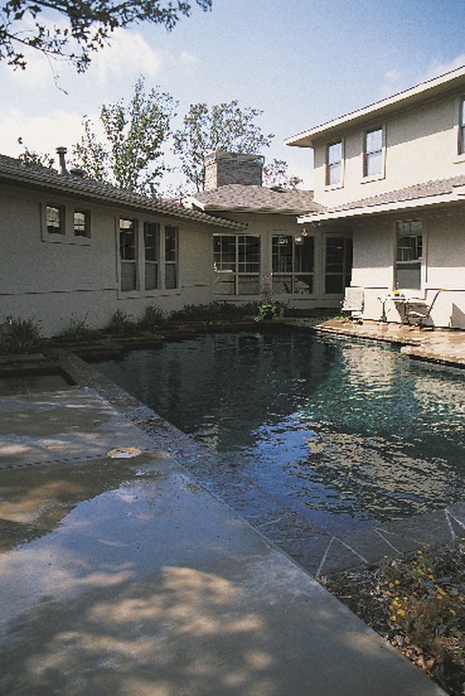
| The style of the home, with its extra-wide soffits and low-pitched rooflines, is in keeping with design ideas expressed by Frank Lloyd Wright – and gave me the inspiration I needed to design its watershape. The angular treatment of the edge along an angled wall of the home keys the impressions made by the watershape – without adding dramatically to the expense of the project. The stone coping lends texture and contrast, while the raised pads give dimension and add interest to the treatment. |
I went on to describe my appreciation for Wright and mentioned the fact that I’d studied his work and had traveled around the country to see Fallingwater, Taliesin, the Guggenheim Museum and the Polk House, to name a few. As renowned as Wright was and is to this day, however, he was not well known for his waterfeatures, which meant the client had no preconceived notions when it came to watershape designs. I knew the door was wide open for my input.
The client gave me the budget and the go-ahead to develop a design. At $50,000, the budget wasn’t large – and I didn’t have the sense there’d be much leeway to expand it. Fortunately, however, the yard had its advantages: The soil conditions were just about ideal and the site would be an easy one to work, so I knew I’d be able to focus the dollars on aesthetics.
MODEST PROPORTIONS
In approaching the design, I knew that keeping Wright in mind and paying attention to the simple, elegant lines and subdued, dark and neutral colors of the house would head me in the right direction.
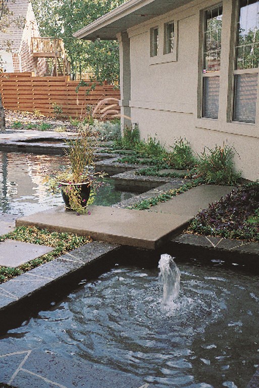
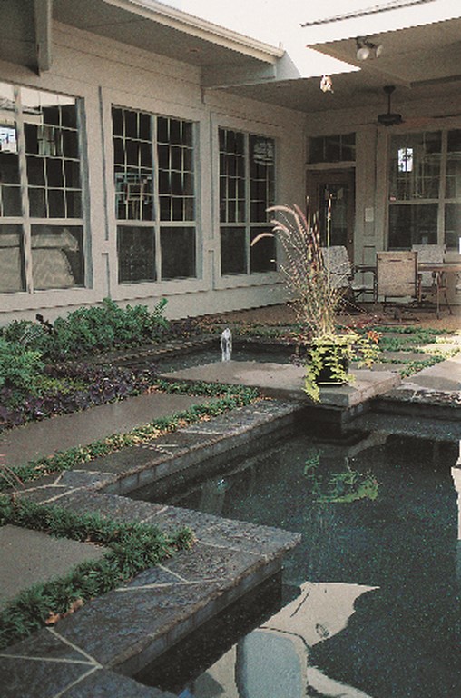
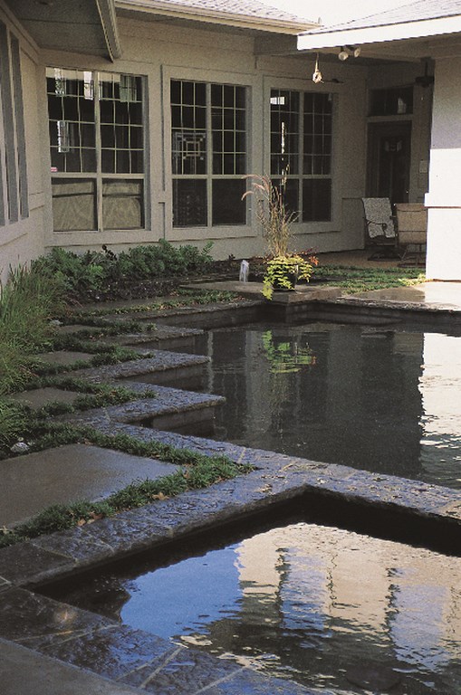
First, and with Japanese garden design somewhere in mind, I tucked a small reflection pond into a slight, otherwise unusable area just outside the back door. This alcove can be seen through windows from the living room, the formal dining room and the main entry – a perfect opportunity to bring a meditative watershape “indoors.”
| In designing the watershape, we took advantage of the angles offered by the home itself and in the process created a Japanese garden-inspired space ripe for use for both recreation and meditation. |
I placed a small bubbler fountain (consisting of a single return line from the filter pump) in the center of the reflection pond for movement. I also carefully positioned a 100-watt underwater lighting fixture in the pond to avoid any glare. Coupled with the bubbler, the lighting creates an elegant, shimmering effect that reaches many interior surfaces at night.
Concrete stepping pads – done in the same color as the deck – border but do not touch the coping around the reflection pond, nor do they touch each other. This allowed for placement of a tight landscape groundcover between each pad and the coping (and other pads), softening the look and contributing to impressions of both texture and color.
| By leaving a space between the coping stones and the decking, we left ourselves room to plant groundcover. All at once, the planting breaks the edge, creates visual interest and completes the meditative impression made by the space. |
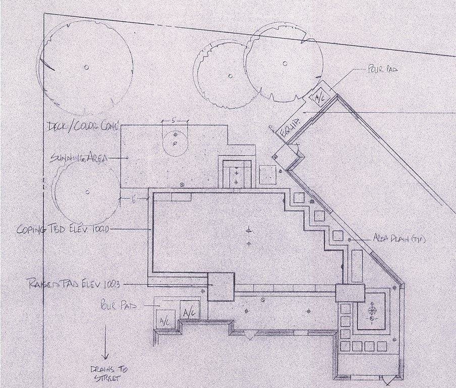
The same stepping-pad idea is picked up again along the angled house wall, neatly filling the gaps at the right angles of the pool and adding to an overall sense of symmetry in the horizontal lines of the design. I chose this series of right angles to accommodate a wing of the house that was set off from the rest of the structure at a 30-degree angle – much more interesting than running a straight line parallel to the structure.
These right angles gave me an opportunity for another detail – that is, aligning all of the inside angle points parallel to the house, the reflection pond, the pool and the spa. The best thing is that this sort of design detail looks like a million bucks but is simple and inexpensive to do. All it involves is borrowing contours found on site, and it can be done with virtually any kind of installation.
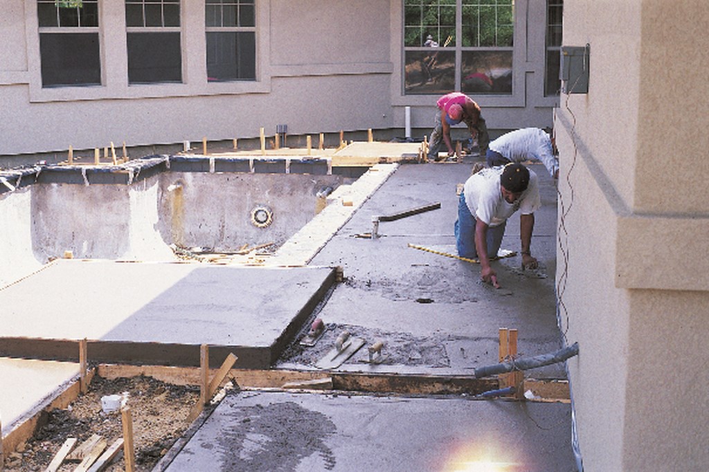
The final detail I chose was, again, simple and inexpensive. I decided to pop up a few sections of deck – not as the standard 6- or 12-inch raised beam, but a raised slab only 4 inches high. All it took was a simple 2-by-4 form placed directly on top of the finished coping elevation to add a slight change in elevation – one that creates strong visual interest while still conforming to the basically horizontal design pattern.
TIED TOGETHER
Given the close proximity of the watershape to the house, we paid particular attention to colors and materials and did all we could to create links between our work and the house exterior.
The back of the house is stucco, but the front features a beautiful stacked stone with a recessed mortar detail – a common feature of Wright’s work. Thinking through the traffic pattern, which draws any guest quickly from the stone façade out front to the rear of the house and offers quick access to views of the pool and pond, we decided to pick up stone details to tie everything together.
Of course, a tight budget makes it tough to use a lot of stone. As a result, we were limited to stone coping and were happy that my supplier, Custom Stone of Dallas, had recently added Ozark bluestone to its inventory. Despite the name, the stone is predominately black with minor brown tones – a perfect complement to the house. Along with a black Pebble Tec pool finish and black slate at the waterline, the stone details complete a perfect package.
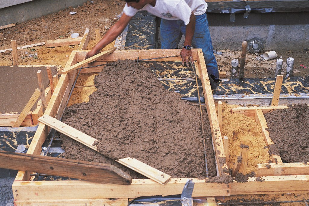
| The special touches we added to the project, including the raised pads, added little to the expense of the project but helped seal the impressions it makes. For the most part, in fact, the work was standard stuff – but always with an eye on quality and on harmonizing the watershape with the house that surrounds it. |
All of this thinking and insight went into the plan we offered the homeowners before any work was done. When they learned that this thing of beauty was also within budget, “prospect” quickly became “client” and we got to work.
The results seen in these photographs, I believe, speak for themselves. The yard evokes the mood of a Japanese garden as well as the design drives of Frank Lloyd Wright (who was himself a student of Japanese design). Even more important, the watershape is perfectly integrated with the style of the house that surrounds it – testimony to the fact that you can stick to your guns in terms of quality and design while operating within a budget.
It’s a beautiful job, one that I am proud to show any of my high-end clients as an example of my finest work.
Michael Nantz owns and operates Elite Concepts by Michael Nantz, a Dallas-based design/build firm for high-end residential and commercial swimming pools, spas and waterfeatures. Now often called upon to offer design and consulting services for elaborate watershape installations around the world, Nantz joined the pool and spa construction industry in 1988 as a project manager for another Texas builder. Previously, he’d spent several years as a project manager for large commercial construction projects including several high-rise buildings that grace the Dallas skyline. Nantz has been a member of the National Spa & Pool Institute’s Builders Council since 1994. His work has won numerous design awards in the United States and Mexico; he served as a design-awards judge for NSPI in 1995 and 1996.


